Interior and Exterior Design
What is Interior?
The definition of ‘Interior’ is the inside of something, eg a house. ‘Interior Design’ also relates to this as it is the art/science of enhancing the inside of a building to achieve a healthy and aesthetically pleasing home.
Interior Photographer- Laura Blight
Laura Blight is a visual artist/ photographer who works and lives in London, but comes from Essex. She adopts an intuitive approach to image making where people are absent and she gives a strange everyday look to images. Blight studied at ‘Middlesex University’ 2007-2010 where she got her BA Cons in Photography, and later on went back to study her masters at the ‘University of the Arts London’ where she received a Distinction.
Laura is currently participating in the ‘Collective Strategies’ programme which is based in London, along with the ‘Hemera Collective’ which she was selected for and develops concepts in a group where they all work together to create a new work for the group show, presented in October 2019.
Most of her individual work is about photographing the difference between domestic and undomestic environments in order to create strange everyday images.
Laura Blight’s Image Moodboard

Her Style..
- Takes images of Domestic Household Items
- Has a white aesthetic following throughout
- Quick shutter speed for fully focused images
- No depth of field used
- Main focus of image usually in centre
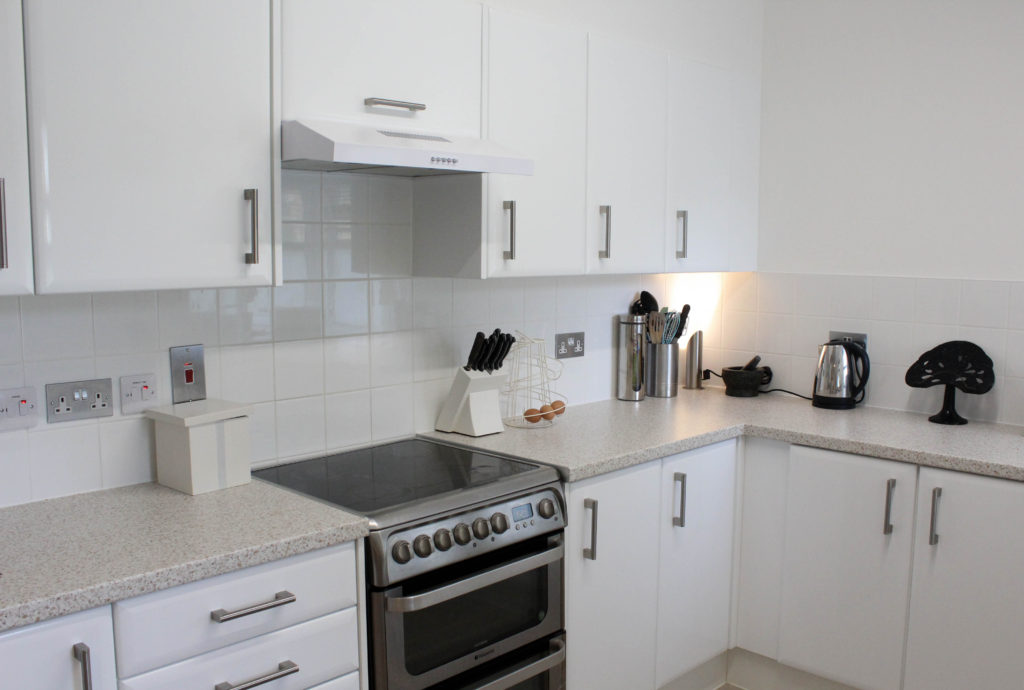
Analysation Image

Technical Analysis- Technically we can see that a good quality camera has been used to take this image, as well as a quick shutter speed being used for the photo which was around 1/250 as it is a fully focused image which has no depth of field to it. It is also suggested that a low ISO must have been used as their is no grain in the image. The overall exposure of the image could have also been high because of the amount of light being let into the image, making it a well lit image. It is suggested that a natural lighting has been used for the photograph due to the even colours in the image.
Visual Analysis- Visually we can see that this is a colour image with two chairs in the centre of it, one white and one wooden. A worn out purple carpet is laying on the floor which if you look in detail you can see that it hasn’t been cut very accurately to the wall. They’re is a white and flower print wall paper on the wall , as well as a radiator in the background of the two chairs.
Conceptual Analysis- Conceptually, the two different coloured chairs is suggesting to me the old and new in a house. Due to this project photo being from the project ” House Clearance” this along with this picture are creating a mood of old and new. However, in comparison to the carpet, we can see that inaccurate cutting has been done to the carpet, suggesting the oldness in it.
Contextual analysis- This is an image from her “House Clearance” shoot which is posted on her website, along with other projects.
Planning my Photo Shoot
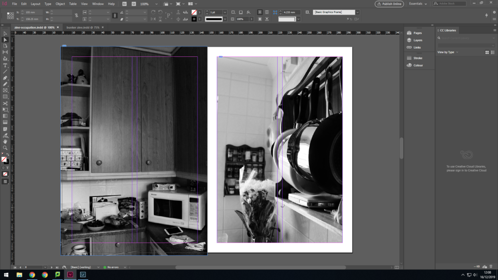
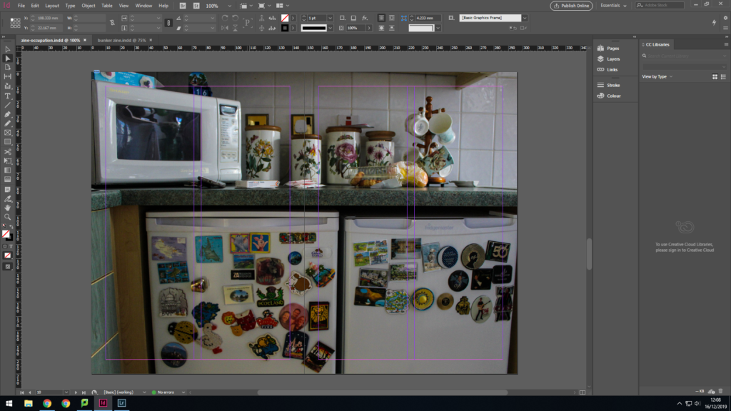
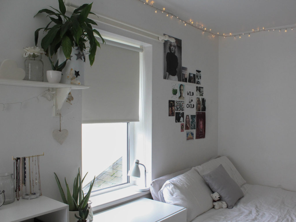
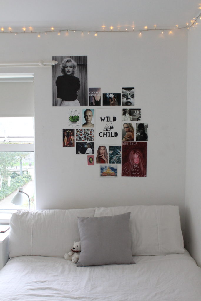
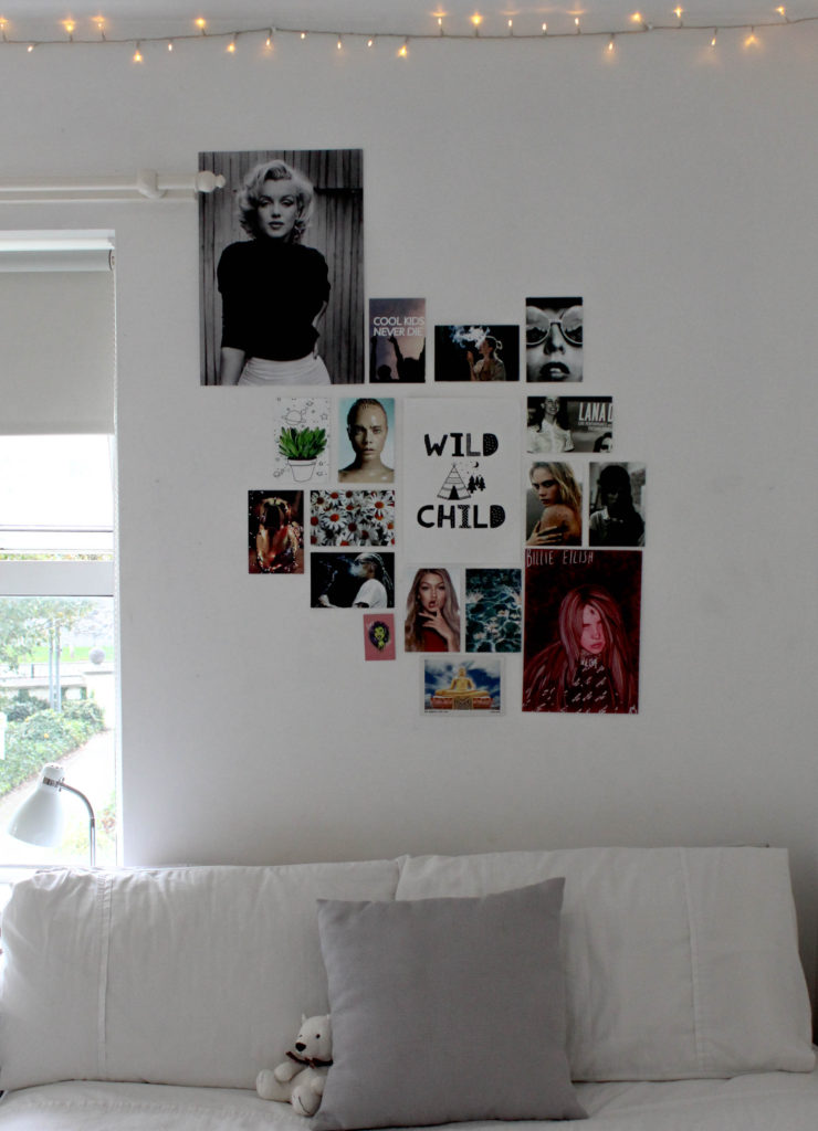
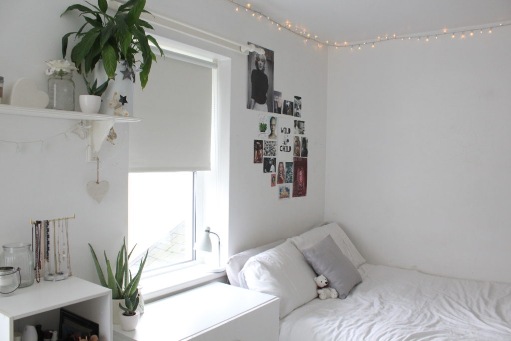
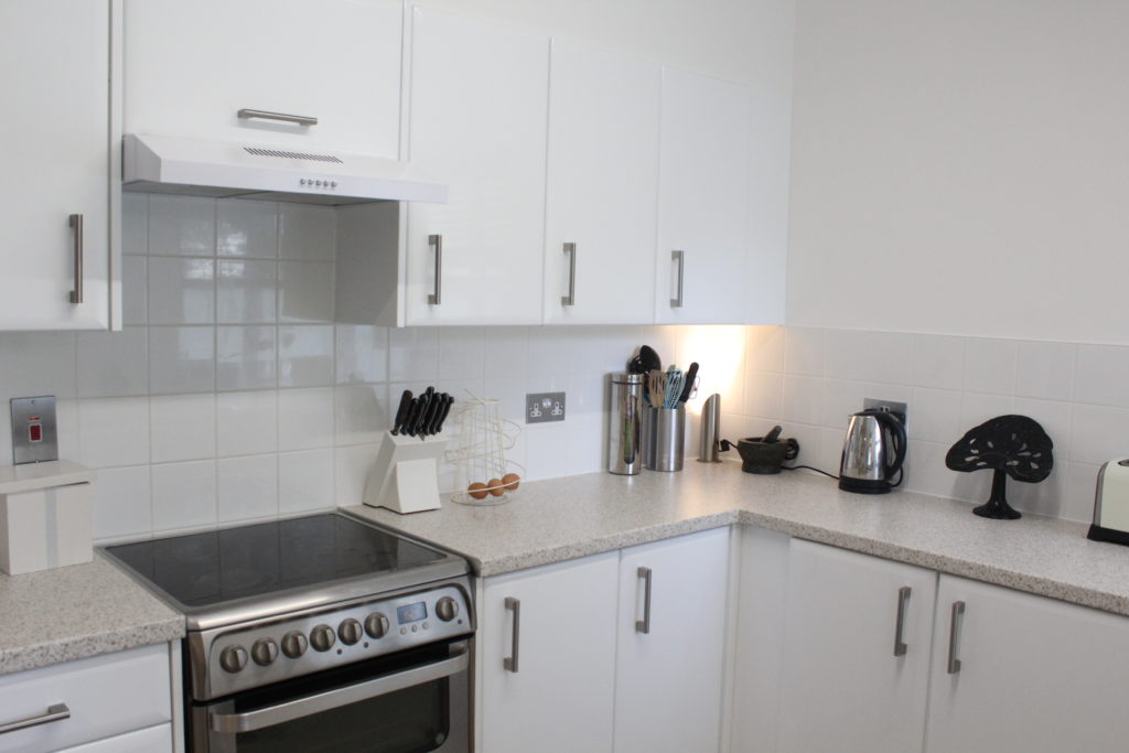
For my photo shoot I will be taking images with heavy inspiration from the photographer above, Laura Blight. I will look into domestic objects in a household which will be done with a personal manner as I will take the images of my own home. Locations I plan to use will be my bedroom, as well as my family kitchen. Laura’s style includes a lot of white backgrounds and she keeps to an aesthetic throughout her photography pieces, therefore I will follow these elements and have chosen to use my bedroom and kitchen as the focuses of the images as they include a lot of white elements in.
On Laura’s website, she has a number of different titles for different projects of hers, after going through a couple of them I have decided that in order to focus on the ‘Interior’ of a home I am going to follow her photoshoot named “House Clearance”. This project shows plain rooms with a small amount of objects In which helps an convey an image. She uses different depth of fields throughout which also will allow me to be able to have freedom with the photos.
I plan to use Manual Focus on a Canon Camera, due to the location being inside, I will set my ISO to 1600, the F stop to around F.5/F.6. Their will be a shutter speed of 1/250 to allow light into the image which will contrast with the auto focus white balance which will help to create an evenly balanced image. The overall Manual Focus setting will allow for me to have freedom with zooming in and out of objects, as well as experimenting with the depth of field.
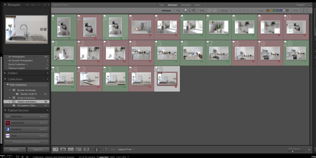
Process of Elimination
Planning my Editing Process
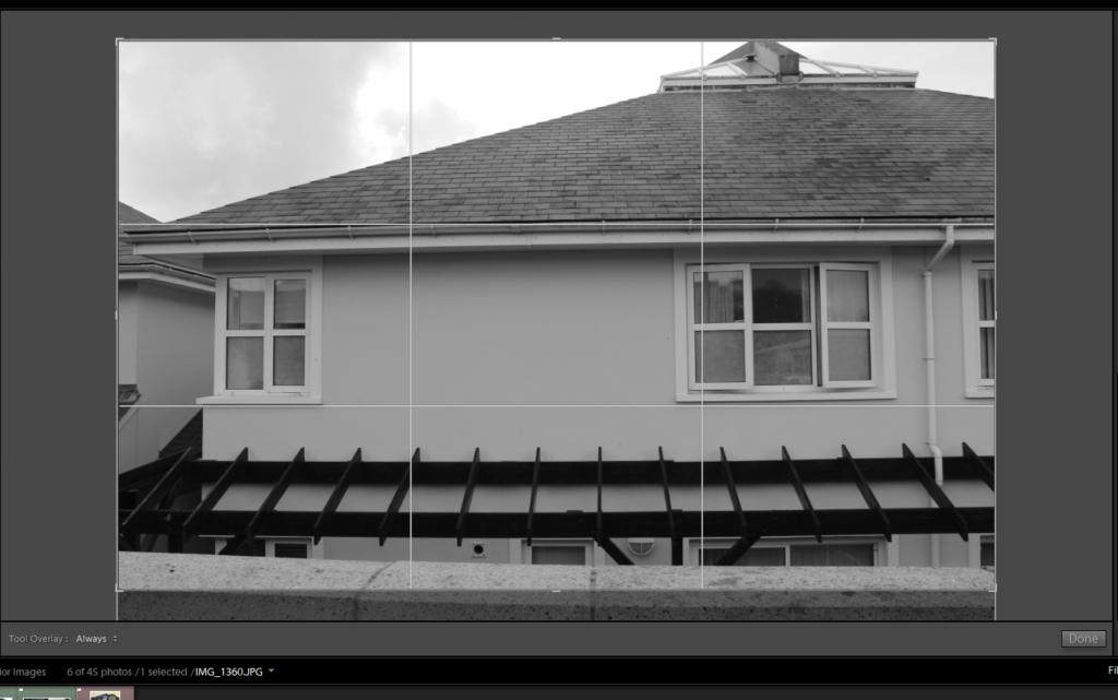
I am very happy with how my images turned out. However i do feel as if there are elements such as the overall size of the image which I would like to crop, as well as simple edits which will allow the images to have an aesthetic like Laura’s do.
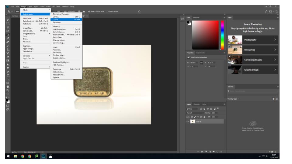
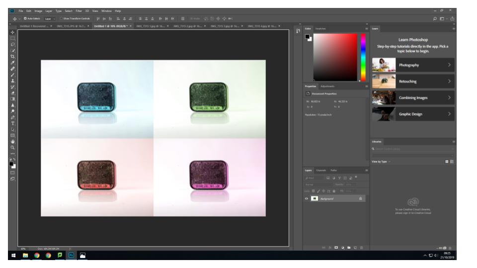
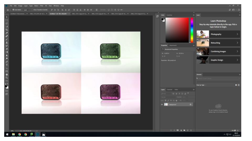
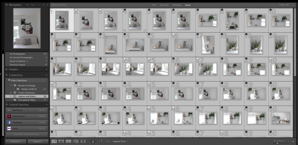
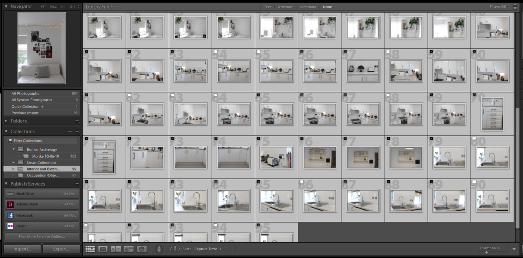
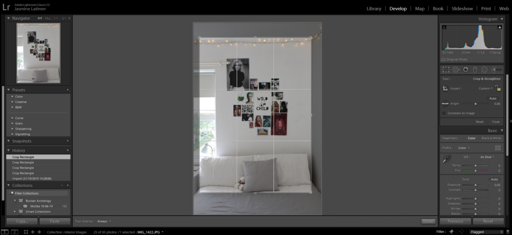
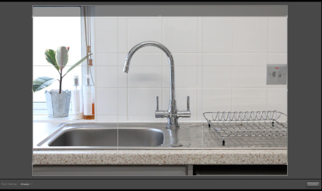
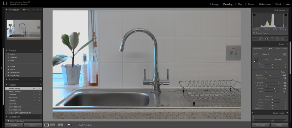
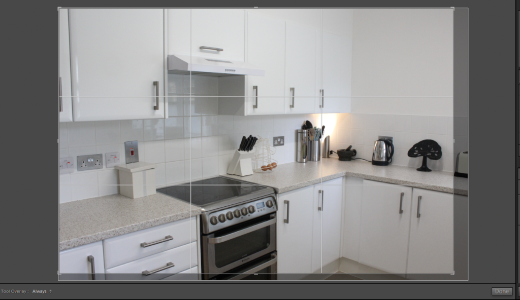
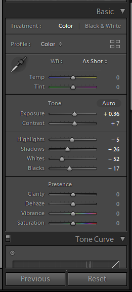
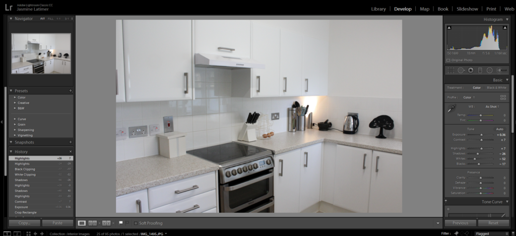
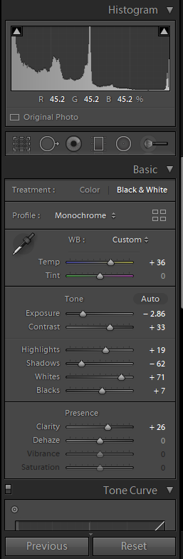
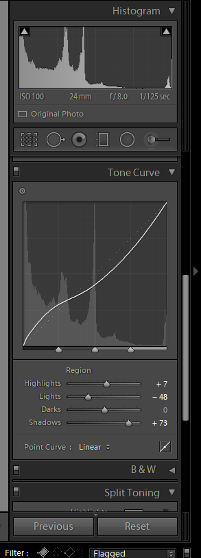
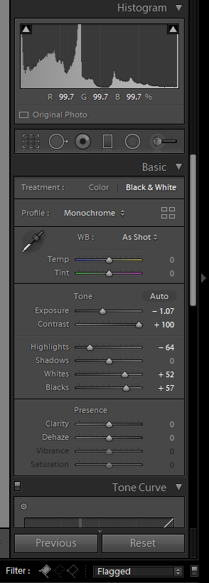
I will use Adobe Lightroom Classic in order to edit my photos and will also screenshot my process.
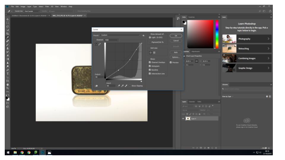
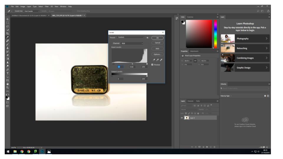
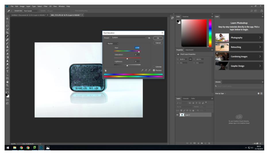
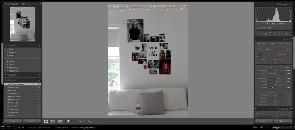
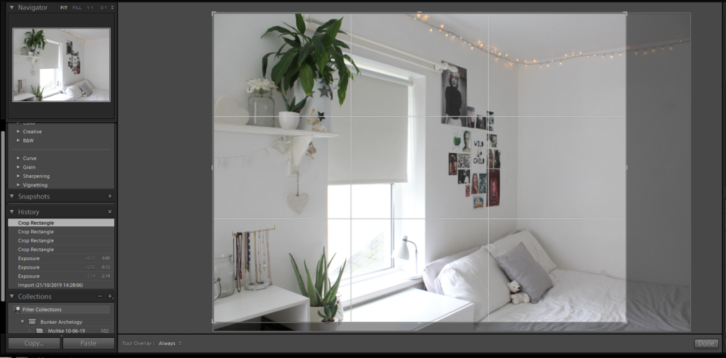
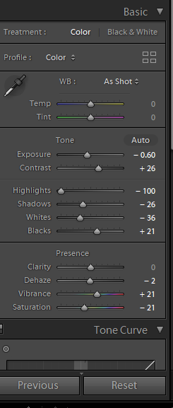
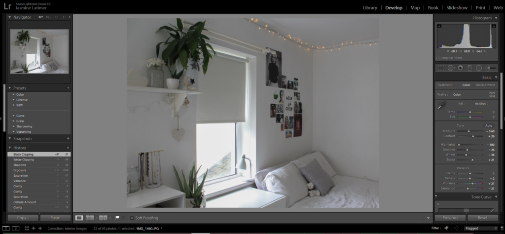
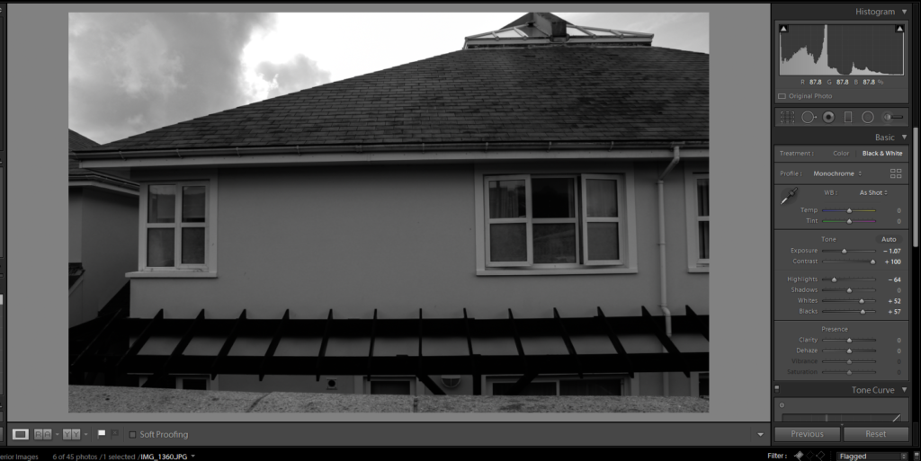
Editing my Photos

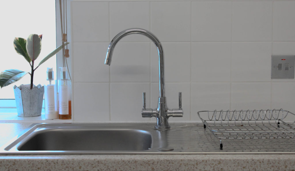

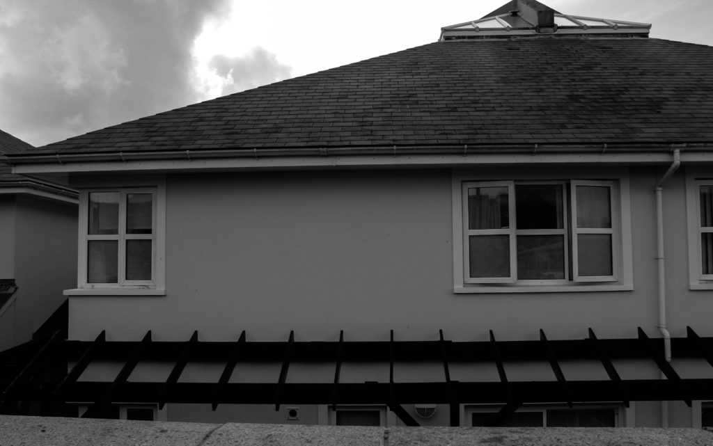
Best Edited Images


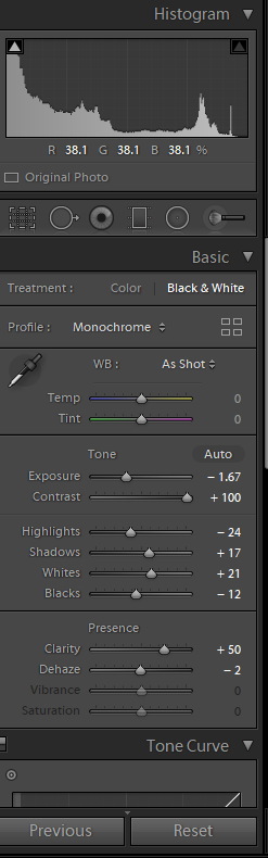
Technical Analysis X4 – I used a Canon Camera on a Manual Focus setting, the ISO was set to 1600, the aperture being F.6. There was a shutter speed of 1/250 which allowed light into the image. The white balance was set to the auto setting and I included no depth of field in ant of my images.
Visual Analysis- Visually we can see that there is a white aesthetic in this image which is a representation of Laura’s work. There is also not many unnecessary objects In the image which again is linking to Lauras style as it is very simplistic.
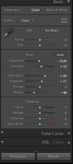
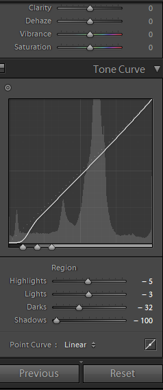
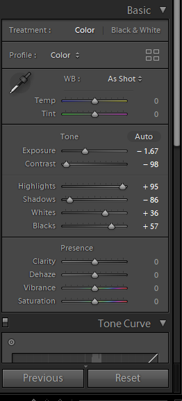
Edits- I mainly made small edits to the image such as the Exposure, Contrast, Highlights, Shadows, etc. This was all in order to ensure their was an aesthetic going throughout and the images linked to the influences work.
Comparing Unedited and Edited Images


What is Exterior?
The definition of ‘Exterior’ is the outside of something, eg the outside of a house, building.
Exterior Photographer- Robert Adams
Robert Adams was born in 1937 in the location of New Jersey and is known for his photographs of the Modern American West. He revisits the classic collection of nocturnal landscapes which he takes near his home in Longmont, Colorado. He published all images in this area in a book called “Summer Nights” which he started working on in the 70s and was finally published in 1985, 15 years later.
Adams won the Spectrum International Prize for Photography and the Deutsche Borse Photography Prize for his many books. Some of the most well known photographic books of his are ‘Summer Nights’ (1985) , ‘Missouri West (1980), ‘Beauty in Photography (1981), as well as ‘New West’.
Robert Adam’s Image Mood Board

His Style…
- Images taken at nighttime
- Black and White Effects used
- Landscape images
- Heavy Contrast in some images
- Quick Shutter Speed
- No Depth of Field used
- Non-Grainy images, ie low ISO used
Image Analysis
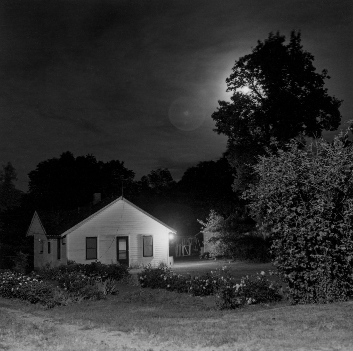
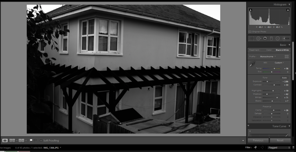
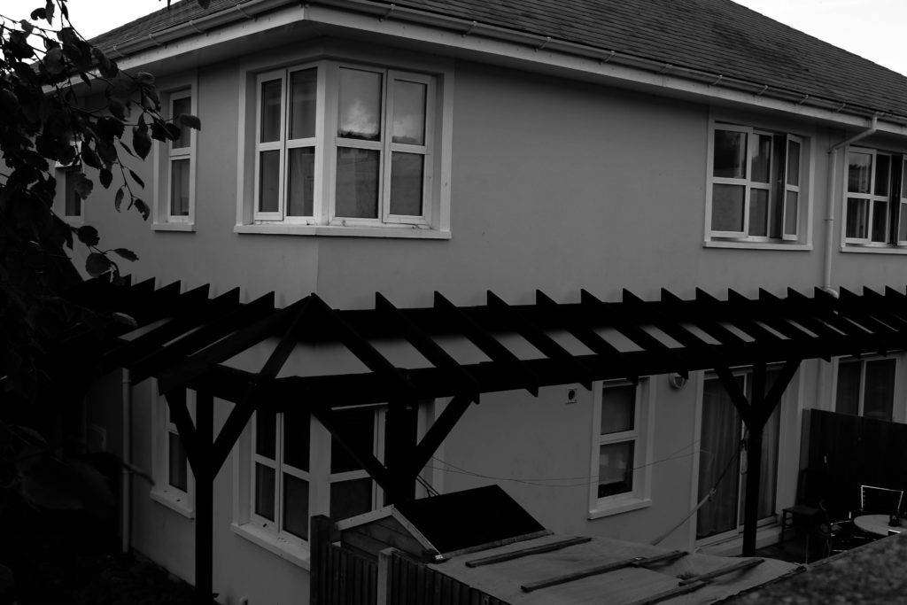
Technical Analysis- Technically we can see that this is a fully focused image, meaning a quick shutter speed would of been used and had a setting of around 1/250. There is also very little grain to the image suggesting a low ISO would have been used. I cannot figure out the exposure of the image due to the black and white edit.
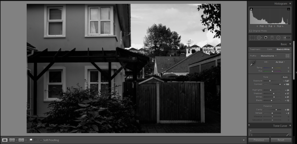
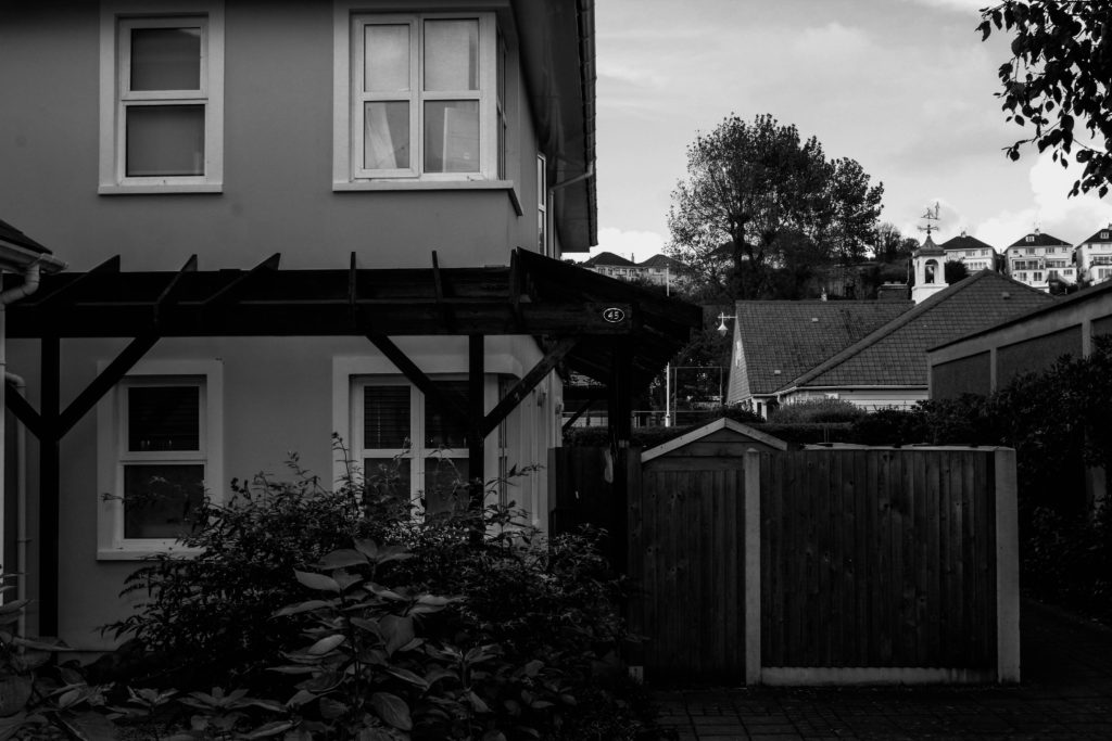
Visual Analysis- Visually, we can see that there is a house on the left hand side of the image and this is an overall black and white edited image. There are also trees and grass included in the image showing nature and also helping to give a dark vibe to the image because of their shadows. The black and white edit used is helping to create light and shade in the picture, showing contrast between the light house which is painted a light colour, with the surroundings of dark trees.
Conceptual Analysis- Conceptually, I think that the use of the black and white effect in this image is allowing for a debate to be opened up around the light and shade.
Contextual Analysis- This image is from the picture book “Summer Nights” which was published by Robert Adams in 1985. The images are taken from around his come in Colorado.
Planning my Photoshoot
After looking at Adams work, I have decided to use his photo book “Summer Nights” as my inspiration for my Exterior images. I will take pictures at night and will experiment with using street lighting as well as flash photography in order to take pictures of my home.
I plan to use Manual Focus on a Canon Camera, due to the location being inside, I will set my ISO to 1600, the F stop to around F5. Their will be a shutter speed of 1/250 to allow light into the image which will contrast with the auto focus white balance which will help to create an evenly balanced image. The overall Manual Focus setting will allow for me to have freedom with zooming in and out of objects, as well as experimenting with the depth of field.
Process of Elimination
Planning my Editing Process
Editing my Photos
Best Edited Images

Comparing Edited and Unedited Images