
The Shoot
We set up the studio with two stations, one where you take photos from a eye-level angle, and one where you take images from a birds-eye view.

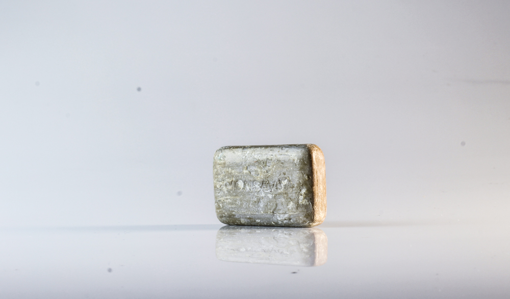
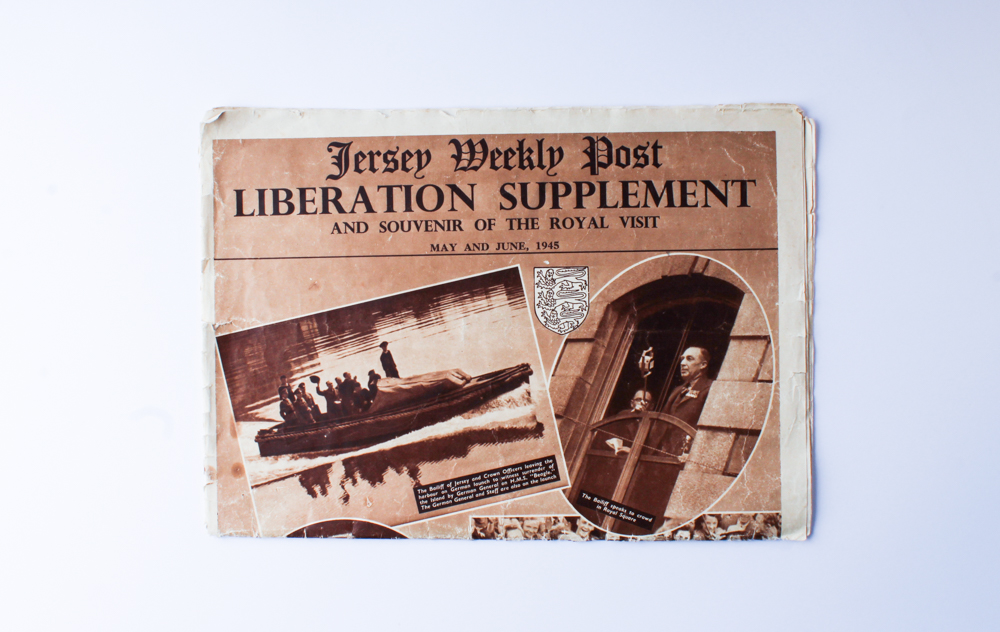
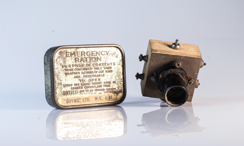
For these photos, I selected objects that were lended to us from the Jersey Archives that are actual objects from WW2. I chose to photographs both images of just one singular object, but I also selected multiple objects to create a narrative.
Selection
In Adobe Lightroom Classic cc, I used the color rating system to select the images that I thought were the best and I wanted to edit them. First I made them all yellow, meaning a maybe and then after manipulating my images I rated the best photographs as a green.
The Yellow Rated Photos


I rated these images as yellow as I believe they are of a better standard of the majority of the photographs, however, there are some technical difficulties that can't be completely fixed in Lightroom such as lighting differences or some focusing problems. I decided to show these photos to display my selection process and to acknowledge my mistakes in order to learn from them. What I would change next time is where the lights are situated and make sure they hit both the object and background in order to ensure that there aren't patches in the background that are darker than others.
The Green Rated Photos

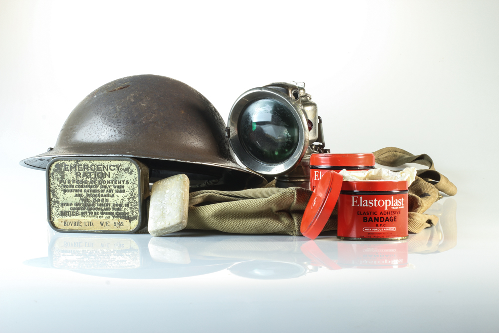


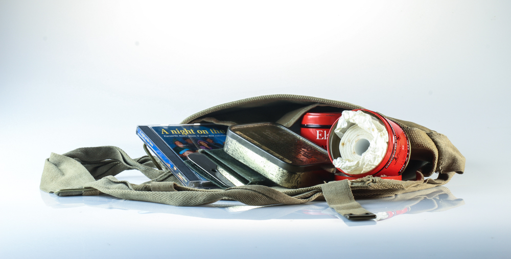

These are what I think are my best images. The focus is crisp and the objects are interesting. I particularly enjoyed photographing multiple objects together to create a scenario. For example, placing the bandage pots and soap bar in front of the First Aid box creates the concept that those items might've been included in the box. I also liked filling up the bag with multiple items that the islanders or soldiers may want to have on them all the time. I also liked taking the birds-eye-view image of the German Occupation of Jersey book. Although I overall preferred taking the images from eye-level, I enjoyed the learning process behind taking the images from the birds-eye-view. I also like the mirror-like effect that the objects reflect onto the surface. It adds more depth into the images and overall make the images more eye-catching. To improve next time, again, I would focus on rearranging the lighting more. I want the images to be a bit brighter and I don't like the blueish/grey effect the background has. I tried to adjust this on Lightroom, but there is only so much adjusting I was able to do.
Composition
On thing I really learnt from this shoot is the composition of the objects can make or break the image. Here is an example:
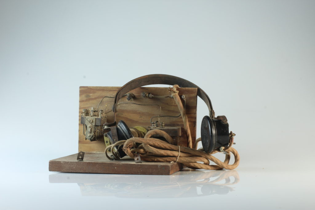
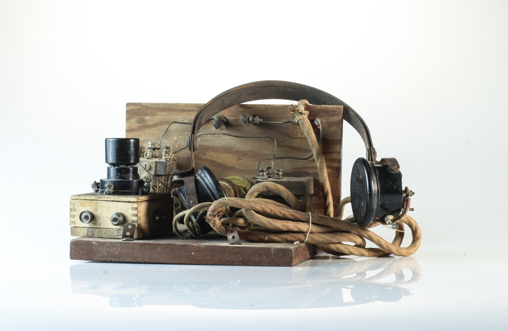
The image on the left is unedited. I wanted to photograph this radio and headphone set but I wasn't happy with how it was turning out. I kept trying to move the wire and headphones into different placed and angles but I just knew something was missing. After trying to make the image work, I decided to see if introducing another object would make the scenario look better. I then found the mini crystal radio set that islanders made and used to find out the news. By linking these already similar objects together added a lot more depth to the image and made it overall more interesting. The similarities between the top of the crystal radio and the headphones are eye catching and the different shapes of the crystal radio adds depth to the photo.