
For my zine I decided to use a simple design with just a 16 page a5 layout.
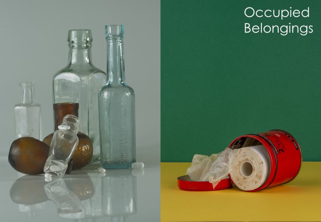
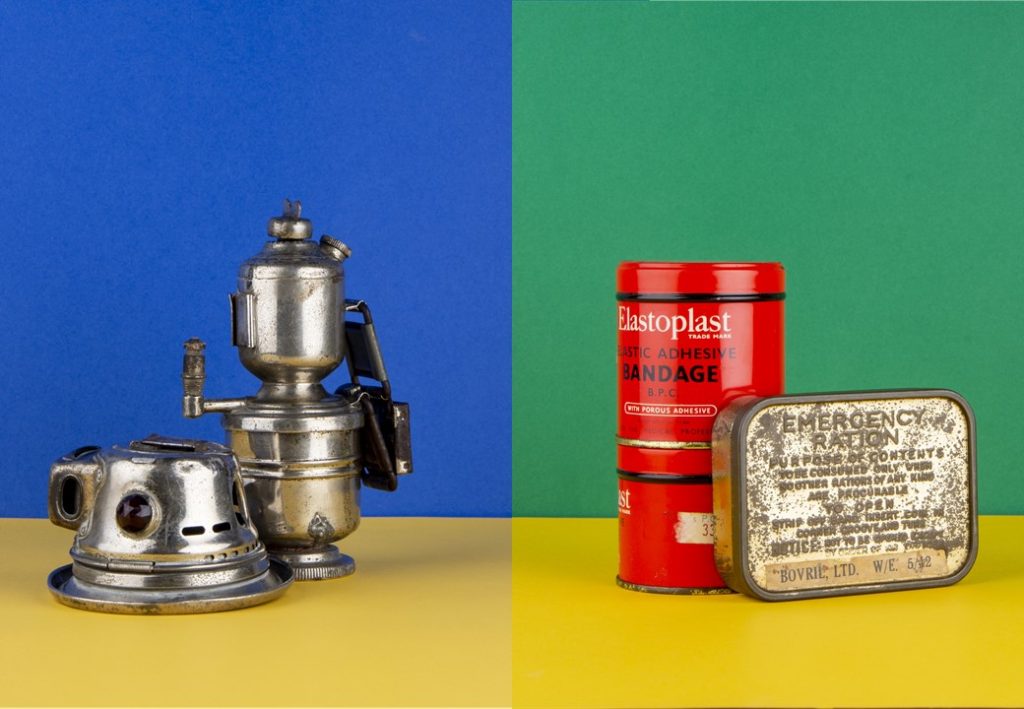
The title image was chosen carefully because because it has a large block of the green at the top and the main focus of the image, the bandage, is far away from where the title is. I have done this so that the title doesn’t look like it is cluttering the page and drawing focus away form the image.
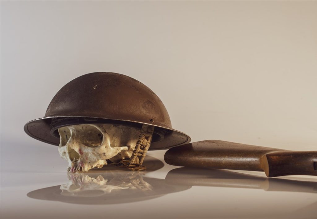
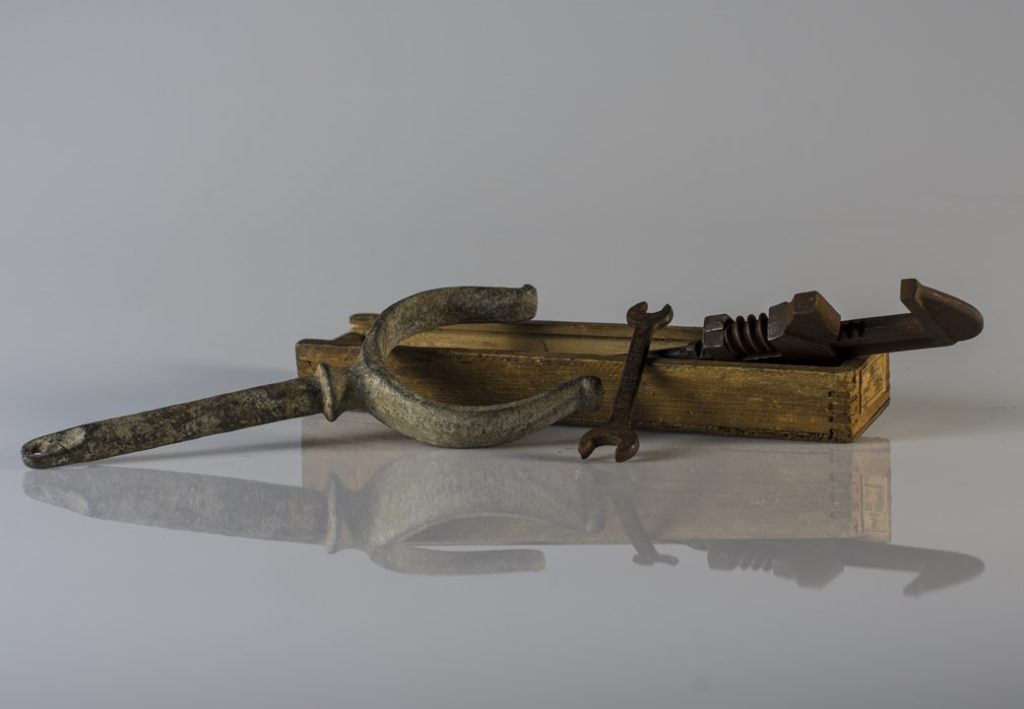
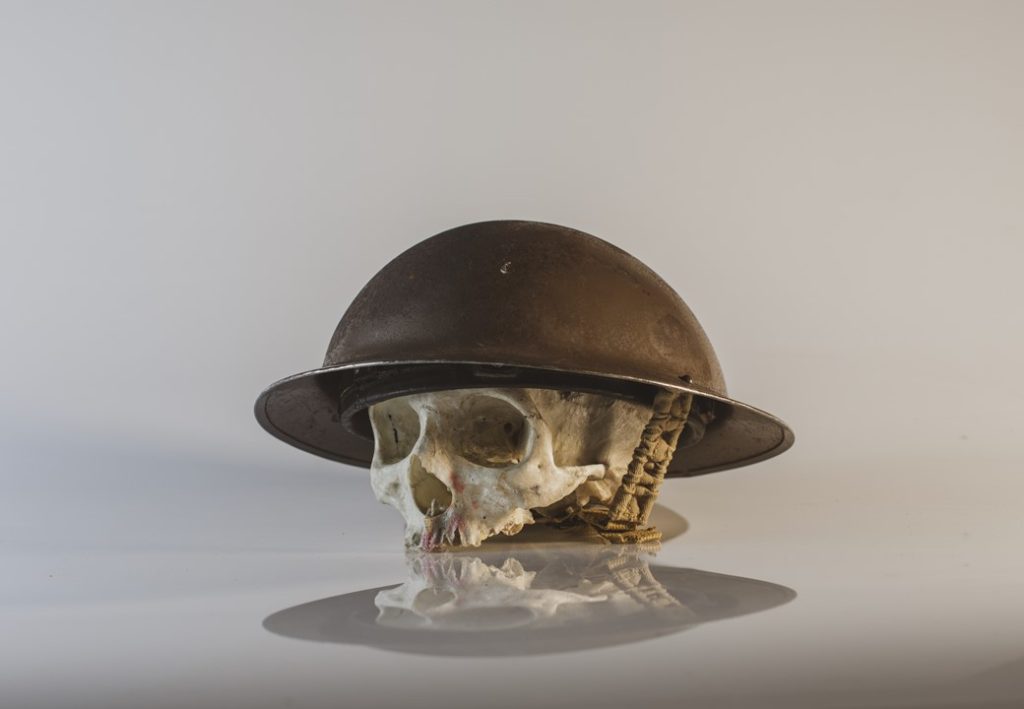
I have done the layout so that there are mostly the set of images from the still life table, the reason for this is because I drastically prefer the outcomes.
Most of the images I took were in landscape orientation with the image filled, this meant that there was a large number of double page spreads.