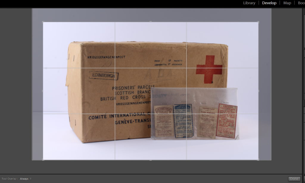
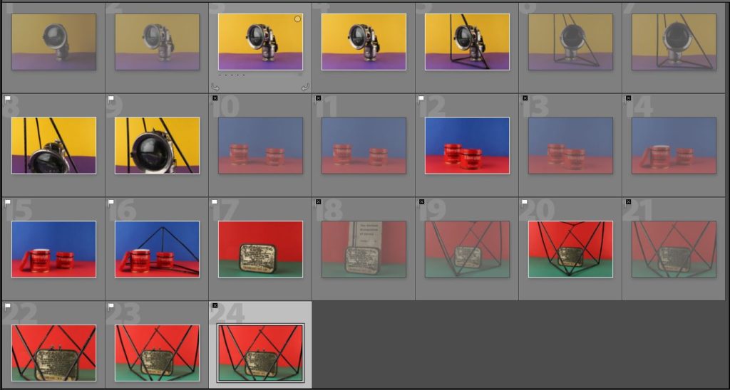
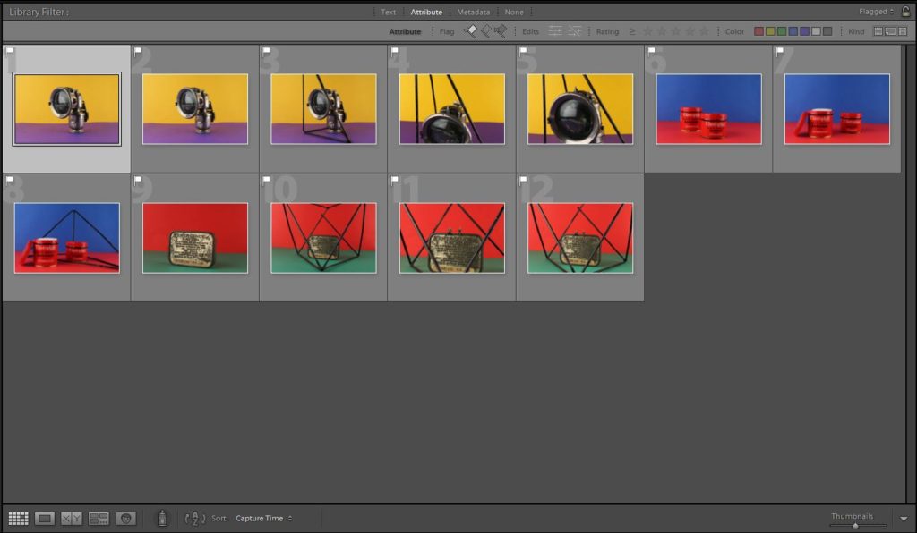
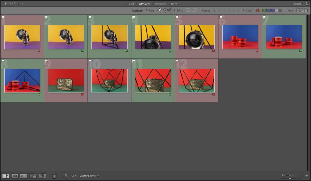
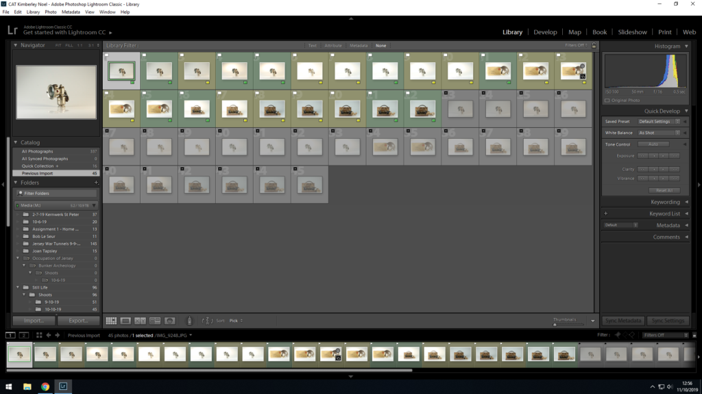
Still life – Photo Shoot

Planning:

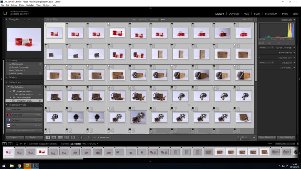
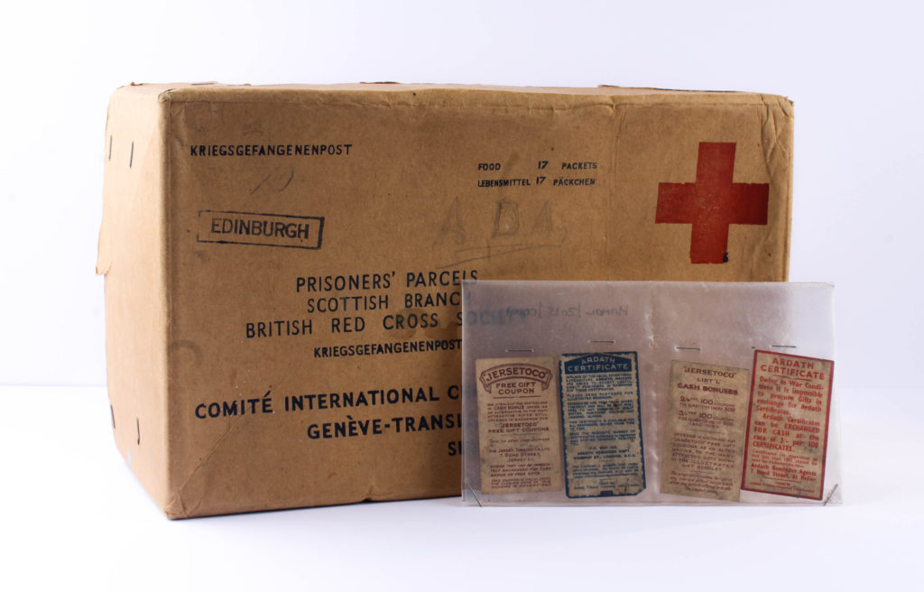
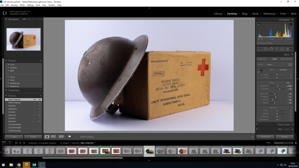
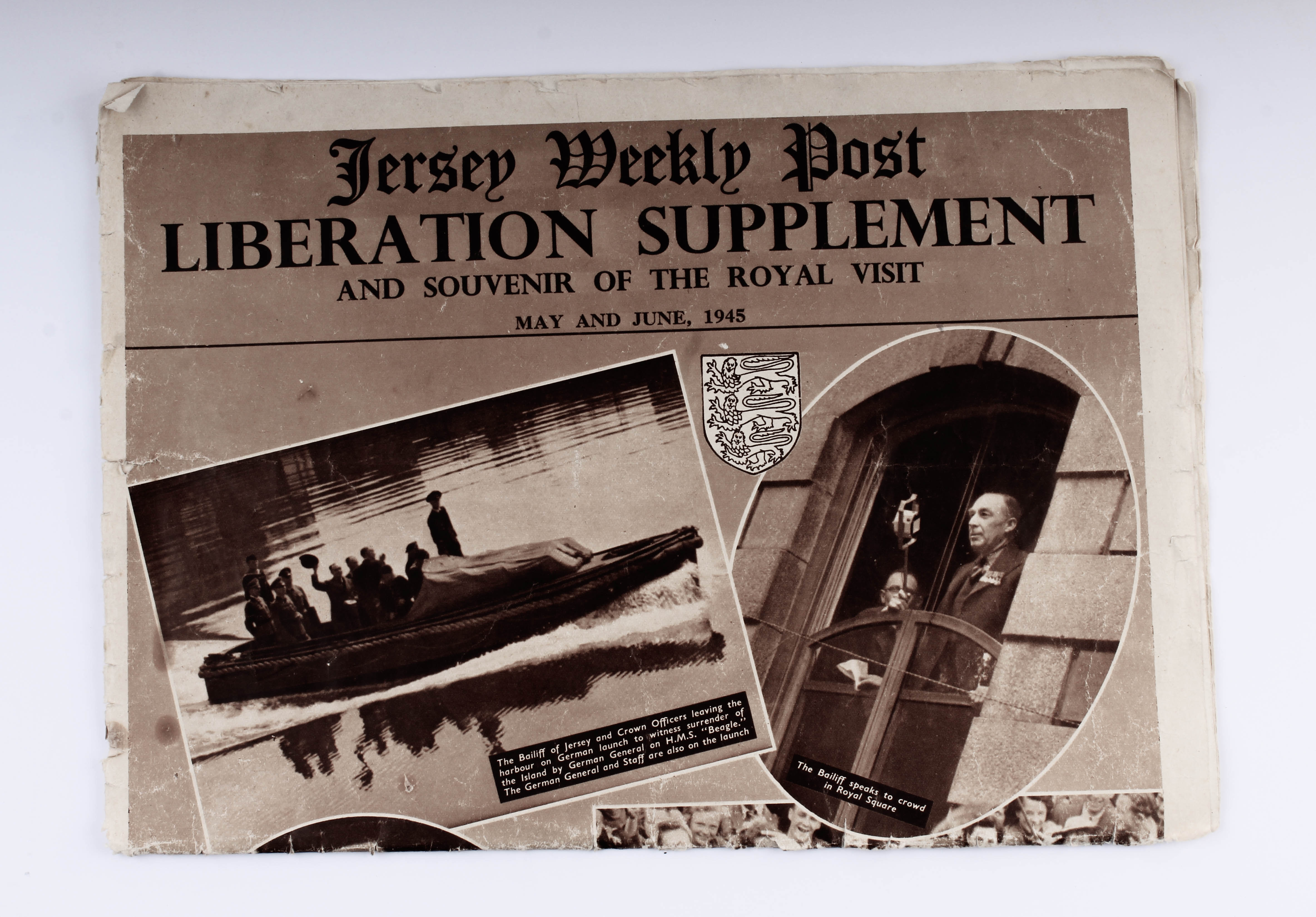
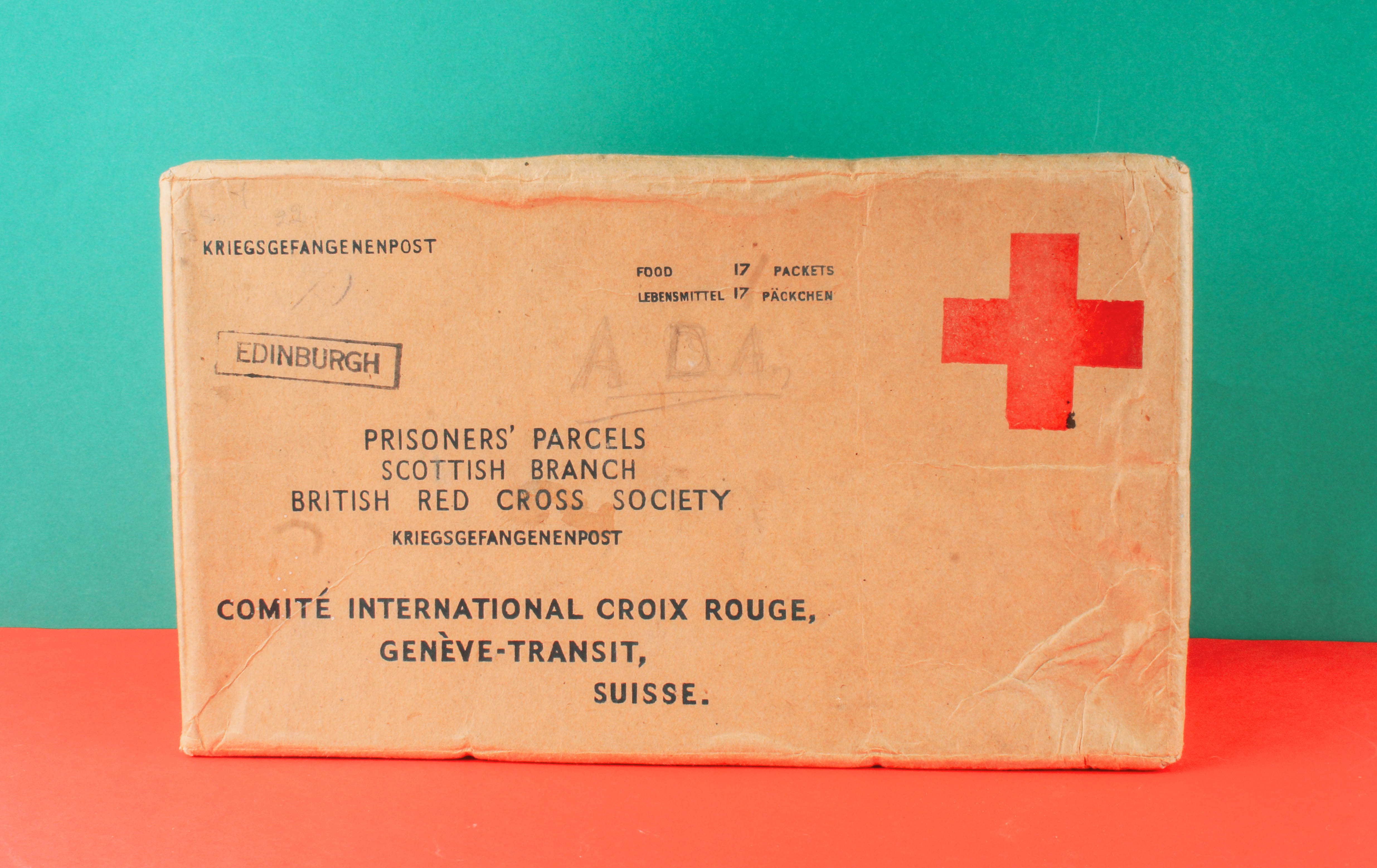
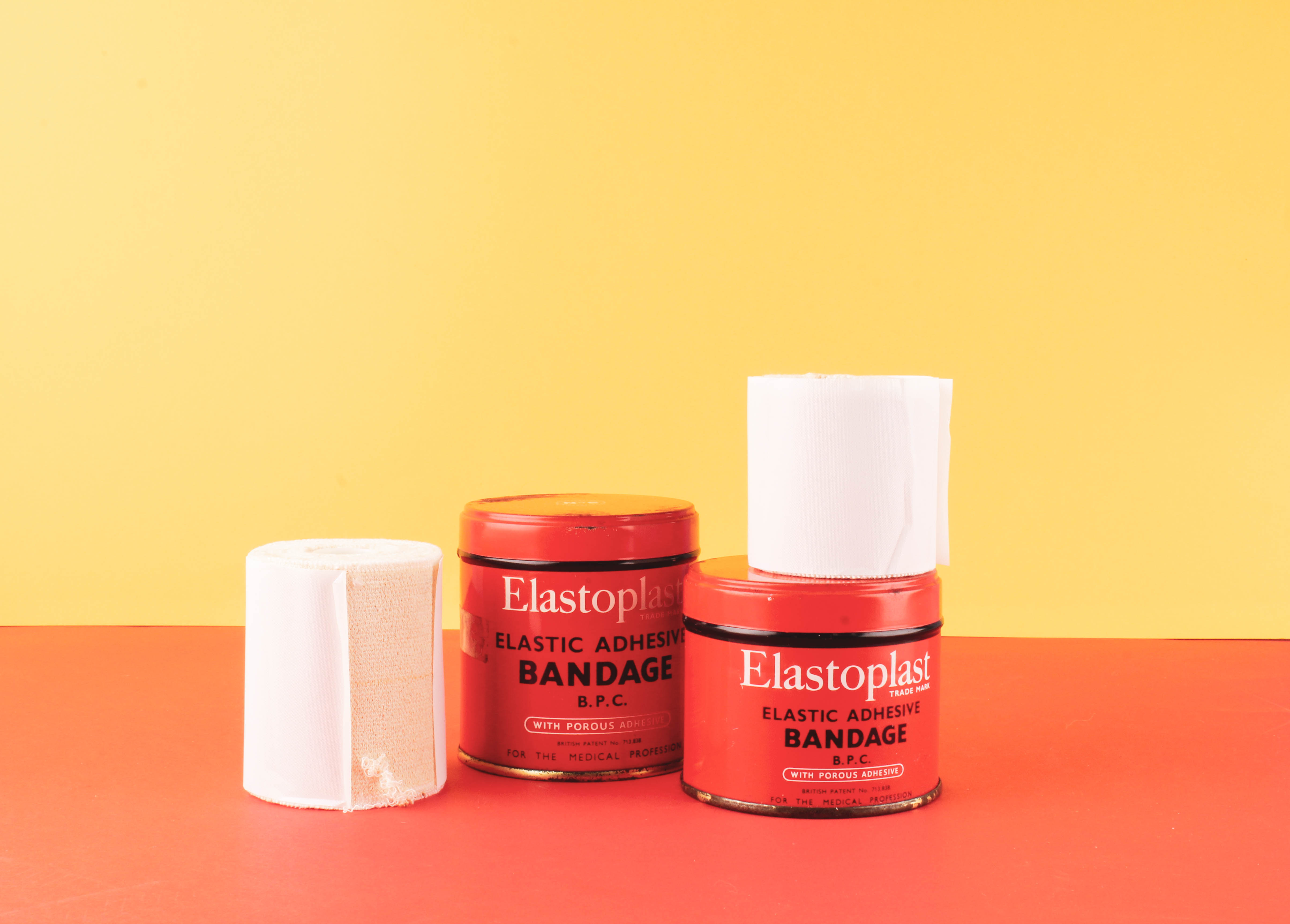
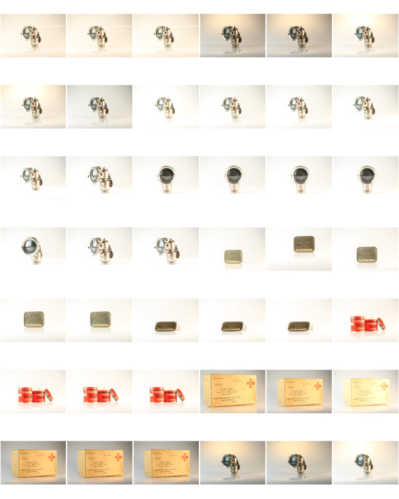
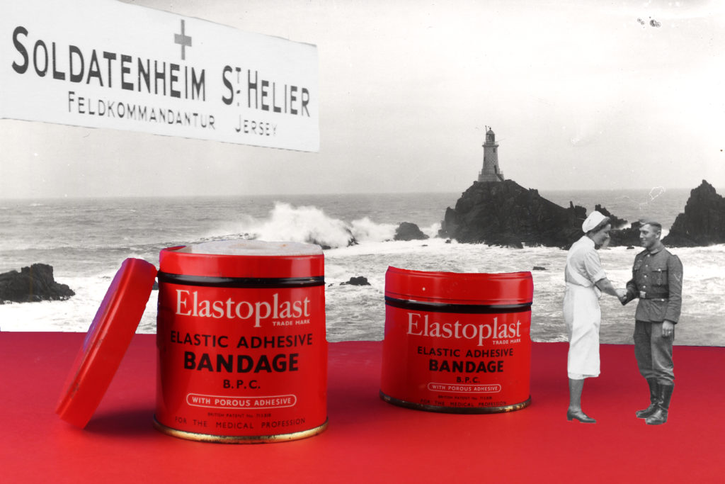
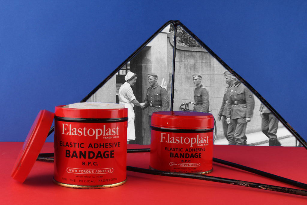
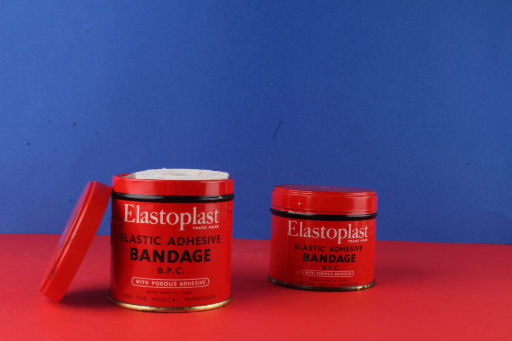
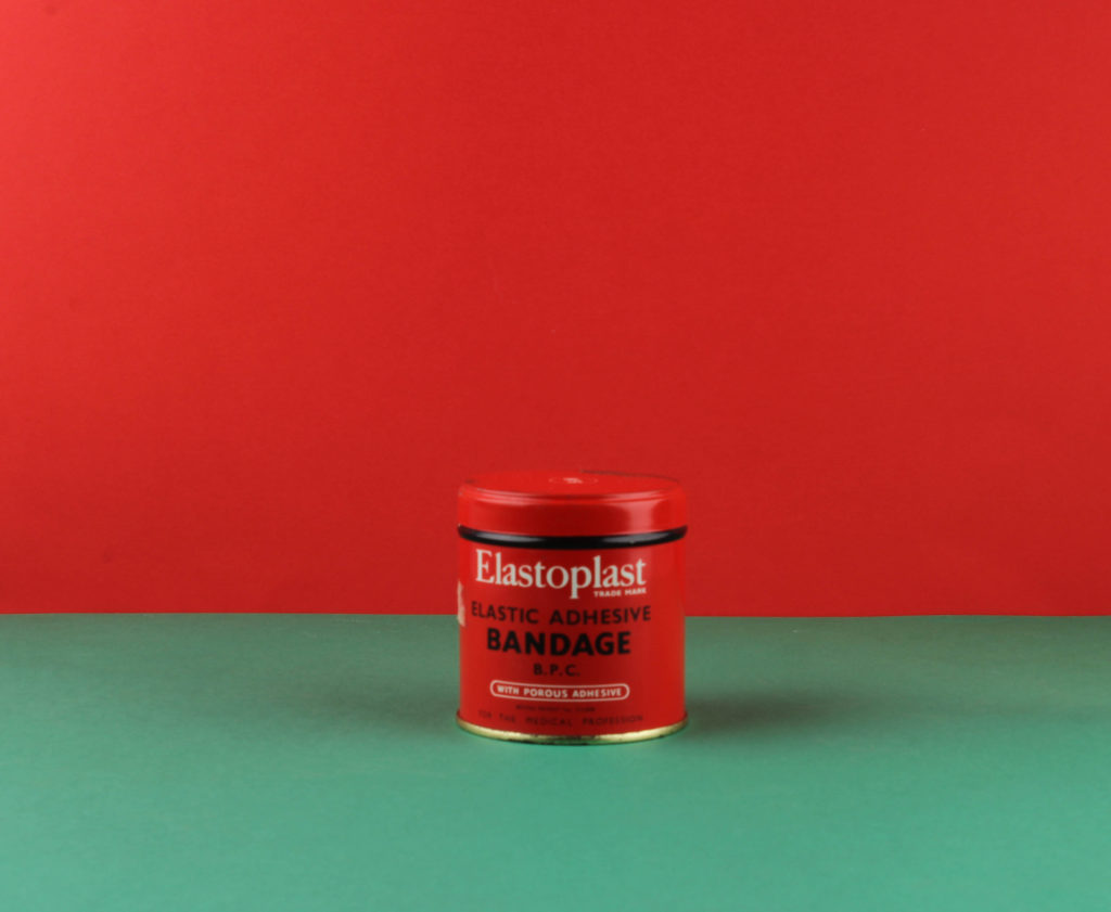
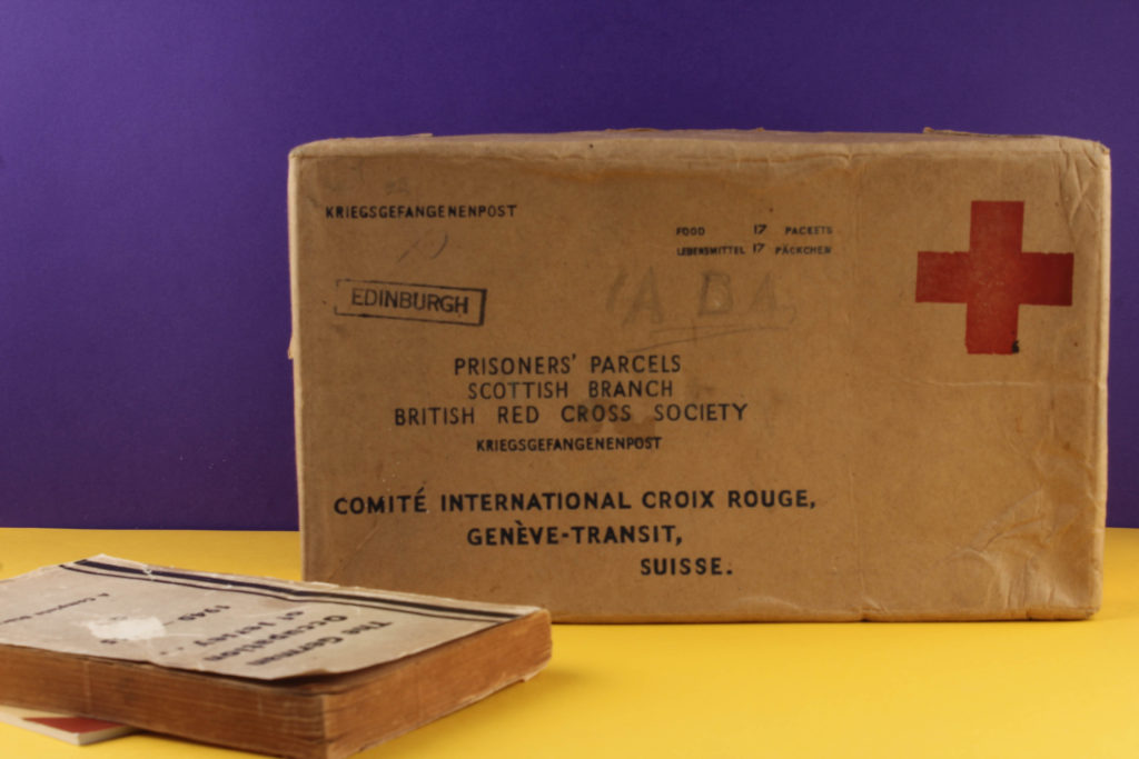
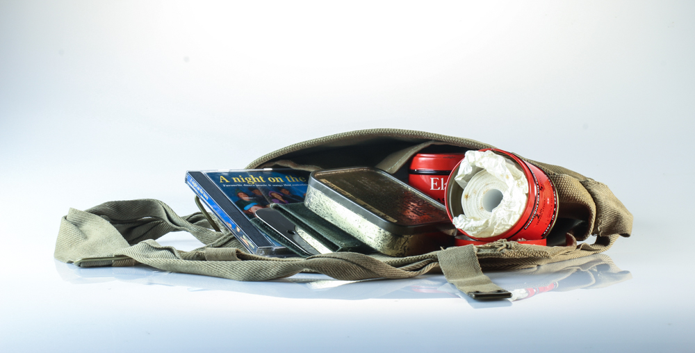
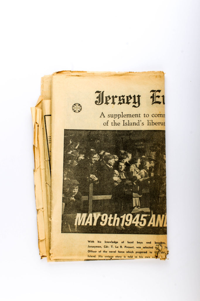
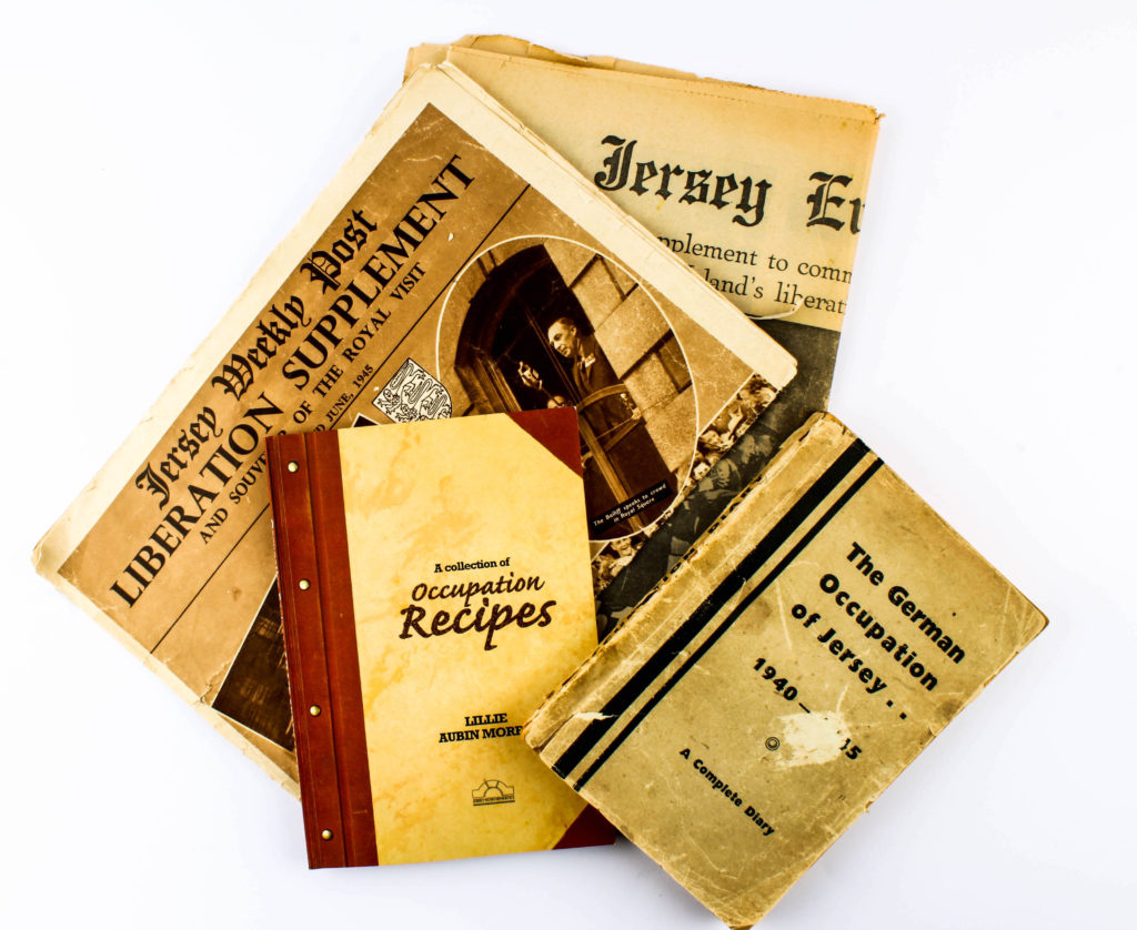
For this photoshoot I intended to photograph objects from the war, which was given to me by the Jersey Archives. There is a mixture of objects such as Red Cross packages, Tins, Helmets, Newspaper’s, Letters and many more which symbolically represented the war. Having this many items, I used two set ups, the first for more flat objects (Birds Eye View) and one for 3-Dimensional objects (Straight on Angle). These two set ups required different lighting rigs, which is explained below. With my camera settings I put the mode to Manual, the ISO to 100 and the aperture to F16, allowing a wide depth of field to be utilised. The shutter speed for the Birds Eye View was between 1/250 – 1/200 and the straight on angle’s shutter speed was 0.5 – 0.8. The white balance for both was set onto daylight, with manual focus being used.

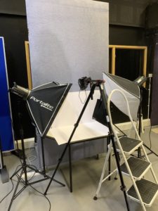
Birds Eye View Lighting Setup:

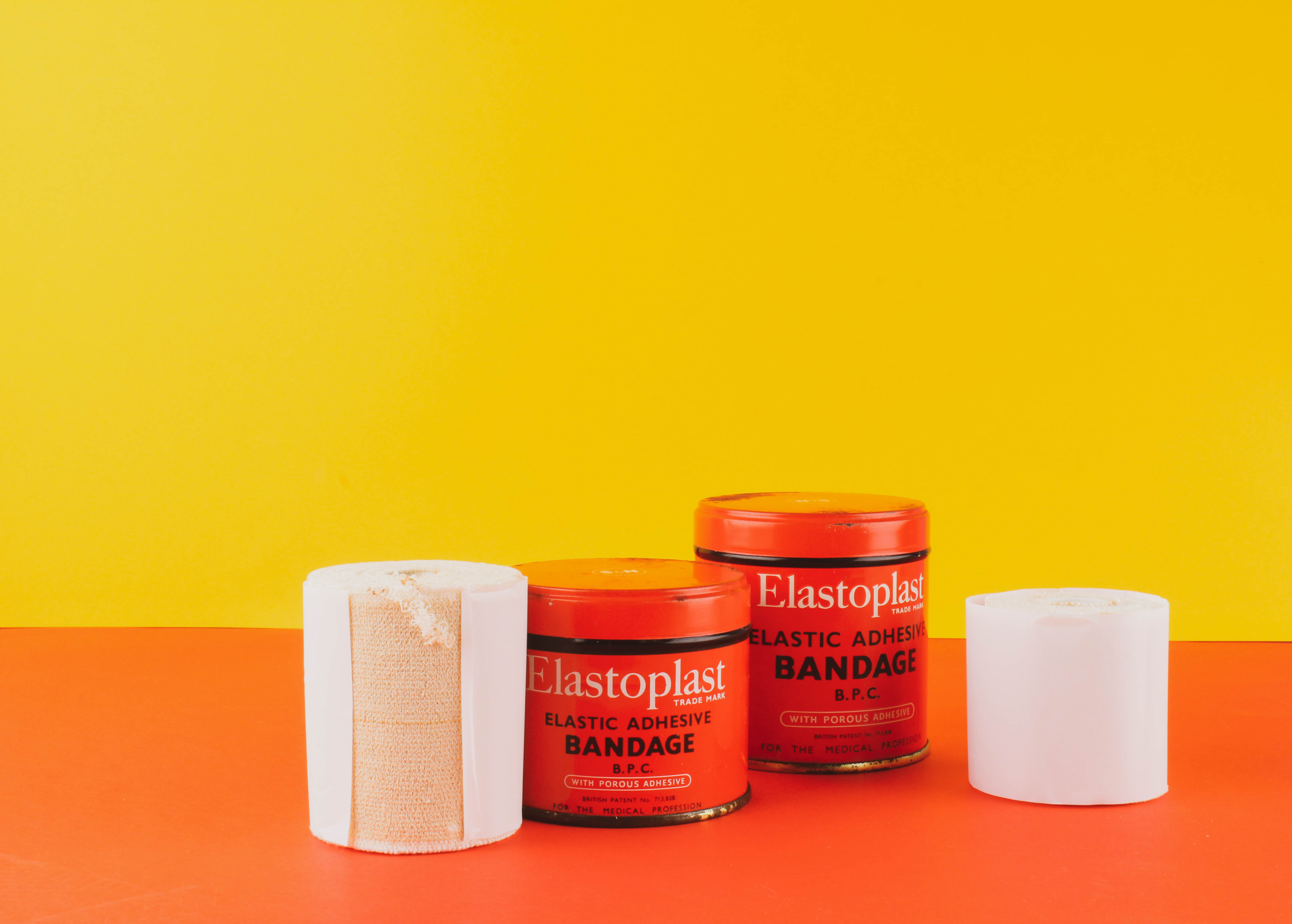
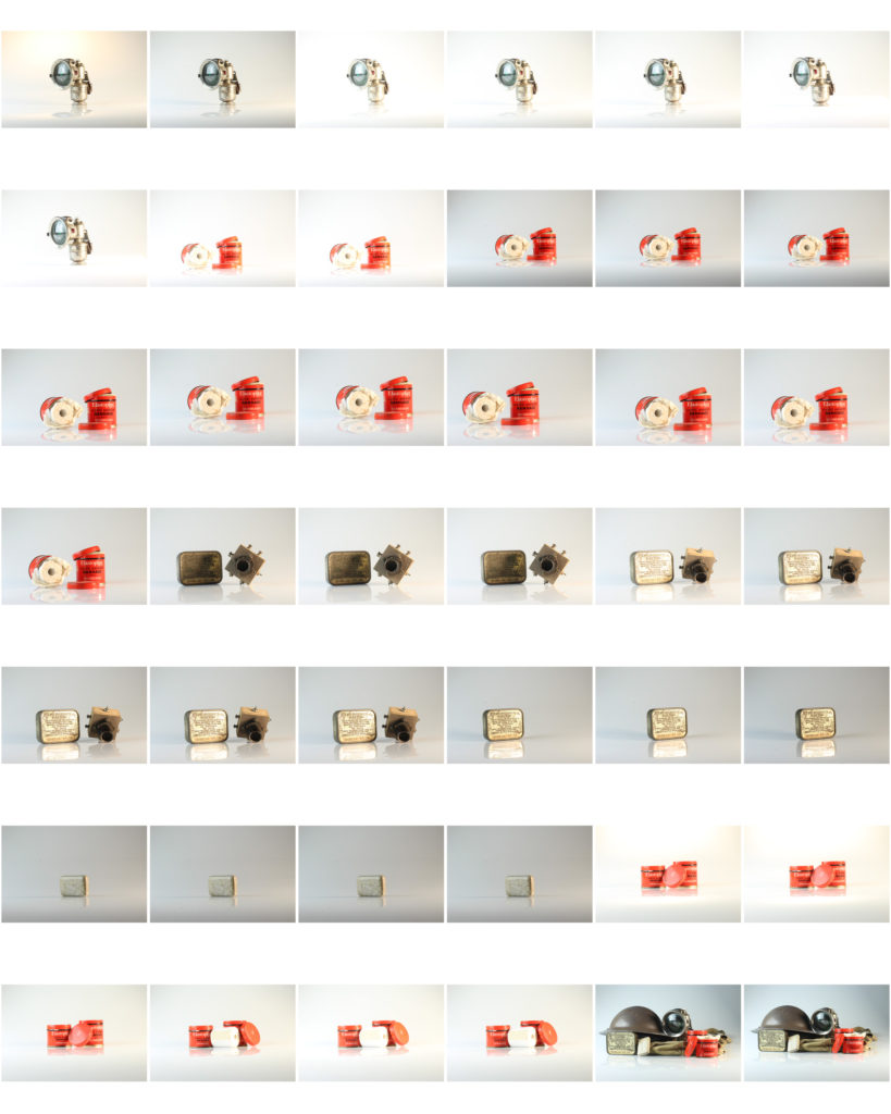
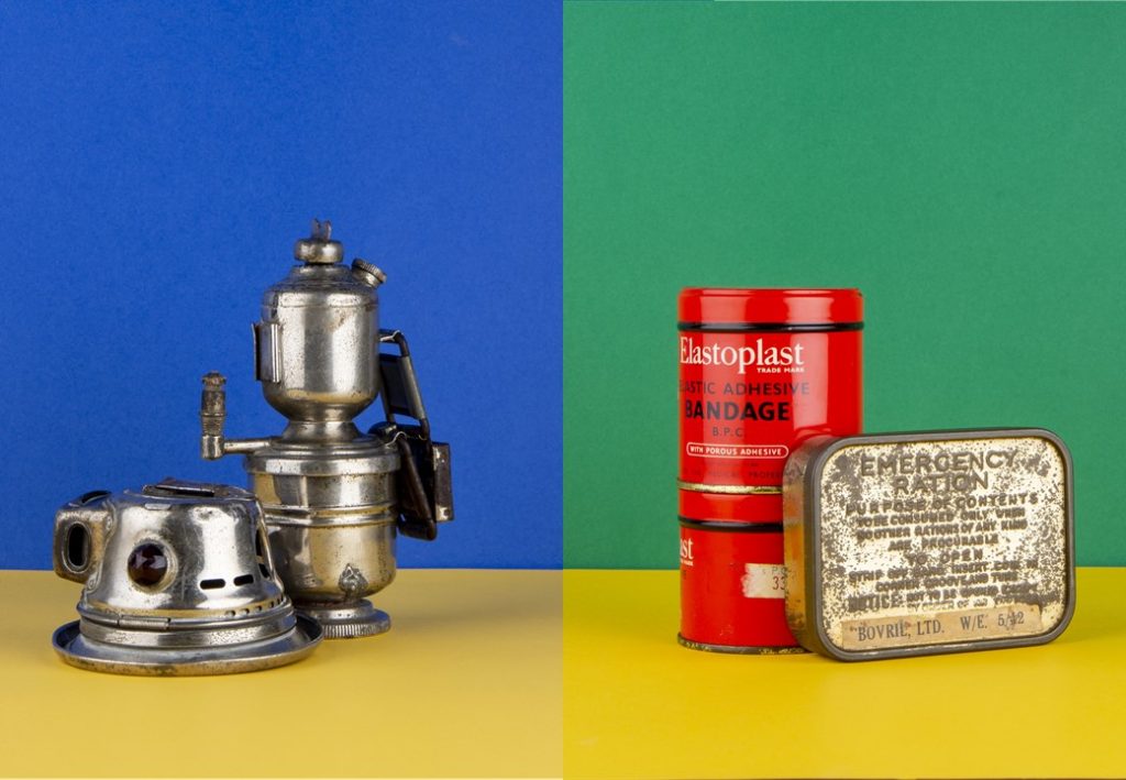
For the Birds eye view set up, I used two flash head lights, set on a 2.0 power output. The lights where paced either side of the table, slightly facing downwards towards the object. On my camera I used a transmitter which triggered the flash heads to operate as I captured my imagery. In addition, I also used a pilot light in order to position a and frame my composition, this was located at the back of the table (on right) and did not affect the colouring or the outcomes of my image. The camera itself was placed on a tripod looking down at the table.

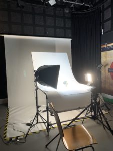
Straight On Angle Lighting Set Up:

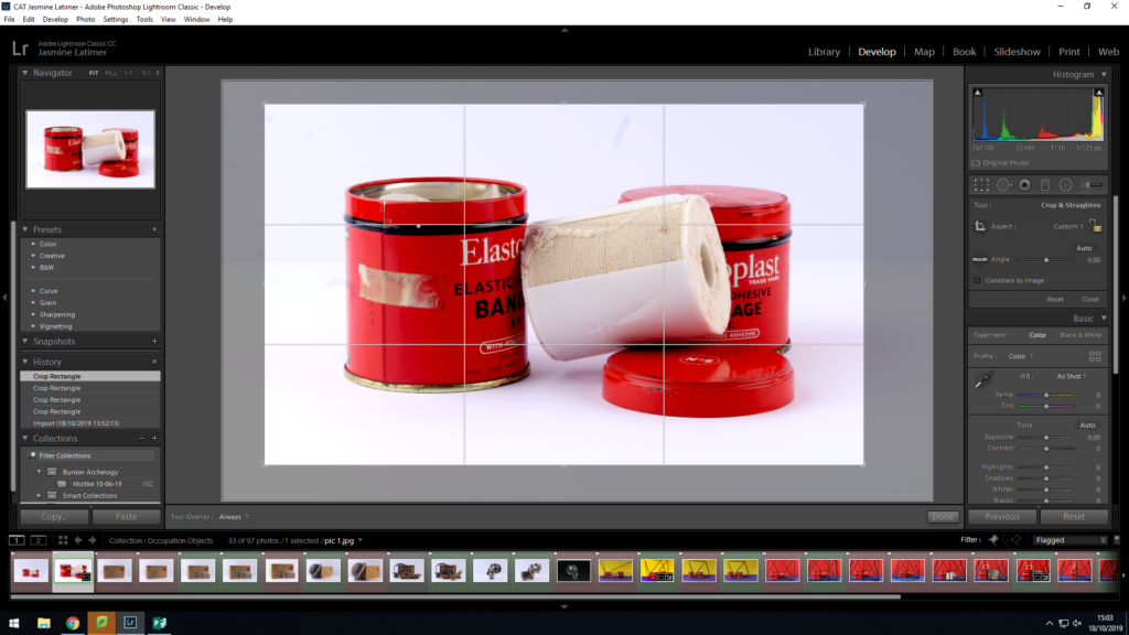
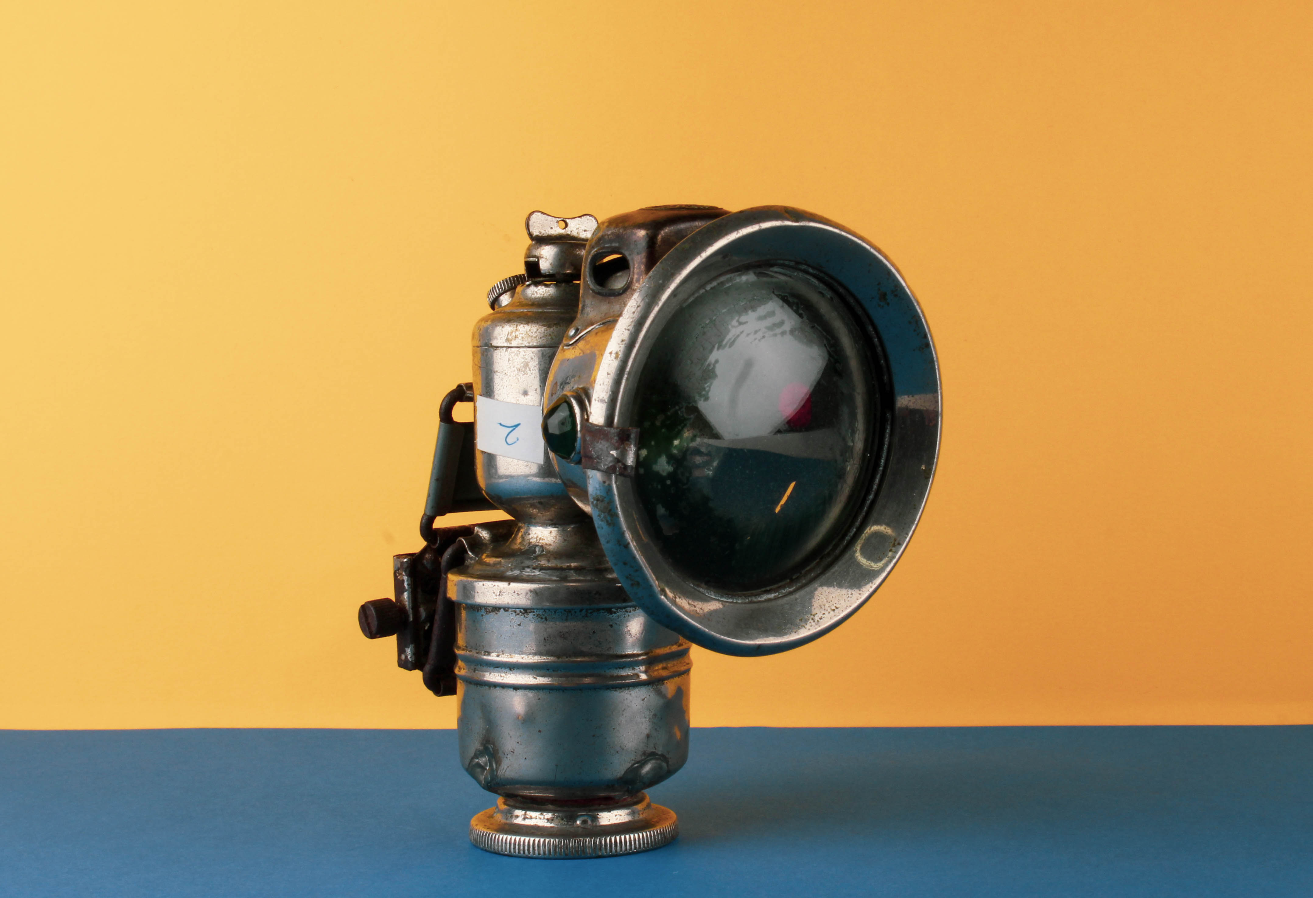
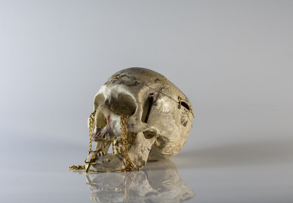
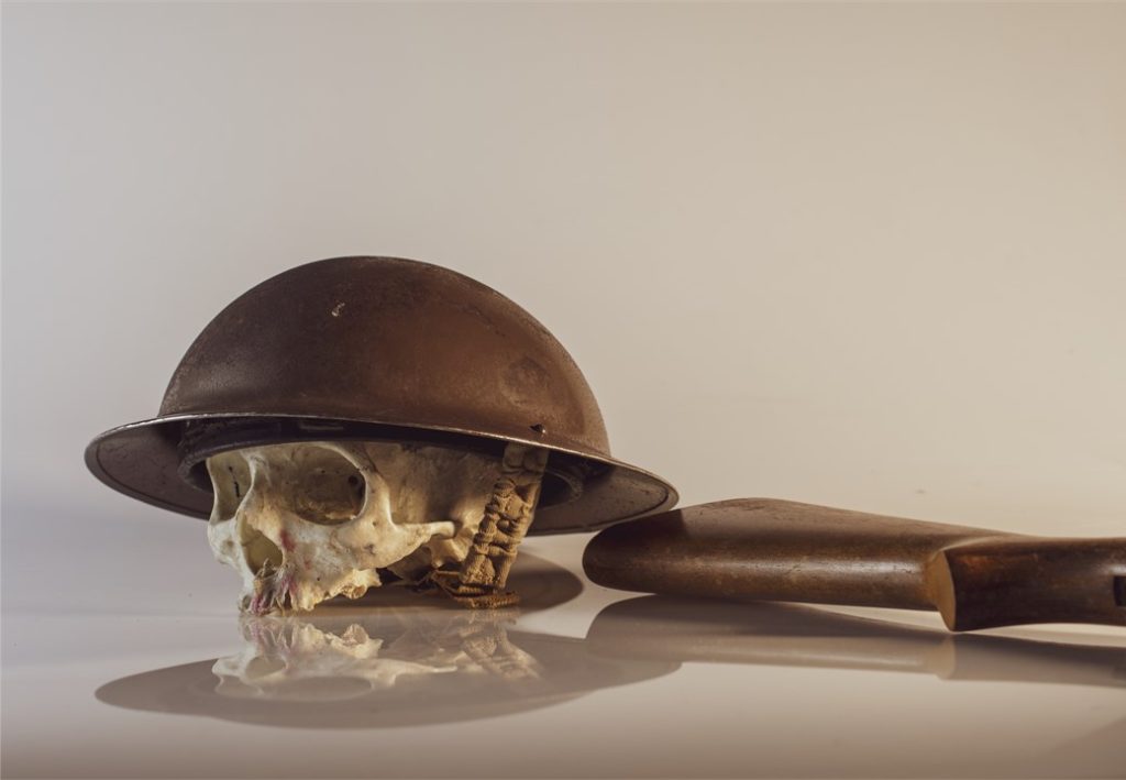
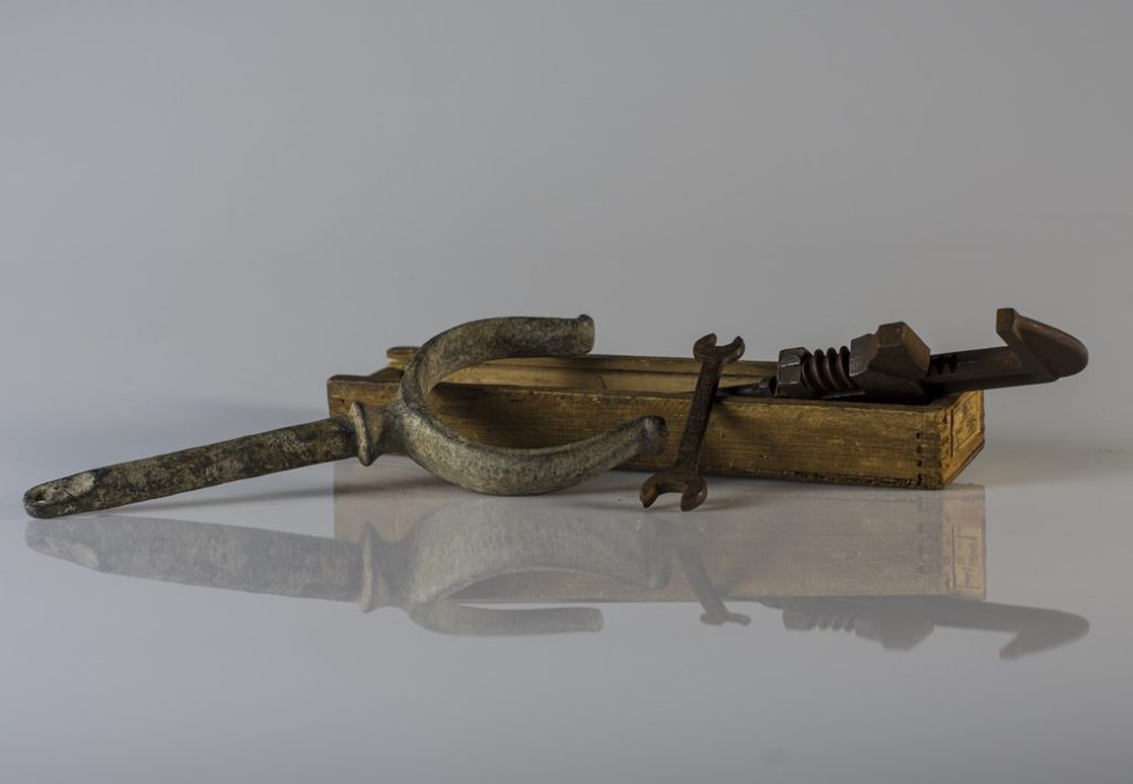
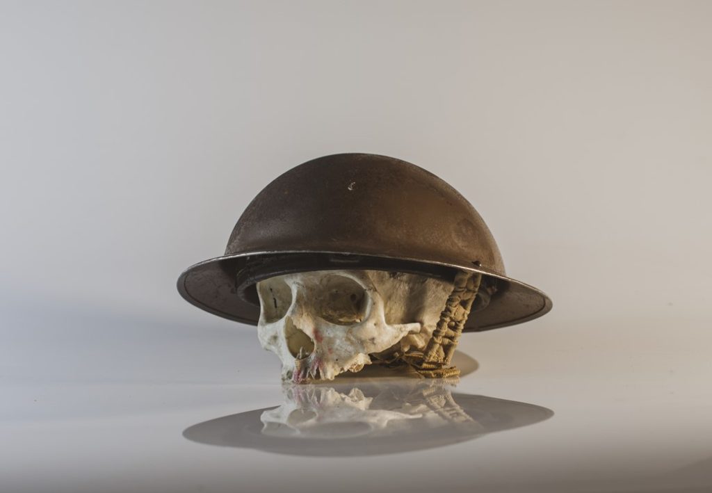
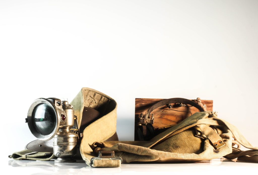
For the straight on angle set up I used a continuous light set up. I used a fill light illuminating the object, with a secondary (tungsten light) light source to reduce the shadows and clearly showcase the object. I also experimented with back lights, but felt that it was not successful and did not justify the objects, thus I stopped using the back light. The camera was on a tripod with a 50mm lens.

Edits:

First Edit – Flagged
Second Edit – Star Rating
Third Edit – Colour Rating

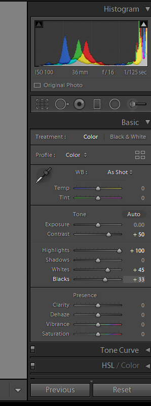
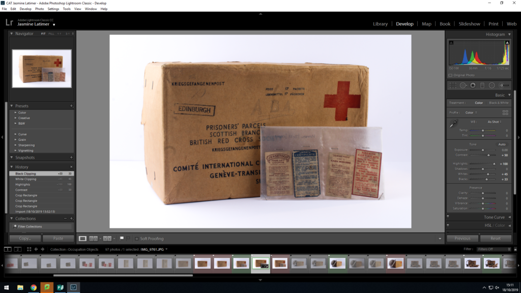
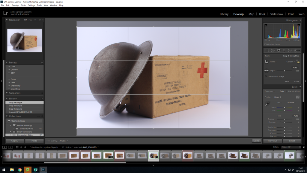
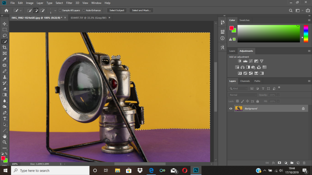
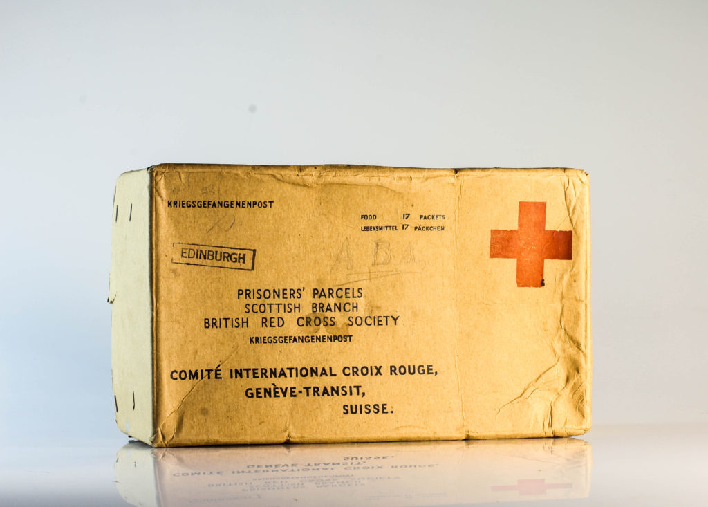
Straight On Angle Edits:

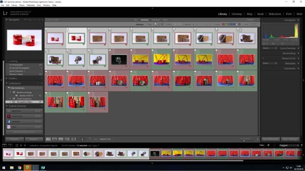
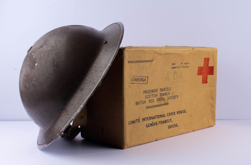
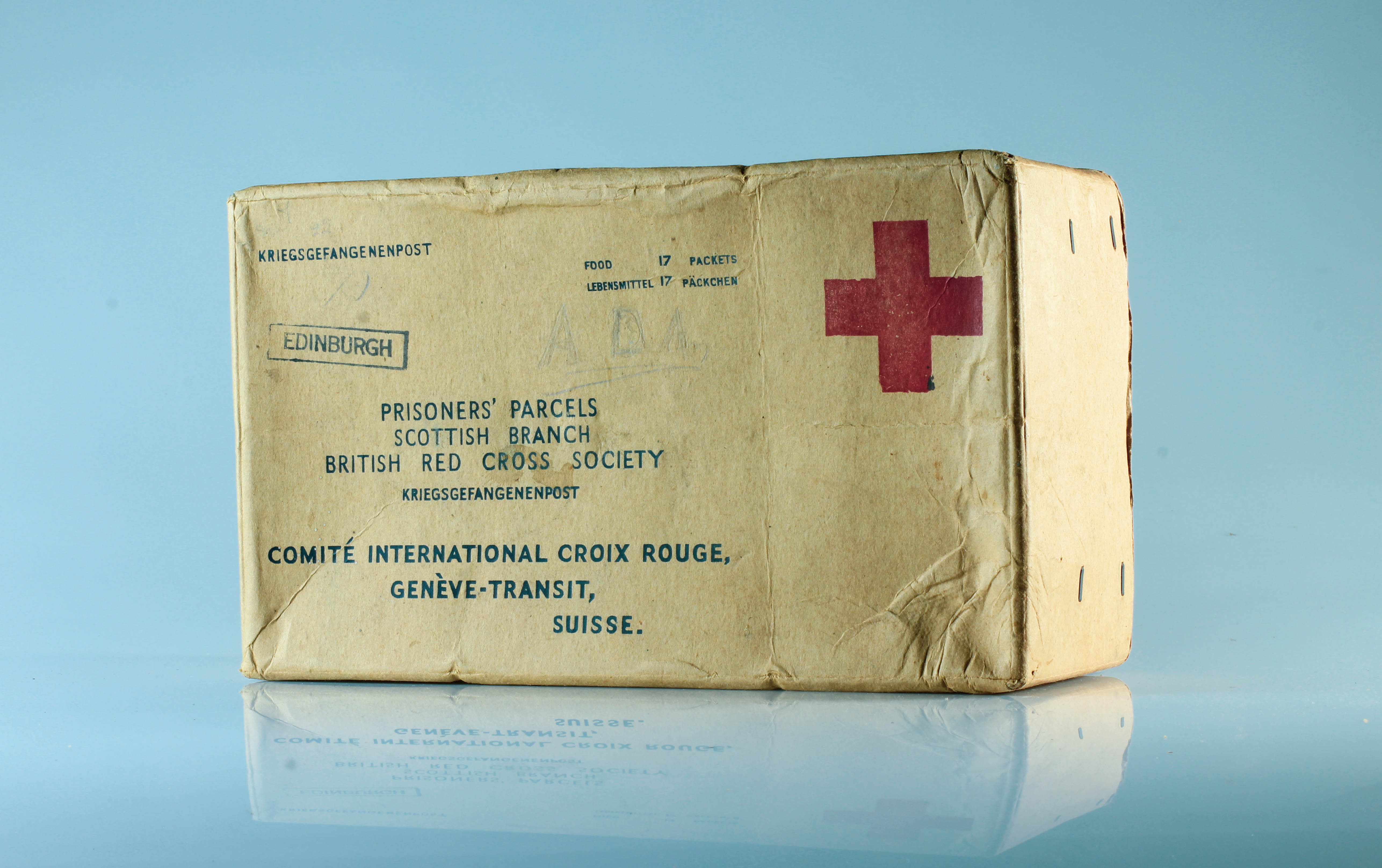
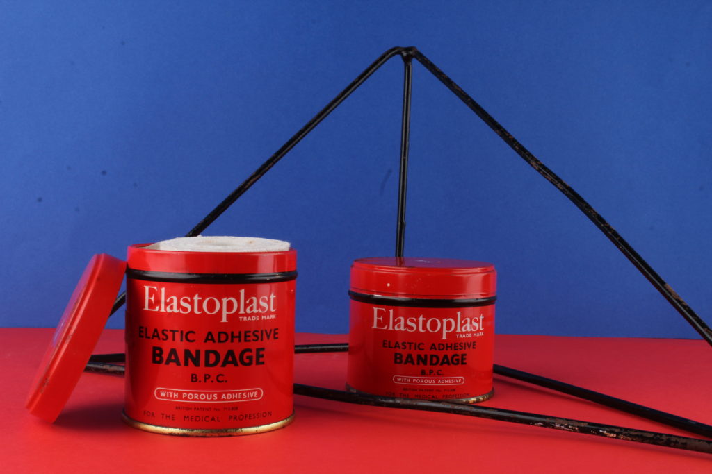
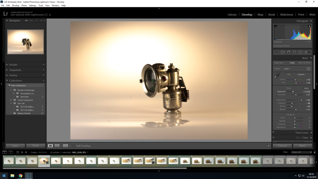
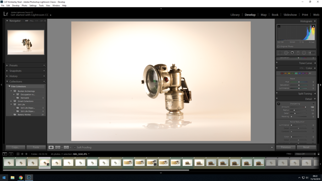
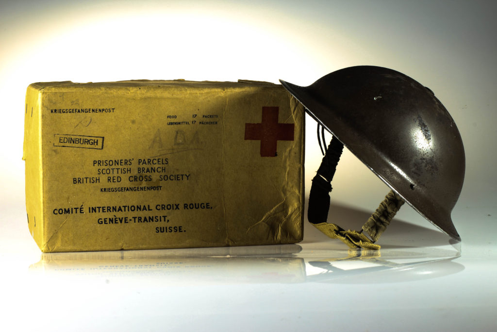
For my straight on angle edits, I began by cropping the photographs, to ensure that the object is in the centre of the composition. I then focused on adjusting the whites, blacks, shadows, contrast and structure in order to accurately portray the objects. This also ensured a complete white background, allowing the objects to be the main focal point within the photograph. Within each photograph, there is a sense of warmth through the artificial lighting, which presents a positive view point towards the contextual meaning of the objects.

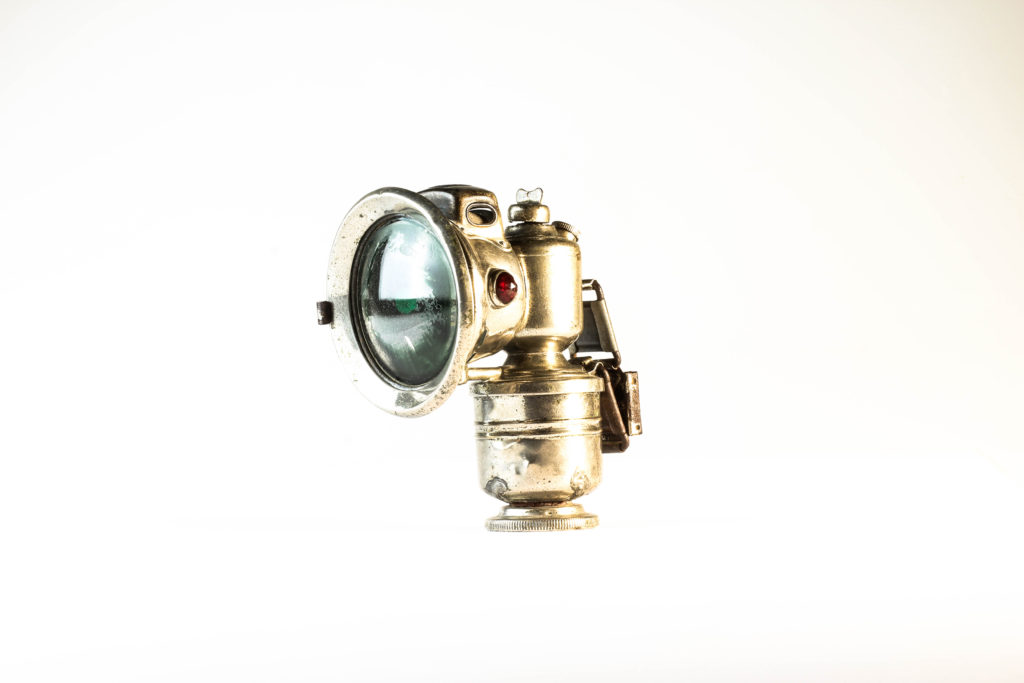
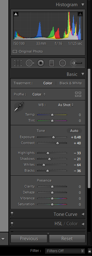
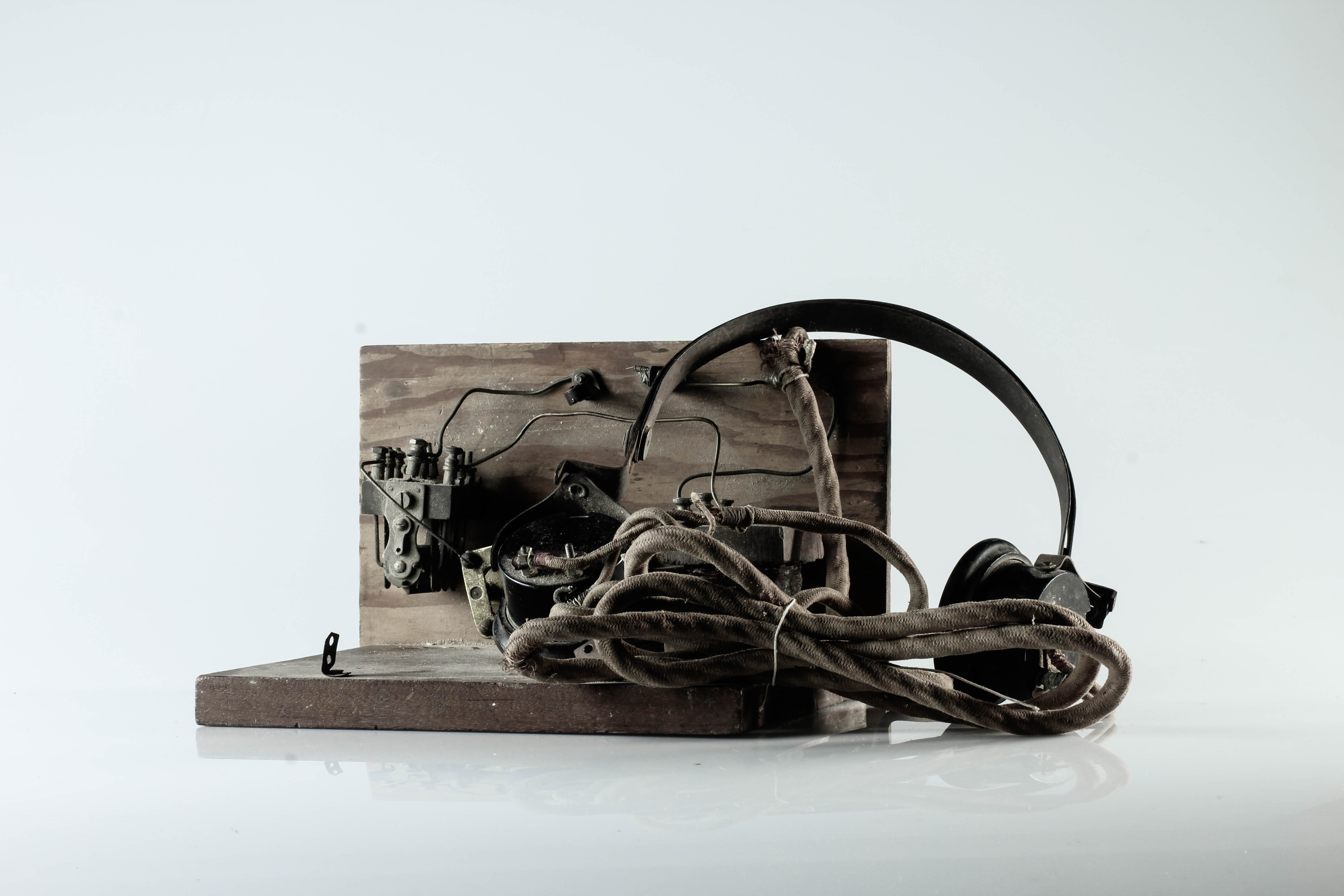
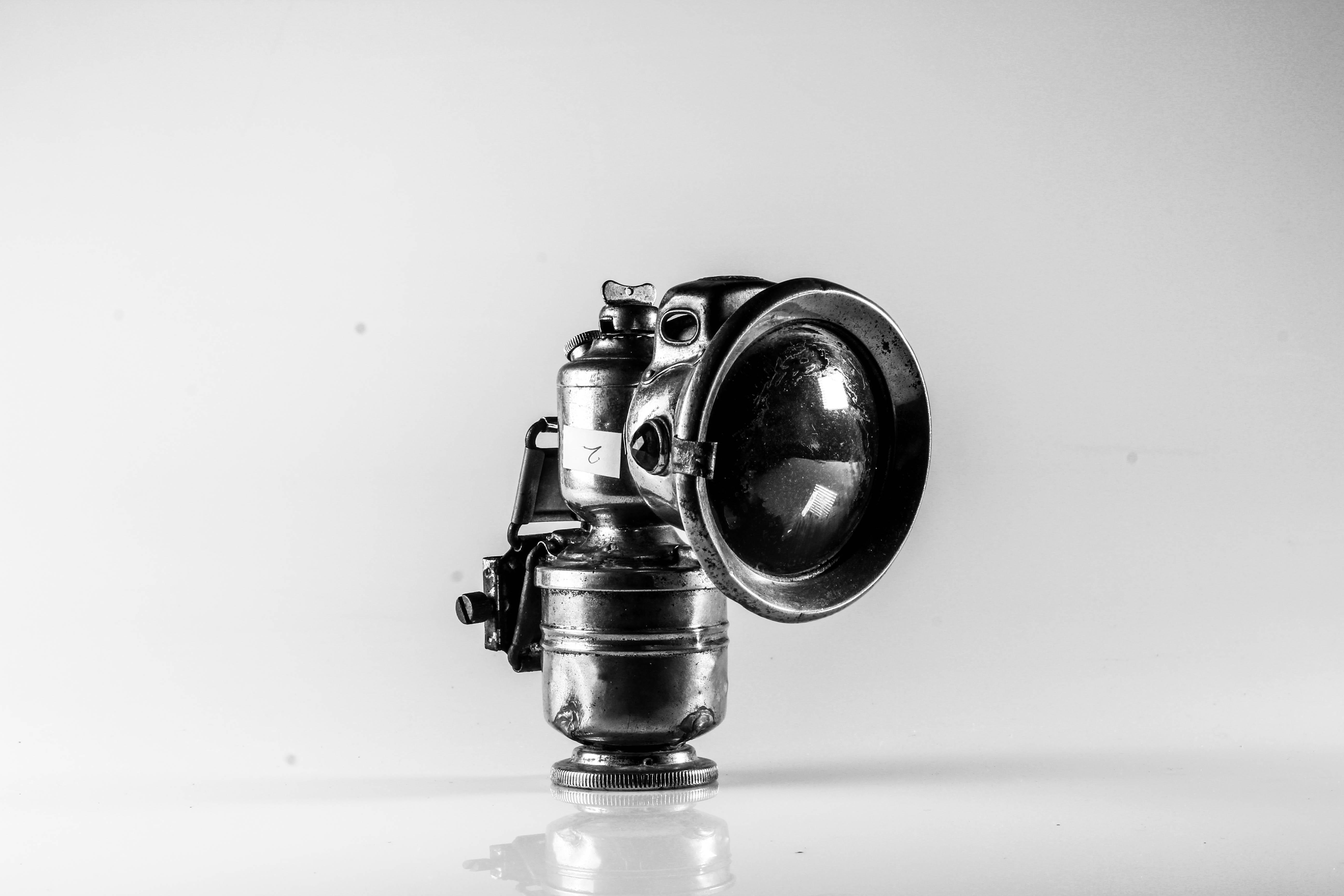
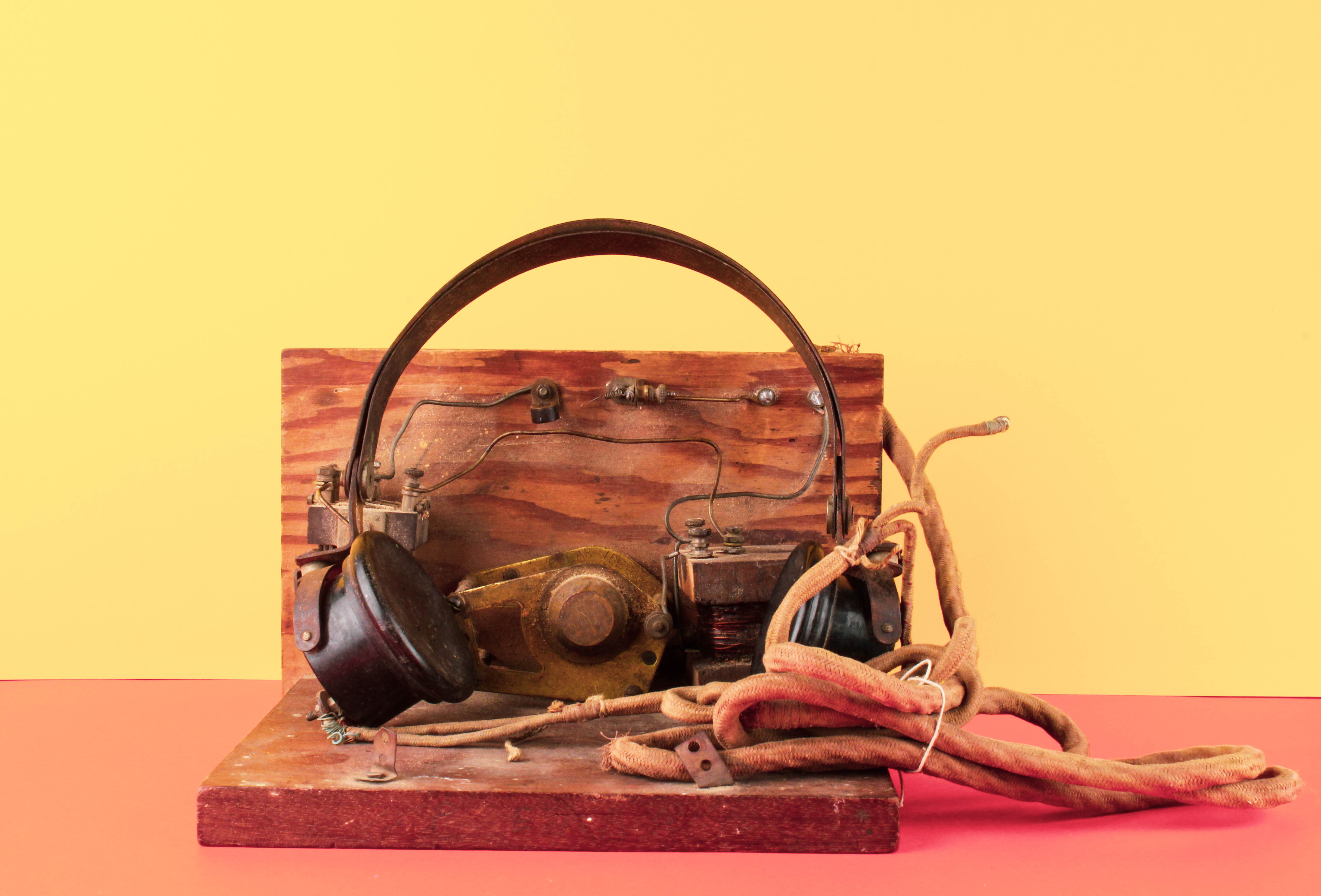
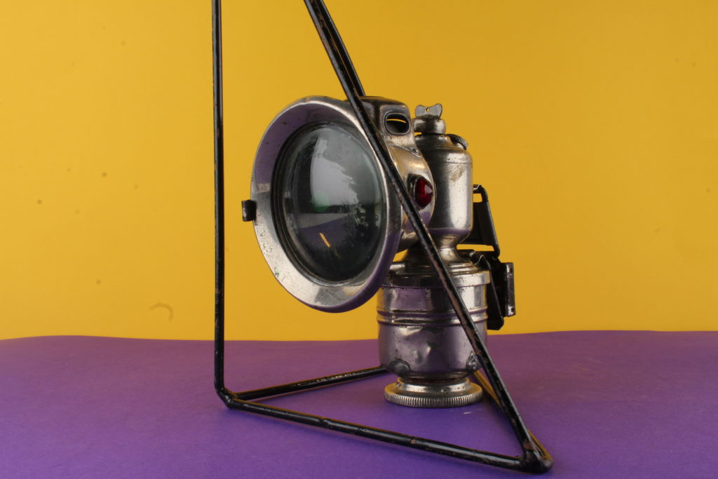
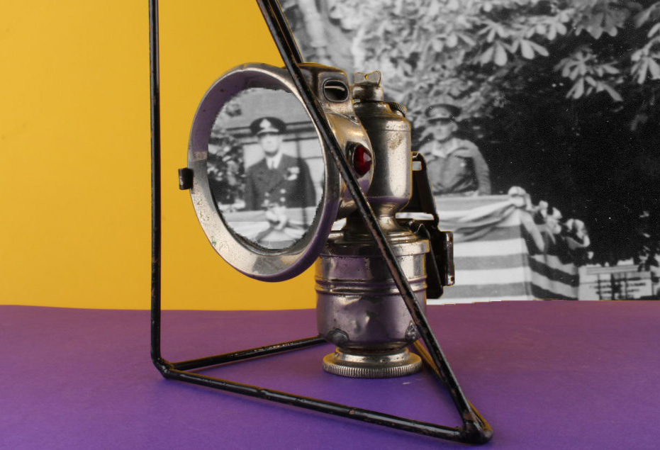
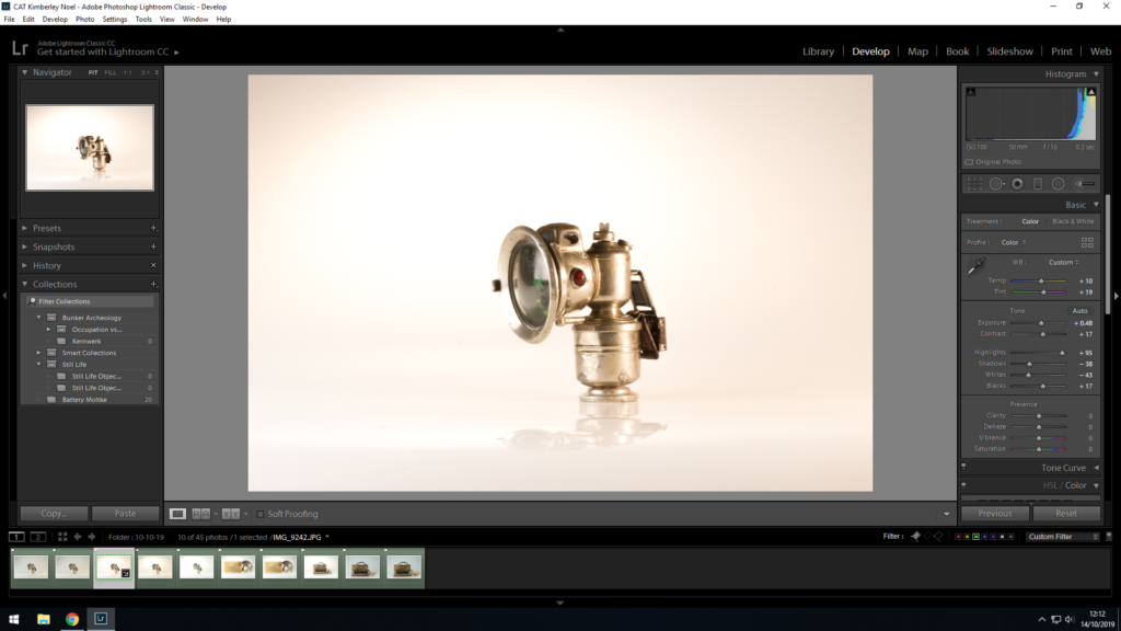
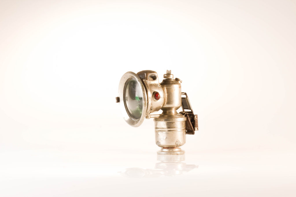
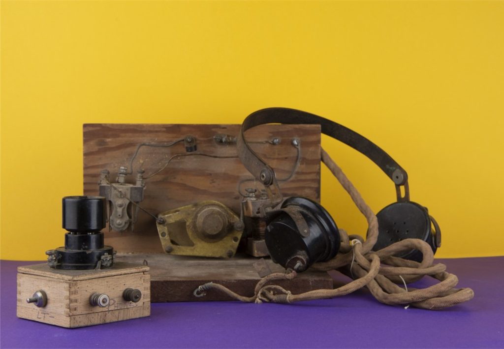
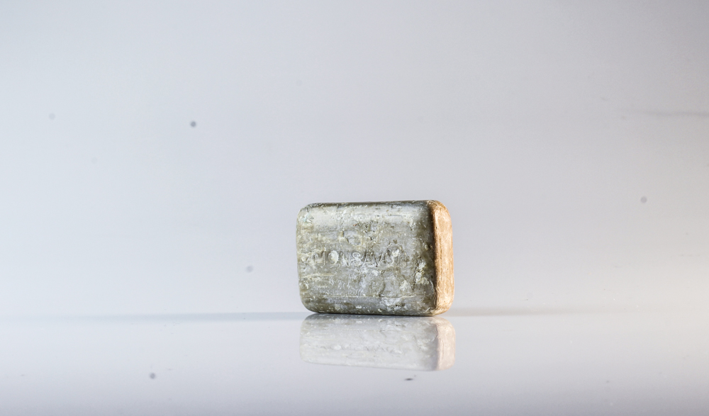
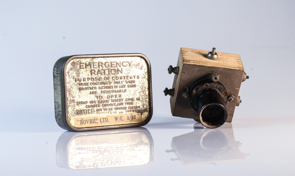
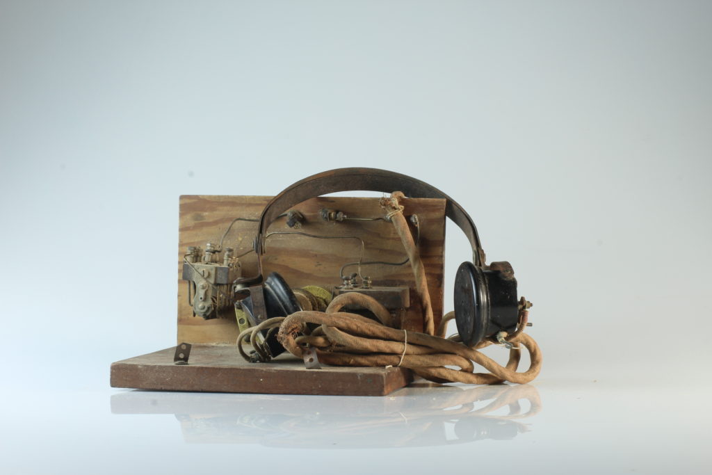
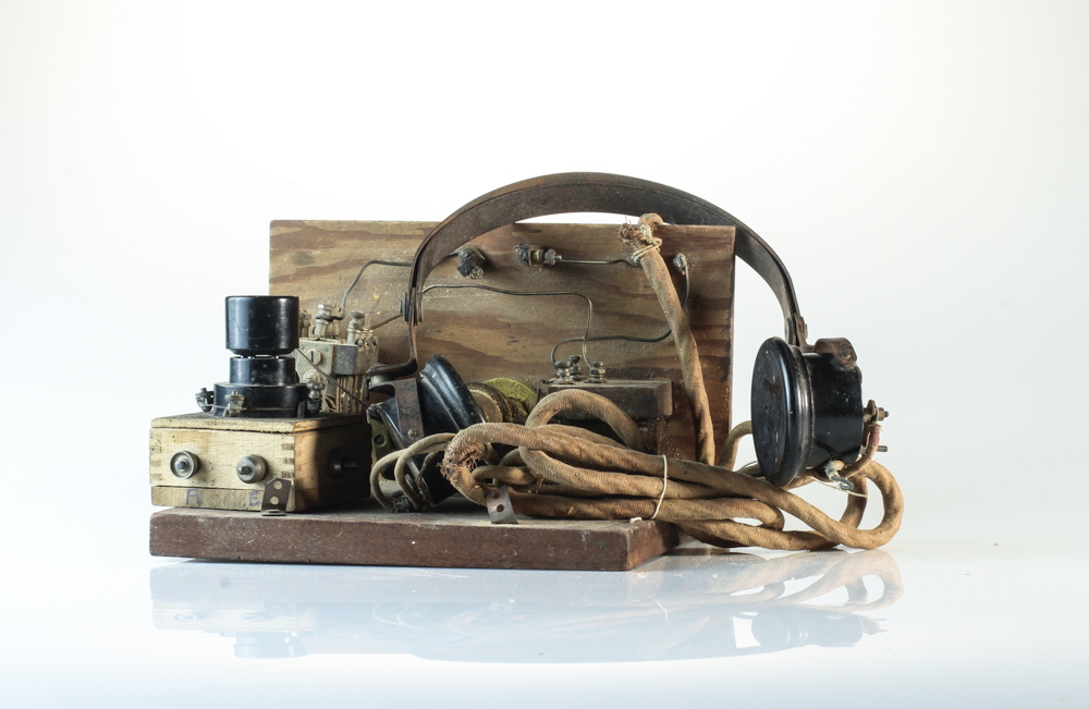
The image above is my top photograph from this exploration of still life photography. Visually, we are presented with a light used in the mines during the occupation of Jersey in 1940-45. This object is the main focal point due to the positioning of it in the frame, and it being the only item within the frame of the photograph. The use of artificial lighting allows reflection on the metal object creating tonal contrast of the rust and decay of the object to clearly be presented. When analysing the main formal elements within the frame, we are clearly presented with a sense of space, and emptiness (showcasing the lack of purpose the item now has within today’s society) form, colour and texture. The photograph captures the object at a straight on angle which works in harmony with the plain background, allowing emphasis on the conceptual and contextual factors.

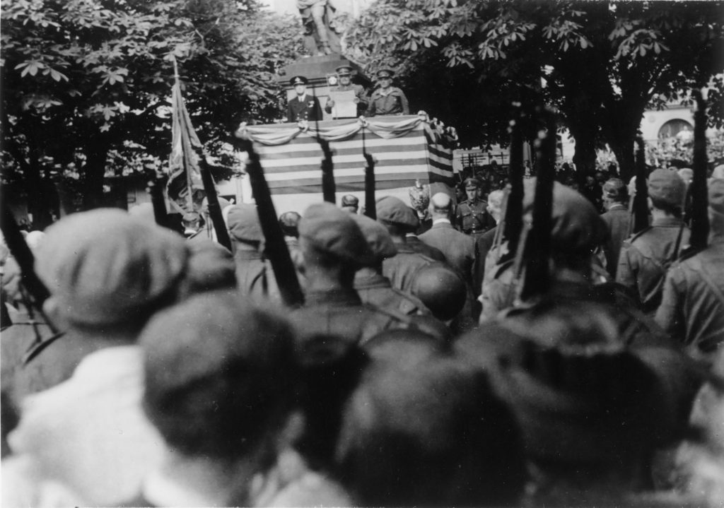
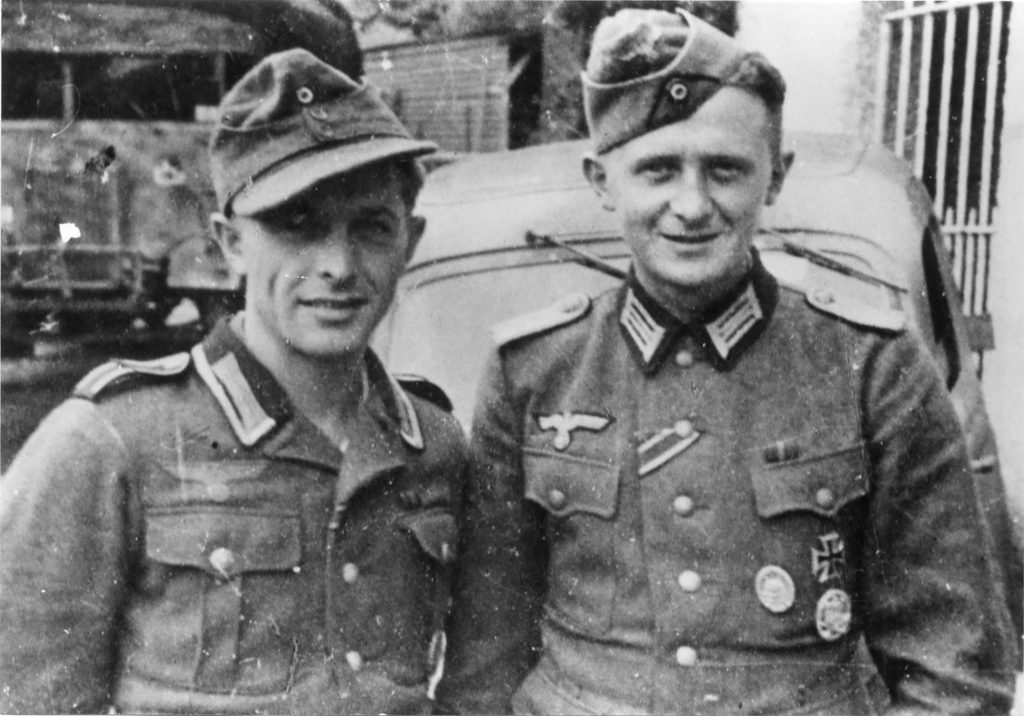
Contextually, the photograph brings viewers back to the second world war and the impact it had on Jersey. It showcases the torch and how slaves, who were taken (from places such as Russia etc) and forced to work digging out tunnels, such as the underground hospital. This conceptually remind us of the importance of this object in Jersey’s history and enriches our understanding of what life was like for the slaves who were forced to work.

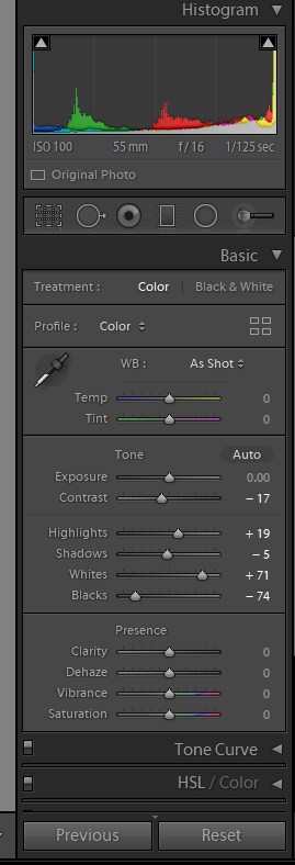
Technically, the photograph uses a slow shutter speed, allowing enough light to be presented within the photograph to emphasis the object, which did not create any blur due to a tripod being utilised when capturing the photograph. The ISO was kept at 100 to ensure that no noise is presented within the frame and the aperture was set to F16 which has let a wide depth of field to be used on top of allowing enough light into the exposure of the photograph. The white balance was sunlight, allowing a clear white balance correction which complemented the warm artificial light source used (a two point lighting set up, with a tungsten light).

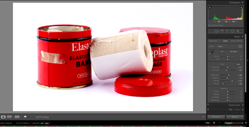
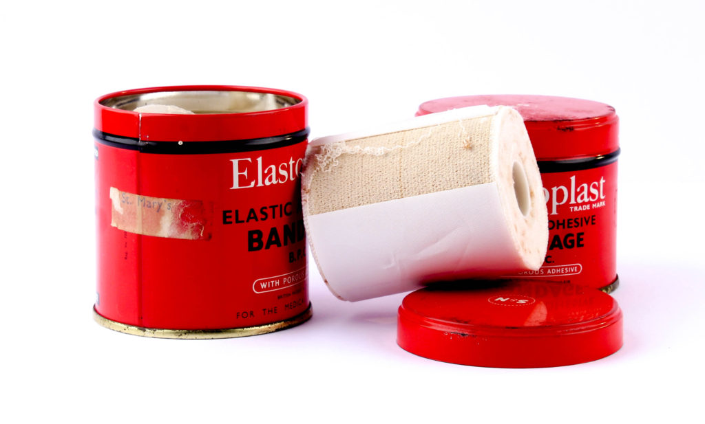
Birds Eye View Angle Edits:

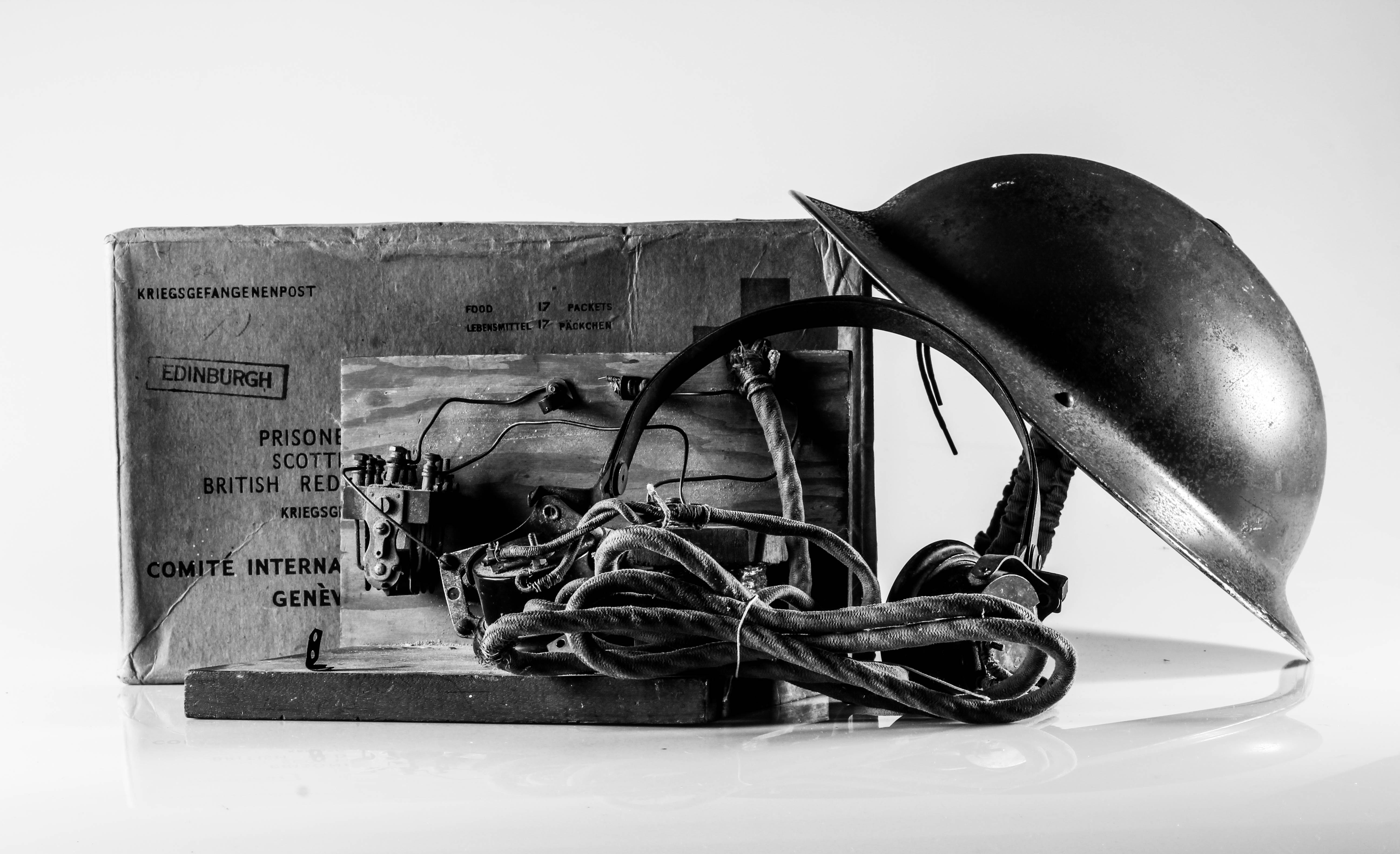
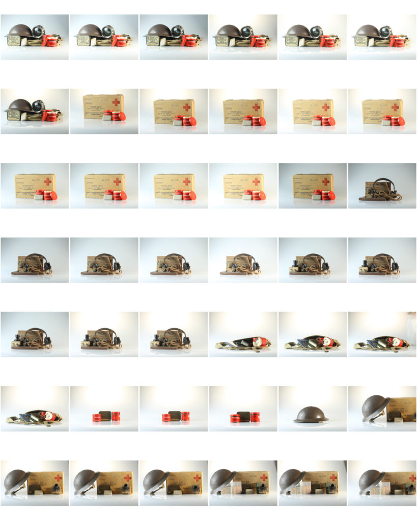
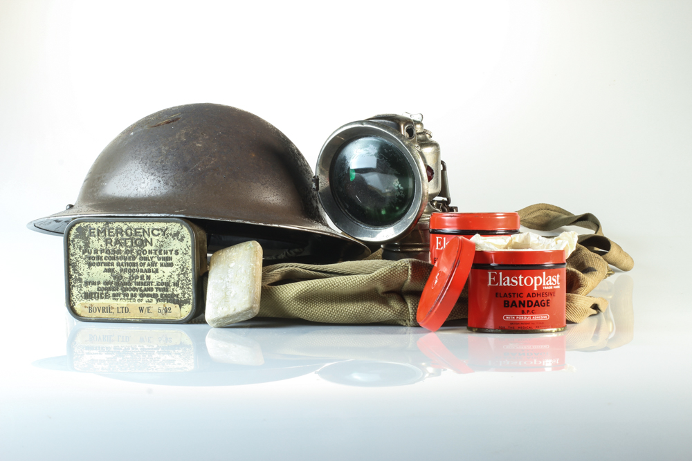
With my birds eye view photographs, I began by cropping the photographs, to ensure that the object is in the centre of the composition. I then focused on adjusting the whites, blacks, shadows, contrast and structure in order to accurately portray the objects. After ‘correcting’ the photograph I then decided to try and make the object stand out for it’s background, almost as if it has been raised and is separated from the background. To do this I looked at further increasing the shadows and blacks, although I achieved this effect, it has meant that the background now has grey tones, which slightly distracts viewers from the focal point of the photograph

Evaluation:

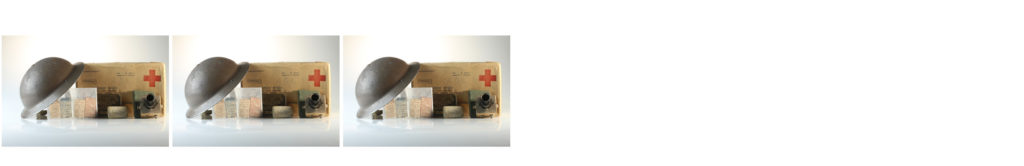
To evaluate my attempt at still life photography, I believe I have been able to produce clear example of my exploration with this style of photography. From taking the photographs at different angles with different lighting set ups, to applying my artist inspiration within my work, I have successfully been able to conceptually and contextually showcase the importance of these items to Jersey’s history. The simplistic editing used within these outcomes have worked well, as it does not distract viewers from the true values of the outcomes, which showcases my aesthetic for the photo shoot. To conclude, I am happy with the outcomes I have produced due to the high quality images created, through correct camera settings, and good edits. If I was to improve this I would look at producing another photo shoot capturing more objects, singularly, at a straight on angle, allowing me then to explore with typologies as a format for displaying the objects.

Occupation Objects (Still Life) -Studio Shoots

Elements to include in Studio Shoot

In order to be fully prepared to take my images successfully in the photo studio, i am going to briefly look into the elements needed for a good image.

  • Lighting– Different lighting points could be played with in order to get the image you are looking for. The lights used could be a soft light, spot light, ring light, hand above light etc..
  • Recording- When recording/taking the picture, it should be taken from different angles so that you capture different view points of the object. Different angles could include from above, right side, left side, front, back.

Planning my photo shoot

In this photo shoot I plan to take images of object from the Occupation in Jersey which has been gifted by Jersey Archive. Their are many objects to take images of and I will chose a few which stand out to me and which i find interesting due to them symbolising elements in the war. I will use two set ups for my photos, one for flat objects which will be done from a birds eye view, as well as a 3D objects which will be photographed straight on. The set ups will require different lighting points. The overall camera settings I have used is my camera is to be put to Manual focus, the ISO to 100, as well as the aperture to F16. These settings will allow me to adjust the depth of field, giving me more freedom with my photography. The white balance for both will be on the daylight setting to allow more light in, as well as the shutter speed for the 3D shoot being 0.6 and the birds eye being 0.5.

Straight on Angle Lighting Set Up

For this set up I used a fill light illuminating object with an extra tungsten light in order to reduce shadowing and to show the object clearly. I also used a continuous light set up which helped all the elements work together. I used a tripod also with a 50mm lens.

Birds Eye View Lighting Set Up

For the birds eye view set up, I placed two box lights on either side of the table, facing slightly towards where the objects would be sitting and used these as two flash headlights with a 2.0 power output. I used a transmitter on the camera which triggered the flash in the box lights to illuminate the object and capture my image. I was advised to use a pilot light to position my frame and cannot be seen in the image as it is hiding behind one of the box lights, and is located at the back of the table. This didn’t effect the colour of the image. I also used a tripod to hold the camera which I adjusted when needed.

Process of Elimination

These are all images from my coloured photo shoot. In order to get the best images out of the shoot i have flagged the images which i think are the best out of the shoot and will later colour code them.
After selecting my best images using the flag tool on Light room, i have now gone and colour coded my overall best unedited images. The best images are coded green, while the eliminated ones being red. I will edit the green coded ones. (IGNORE IMAGES WITH COLOURED BACKGROUNDS)

Planning Editing Process

Through my editing process, i going to try to make as little edits as possible in order to ensure the pictures don’t look overally edited and still looks realistic. Therefore the edits i used were simple such as editing the contrast, highlights, cropping the photos etc.

Editing my Images

I firstly cropped the image to ensure the focuses were in the middle of the image and that they were in a good position.
This is a detailed shot of what the edit panel looked like once i had fiddled around with the settings in order to create a image which i was happy with.
This screenshot is together with the image above, and shows what the editing settings have done to the image.

Best Finished Edited Images

Technical Analysis (X3 Images)- I used a Canon Camera on a Manual Focus, the ISO to 100, as well as the aperture to F16. These settings will allow me to adjust the depth of field, giving me more freedom with my photography. The white balance was on the daylight setting to allow more light in, as well as the shutter speed for the shoot being 0.6. The camera was also connected to a transmitter which set off a flash when i pressed the camera setting, allowing the objects to retain light.

Visual Analysis- Visually we can see that the objects photographed have been positioned into the middle of the photograph with the help of the cropping tool on Lightroom. There has been a plain white background used, helping the objects to stand out, and this works well with the flash of the soft box lights as it helped to create an aesthetically pleasing image.

Edits- When editing the images I ensured that the images still looked as if they were real objects and weren’t overly edited. This meant that I kept editing on a low and only cropped the image and changed simple elements such as the Exposure, Contrast, Highlights, and Shadows.

Comparing Unedited and Edited Photos

comparison

Occupation objects: studio shoots

RECORDING:

We had to present the Occupation objects from the Jersey Archives in a creative way and use a special still-life table and its translucent backdrop. I photographed the objects using different angles, both from above, side and front. I chose to either photograph each object individually or group together several objects for a more complex still life arrangement.

LIGHTING:

To photograph the Occupation objects in the studio, we experimented with different lighting set-ups, both continuous lights and flash lights. Continuous lighting has studio lights that stay on. You can power them up or down, based on what lighting you need. Flash lighting, lights up when you trigger it. You cannot see how the scene will be captured until the flash is triggered. When it is, a high intensity light will pulse for just a fraction of a section, lighting the scene.

TECHNICAL:

Continuous lights – To photograph objects three dimensionally

  • Camera setting: Manual Mode
  • ISO: 100
  • White Balance: Daylight
  • Aperture: F/16
  • Shutter: 0.5 sec to 0.8 sec
  • Lights in the room had to be switched off to avoid reflections

Flash lights – To photograph images, documents, books, newspapers, etc.

  • Camera setting: Manual Mode
  • ISO: 100
  • White Balance: Daylight
  • Aperture: F/16
  • Shutter: 1/125 – 1/200
  • Flash heads set to power output: 2.0
  • Pilot light was used for focusing
EDITING:

After photographing in the studio, I uploaded my images from the photo shoot on to Lightroom and made a rough edit of 6 images. I used the presets Desaturated Contrast, B&W Punch, Warm Contrast and Red Lift Matte. After selecting the filter, I adjusted the contrast, shadows and highlights. I also cropped unwanted areas to centre the Occupation objects in the middle of the frame.

MY RESPONSE:
FIRST PHOTO-SHOOT

To evaluate my first still life photo-shoot, I believe that I have been able to produce photographs that explore my own style of capturing Occupation objects. I have shot these images using different angles and lighting to contextually showcase the significance of these objects during World War 2. I believe that my outcomes turned out well since they capture the detail and textures of the objects. The minimal editing and central framing helps to draw the viewer’s attention, further emphasising the point that these items are of importance.

SECOND PHOTO-SHOOT

For my second photo-shoot, I decided to capture photos with a contemporary approach by using coloured backdrops which has been inspired by Rafal Milach’s work. Using his photographic style has allowed me to further develop my response to still life Occupation objects. Below are my 5 final outcomes for the colour photo-shoot that have been edited on Lightroom to enhance the saturation of backgrounds. I love how the coloured edits turned out because it makes the objects appear childish, as if it was a toy. This juxtaposes and camouflages the serious subject matter of World War 2.

To evaluate I believe that I have produced imagery which clearly conveys my own understanding of Rafal Milach’s work and my ability to apply his photomontage style into my own photographs. This new way of capturing still life Occupation objects has furthered my exploration since I am now presenting coloured outcomes which creates a strong link to Milach’s work.

Rafal Milach inspired photo shoot/montage making

In this photo shoot I plan on taking image of the occupation objects in a slightly more artistic way. I will be using very vividly colored background as this is what Rafal did in his work, and I like how it makes the objects he’s photographing stand out more. I also like how he used geometrical patterns in order to symbolise being being enclosed or trapped, so I will be using different geometrical shapes in order to do the same thing as it symbolises how Jersey people must have felt under the occupation. I want to create a strong sense of displacement through contrasting colours, and a feeling of being trapped through the use of geometrical shapes.

Here are all the images I took, you can see the both the flagged and rejected images.
Here is an image of just my flagged images, which are my best images.
From my flagged images, I colour coded my best pictures green and my least favorite, red.

Best images

Further developing using archive images

1st montage:

Firstly, I used the patch tool to get rid of some marks that can be seen on the card as I wanted the background to appear very pristine and put together.
I then cropped the image because I wanted the object to be at the centre since it didn’t look right having a lot of clear space to the left of the image.
I then used to quick selection tool to highlight the area shown above as I wanted to place an archival image there. I then right clicked the area, and pressed layer via cut so that part of the image became a layer that I could delete at the end.
I then dragged and dropped an archival image onto my initial image and placed it just above my background. I also decided to use the quick selection tool again to get rid of the lens of the object. I then moved the archival image in the background, so that one of the figures could be seen through the lens area.
Final image.

2nd montage:

To begin, I used the quick selection tool in order to get rid of any markings on the backgrounds I used.
I then used the quick selection tool to get rid of the area of my original picture that I wanted gone.
As you can see above, I got rid of the area within the geometrical shapes as I thought this was the place where the archival image would look best.
Final image.

3rd montage:

Similarly to before, I dragged my archival background picture onto my original image.
I then selected certain areas of the picture that I wanted removed so that we could see the archive image in the background.
Final image.

4th montage:

To achieve my final montage, I used the archive image seen above. I thought an interesting part of the image was the nurse and the soldier shaking hands, and also the medical sign. I selected both of these areas using the quick selection took, so that I was then able to place them onto my image. After selecting them, I used to eraser tool to clean up the edges as I knew they would be going onto a photo with a bright background.

After placing the two sections of the archive image, onto my own, I then went on to open another archival image of a Jersey landscape as I thought this would make my montage more interesting. I selected the blue area of my montage with the quick selection tool, deleted the selected layer and dragged the archival image on. Since the lighthouse would’ve originally been covered to the my placement of the medical sign, I then flipped the image horizontally.

Final image.

Initial images vs. Final images

1st montage:

2nd montage:

I thought these images would look interesting together because it shows a medicinal side to the occupation in 2 different time periods. It almost looks like we are looking into the past through the geometrical shape, and we can also see a medical product used back then, in the present.

3rd montage:

I chose to place these 2 specific pictures together because I thought they had an interesting narrative together. My original image contains an emergency ration pot, with 2 little figures of old men sitting on top. By having the picture of the 2 young soldiers as a background, it could represent the 2 people in different time periods.

4th montage:

I chose to put all these specific images together as they’re all quite similar in theme. I added the nurse and the medical sign onto my original image because the original image contains bandages as my object, so I thought something medical related would be fitting. I decided to add the landscape as my background as I thought it makes it more related to Jersey under the occupation.

Still Life Experimentation-Objects

Green and red are complimenting and I wanted their to be as much red as possible to symbolize blood and death. The tin is red which is a metaphor for the how the bandage is going to eventually turn red due to covering up a bloody wound. I made sort the ration of red to green was bigger as the green is meant to look like it is being consumed by the red. The rate of death everyday kept increasing during the war, the green symbolizes life’s left and its gradually becoming less and less. The green also represents nature and how it was being destroyed by bombs, stomping, trenches and deserted rotting bodies.

Purple and yellow card was used as my background colours as they are complimentary to each other. The bright colours create contrast between the beige box and book. On the contrary I purposely made the box to look at of place because I wanted it to be the focal point as a Red Cross Box held so much importance to those who received them. Although the outside is plain and uninteresting the contents were the opposite these boxes held the power of life or death for some people.

This image was originally from my first shoot, the occupation diary and the radio tower is from an archive image. I went through the process of trimming and cropping the radio tower out of its initial background and placing it on top of the diary to create this montage. The photo highlights the importance of documenting the past through the use of writing and photographing. The radio tower symbolizes the significance of historical documents and how they recreate the past and educate us. Without narrative from the time of the occupation we wouldn’t have a story behind Jersey’s bunkers.

For this image I used miniature people, a green and yellow card background and triangular metal poles. Even though it doesn’t feature any literal occupation objects it has a historical concept. The miniature people symbolize the people of Jersey and the poles are the change made by the occupation for instance bunkers. This image displays how locals had to cope with such drastic changes to their daily life with curfews, their loved ones leaving and rationing. Although this disruption was going on, people had to get on with their lives and stay strong for their remaining families. From another perspective the poles represent mental trauma that was left with some many people after the war.

Studio PHOTO SHOOT 2 Objects.

This time in the studio I decided to photograph objects from the occupation of jersey, I photographed a German Helmet, Ration Box, A Crystal radio Set and a Bike Lamp.

these are the images I took, I have selected the images I want to edit and the ones I want to discard as they were blurry, or weren’t to my liking, then after this I Coloured the pictures into green for the ones I think went OK and I am going to edit, and also yellow for the images which I thought went OK but they could be improved upon.

Here is my Edits from shoot:

For this first Edit I have edited the Tones within the image, for example the the contrast f the black and white, but also the highlights and shadows.
For an experiment I decided to lower the contrast even more than before, by doing this I felt that this has more of an effect than the one before.
I have increased the amount of sharpening within the image, therefore by doing this the clarity of the object is much clearer than before.
Final Image – Bike Lamp

Second Edit:

I have changed the highlights and shadows, by doing this I have made a surround around the object, I like what it has done because it makes the object feel more connected.
I have decided to lower the temperature to make the image look colder, I decided to do this so it reflects on the atmosphere during the second world war.
I have edited the tone curve on the image, this has further effect.
I have lowered the exposure to make the image darker because it will give a darker impression on the audience.
Final Image 3 – red Cross Parcel + German Helmet

Third Edit:

I have slightly edit the exposure level to decrease so you can see the shadows of the Object as before you were unable to see the full shadow. I have also edited the contrast to lighten the image a little bit
I have edited the tones within the images e.g. the highlights and shadows, I have decided to edit this because it helps to lighten the image more behind the object but also it creates little shadows at the bottom of the object.

object zine -Occupied Belongings-

For my zine I decided to use a simple design with just a 16 page a5 layout.

The title image was chosen carefully because because it has a large block of the green at the top and the main focus of the image, the bandage, is far away from where the title is. I have done this so that the title doesn’t look like it is cluttering the page and drawing focus away form the image.

I have done the layout so that there are mostly the set of images from the still life table, the reason for this is because I drastically prefer the outcomes.

Most of the images I took were in landscape orientation with the image filled, this meant that there was a large number of double page spreads.

Still Life

Still life photography is a genre of photography where the subject of the photos are typically small groups of object. Still life originates from the middle ages and Ancient Greek/Roman art, and genre gives the artists creating paintings and photographs more leeway in the arrangement of the design elements within a composition compared to other photographic genres, such as landscape or portrait photography. Lighting and framing are important aspects of still life photography composition. The most popular subjects in still life images include groups of flowers, food, desk space, and many others. Normally still life images are taken close up to the subject but it also isn’t too far away, but instead taken at a medium distance from the subject.

Image Analysis:

Image result for dutch still life paintings
Pieter Claesz

This image was taken by Claesz, who was one of the most important Dutch still life painters in the 1600’s. Everything om the table, from the fluted glass and goblet to the lobster and crab, all look very life like. Claesz has captured all these objects together as during the 17th century the Dutch would proudly present these expensive status objects in their homes to show their wealth and remind them of the better things in life. Fish was very expensive and hard to get hold of during the 17th century, so having fish on the table would show wealth. The Dutch would also have bread and wine on the table to add a touch of Christian symbolism, and if it was white bread that would also symbolise wealth as the less fortunate, such as the poor, would either eat rye bread or porridge.

Still Life occupation objects

The Shoot

We set up the studio with two stations, one where you take photos from a eye-level angle, and one where you take images from a birds-eye view.
For these photos, I selected objects that were lended to us from the Jersey Archives that are actual objects from WW2. I chose to photographs both images of just one singular object, but I also selected multiple objects to create a narrative.

Selection

In Adobe Lightroom Classic cc, I used the color rating system to select the images that I thought were the best and I wanted to edit them. First I made them all yellow, meaning a maybe and then after manipulating my images I rated the best photographs as a green. 

The Yellow Rated Photos

I rated these images as yellow as I believe they are of a better standard of the majority of the photographs, however, there are some technical difficulties that can't be completely fixed in Lightroom such as lighting differences or some focusing problems. I decided to show these photos to display my selection process and to acknowledge my mistakes in order to learn from them. What I would change next time is where the lights are situated and make sure they hit both the object and background in order to ensure that there aren't patches in the background that are darker than others.

The Green Rated Photos

These are what I think are my best images. The focus is crisp and the objects are interesting. I particularly enjoyed photographing multiple objects together to create a scenario. For example, placing the bandage pots and soap bar in front of the First Aid box creates the concept that those items might've been included in the box. I also liked filling up the bag with multiple items that the islanders or soldiers may want to have on them all the time. I also liked taking the birds-eye-view image of the German Occupation of Jersey book. Although I overall preferred taking the images from eye-level, I enjoyed the learning process behind taking the images from the birds-eye-view. I also like the mirror-like effect that the objects reflect onto the surface. It adds more depth into the images and overall make the images more eye-catching. To improve next time, again, I would focus on rearranging the lighting more. I want the images to be a bit brighter and I don't like the blueish/grey effect the background has. I tried to adjust this on Lightroom, but there is only so much adjusting I was able to do.

Composition

On thing I really learnt from this shoot is the composition of the objects can make or break the image. Here is an example:
The image on the left is unedited. I wanted to photograph this radio and headphone set but I wasn't happy with how it was turning out. I kept trying to move the wire and headphones into different placed and angles but I just knew something was missing. After trying to make the image work, I decided to see if introducing another object would make the scenario look better. I then found the mini crystal radio set that islanders made and used to find out the news. By linking these already similar objects together added a lot more depth to the image and made it overall more interesting. The similarities between the top of the crystal radio and the headphones are eye catching and the different shapes of the crystal radio adds depth to the photo.