
First lighting setup
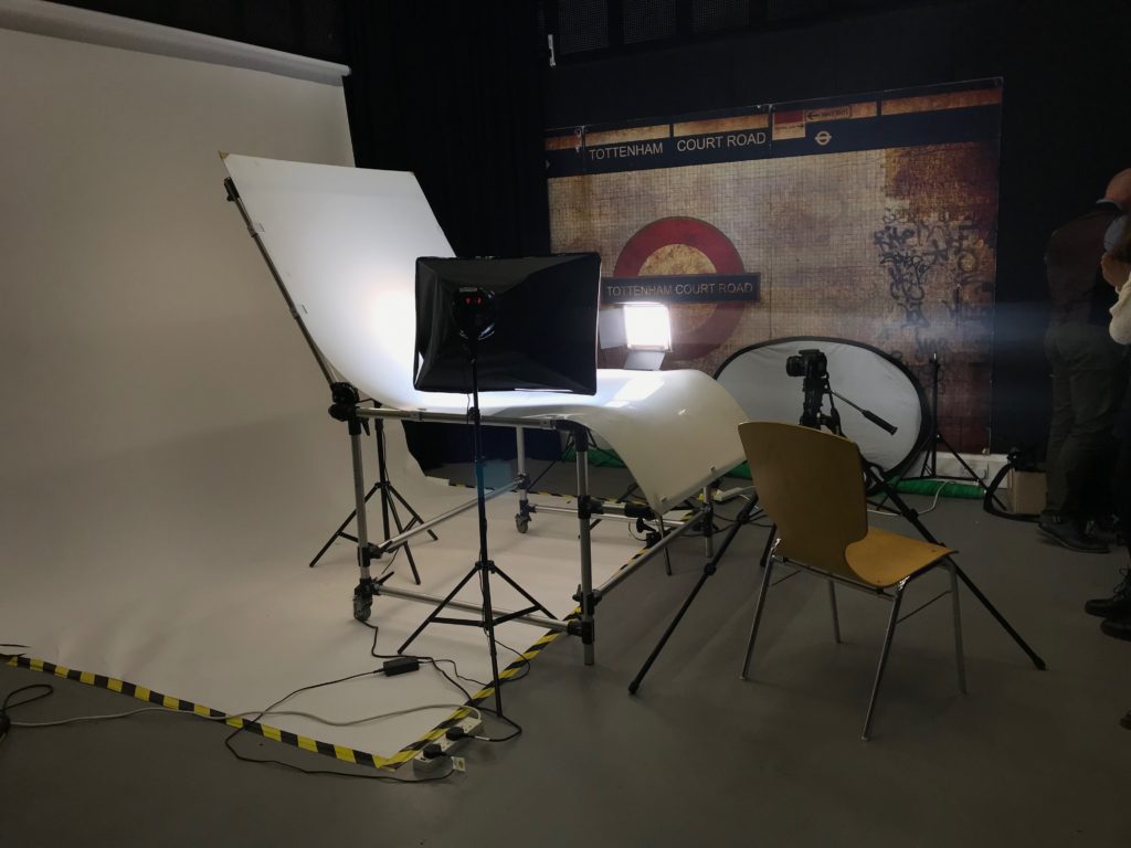
The light on the left is the continuous light, which is also known as a fill light as it has a diffuser of it. When photographing it should be set up to around 500 kelvin, and the dimmer can be adjusted in order to make the light brighter or darker.
The light on the right side if called a key light, which is the strongest light. It projects a very strong, clear light in for the camera to clearly be able to focus on the object.
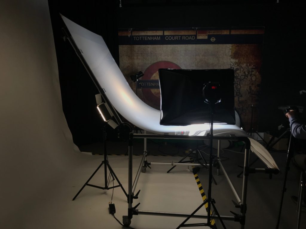
Behind the backdrop, we also have a back light. This helps the backdrop appear slightly lighter, as it is translucent and allows minimal light through.
when photographing using this set up, you should use a slow shutter speed , which means it is a good idea to use a tripod and a cable release as it will mean the camera wont shake and make the images blurry. The white balance should be adjusted to match the type of light the continuous light is emitting. The F stop should be quite high, around 16 as this gives the image a shorter depth of field as the aperture is smaller.
This set up is effective when taking images of things with dimensions, as you can experiment with angles and lighting in order to emphasize different parts of the object. This is also useful when capturing lots of objects together, as it allows to a lot of space, and it contains a lot of different lighting set ups to effectively be able make the groups of objects look aesthetically pleasing.
Second light setup
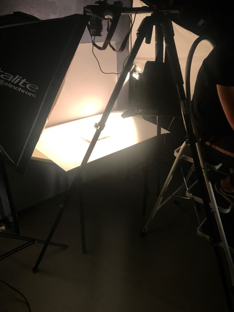
This set up can be used to capture images from a higher angle. On the left, there is a flash head light which is triggered by the transmitter which is connected to the camera. It is also important to place a sandbag on the tripod in order for the weight to be balanced, so the camera doesn’t fall over. It is important to place the camera parallel to the 3rd leg of the tripod as this means the camera will be straight. To be able to see what is being photographed, there is a ladder placed on the right hand side, to help you be able to looking through the view finder.
This set up is highly effective when wanting to photograph things that appear 2D or almost flat, such as books, or newspapers since you may only want to be capturing these things from a front facing angle.
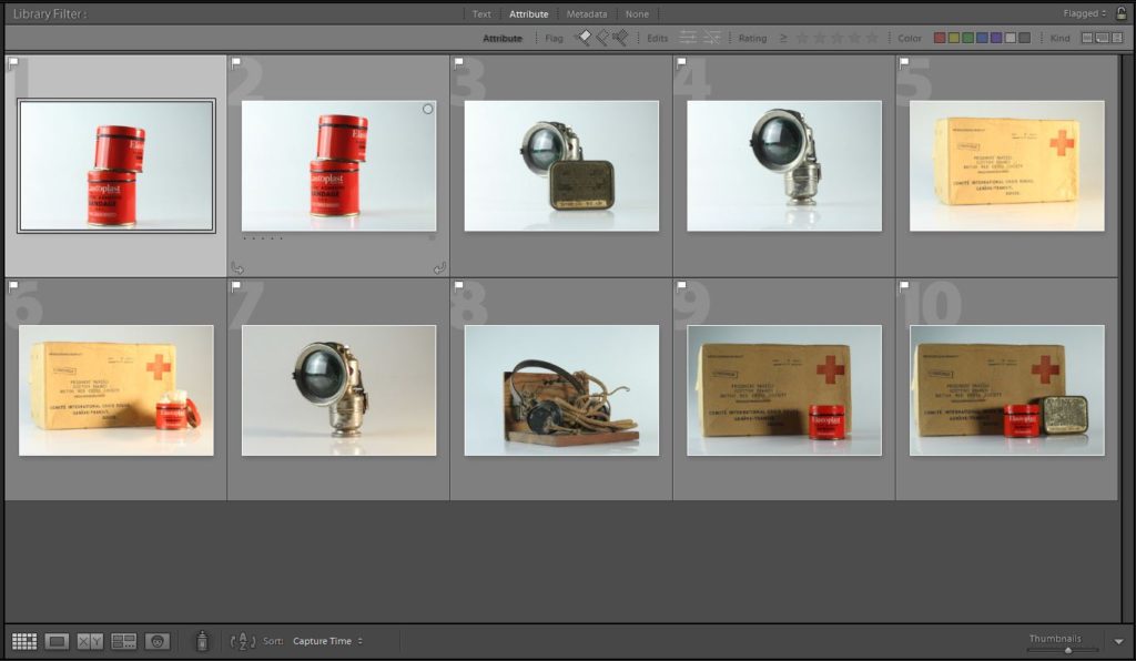
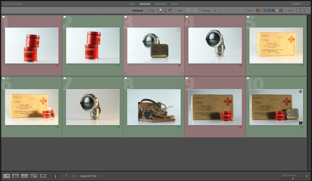
Photo shoot
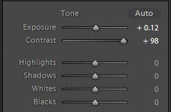
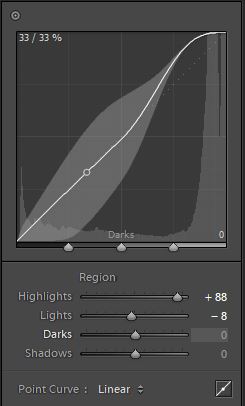
Developing
Initial images vs. Final images
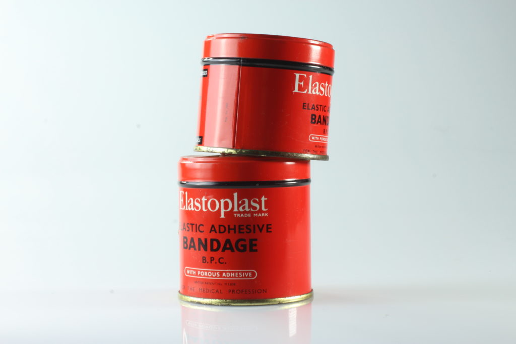

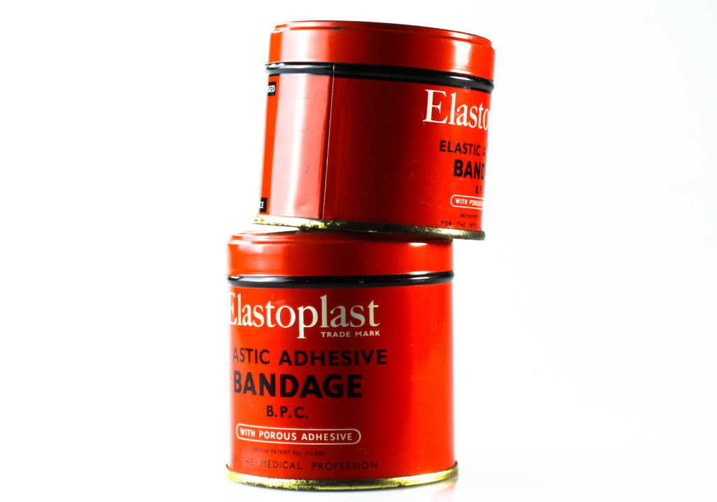
I really like how the object in the image above stands out a lot more from the background. I also think the colours are a lot more vivid, and they stand out more as it almost appears as there is no background. I like how my final picture has more dimension to it due to the emphasized shadowing and the highlight on the objects.
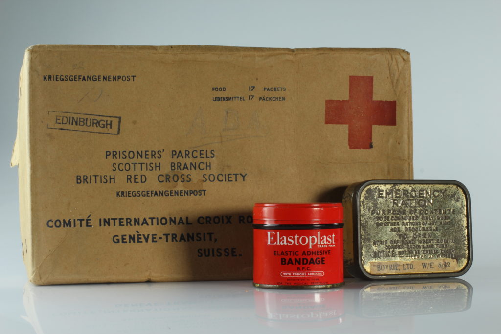
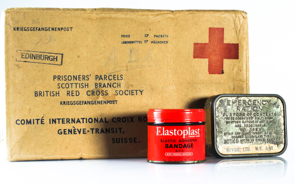
The objects in this image all have their own different type of texture, which I think is brought out more in the final image. I like how you an see all the details in the parcel such as some staining, and scratches. You can also see the rusting on the emergency ration box a lot more clearly. I think this makes my image a lot more successful as it gives the photo a lot more character, and it emphasizes how there is a rich story and history behind each object, which otherwise may not have been as notable to an audience.
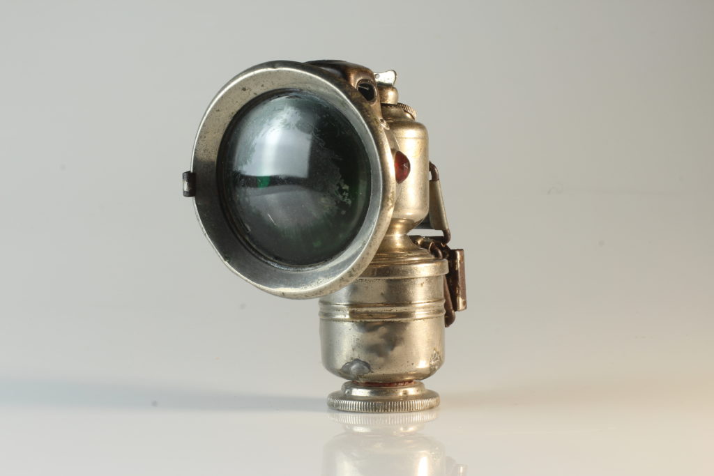

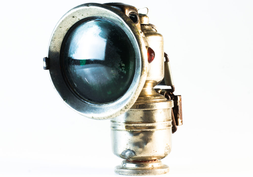
I like how the bicycle light looks a lot bolder and clearer in my final image, compared to my initial one. I think this makes the image far more interesting because it makes the object look slightly more mysterious, which may be intriguing to an audience. However, I think the final outcome could’ve been improved if I would’ve left the shadowing of the object on the bottom left hand side as it would help add a more dramatic effect to the picture.