Contemporary VS Classic Photography –
The classical Photographer is a man called Francis Foot. He was born in 1885, the son of Francois Foot (1847-1918) and Louisa Hunt, (1843-1934). Francis was a china and glass dealer in Dumar.
Francis Foot was born in 1885, the son of Francois Foot (1847-1918) and Louisa Hunt (1843-1934). Francois was a china and Glass dealer in Dumaresq Street, at a time when the area was one of the more affluent in St Helier. His son started his working life as a gas fitter. However, he soon became fascinated by photography and the early phonographs and gramophone records and realised that he could earn a living from them.
So the family took on a second shop in Pitt Street, where Francis worked as a photographer, while his father and mother sold gramophones, records and other wares in Dumaresq Street. After his father’s death, Francis concentrated the business in Pitt Street.
Francis married Margaret Vernon shortly before the First World War and the couple had four children, George (1914- ), Stanley (1915- ), Dora (1917- ) and Reg (1920- ).

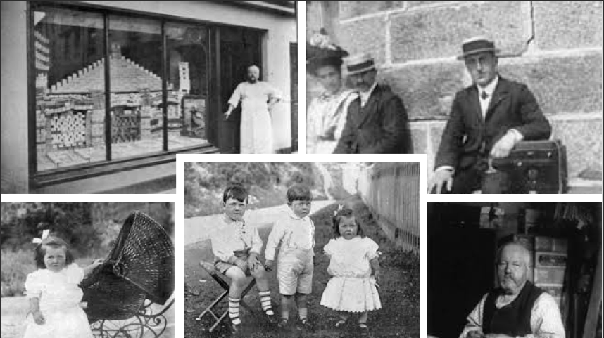
Due to the unintended blur in the images above analysing the technical aspects of his work is harder due to the camera quality he has used at this time. However, I like how the images are more out of focus and the sharpness of key elements is grainy because it makes the photos naturally seem like there from the olden days. The exposure of some of his images is high, this is because details like patterns in the little girls dress, hairs on the mans face from the mood board above are out of focus had this had been lower we might have been able to see smaller details Francois like Michelle Sank uses natural existing environments in their photographs
Previously mentioned Francis takes his pictures in a natural environment, thus taken outdoors which is is suggesting natural lighting as also being used to take this image. The image was taken in the 20th century, explaining the black and white.
Visual analysis- Visually we can see that there is one child in the photo, presented a little of the left of the picture and she is dressed in a white dress. The white could symbolise purity in the family giving an idea of upper class and wealth. The positing of the child could be planned as she is looking at the camera and has her hand on the baby stroller which could be seen as a posing position, therefore un naturalistic.
Conceptual analysis- I think that Francis wanted to show the wealth of the child in this image as the little girl can be seen in a clean white dress, a bow in her hair to represent purity, shiny black shoes, and is also captured next to a expensive looking baby stroller. This is showing that the children have a good life due to the financial situation of the parents, showing the contextual factor of how the class system had affected Jersey Channel Islands. This image is showing Francis is proud of his financial situation and what he can provide his children with, almost as if the took these images to brag.
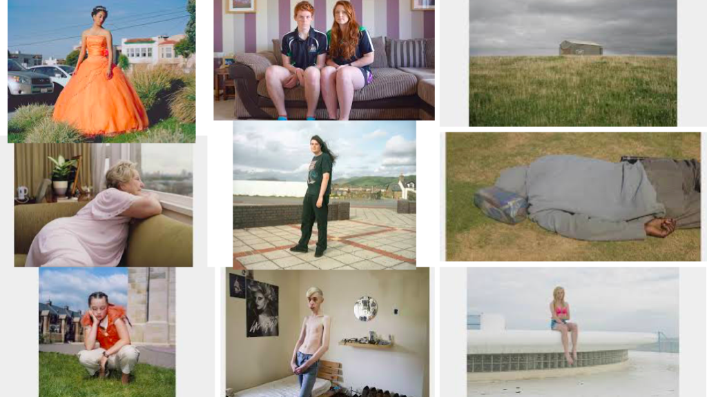
Below is a mood board for Michelle Sank:

Michelle Sank
Michelle sank was born in Cape Town, South Africa. She left there in 1978 and has been living in England since 1987. Her images reflect a preoccupation with the human condition and to this end can be viewed as social documentary. Her work encompasses issues around social and cultural diversity. Michelle Sank was born in Cape Town, South Africa. She left there in 1978 and has been living in England since 1987. Her images reflect a preoccupation with the human condition and to this end can be viewed as social documentary. Her work encompasses issues around social and cultural diversity.
Nature is a crucial element in her images as they take up the mojority of the photo. However the key focus of her images is the person standing directly in the centre weather they’re looking at the camera or not. I like the way she’s angled herself when taking these images as their not just all straight on. There are some where she has positioned herself higher or to the side and even below the model to obtain these images. She tends to use natural lighting but then seems to have them a little too the under exposed side as the colours don’t directly jump in the viewers faces in particular the top right photo of the shed on the hill, the lighting is dull and dark making the photo less exciting to look at whereas the top right image is exciting, quite out of the ordinary but more intresting to look at due to the contrast in colours between the orange and the blue sky.
