Case study: Klaus Pichler

Klaus was born in 1977. He lives and works in Vienna, Austria. His project titled “one third” is a prime example of still life images in the modern world.

“According to a UN study one third of the world’s food goes to waste – the largest part thereof in the industrialized nations of the global north. Equally, 925 million people around the world are threatened by starvation.”
“According to a UN study one third of the world’s food goes to waste – the largest part thereof in the industrialized nations of the global north. Equally, 925 million people around the world are threatened by starvation.”

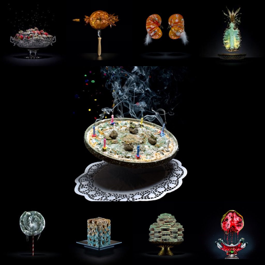
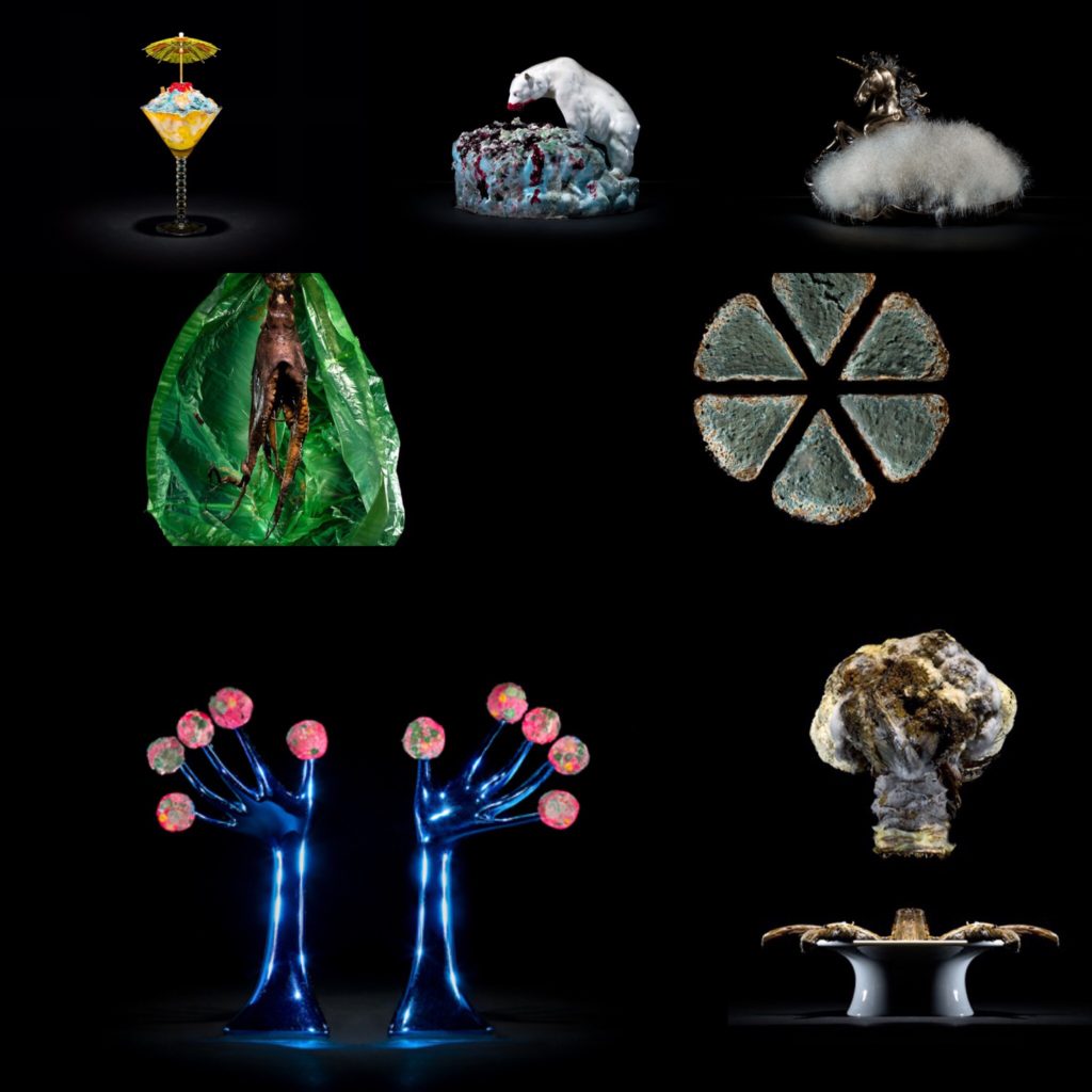
“One third” is a photography series that draws attention to food waste. All the images in this series are of food items that have gone by their sell date. This project was completed over a period of nine months, in his own apartment, keeping different types of food in plastic containers in his bathroom.

In 2011, there was a survey on food waste completed by the UN. The report found that one third of all food produced for human consumption went to waste due to variables such as consumer decisions, which is shocking considering that more than 9 million people are starving.

All the images in the series were positioned and made to look very elegant, using backdrops and different types of dishes and plates, to mirror how food is portrayed in the media in an almost appealing way.

“From the beginning, it was obvious for me that I wanted to quote the aesthetics of advertising photography, because I thought there is a little bit of a twist if I really style the food and make it look perfect. On first sight you react with ‘ok that looks nice,’ and then you realize what you are looking at.” -Pichler on “one third”

Each food product that he pictures also contains a detailed history, that he researched himself, of where it was grown/produced and how far it traveled to reach the supermarket shelf, which you can see under the image below:

“Pichler gathered all of this data himself, which was as challenging as making the photographs. Since European law says that while the origins of food must be kept on record, retailers and producers are not obligated to share the information with consumers, Pichler met a wall of silence when announcing his intentions. “ -Source

The UN were very interested in the creative narrative that Pichler was creating and showcase his photo series at their annual meeting and at food waste events.


Carrots

Sort: Baby- carrots / Place of production: Tuvaila, Arumeru, Tanzania / Cultivation method: Outdoor plantation / Time of harvest: All- season /  Transporting distance: 6.068 km / Means of transportation: Aircraft, truck / Carbon footprint (total) per kg: 6,59 kg / Water requirement (total) per kg: 24,0 l / Price: 39,95 € / kg

Technical: This image appears to be taken in a £studio setting” as we can clearly see a black backdrop. This image also appears to have been taken using a professional lighting set up.
Context: This picture is part of the “one third” photo series captured by Klaus Pichler.
Visual: In this image we can clearly see rotting carrots placed strategically on a white plate. The white plate stands out brightly amongst the black background helping to create an eye catching contrast. The placement of the carrots are also visually appealing, which is odd considering the food being photographed isn’t presented in a traditionally appealing way. The reason why it looks interesting is because it was placed in a specific order in which we can see the next carrot in a more decomposed form when compared to the one previous.
Conceptual: This image is one of many from the series that was taken in order to try and show consumers how much food goes to waste due to our un-environmentally friendly shopping habits.

Establishing shot

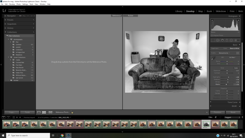
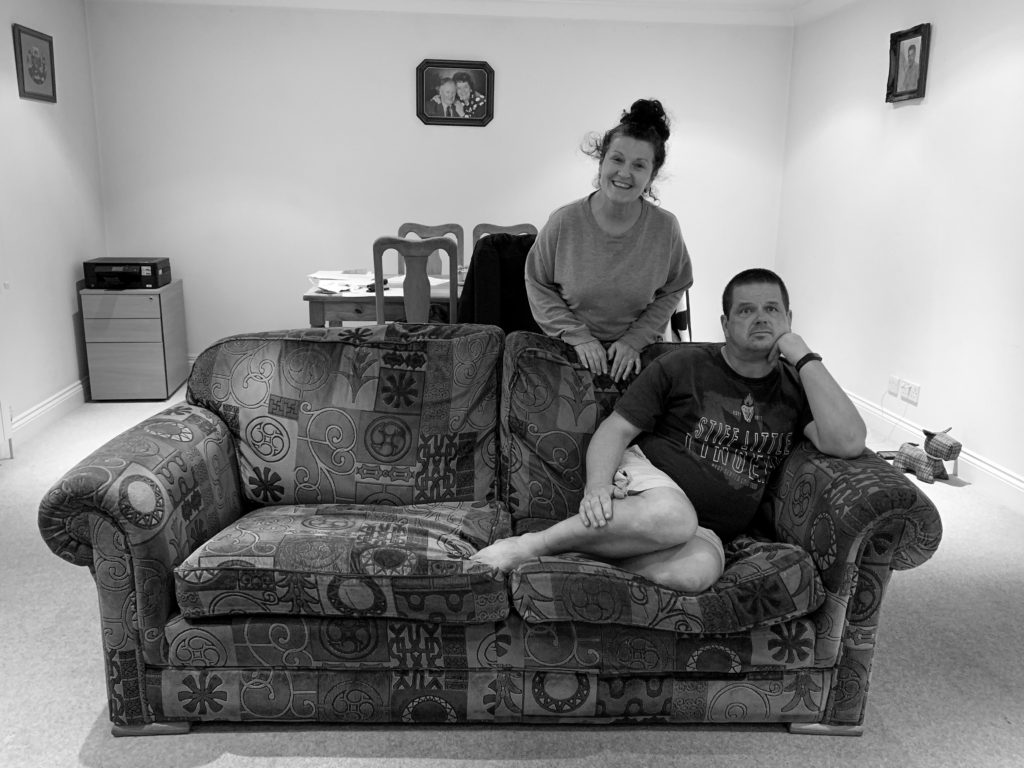
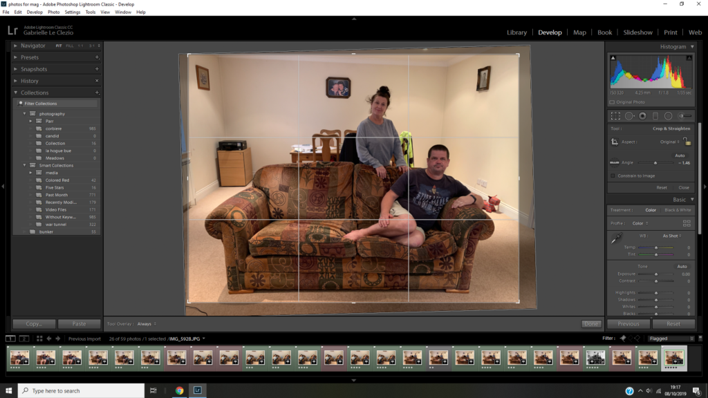
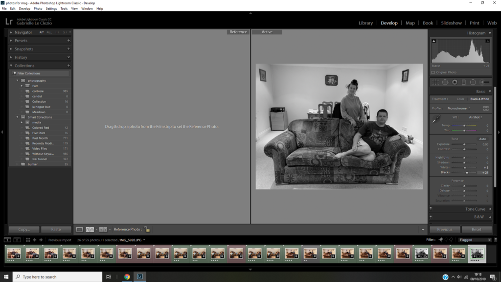
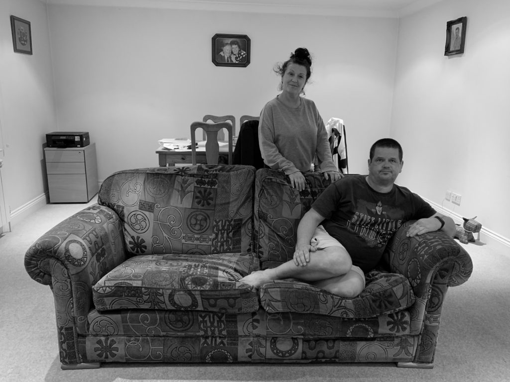
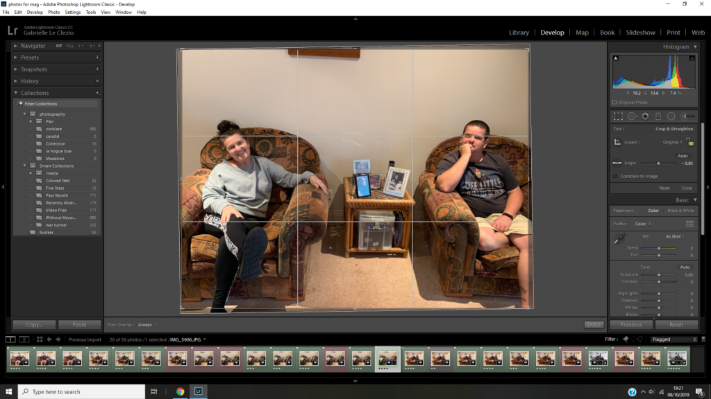
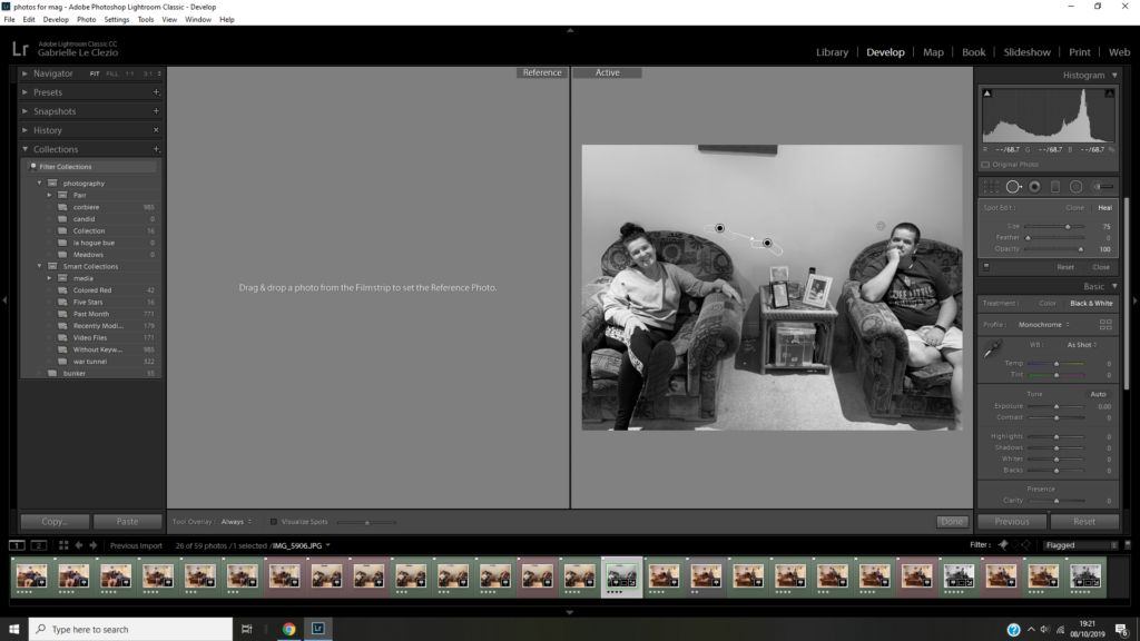
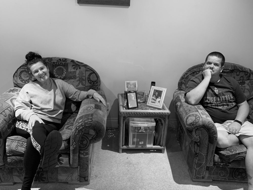
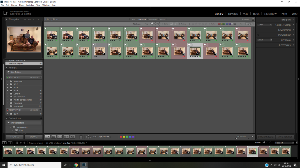
ESTABLISHING SHOT: a group portrait of two or more members of the family where you are constructing an image that tells a story. This image can be naturally observed or staged. The main focus is conveying a sense of narrative.

Daniel Meadows

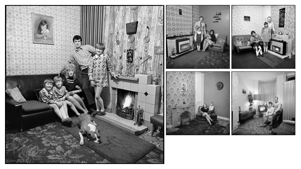
Images from Meadow’s June Street Salford

Daniel Meadow’s considers himself a documentarist, ‘ I have spent a lifetime recording British society, challenging the status quo by working in a collaborative way to capture extraordinary aspects of ordinary life, principally through photography but also with audio recordings and short movies. ‘ (Meadows https://www.photobus.co.uk/daniel-meadows )

He was born in England, Glouschestire, in 1952 and studied at Manchester Polytechnic from 1970-73. During this time he took photos for June Street Salford and collaborated with a fellow student at the time Martin Parr.

1973-73 he toured England in the PhotoBus running a mobile free portrait. He made a record of this journey in his book Living like this- Around Britain in the Seventies which was published 1975.

Daniel Meadow’s Style

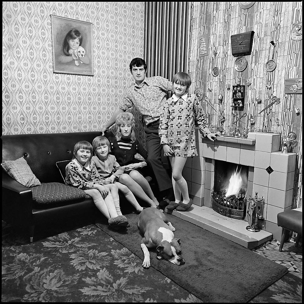
Meadow’s style is very nostalgic and reflects on the passing of time, for example, he did a collection looking at how people have aged, photographing them in the same place. His images in June Street Salford tells a story of a family by how they are positioned and by the items around them, but also the number of people or lack of people in the image. He takes the majority of his images in black and white. His images also comment on the structure of the family at the time with men always standing above the rest of the family or at the center of the image.

Analysis

Image result for daniel meadows june street

Technical

The lighting is artificial from the light in the room and light coming from the fireplace. It’s a wide-angled aperture because the items around the family are in focus. I think it was taken with a lower IOS sensitivity because the image isn’t grainy.

Visual

There is no color in this image because it’s been done in black and white. There is a variety of tones, there are some really bright whites on the walls and then the dark couch and carpet which creates a lot of contrast. There’s also a variety of texture in the image like the whool of the carpet juxtaposing with the smooth tile.

Contextual

The image was taken kin 70’s to document homes of the working class. At the time documentary photography was becoming increasingly popular and Meadow’s and Parr were part of a new wave of documentary photographers. Meadows asked the families to pose for the photos.

Conceptual

The idea behind the image was to document working-class family life and to tell the stories of those families. It also comments on the social constructs of the majority of the homes in Britain at the time. Meadows asked the families to pose for the photos, he didn’t direct them. In most of the images from this series, the image depicts a family, always with a man at the center or standing over the rest of the family, with the wife sitting down with the children. The eldest child is standing and any animal is on the floor. They almost show the hierarchy of the family in those days which makes sense because in those days the man was the main provider and main decision-maker of the family and the women were encouraged to sit at home with the children.

Detail shot

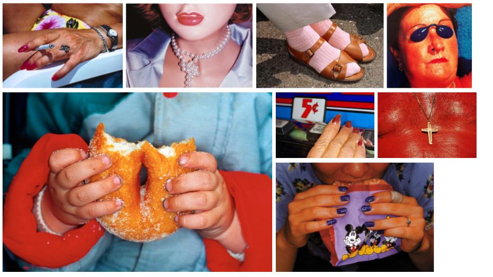
DETAIL SHOT Focus on a detail of a person or close up of something that conveys something about the individual character or identity eg. age, race, gender, sexuality, fashion, hobby, lifestyle, etc.

Information:

He was born in 1952 and is a British documentary photographer, photojournalist and photobook collector. He had the ambition to be a photojournalist since he was 14. His grandfather was an amateur photographer. He studied at Manchester Polytechnic with Daniel Meadows and Brian Griffin. They collaborated on projects frequently.

His first mature piece of work was in 1975, called Rural Communities. He spent five years photographing rural life in West Yorkshire, Greater Manchester, and Ireland. His focus was on isolated rural communities that were closing down. He shot in black and white to give the images a nostalgic look.

He then went on to do many other projects including Common Sense. In 1988 he joined Magnum photos. He became a full member in 1994 and was even president of Magnum Photos international for 3 and a half years.

Martin Parr style of Photography:

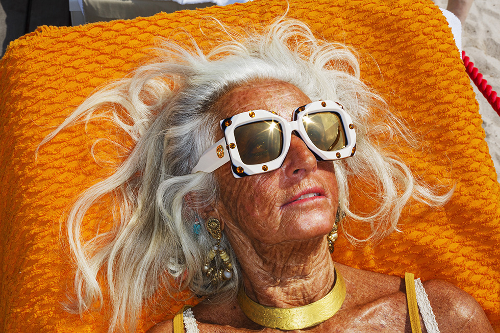
Martin Parr uses his photography to display his unique view of the world. He uses bright colours which can appear garish, he makes them appear this way so you react slightly in disgust as some of his images like the ones of bizarre people sunbathing in Common Sense. He focuses on the way we live, the way we present ourselves and our culture to others and what we value.

To contextualise his work he has researched leisure, consumption and communication, which is very evident in his works. He shines a new light on normalities in our culture and makes them seem peculiar and ridiculous. Within his images, he manages to create his own view of society which makes you question your view on society.

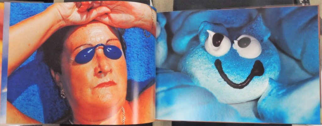
His style is humorous and makes one question our values and culture within the ideas of leisure and consumption. Within his photobooks, he juxtaposes images that are of completely different things but are similar because of a common colour or subject like below. You have this woman on a blue towel sunbathing which is already peculiar then he juxtapositions it with this image of what looks like blue meringue with a smily face which is of a completely different thing yet is similar.

Image result for martin parr common sense

Analysis:

Related image

Technical

The lighting in this image is natural because it’s outside. You can see the light reflecting off the sunglasses. The image was taken with a wide aperture because the items in the background are still in good focus. I think it’s got a lower IOS, it’s got low light sensitivity because the image isn’t grainy.

Visual

The colours in the image are highly saturated. Every different colour catches your eye, from the red rope in the background to the small pink lines of her lips. This is intentionally done by Parr to make our leisure culture appear bizarre and question the society we live in. This image has a lot of variety of texture. You can see the leathery texture of her skin, the wispy texture of her hair, the grainy texture of the dand and the texture of the towel fabric. The image has been cleverly composed so you have this bronze leathery woman haloed with white wispy hair sprawled ly medusa on this bright beach towel taking up most of the image. It’s been taken at just the right time where you can see her eyes within the glasses looking towards the sun.

Contextual

This image was taken in 2019 as part of a Gucci Cruise of the French Riviera#. It was a reminder of his work from Common sense due to its saturated colour and bizarre subject.

Conceptual

The conceptual image behind this is much like the conceptual meaning of his Common Sense work. The idea behind it is to make us be critical of British culture through his satirical eye. This image shows it in the way that yes, she’s this woman in lavish jewellery, glasses, swimsuit and she seems to be enjoying it but the concept is to make us question it. And we do. Why is she such big earrings whilst sunbathing? Why is she sunbathing, she already looks like she’s had so much sun? Is this what I look like sunbathing? This idea behind it is to make us cringe at ourselves and make us self aware of our peculiar culture of leisure. The idea behind it is idiosyncrasy which is to express excentricity and peculiarness.

Martin Parr Detail shot Inspired shoot

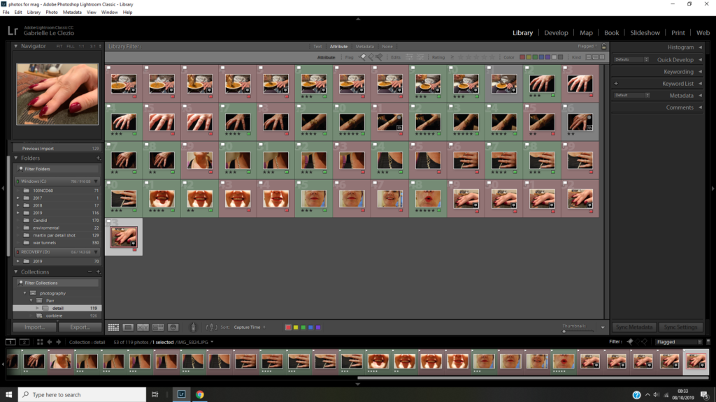
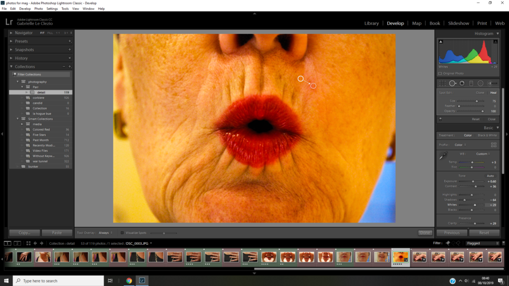
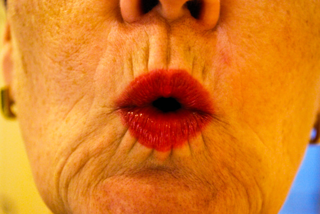
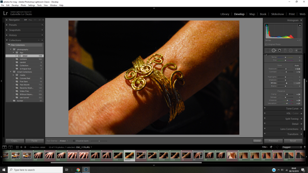
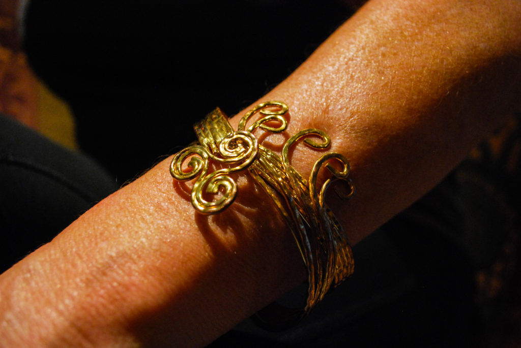
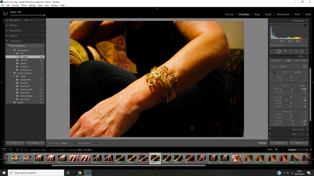
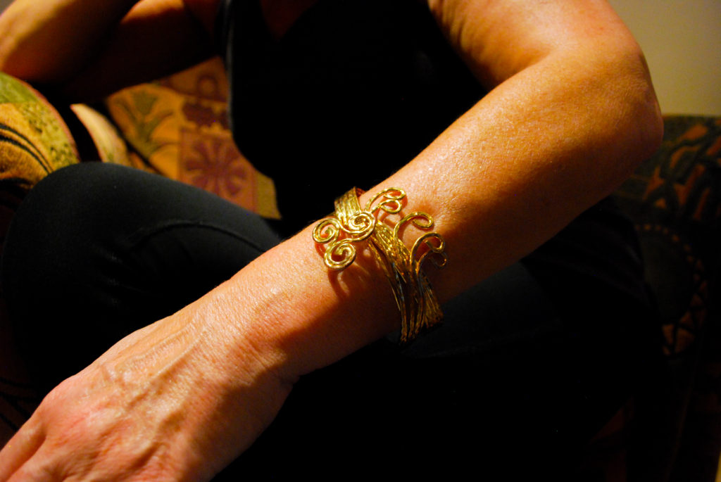
I’m really happy with the outcome of this shoot. I think the outcomes really reflect the genre of detail shot in the way that I’ve used a close aperture to focus on a small detail of a person or what they are wearing. I think the images also reflect Martin Parr in the way that by editing their saturation and vibrancey I’ve made the images look like his and because I’ve focused on jewelry which is a constant subject in his work.

Autochrome

In 1802, Thomas Young theorised that all different colours were produced optically through your eyes, and there were only 3 wavelengths of light, this is called trichromatic. These colours were red, green and violet. These theories also provided the first framework for the first commercially viable method of colour photography, the autochrome.

Emile Guilton was the founder of the Societe Jeriaise photographic archive. Emile took the first colour photograph in Jersey using autochrome. This image was called Lumière Autochrome. Though it is hard to see, each image is made up of lots of small dots with one of three colours, red, violet and green. Our eyes make the dots within the image merge into the colours they would make when mixed and create this bright image of colours.

The image above is an example of autochrome image, made by Emile F. Guiton. This is an early example of colour photography using the autochrome technique. The image is of plants in a vase. These plants are pink, and the use of autochrome allows this pink to show brightly due to the colours mixing into the colour it should be.

CONTEMPORARY PRACTICE:Mat Collishaw

Matthew is an English artist, born in Nottingham, raised in a Dawn Christadephian family and is now bases in London. Collishaw’s work uses photography and video. He’s well known for his Bullet Hole which was taken in 1988, which is a closeup photo of what appears to be a bullet hole wound in the scalp of a person’s head, mounted on 15 light boxes. Collishaw took the original image from a pathology book that actually showed a wound caused by an ice pick . Mat got his debut when Bullet Hole was exhibited in Freeze, the group show organised by Damien Hirst in 1988 that launched the YBA (Young British Artists). It is now in the collection of the Museun of Old and New Art in Hobart, Australia. Mat has done many projects throughout his career but I one I am going to focus on is the still life exhibition named ‘Last Meal on Death Row’, which is pretty self explanatory.

Image result for allen lee davis last meal on death row

This work of Collishaw’s is a depiction of Allen Lee Davis’ last meal, a lobster tail, fried potatoes, fried clams, fried shrimp, garlic bread and root beer. Davis was executed in Florida in 1999 as he was convicted of a brutal crime in 1982, he murdered Nancy Weller and her two young daughter, Kristina,nine ans Katherine, five, in Jacksonville, Florida. Karma caught up to him when the electric chair failed to deliver a clean death and witnesses heard him scream and saw him bleed. That was the last time the electric chair was used in the state of Florida and now only the lethal injection is allowed. The meal has been placed in a banquet looking way, like the last supper that Jesus held before he resurrected this emphasises the inevitable death of Davis. As well as that it is mutely lit and under-exposed as if there is no light left to give and there won’t be in hell. There is plenty of depth in the shadowing, this could represent the inner feelings of guilt, shame, regret or maybe even happiness going through the heads of the criminal on death row. His still-life resembles foodstuff painted by some Dutch artist in the age of the Vermeer. He takes a 1700s approach and matches it was a modern concept of the last meal but at the same time it goes with old times as the death penalty is seen by the large majority as an outdated punishment. The plate and the table look as if they are from a different century even the meal itself, I feel the underlining message could be that the death penalty should be abolished.