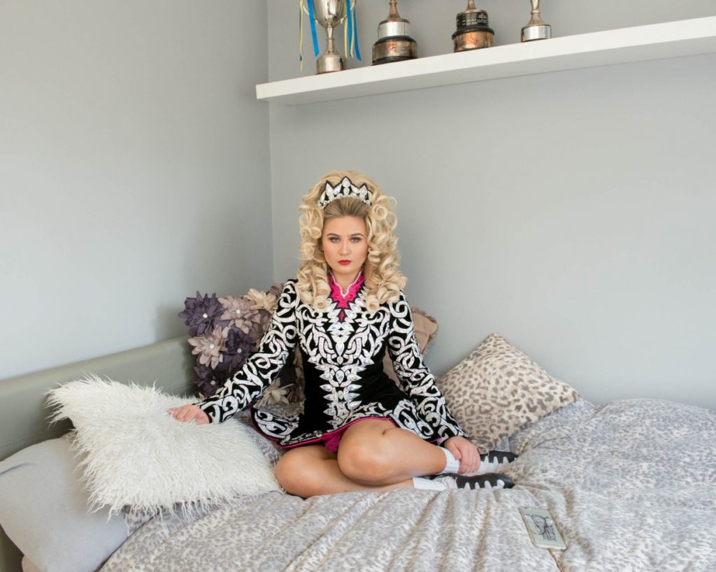
After spending some time with Joan Taply and hearing all about her stories during the occupation, it was essential to me to create and edit her portraits to represent a certain effect. I did this my experimenting in Photoshop with the different images I collected from the photo shoot, and carefully selecting the most appropriate photograph in order for me to achieve the highest level of quality and the most effective final image. With all this in mind I wanted to demonstrate how easily the conceptual aspect of the photograph can change by just editing each image in a certain way giving it a new feeling and depiction
Firstly, after spending time with Joan Taply in the studio I moved all my images into Light room which enabled me to closely look at and concentrate on the best quality images.
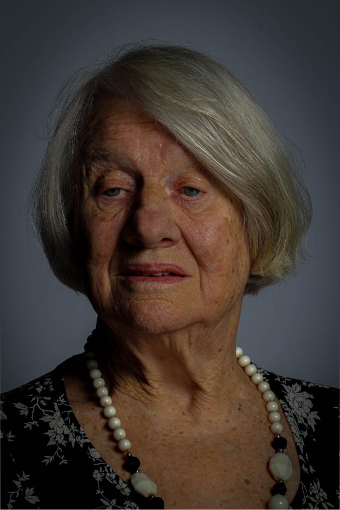
Next, selecting the main images that I wanted to attempt to edit, I started to clear up the lighting errors from the image for example, the shine on Joan’s nose from the studio lighting. this helped improve the photograph a lot already before the editing had even begun. Additionally, I went on to begin editing for my first attempt I wanted to keep it simple and affective so, I increased the contrast levels in order to give a sharper deception of the image to add even more significance to the image to help highlight Joan as the main subject, in Light room I went on DEVELOP then EFFECTS and altered the AMOUNT button that created a shadow around the corners of the image. This particular edit helped to provide a contrast of the lighter for illuminated face of Joan compared to darker shadows around the corner. This was the result:
Although, my initial idea I was pleased the end result of the image came out much darker than intended so I further experimented, keeping in mind my previous edit issue that would help me develop and improve the next image
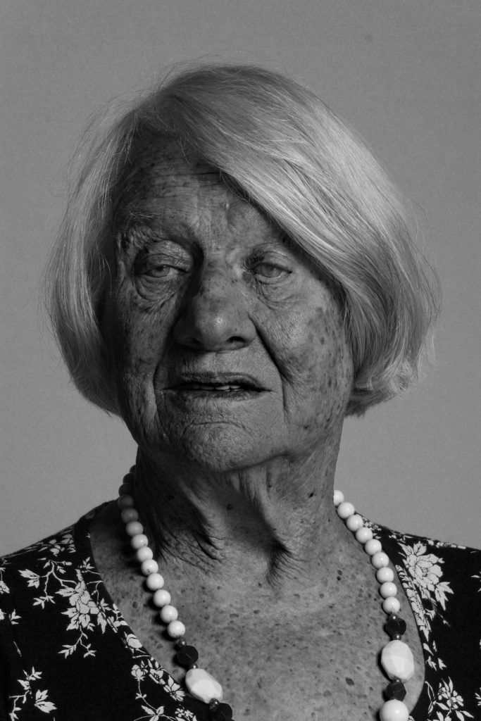
This was my second edit after evaluating the faults and issues with my first image I made sure that I didn’t repeat the issue. I was much happier with this image especially at the darker edges of the corner which helped highlight Joan’s face even more. To me this feature really provides a significant overall improvement to the photograph and adds a more dramatic feel.
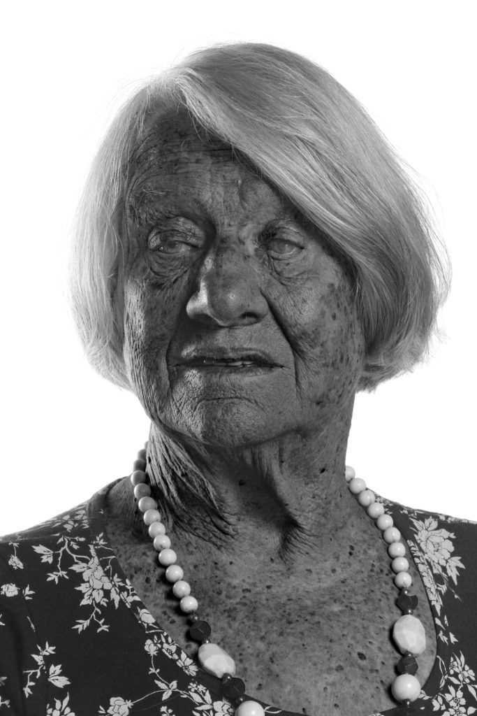
Finally for my third photograph I decided to take a more abstract approach using Photoshop which enabled me to control the intensity of each shade produced after changing the image to black and white, giving a more drastic and sizeable transformation. These photographs give a more disturbing feel due to the contrasting intensities of the different black and white shades.
For my last edited image, I used a different approach, by using a completely different angle and a side view which meant a lack of eye contact providing an original feeling compared to the more basic front faced portraits, to me it gives a more personal feeling and therefore suggest a more ‘soft’ notion. Furthermore, the idea of adding a personal feeling was a necessity to me as after spending time with Joan and hearing about all her experiences and her life during the war and as a child, the sense of providing a personal touch has connotations of personal experiences and a journey that a particular individual has taken.
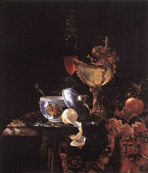
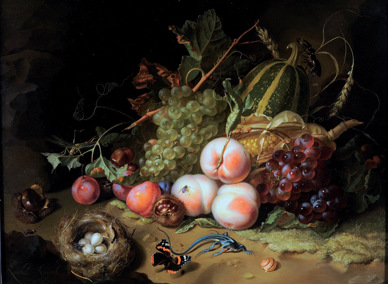
Lighting: The lighting in this painting is minimal and most likely natural from a window.
Visual
There an abundance of different colours in this painting. There’s lots of rich orange which shows wealth because at the time bright fabrics were expensive so were only bought by the rich. There’s also a lot of gold which also symbolises wealth.
Contextual
This painting was painted by Willem Kalf a Dutch still-life painter. His style of still life was called ‘pronkstilleven’ which translates as the life that is luxurious with items that represent wealth. This specific painting is called ‘Still Life with a Nautilus Cup’, 1662. A Nautilus cup was seen as the item of kings in the 17th century.
Conceptual
In the foreground, you can see the items resting on a marble that symbolizes wealth. Many items in the image symbolize wealth as well. The china pot, the shell chalice, and even the orange and lemon are all symbols of wealth because the orange and the lemon were originally grown in Asia and are symbolic of trade. The peeled lemon is supposed to represent the passing of time but also Lemons were very expensive so they were popular because they showed wealth in the 16th century because only the rich traded with the east. Lemons are very sour and bitter so they were considered to symbolize deceptive allure/attraction of earthly beauty. The focal point of the image is the lemon because the light has illuminated the lemon the most, whereas everything else is slightly submerged in darkness.
Famous Still life artists: Van Gogh. Wilhelm Kalf, Pieter Claesz,
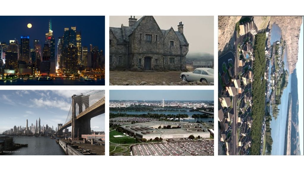
Establishing a shot is related to film-making and television production set up, and it can also been with a contextual view through a scene showing a relationship between the main subjective figures and objects creating a narrative story. In terms of the technical view its most often viewed as a long or extreme long shot at the start of the scene, most often setting the scene and placement. For example, where, what, when. Establishing shots were much more popular during the more classical era of film making, compared to now-a-days who often now skip this process of establishing a shot in order to make the overall process quicker and getting to the point at a faster pace. In addition, the expositional nature of the shot may be unsuitable to scenes in mysteries, where details are intentionally obscured or left out. The best examples of establishing shots and more famous landmarks to indicate the city where the action is taking place or has moved to, such as the following:
Brandenburg Gate or the Fernsehturm to identity Berlin
Victoria Harbour to identify Hong Kong
Las Vegas Strip to identify Las Vegas
LOndon Eye, Big Ben or Town Bridge to identity London
Parliament House, Old Parliament House, the National Caraillon or the Black Mountain Tower to identify Canberra
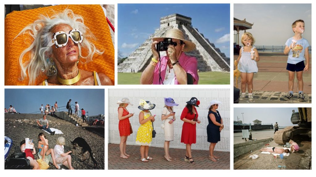
MOOD BOARD:
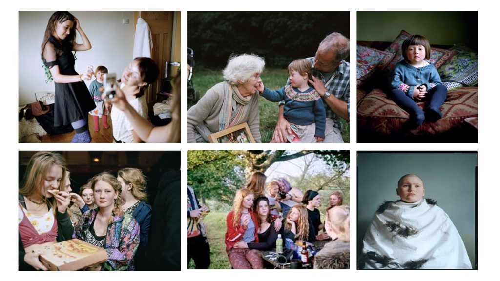
SIAN DAVEY:
ABOUT: Sian Davey was born in Brighton in 1964, and is now a popular British photographer, she studied paintings at Bath Academy of Fine art in 1985 ad the went on to social policy at the University of Brighton in 1990 and most recently MA 2014 and MFA 2016 at Plymouth University) . As well as this Davey was also a psychotherapist for 15 years before properly dedicating her time and passion of photography in 2014. Furthermore, Davey’s main focus in photography is her family, community and on herself and try to relate her background of psychology and relates it to her photography. One of her most famous series is based on her daughter called Alice who lives with Down Syndrome and looks more closely in to her life (called: Looking for Alice). This particular series was shortlisted for Photobook of the year in the Paris Photo-Aperture Foundation PhotoBook Awards. On the creations of her work she always try’s to incorporate her family, so for this particular creation of Looking for Alice her other daughter Martha helped with the production, which significant highlights and supports her view of the importance of family. With the assistance of her daughter Martha it led to her next series based on Martha and her teenage friends which Davey simply called Martha. Finally her most resent series was called We Are Family and was produced in 2017, and was exhibited at the National Portrait Gallery in London. This particular series led Davey to travel across Britain and was lucky enough to photograph a total of 31 families in an impressive 21 days.
PHOTO:
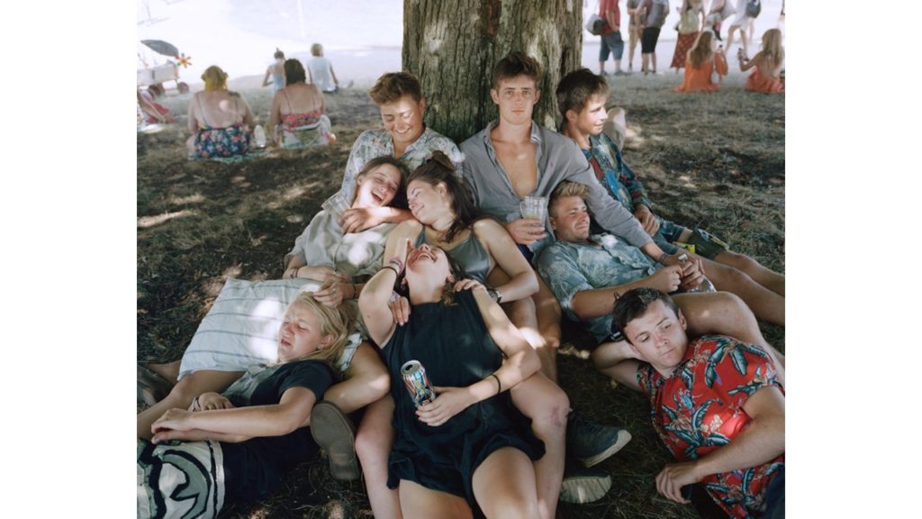
TECHNICAL: from this image its clear to see that natural lighting is an essential role in capturing this image, this is seen through the shadows of sunlight seeping in through the trees and leaves on to the group of friends perched underneath. The exposure is fairly low which enables the shadow to have more contrast against the sunlight seeping through, furthermore there is low light sensitivity as there lacks grainy textures, there are no significant textures that stand out as the image is projected in a real life situation and therefore shows a sense of reality; the colours are warm and suggest a warm summers day as well as features of the image which help provide evidence of this. to continue the colour provide a light tone which aids proof of the summers day with a pattern of the layout of the friend group positioning linking to the natural layout of the frame giving a 3D projection.
CONCEPTUAL: The conceptual feeling from the image is a group of friends hanging out on a summers day and having fun together and just trying to relax. Furthermore the different facial expressions from the image suggest it was taken fairly off guard as a lot of the people are not all looking at the image nor posing, for example;the top left people are laughing which suggests a joke being told and having fun furthermore the blonde girl in the bottom left having a disgusted face. overall suggests connotations of just a regular friend group having fun however deeper meaning maybe reflected through the various facial expressions could project the emotions that different people go through in their everyday life; disgust, laughter, sadness, happiness etc.
CONTEXTUAL: This image is from Davey collection called ‘Martha’ she got inspiration from her second daughter who said ‘why don’t you photograph me anymore’ which inspired her to look more closely at daughter Martha and her friends. ‘The work began when Martha was 16 and at the time when a child is on that cusp of being and becoming a woman. Its a particular period of time, when for a brief period you are both a young woman and a child in the same body, before the child leaves and the young woman stands on her own to meet the world’ ( Davey, 2018, Martha http://www.siandavey.com/portraiture/rqtu5vwfmmk1p0iagah6moz73evpob ) This suggested that the image has a deeper meaning and looked more closely at growing up as a woman and everything they go through.
DETAIL SHOT:
A detail shot is established by the use of a macro lens and involved capturing an image to help project a new an different conceptual meaning. The image and picture has connotations and references with identity and informs us about the subject being focused on within the picture. From the norm its suggested that the most popular element produced within the genre are texture, shape and space which all works together to create a forum.
MOOD BOARD:
MARTIN PARR:
ABOUT:
Martin Parr was born in 1952 on 23rd May 1952 and is a British documentary photographer, photojournalist and photo book collector. He is known for his photographic projects that take an intimate, satirical and anthropoloical looking at aspects of modern life, in particular documenting our social class in England, and more broadly the wealth of the Western world. Major projects include; 1975–1982), The Last Resort (1983–1985), The Cost of Living (1987–1989), Small World (1987–1994) and Common Sense (1995–1999).
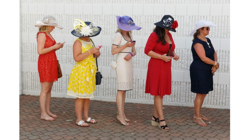
PHOTO:
TECHNICAL: from this image there is clear use of nature daylight and possibly the use of flash seen through the brightness of the colours portrayed in the image. The lens size is regular with minimal exposure level which helped highlight the different colours on the dresses, overall the image has good focus and low light sensitivity due to the lack of graininess in the picture, overall the image is a warm temperature due to the colours presented; red, yellow, black further aiding the idea of the image having a lighter tone with natural textures creating a more realistic view of the image to others, with a consistent pattern of woman being laid out in a line all facing the same way which add some symmetry although the layout and positioning of the woman would suggest otherwise due to the fact that one of the woman is cut off and the other aren’t which shows the image isn’t central.
CONCEPTUAL: The image shows five woman inline all dress to a high standard, suggesting an upper class range furthermore there a few of them staring down at their phone which could have connotations of the idea of social media taking over our lives and that we would rather look down at our phone than up at the world or talk to others around us.
CONTEXTUAL: ‘ At first glance, his photographs seem exaggerated or even grotesque. The motifs he chooses are strange, the colours are garish and the perspectives are unusual. Parr’s term for the overwhelming power of published images is “propaganda”. He counters this propaganda with his own chosen weapons: criticism, seduction and humour. As a result, his photographs are original and entertaining, accessible and understandable. But at the same time they show us in a penetrating way how we live, how we present ourselves to others, and what we value.’ (Martin Parr, intro, https://www.martinparr.com/introduction/ )
My own plan:
From this i will take everything I’ve researched and learnt to capture and respond to the ideology of established shot and details shot; for my work i will use inspiration from Martin Parr and Sian Davey and reflect their work on to my family as i will be using them as my subject
Still lifes were a great opportunity to display skill in painting textures and surfaces in great detail and with realistic light effects. Food of all kinds laid out on a table, silver cutlery, intricate patterns and subtle folds in table cloths and flowers all challenged painters. Several types of subject were “banquet pieces” or simpler “breakfast pieces”.[Virtually all still lifes had a moralistic message, usually concerning the brevity of life – this is known as the Vanitas theme – implicit even in the absence of an obvious symbol like a skull, or less obvious one such as a half-peeled lemon (like life, sweet in appearance but bitter to taste). Flowers wilt and food decays, and silver is of no use to the soul. Nevertheless, the force of this message seems less powerful in the more elaborate pieces of the second half of the century.
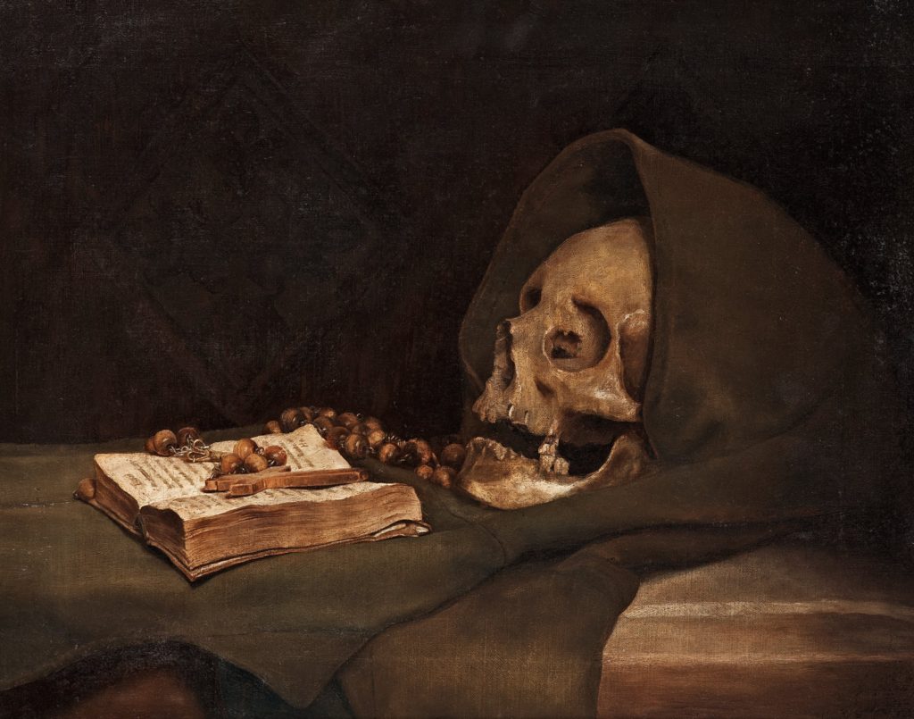
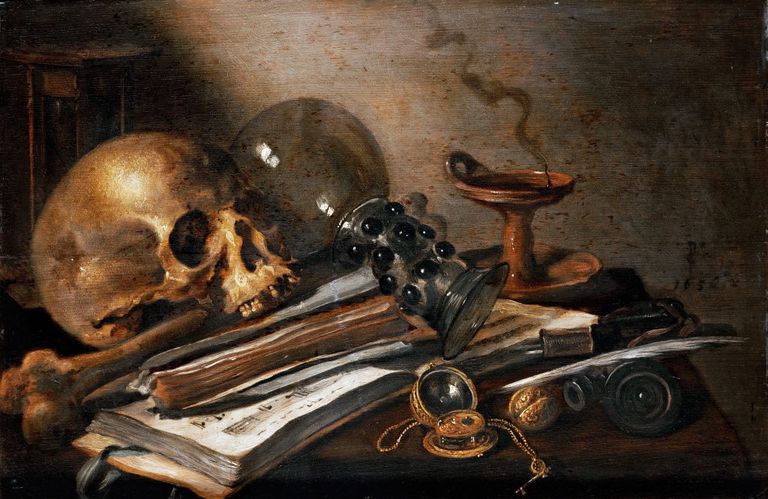
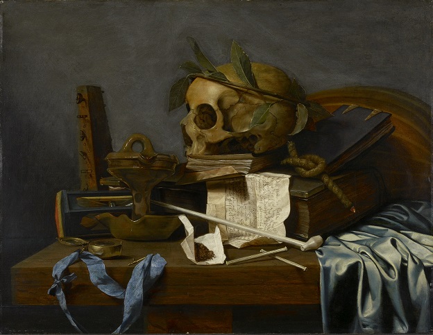
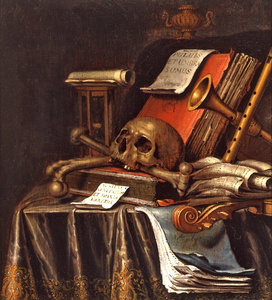
Vanitas still life painting, very popular among the Dutch, is based on the theme of death’s inevitability. The symbolism of the skulls in this painting is obvious, but the rose (quick to wilt) and oil lamp (easily snuffed out) also refer to life’s brevity and fragility. The vanitas symbolism is underscored by the Latin inscription underneath: “All that is human is smoke, show, vanity and the picture of a stage.” Indianapolis Museum of Art
Vanitas Paintings:
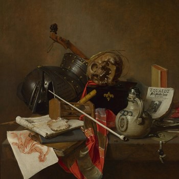
Vanitas Paintings – A Metaphor for Transience “Society’s awareness of death did not disappear with the end of the Twelve Year Truce; in the 1620s the Republic suffered two outbreaks of Bubonic Plague and this may account for the proliferation in Leiden of Vanitas paintings, whose recurring motif, the skull, was a constant reminder of mortality. Symbolism was present in every form of Still Life but never more significant than in Vanitaswork where everything spoke of ephemerality and the inevitability of death: the watch or hourglass – the passage of time; the overturned glass – the emptiness of life; a violin – the vice of enjoyment, or music fading away; a book – pride in knowledge – an artificial virtue, or history being finished; a smoker’s empty pipe, a guttering candle or smoking oil lamp – life is eventually snuffed out; and airborne soap bubbles were evanescence epitomised. However, there remained as redeeming Christian reference, the chaplet of corn on a skull, a reminder of the Resurrection. Fuchs suggests that this density of morbid symbols would have appealed to the intelligentsia at Leiden University, centre for the study of Calvinism.”
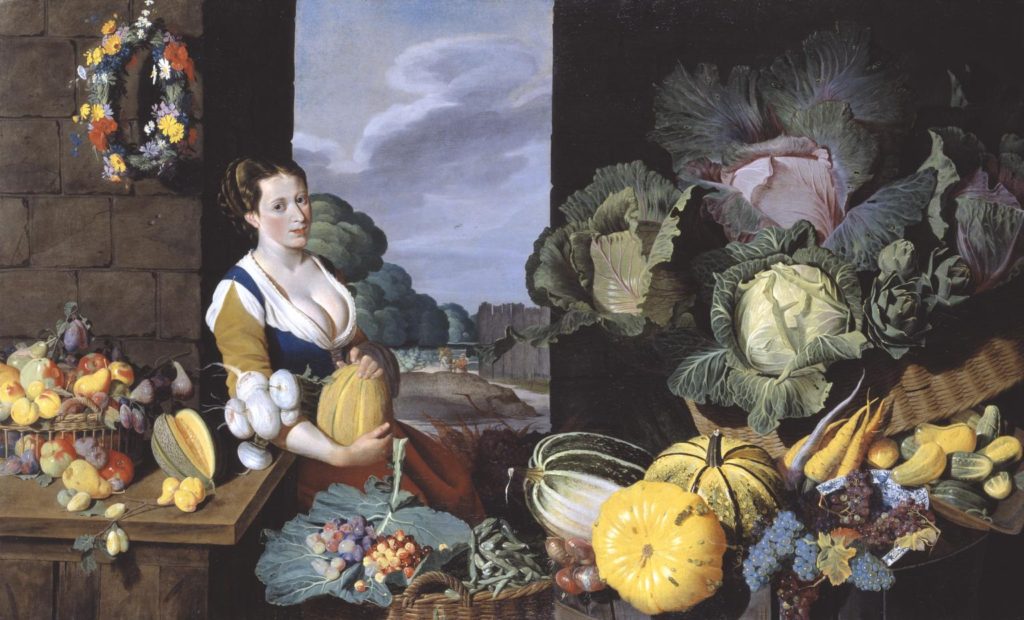
Above is Sir Nathanial Bacon’s ‘Cookmaid with Still Life of Vegetables and Fruit’. This was painted from 1620-5. The paintinf is a landscape of a cookmaid with an arrangement of exotic fruit and vegetables around her and on a table. The backdrop is comprised of outdoor walls and a gap in the walls where a landscape of sky and trees, along with other buildings can be seen.
Curator Tim Batchelor discusses Cookmaid with Still Life of Vegetables and Fruit: TIM BATCHELOR: This striking painting is quite unusual for British art of this period in that it shows quite a lavish still life. Still life painting really becomes established in Britain in the late seventeenth century. NARRATOR: Curator Tim Batchelor. TIM BATCHELOR: The painting also reveals the artist’s interest in gardening and horticulture, the cultivation of plants. This was becoming increasingly fashionable in this period and Nathaniel Bacon took a great interest in this. We have a variety of grape on display here which was a new introduction from America and the melons that we can see prominently displayed near the cook maid herself were grown on his own estates. NARRATOR: Bacon is unusual in being an artist who was of the gentry. His wealth enabling him painted for own pleasure. Not much is known about his training but this painting may hold a clue. TIM BATCHELOR: We know that Nathaniel Bacon travelled in the Southern Netherlands during this period, and that paintings of cookmaids and cookmaid scenes, banquet scenes of this nature, are prevalent in the southern Netherlands, around Antwerp in the late 16 Century and early 17th Century. So he may well travelled there, trained there and become accustomed to this compositional style while he was there.
The most visible similarity between these photographs of Francis Foots and Michelle Sanks work is that they are both a portrait of just one person. However a difference between the subjects is that Michelle Sanks model is visibly more modern and a significantly younger age, which could well indicate and represent the eras in which the photographs were captured. In terms of the context the photographs were taken there isn’t much of a background in Foots work as it is completely plain, where as in Michelle Sanks the image has quite clearly been taken in the teenage girls bedroom, her own environment, with her own belongings and this is a significant difference between the two photographs. Technically they would have been taken with very different type cameras due to the advance in technology over recent years, so the visibly better quality portrait is Michelle Sanks work, this appears as if it would have also been taken with artificial lighting due to the very clear and bright light, and this would’ve been unlikely within Francis Foots photograph.
The earliest forms of still life could be considered to be caveman paintings or Egyptian. wall paintings from 15 BCE. A still life is a piece of art illustrating an inanimate object. The most famous case of the Egyptian still life comes from a tomb in Menna which depicted everyday objects and life.
Ancient Greeks and Romans also did forms of Still life art. often in the form of mosaic or Fresco.
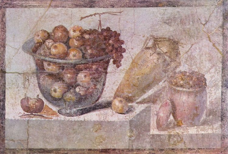
Still Life with Glass Bowl of Fruit and Vases, a 1st-century wall painting from Pompeii
The Middle Ages
Still Life art was adapted for religious purposes. Religious symbols were painted and still-life images were painted to fill manuscripts. Objects like coins, seashells, and fruit were painted into these religious books.
Renaissance
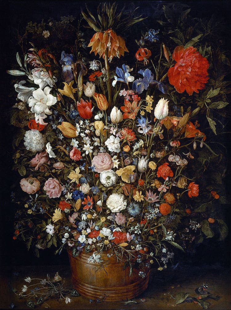
Artists in the north popularised paintings of flowers. As these paintings became trendy the rich would get exotic flowers originally from other countries or other continents painted in order to show off their wealth. In the 17th century painting, everyday objects became very popular. Different objects became different symbols for wealth, mortality, death.
Dutch Golden Age
Dutch artists took a particular interest in still life paintings but they took it one step further. A specific style called Vanitas developed which was characteristically known by having a skull in the painting. They were inspired by a specific Latin style memento mori which means ‘remember you have to die.’ The difference was that Vanitas paintings also contained books and musical instruments to represent the vanity of life.
Modern Art
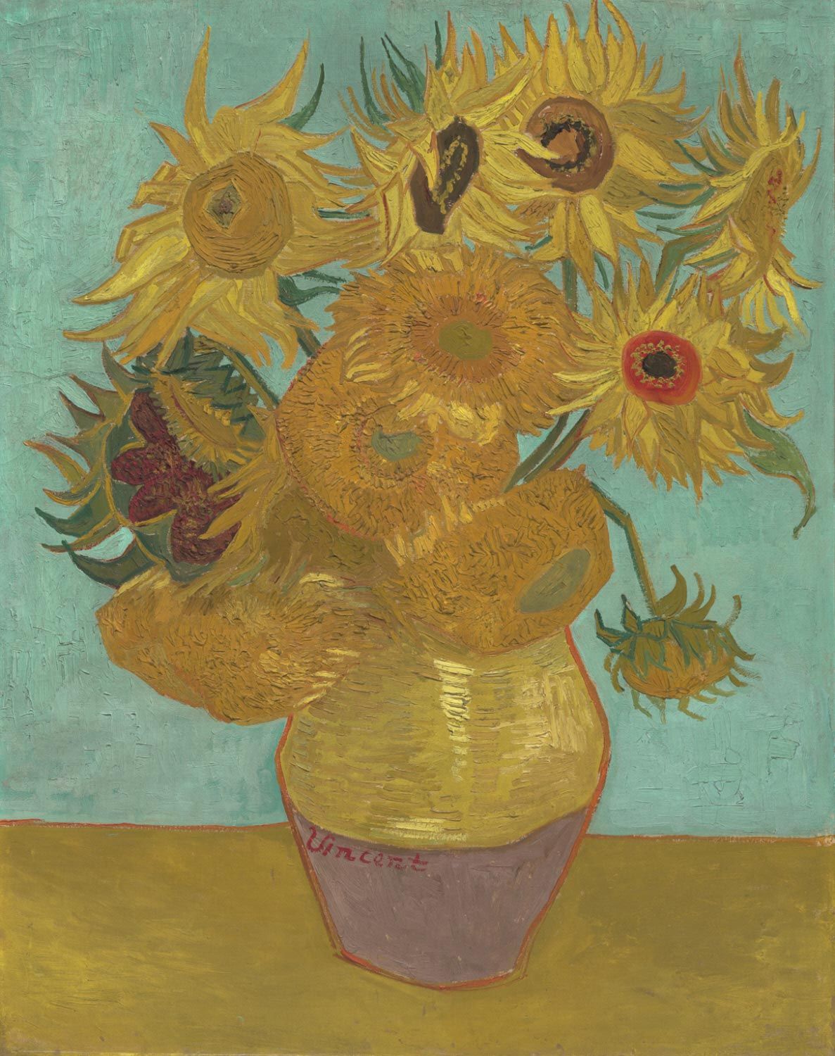
Still life remained popular in the modern art movement. Impressionists like Van Gogh adopted flower vases as their subjects and apples, wine glasses and water jugs became very popular as subjects.
Contemporary Art
Now in the 21st century still life has taken on another new style called hyperreality, which is a contemporary twist on still life. This is either done through really realistic paintings or photographs.
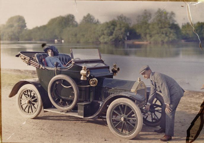
Autochrome colour photography was developed in 1903 by the Lumiere brothers in France, and involved the process of creating a filter from placing tiny starch potato grains onto a sheet of glass, and dying them red, blue and green (with black charcoal being used to fill in the gaps between the colours), before coating the entire sheet with an emulsion. The 3 primary colours, when subjected to light, would create a range of different colours which would reflect the accurate colours of a real life object. In order to counteract the blue sensitivity of the emulsion, the exposures were made using a yellow filter, giving the final image it’s distinctive slightly yellow tone.
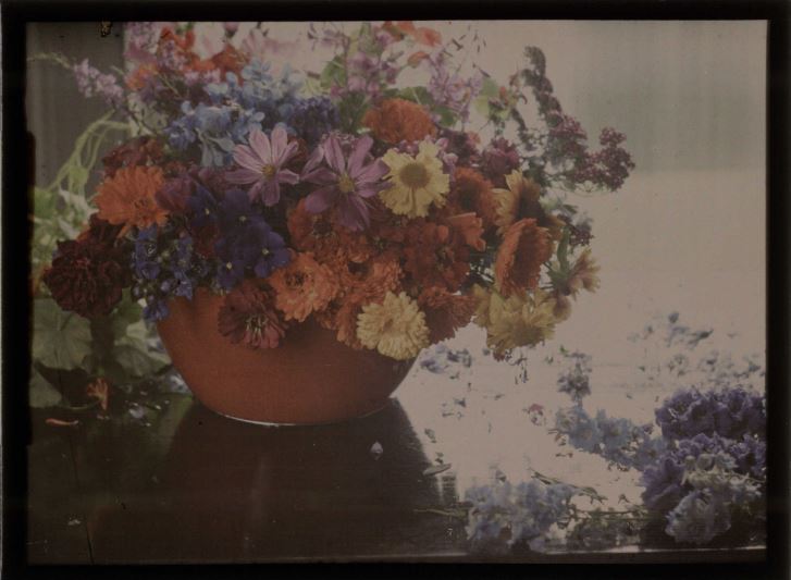
Source: Anon, Couple with a motor car, c.1910, auto-chrome, notice the slightly yellow undertones caused by the yellow filter. Source: Baron de Meyer, Flower study, 1908, autochrome – this image is a reflection of the type of subjects that were often used in the early days of auto-chrome photography, including fruits, flowers and vases.
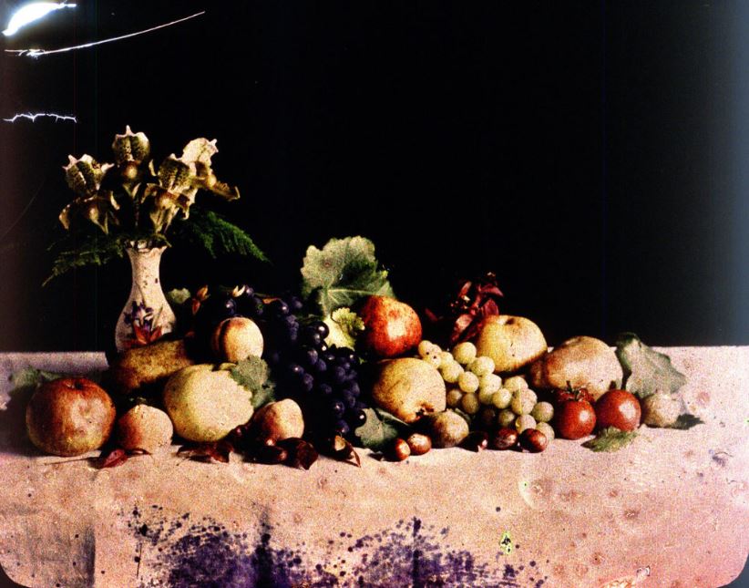
The first colour image taken in Jersey was produced by the founding father of Societe Jersiaise, Emile F. Guiton, in 1904. Guiton was an enthusiastic amateur photographer, and made use of the newly developed Autochrome technique to produce coloured images of vases, flowers and fruits.
Emile F. Guiton, early 1900’s – this auto-chrome is an experimentation by Guiton to look into the ways colour interacts within an image.
The ability for photographers to take coloured autochrome images was revolutionary, and many people commented on the depth of the images along with the vibrance of the colours. in 1908, the Photographic News was quoted as saying:
“when the effect of relief is joined to a life-like presentation in colour the effect is quite startling in its reality. It is not easy to imagine what the effect of anything of this kind would have been on our ancestors and witchcraft would have been but a feeble, almost complimentary term, for anything so realistic and startling“
This quote reflects the opinions of photographers towards the development of the auto-chrome, and allows for us to grasp an understanding of how revolutionary it was that photographers could now take images and photographs in colour that almost perfectly reflected real life. A huge difference from the common black and white photography.
As a result of this trade with far-flung places and the introduction of exotica, Dutch artists of the 17th Century became renowned for being greatly concerned with what Kahr refers to as a: ‘close scrutiny of the natural world.’[1] This, combined with their preoccupation with perspective and the study of light, provided the basic elements of Still Life painting. The term had come into general usage in mid-century, Still Life being the carefully composed portrayal of inanimate objects. Living creatures were in fact allowable as long as they were incidental to the main theme. Specialisation was a notable feature of Dutch 17th century art; consequently, Still Life - itself a particular aspect of art - further diversified into different categories.
‘Breakfast with Crab’ by Willem Claeszoon Heda (1594-1680)
This scene would be described as a small breakfast or ‘ontbijtje’ which is a particular genre in the Dutch 17th century still life painting scene. This could also be described as a vanitas painting as it features dead animals. Holland is by the sea, which makes seafood a lot more accessable. Seafish such as shanker crabs and lobsters connote that a person is wealthy, as they were a highly desireable food. Although, the death within the paintings have an indexical meaning that wealth is transient and won't last forever. In the 17th century, some people did have fish for breakfast, however a vast majority mainly had bread and cheese, which carries on into the 21st century.

The bread in the painting is also a signifier for wealth, as white bread was associated with the wealthy. The less fortunate (the poor) ate either rye bread or porridge.

The peeled lemon is actually a symbol that represents deceptive appearence. It is to show that although a lemon is beautiful on the outside, it is sour and malicious on the inside. It is a warning to its viewers that although some men and women can be beautiful and seem innocent on the outside, there can be corruption and harm from within.
Still life images typically consist of fruits, flowers or household objects. The image captures a staged assortment of objects, placed to simply show them off or to have a hidden meaning.
17th Century Realism:
During the 17th century, still life painting were an emerging genre in Dutch culture. These paintings were known for their realism and ability to show off the objects in them. Since painting was still an art for the wealthy, many still life images from this time were commissioned by the rich to show off their wealth and economic success.
Banquet Still Life, Adriaen van Utrecht, 1644
Vanitas:
However, the Dutch also used still life to communicate a slightly more morbid message. Vanitas paintings are easily recognizable by the presence of a human skull in the image. These painting aimed to convey the consequence of vanity and giving in to pleasure. Symbols of death greatly contrasted those of riches in other still life paintings.
Cookmaid with Still Life of Vegetables and Fruit c.1620-5 Sir Nathaniel Bacon
Sir Nathaniel Bacon did not paint professionally but he was a skilled amateur artist. The cook maid surrounded with lavish produce, usually associated with Dutch and Flemish art, is unusual in England for the period. The painting is quite unusual for British art of this period since it shows a lavish still life. Still life paintings became established in Britain in the late seventeenth century.
Every item depicted in the image is known to have been growing in England. Although every item represented in the painting was grown in England, not all would have been in season. According to a letter, Bacon was growing melons at his estate in East Anglia, and was known to have a keen interest in horticulture. The painting reveals the artist’s interest in gardening which was becoming increasingly fashionable during this time period.
His wealth let him paint for his own pleasure. We know that Nathaniel Bacon travelled in the Southern Netherlands during this period and that paintings of cook maids were prevalent in the southern Netherlands in the late 16 Century and early 17th Century. He may have travelled there, trained there and become accustomed to this compositional style while he was there.
The subject most likely would have had erotic connotations. The large amount of ripe melons surrounding the cookmaid echo her cleavage.