Origins and Definition of Still Life:
Still life paintings have technically been around for thousands of years. The earliest examples of still life paintings were by cavemen dating back toA still life composition is a work of art depicting mostly inanimate subject matter, typically commonplace objects which are either natural or man-made. The art style often uses symbolism and meanings hidden within the image. Still life images should rarely be taken at surface value.
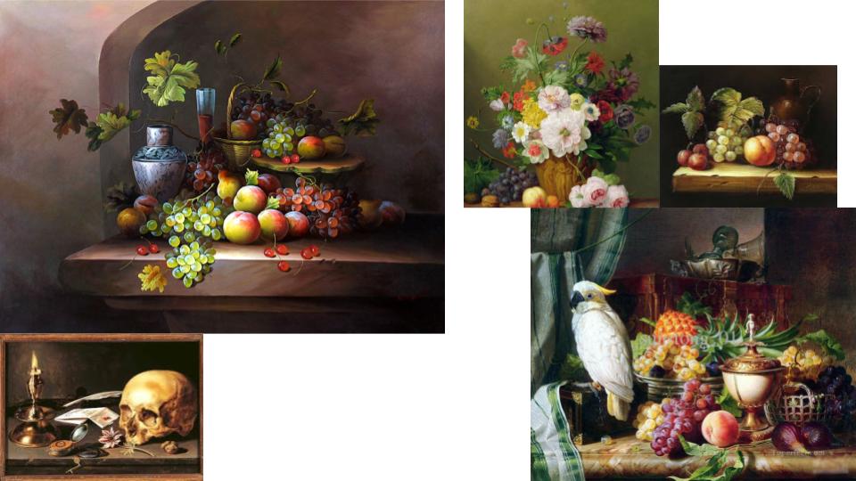
Dutch artists of the 17th Century became renowned for being greatly concerned with ‘a close scrutiny of the natural world.’ This, combined with their preoccupation with perspective and the study of light, provided the fundamental elements of Still Life painting. The term had come into general usage in mid-century, Still Life being the carefully composed portrayal of inanimate objects, such as: fruits, flowers, skulls and other prestigious objects. Living creatures were able to be incorporated as long as they were incidental to the main theme. Still Life, in itself a particular aspect of art, further diversified into different categories.

The Distinct Categories:
The earliest examples, from the beginning of the 1600s and later influenced by ‘tulip-mania’, were the popular floral paintings. These were followed by flowers with fruit, then the humble ‘breakfast pieces’. As the century progressed, and wealth became widespread, so the ‘breakfast’ developed into the ‘banquet piece’, depicting large quantities of high end food and delicacies. Another important facet of Still Life called ‘Trompe L’Oeil’, French for ‘deceive the eye’ – evolved in the mid-century from the game piece and its illusionist appeal to the Dutch. Finally, at the latter part of the century, taste changed, colour and form became more baroque.
Flower Pieces:
Just as painters specialised in different aspects of art, certain towns became the focal points for specific genres. Dutch cities such as Middelburg, Utrecht and Amsterdam were the main centres for flower painting, a genre that was highly regarded and very well paid. The artists, although portraying genuine flowers, depicted them in impossible arrangements such as blooms from all four seasons were shown at once, reflecting the studio practice of painting individual flowers, in season, as studies for future reference. Flowers were accurately detailed without the overlapping that would happen naturally in a vase arrangement. Flowers were ciphers for spring but there was also an evolving symbolism in the language of flowers that was accessible to contemporary viewers. For example the Madonna lily was an attribute of the Virgin Mary, the white iris a symbol of her purity and the rose, of her love. A daisy meant charity, a buttercup represented the unmarried , and the sunflower represented the love of God, or sometimes love of the earth. Some artists presented their work as so-called ‘niche’.

Fruit with Flowers:
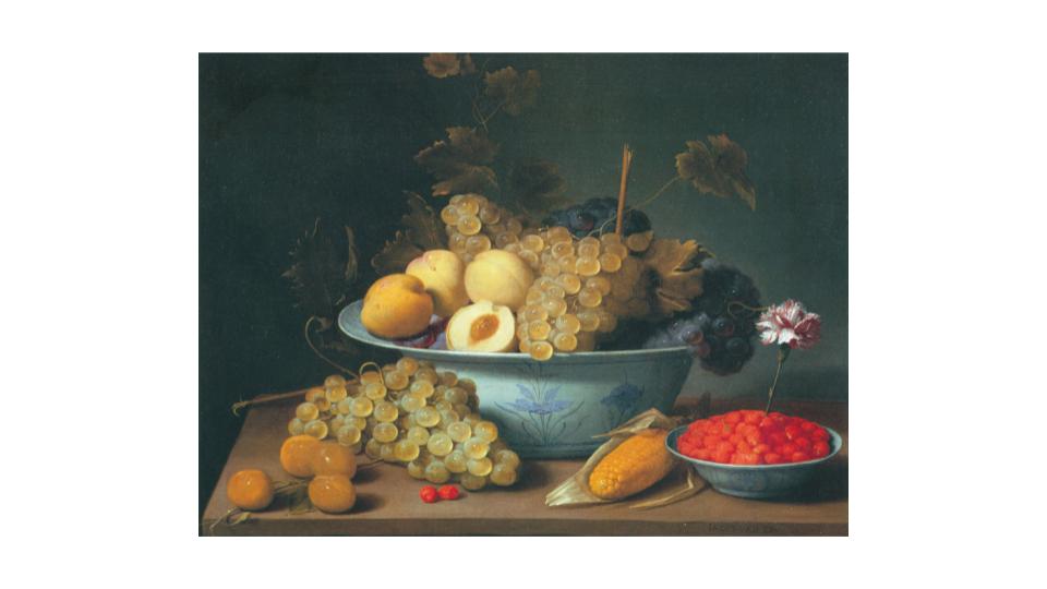
Symbolism was highly present at the time in objects such as exotic fruits and shells brought back by trading merchants. Shells had particular appeal to a nation governed by the sea and, with fruit, were often displayed as part of floral compositions. Fruit had a religious message; the apple of temptation, the grape the blood of Christ; and a different shell might represent each continent as visual tribute to the geographic and scientific discoveries of the day.
Breakfast Pieces:
With the introduction in Haarlem and Amsterdam of the Ontbijtje, the Breakfast Piece, the format changed to landscape to accommodate the expanse of a tabletop. Placing the table edge parallel to the horizon, with the table-cover dropping markedly downwards, enhanced the impression of space. The food illustrated was basic – bread, cheese, fruit, nuts, herring – and often presented half eaten for realism. The cutlery and dishes of pewter or pottery were equally simple but skilfully painted. In earlier breakfast pieces, the viewer is looking downwards onto the table, but as the century progresses, the viewpoint is lowered. Like the flowers, the objects were carefully spaced and by the 1620s were projecting over the table edge, creating an illusion of nearness to the viewer. By the 1630s these bright colours were becoming more monochromatic.
