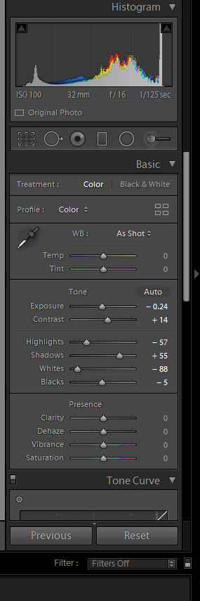
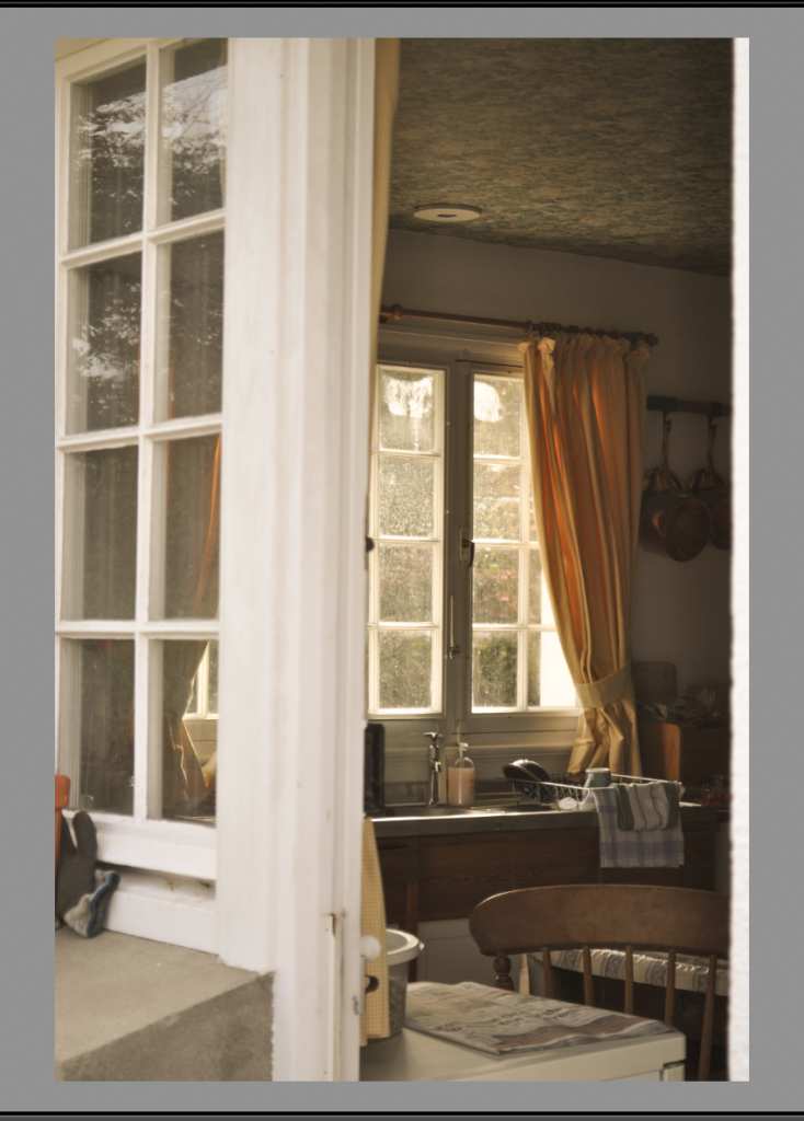
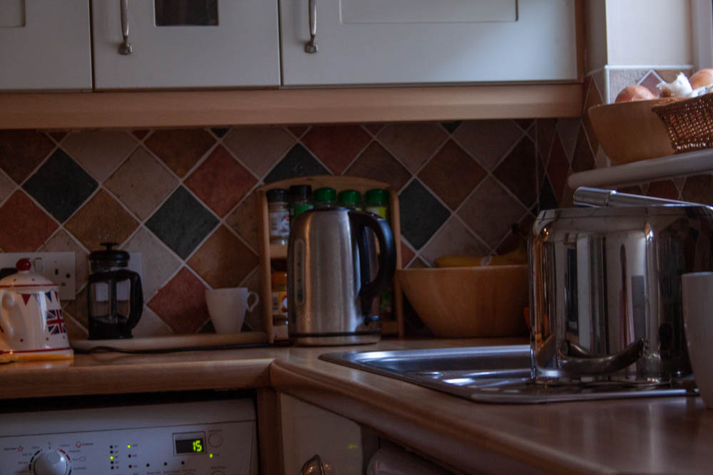
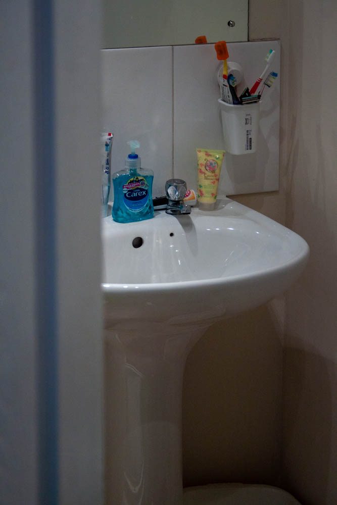
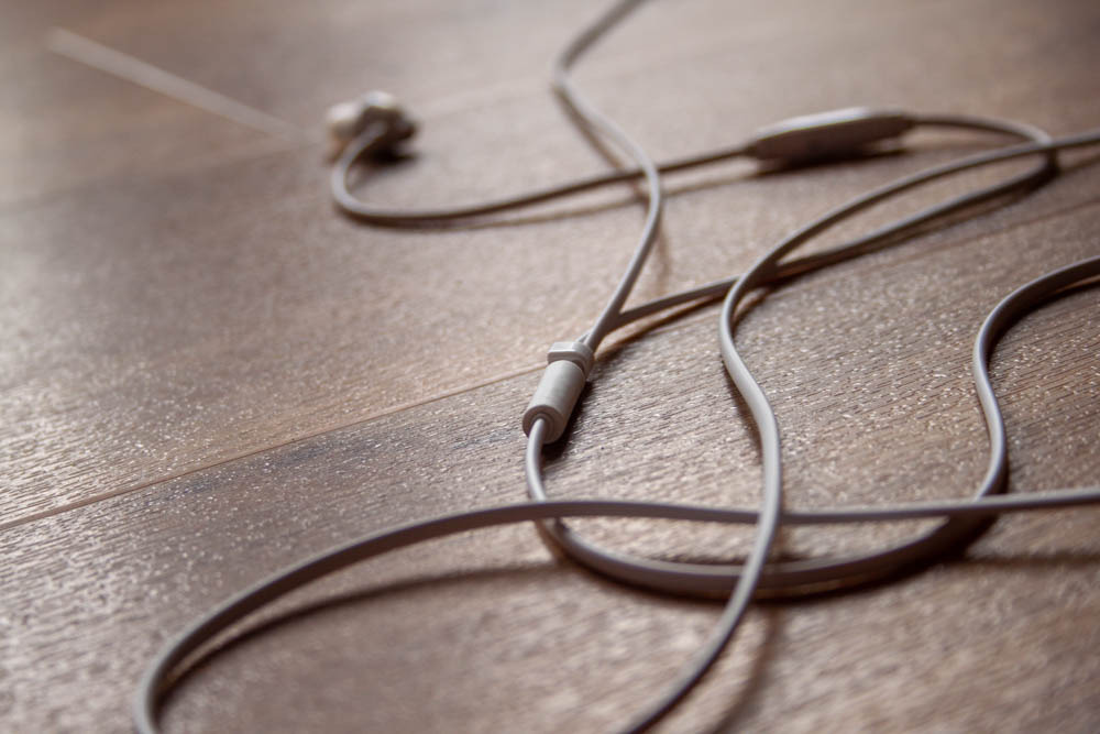
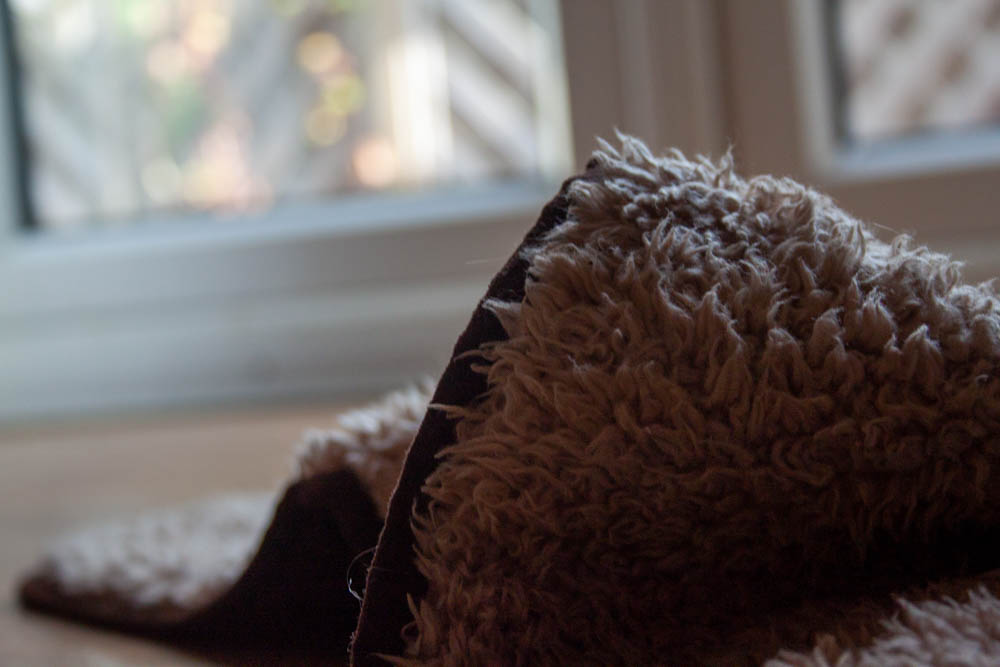
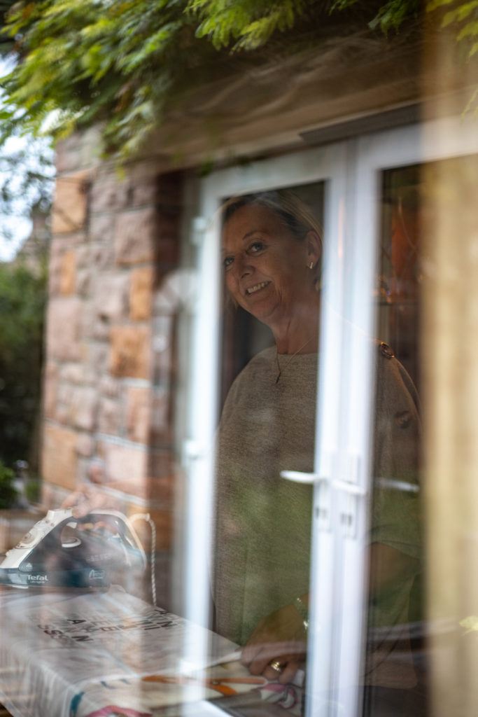
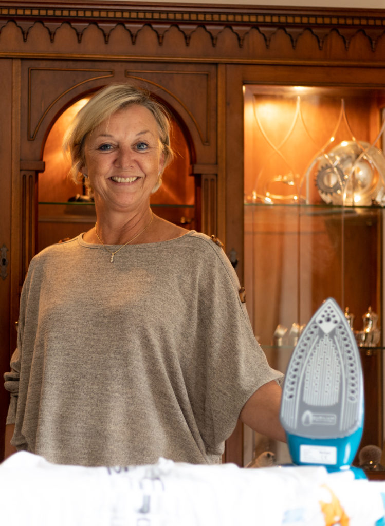
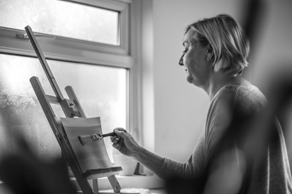
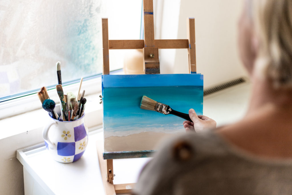
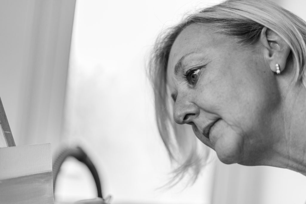
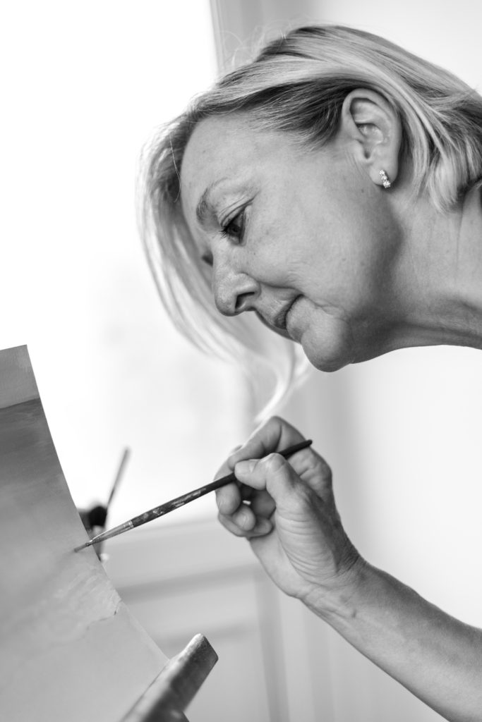
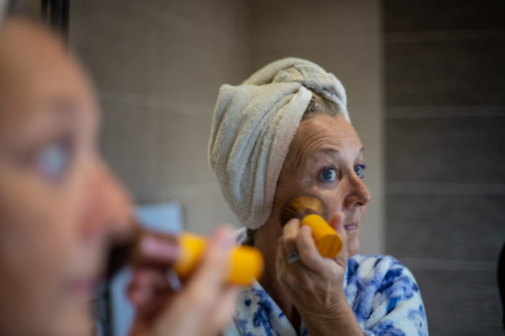
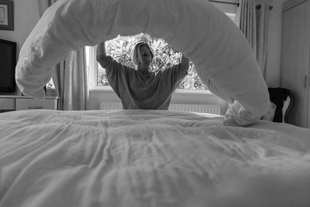
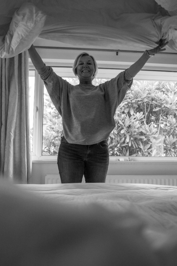
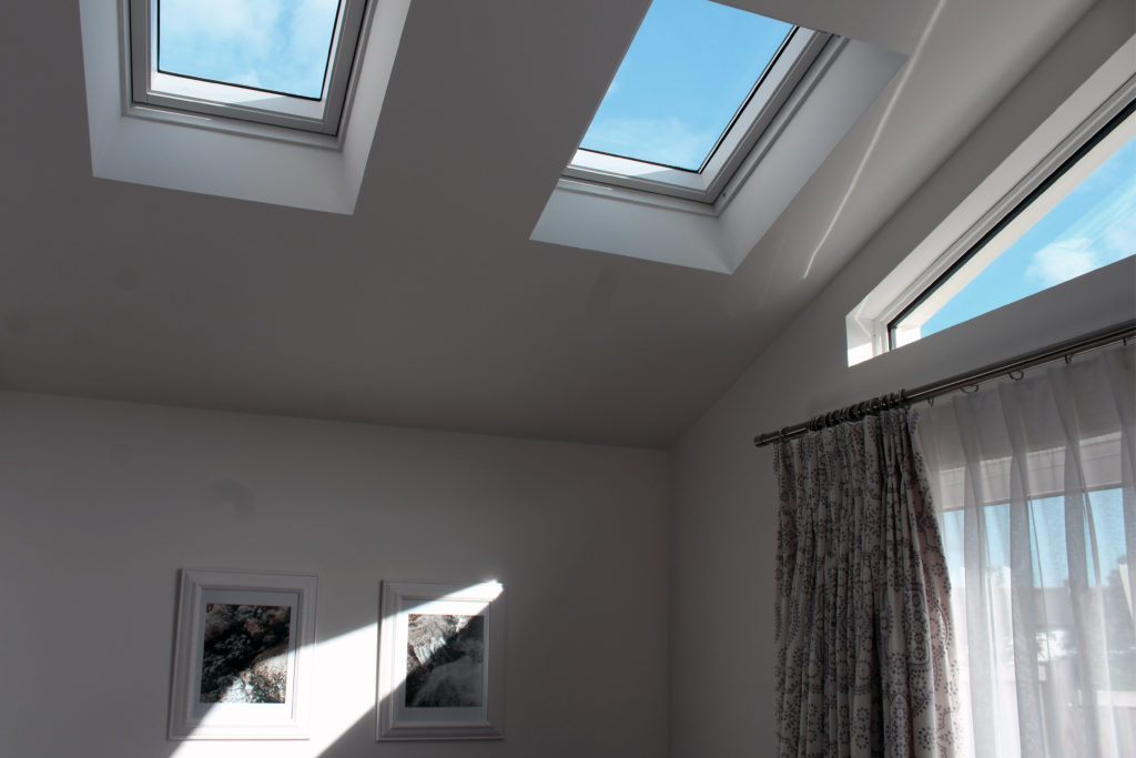
My goal for creating both environmental and candid portraits is to show the some of the subjects personality using different environments and Mise-en-Scene to add to the backgrounds of the subject. I also found that personally, i think that a home is made by the people who live there, not the rooms or objects that surround them, which is why i decided to take many of my images focusing solely on the subject, using a telephoto lens for many of the images to throw out the background to further emphasize my viewpoint.
I manipulated this image in editing so that the door frame is completely vertical, despite this making the wall in the centre of the image slightly slanted. The image was taken with the idea of having two halves of the image; One plain and one full of tones and textures that are lacking in the opposite side.
Visual:
This photograph has two clear halves; the plain white wall and the door, frame and hanging items of clothing. The white wall however, isn’t completely white. Due to the reflection of the light passing through a sky light window there are warm tone and cool tone patches, creating an interesting beaming effect on the wall. The other half consists mainly of black, white and grey items of clothing, which break up the image. The multi-tone dress in the centre of the door is the focal point of the entire image, helping to add texture and an interesting pattern.
Conceptual/Contextual:
The concept behind this image and the entire ‘Home-Sweet-Home’ photoshoot was to shoot my house in quite a simple, cool tone yet visually (aesthetically) appealing way. For this reason I decided to photograph an array of dull clothes and a slightly colourful reflection of sunlight to create a balanced yet contrasting image.
TECHNICAL: The image was taken in black and white, The writing and the logo is the main focus of the image which is centered on the right of the image, these are in bold, which then creates the audiences attention.
VISUAL: In the image you can see Francis foots, Wife and child, but also importantly you can see into Pitt street, and the families shop, where they sold records. You can also see in the shop the different types of items they sold in their shops. I get a feeling that this picture is a celebratory of what the family has achieved.
CONTEXTUAL/CONCEPTUAL: This image was taken in 1900s, by Francis foot showing the iconic sign, along with his wife and their child. The iconic sign was put on side of the building because it showed the families business, the sign soon became known as the HMV Sign. The foots family was the first gramophone and record sales. I know that recently the logo has been restored and the store fronts have been decorated. The logo was put on the side of the buildings on Pitt Street and Dumaresq Street
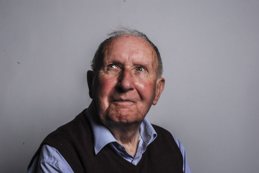
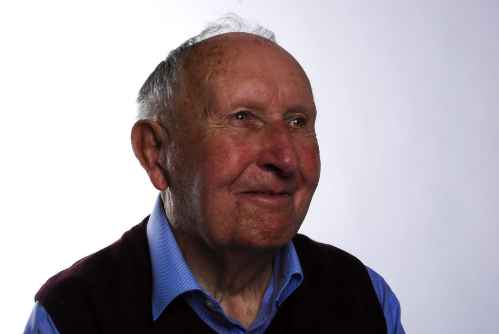
Joan was age six when the occupation of Jersey Channel Islands first started and had only been in school two years before hand. She lived in the middle of Jersey, at the highest point (Le Platon) and was an only child. Due to being an only child, she says her parents didn’t baby her at such a young age and she knew the circumstances of the situation the people of Jersey were in. Her living in the north coast of jersey meant that she could see over France and witnessed the Germans settling over in France before deciding to come to Jersey, meaning she was so close to the country that she could hear the bombing going on.
3-4 days before the Germans arrived in Jersey, Joan helped her mother put up white flags in her garden to stop them shooting at the area. June 1940 is when everything started. The family heard the planes come over above their heads which is when Joan met with her five year old female neighbour and they sat in the deserted roads watching the planes fly above them. However, due to their being a rumour that bombing was taking place on Victoria Avenue (St. Helier) Joan’s mother moved the children to under the bushes on the side of the road, sheltered out of sight from the Germans. The three of them sat over night listing to the planes go by, listing to the bombings which she described as being overpoweringly loud and mostly watching the stars in the sky which she found very relaxing.
Living in the highest point of Jersey meant that once the Germans had overtaken Jersey, they then set up base in the area which Joan was living as it was a good point for the Germans so shoot over at France while being able to also see what was coming towards them. Cliffs around the area were also blocked off meaning Joan could no longer play along the cliff edges which she expressed was an activity she used to do a lot. Although the Germans and France were shooting at each other, the germans also used to trade good with them to allow people in Jersey to live. This was the time where ration booklets also came and everyone had to track the amount of food they were buying, and the shop keepers could see the amount that they were allowed to be given. Depending on your occupation depended on the amount of food you got. Joan’s mother cheated at this system and registered her occupation as being a farmer as there was a farm next door to her house, this was believable and allowed the family to get 5grams more of food. The dates people bought food was also noted in these booklets in small squares in the top right hand side. The amount of food being given was no where near enough to last people a week and meant that people started to grow crops, sometimes illegally.
At this point in time the Germans introduced rules to keep the islanders in line, the first being a military zone which meant islanders couldn’t go on beaches. The curfew time was also brought in where in summer everyone had to be home by 10pm and in winter 9pm, no one was allowed out the house until 6am the next day creating restricted movement and allowed the germans to do whatever they lived during this time. During this time blackouts were also happening and everyone had to black out their windows with cardboard to stop any light shining to the outside at nighttime. All radios and other electronics had been taken away to stop people knowing what was happening at this point as well.
The brits are known for liking their tea, and of course there was no rations of tea being given out meaning people had to make their own. This consisted of grating parsnips which people grew, oven baking the parsnip until brown and then pouring hot water onto the parsnip which made a tea favour. If you wanted to buy supplemented off other people you had to use the new German phennings which was money at this point.
Coming back onto people growing their own crops, farmers were told how much they were allowed to grow which was a very restricted amount and kind of made no point of every growing stuff in the first place. They also couldn’t cheat this system as the Germans kept a very close eye on how much everyone was growing. Joan said most people kept to the rules (95%) but the other 5% were punished if not staying in line.
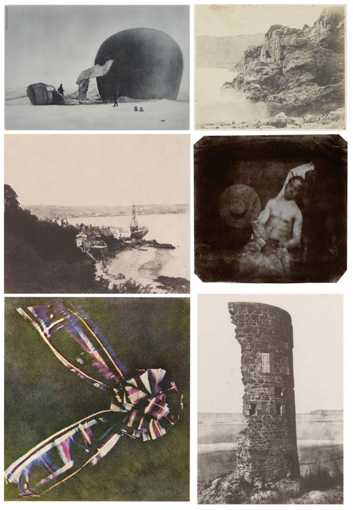
In 1859, Sutton developed the earliest panoramic camera with a wide-angle lens. The lens consisted of a glass sphere filled with water, which projected an image onto a curved plate. The camera was capable of capturing an image in a 120 degree arc.
In 1861, Sutton created the first single lens reflex camera. Sutton was the photographer for James Clerk Maxwell’s pioneering 1861 demonstration of colour photography. In a practical trial of a thought-experiment Maxwell had published in 1855, Sutton took three separate black-and-white photographs of a multicoloured ribbon, one through a blue filter, one through a green filter, and one through a red filter. Using three projectors equipped with similar filters, the three photographs were projected superimposed on a screen. The additive primaries variously blended to reproduce a gamut of colour. The photographic materials available to Sutton were mainly sensitive to blue light, barely sensitive to green and practically insensitive to red, so the result was only a partial success. Forty years later, adequately panchromatic plates and films had made excellent colour reproduction possible by this method, as demonstrated by the work of Sergey Prokudin-Gorsky. The principle of reproducing a full range of colour by three-colour analysis and synthesis is based on the nature of human colour vision and underlies nearly all practical chemical and electronic colour imaging technologies. Sutton’s ribbon image is sometimes called the first colour photograph. There were, in fact, earlier and possibly better colour photographs made by experimenters who used a completely different, more purely chemical process, but the colours rapidly faded when exposed to light for viewing. Sutton’s photographs preserved the colour information in black-and-white silver images containing no actual colouring matter, so they are very light-fast and durable and the set may reasonably be described as the first permanent colour photograph.
CRITICAL ANALYSIS:
VISUAL:
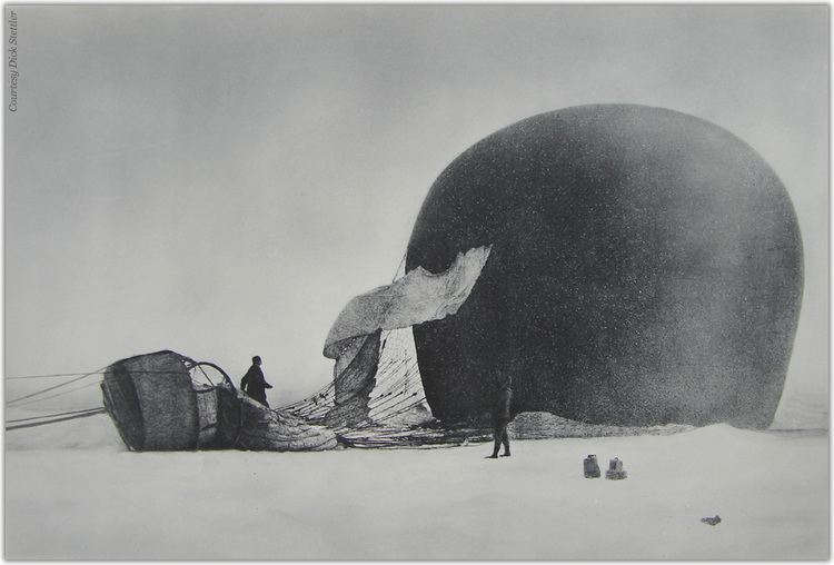
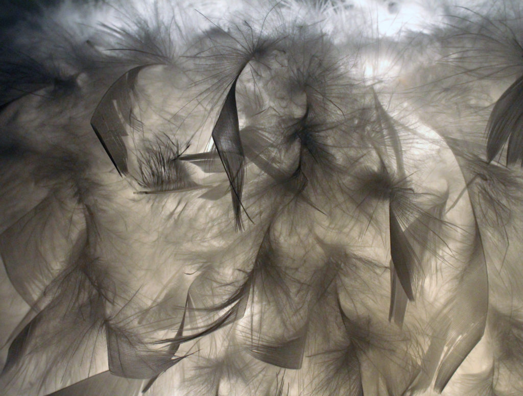
In the image above, the initial feeling which I get is dystopia and war through the very plain background and black and white color scheme. The ripped fabric which is flowing in the wind also portrays this, it gives a flow to the photo leading from the hot air balloon basket to the actual balloon on the right hand side of the image. There is no clear understanding of the location of the image therefore the viewer is kept guessing. The shapes within the image are also very circular and round, giving a sense of pattern and continuity. Due to the time frame of when this photo was taken and the technology available at the time, the image is monochromatic with very little variation in tone or texture. The image is a little grainy, but it adds to the overall aesthetic of historic images. Furthermore, due to the monochromatic nature of the image, the people are left as silhouettes, especially the first man in the back.
TECHNICAL:
In terms of the technology available at the time, the light sensitive paper which was used for the production of this image means that neither color or minor shadows can be produced in the image, resulting in a very flat and one dimensional image. In order to produce clear images, the camera had to be propped up on a tripod to keep it steady and the subjects also have to be very still. In the early 1800s, the camera obscura had become a portable, light-tight box that contained materials and chemicals that would momentarily record the image through the lens. Cameras created in the 1800s were often crafted for looks as well as functionality. For instance, fine woods were used with brass fixtures to showcase the equipment. Wood had the advantage over metal as it was lighter and the camera could be made larger, which would give the photographer more movement and extension. The wood was also exceptional for dampening vibration, which could affect a metal camera and blur the picture. On the other hand, the metal cameras had the advantage of less flexibility for long extensions. The metal cameras could be knocked over with little damage, while the wooden cameras could be shattered if they hit the floor.
CONCEPTUAL/CONTEXTUAL:
Sutton had a workshop and studio in St Brelade’s Bay from 1848 until it burnt down in about 1854. He was in partnership with the famous French photographer Louis Désiré Blanquart-Evrard, who pioneered the calotype (negative and paper print) process in France. Their business was patronised by Queen Victoria’s husband Prince Albert and, according to its advertisements, was founded at the suggestion of the prince, who was a collector of photographs.
Sutton produced the first photographic publication of the island – Souvenir de Jersey – and was a prolific writer on photography. He wrote his Dictionary of Photography, the major work on the subject at the time, in 1858, and in 1867 he and photography lecturer George Dawson produced a revised edition. Sutton’s calotype manual was another often reprinted and updated work that kept its popularity through at least 10 editions.
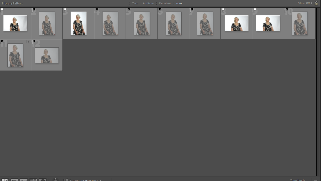
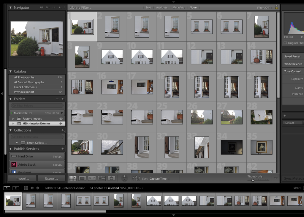
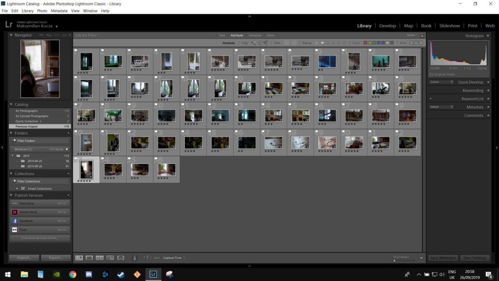
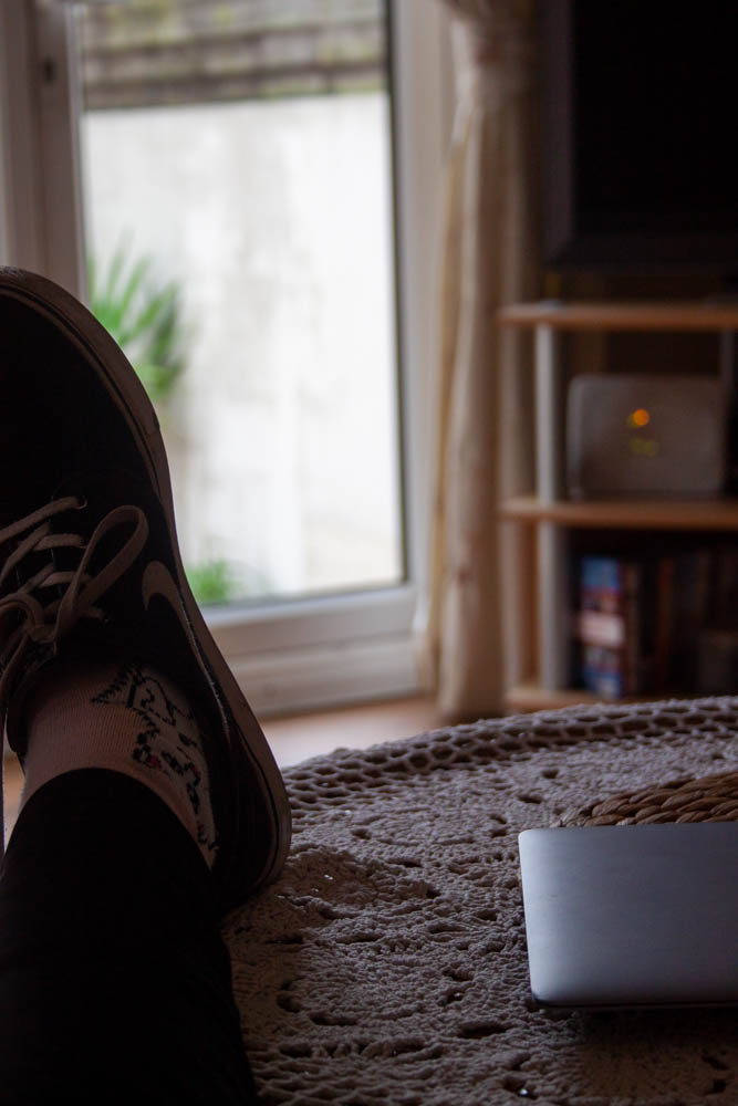
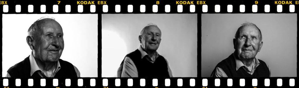
I started this photoshoot in the afternoon hours of the day and then continued on inside when the natural light dimmed. I feel this photoshoot was successful however I feel if I was to give it another go I would take wider shots of some of my interior. Below shows the contact sheet opened in Lightroom after my photoshoot, this includes all of my photographs that I took which I will then go through and flag so that I can experiment with different ones to create the best outcomes possible.
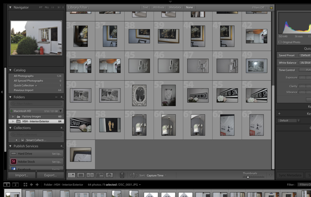
Contact Sheets and refining:
Contact Sheet
Contact Sheet
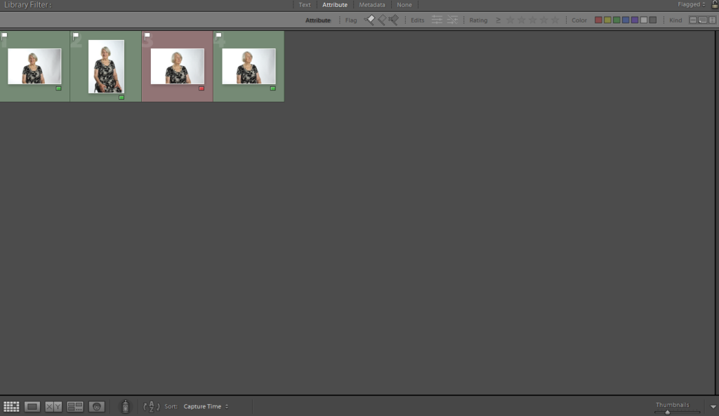
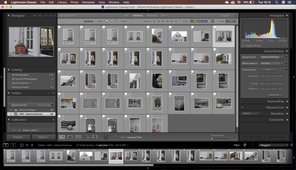
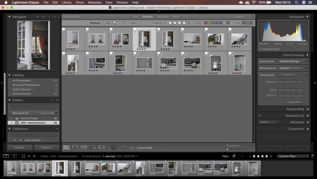
Flagged Photographs
4-5 Star
For my selective process I went through and flagged up all of what I thought would be a first round of best photographs, my really good ones and ones that maybe could get better as an outcome with some editing involved. Next I went through every flagged image only, separated the off and stared them all out of 5 stars, using 3’s and 4’s mostly as a decider of my better images and ones I will not choose to edit. I singled out my 4 star photographs to start looking into editing them and also producing some outcomes that could either be viewed by themselves or as a double or triple display.
Editing:
Editing Process: Colour
Editing Process: Colour
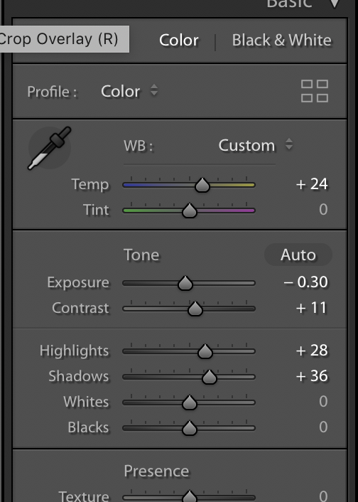
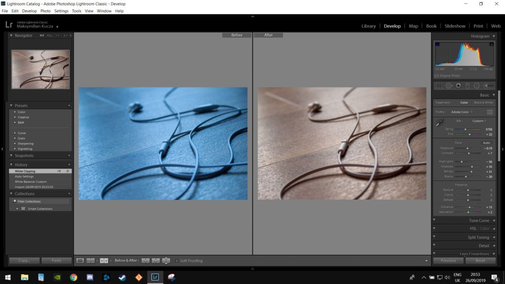
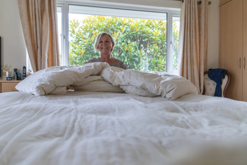
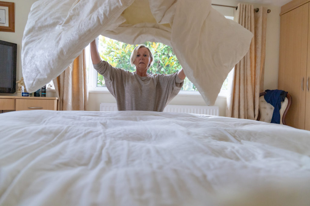
While editing my coloured photographs I knew I wanted to create quite warm-toned photographs, compared to being colder-toned, this is because I personally enjoy warm/yellow light compared to white light and I feel editing to a higher temperature and contrast it helps to create the effect and illusion of warm light and a warm toned image even if it wasn’t there in camera originally due to the time of day maybe. I have chosen to make them warm-toned as I personally feel that it makes me relate to and think of it being more homely and welcoming which I think of with the ideas of Home-Sweet-Home.
Editing Process: Black and White
Editing Process: Black and White
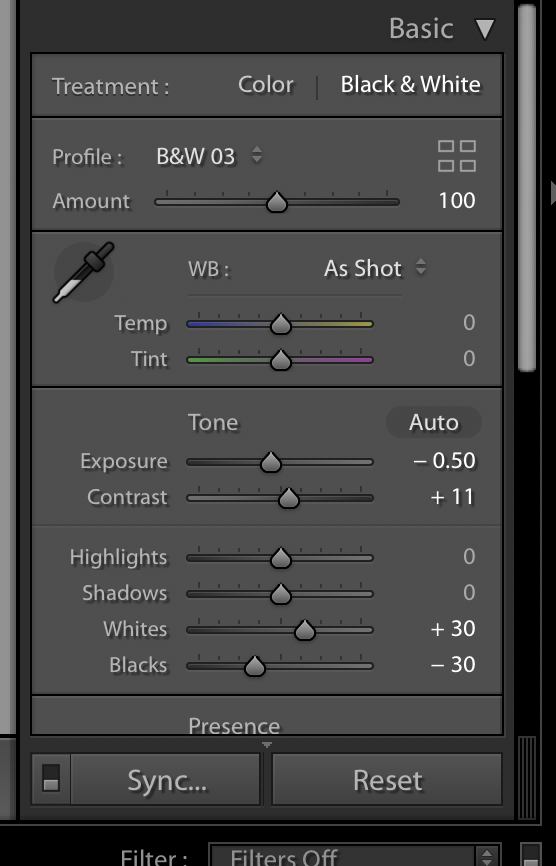
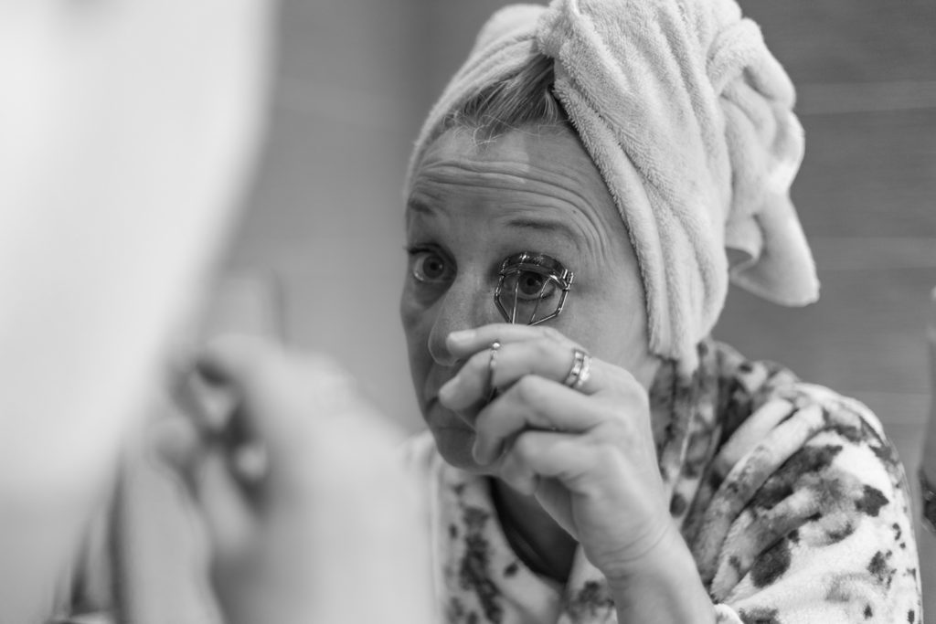
While editing my black and white photographs I used these as a slight experiment, while developing and editing I felt myself preferring the coloured photographs however felt that some of the interior shots that I produced work well in high-contrast black and white which is where I took these experiments along.
Edited Photographs and Outcomes:
I feel that this photoshoot went well, I feel that my exterior photographs went better than my interior shots, however all together I feel they work well and the exteriors help to bring up the interiors.
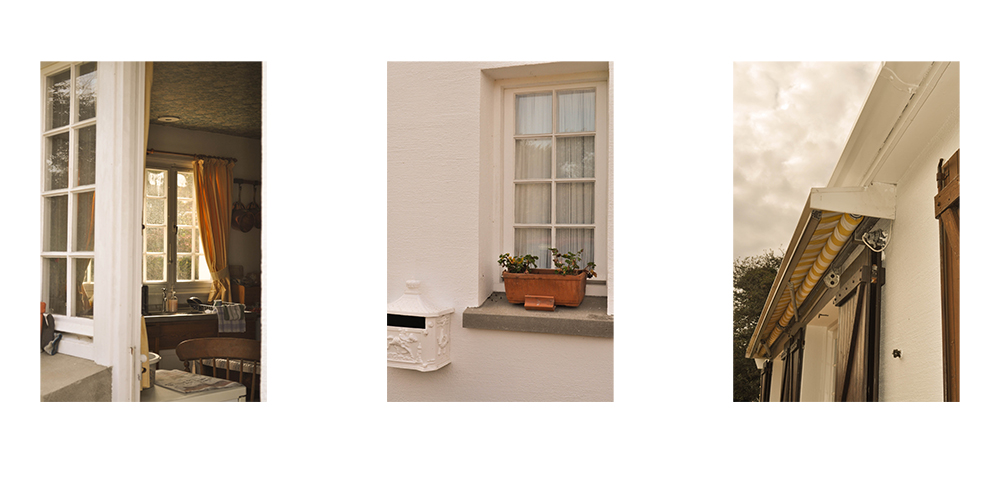
Below I have my personal favourite outcomes from the photoshoot and the editing. I feel they are successful being displayed in a trio together as they are all linked and are following the same warm-toned colour scheme.
This is the result of my first 2 edits bringing the photo-shoot down to 56 images and then further down to 9 images using the rating system
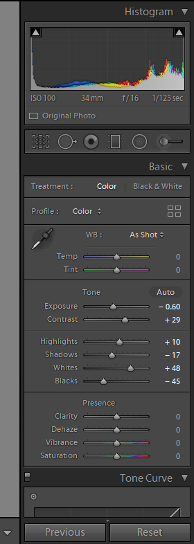
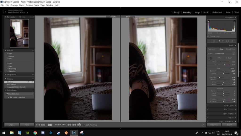
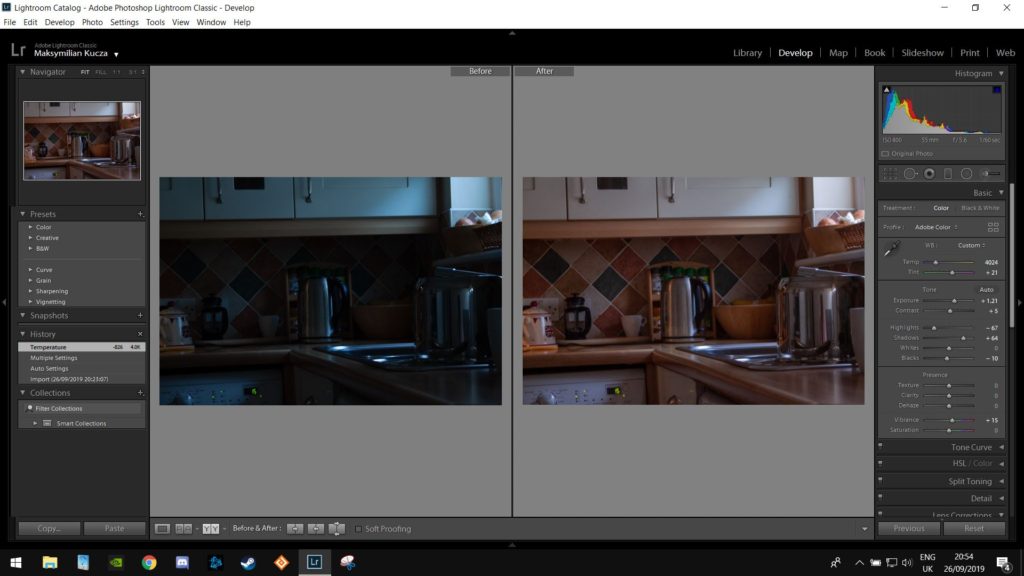
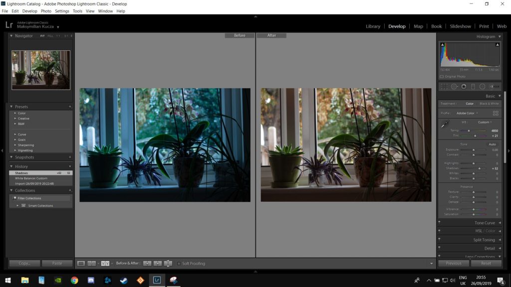
Most of the edits that I made were white balance adjustments as the images had came out very cold, during the shoot I changed the cameras white balance to compensate for this however this was quite far into the shoot and thus most of the images required some form of color correction.
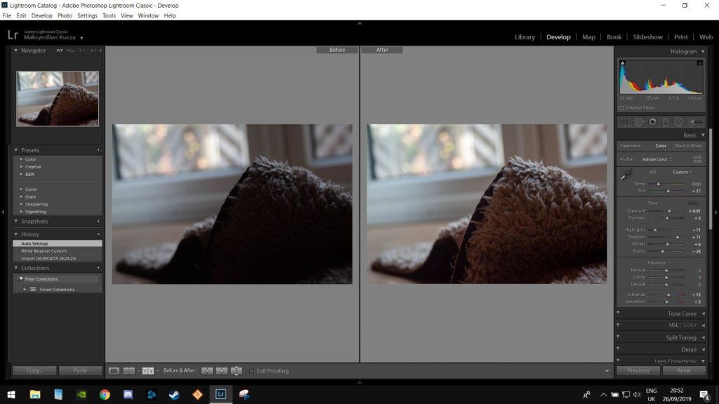
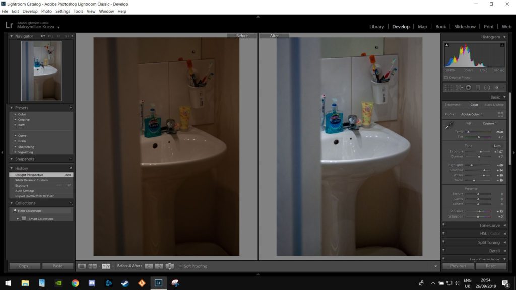
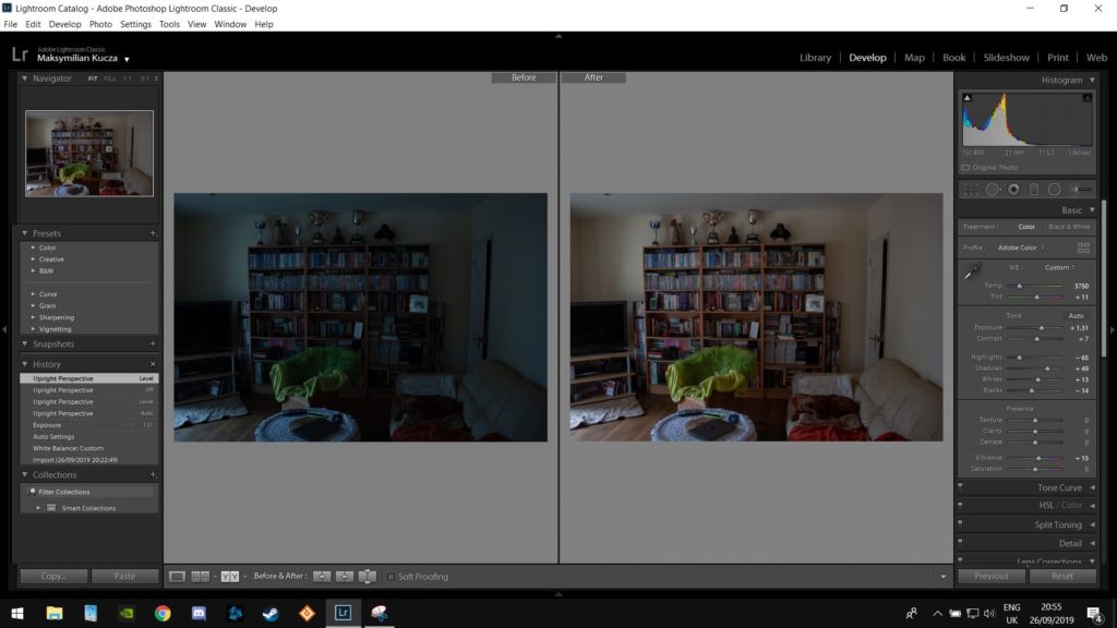
The rest of the edits were mainly compensating for the dark shadows in the images in order to bring some more detail into the compositions.
Most of the images were taken using natural lighting in order to cast more directional shadows.
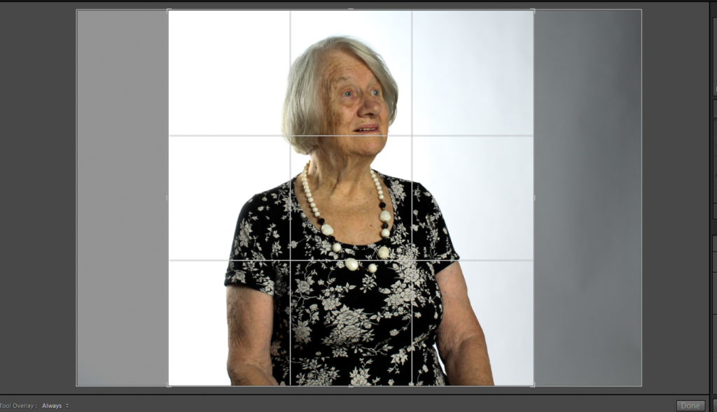
Here the shadows were brought higher in order to show the light reflecting off of the floor. Highlights were then lightly adjusted due to the exposure changes made.
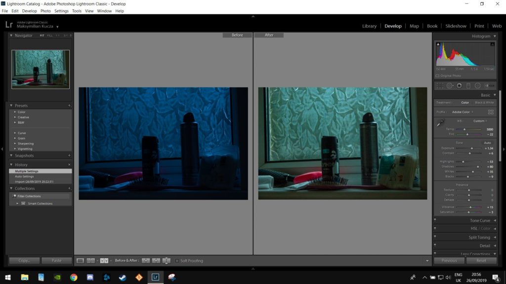
Here the shadows were increased to accent the main subject of the image.
Here the white balance was adjusted to compensate for the cold lighting as well as some adjustments to contrast to bring out more of the details.
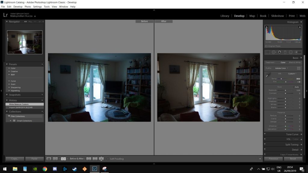
here i adjusted the various levels in order to help extenuate the natural vignetting created by the central light source
Here the shadows were brought up in order to bring out some more detail while not raising them too much in order to preserve the contrast between the shadows and highlights.
Here I adjusted the tint in order to come at this image with more of a stylistic approach.
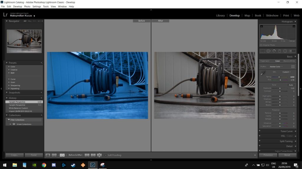
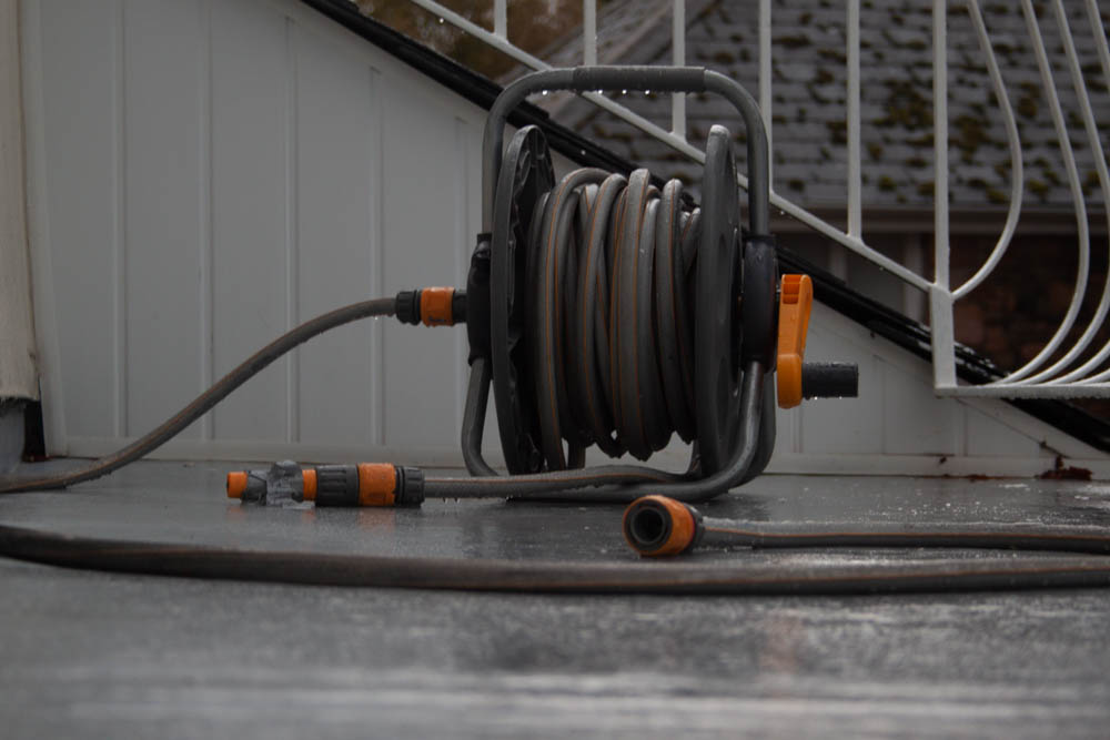
On these 2 images of the hose I tried to accent the water within the images as it helps to bring out details as well as bring in some more highlights.
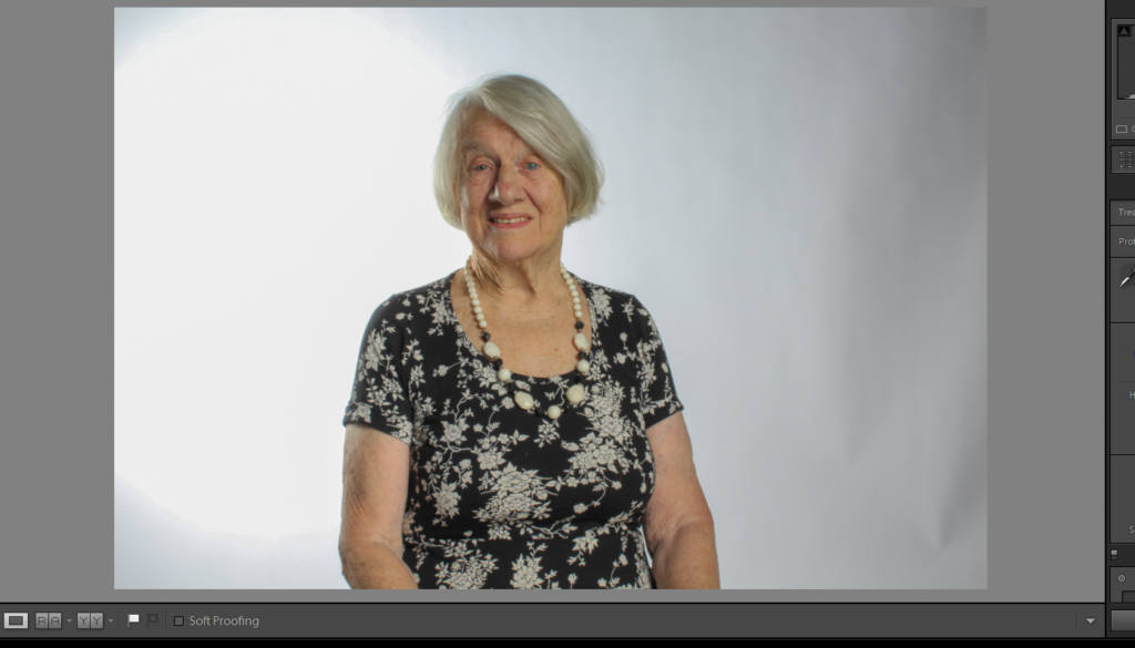
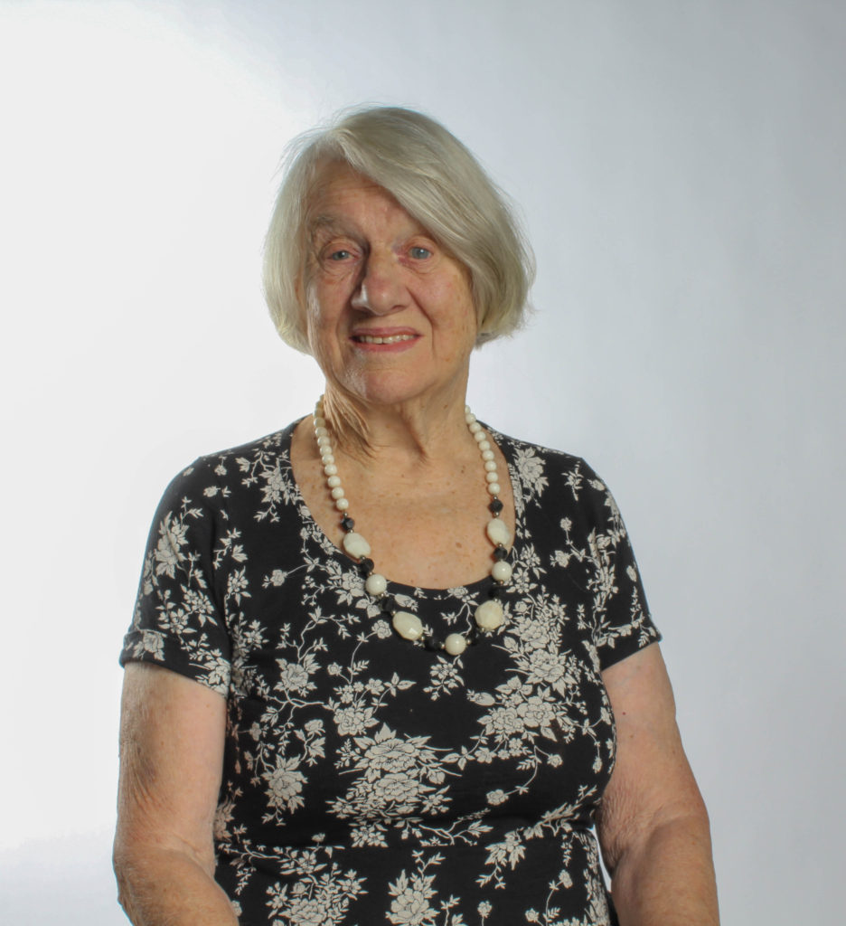
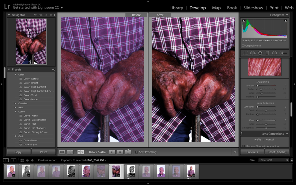
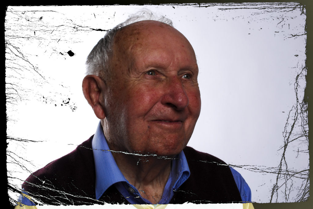
The rational behind my further exploration was that I wanted to explore different ways in which I could change one of my Bob Le Sueur images, in order to create different effects. I looked at experimenting with different tools on Lightroom in order to explore the effect they give, and how they compliment other effects. I then also looked at making the photograph more contemporary, in a photomontage style, in order to create a new conceptual meaning towards my work. Within this piece of work I selected my three top images, based on camera technique and overall ascetic of the photograph, and created three different edits for each one showcasing this exploration.
Photograph 1 Edit Exploration:
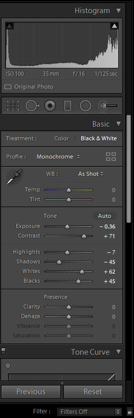
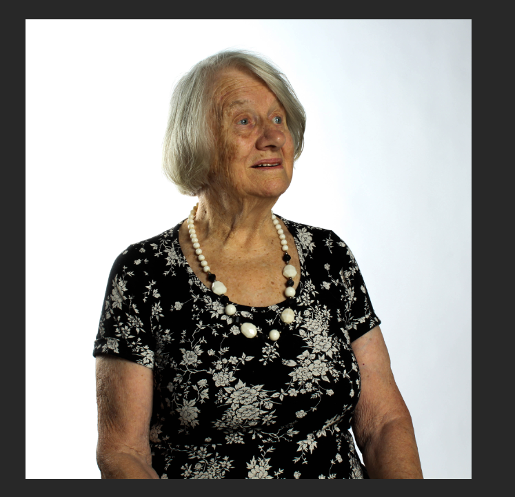
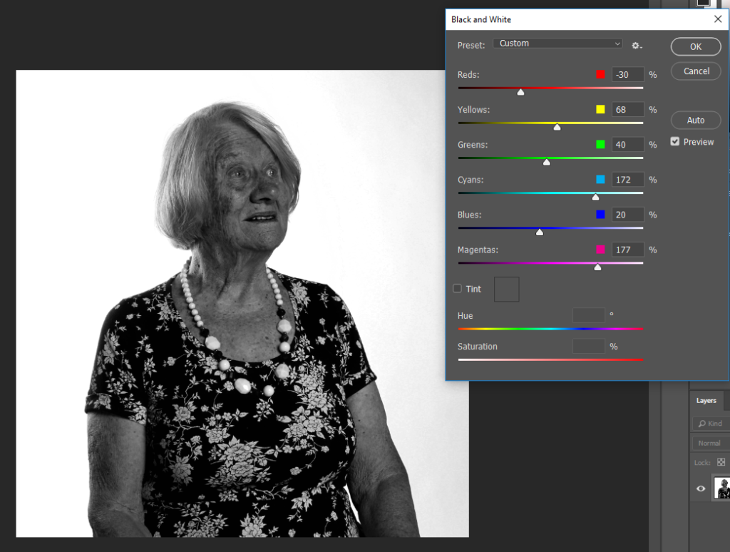
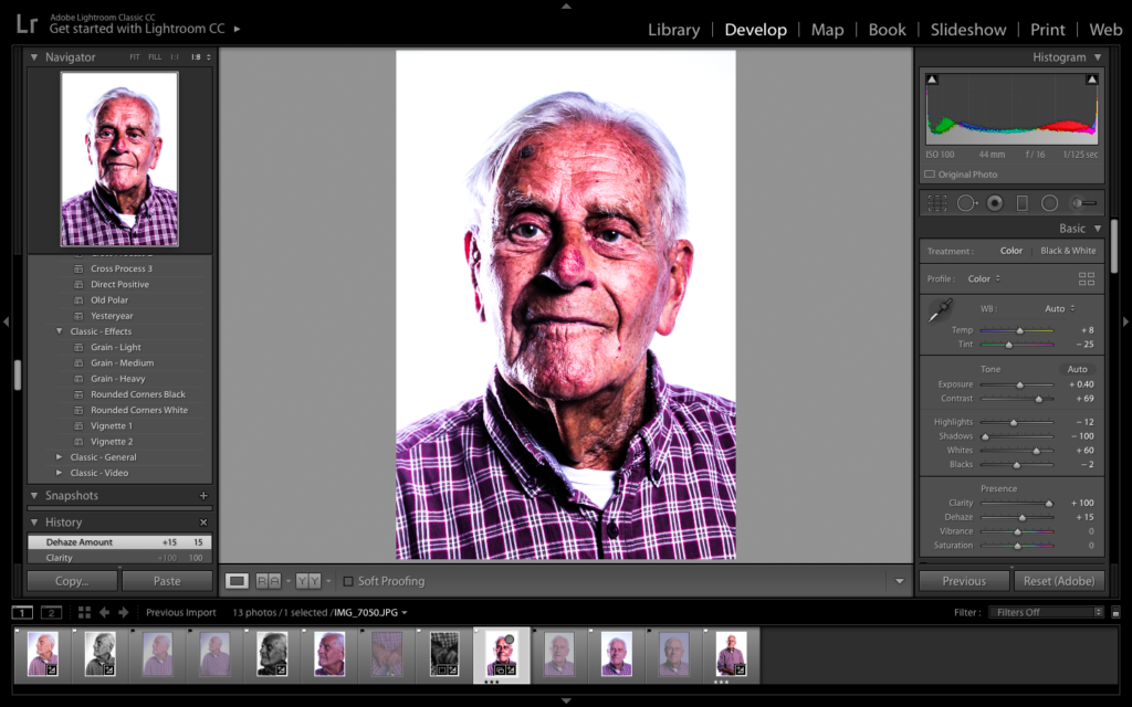
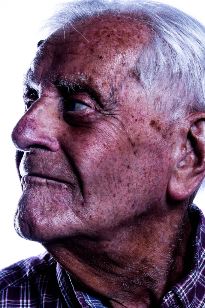
For my first edit, I decided to make a colour edit which allows the formal element of Colour and Texture. To make this photograph work, I decided to allow the structure and clarity of the photograph to be strong. I also decided to add in vignetting allowing the corners to be darker, forcing my subject to be the main focal point within the photograph. I believe this edit is successful due to the warmth presented with the lighting, as well as the detail on the skin, helping to present the contextual and conceptual elements of the photograph.
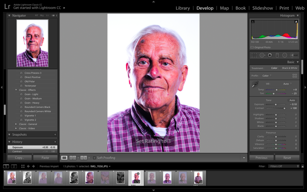
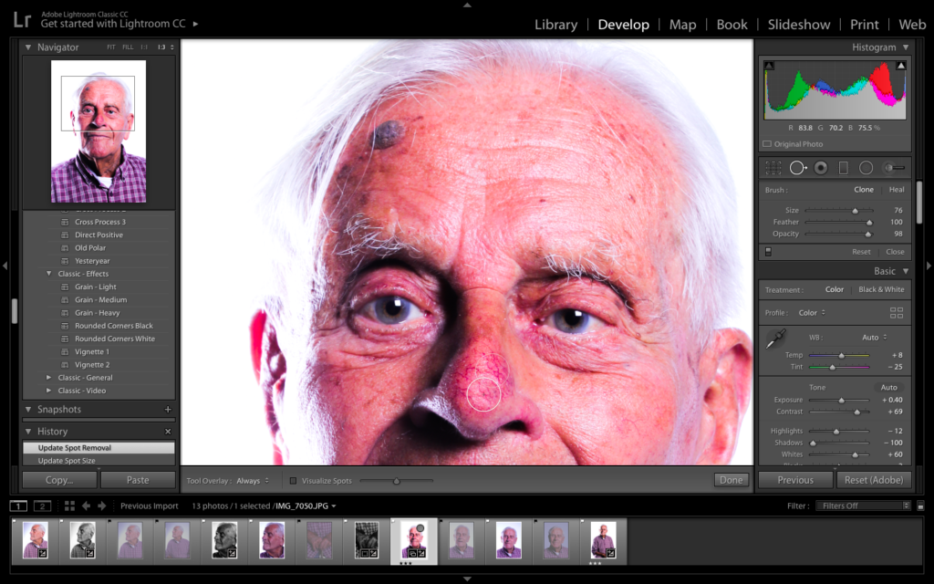
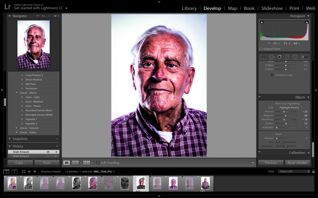
Picture Guide To how Edit was Achieved:
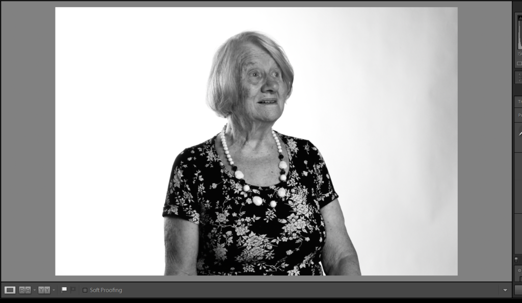
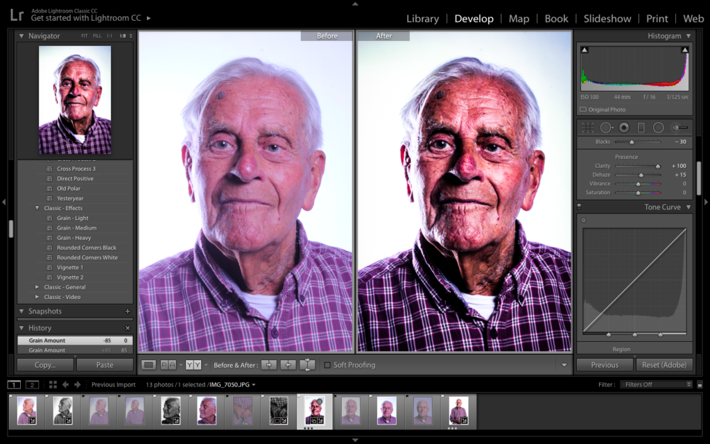
Comparison of Original and Edit
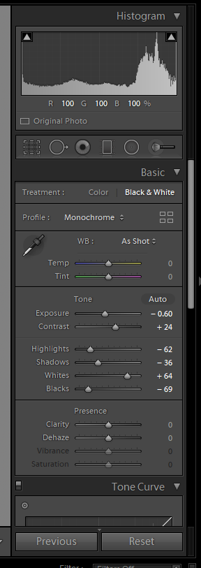
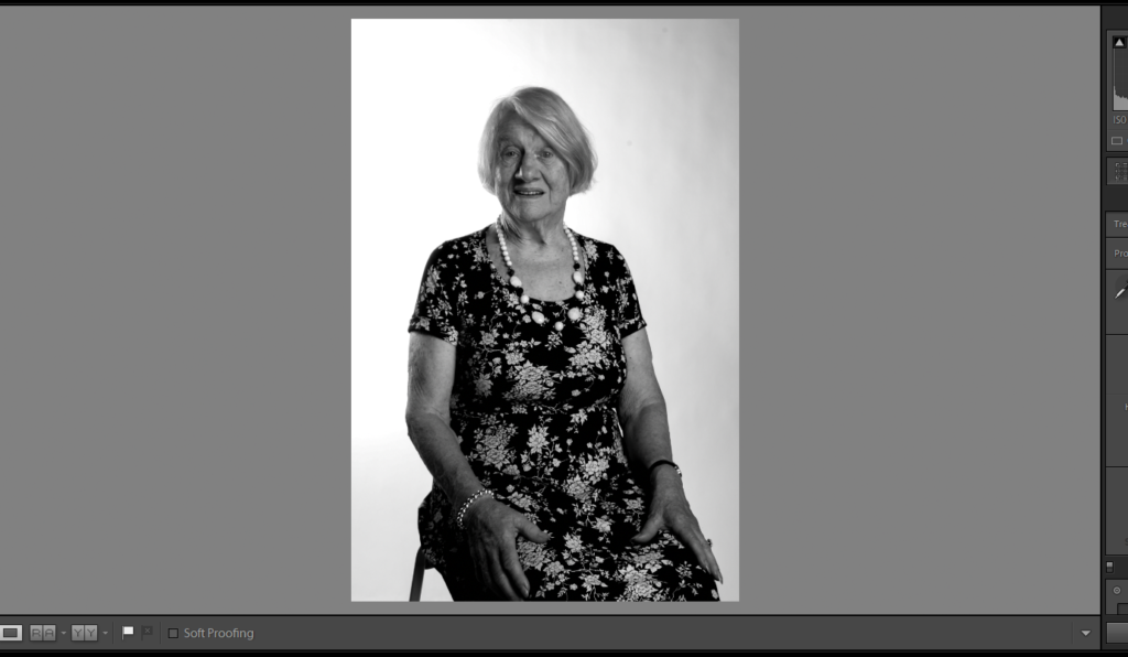
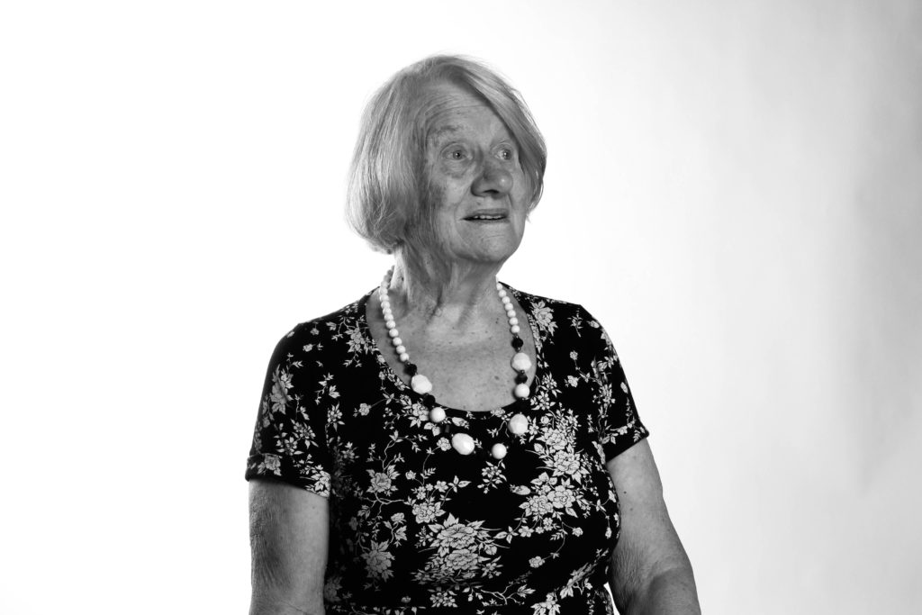
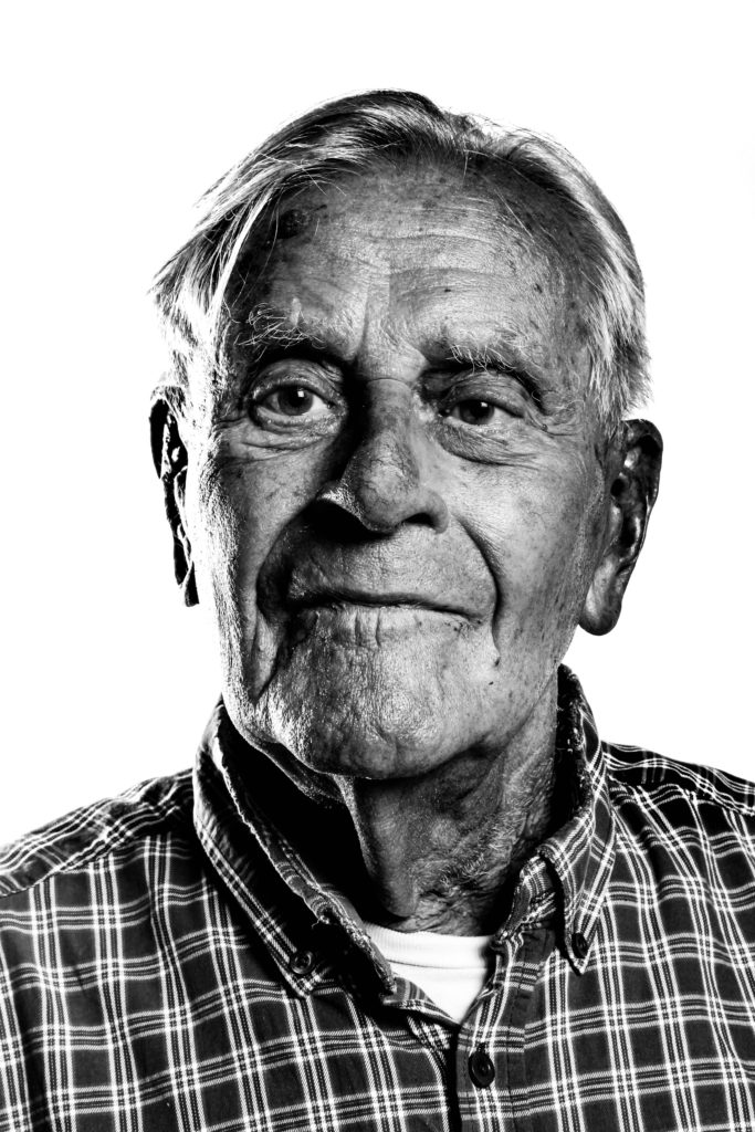
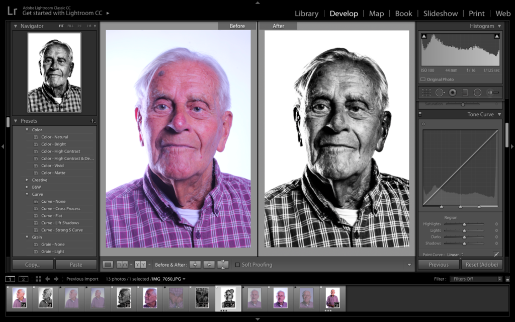
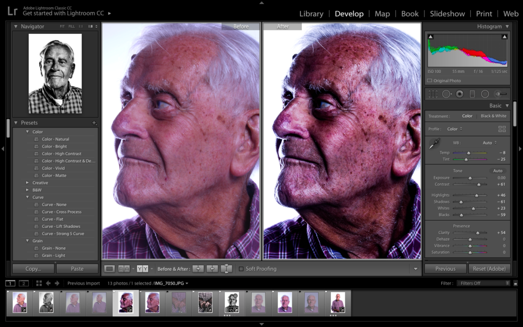
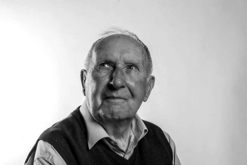
For my second edit with this photograph, I produced a black and white design which is similar to the colour. I felt that having the photograph in black and white will allow the detail and structure, formal elements, to be clearly showcased through the contrast in tonal regions within the frame. This artistic intention has allowed a clearer conceptual and contextual reasoning within the image. I also like the fact that the subject stands out from the background, drawing attention to itself, thus making it the main focal point.
Comparison of Original and Edit
C
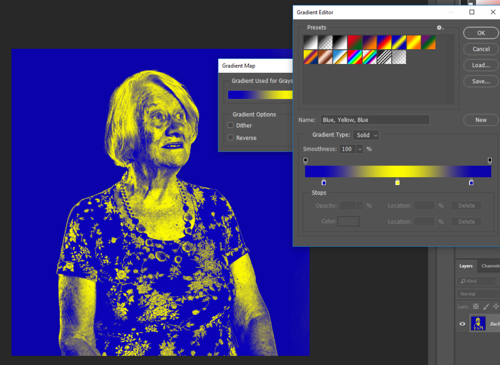
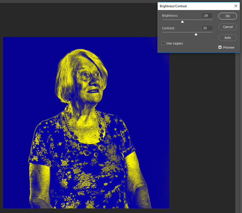
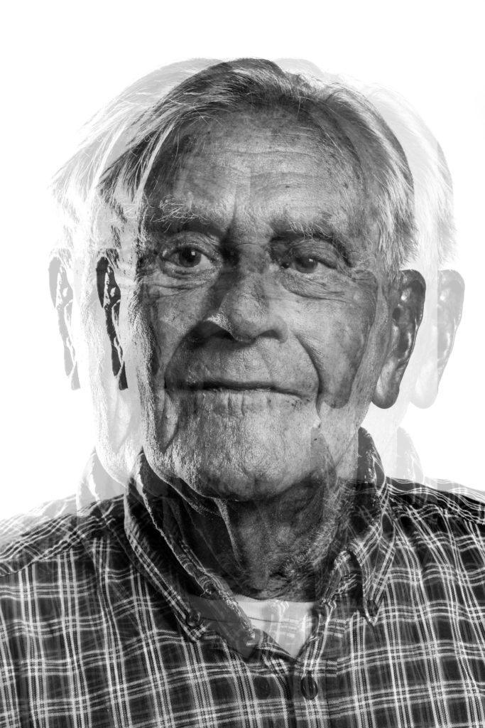
For my final edit I decided to take a more contemporary approach to my work, and created a surrelism photomontage. I used the black and white photograph from above and transferred the file onto photoshop. To achieve this effect I duplicated the layer (ctrl + J) and then moved it slightly to the left/right turning down the opacity allowing the bottom layer to still be seen. The distorted effect, allows the concept of how Bob’s war memories has affected him and changed his outlook on life. I really like the way in which this edit turned out, due to distorted and disorientating ascetic it holds.
Photograph 2 Edit Exploration:
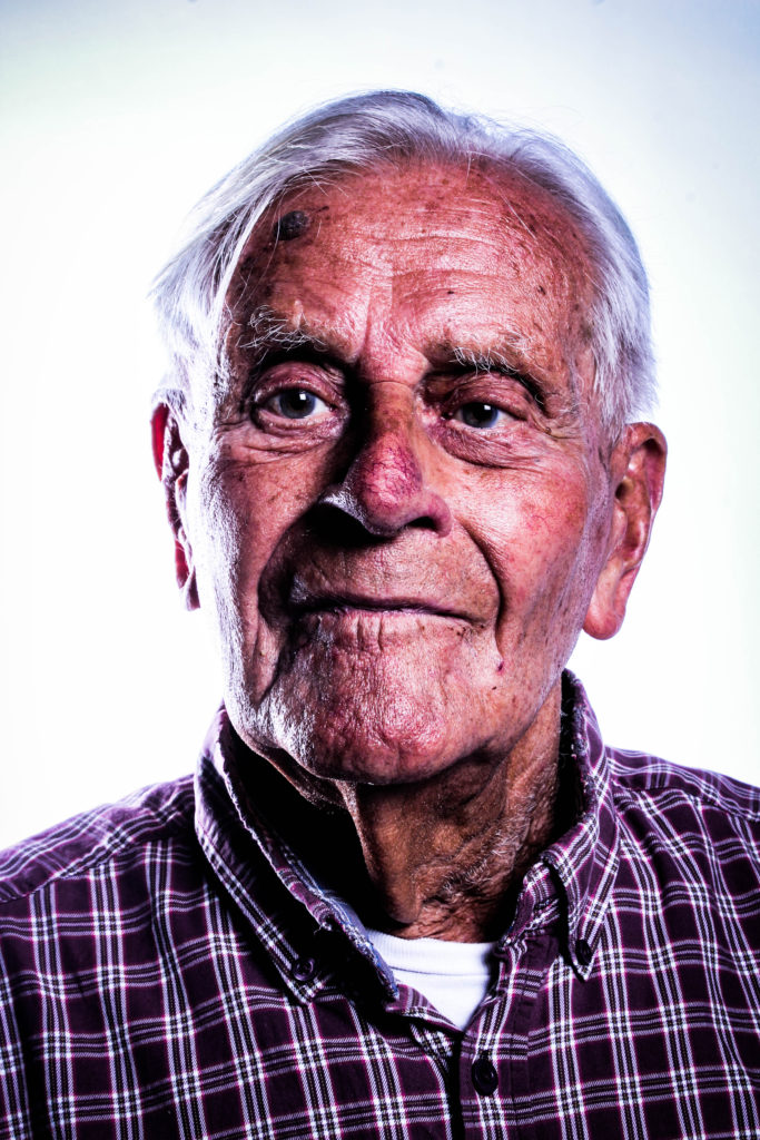
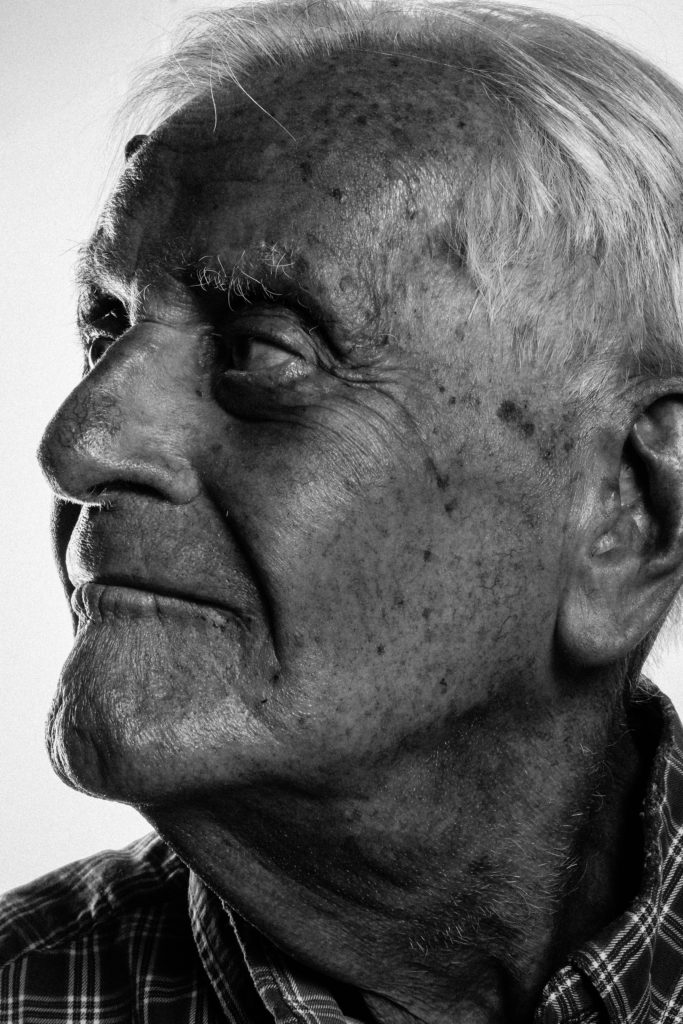
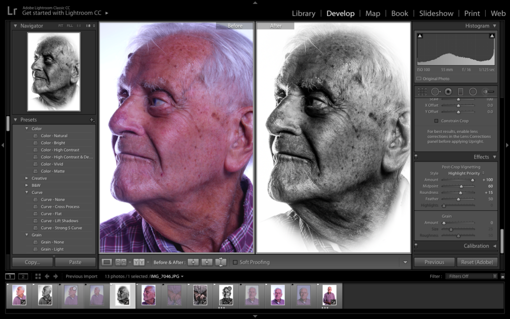
For my next experimentation I selected the photograph of Bob looking towards the side, showing his better side, which has more detail allowing the formal elements of texture and shape to be presented within the composition. The lighting makes his face naturally darker, almost creating a chiaroscuro affect, thus having the photograph in black and white allows the tonal regions to be showcased.
Comparison of Original and Edit
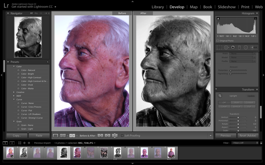
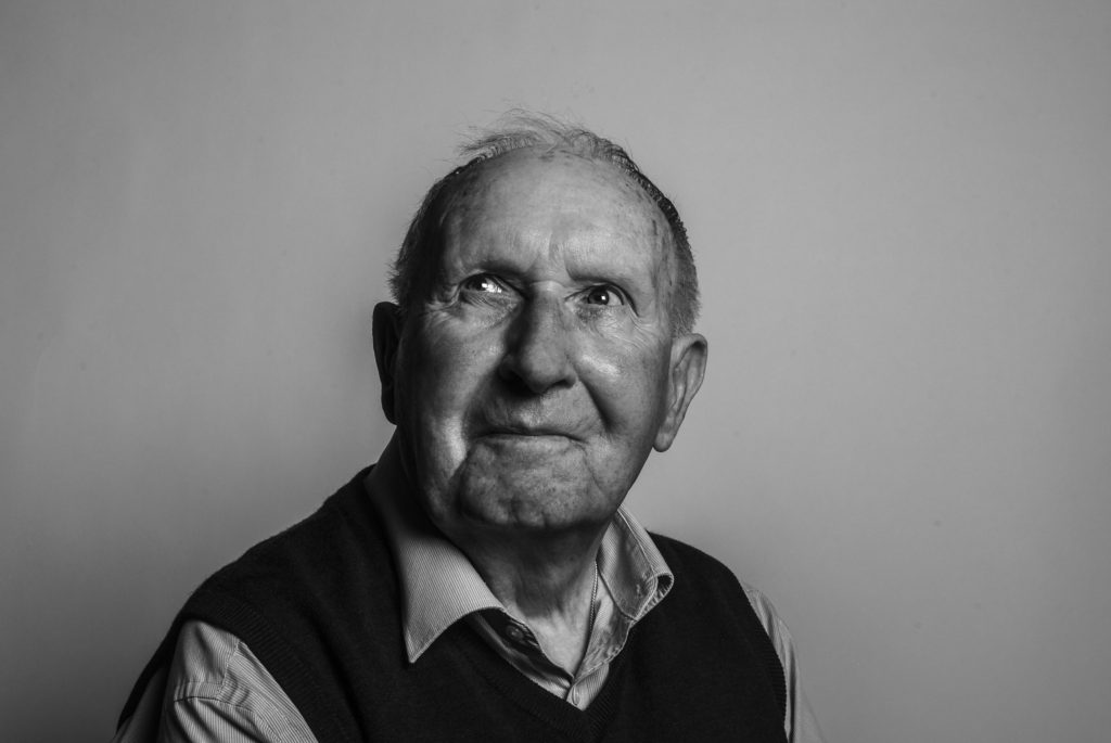
For my next edit, I used the black and white edit, slightly adjusting the structure and clarity, allowing the detail to be showcased better, creating an overall more detailed and visually better photograph. I then decided to add a large vignetting, white, which allows the portrait to be framed, creating a stylistic portrait, like shown on a memorial paper. This artistic design allows the contextual factors of Bob to be shown, on top of the conceptual factor that Bob before the war has died and has changed and developed into a better person due to the event of the war.
Comparison of Original and Edit
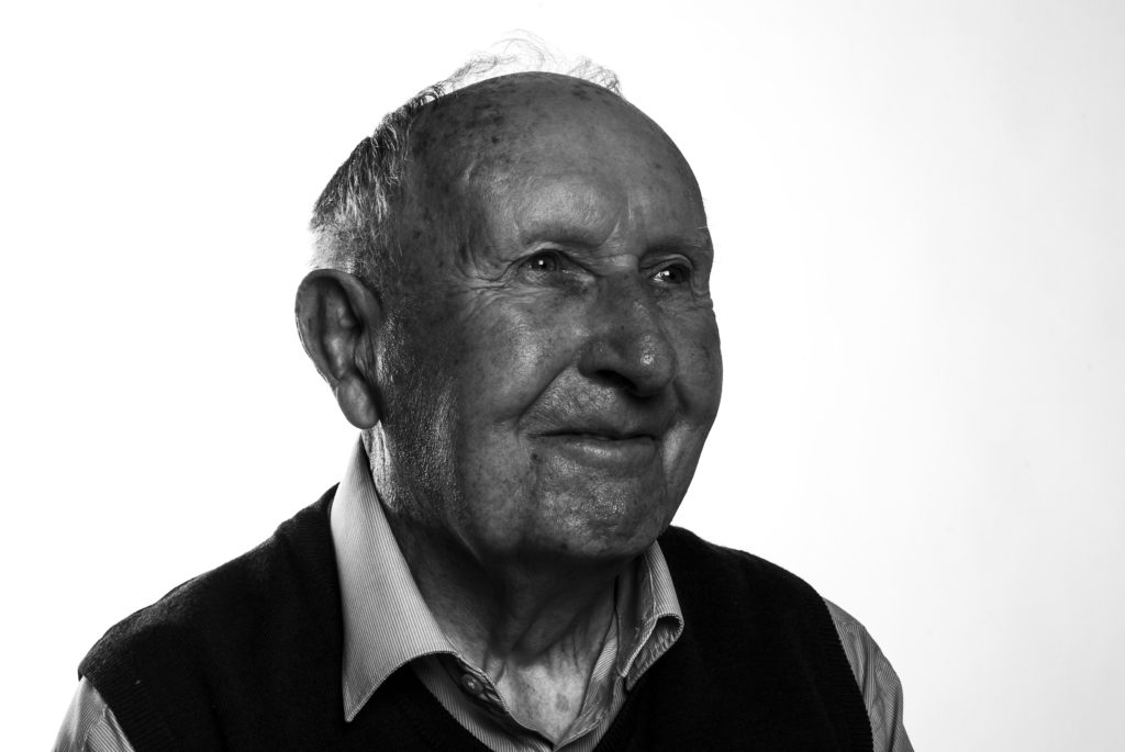
For my final design using this photograph, I decided to turn the photograph into colour. This design is not as successful as the black and white, due to the lack of detail and texture being presented. However, it still showcases my ability to experiment in colour and black and white, and critically evaluate my final designs. I like the warmth presented on Bob’s face, presented through the colour and lighting used, as well as the chiaroscuro effect clearly showcased within the design.
Comparison of Original and Edit
Photograph 3 Edit Exploration:
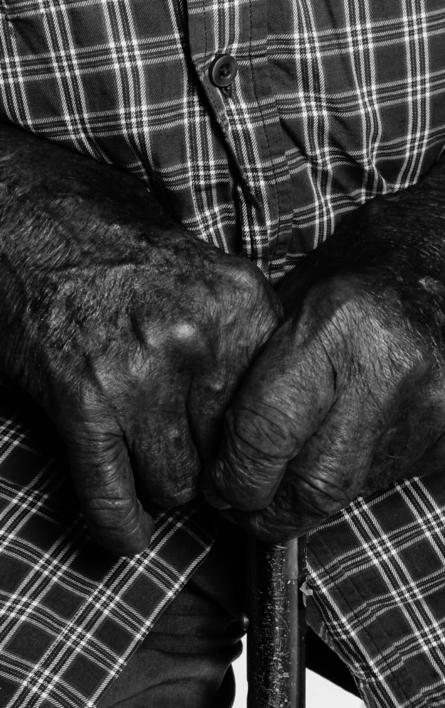
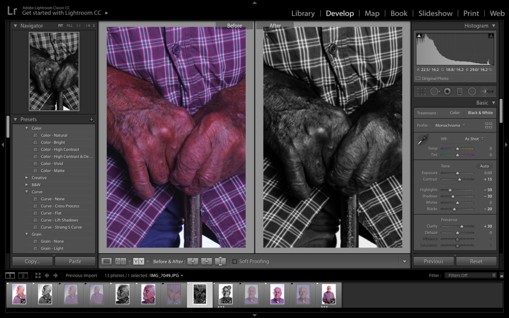
My final photograph used was the macro shot of Bob’s hand allowing the detail of my subjects skin to be showcased, on top of presenting a whole new conceptual meaning towards my portrait. My first design with this photograph is in black and white, allowing the contrast in tonal regions to be shown. It also has a darker atmosphere towards the photograph, which allows the conceptual factors to present the horrors of the war, creating a whole new meaning towards my photographic response to Bob’s stories.
Comparison of Original and Edit
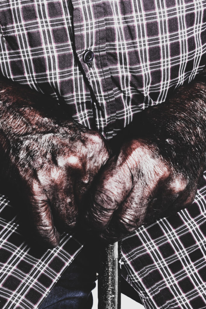
My second edit utilising this photograph, I decided to adjust the settings to the extremes, either end of the Bipolar scale. This included having the structure to the higher end and the whites and blacks on bipolar ends, allowing the detail in his skin to be showcased clearer, really showcasing the formal elements of detail, shape and texture. I also decreased the saturation of the photograph, which as allowed the colours to not seem as vibrant, which reinforces the statement mentioned above. This is my most successful photograph within the experimentation, due to ascetic and new conceptual reasonings it brings to my work.
Comparison of Original and Edit
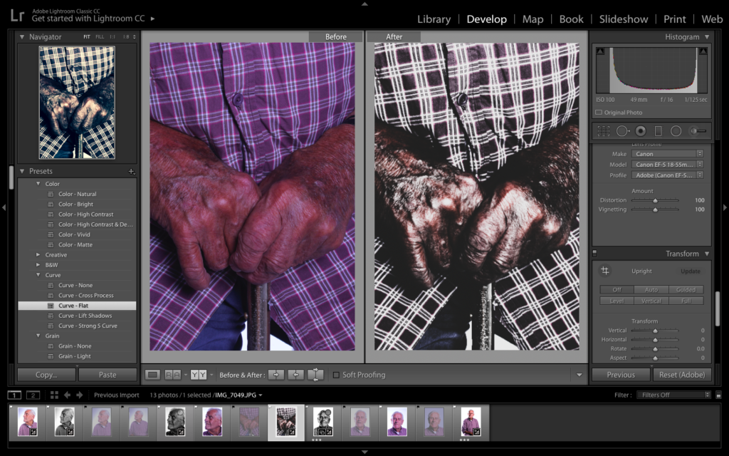
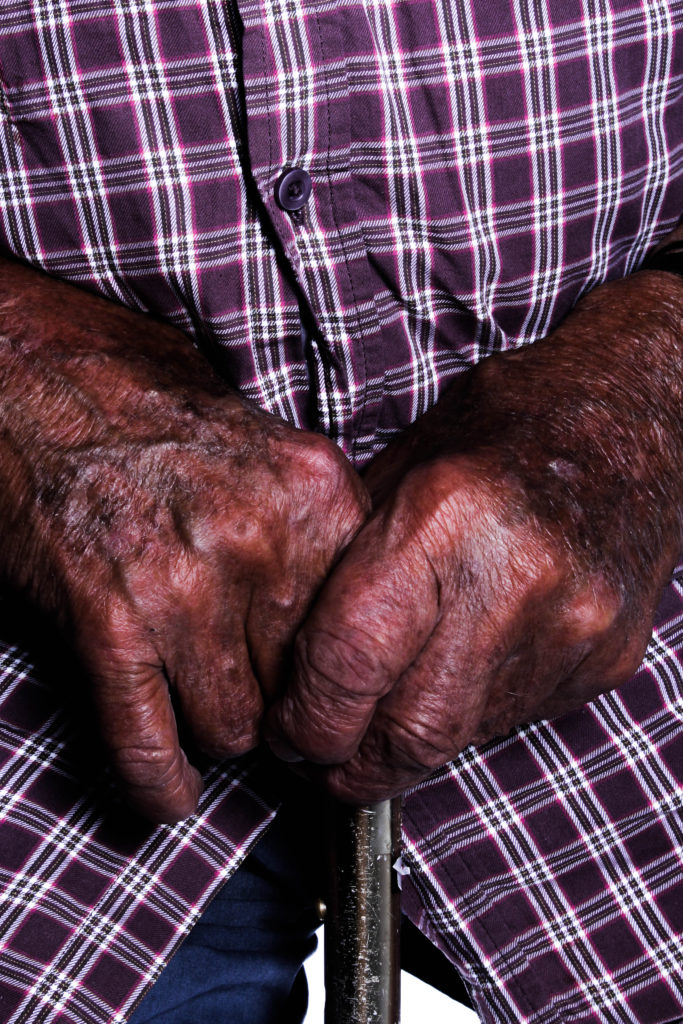
For my final design of this photograph I decided to produce a colour version of the image. To do this I wanted the detail and texture of the skin and cane to still be presented, so I ensured the structure and sharpness of the photograph was high. I also decided to make the image naturally darker, having more shadows which allows a sense of space to be presented, on top of a more sinister mood, implying the horrors of the war as conceptual and contextual reference.
Comparison of Original and Edit
Top Photograph From Each Experimentation:
Evaluation:
Within this further exploration I have been able to experiment with different tools on Lightroom as well as going back onto photoshop to create a surrealism photomontage. I have been able to present different conceptual values to these documentary style portraits. In addition, I have shown my ability to present the same portrait in three different ways, with different artistic intentions allowing my creativity to be presented. This exploration was helpful as I have been able to produce outcomes which I would not usually do, which are successful and are some of my stronger outcomes. In addition, I am happy with the three final outcomes as I think they clearly present Bob’s stories of the war as well as presenting a visually stimulating photograph with a clear ascetic. One thing I have found is that these portraits work better in black and white or with lower saturation due to the detail and texture of the skin, which is emphasise through the contrast in tonal regions. To conclude, I have been able to produce successful outcomes, and evidence of me exploring with my photographs, showcasing my competence on photo editing structure.


/arc-anglerfish-arc2-prod-jerseyeveningpost-mna.s3.amazonaws.com/public/7B4UD24JYRDHVFBTKER46ZFBNU.jpg)