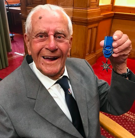
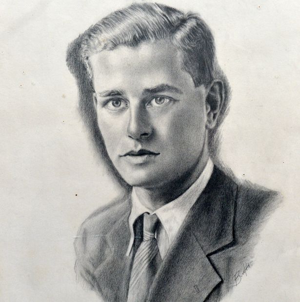
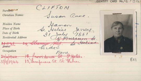
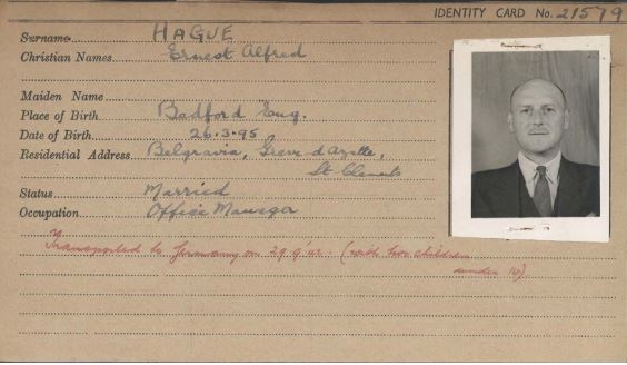
Bob Le Seure is a Jersey man who was 19 years old when the Germans occupied the island of Jersey and is due to turn 99 this year. I was lucky enough to be able to spend some time listening to Bob talk about his experiences during the war and then go and take some portrait photographs of him in our studio.
Below shows my four best images I have chosen to work with in the editing process of my photographs. Out of all my photographs these were the clearest and best ones I thought I would be able to work with to develop into final outcomes for this photoshoot.
Contact Sheet:

Four best Images from the Bob Le Suere Photoshoot
Edit 1: Black and White
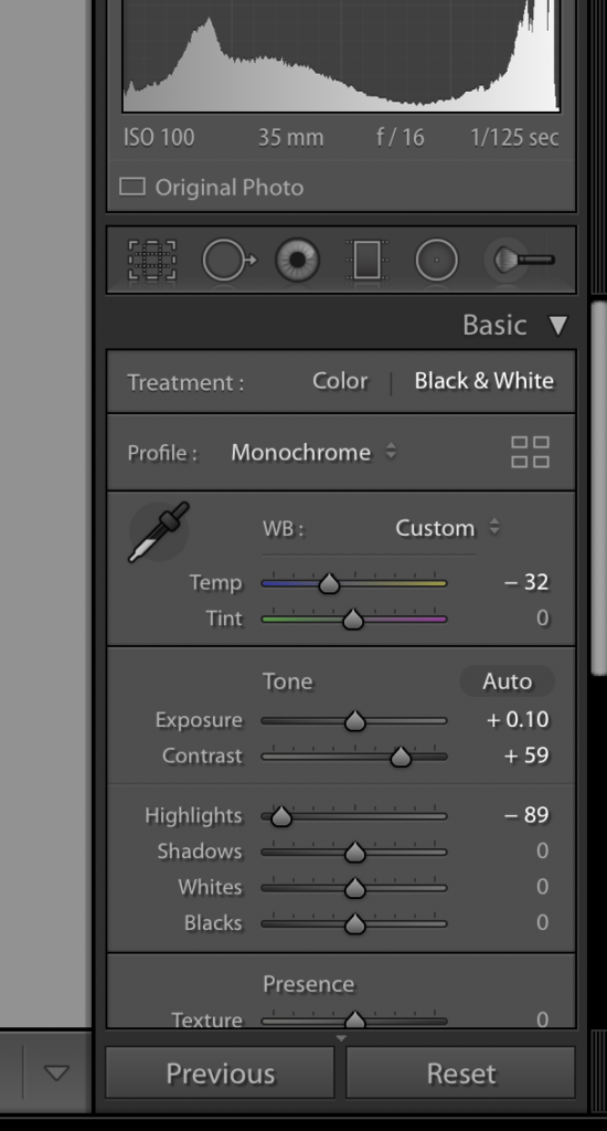
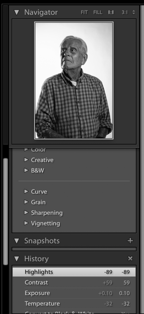
Editing Process 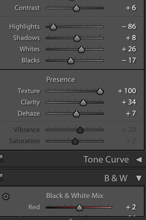
For my black and white photographs I knew I wanted to create them in high contrast as it creates a sense of drama in the photograph. To start with I started in the quick edit section of light room to just straight away turning the photograph into black and white, choosing the preset option of ‘high contrast’ that I could then go through and change and adjust myself to how I feel the photograph needed. I then went to develop, here I altered smaller parts such as the contrast itself and exposure, as well as highlights and shadows; I did this to begin to darken the image, to create some deep shadows and tonal range. I also went in an heightened the texture and the clarity as I felt that it created for a sharper photograph which I feel worked well for what I was trying to achieve as it shows the lines on Bob’s face and all the details which is important to me to show as it shows him as he is as a person and is creating an interesting photograph of him and his stories.
I feel the edited photograph below turned out well and how I personally wanted it too. I feel the position I had Bob in works for this photographs as it lets the light pouring in from the left side of the frame (right side of Bob) to begin to gently light his eye as below his nose onto mouth however unlike the colour image I don’t feel it is working too harshly and is something I am happy with. If I was to go back in again I would possibly think to adjust the photograph to stop the backdrop of Bob from going to grey and would be something I will learn from the alter next time. Overall, however, I feel turning this photograph into black and white has worked well.
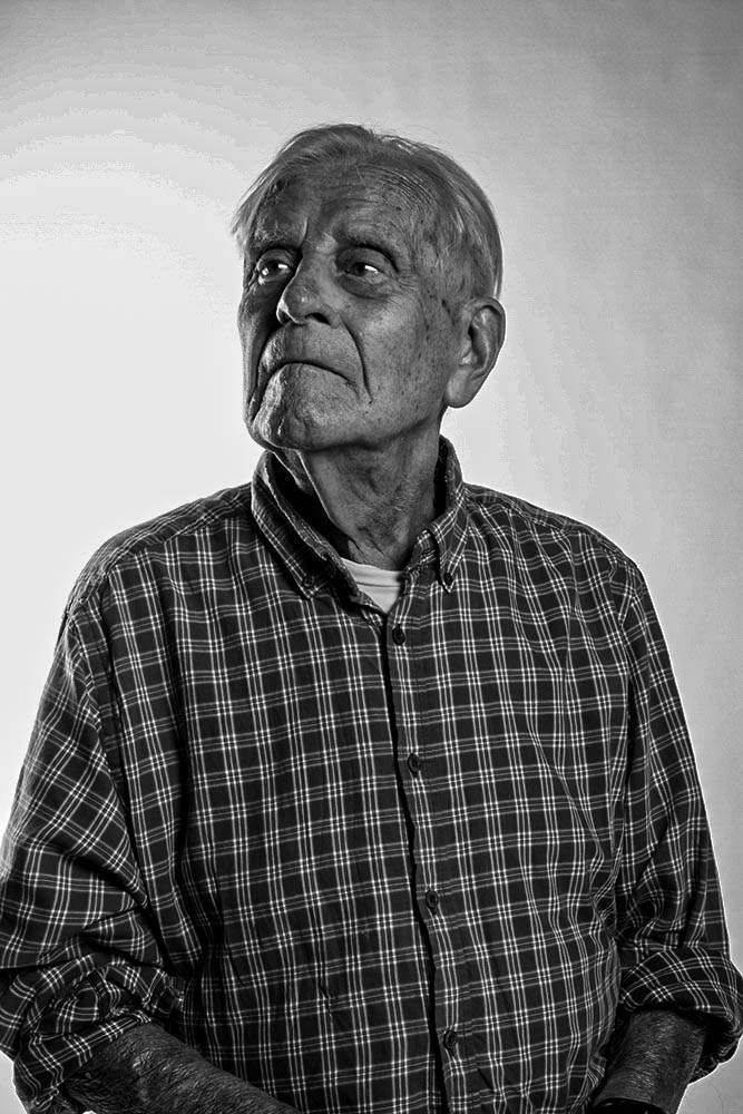
Final Photograph
Edit 2: Colour Enhancing
Editing Process 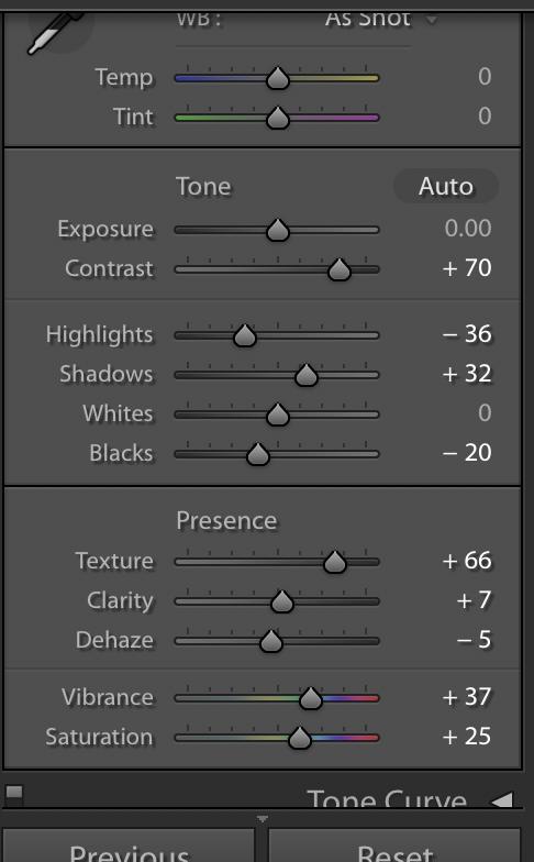
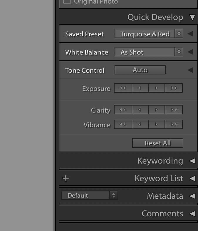
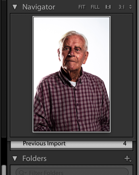
For my colour photograph I wasn’t aiming to so much change the photograph drastically, just enhance it. To start with I experimented with looking at the different pre-sets available to me in Lightroom to get an understanding of what changing different aspects might start to look light so I knew where I wanted to go and what would work. I ended up deciding to use one of the presets: Turquoise & Red. I decided to do this as it enhanced the photograph closely to what I was going to aim for myself. From here I went to develop and I began to alter some of the temperatures to create a warmer photograph around Bob himself as well as the contrasts and exposures to enhance the tones and colours in the photographs to make it more vibrant. Again, like with the black and white, I went in and adjusted the texture and clarity to enhance Bob’s features themselves as he has quite distinct features which would be a shame not to bring out and make seen.
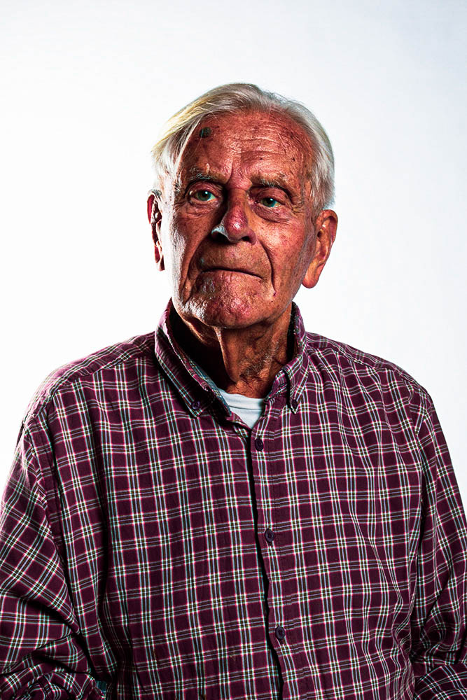
The edited photograph, I believe has turned out well and is my favourite of the two photographs due to the vibrancy in the image. I feel if gone back into I could look to adjust the harsh light that is lighting the right side of his face more compared to the left, something that worked well slightly with the black and white image, this I would believe is due to the position that Bob is in, I chose to have him looking straight on to me as I feel he has very compelling eyes and this is something I wanted to capture, however maybe I would go back through and edit it a bit more due to the lighting that this position then lets back onto the face. Overall I do think that this is a successful outcome for enhancing the photograph.
Final Photograph

