
After I had looked at the images I had taken I used Lightroom and photoshop to edit and select my best images.
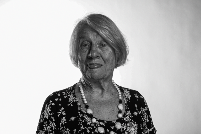
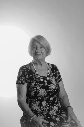
This image I actually didn’t edit on photoshop I edited it into Lightroom. After having looked at this picture again a few days later I have decided I am going to change the brightness and contrast of the image as it looks quite grey all the way around. However, I don’t completely dislike the grey as it adds an element of previous times maybe when they didn’t have ranges of tones and different shades. I also think next time I edit this one which will be in the boxes below I am going to crop it and maybe compare it to one of my other images.

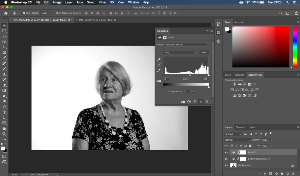
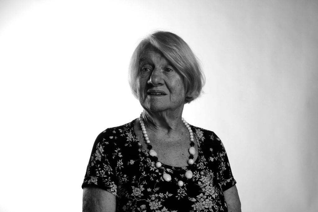
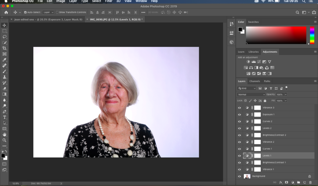
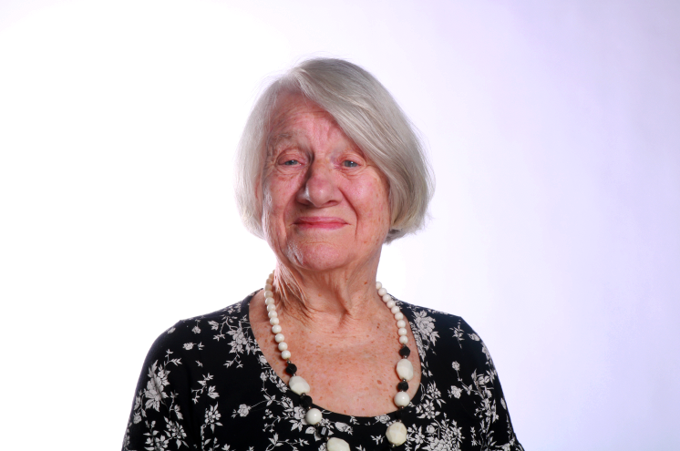
I decided to keep one of my final outcomes in colour as its focused quite well on certain features of her face, especially her eyes and the creases between her wrinkles. The picture has focused well on just her face but also kept the background good shade so that it doesn’t blend in with her hair. The darkening of the her dress even thought its not seen has added different shades to the image making it more appealing to look at as its not all the same tone and quite bland. For the image above I have edited the vibrance to make it more lively, the brightness which has added a glow to her skin and the exposure which has made the background divide into 2 colours which for me makes the photo look a lot more structured and makes it look more planned out.
