
Rational for Experimentation:
The rational behind my further exploration was that I wanted to explore different ways in which I could change one of my Bob Le Sueur images, in order to create different effects. I looked at experimenting with different tools on Lightroom in order to explore the effect they give, and how they compliment other effects. I then also looked at making the photograph more contemporary, in a photomontage style, in order to create a new conceptual meaning towards my work. Within this piece of work I selected my three top images, based on camera technique and overall ascetic of the photograph, and created three different edits for each one showcasing this exploration.
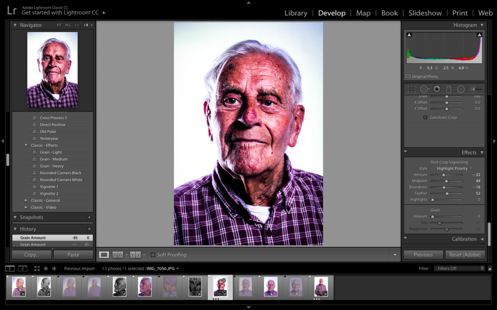
Photograph 1 Edit Exploration:
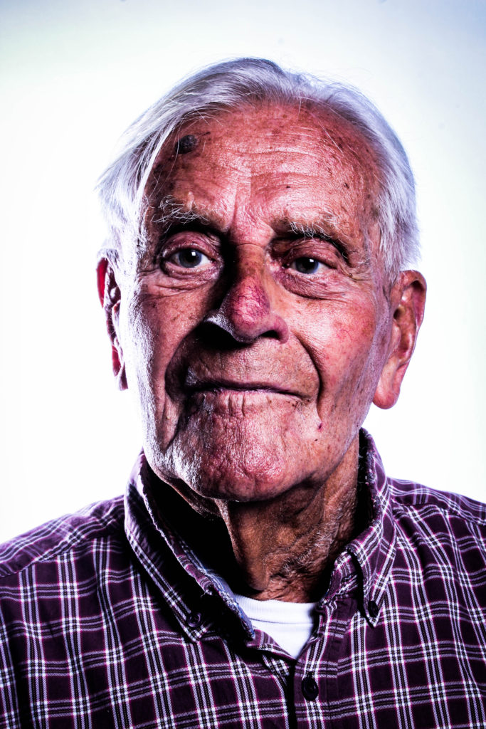
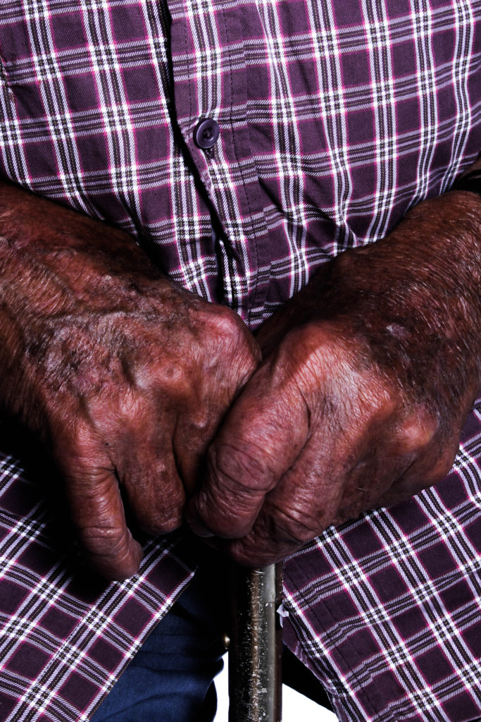
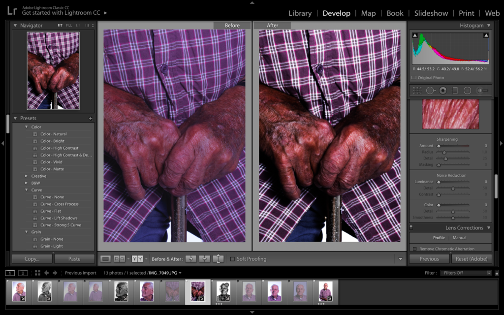
For my first edit, I decided to make a colour edit which allows the formal element of Colour and Texture. To make this photograph work, I decided to allow the structure and clarity of the photograph to be strong. I also decided to add in vignetting allowing the corners to be darker, forcing my subject to be the main focal point within the photograph. I believe this edit is successful due to the warmth presented with the lighting, as well as the detail on the skin, helping to present the contextual and conceptual elements of the photograph.
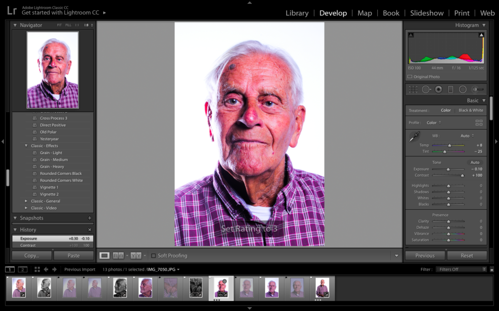
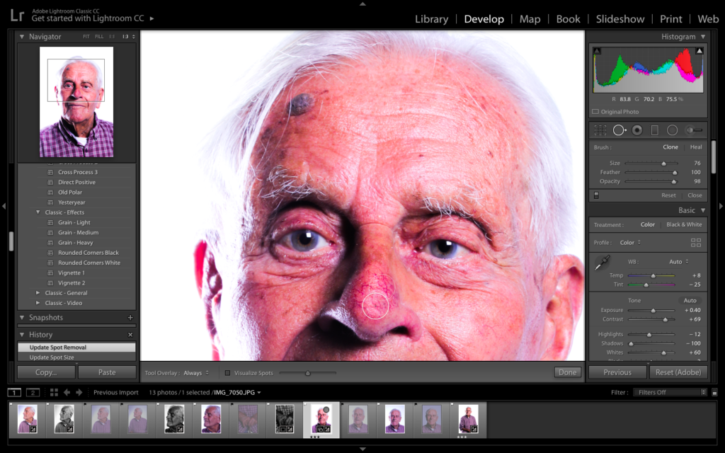
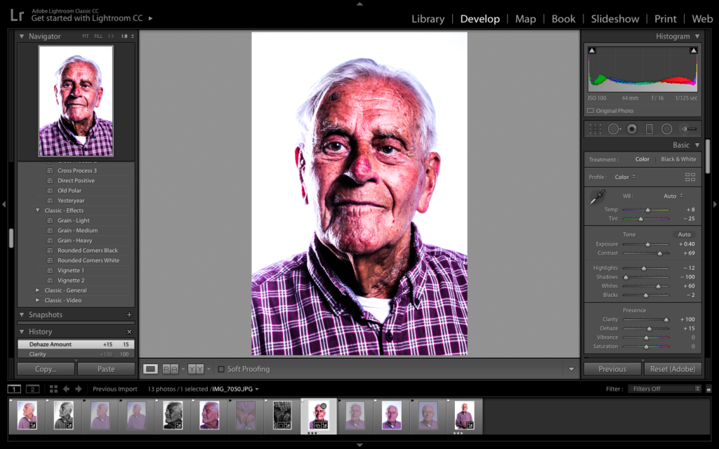
Picture Guide To how Edit was Achieved:
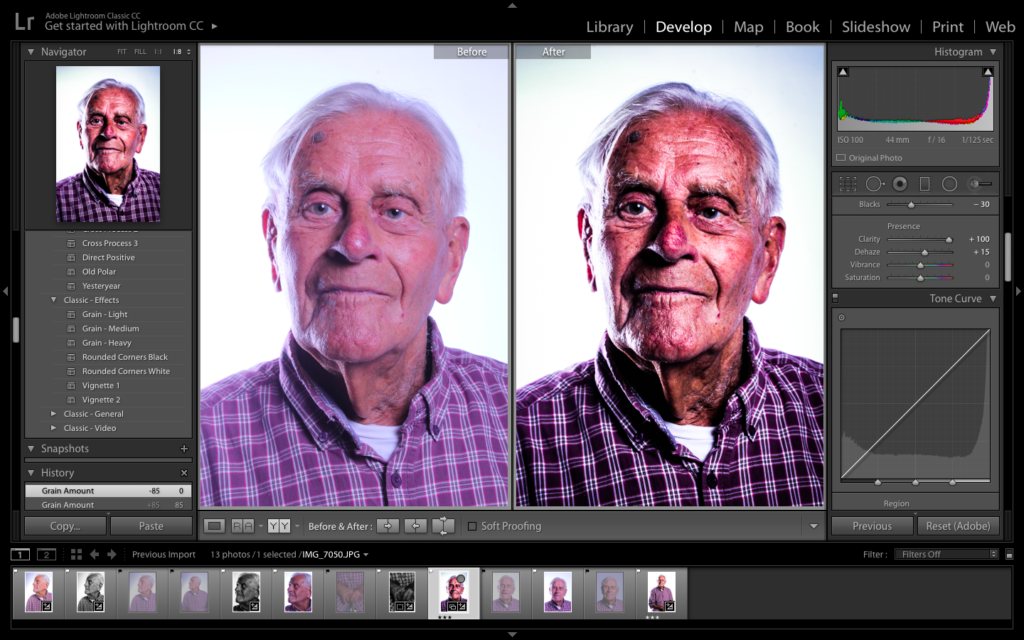
Comparison of Original and Edit
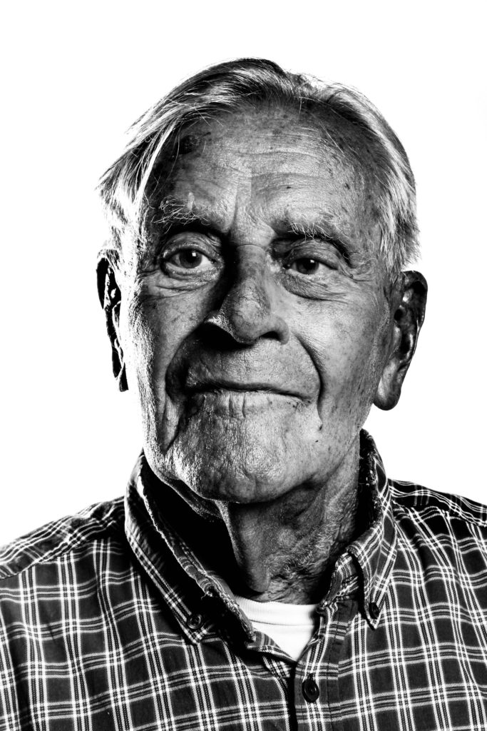
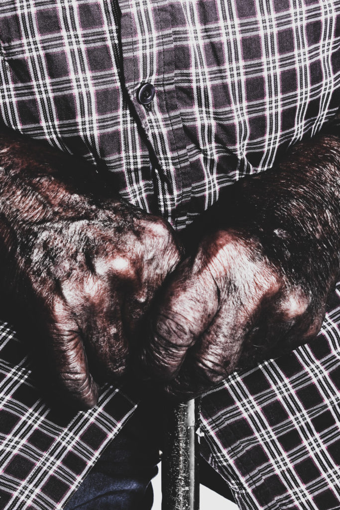
For my second edit with this photograph, I produced a black and white design which is similar to the colour. I felt that having the photograph in black and white will allow the detail and structure, formal elements, to be clearly showcased through the contrast in tonal regions within the frame. This artistic intention has allowed a clearer conceptual and contextual reasoning within the image. I also like the fact that the subject stands out from the background, drawing attention to itself, thus making it the main focal point.
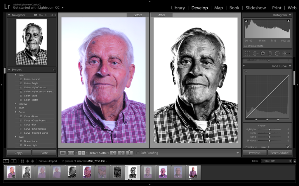
Comparison of Original and Edit
C
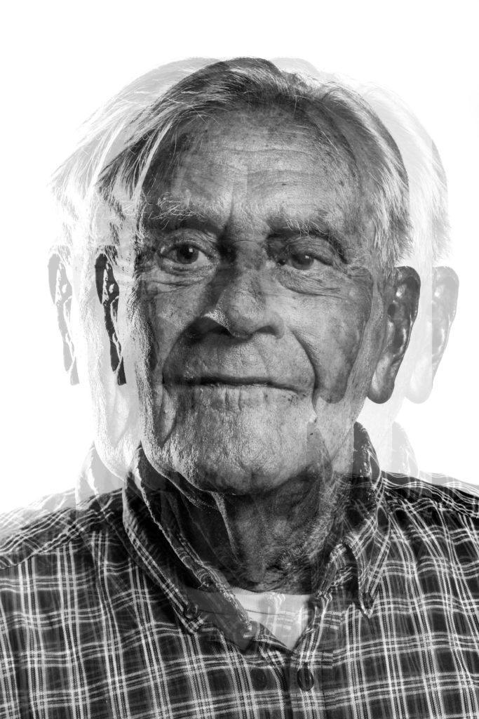
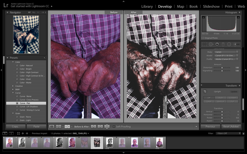
For my final edit I decided to take a more contemporary approach to my work, and created a surrelism photomontage. I used the black and white photograph from above and transferred the file onto photoshop. To achieve this effect I duplicated the layer (ctrl + J) and then moved it slightly to the left/right turning down the opacity allowing the bottom layer to still be seen. The distorted effect, allows the concept of how Bob’s war memories has affected him and changed his outlook on life. I really like the way in which this edit turned out, due to distorted and disorientating ascetic it holds.
Photograph 2 Edit Exploration:
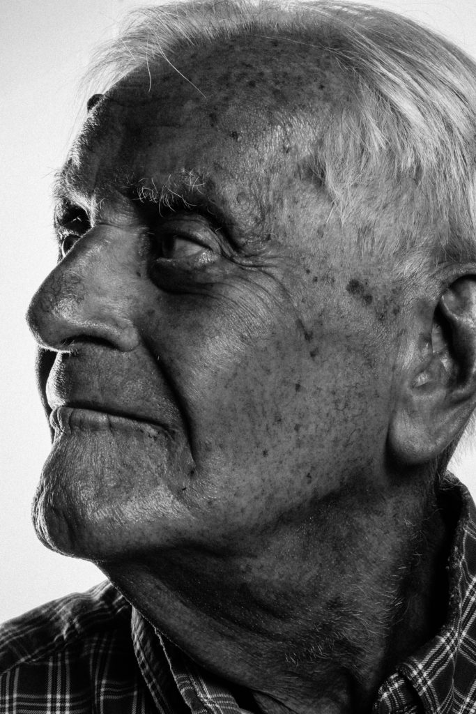
For my next experimentation I selected the photograph of Bob looking towards the side, showing his better side, which has more detail allowing the formal elements of texture and shape to be presented within the composition. The lighting makes his face naturally darker, almost creating a chiaroscuro affect, thus having the photograph in black and white allows the tonal regions to be showcased.
Comparison of Original and Edit

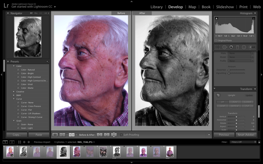
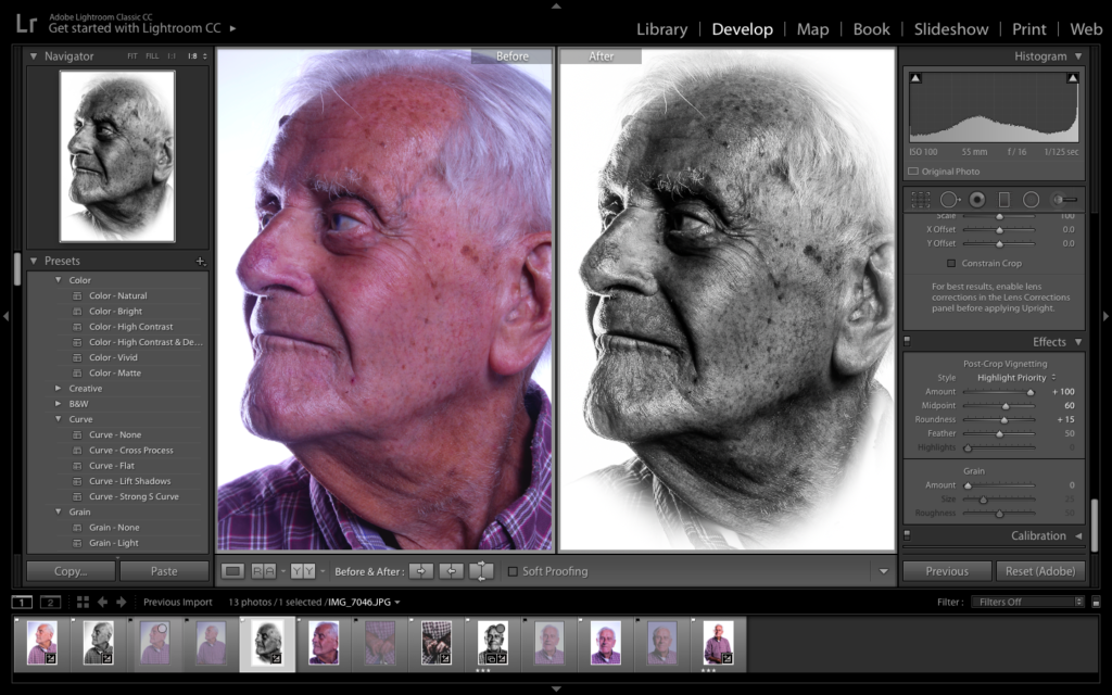
For my next edit, I used the black and white edit, slightly adjusting the structure and clarity, allowing the detail to be showcased better, creating an overall more detailed and visually better photograph. I then decided to add a large vignetting, white, which allows the portrait to be framed, creating a stylistic portrait, like shown on a memorial paper. This artistic design allows the contextual factors of Bob to be shown, on top of the conceptual factor that Bob before the war has died and has changed and developed into a better person due to the event of the war.
Comparison of Original and Edit
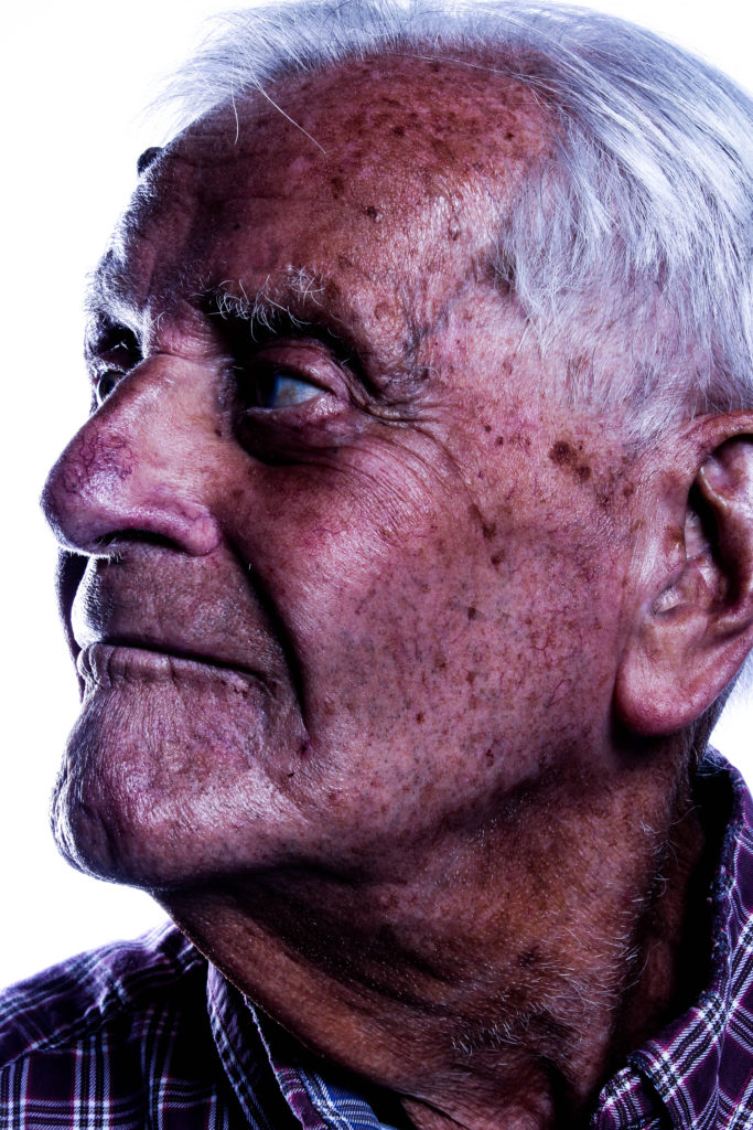
For my final design using this photograph, I decided to turn the photograph into colour. This design is not as successful as the black and white, due to the lack of detail and texture being presented. However, it still showcases my ability to experiment in colour and black and white, and critically evaluate my final designs. I like the warmth presented on Bob’s face, presented through the colour and lighting used, as well as the chiaroscuro effect clearly showcased within the design.
Comparison of Original and Edit
Photograph 3 Edit Exploration:
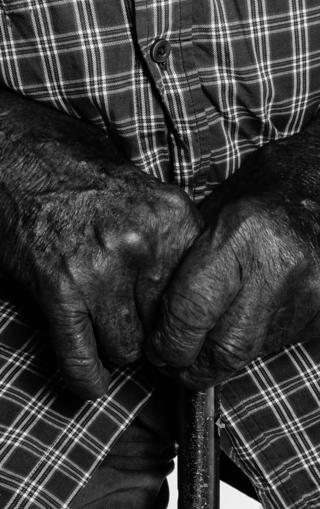
My final photograph used was the macro shot of Bob’s hand allowing the detail of my subjects skin to be showcased, on top of presenting a whole new conceptual meaning towards my portrait. My first design with this photograph is in black and white, allowing the contrast in tonal regions to be shown. It also has a darker atmosphere towards the photograph, which allows the conceptual factors to present the horrors of the war, creating a whole new meaning towards my photographic response to Bob’s stories.
Comparison of Original and Edit
My second edit utilising this photograph, I decided to adjust the settings to the extremes, either end of the Bipolar scale. This included having the structure to the higher end and the whites and blacks on bipolar ends, allowing the detail in his skin to be showcased clearer, really showcasing the formal elements of detail, shape and texture. I also decreased the saturation of the photograph, which as allowed the colours to not seem as vibrant, which reinforces the statement mentioned above. This is my most successful photograph within the experimentation, due to ascetic and new conceptual reasonings it brings to my work.
Comparison of Original and Edit
For my final design of this photograph I decided to produce a colour version of the image. To do this I wanted the detail and texture of the skin and cane to still be presented, so I ensured the structure and sharpness of the photograph was high. I also decided to make the image naturally darker, having more shadows which allows a sense of space to be presented, on top of a more sinister mood, implying the horrors of the war as conceptual and contextual reference.
Comparison of Original and Edit
Top Photograph From Each Experimentation:
Evaluation:
Within this further exploration I have been able to experiment with different tools on Lightroom as well as going back onto photoshop to create a surrealism photomontage. I have been able to present different conceptual values to these documentary style portraits. In addition, I have shown my ability to present the same portrait in three different ways, with different artistic intentions allowing my creativity to be presented. This exploration was helpful as I have been able to produce outcomes which I would not usually do, which are successful and are some of my stronger outcomes. In addition, I am happy with the three final outcomes as I think they clearly present Bob’s stories of the war as well as presenting a visually stimulating photograph with a clear ascetic. One thing I have found is that these portraits work better in black and white or with lower saturation due to the detail and texture of the skin, which is emphasise through the contrast in tonal regions. To conclude, I have been able to produce successful outcomes, and evidence of me exploring with my photographs, showcasing my competence on photo editing structure.
Great set of portraits!