Photo shoot planning: Family Portraits

PHOTO SHOOT PLANNING:

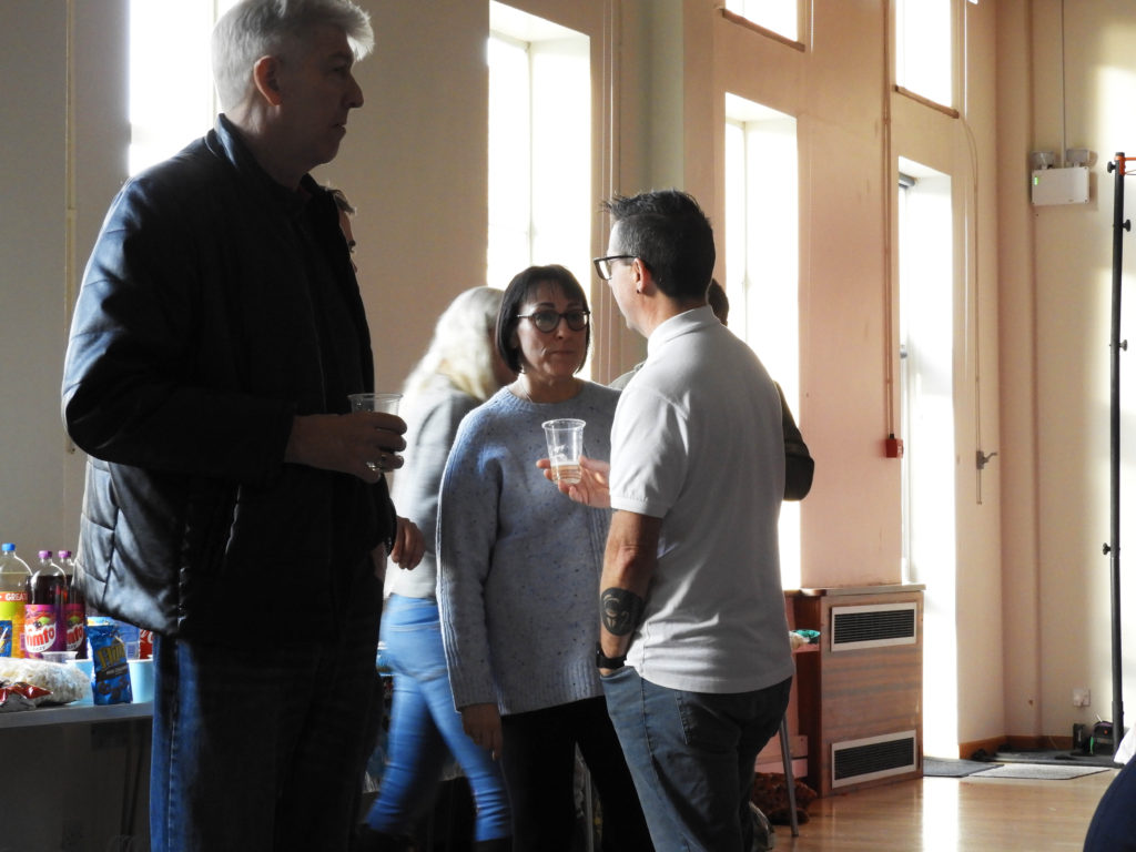
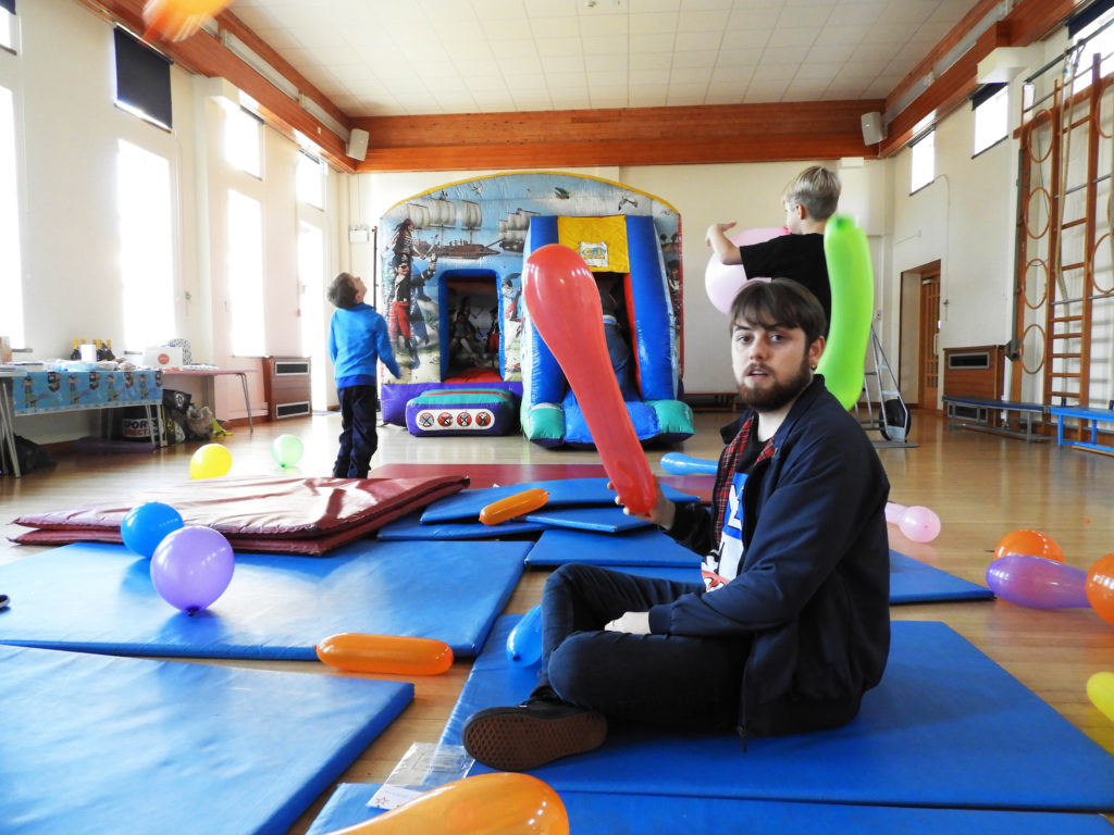
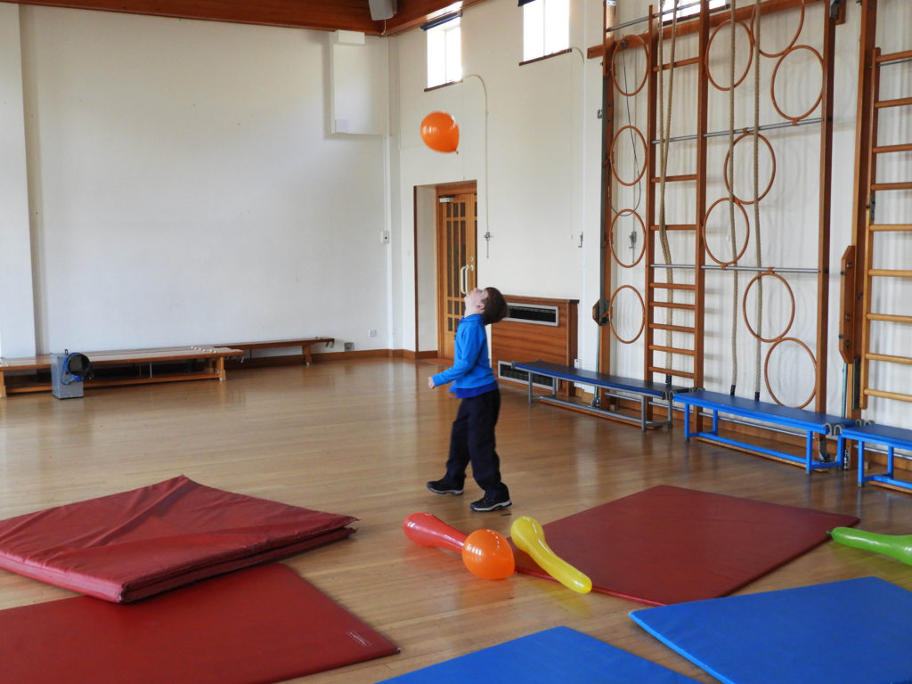
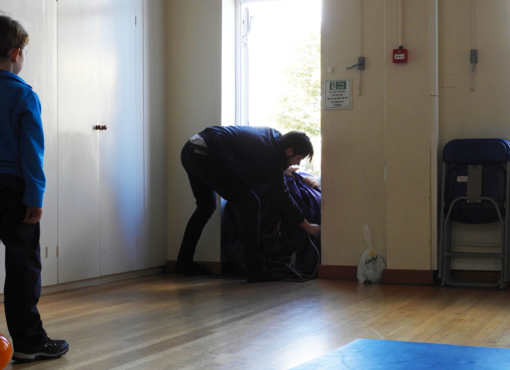
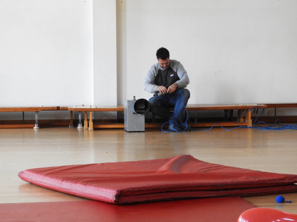
WHERE: The images below were all taken in a school gym which was utilised for the 3rd birthday part of my boyfriend’s nephew.

WHEN: The images were take during the late hours of the afternoon, creating bright and at times dramatic warm lighting within the images.

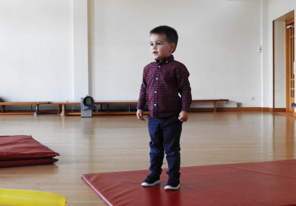
WHO: I manly focused on Beau, who was very interested in participating in the images, but I also attempted to include a wide variety of people, from the young to the old who attended the event.

HOW: I used my usual DSLR camera in order to capture these images, using the manual camera setting in order to adapt to the quickly changing lighting of the gymnasium.

WHAT: In order to get successful outcomes, capturing this birthday party was a priority as I knew I would be able yo capture a wide variety of people within my family in an environment which is different from the typical.

WHY: In order to keep exploring different themes and experimenting with the topic of candid portraits within our own personal family life.

SUCCESFUL IMAGES:
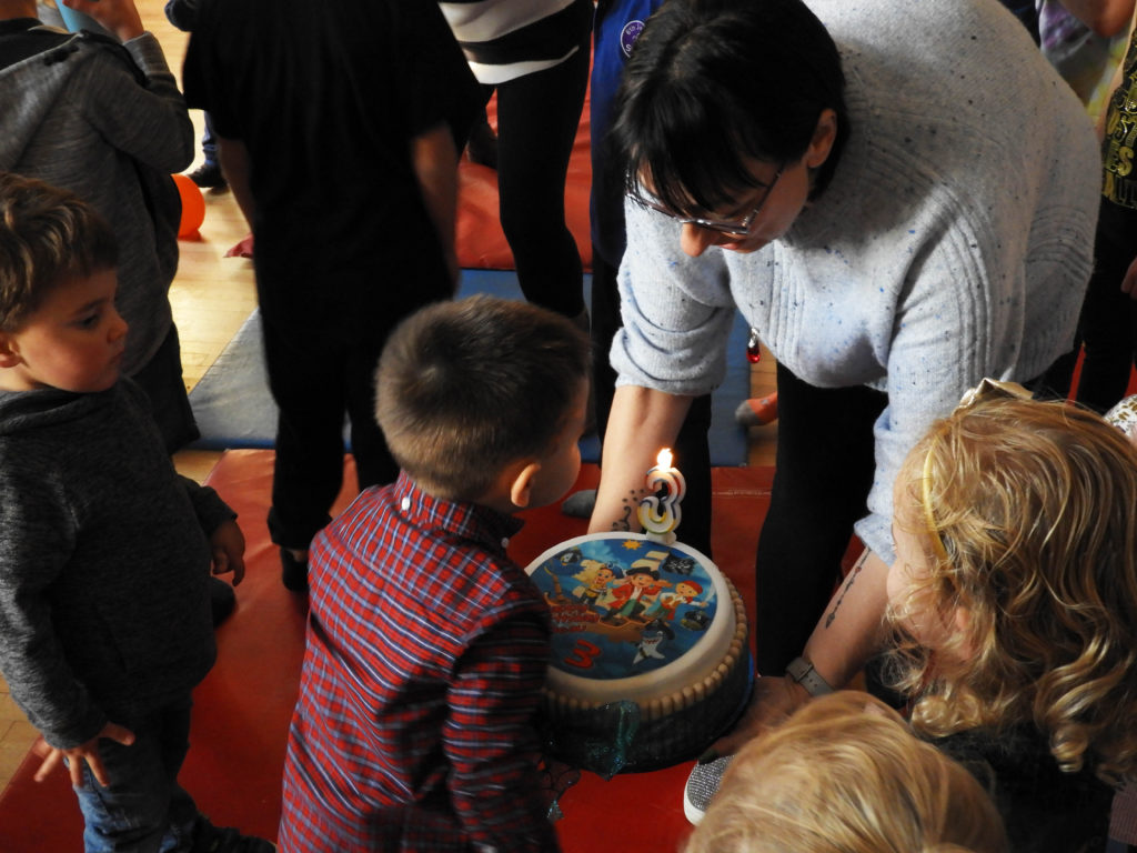
CRITICAL ANALYSIS:
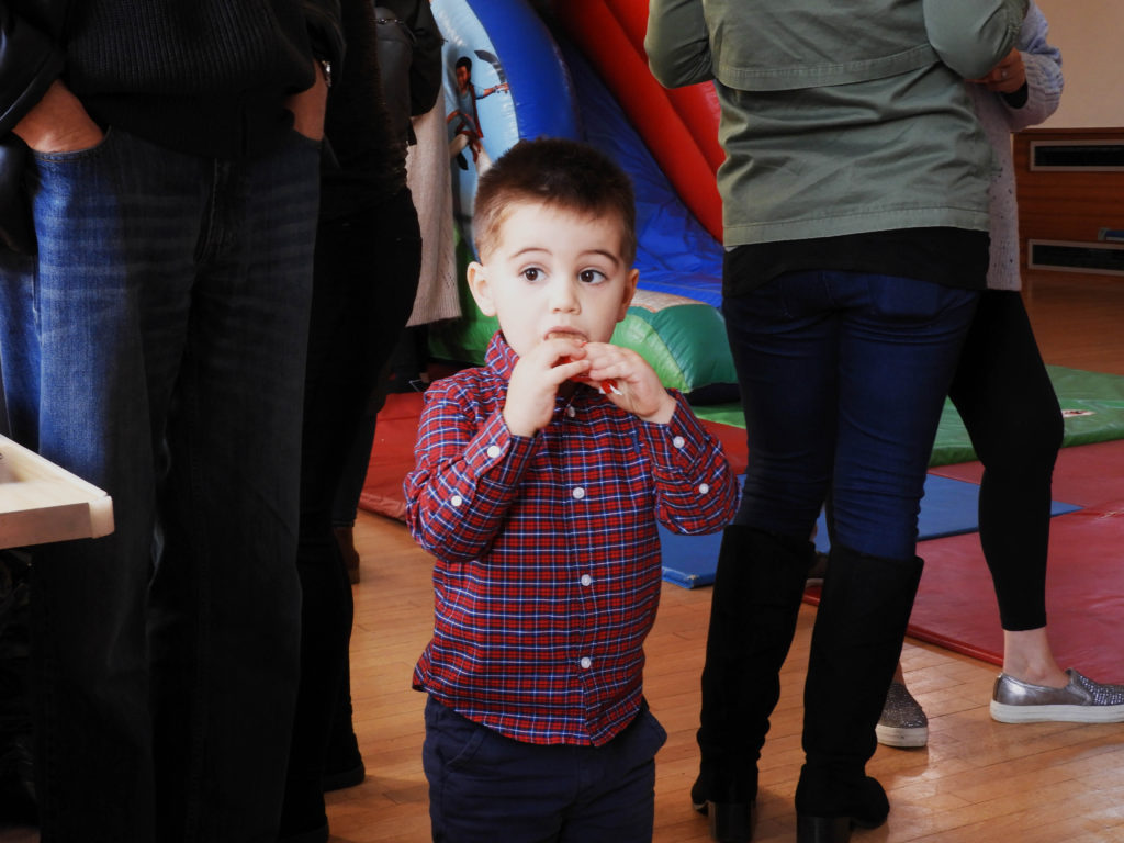
VISUAL:

In terms of the visual aspects of the image it is fairly interesting as it captures the innocence of childhood perfectly. The notion of innocence refers to children’s simplicity, their lack of knowledge, and their purity not yet spoiled by mundane affairs. Such innocence is taken as the promise of a renewal of the world by the children.The focal point of the image, Beau, can be seen unassumingly biting down on a snack surrounded by an abundance of darkly dressed adults. In my mind this was a very successful image both in terms of its quality and the narrative. Beau is almost illuminated like an angel with the warm tone lighting which is provided by the golden hour sun coming in from the left hand side of the image. The long, and multitude of legs in the background is broken through by the curious expression of Beau who is gazing out towards the window, juxtaposing the lack of identity which comes from just the bottom half of the adults. Another important point of contrast in the image is the height between the adults and Beau, representing development and again, growing being a part of becoming an adult both in a physical and literal sense. Another point of juxtaposition within this image comes from the lack of pattern in the backdrop of the image with the checkered shirt which Beau can be seen wearing. There is a real sense of depth within this image not only from the positioning but also the lighting, Beau is very much illuminated ,with less dramatic contrast between light and dark on his body whereas the backdrop is composed mostly of shadowy darkness.

TECHNICAL:

In terms of the technical aspects of the image, it was one of the harder photo shoots which I have had to compose due to two factors. Firstly the lighting was constantly shifting within the hall, I started of the shoot with very dull, neutral lighting which came from the fairly cloudy weather conditions outside. This was a challenge to work with as the lighting was not sufficient enough for my camera to work at its optimum and it meant that the majority of my beginning images ended up containing a lot of motion blur, not ideal when working with kids who are constantly moving. When the weather conditions became slightly clearer, the golden hour lighting, which came through during the later hours of the afternoon, illuminated the images in a way which was warm and yellow/orange toned as opposed to the cool blues of before. Capturing images when the lighting was more direct meant that less motion blur occurred and the amount of successful images increased. A way in which I could have combated the motion blur could have been flash, yet I did not want to employ this strategy as I think it is essential for candid portraits like these to remain as natural as possible, with the addition of flash I feel as though they become staged, almost something which would be captured within a studio.

CONTEXTUAL:

In order to explore other aspects of my family, it was important to me that I capture the different facets of what family can mean. The people who are displayed in the photos are not my blood relatives but rather the family of my significant other. As someone who does not have any children who are a part of my family, an interesting topic which I had hoped to discover through my photography was the innocence of childhood which I think has been captured well within my images especially in my most successful image, Beau encompassing the essence of what it means to be oblivious to the outside world and the struggles of adult life. Simply enjoying his birthday in a school gym which was organised by his grandfather. It was also very interesting to find out about the family dynamics of other families other than my own, sometimes being eyeopening and strange to witness. I feel as though the abundance of people also made it easier to capture these candid images as the pressure o one camera being focused on a few people can sometimes be too much ,making the images uncomfortable and staged at points.

CONCEPTUAL:

A candid photograph is a photograph captured without creating a posed appearance. The candid nature of a photograph is unrelated to the subject’s knowledge about or consent to the fact that photographs are being taken, and unrelated to the subject’s permission for further usage and distribution. The crucial factor is the actual absence of posing. However, if the subject is absolutely unaware of being photographed and does not even expect it, then such photography is secret photography, which is a special case of candid photography.

EXAMPLES OF SHIFT IN LIGHTING TONES:
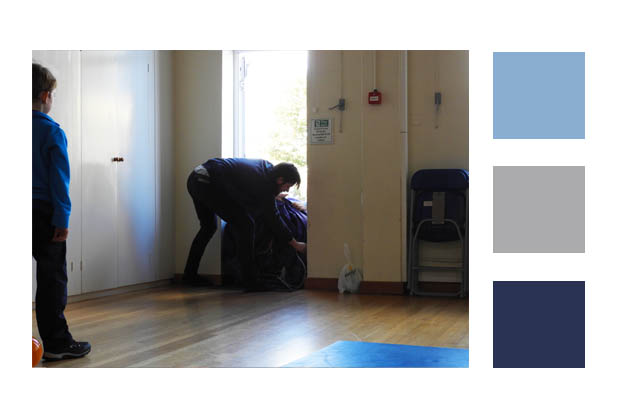
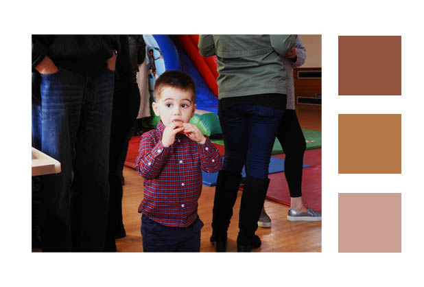
When taking sample colours from the images it can very clearly be seen that one image leans far more cool toned than warm toned which reinforces the points I made before about how cloudy weather conditions can significantly cool down a photo, and a lack of them with clear weather can warm up a photo’s colour palette.
EDITING PROCESS:

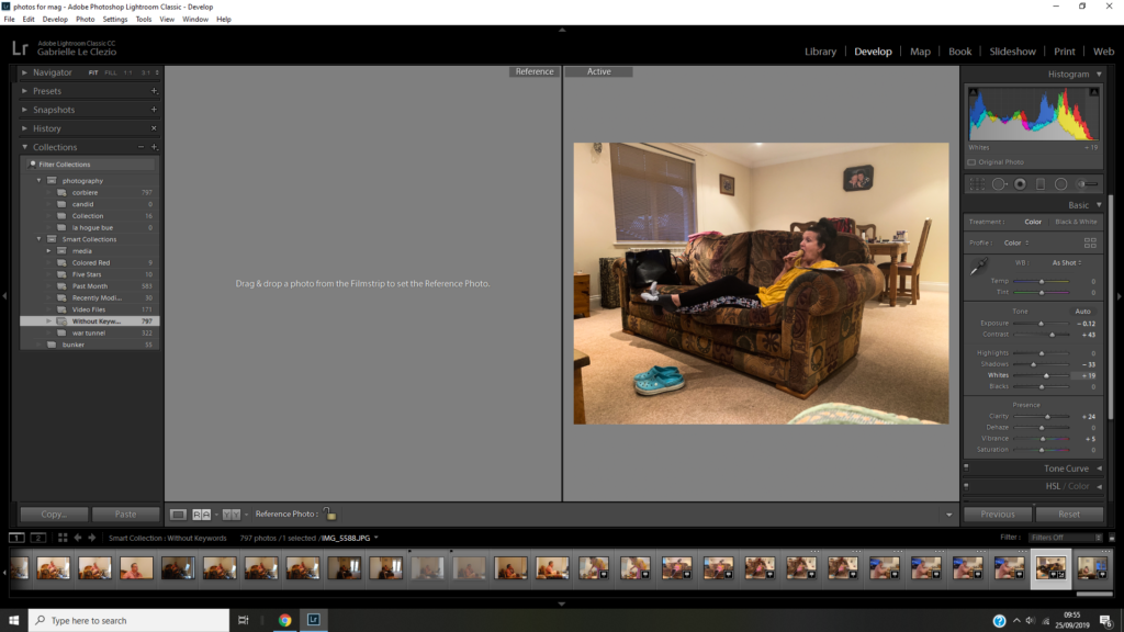
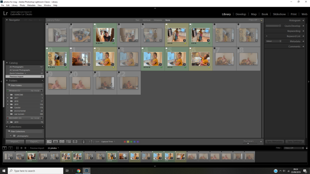
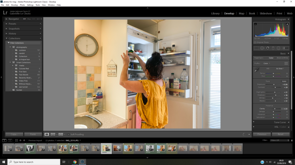
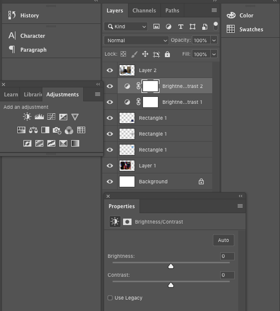
In order to edit the image I stuck to a very simple procedure, simply correcting the exposure, brightness, contrast, vibrance and saturation. As this essence of this project is to capture candid imagery, I though it was essential that I kept the images as candid and raw as possible in order to allow the viewer to make a connection with the people and make them the focal point rather than over the top editing which would distract away from this.
Home Sweet Home:Gran

I think its important to establish who you are photographing before you start shooting. My Gran is 74 years old, born in 1944 in Nottingham, she experience WW2. She was meant to be born in Alderney but everyone on the island was evacuated, her and her family sheltered in a house on the mainland but not for too long as the war was nearly over. Since living in Jersey she met my late grandad and had two babies , they divorced when their youngest child went to uni. My gran moved to the current house she is living in now on her own, shes had love interests since but they either didn’t work out of died. I met her mother when I was little but around when I was 3 years old she died in Alderney. I never met her father, she hardly ever mentioned him. She currently has four grandchildren but two are at boarding school and this is my last year on island and I can tell that she is being to lose purpose.

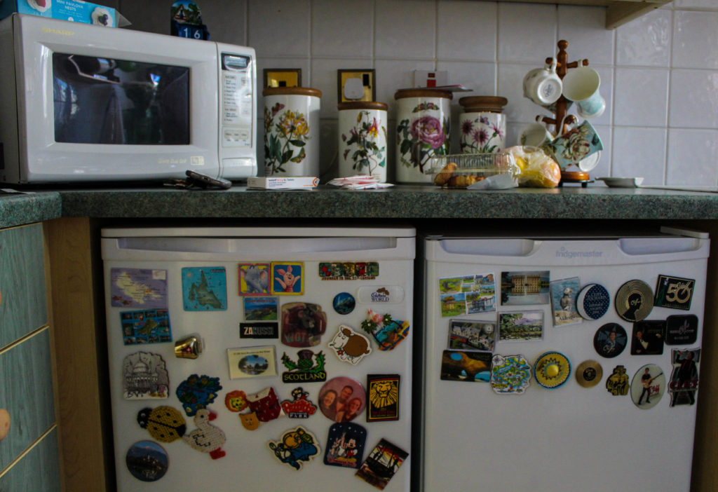
The house she lives in now has great significance to me, it was the first place I slept without either of my parents, it was the place I would go when mum was at work or going out, it became my third home after my dads. I remember so vividly counting sheep in the attic room to get myself to sleep as I thought the house was haunted and I still do today. The kitchen has significance because its where I made my first cake and she would always make cheese on toast for me and no one could make it better than her.

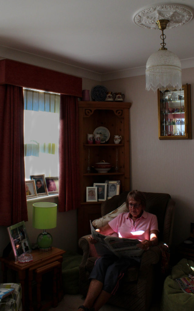
I used to as a child think it was weird she lived alone when she had a committed boyfriend but I understand it, she likes her own small space and I think after years and years of looking after my grandad she just wants to look after herself and not relive it with another man. She likes her small house because its easy to keep tidy and it doesn’t feel empty to her. She frequently is out playing squash, cards, country dancing, holidays, meals, visiting friends and family, but when I see her she’s always at home, when I think of her the house is a part of my image.

My Images

Analysis

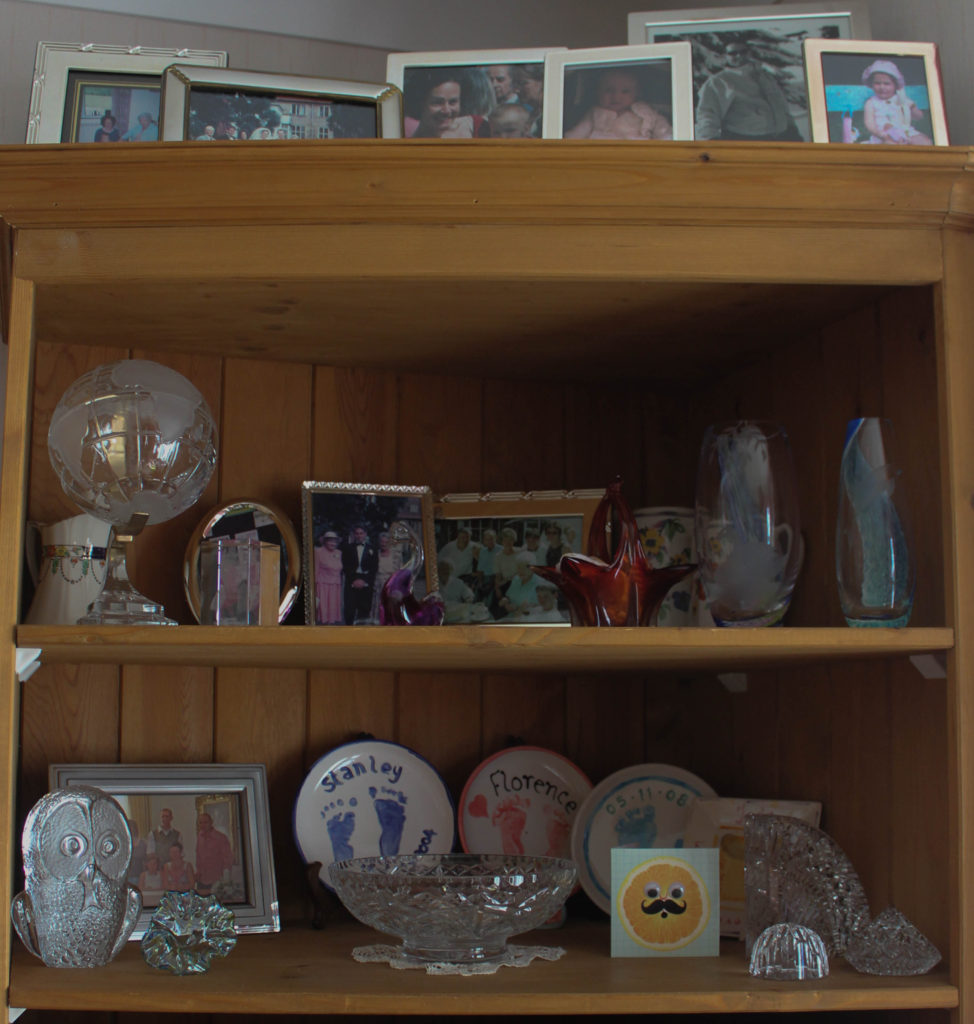
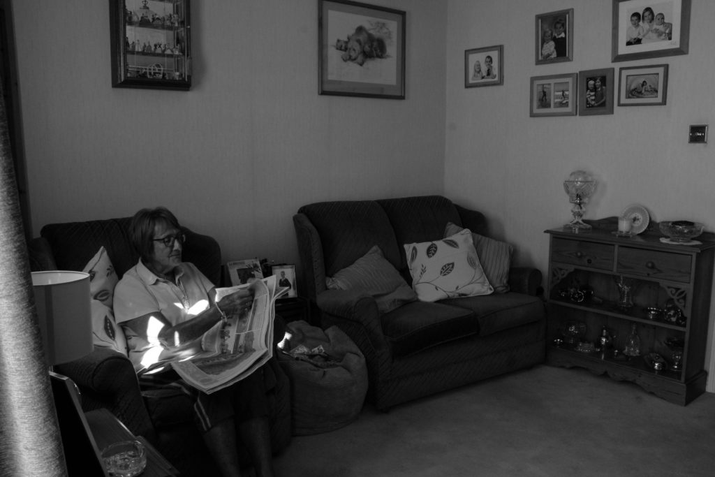
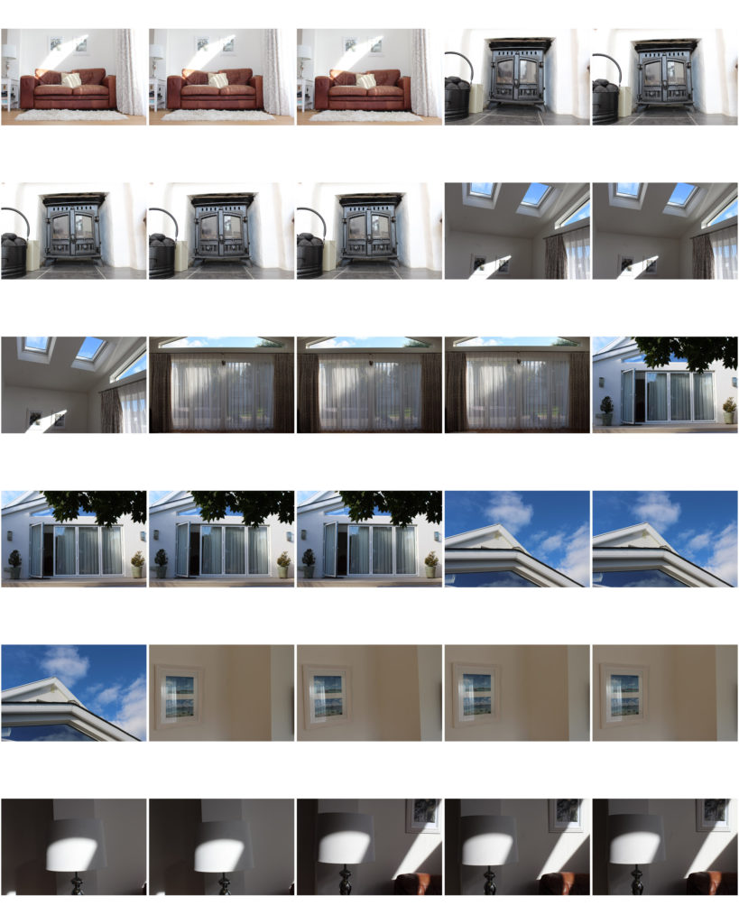
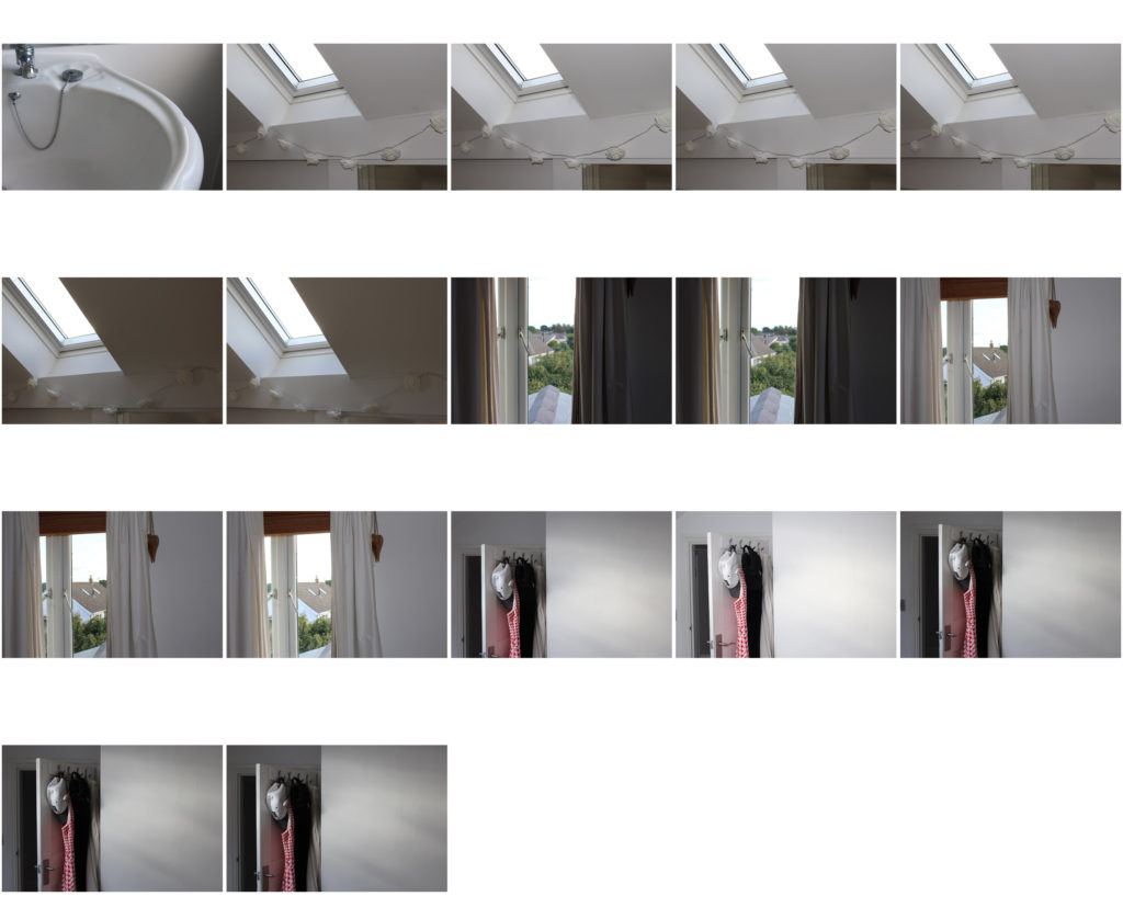
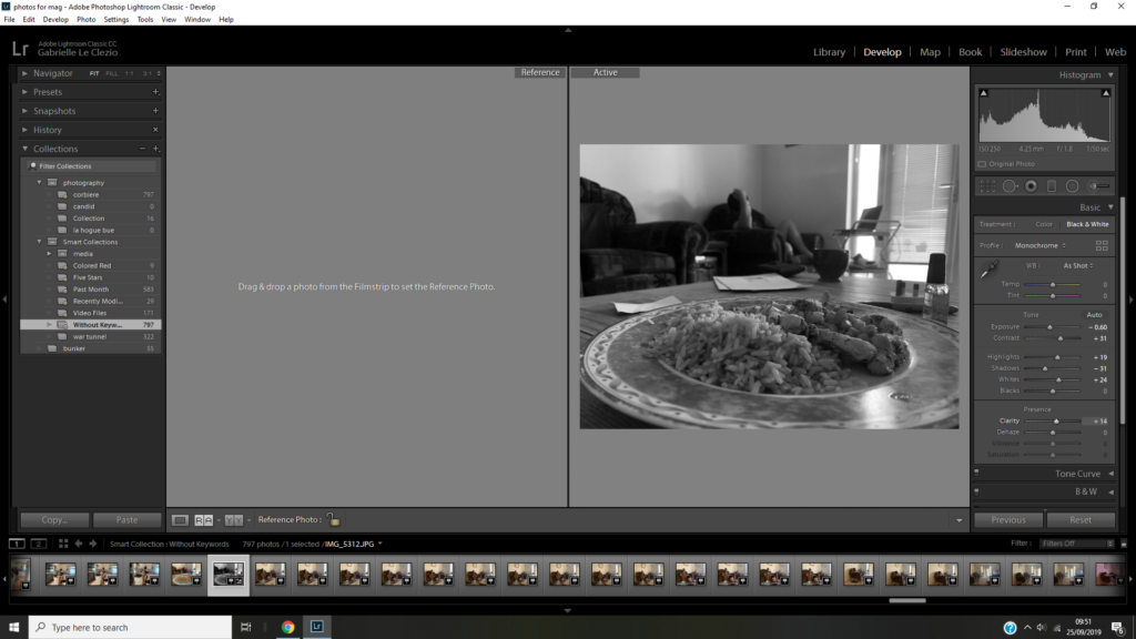
Overall I am pleased with my shoot as I feel I have several successful images. All images of my gran are candid as required of the task but I wanted to also include close up images of item and furniture in her house in order to get a further sense of who my gran is. I’ve always wanted to capture images of my grans house as I feel it has so much character to it, all the trinkets and photos hold meaning and have a story behind them. I feel her house mirrors her age well because modern houses are usual minimal, mostly white and lack individuality. When I arrived she was just sat on her sofa listening to the radio with a paper in her hand so I captured that, rather then placed her in an unnatural position, I wanted it to feel as authentic as possible, therefore I had low levels of control. She then later went in the kitchen to make a cup of tea so I followed her and just took shots of her getting on with it and then some close ups of features in that room. I used natural lighting in all my images and a mixture of close ups and wide angle images. I have cropped every photo in lightroom to get rid of any unnecessary space to make sure the focus of the image is clear. I chose to have both colour and black and white images as I wanted to replicate her my memories in her house differ, some are hazy(black and white) and others are very vivid(colour). The contrasting tones of light and dark also represent how life in that house has been for my gran, some sad things have happened since living in their as well as amazing things.

Photoshoot of Occupation Survivors.

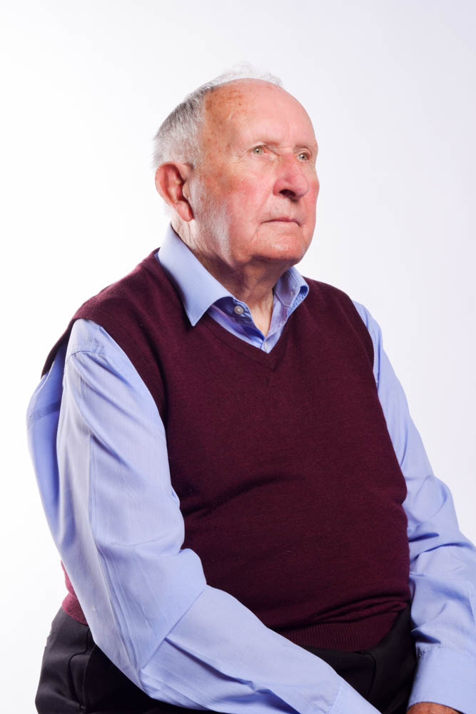
As a follow up to the interview with Hinualt and Joyce, we were given the opportunity to photograph the pair in the studio.

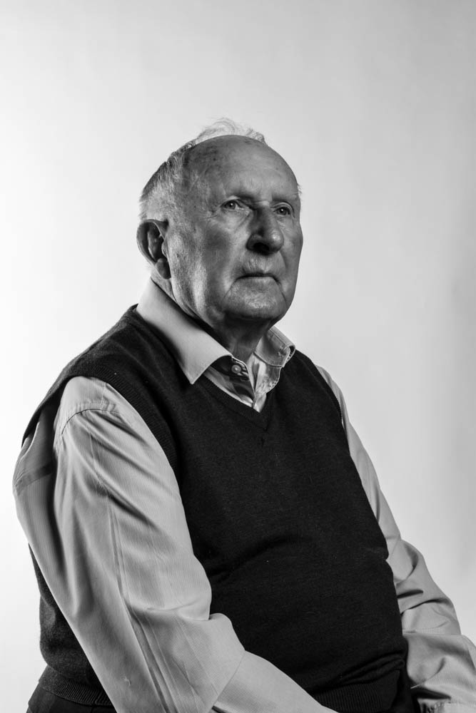
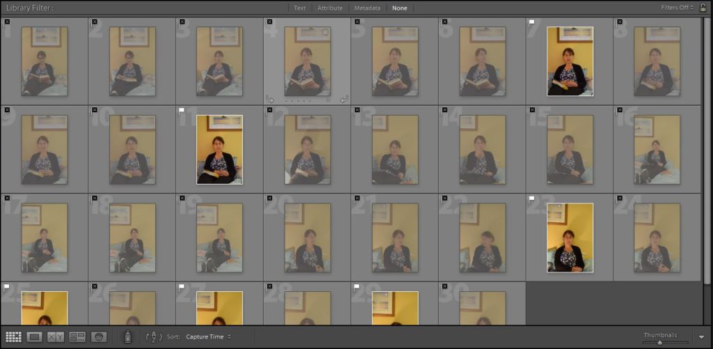
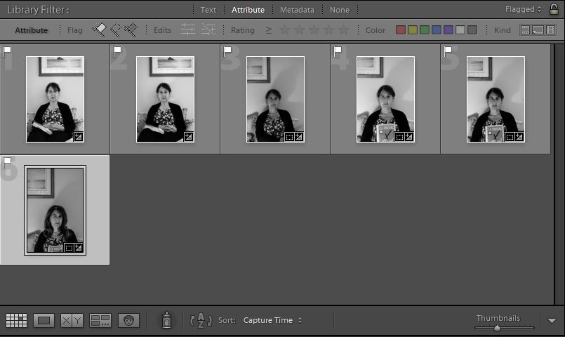
Pick/Discard.
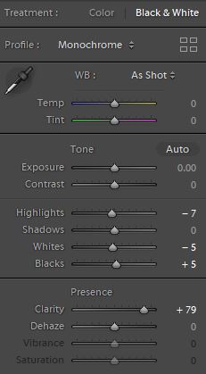
Editing.

Concept/Context:

For this image I wanted Hinault to appear to be remembering the past. During the interview he mentioned that the Occupation was something he now found ‘hard to remember’ but he could ‘never forget’ it. This is something that I wanted the portrait to show.

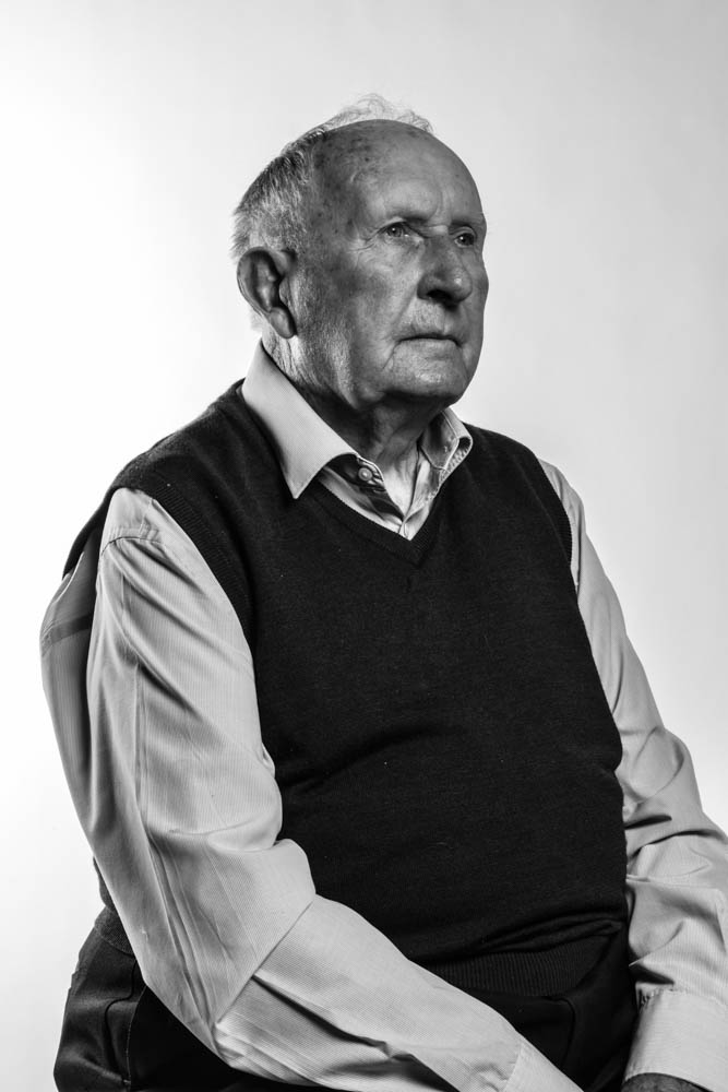
I also knew when I took the photo that I would later use Lightroom to make the image black and white. This was to mimic the colourless images that would have been taken during the 1940s, before colour photography was available.

Visual:

The above image shows Hinault looking off to the side of the camera. I asked him to do this as I wanted to create a distant, far-off look on his face. This was to show that Hinault was lost in thought, remembering the Occupation. The look of content on his face suggests that he is remembering on the more pleasant experience from that time.

A second feature of the image is the choice I made to make the image black and white. I did this for two reasons. The first being that I wanted to make the image resemble those from the 1940s. The second reason, was to give the image a slight bitter-sweet feeling. While Hinualt’s face shows that he may be reminiscing a positive memory from the Occupation, the monochrome look of the image as a whole adds a sense of sadness that contrasts this. This represents that idea that while there were the occasional good thing that happened, the five year occupation was a tragic time for the people of Jersey and the survivors now find it difficult to think about without tearing up, something that both Hinualt and Joyce demonstrated during the interview.

Technical:

I took this image in the studio using a shutter speed of 1/25secs, an aperture of F/16 and an ISO of 100. Soft boxes were used to illuminate Hinualt’s face and prevent shadows using a light from behind.

Experimentation:

Contemporary Artist – Martin Parr

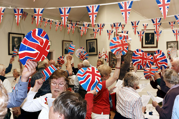
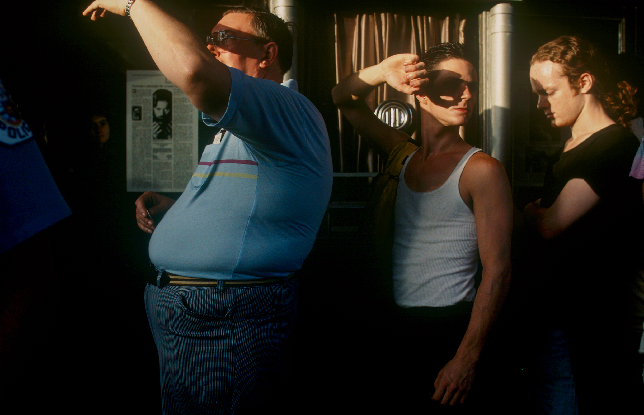
Martin Parr, born May 23rd 1952, is a modern documentary photographer. A lot of his work is based upon social classes and power. Some work that links to power are his Liberation imagery, in these images he uses the event of Liberation Day which is celebrated every year in Jersey to create photographs, usually of people to show the power that people that lived through world war 2 have regained power.


Technical: This image uses unnatural lighting, which is coming from above. Though the lights are dim and therefore cause the brighter colours within the image to stand out more, such as the hats and the people. Martin Parr has taken this image from fairly close up using a wide lens to see as many of the people within the frame. He may have decided to take it from this close to display how closely he and we are related to these people.

Visual: This image uses lots of colours. The main colours that stand out are red, white and blue. This was likely done to show the people within the images overwhelming love for Britain. This is also shown by the Union Jack logo being repeated throughout the image overhead and on the hats.

Contextual: This image was taken at a Liberation celebration which is a celebration in Jersey to remember the day the island was liberated from the German occupation at the end of World War 2. This image shows people who likely were very young during the time of the war or born shortly before it ended.

Conceptual: This image was taken as an image to celebrate Jerseys freedom from Germany during World War 2. It was taken on a Liberation day celebration, it shows lots of people who were likely alive within the war sitting down with Union Jack hats. An idea Marin Parr may have had while taking this image is to stay close to the people within the room to show the connection between him and them. He may have also decided to take the image while they were all holding the hats in the air to show that they have faith in their country.

Portrait Edits – Joan Tapley

Intro

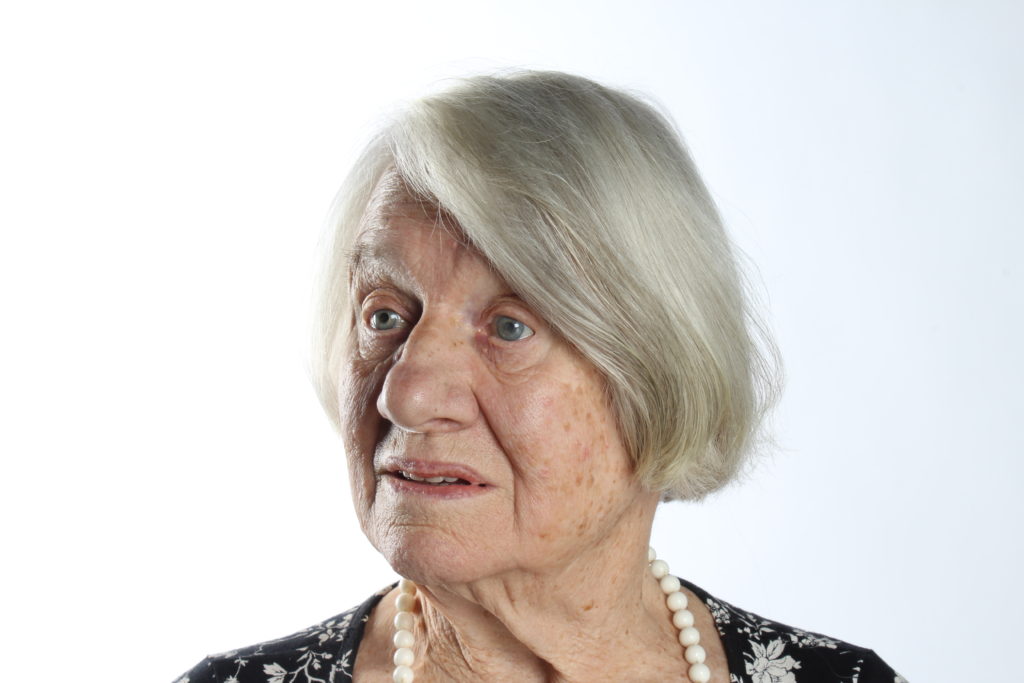
Joan Tapley, a living survivor of the German occupation in Jersey came to our school to tell us her really interesting stories of how it was like for her living in Jersey during the occupation and how she and her family survived it. After that she was kind enough to let us photograph her and take portraits of her in the schools studio, so i chose the best one of these portraits and i edited it to make three different versions of it.

The Original Photograph

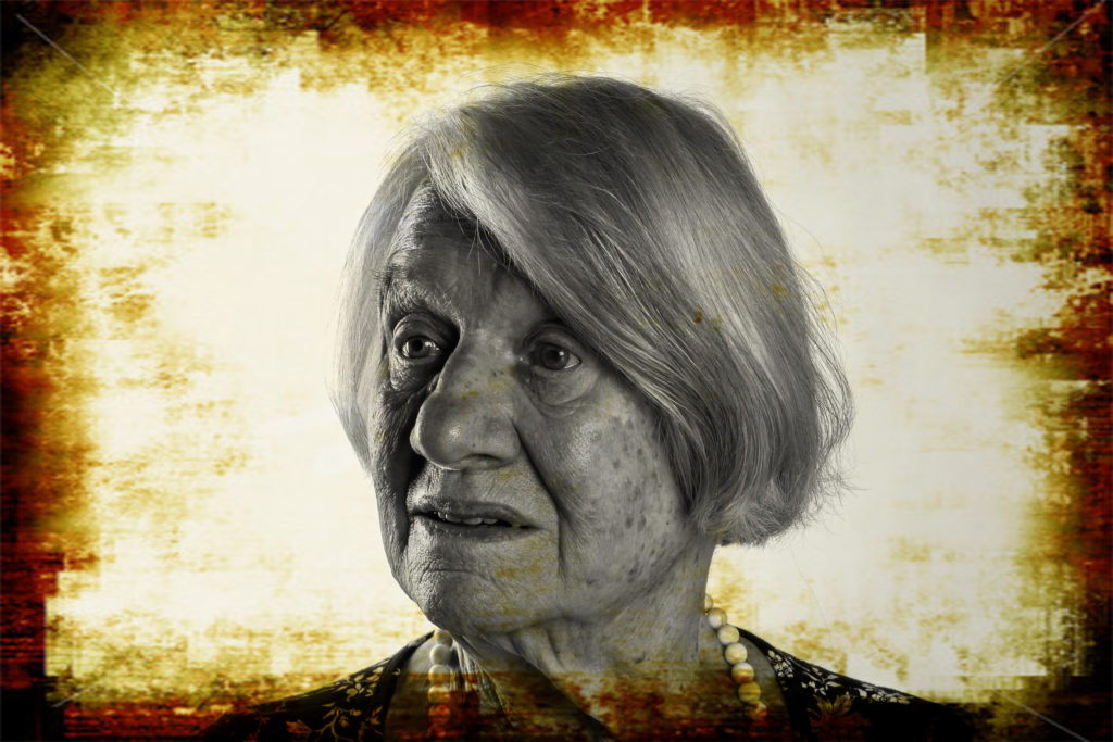
This is the best portrait i chose in the end as i really like Joan’s pose and face texture along with the great angle in where there’s some clear light on her left and then on the other side there’s a reflection of light, so this adds so much vibrancy and color to the photograph.

The Edits:

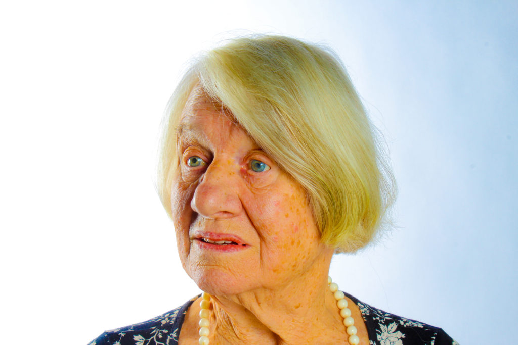
1)

first thing i did after choosing the photograph i want to work with is change the colors in it by adjusting everything from exposure to temperature manually until i came up with this really colorful portrait

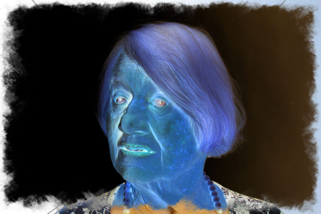
2)

after editing the photograph i imported it to Photoshop cc where i embedded a frame behind it and binded them together to produce this really alien like color feature to the portrait and it really caught my eye so i decided to make it one of my three final edits

3)

Using one of light-rooms automatic filters i turned the original photograph into black and white, then i did some changes like raising up the contrast, after i was done editing it i embedded a frame on top of the image o make it look like an old style image.

Conclusion:

In conclusion, the purpose of this blog post is to improve my editing skills and to prove how many different forms someone can create from one photograph.

Hedley and Joyce Edits

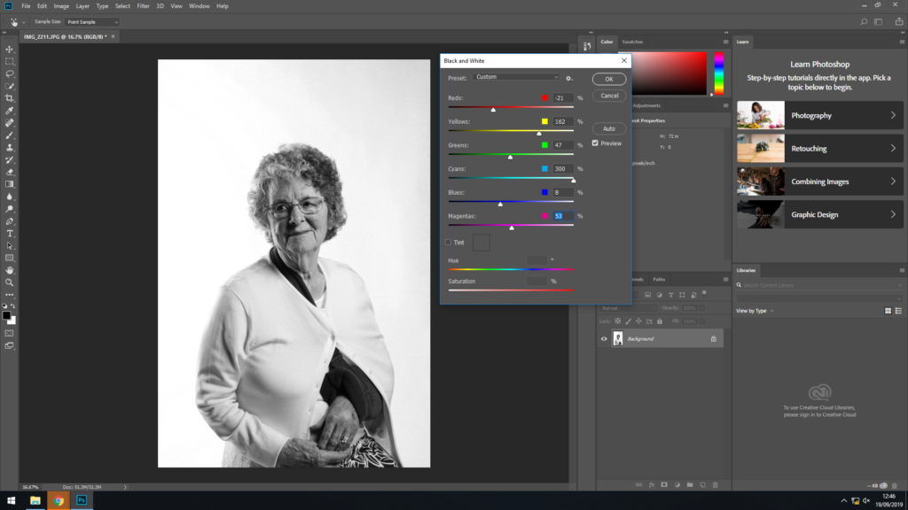
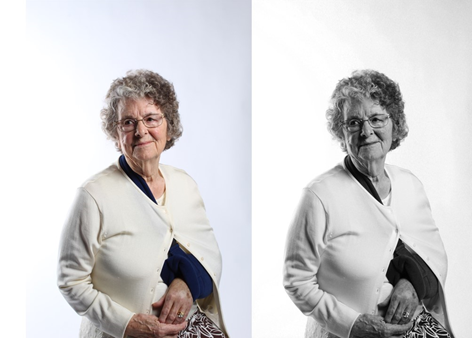
After making adjustments to the original image I saved it twice, once in color and then editing the other one into black and white. To convert my image into black and white, I lowered the exposure on the image, only slightly and then went into adjustments and changed the image to black and white. I then adjusted the colors within the image so i could increase the darker and lighter patches within the image to make it stand out more and make her features bolder

These are my final images of my portraits of Joyce. The adjustments I made helped define the features on Joyce, like her skin complexion, which enhances her age, as the shadows under her eyes make her look older which enable the audience to see her age and imagine her history. I converted the same image into black and white, this is because during the younger ages of Joyce’s life, photographs where in black and white as they had not yet discovered colored images. However, the bottom left hand side of the image is lighter than the top right hand side, which creates a fade effect. This looks okay on the black and white image, however on the colored image it doesn’t look right.

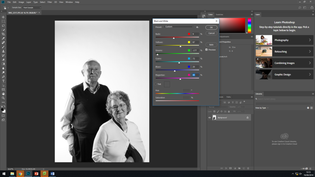
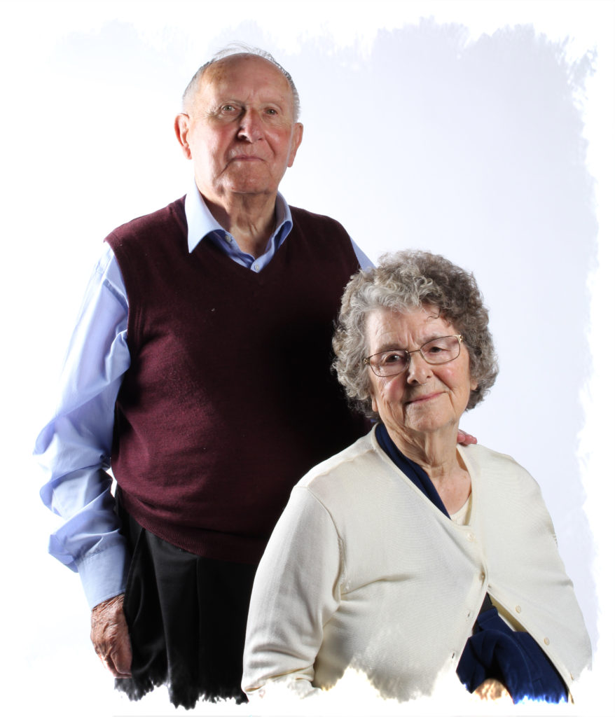
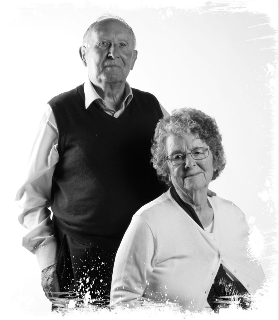
Similar to the portraits of Joyce, with the portrait of Hedley and Joyce I made adjustments in color, saved it twice and the edited one of them into black and white. The settings were slightly different to the one person portrait, as Hedley had different colors to Joyce, so I had to balance them out, but enough to still show the complexion within their skin sand their features showing their growing age.

These are my final images of the portraits of Hedley and Joyce. When photographing two people I had to change the way the lighting was positioned otherwise the shadows created by Hedley would’ve been projected onto Joyce taking away the boldness of the image. I learnt that photographing two people together, a lot more planning has to go into it, so they compliment each other.

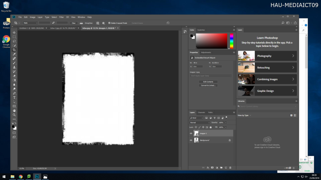
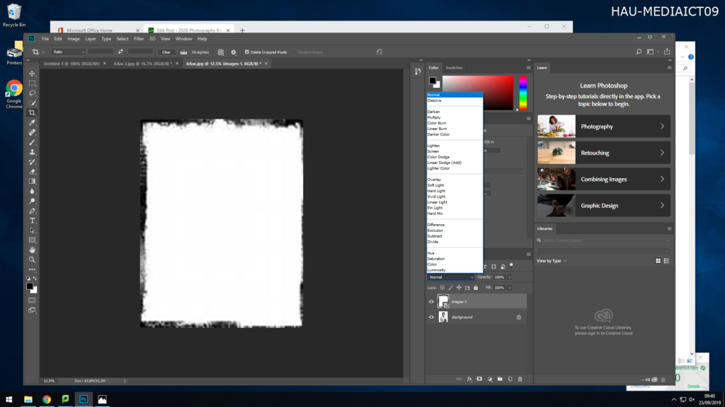
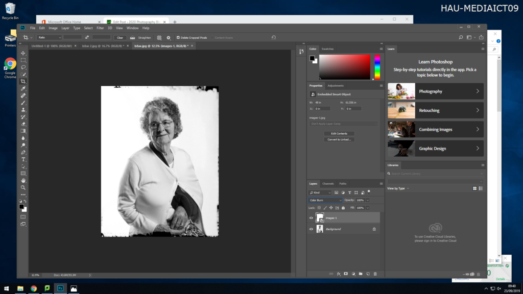
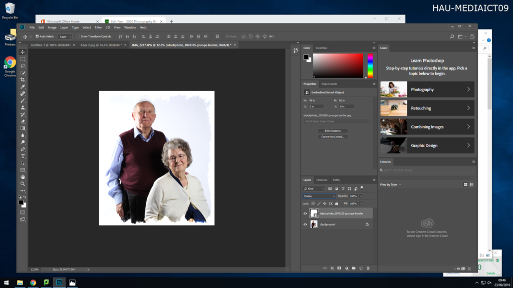
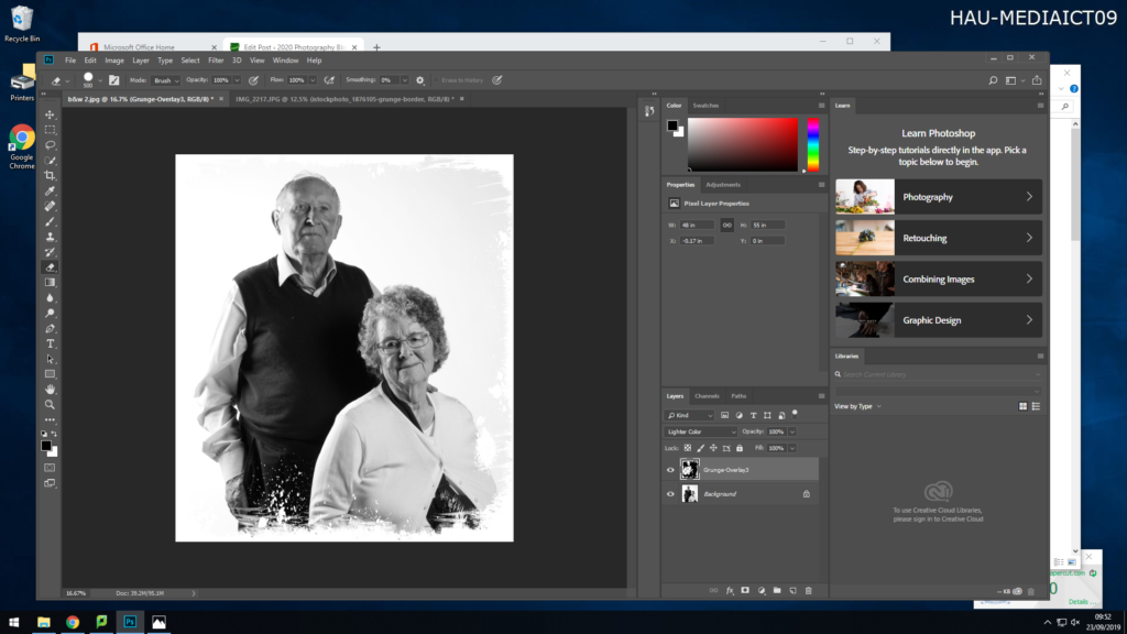
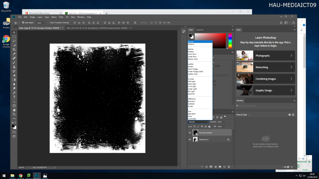
To the images of Joyce I added a frame around the portrait as I felt that it would add age to the image. I opened the original black and white portrait in Photoshop, then copy and pasting a frame from my folder onto the image of Joyce, this allowed me to stretch the image over Joyce. Above the two layers I had create was a drop down box with different settings, once selected the layer with the frame on it, I clicked on the drop down box and selected ‘Normal’. The using my right key, I slowly went through the different settings, this changing how the frame sat on the image, and what parts of the image it covered. Once I selected the frame I preferred, I then re-saved the image as a new image (JPEG). The frame I picked makes the image look as if it was taken on a film camera with the border surrounding it, as if the ink in the photo has bleed around the outside slightly, this adds age as film cameras are associated with war and the 19th century. The frame adds character to the image and makes it stand out as it inst just a standard portrait, with the knowledge I have on Joyce and her experience during the occupation I feel this frame fits her past.

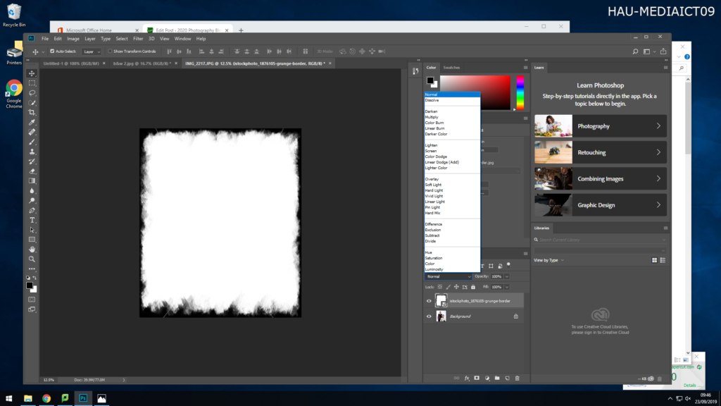
With the images I took of Hedley and Joyce I then again added frames to them, I experimented with different types of frames as show above. I executed the same steps as I did when I was adding a frame to the images of Joyce. I decided t use the white frames on both images. It gave the colored image a rounded shape, acting like it had been destroyed and these were the pieces that were left from the war, which again as they both experienced the occupation it fits well with their stories, the same thing with the black and white images, adding a frame which gives the image a damaged look, gives the image character and effect which relates back to the couple.

This image has an empty alt attribute; its file name is edit-2--878x1024.jpg

I took time with the images of Joyce and Hedley, I experimented with different frames, as show above in the screenshot evidence I gathered during the process.

Home Sweet Home #1.

Image Selection:

Final selection

A large amount of the images I took had to be labelled as ‘Unusable’. This is because my brother kept distracting my mum when I was trying to capture the photograph.

Image One:

Before -> After

Concept/Context:

The idea behind this image was to capture my on her favourite place in the house which happened to be where she likes to read. This lead me to make the decision to have her hold up ‘The Casual Vacancy’ by J.K.Rowling, the book she is currently reading. I also wanted my mum to wear the clothes she wore to work that day. This gives a look at what kind of job she might do based on the level of formality in the outfit. It also shows that she may have not had time to get changed since arriving home.

Technical:

I took this image using an aperture of f/5.6, an ISO of 400 and a shutter speed of 1/3 seconds.

Image Two:

Home Sweet Home task 1: Candid Photography

Candid

Examples:

Image result for candid photos

Definition:

A candid photo is a photo taken without posing or positioning The image is normally taken without the subject’s consent or awareness.

List of Candid Photographers:

Henri Cartier-Bresson (1908-2004)

Garry Winogrand (1928–1984)

Vivian Maier (1926-2009)

Josef Koudelka (1938- )

Robert Doisneau (1912-1994)

Jill Freedman (1939-)

Walker Evans (1903-1975

Editing:

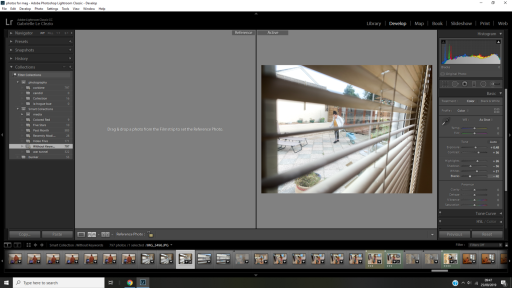
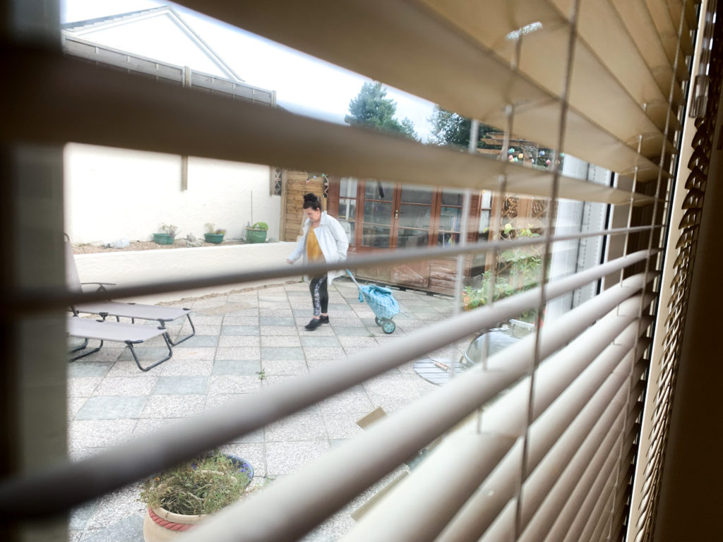
I really like this photo because of the way it’s taken completely hidden and is taken at an interesting angle. You can see the interior and exterior of the building both giving you ideas about who the subject is.

I really like this image because it’s taken without the subject’s knowledge and you have interest in both the background and the forground.

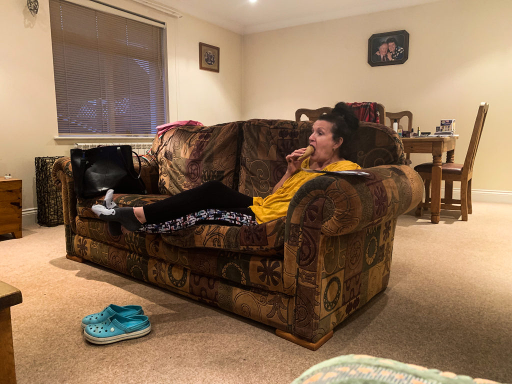
I think this image is interesting because there’s a lot in the image and at the center of it all you have the subject gnawing on an icecream. I also like the vibrancy of the image and the amount of detail in it. I like the wide angle of the room so that you can see pictures on the walls that tell you about the person and shows you the faces of their family and their past.

Home Sweet Home task 1: Environmental

Environmental

Examples:

Image result for environmental portraits
Image result for environmental portraits photography

Definition:

A portrait taken in the subjects usual enviroment, usually home or work place with the background maybe slightly blurred or illuminated.

My Selection

Editing:

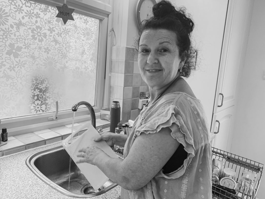
I like this edit because I’ve got the subject actively working and you can see items in the background that give a sense of who she is, what she does every day. I increased shadows and decreased contrast in order to create more varients in shading. If I took the image again I’d try and focus more on her eyes.
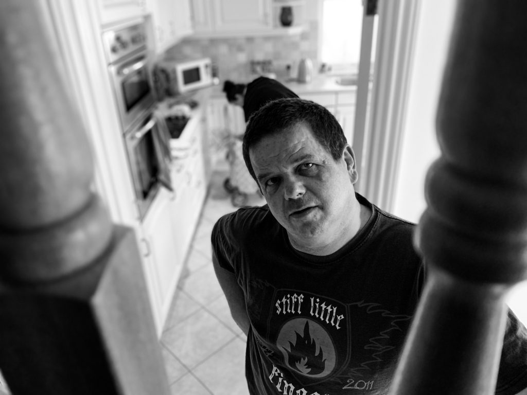
I really like how this image is framed with the parts of the stairs and how you can see whats going on inm the background but it’s blurry so there’s more of a focus on the subject.