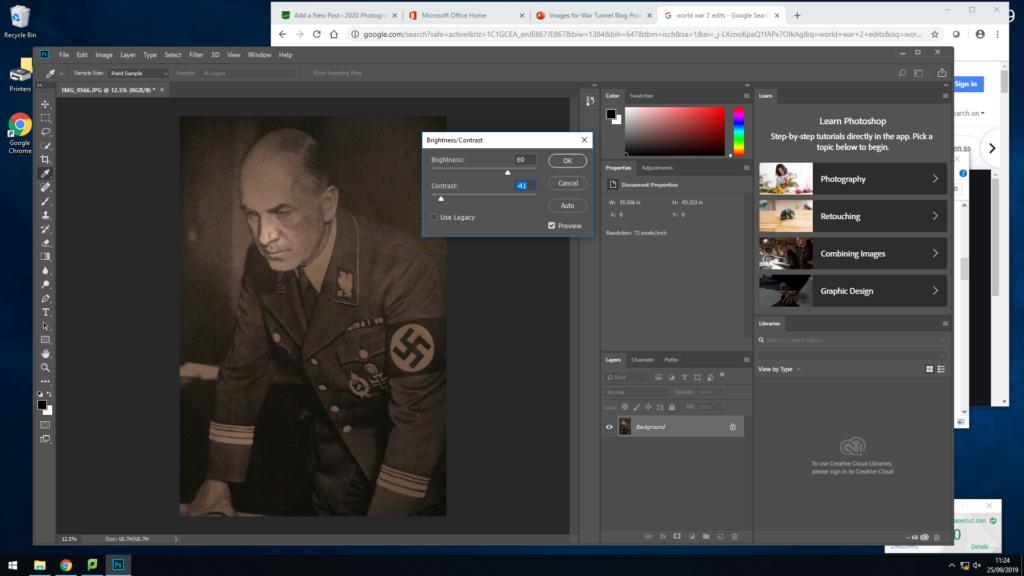
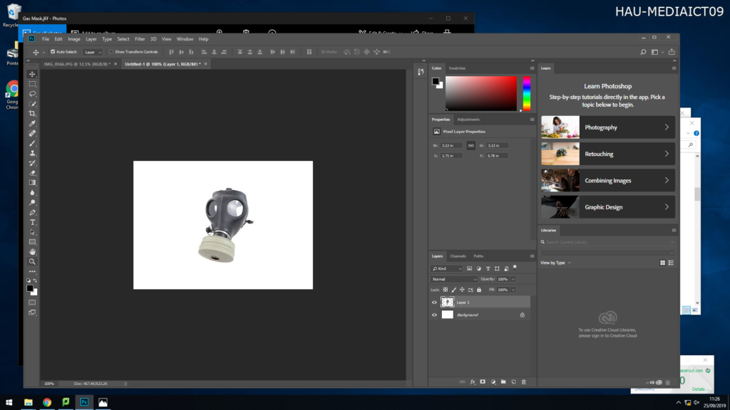
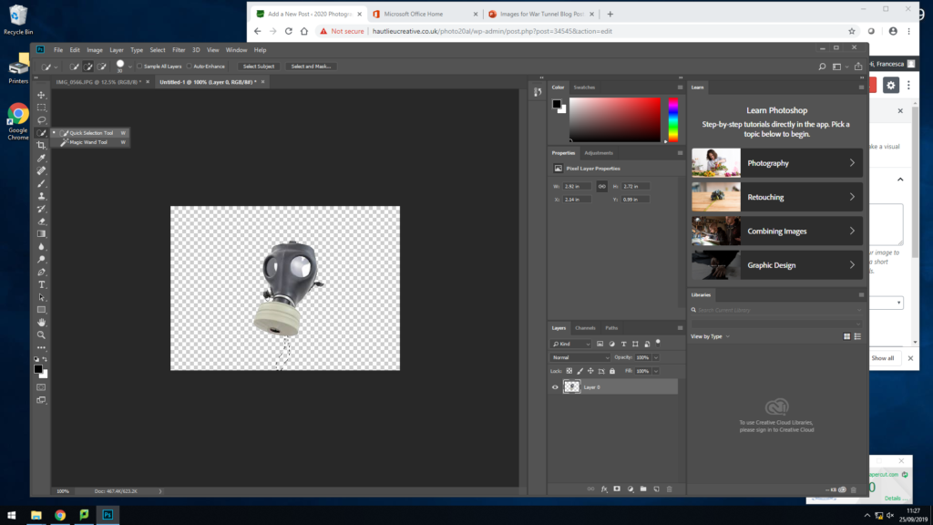
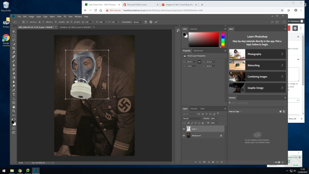
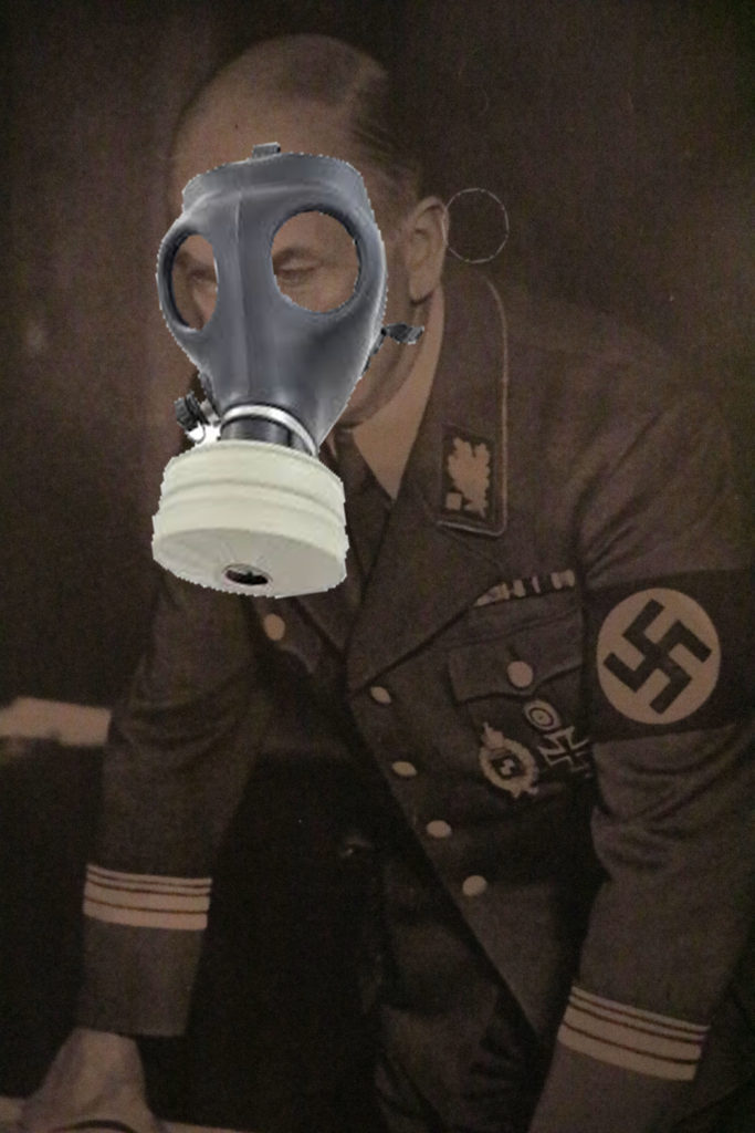
To create this image I started with the original image of the solider, I chose this as my main piece because it is a strong image and shows history. I firstly started off adjusting the brightness and exposure of the image, I turned up the brightness of the image so you could see the man more clearly as his features and clothing play a main role in the image. I then opened the image I was adding on top of my base image. To this image I removed its background using the quick selection tool, then dragged the final image over to the base. Here, I used the eraser tool to removed any little details that didn’t fit the man face, along with using the blur tool to make it look more realistic that the mask it on his face. I decided to put the mask on top of the German solider as they are both key image of the occupation. I am show casing the problem of gas mask, which was the German’s dropping bombs around the island making it unsafe for islanders, meaning they had to use gas masks to survive.
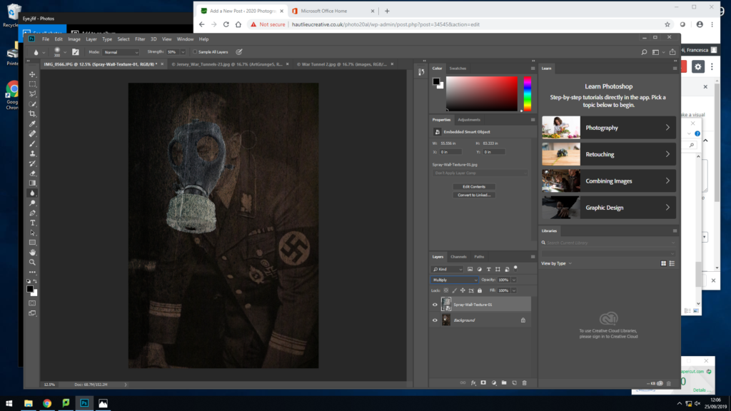
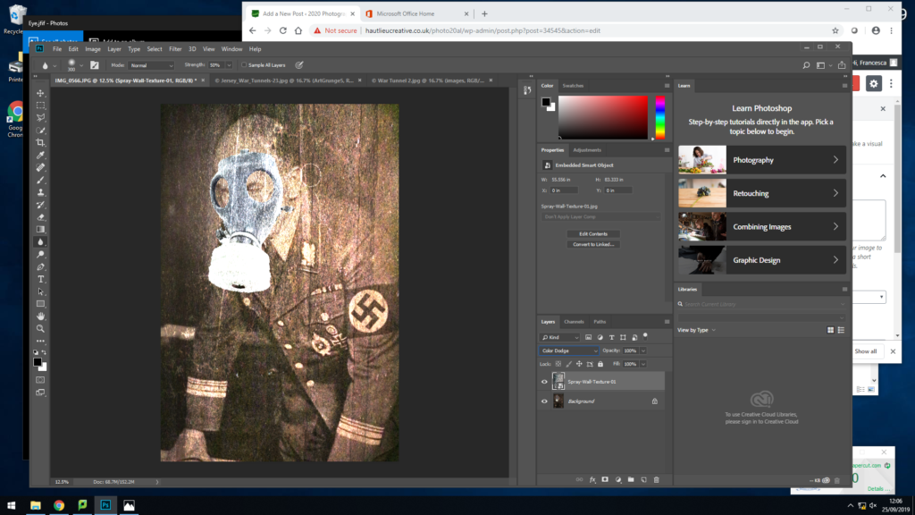
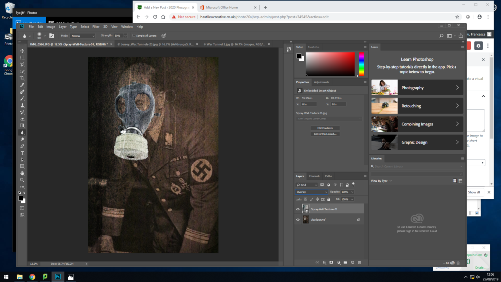
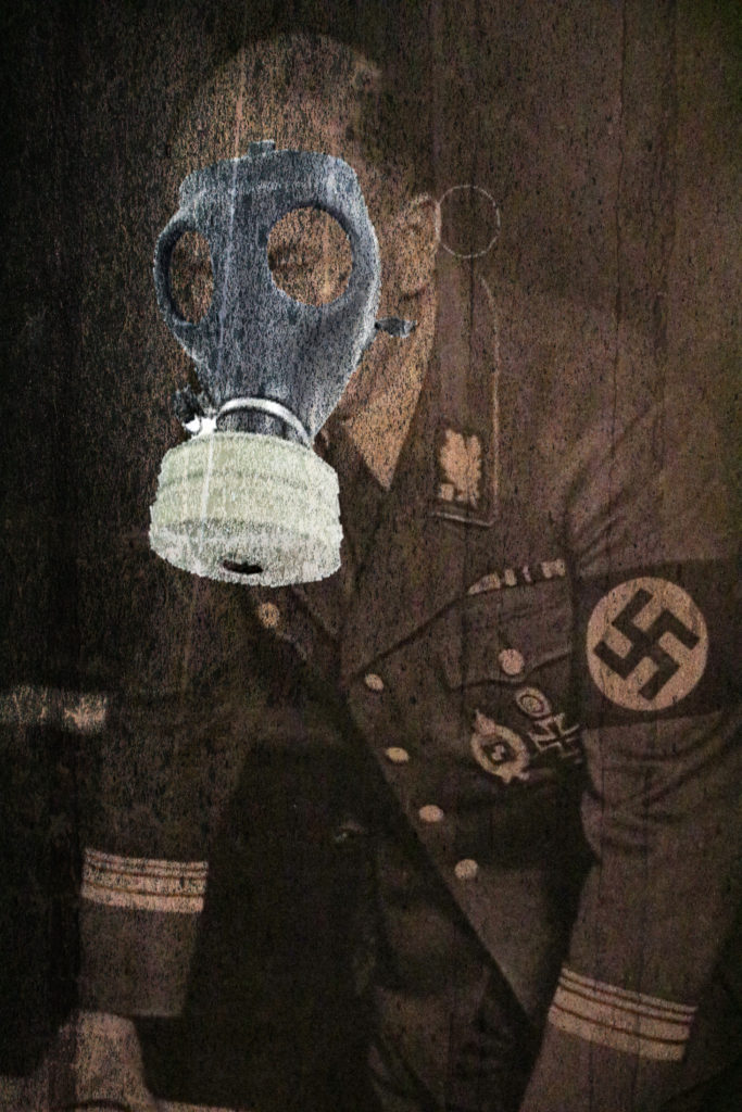
After finishing my image, I then tried out different backgrounds to give the image a different effect and texture. This gives the image a more ancient and older feel to it.
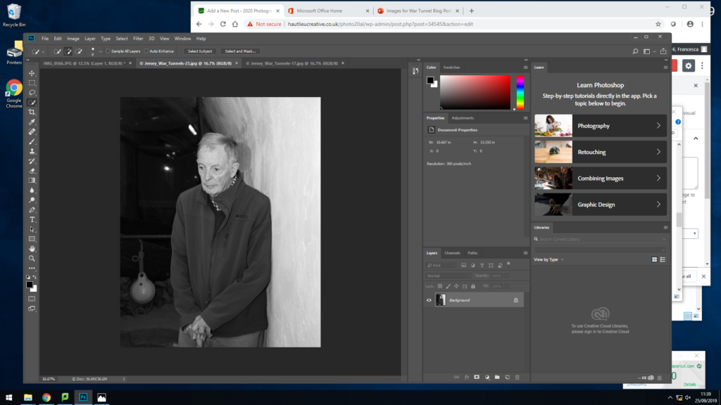
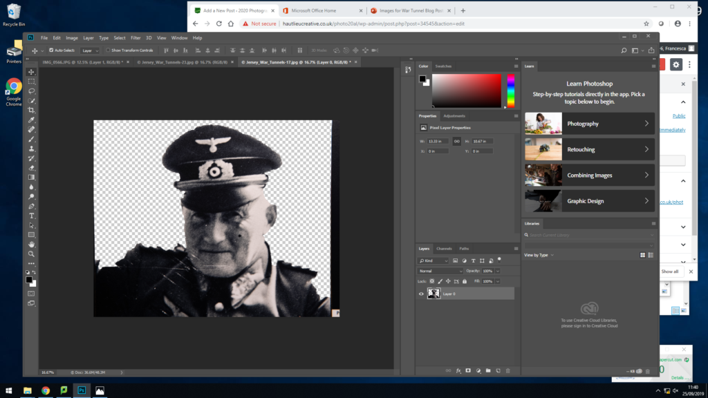
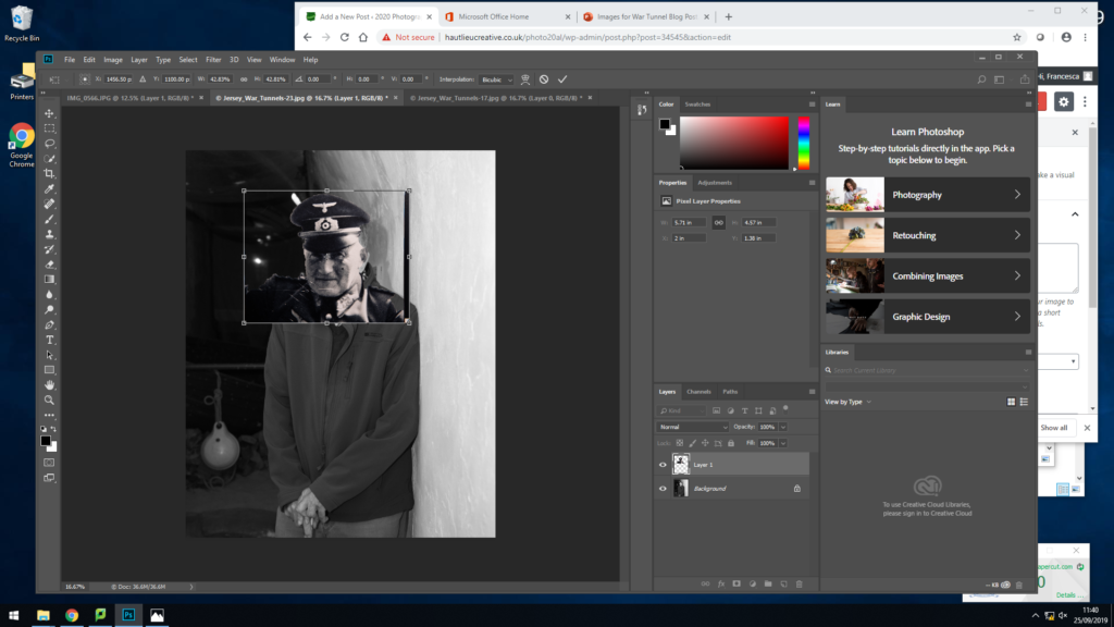

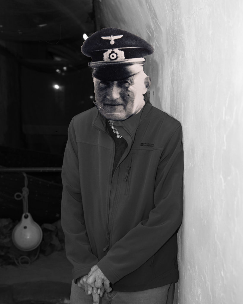
I started with the original black and white image of the guy who showed us around the war tunnels, he spoke about the knowledge he had during the war and how his father was a solider. Knowing this, as I went round the war tunnels I made sure I photographed an image of solider so I could use it for an edit. One I came back to school, I edited the photos into black and white and adjusted a few of the settings so everything was more clearer and in focus. I then set the image of the man as my back ground, then opened up to image of the solider seperatly. To this image I removed the background by using the quick selection tool, then I dragged it over to the background image and placed it over the man face. I then stretched the image to fit over the face and using the eraser tool go ride of the extra parts I didn’t need or didn’t fit his face. After placing the face down I then when in with the blur tool, I did this so there wasn’t such a distinct difference as it was off putting when looking at the image. After this I then flattened the image. Overall, I like this image as it is portraying the mans history by paying respect to his father for going to war.
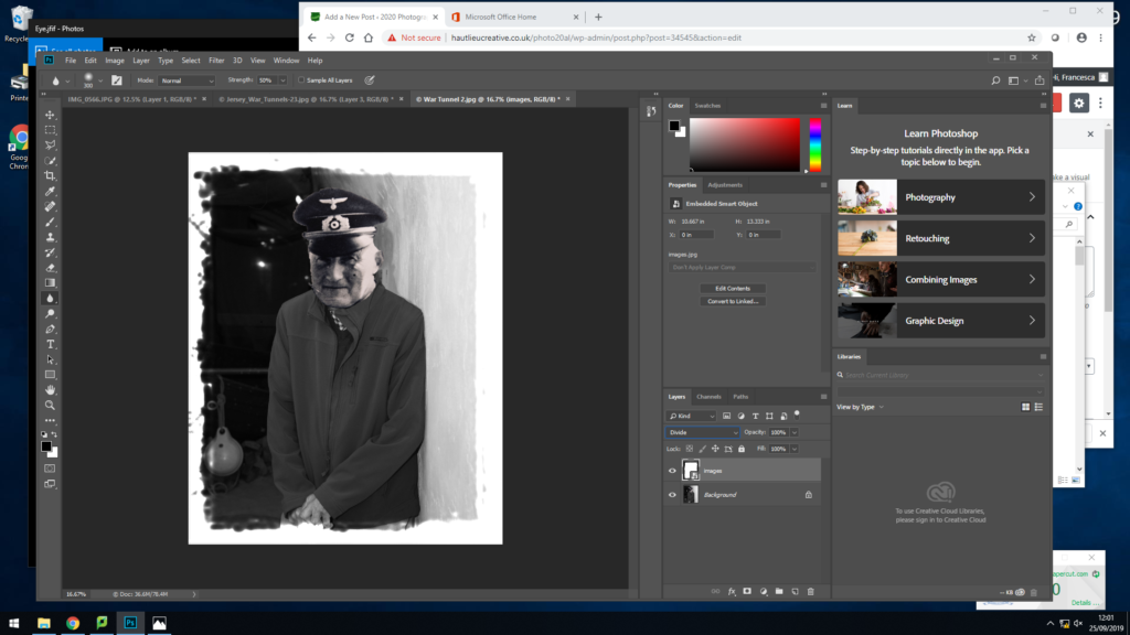
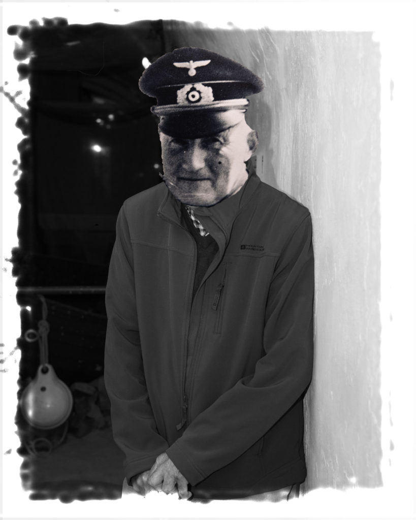
After then editing this image, I decided to play around with adding frames to my images. I dragged the frame across to the image, sized it up, then down by the layers I changed it to normal and using my arrow keys I was apply yo go through different effects the frames had on the image. The frame above I decided on as it made the image look older and it fits the genre of the image.
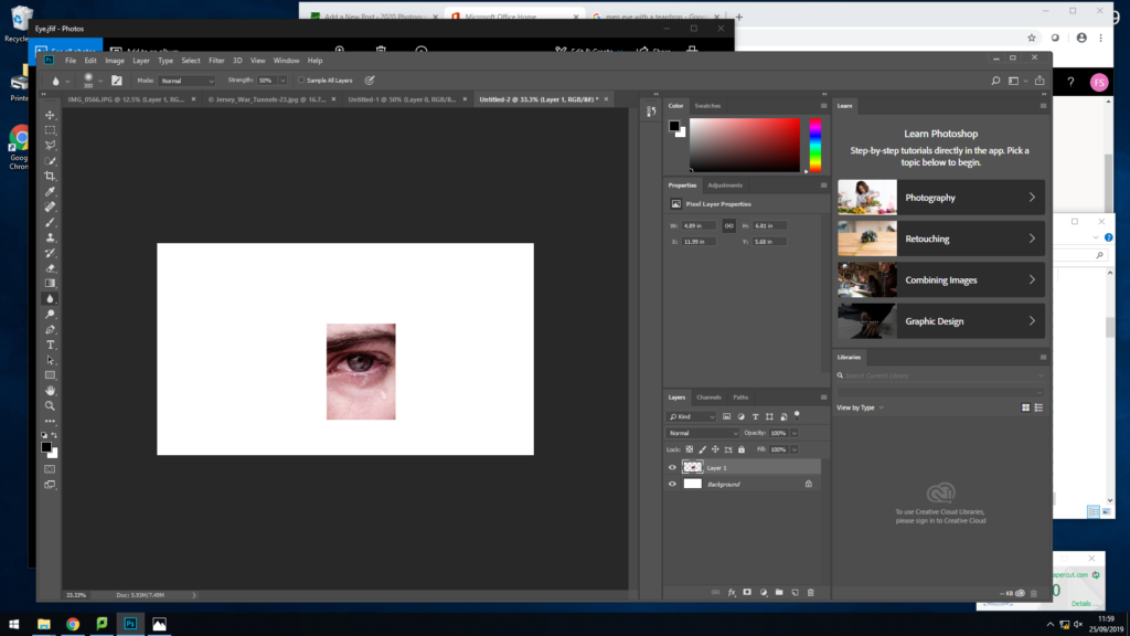
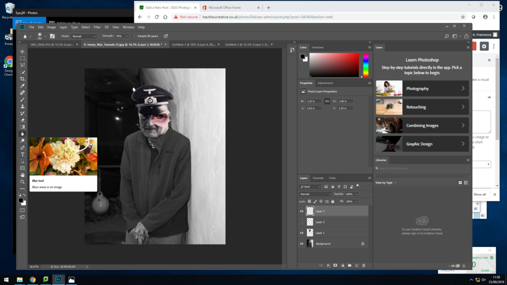
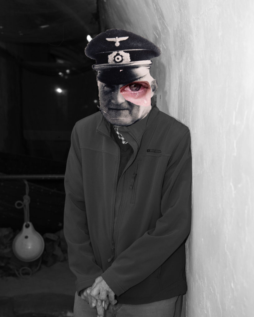
After making the final image previously, I wanted to try some experimentation and do something different. So I removed the background of an image with an eye with a tear, I then dragged it across to the image and made it slightly bigger to give it an affect. I did this to make my image more effective and hard hitting as it is showing a painful emotion from a touching event that has happened to the people of the war.
