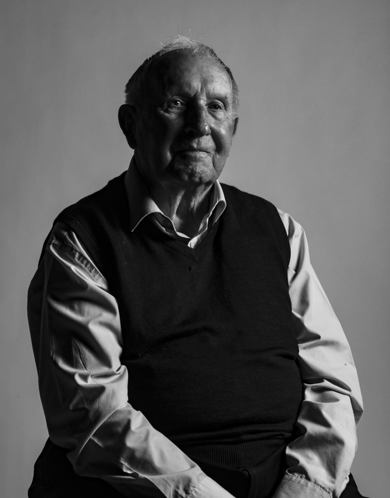
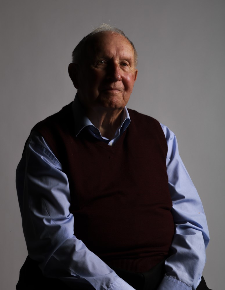
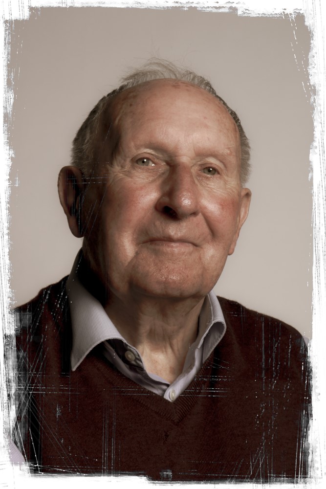
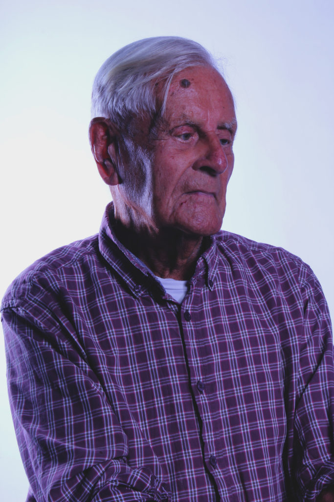
I like this image as i like the way the light is coming in at the side and creates a chiaroscuro effect on the side of his face, but the eye is still seen. I feel the flash really captures his facial features which I amplified and adds more feeling behind the image. the light creates interesting shadows and allows greater texture to see seen. I like the direct eye contact that I captured from Hedley, it makes the photograph seem more personal. Hedley is also relaxed in this image which makes it seem less formal. I cropped the image to frame medley better and not have so much negative space. I chose to out the image in black and white because I thought it would compliment the lights and darks in the photos and accentuate it.
What would I do differently?
If I ever got this opportunity again, I would probably change the angle in which I would photograph my subject, and maybe get them to pose in different ways. I may also experiment more with various light sources and angles. Overall however, I am happy with my outcomes and the way I went about the shoot.
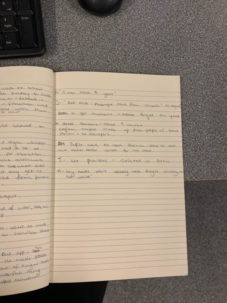
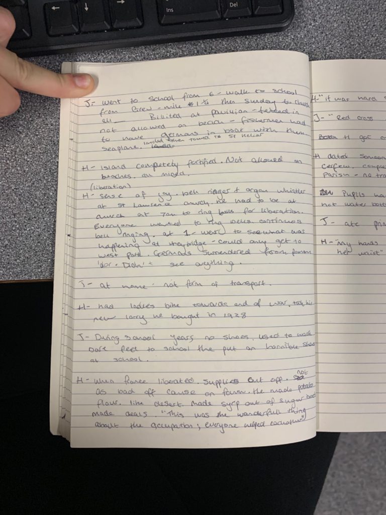
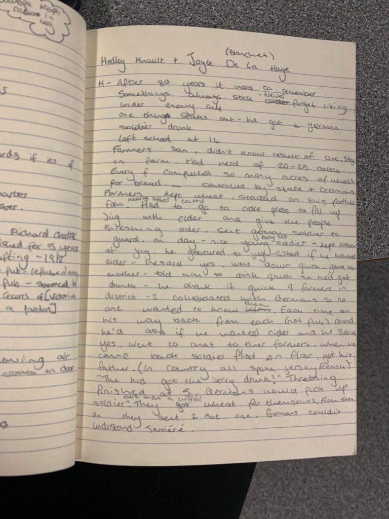
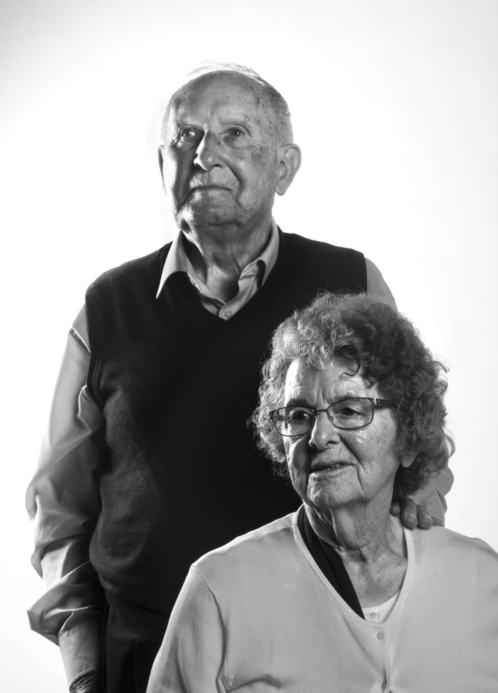
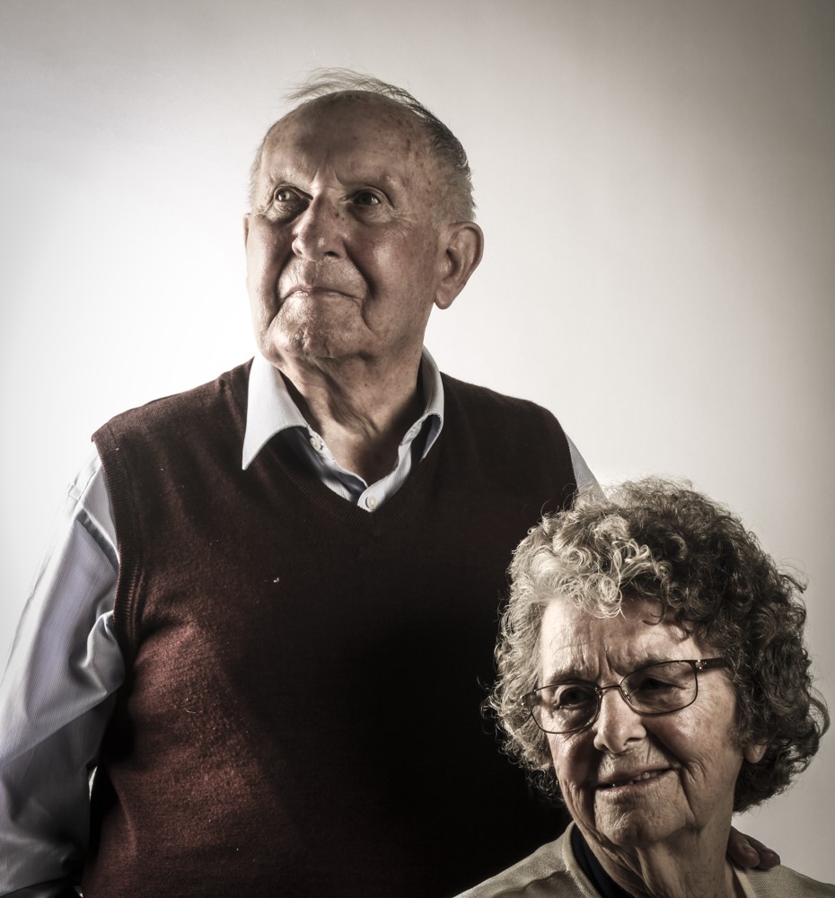
Two survivors of the occupation, Hedley Hinault and Joyce De La Haye, came in and shared their stories with us. Joyce was only a young child going to school so she told us about that, while Hedley was a teenager working on a farm and told us about the time he got a German soldier drunk. Joyce was rather shy at first, but gradually got more comfortable and I managed to chat to her one-to-one over tea and biscuits. Hedley however was rather confident and also very cheeky as he said whilst we were taking photos “my hands arent usually here, they’re usually on her wasit” .
These are my notes I made whilst they were talking:
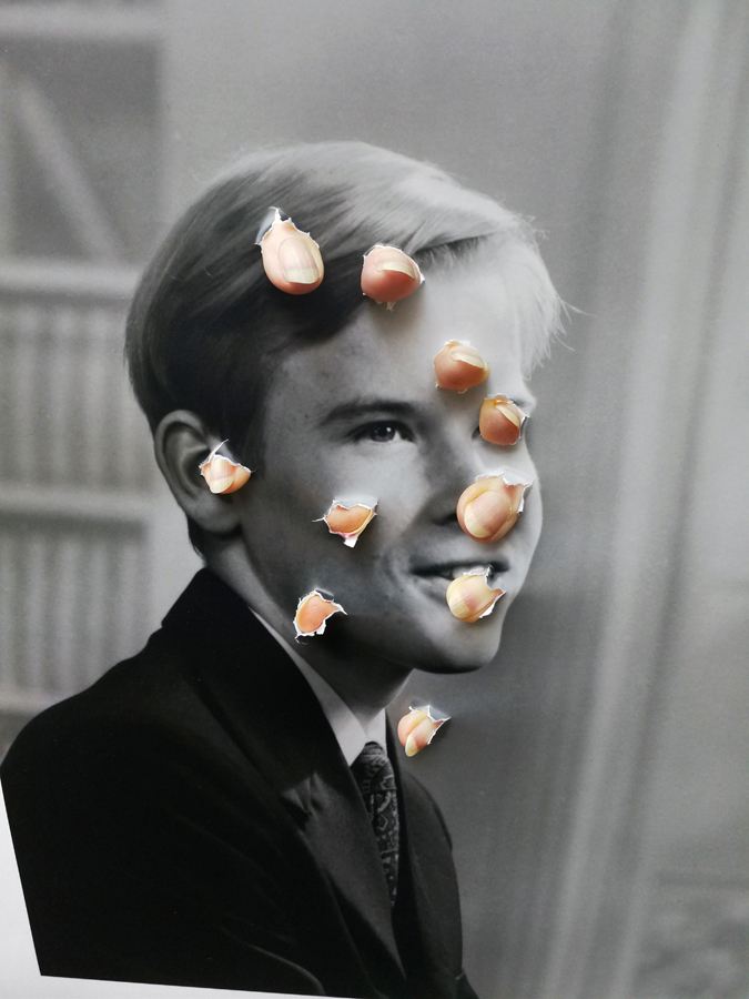
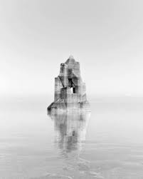
What is photo-montage? A photo- montage is a constructed form a series of photographic images that can be over- lapped and usually set out in a way that forms some sort of narrative.
We had looked at various examples of photo-montage a few months ago but had only experimented with it on Photoshop, this time we used pencils and paper and scissors. What I found difficult when creating these montages was the story I was trying to portray within this montage but after having thought about it I liked the way it could be interpreted within different peoples minds.
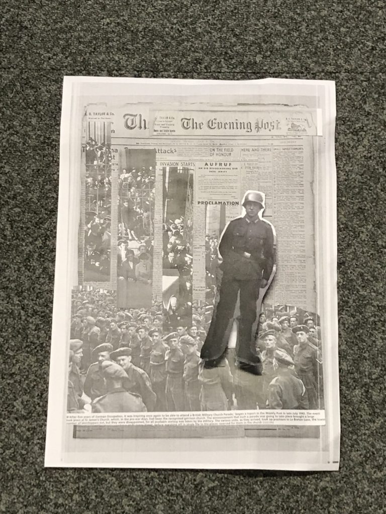
My idea behind the top image as it was my very first go with these sort of photographs I decided to cut out a superior officer as in those times no matter what class, race or gender there was always going to be someone who’s more superior to you. Therefore I chose a uniformed officer which clearly presents authority. Futhermore I placed the army behind him which therefore indicates that this is could be set in a conflicted area. Finally I decided I did not want to leave it on just a plain background then saw the old JEP which adds elements that what’s going on is important highlighting the story of the occupation times even more.
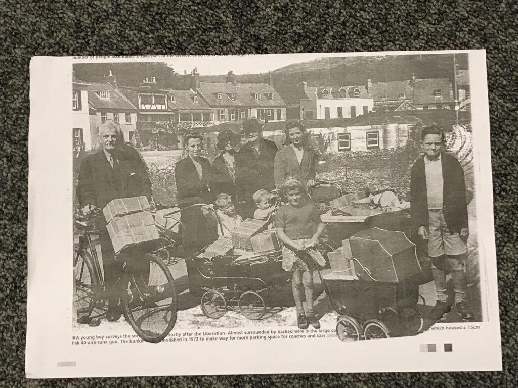
The image I created below is more a less the polar opposite of the top one. Here I chose a more peaceful and calm setting which seemingly looks a village, all the people dressed also seem fairly well off which made me view a narrative that indicates it may have been after the war. I decided upon this idea as there is no dad like figure but yet this is lots of children and again there’s a couple of woman in the image. However the Montage isn’t all sadness as people seem to be relatively happy.
Below are various examples of photo-montages:
NOEMIE GOUDAL
The photographer I have chosen to look at that experiments well with photo montage is Noemie Goudal. Below are some examples of her work:
Noemie Goudal is a French artist who graduated from the Royal collage of Art in 2010 with an MA in photography and now lives and works in Paris. Goudal’s practice is in an investigation into images and films as dialectical images, wherein close proximities of truth and fiction, real and imagined offer new perspectives into the photographic canvas. She questions the potential image as a whole than reconstructing its layers and possibilities of other extensions through the landscape she chooses. Goudal is represented by Edel Assanti London and Galerie Les Filles Du Calvaire ( Paris).
Goudal actually said in an interview that she really wants us (the viewers) to actually question what is being presented in-front of us, she says that she does not try and hide the construction she states that she always wants us to see little parts to we realise that actually she has not photoshopped these images to appear like this.
The video link below is an interview with Goudal herself actually explaining what she’s trying to do with her pieces and she explains how by simply placing an object or slightly altering an object you can change the whole perspective of that image.
I liked her work because after having watched the video I seemed to understand what sort of ideas she was trying to present. She made an example in the video of a picture of a simple forest nothing to crazy just see trees and some greenery then she added a picture of a bed sheet on what seemed like a washing line then by placing that object over the forest picture the outcome actually surprised me as it looked like a water fall.
Here was her example. This genuinely confused me because having saw the image before and the object serrate I would never have put two and two together I think this really highlights what she is going for ,the idea she’s trying to achieve for us as the viewers. I like the idea that she uses materials like card board and fabrics to create this contrast between man made and organic which she heavily captures by going outside and finding landscapes that best suit whatever material she’s preparing to best suit it.
Visually, its a nice picture to look at. At first glance I would not have straightway been able to figure out it wasn’t water which essentially is good for a photo- motage but after having looked at it for a while then watched the video on her work I discovered she likes the use of fabrics in raw nature to present these opposite perspectives.
The lighting she uses seems to be natural as she creates these obejects, elements and places them into natural scenery considering the lightness she has got out of the images it makes me only think it could have been done road the morning when its at its brightest points. What I also visually like about her work is that its layered. What I mean by this is that its got structure its not just a flat image of a rock places on sand its been made bigger, higher, generally more elevated than you probably would see these objects in day to day life. I like the fact that she also leaves a small amount of white space so we can clearly focus on the object that’s placed In the centre not only that but the images she’s got from the beach I like how its been reflected in the sand although its not even a real object just a simple piece of card with a material or fabric which ultimately creates a contrast as Goudal said it “man made vs organic.”
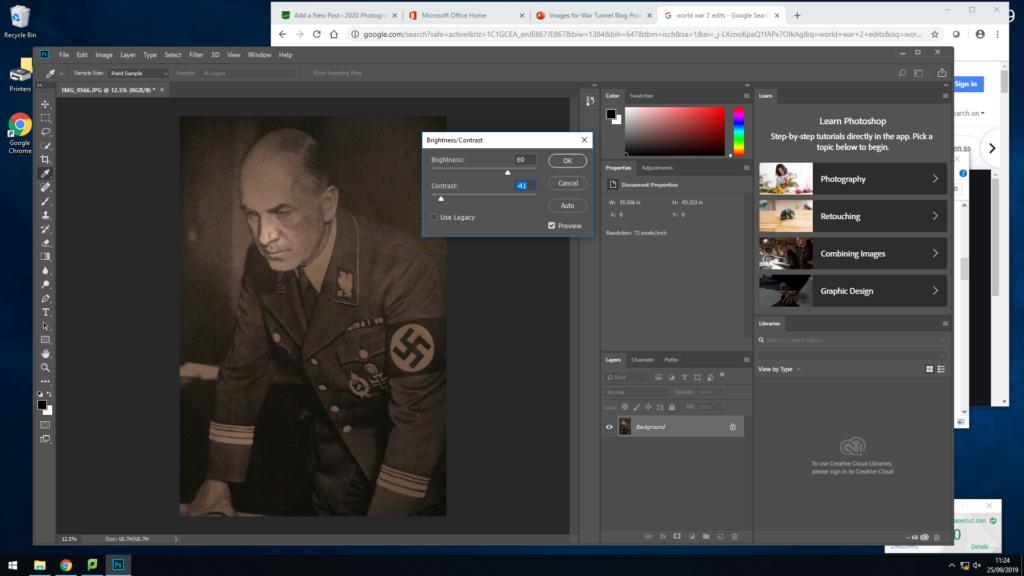
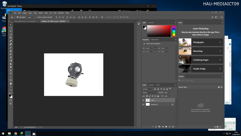
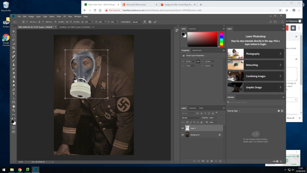
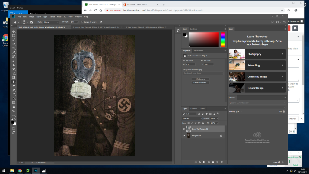
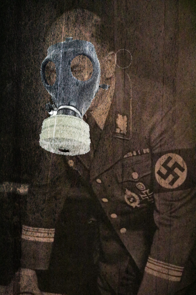
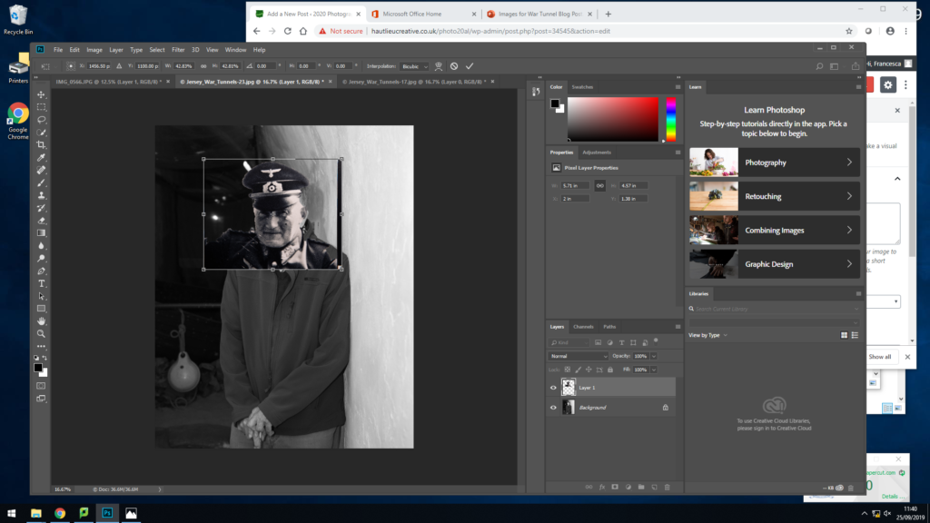
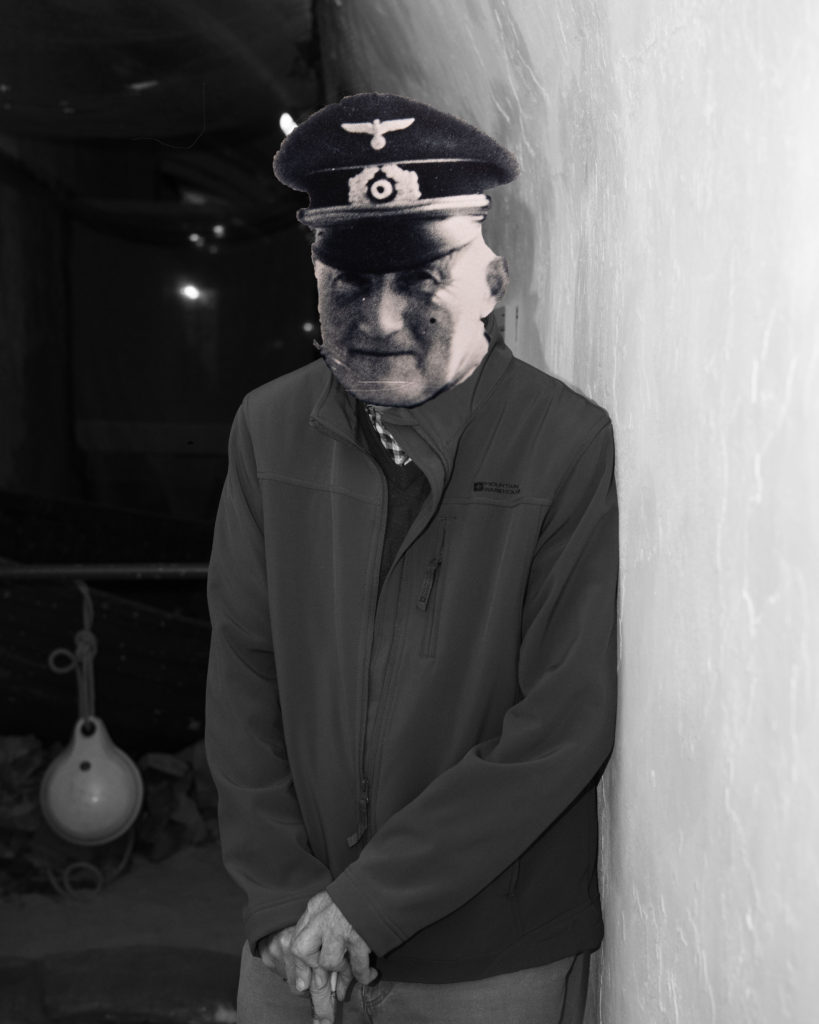
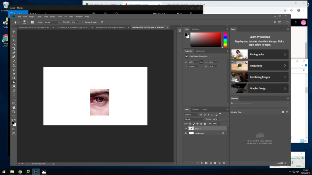
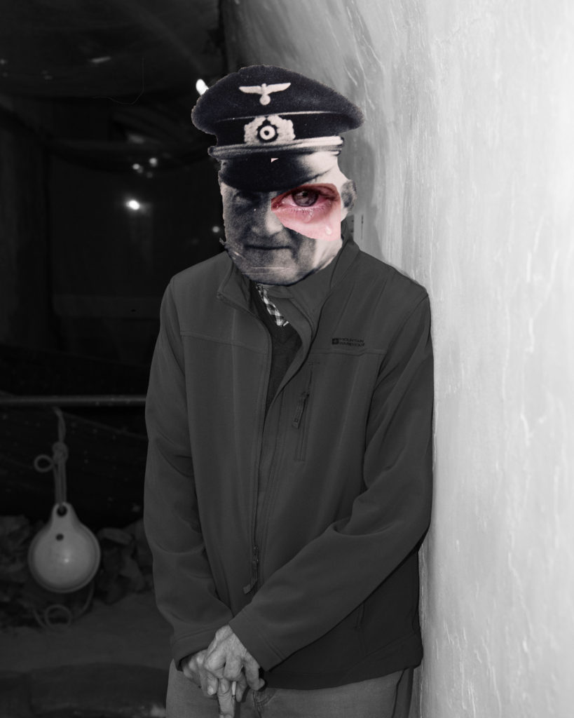
To create this image I started with the original image of the solider, I chose this as my main piece because it is a strong image and shows history. I firstly started off adjusting the brightness and exposure of the image, I turned up the brightness of the image so you could see the man more clearly as his features and clothing play a main role in the image. I then opened the image I was adding on top of my base image. To this image I removed its background using the quick selection tool, then dragged the final image over to the base. Here, I used the eraser tool to removed any little details that didn’t fit the man face, along with using the blur tool to make it look more realistic that the mask it on his face. I decided to put the mask on top of the German solider as they are both key image of the occupation. I am show casing the problem of gas mask, which was the German’s dropping bombs around the island making it unsafe for islanders, meaning they had to use gas masks to survive.
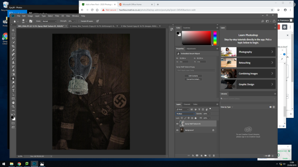
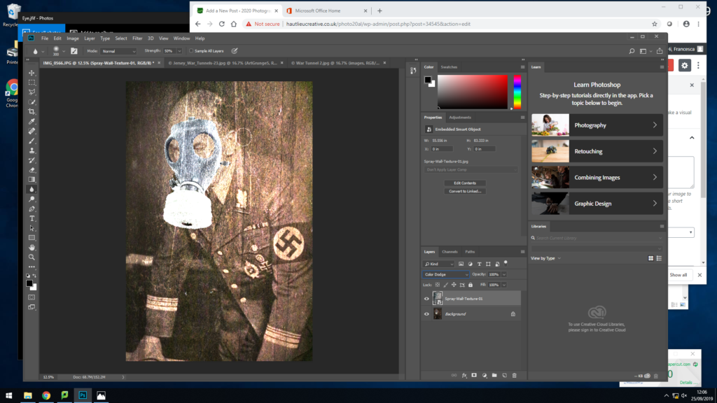
After finishing my image, I then tried out different backgrounds to give the image a different effect and texture. This gives the image a more ancient and older feel to it.
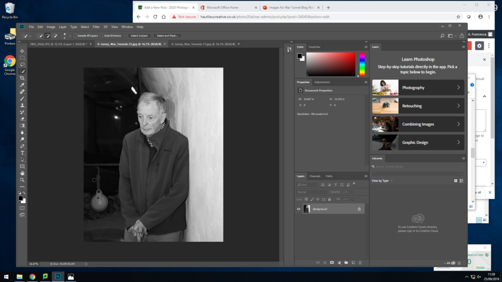
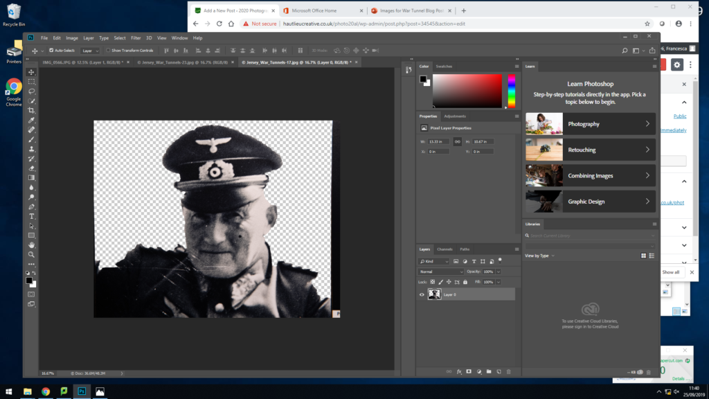
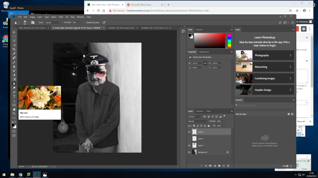
I started with the original black and white image of the guy who showed us around the war tunnels, he spoke about the knowledge he had during the war and how his father was a solider. Knowing this, as I went round the war tunnels I made sure I photographed an image of solider so I could use it for an edit. One I came back to school, I edited the photos into black and white and adjusted a few of the settings so everything was more clearer and in focus. I then set the image of the man as my back ground, then opened up to image of the solider seperatly. To this image I removed the background by using the quick selection tool, then I dragged it over to the background image and placed it over the man face. I then stretched the image to fit over the face and using the eraser tool go ride of the extra parts I didn’t need or didn’t fit his face. After placing the face down I then when in with the blur tool, I did this so there wasn’t such a distinct difference as it was off putting when looking at the image. After this I then flattened the image. Overall, I like this image as it is portraying the mans history by paying respect to his father for going to war.
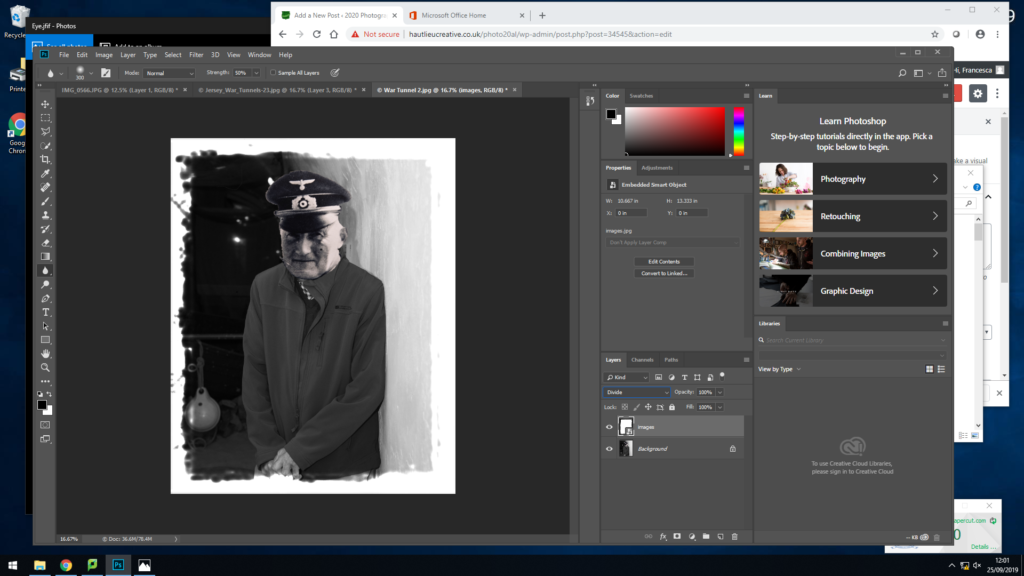
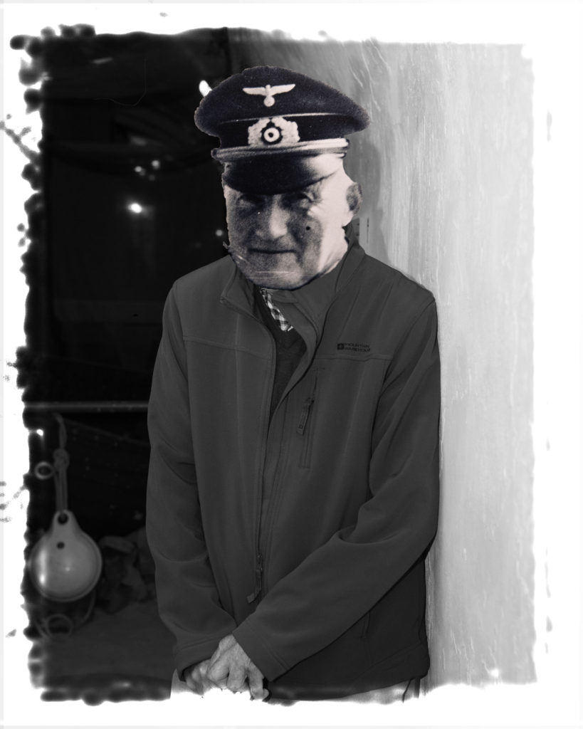
After then editing this image, I decided to play around with adding frames to my images. I dragged the frame across to the image, sized it up, then down by the layers I changed it to normal and using my arrow keys I was apply yo go through different effects the frames had on the image. The frame above I decided on as it made the image look older and it fits the genre of the image.
After making the final image previously, I wanted to try some experimentation and do something different. So I removed the background of an image with an eye with a tear, I then dragged it across to the image and made it slightly bigger to give it an affect. I did this to make my image more effective and hard hitting as it is showing a painful emotion from a touching event that has happened to the people of the war.
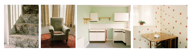
This whole photo shoot is about photographing empty spaces, which are also normally filled. For example an arm chair where your Father might normally sit, or a coffee table where some of your family gather.
This helps create the sense of emptiness which is the aim of this shoot.
These are some examples of such photographs
For my take of this I have decided I will focus on changing the room during the photo shoot. For example, I will photograph an empty bed when it is nice and tidy, the photograph it from the same angle, except I will make it rough and messy the second time around. This will create a contrast but still without including any people. I might also experiment with overlaying the two photos over each other.
I will also try to maintain a theme throughout the shoot. I have not yet decided on the exact theme, but possibilities include maintaining a colour theme which could be done by having an object of a certain colour in every photo, or possibly having the same exact object in every photo. I have also considered including the same form in every photo (e.g. the same strong horizontal or vertical lines in the photos).
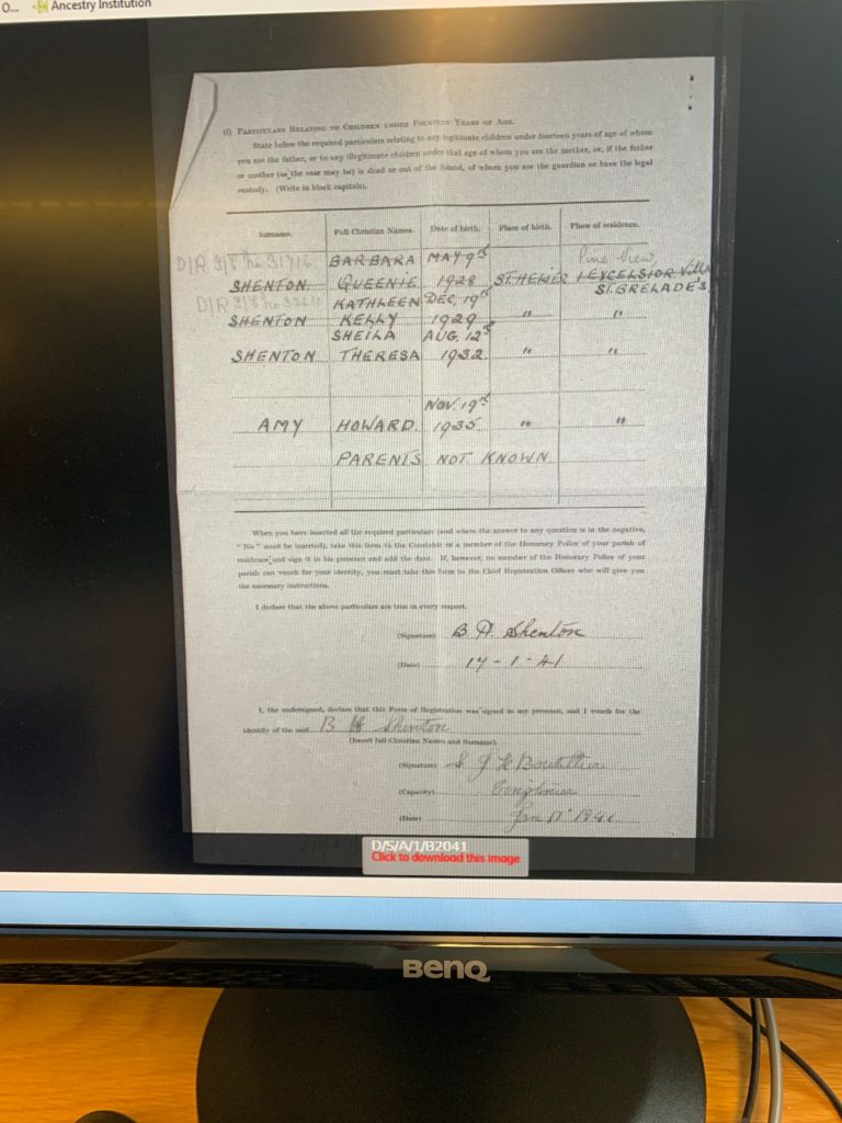
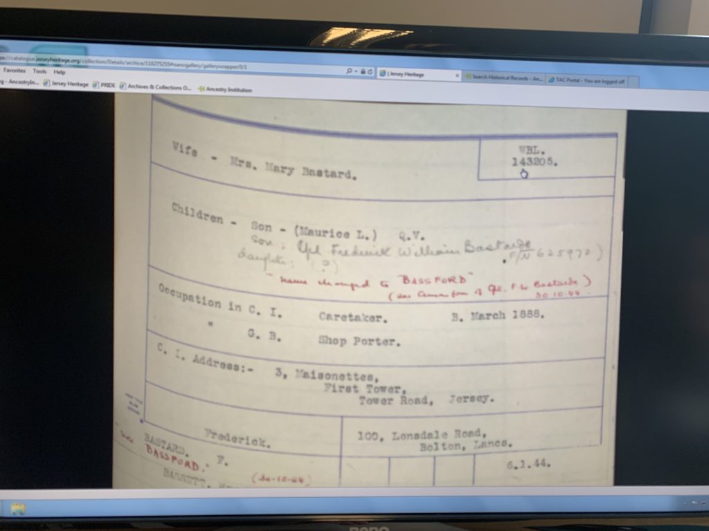
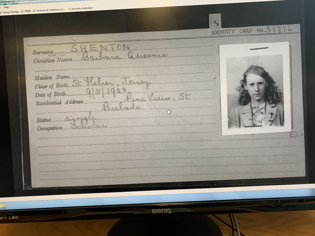
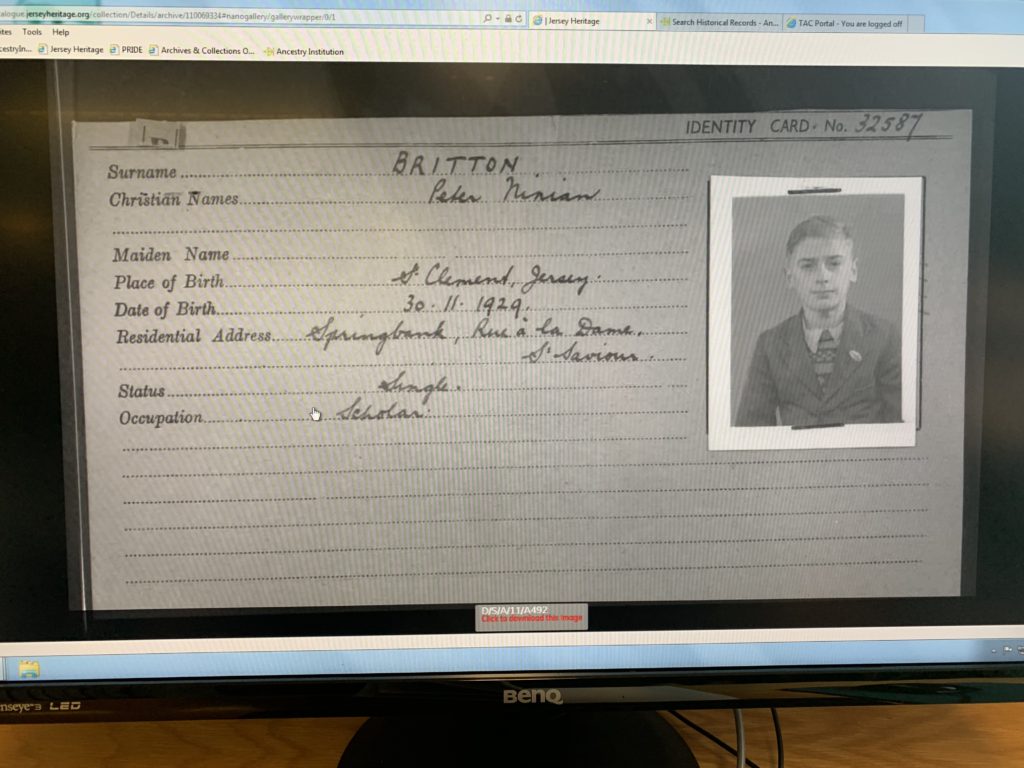
Whilst at the Jersey archives, I decided to look up my families name. I ended up finding a lot of information about my family, including that my paternal Grandfather actually changed our name during the war to what it is now. I also found many occupation cards from various members of my family, and discovered that one of my relatives was adopted and his original name. Below are some photos of these documents:
CANDID PORTRAIT: An informal portrait that presents a ‘natural’ look and capturing a moment, seemingly without artifice.
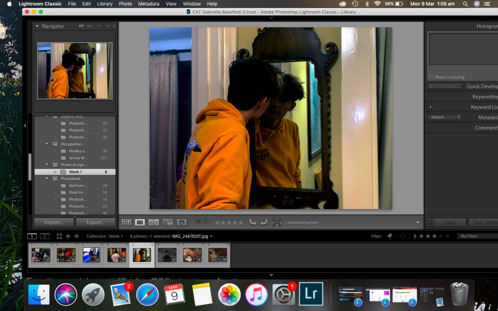
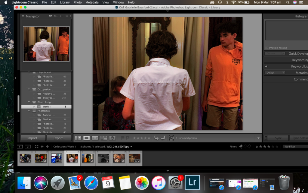
LOCATION: I decided to go someone elses house to take photos of their family as it was a more interesting environment and id be able to get better quality content in my images.
MODEL: I used my boyfriends family as there is more of them than my own and they were more available. it was interesting to get images to their family dynamic.
POSING: Since these were candid photos, i tried my best to get them to act as natural and normal as possible. trying to get different angles was also hard whilst trying to be subtle.
EDITING: These ended up being my favourite images out of all the ones I took. I felt like they truly reflected the nature of a candid photograph.
EXPERIMENTING: I played around with various photos and editing them by moving the sliders to see which combinations i preferred. i wanted to go for an amateur look similar to Richard Billingham, with very contrasted images.
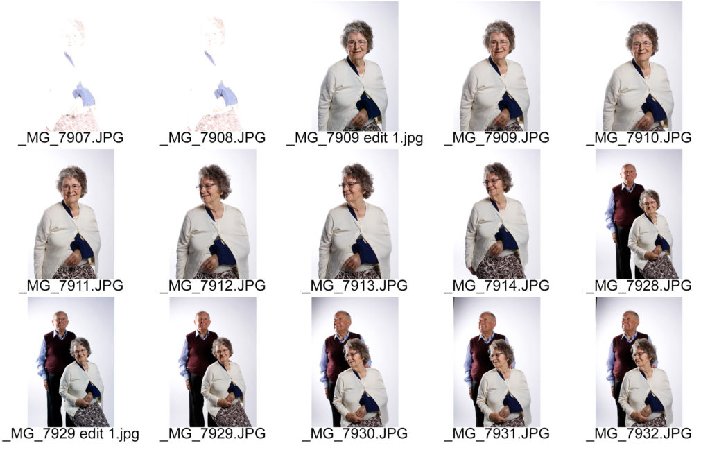
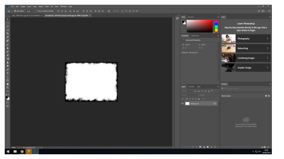
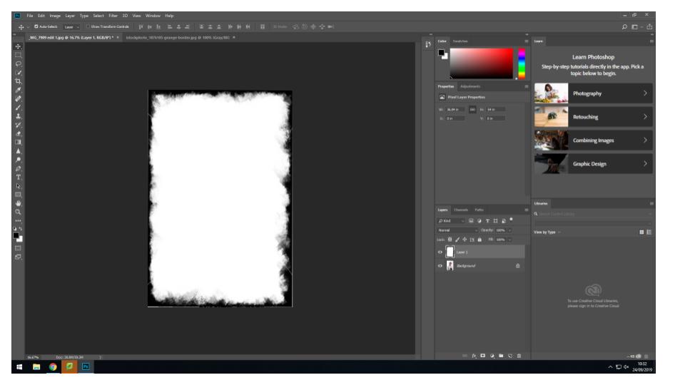
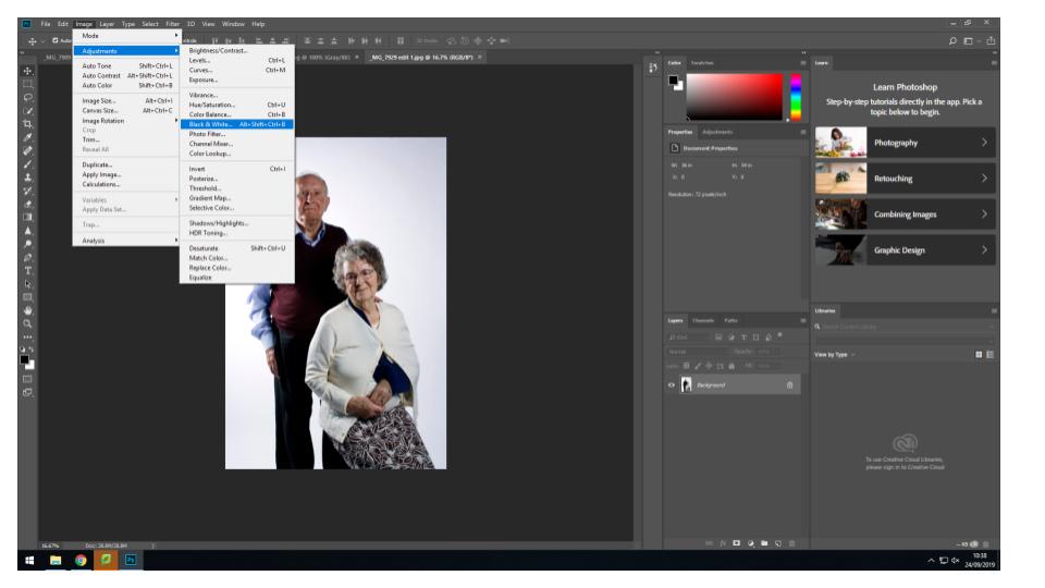
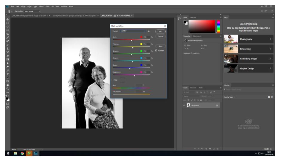
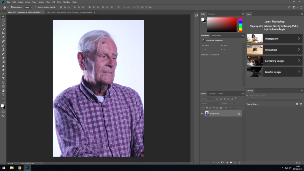
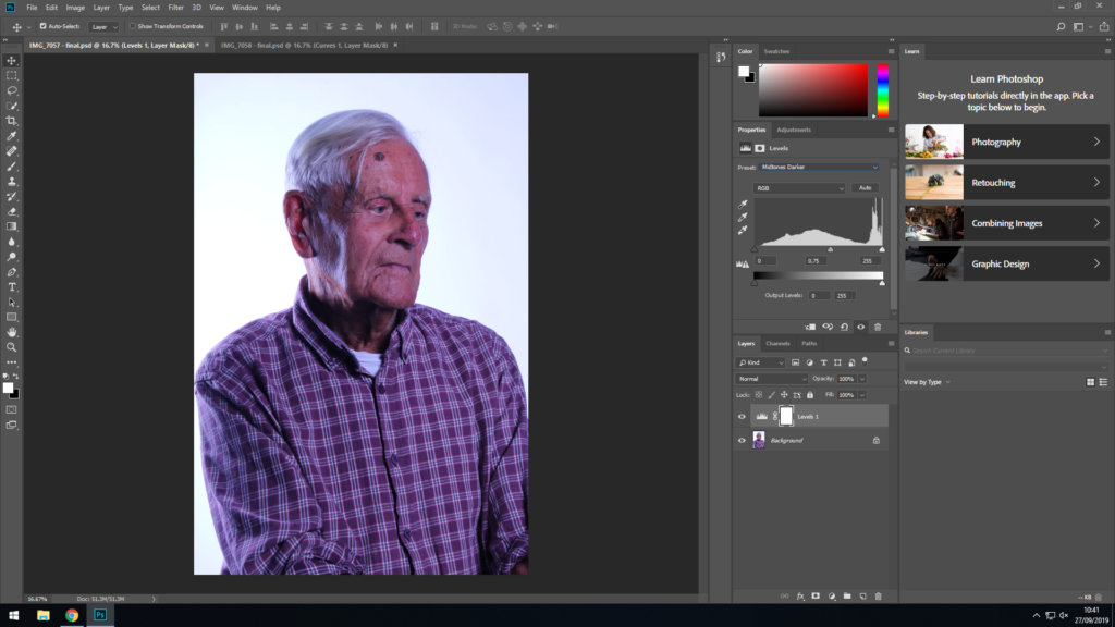
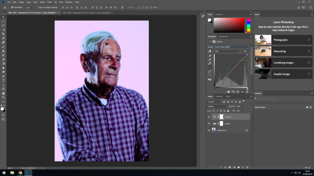
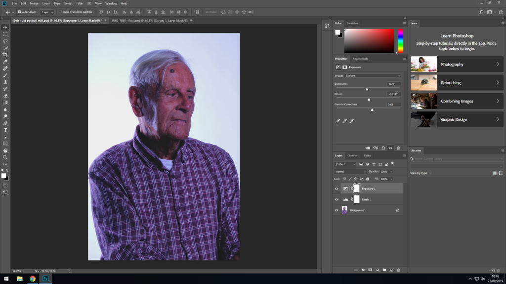
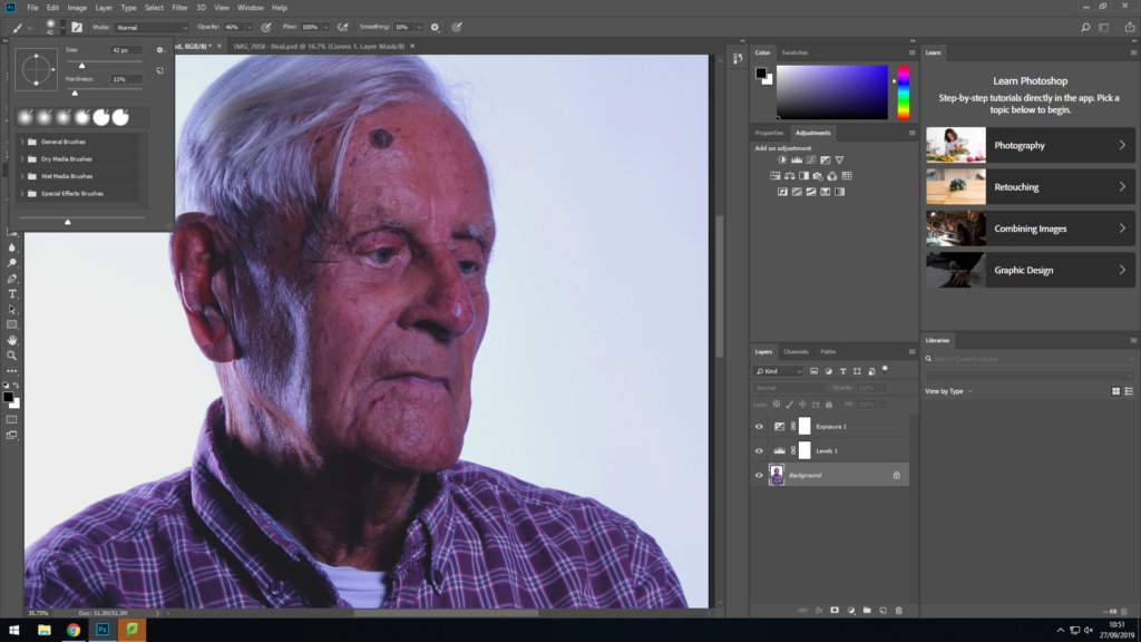
This is a series of screenshots showing the editing process of a photo I took of Bob. I didn’t include this image in my final selection as it doesn’t fit the theme I ended up implementing to the images I did choose.
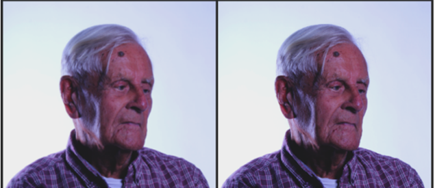
This is the original photo I started out with.First I used the Levels filter and applied the ‘midtones darker’ preset. This helps make Bob stand out from the background more.This is an alternative edit I came across when messing around with the Curves filter. This is achieved by applying the cross process preset.Focusing back on the editing process; I have applied the exposure filter. Here I have changed three aspects of the image; I have very slightly lowered the exposure of the image and slightly increased the Offset. I have also decreased the Gama correction in order to blend the shadows in the image more.Here I have selected the brush tool and selected the setting shown above in order to apply some layering to make the shadows in the image darker. The brush size is relatively small with a very low hardness at 11%, this helps blend in the areas I make darker with the rest of the image. I also ended up using a much lower opacity; I used a very low opacity at just 10%.Here is a side-by-side of a close-up of Bob’s face before and after I touched the image up. There isn’t a massive difference, however the image on the right does stand out a bit more which was the aim.Here is the Final image after it has been edited. It stands out from the background much more than the original, and the colour palette has been managed in a way so that the image is much more aesthetically appealing now.This is the alternative edit I came up with along the way in full size.