
As part of out research into the Liberation and Occupation of Jersey, following the path of portraiture in order to document the lives, experiences and stories of those who experienced the liberation and occupation, we were lucky enough to be able to meet and listen to the stories of 2 individuals who experienced both the initial occupation of Jersey in 1940, and its liberation in 1945. Henley (14 at the time of the occupation) and Joan (6 at the time of the occupation) both gave detailed accounts of their experiences with life under German rule, with Henley recalling the time that, at the age of 14, he was able to render a German guard almost unconscious by continually giving him glasses of cider, and the soldier was drunk enough to not notice when the farmers had time to hide a lot of the wheat they had farmed in order to avoid having to hand it in to the Germans. In contrast, Joan was able to recall her experience with walking to school through a number of German outposts and identification points, as she passed by the fenced off and mine covered beaches. The lack of transport (confiscated by the Germans) and the censorship and limits imposed during the occupation brought the native community together, with adults crafting bicycle tyres out of hosepipe and rope, and children knitting water bottle cosys for the Red Cross. Both Joan and Henley recalled the liberation of Jersey as being a huge event, with Henley not being able to see the liberation ship for the huge crowds of people blocking his view, and Joan missing the crowds at the harbour altogether due to her inability to travel across the island from her home to town.
After listening to the stories of Henley and Joan, we had the chance to photograph them in the school studio. I was able to collect images of both Henley and Joan, and singular images of just Joan. In the studio I had my IOS set to 100 (as the lighting in the studio was already very bright) and my shutter speed was at F16. I also used the Daylight white balance in order to slightly correct the colour based on the studio lighting and colours. Below are the results of my photoshoot, shown in a contact sheet:
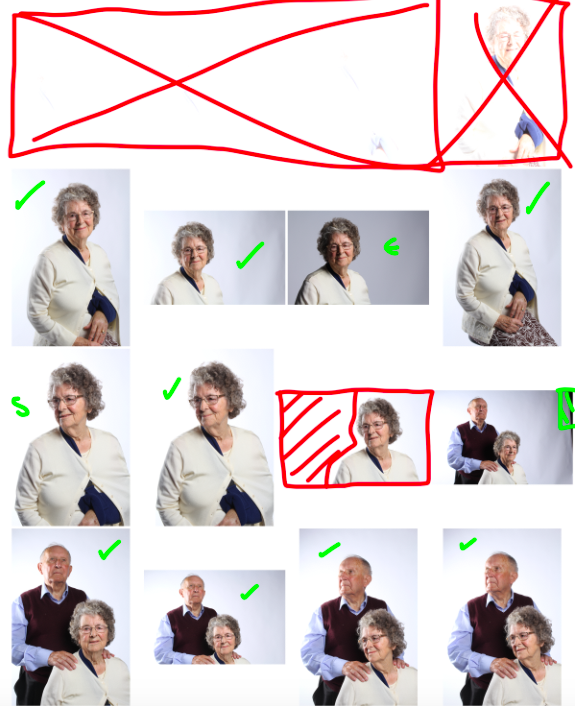
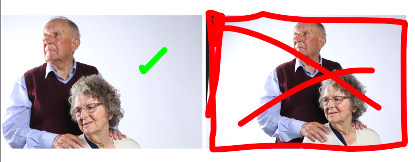
Key: GREEN “S” = Small issue with the subjects pose – GREEN TICK = candidate for final image – GREEN HASHED AREA = problem area/needs editing out of final image – RED HASHED AREA = problem area too big to edit out – RED “x” = rejected image
The first row of the contact sheet includes images that are so over-exposed that they appear as white boxes. This was my own error as I originally failed to adjust the IOS from 6400 down to 100, and so the amount of light that entered the lens was way too much to produce a clear image. I adjusted this afterwards and the rest of my images are shot at the right IOS.
After taking the images in the studio and using the contact sheet in Photoshop to nail down my selection to my final choices, I moved the final images onto the editing stage. The following are the results of the images I edited:
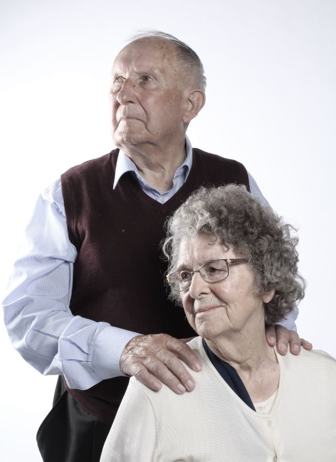
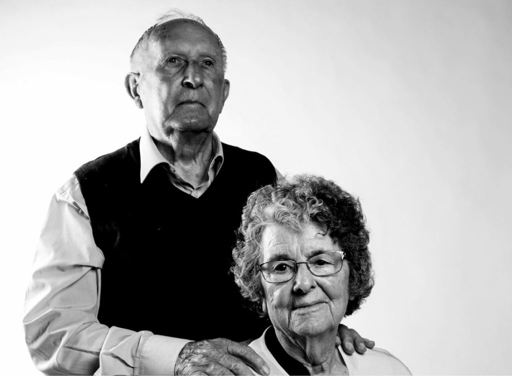
I was able to use Photoshop to adjust the contrast and colors of most of these images, in order to make the initial edits. I then moved the images to Light-room to further make use of the tools available on that software. In Light-room I especially focused on the last image, as I was able to edit the image to draw up the contrast in order to give it a more bold look. Below is the before and after Light-room edit:
The image on the right was the original from the Photoshop edit, which I found to be too over-exposed (especially around Henley’s right-hand shoulder). I used Light-room to adjust the contrast and more specific colour settings (highlights, shadows, blacks, whites and clarity). I feel like the final product (left) looks much more bold and eye drawing than the original on the right.
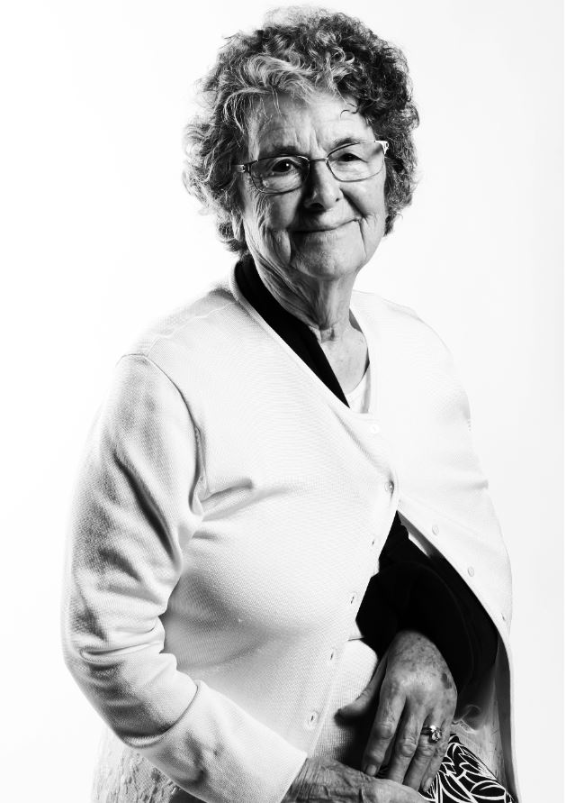
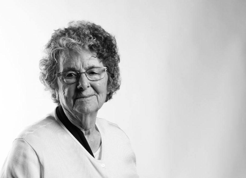
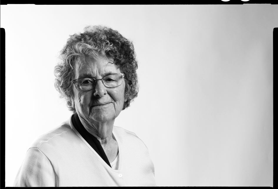
For some of the images, I adjusted the colour settings so that they were in black and white. I did this in order to make a link to the imagery of the occupation and liberation of Jersey, which was all taken in black and white as colour photography only became common for the average person in the 1960’s. I feel like black and white images also allow for the details in the textures and shapes of the images to be better emphasized, and it allows for certain aspects of the image (such as eyes and clothing) to present as more eye-catching, and can between hold the attention of the viewer. Below is an example of an image I edited into black and white for these reasons:
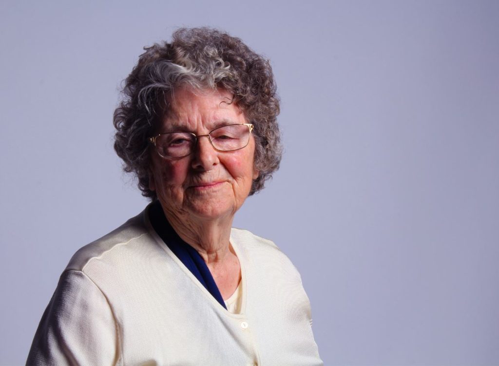
Furthermore, on some images I made the decision to simply lower the saturation of the images in order to dull down the colours of the image, giving the final image a more somber and dulled image. I made this decision as I feel that it accurately reflects the atmosphere and feelings surrounding the occupation of Jersey, as the overall atmosphere at the time (and the feeling that came with many of the stories given by Joan and Henley) was solemn and very close to being hopeless. I therefore tried to reflect this through the colour of some of my images, which are dulled and almost drained completely of colour. An example of one of these images can be seen below:
For the final image, I made the decision to raise the saturation and contrast, and made some colour adjustments in Photoshop that involved heightening the colour balance so that it fell more towards a lilac/subtly feminine colour (especially in the background). I did this in order to highlight that through the occupation, many individuals were still able to keep hope, and regardless of the solemn circumstances, many individuals were able to find pleasure in small things (such as dances and cycling). The editing of the colour in this image is a reflection of the subject being able to maintain her femininity and hope for a better future, even through the difficult times of the occupation:
After the initial editing of colour and saturation, I began to experiment with some of the images, using things such as boarders, adding in other images to the initial image in the form of collaging, and experimenting with different techniques in order to enhance the image further.
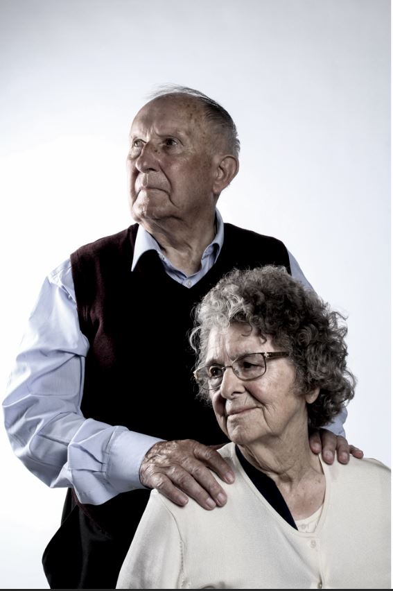
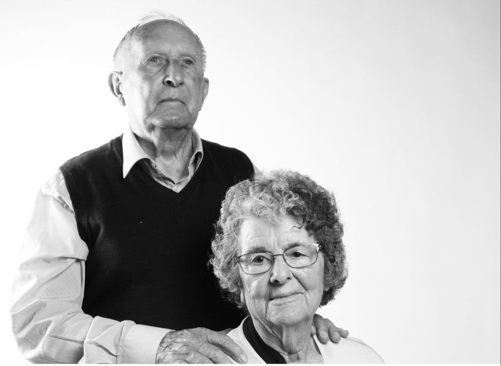
In the above image, I used the spot removal tool in Light-room to remove some of the light colored fluff that was on Henley’s jumper, which distracted from the image itself.
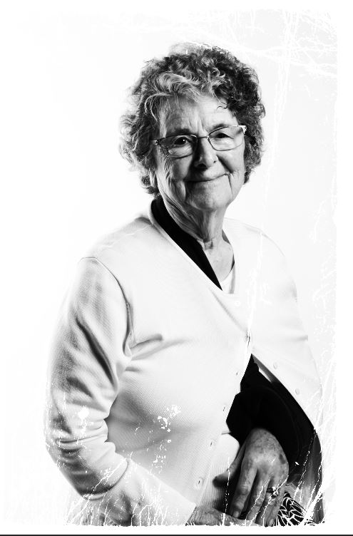
The above 2 images of Joan have been edited to produce a different framed effect on each of them. I experimented with this in order to see if the frames make the image seem more eye-catching.
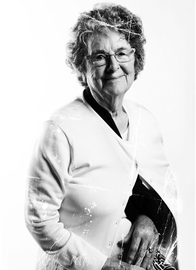
I further experimented with the above image, using the same template for the frame as I used in the original, but this time cutting and stretching the damaged effect of the frame more over the subject, allowing the contrast between her darker shape/outline and the white damaged effect to become more clear. Below is the process I used to do this:
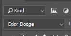
I selected the colour dodge option on the layer that the frame was on. In doing so I only kept the white damaged effect, removing the black background so the subject could be seen through it.
I then copied and pasted the frame onto multiple layers, and used the lasso tool to cut the frame so that I could fit it into the correct areas of the subject so that the damaged effect covered the darker areas.
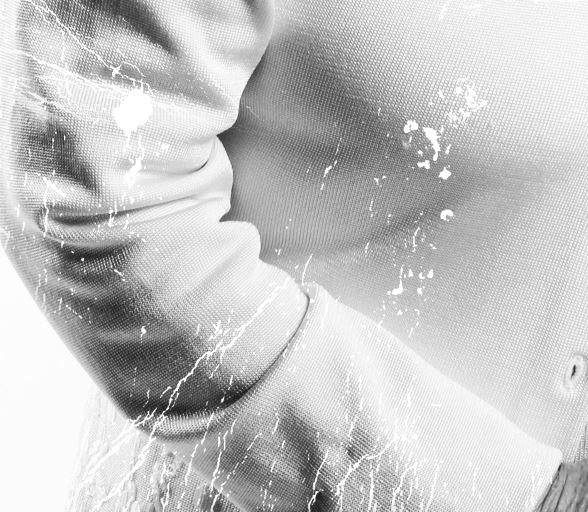
The final effect was the damaged effect that can be found more clearly in the image above. I decided to do this because the effect that the frame gives the image reflects the same kind of damage that happens to old, archival images. Therefore here, I am referencing the past/youth of June, and contrasting it with the present, using the style of the image to reflect past trauma (through “damaging” the image) while the subject can still be seen smiling as her current self, a survivor.