Evaluation
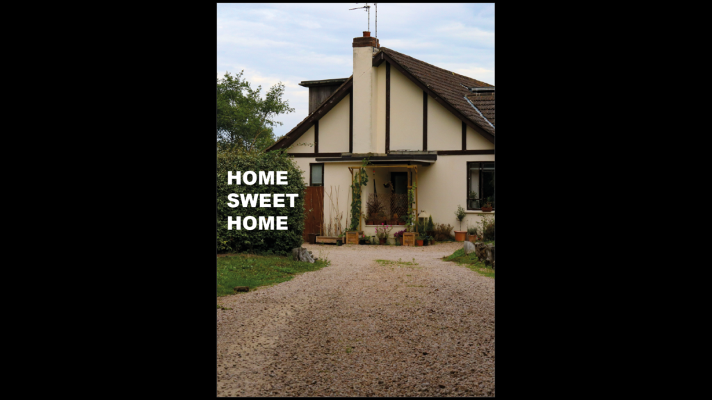
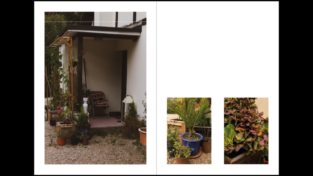
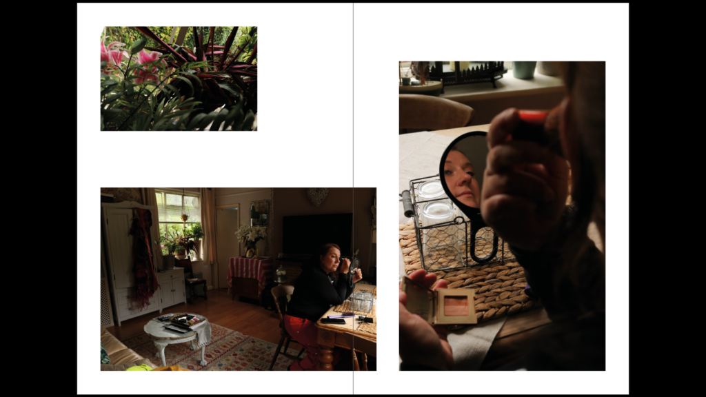
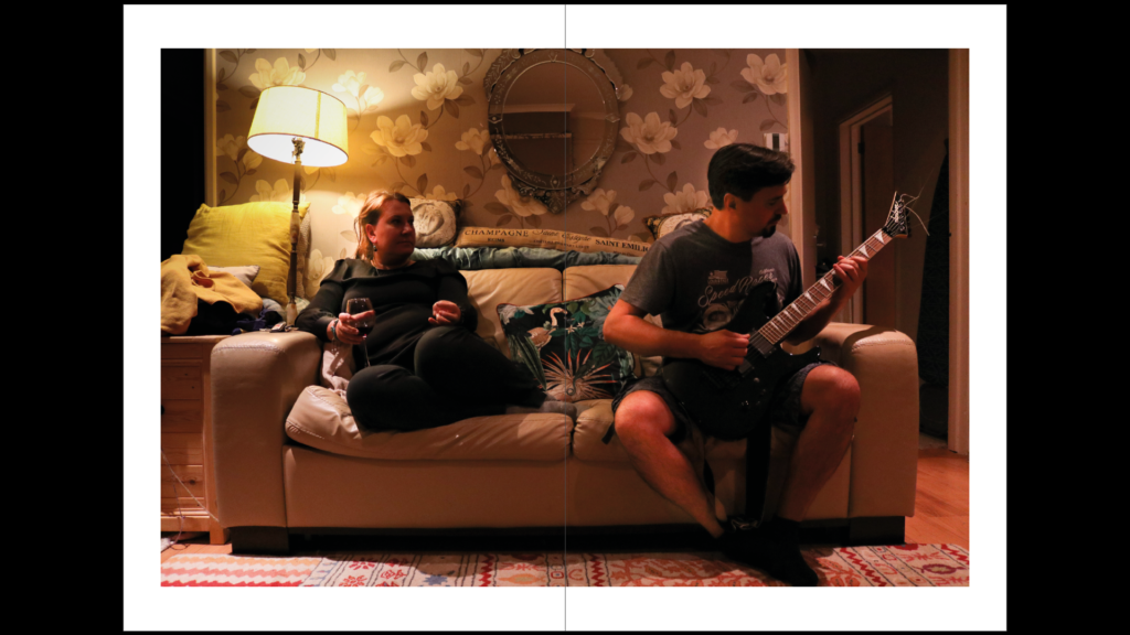
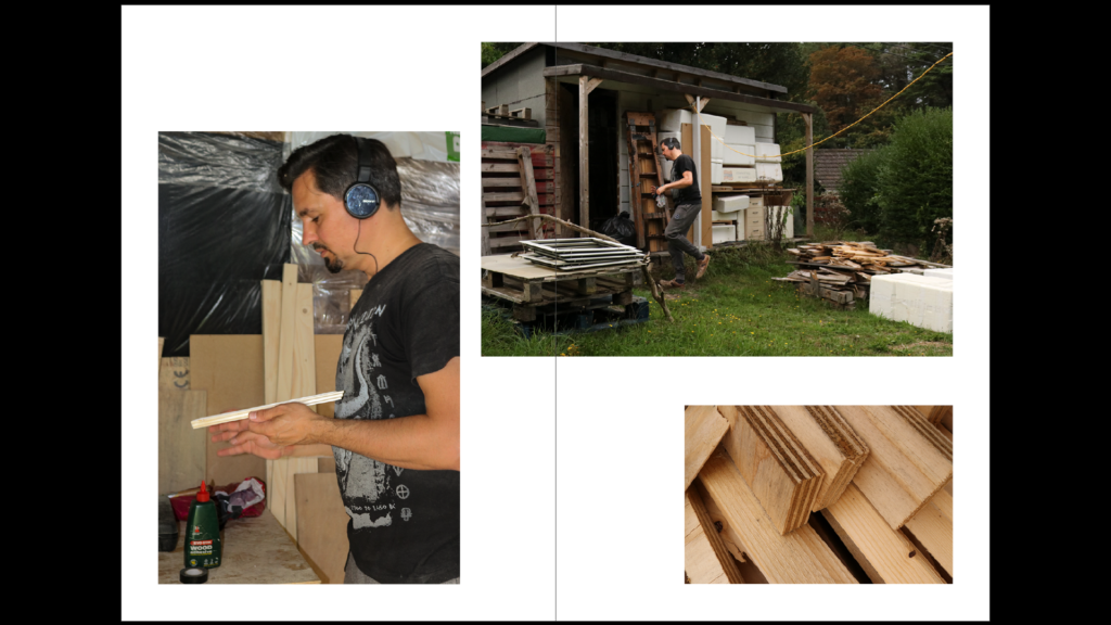
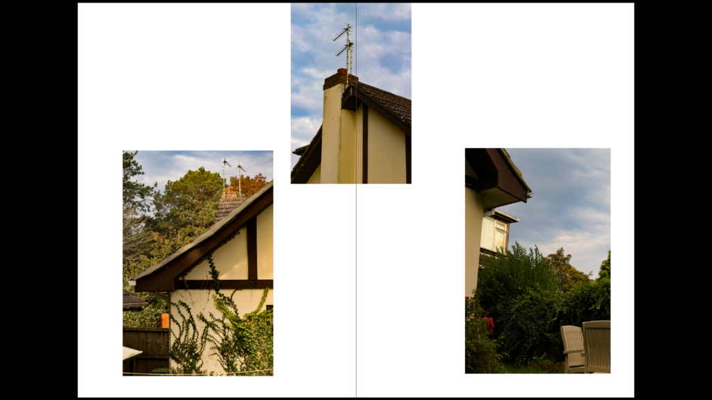
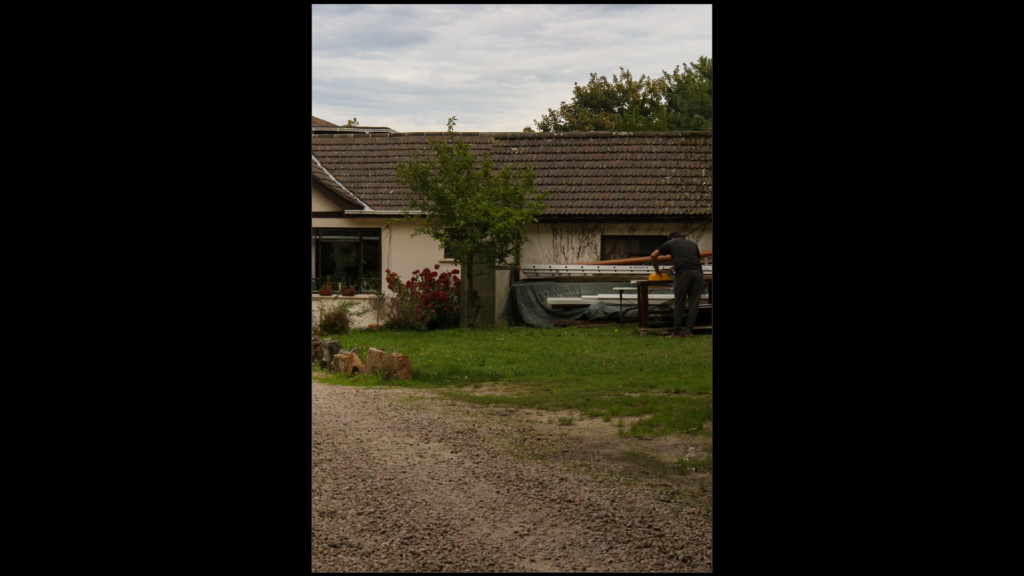
I believe the presentation of the images in a zine has turned out well as this gives my final images a good structure, and allows me to show a narrative of life at my home. I believe the quality of images that I used is high throughout most of the zine, and there is an even focus on portraiture, objects and external shots of the house. One image that I believe doesn’t aesthetically fit in is the double page spread in the centre of the zine as it is warmer than the rest of the selection due to poor lighting. I, however, have still included it as it serves as a good transition point where the focus on my mum is shifted onto my dad. I believe the structure is much more linear and maintained throughout, compared to my final zine from the Bunker Archaeology unit, where the subjects and scenes were varied.
