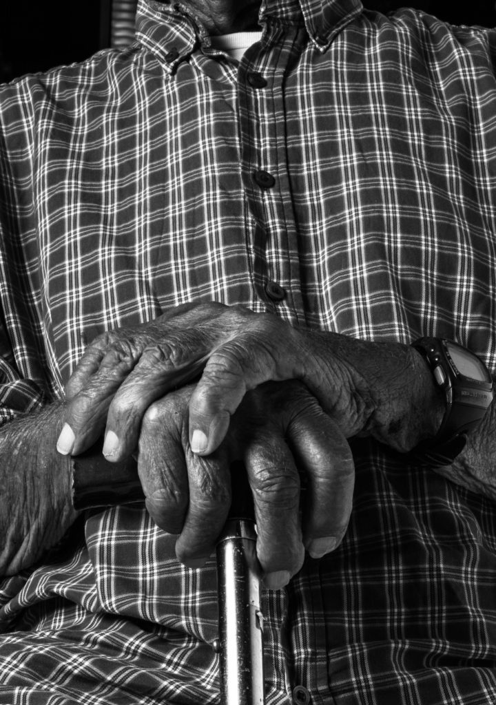
For the edits in this shoot I decided to primarily focus on emphasizing bobs more prominent features while highlighting some of the more discrete details. This was mainly done using levels and the black and white mix in the black and white edits. There are some subtle radial filters used in order to allow a higher contrast while avoiding glaring highlights.
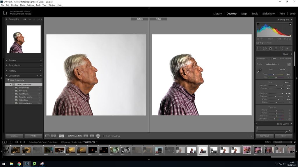
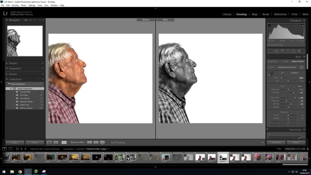
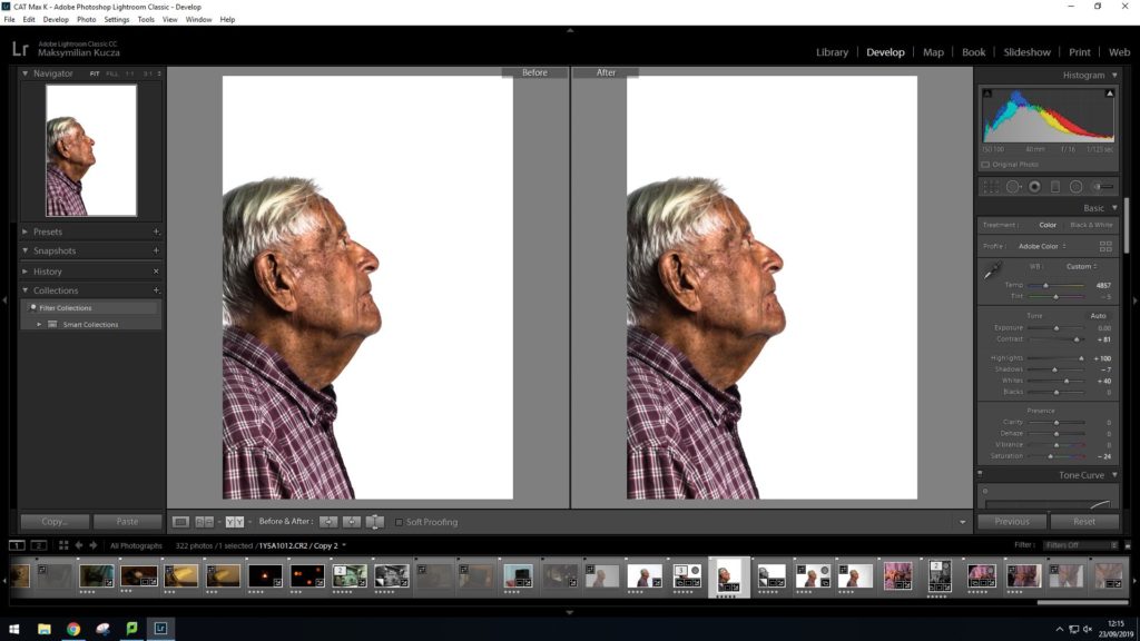
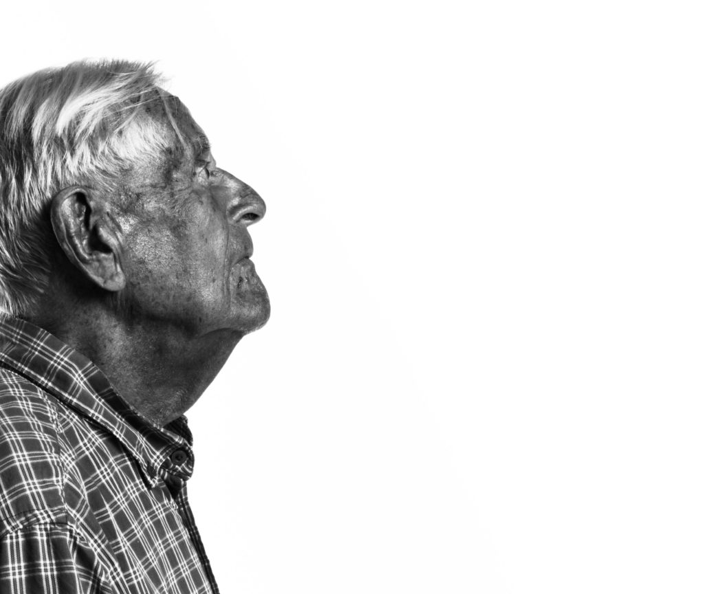
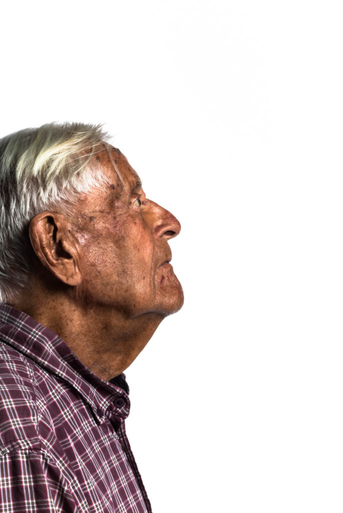
On these images a lot of detail was visible on his face such as small veins on his nose and various markings on his temple. I took advantage of the bright studio lighting as well as skins natural reflective properties in order to highlight these features. I lowered the saturation on the color edits as the increased contrast left the image looking highly over saturated and although I experimented with adjusting the vibrancy to bring back some of the color lost in this process, I eventually decided upon leaving the vibrancy at neutral.
In the black and white edit I made a heavy crop in order to hide the back lighting which in post, I decided was too bright. in order to avoid losing too much of the original composition to hide the back lighting I ended up using a small radial filter in order to hide some of the highlights on the back of his neck.
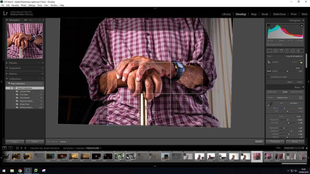
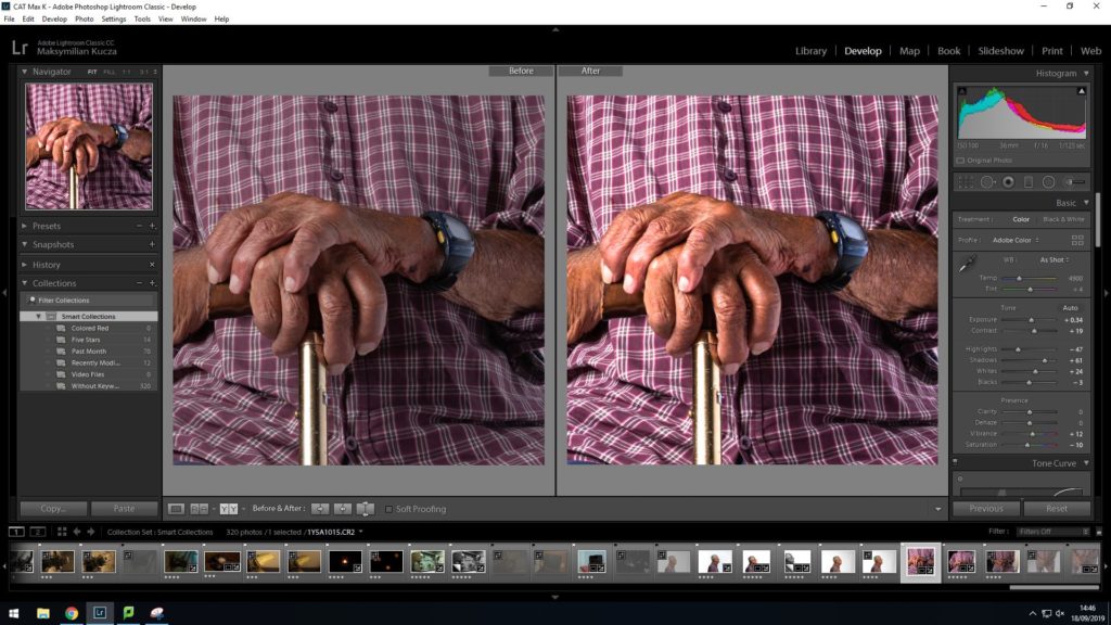
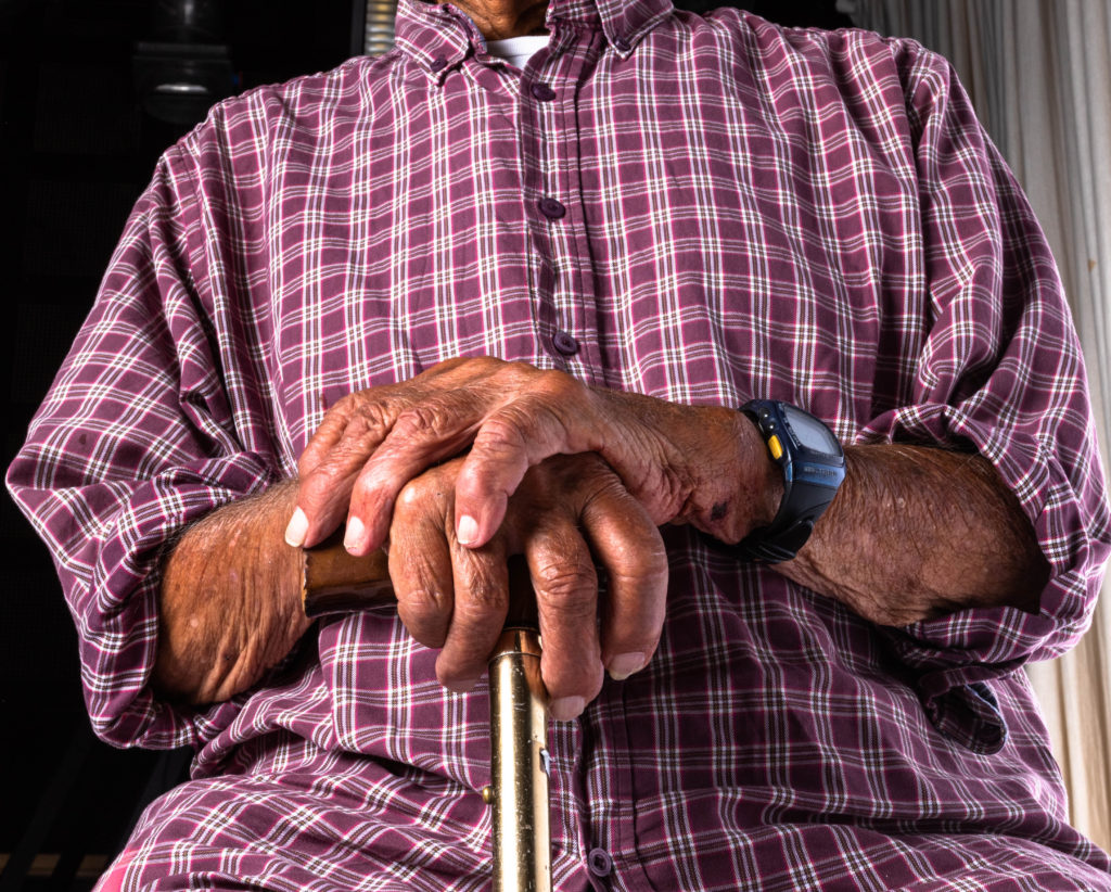
Here I decided that I wanted the primary subject to be the hands resting atop the cane and thus did some aggressive cropping to do so.
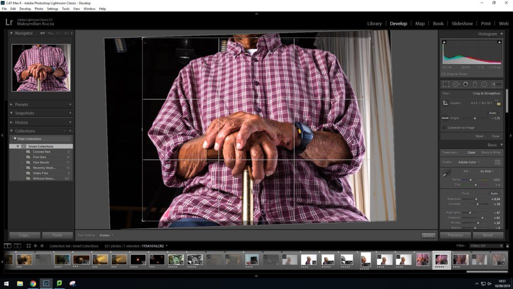
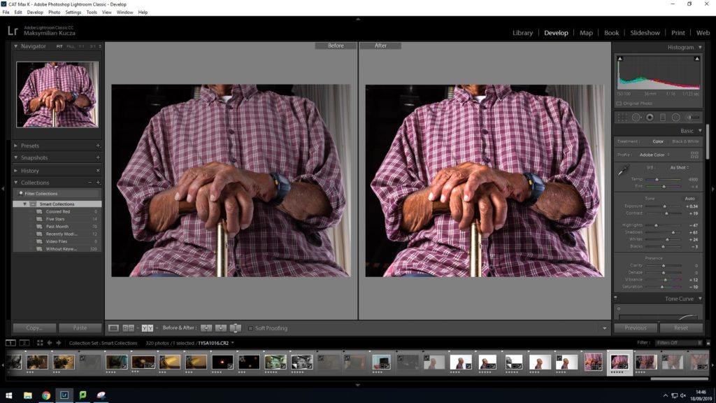
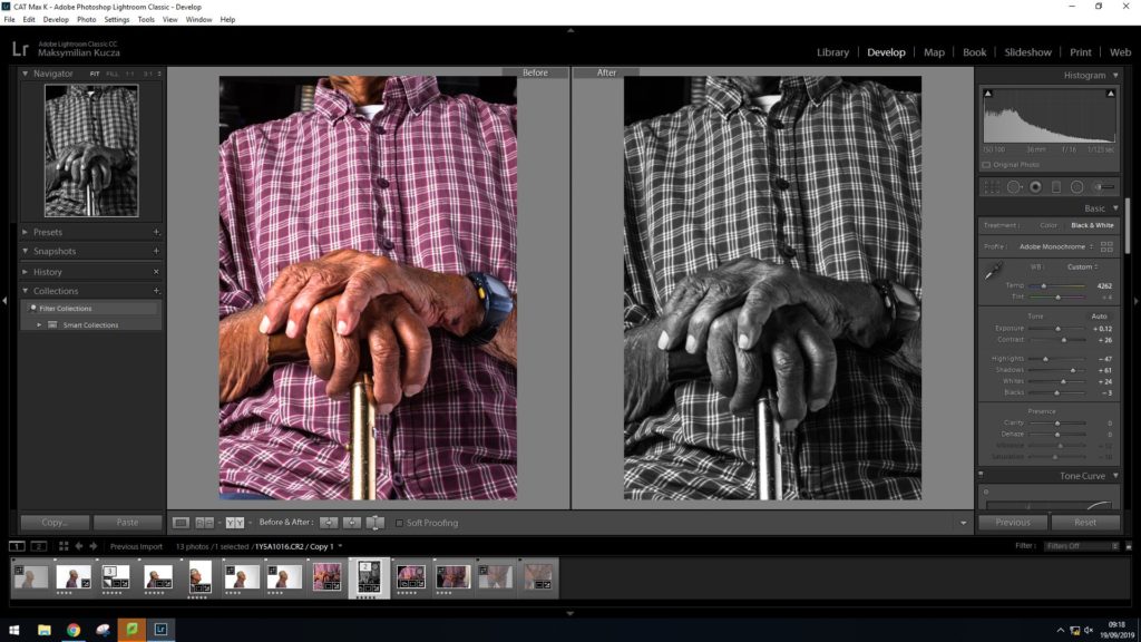
In these images I decided against using the studios infinity wall as I decided I wanted a darker and less clean background for these images. This helps to bring out the highlights of the subject in the images. I started by adjusting the crop angle and then preserving it while doing the perspective corrections in order to have finer control over what is shown in the image. then followed a similar process to the profile shots in terms of tonal and color adjustments.
