For this assignment I will be taking environmental and candid portraits within the home.
An environmental portrait is an image taking of someone, where their surrounding is important as it contains information or clues towards someone’s personal story.
A Candid portrait is an image taken of people when they’re unaware. Unlike environmental portraits, the scene is not artificially set which means that this photography style is used to capture natural, raw moments.
Larry Sultan
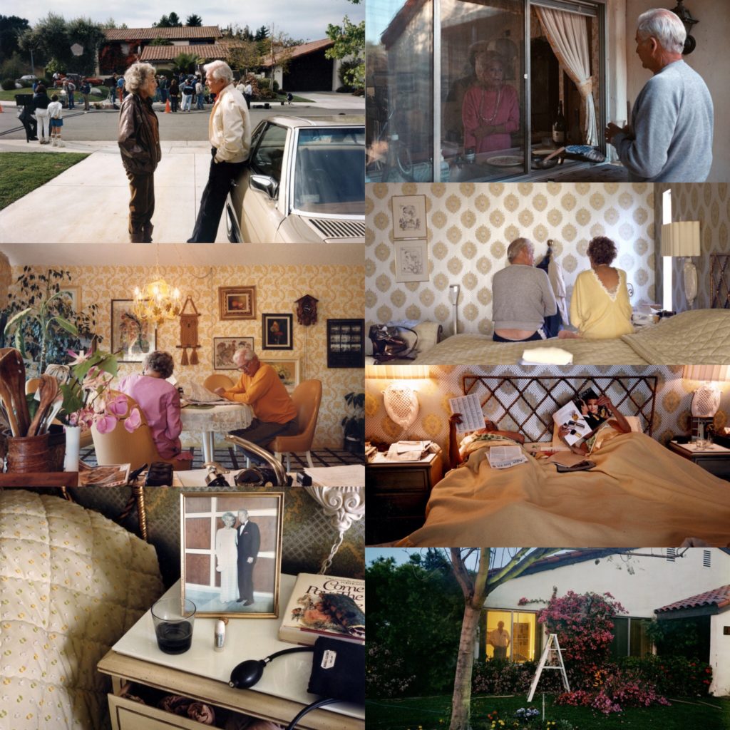
Larry Sultan (July 13, 1946 – December 13, 2009) was an American photographer from California. He taught at the San Francisco art institute and at the California college of arts.
“I love making pictures, even if most of the results are lousy.” – Source
His book “pictures from home” was published in 1992, and is a collection of images he took of is parents in the 80s.
“The demands of my project and my confusion about its meaning, is the wish to take photography literally. To stop time. I want my parents to live for ever.” – Source
Candid photography photo shoot
Plan:
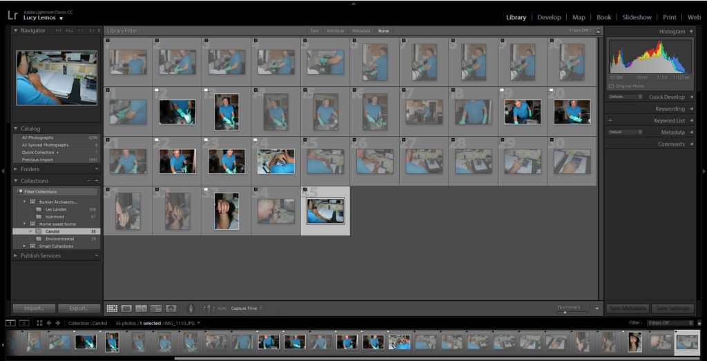
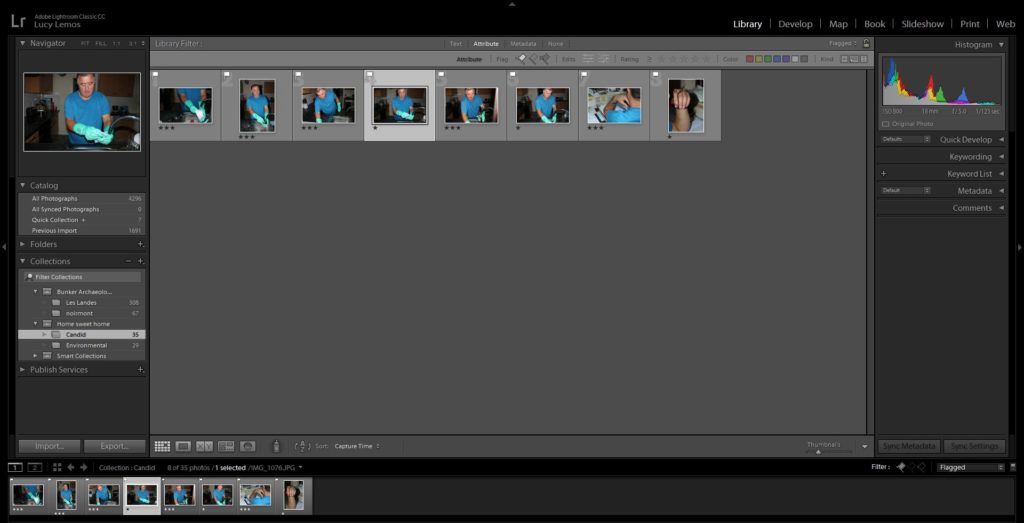
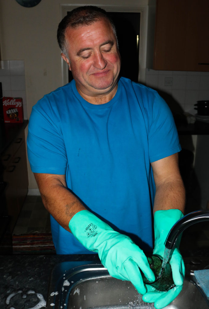
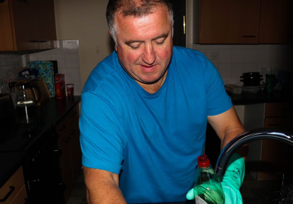
After looking at Larry Sultan’s work, I decided I also wanted to photograph family. I chose to photograph my dad as he is my closest family member meaning I can get a realistic representation of him. I chose to photograph him as I know that he has multiple varied roles in the house and I thought that it would be interesting to see the contrasts. I do not plan on intentionally creating scenarios, instead I plan on taking images of him doing things naturally that I think I could photograph in an interesting way.

Edits:
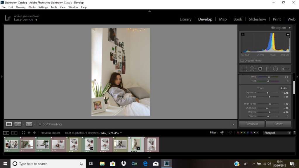
To edit these images I used a very similar approach. I increased the contrast slightly in order to make the subject stand out more,and I increased the vibrancy on each image in order to bring more colour to the selection of images.

Context: I took this image of my dad while he was in his home office.
Visual: It is clear that this image was taken from an unusual perspective as were able to see a side view from behind the subject. The background is filled with books and stacks of paper making it clear that it is an office environment. we can also see a faded tattoo on the subject’s hand.
Conceptual: I think that this image is very interesting as we cannot see the subject’s face, however we still see some elements of their personality through the background and through the tattoo.
Daniel Meadows
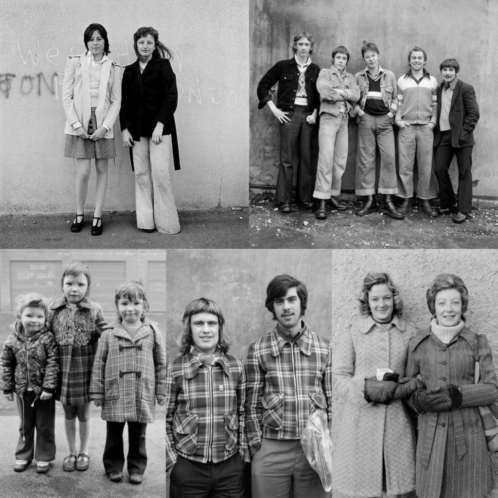
Daniel meadows was born in Gloucestershire, England on the 28 Jan 1952.
“As a photographer, my principal subject was – and remains – the British people,” – Source
From January 1972 he rented a barber shop in Manchester and invited people in to have their portraits taken for free. He team out of money in two months but had gained good experience. In the 70s he became interested in becoming a teacher and was invited to help teach documentary photography at Newport college of art and design.
“I’m not interested in celebrities, just ordinary folk.”– Source
Environmental portrait shoot
Plan:
After looking at Daniel’s work, I like how he took images of people who weren’t as personal to him. I plan on taking images of one of my friends in their bedroom as I feel it is a personal environment to them and it allows us to see elements of their personality. This shoot with be slightly more staged as I will need to position the subject in order to get successful environmental portraits and the subject will be more aware of my presence.

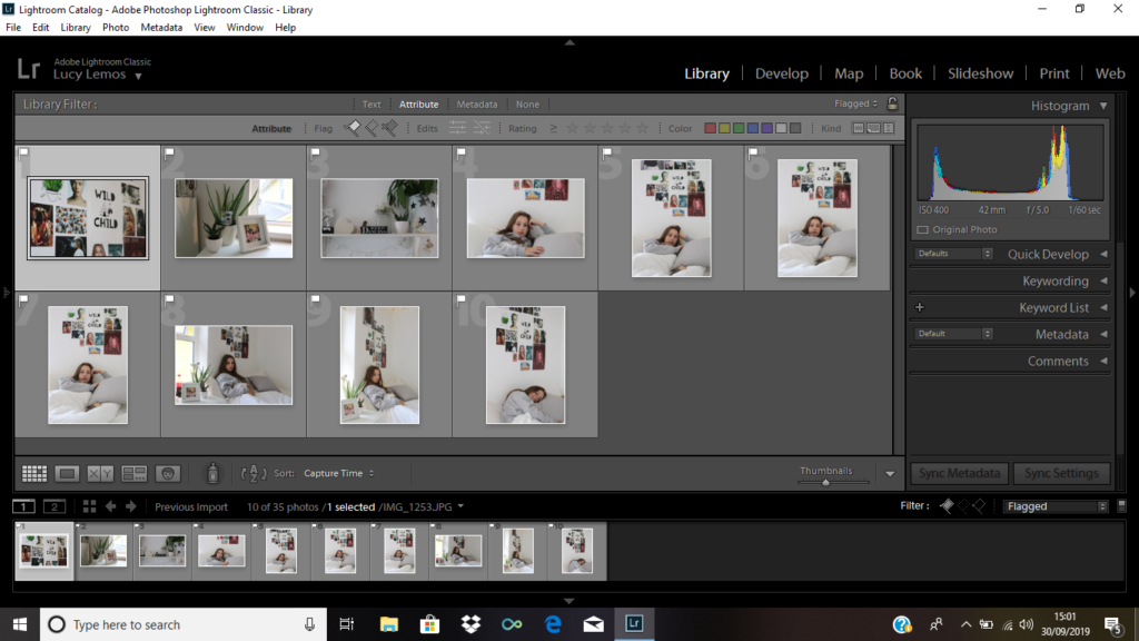
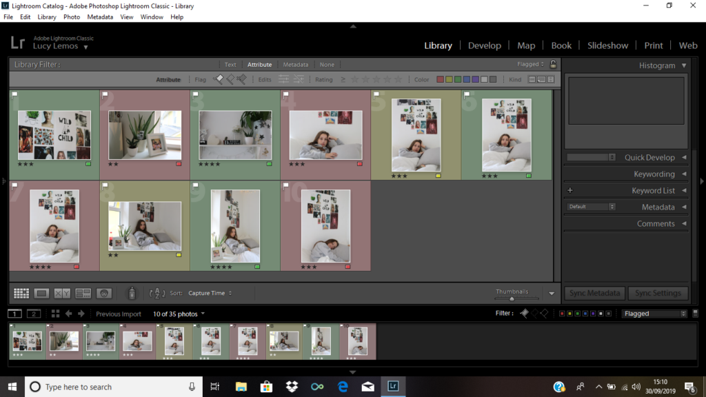
Edits:





Technical: This picture was taken using portrait mode, and the exposure time was 1/30.
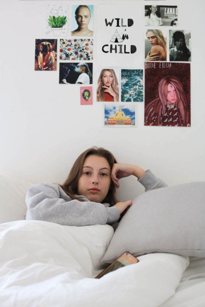
Context: I took this image of a friend in their bedroom.
Visual: In this picture we see a subject in bed. The image is very bright and the background appears very white and clean. On the bottom Left hand side of the image we see a photo frame with an image in it, and 2 plants. Behind the subject we can see an image wall which resembles a mood board.
Conceptual: The main concept of this picture was to try and capture the subject’s personality. The picture frame on the side does this as it shows the subject’s friends. We can also learn a lot about the person through the images they chose to display on their wall. The fairy lights also add a homely warmth to the image.
