

Evaluation:
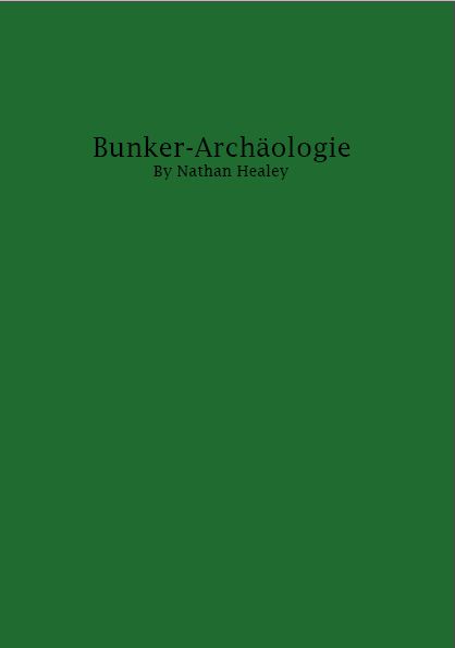
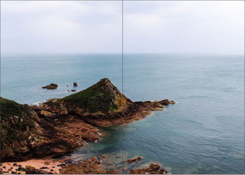
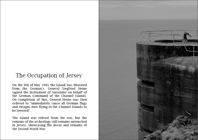
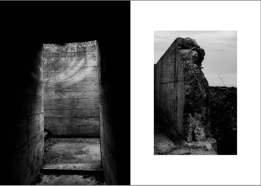
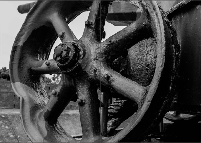
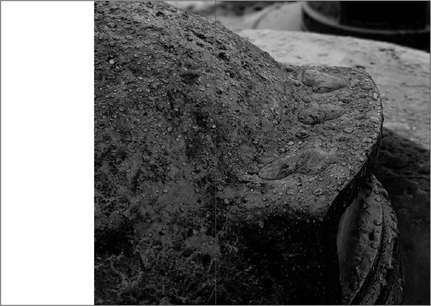
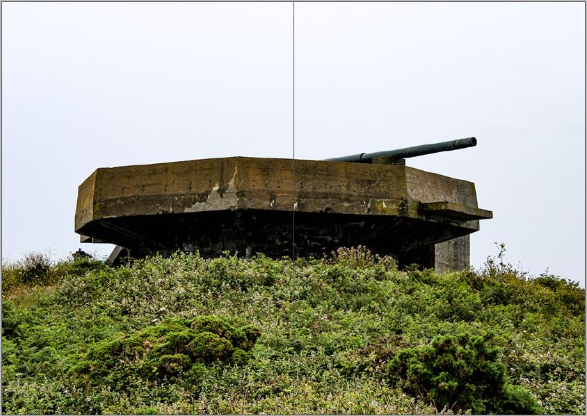
To evaluate my zine design, I believe I have produced a strong outcome which showcases my work following my intended narrative. To begin with my front cover takes inspiration from the bunker green books made by the German’s during the second world war, which showcases my ability to take inspiration and implement said inspiration into my work for an intended affect. The sequencing of my imagery within my photographic zine works well, as it clearly showcases my narrative, the decay of Jersey’s bunker’s and how nature is taking back its land, and each image compliments one another with not having any miss fits within the design. My layouts are well thought out, as I have considered contrast, shape and how the images compliment each other, and work at different sizes. This process was not easy and my experimentation can be seen on previous blog posts, were I explored the layouts of different images. In my final design I decided to include text, which I believed to help convey my narrative, supporting the images in the story. I experimented with different fonts till I was happy with one which fit well with my images and presents an older time frame within my images. To conclude, I am very happy with my final design, as it showcases my strongest outcomes from my work so far, and shows my understanding of what makes a successful zine, which shows how I have acted upon my research.
