Design 1:
For my first design I followed the sequence which I outlined on my previous blog post. Having the start and finish have imagery of landscapes of and around the bunkers, and the middle pages containing images of the bunkers, showcasing their decay. To create this layout I used InDesign, I set up my page to be portrait and the size of A5 paper and in the style of a photo book. In this attempt I looked at different page spreads, what works and what does not look as effective. Within this initial design and experimentation I managed to produce spreads which work well in showcasing my narrative. However, some pages need to be reconsidered and the sequencing of my images could also be reconsidered in order to produce a stronger outcome.
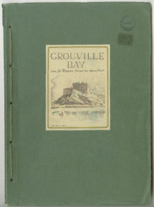
For my front cover, I took inspiration from the archival green books found at Society Jersiase. Below is an example of the green book cover.
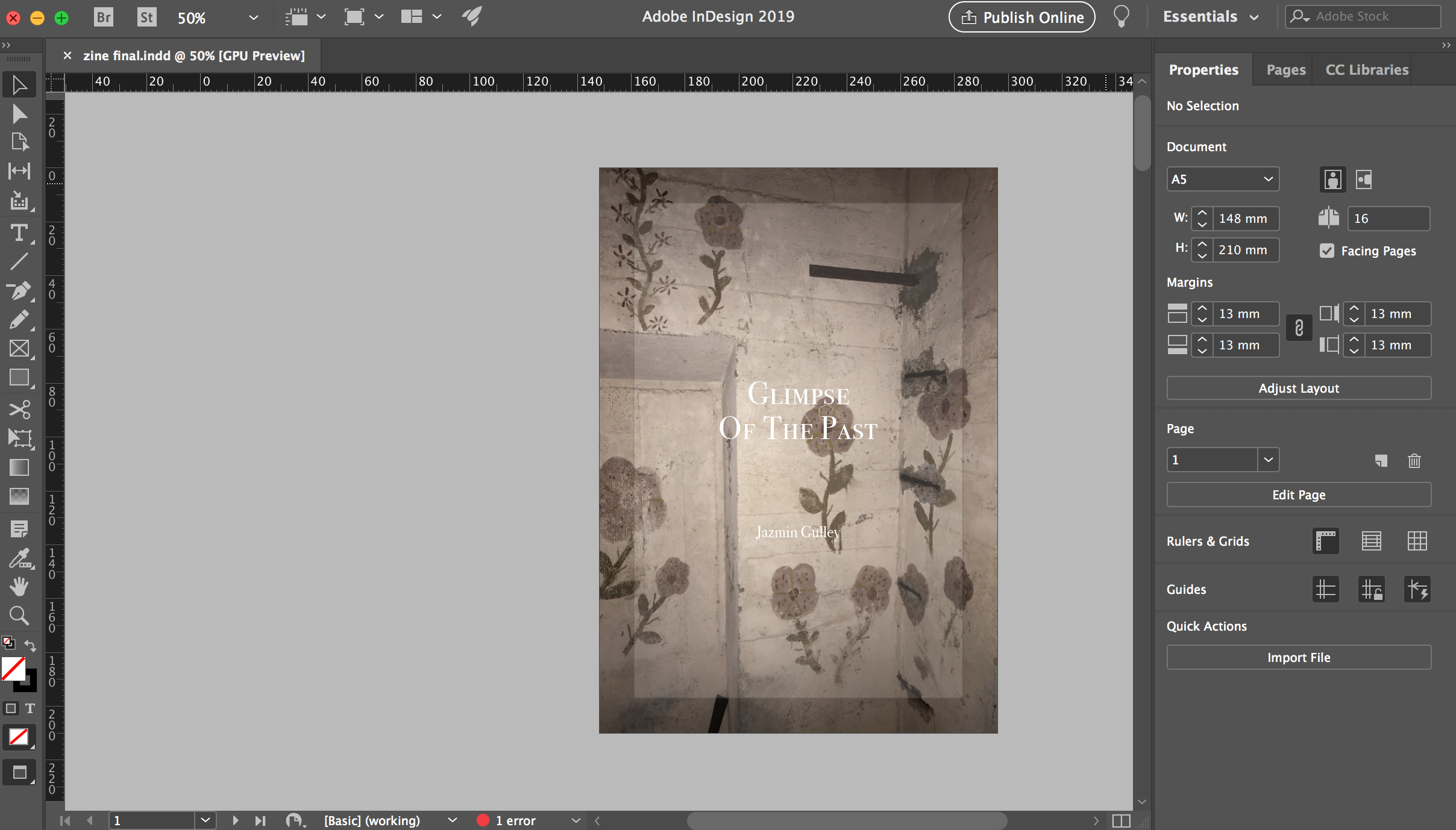
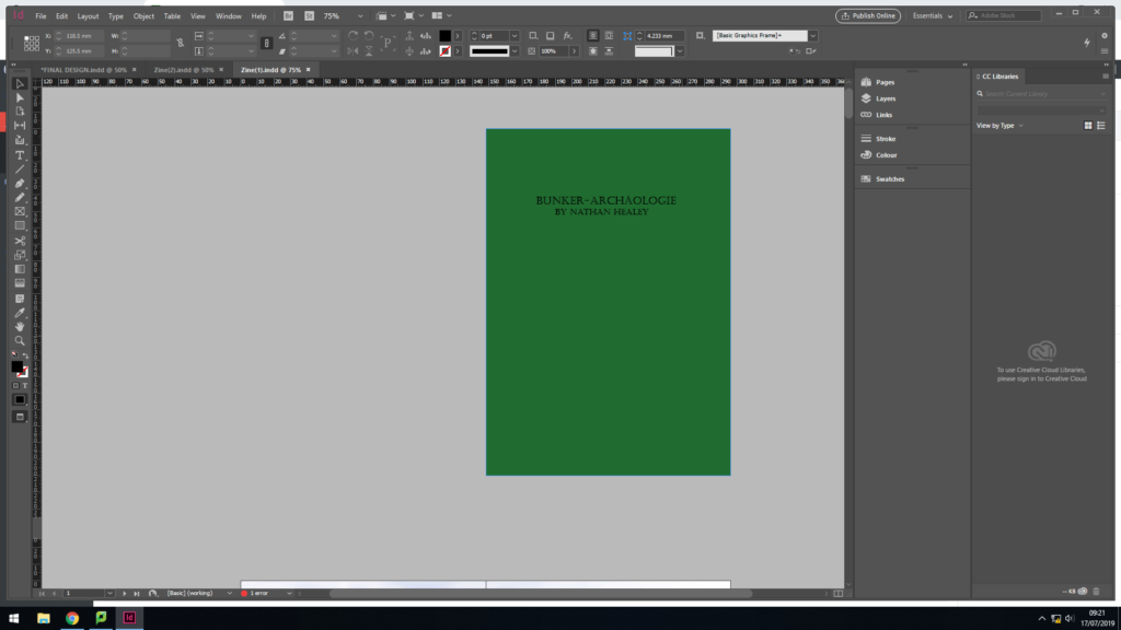
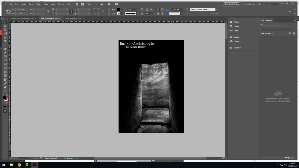
The ideology behind replicating this, was that the green books were created by the German’s during the war, showcasing the defence systems in the area on the front cover. Due to them being archival material it begins to suggest that the defence systems have changed due to the abandonment, thus it begins to present my narrative of the decay of Jersey Bunkers. For my cover I used a dark green to cover the back and black text. Although the two covers are very different, I wanted it to be a ‘modern’ version of the green book, thus this simplistic design clearly showcases this. The title of the Zine is ‘Bunker-Archäologie’, it translate to Bunker archeology in English. Deciding to have my title in German, reminds us of how the bunker’s were built for German soldiers to prevent people getting into the Island, thus it showcases how the Germans have left their mark on the island and allowing it to decay. The font used for the title is bold and has a rigid structure, which represents what the bunkers once were.
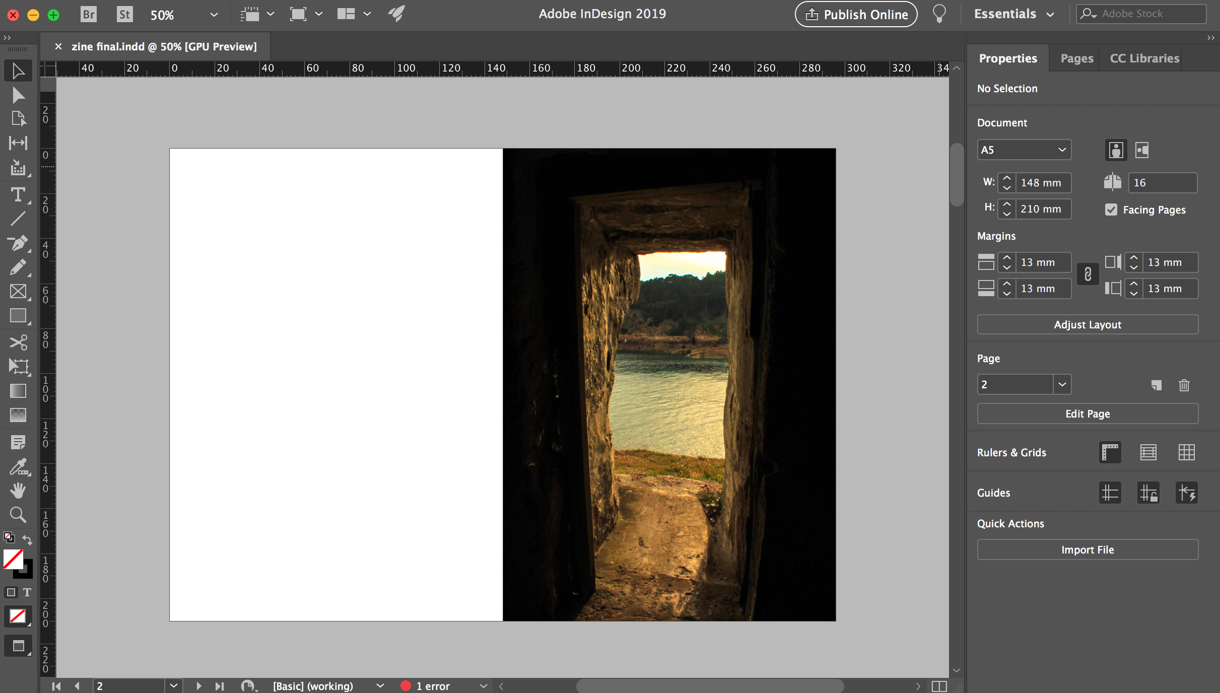
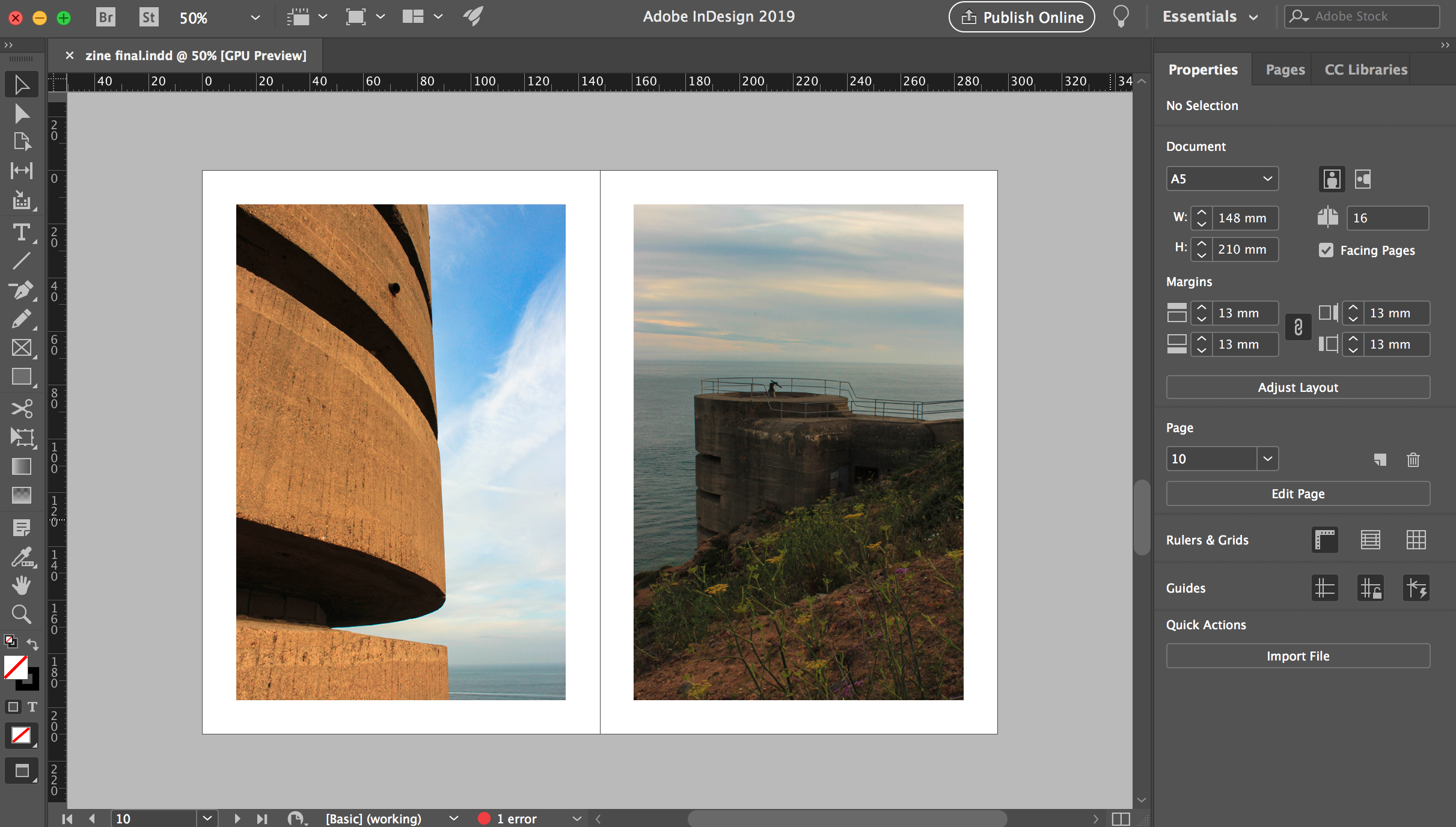
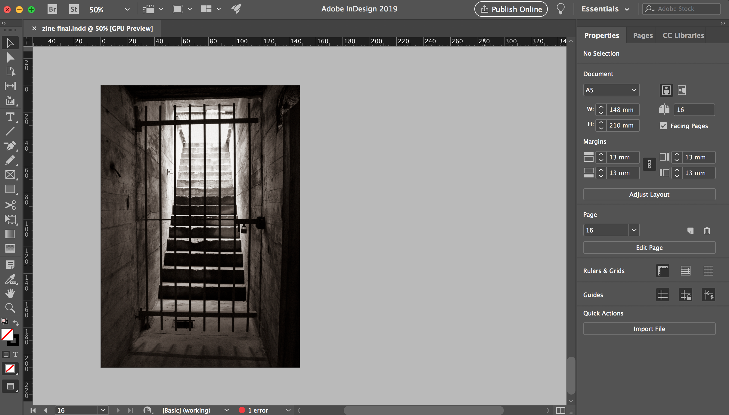
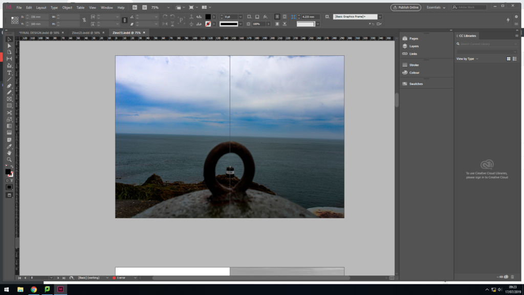
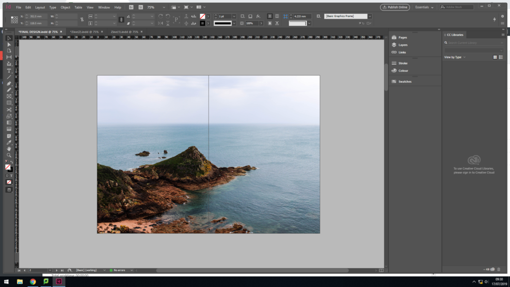
For my second page of the Zine, I used a full page spread of the landscape photograph, looking out from the Noirmont point, a location of one of Jersey’s bunkers. I kept this image in colour to showcase that the image is recent and reinforces the idea of a modern green book. In addition, it showcases the beauty of Jersey, and although the bunker’s are decaying on the top, it is not forcing the rest of the island to decay with them. The full page spread clearly showcases the sea line, and beauty of the nature, which creates a sense of space and a peaceful mood, which holds a ameliorative tone towards the photograph.
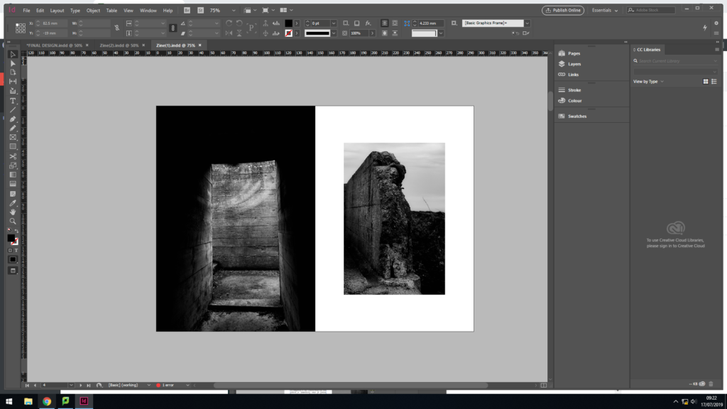
For my next page, I wanted to start showcasing the decay of the bunker’s, this layout clearly emphasises this. The juxtaposing colours, showcases the abandonment of the bunkers, which is reinforced by the formal elements of space and texture. The image on the left is a half page spread, filling the screen creating the sense of space. The image on the right is much smaller and located in the centre of the page, producing juxtaposing colours which helps the photographs to compliment one another. I believe that this layout is my strongest page spread, and is unlikely to be changed.
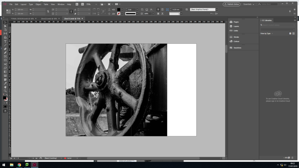
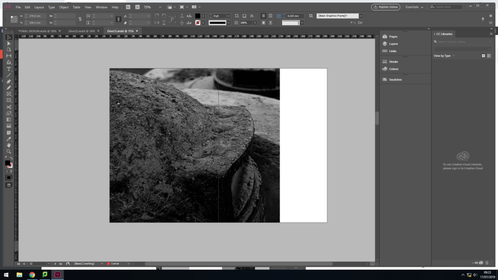
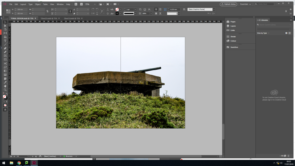
In my next page spread, I used a 3/4 page spread to showcase this macro image of the bottom of the gun. This layout allows the formal elements of texture and shape to clearly be showcased, reinforcing the narrative of the decay of the bunker. This photograph is strong enough to be alone and is busy, allowing viewers to be drawn into the image. In my opinion this page works well within my design.
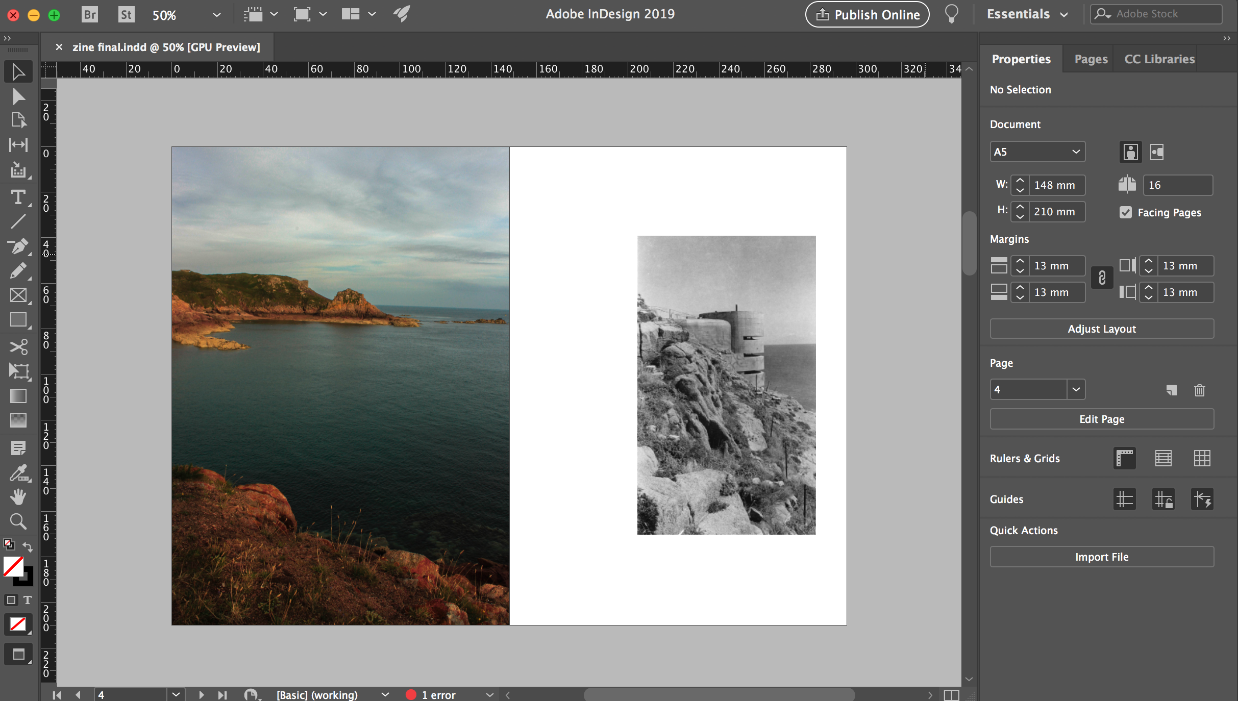
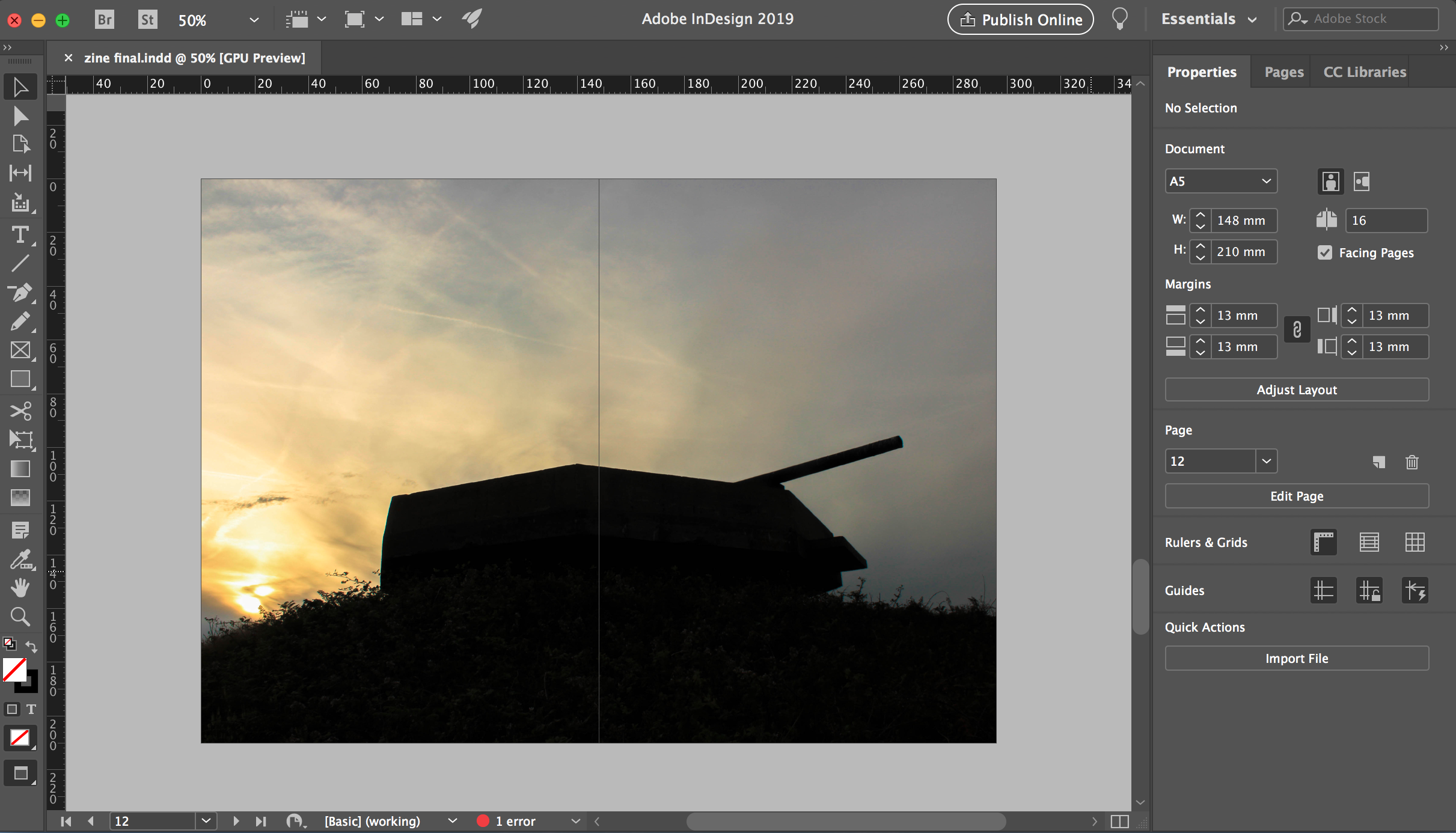
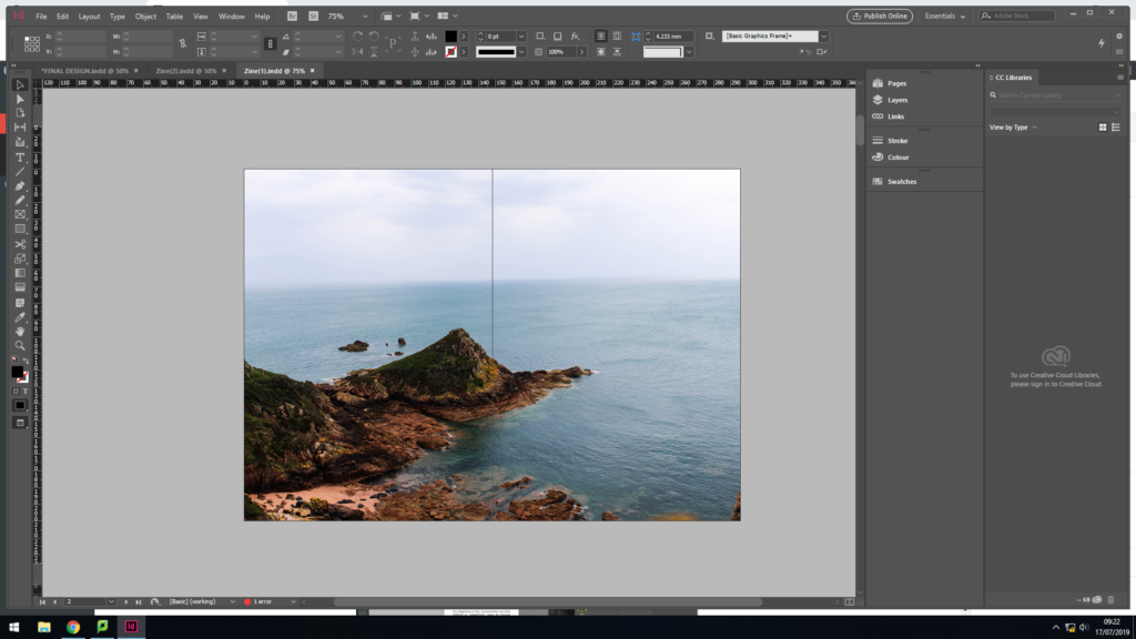
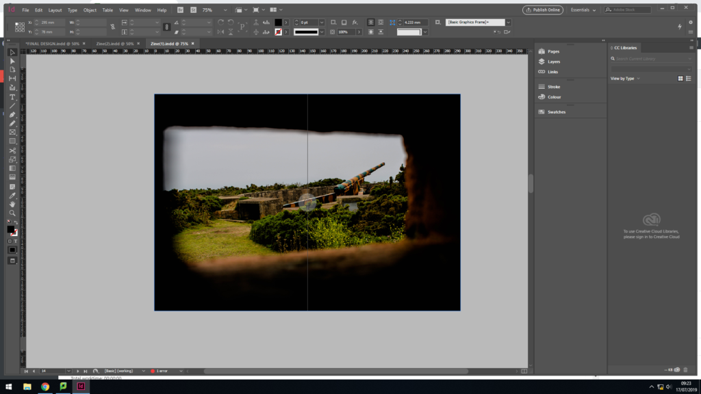
For my middle page spread I decided to repeat the idea of have a landscape image looking out in colour. I used a full page spread, for the same reasoning as the first page. This artistic design worked well, as it reinforces the idea that the bunker’s are decaying but the island will not decay with the bunker. The image works well as it uses the technique of framing to enclose a bunker type building out at sea, leaving the rest of landscape to be free. Although I like the way in which this page turned out, I do not believe that having a colour image in the centre of the zine is the best idea, as it almost distracts viewers from the actual narrative, decay of the bunkers.
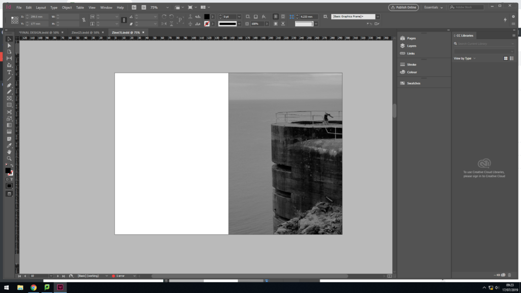
For my next page spread I decided to go with a half page spread for the image, and leave the other half blank. Creating this blank page takes a break from the action, allowing the information and concept of the zine to settle into viewers heads, it can also be used represent the idea that one day the bunkers will be gone, due to them decaying so rapidly. The image is placed on the right side of the page, as the structure is cut off on the right, so the edge of the zine acts as the end of the bunker.
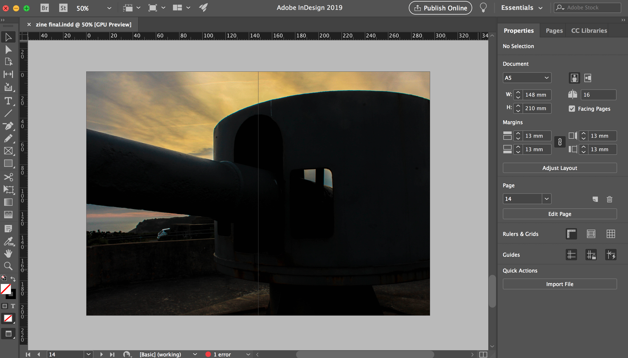
In my next page, I decided to use the 3/4 page spread again, due to me liking the way in which the other 3/4 page spread look. The image used suits being a larger image, due to the texture being presented through the raindrops and decaying of the bunker.
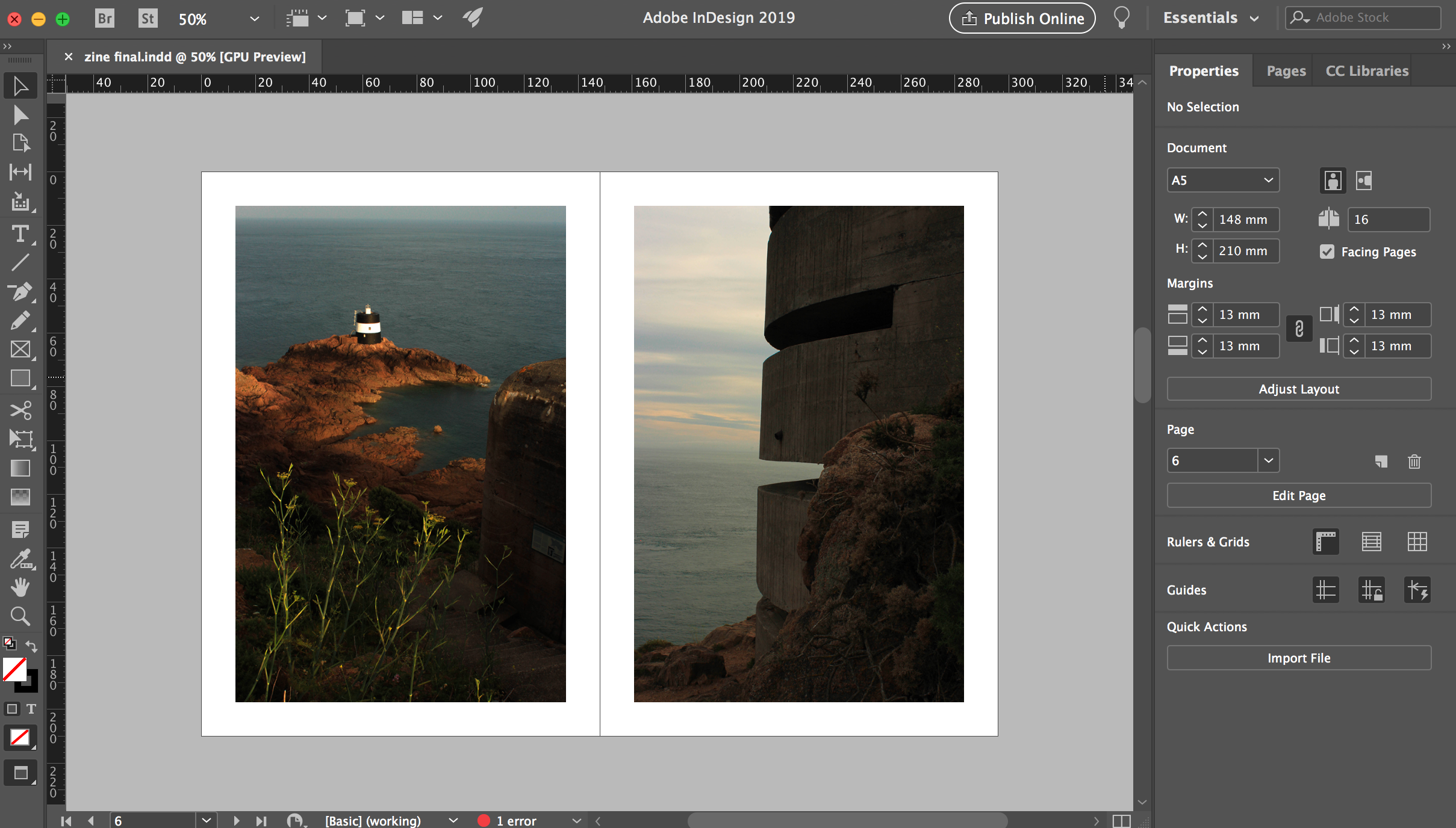
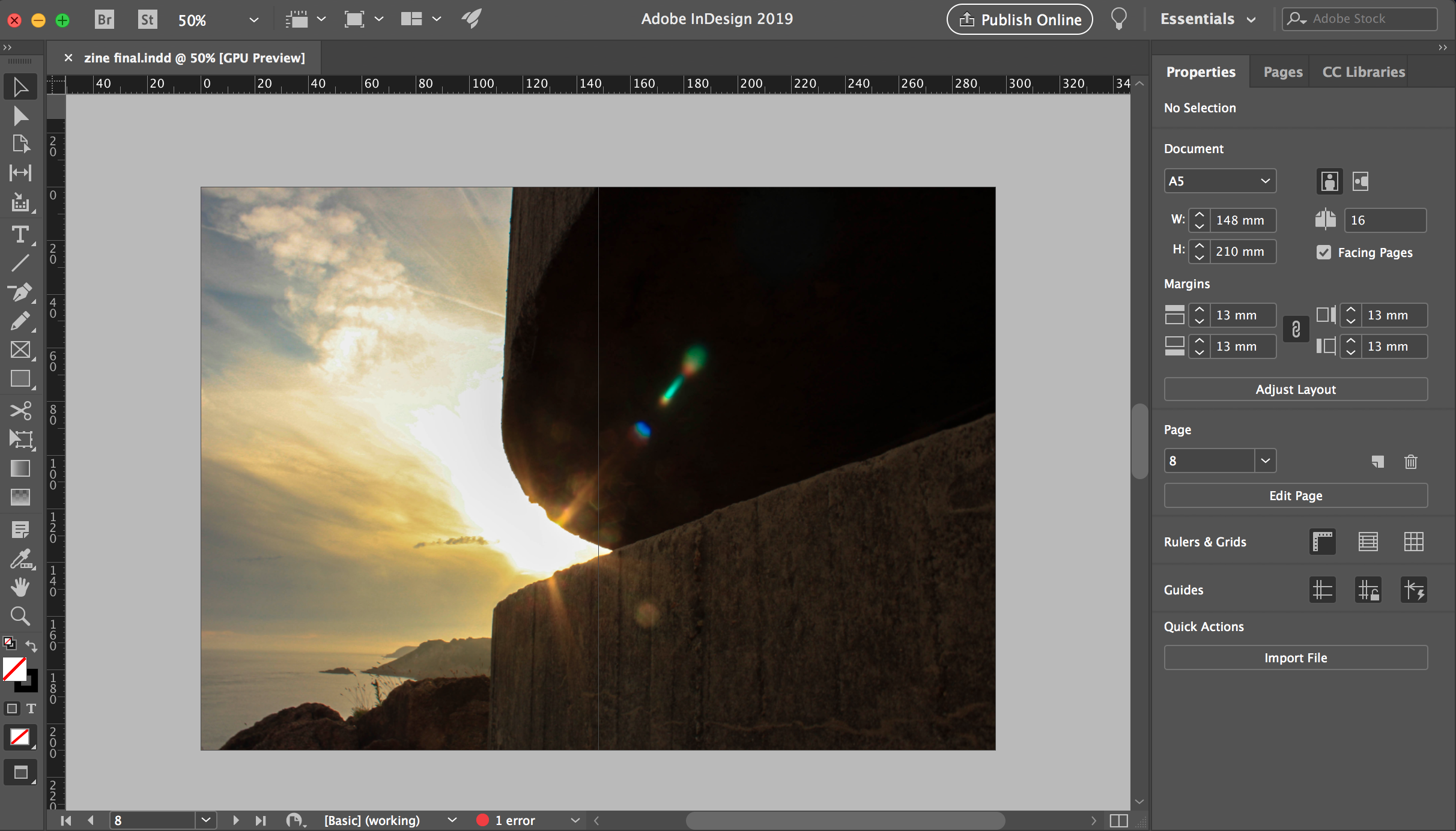
For my final page spread I wanted to use another landscape image, to create a circular plot and allowing it to follow my intended sequence stated in a previous blog post. I used a full page spread, and a colour image. This time the landscape photograph is looking back at the bunker, which nicely brings the zine to an end, as we can see how the bunkers are decaying the but what surrounds is not decaying. Although this image works well on a full page spread, I do not believe that it is the strongest finish to my zine, thus I will look at changing this.
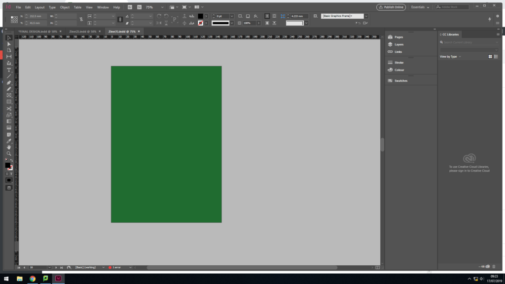
The back page of my zine is simply the same colour green as the front cover, which refers to the archival green books which showcase the layout of the bunkers, made by the German’s.
Design 2:
In my second design I looked at alternative ways in displaying my images, by changing the spreads and adding in text in my zine. I explored a different front cover option as well as different layout options. I intend to use my best page spreads, from this design and my previous design, to create my final sequence and make my final zine design. Doing this further exploration of page layouts has allowed me to develop my skills within InDesign and has allowed me to show development within my work.
In this front cover design, I decided to use my strongest image produced in my photoshoot, It clearly showcases the decay of the bunkers, thus bringing my narrative from the get go. In addition, I used the same title and font as I did in my first design, but set the colouring to white. The placement of the text is in the top left corner, which is a little hidden, but is placed with in a completely black are making it work successfully. Although I like the way in which this front cover looks, I think this image would work better in the spread created in the previous design. Needless to say, it was well worth doing this experimentation as it confirms that I like the way in which my original front cover looks, and the conceptual and contextual factors it holds.
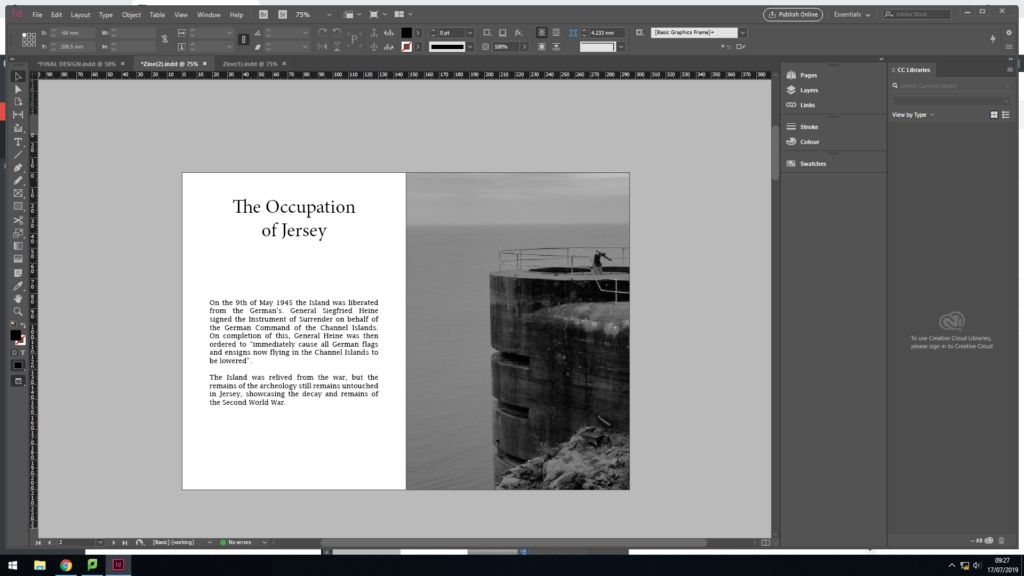
In my next layout I wanted to experiment with adding text into my work, in order to clearly outline the historical factors of the Second World War in Jersey. With this I simply added a title and text which outlines the liberation of the island and how the bunkers have been left to decay. The short text allows my narrative to be presented, and works well with the one page image spread next to it. I really like the way in which this spread looks, thus I am planning on implementing it in my final design. However, I will develop the font and layout of the text, as I do not believe it is having maximum impact within the zine.
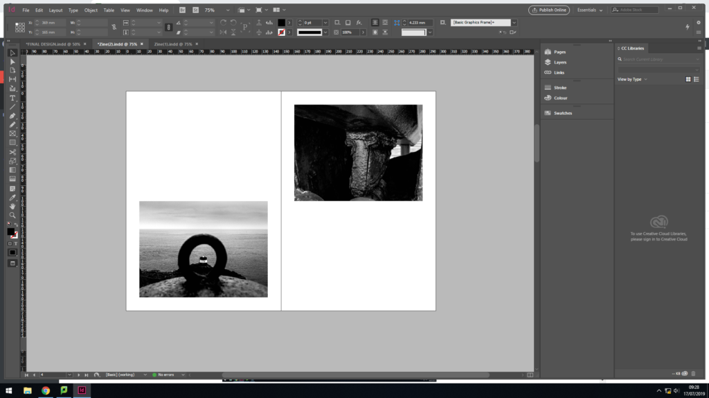
My next layout, I looked at placing two landscape images on a page. I selected two images which juxtapose the sense of space. One image is placed at the top and the other at the bottom. For the narrative I am going for I do not believe that this spread is effective, or fits in with the other layouts within my zine. Therefore, I will not be further developing this layout.
I then decided to look at another alternative for a middle page spread as I was not happy with the one created in my initial design. I decided to use this photograph, which was originally a 3/4 page spread, and made the black and white photograph a full page spread in the middle. I much prefer this layout, as it does not disturb viewers from the narrative with a colour photograph in the middle, thus fitting my sequence more appropriately.
Changes:
After developing my two design idea, I still had pages which I liked but still needed developing in order to have maximum impact. Below are the three main changes I made. This shows my further development and me critiquing my work from an artistic perspective.
Font:
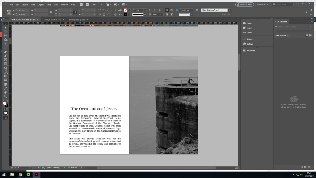
As mentioned earlier I was not happy with the font I used to create the page spread which included information about the decay of Jersey’s bunker’s. I decided to change the font to one which is similar to my title, keeping my work consistent. I also decreased the size so my title fitted on one line as well as getting rid of the hyphens within the paragraph. In addition, I moved all my text down to the bottom of the page, which is a typical design layout for a zine when the text does not fill the whole page. I am much happier with this change in design, as it allows the zine to flow more fluidly now and presents my narrative well.
First and Last Page Design:
Colour Changing:
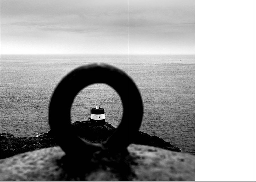
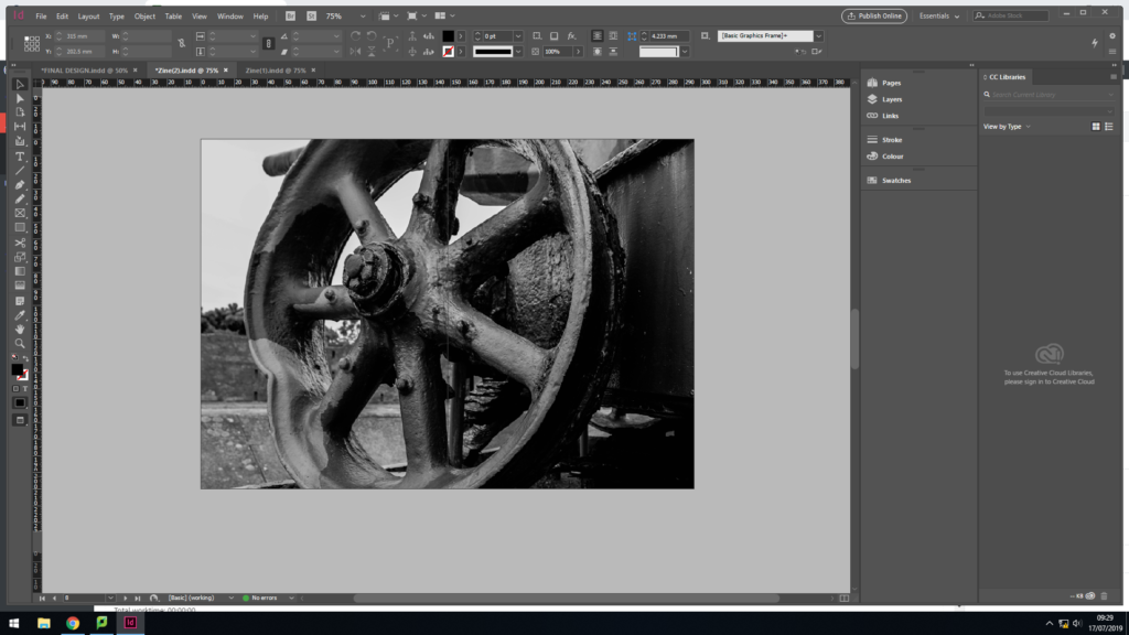
My last major change was the colouring and positing of the image above. Originally this image was in colour and a full page spread in the centre of my zine. As mentioned, I did not think this was an affective look as disturbed the rhythm within my zine so I created a new centre page. I still wanted to include this image somewhere in my final produce. I decided to turn it black and white and have it as a 3/4 spread, taking the position of where the wheel image was. I believe that this image is better suited in black and white and in this layout, as it showcases the decay more appropriately.
Action Plan:
As an action plan I will now combine my favourite spreads onto one document, creating my final design for my zine. I will then place them in the appropriate sequence and evaluate my final outcome on another blog post, which shows my final design page by page.