BATTERY MOLTKE

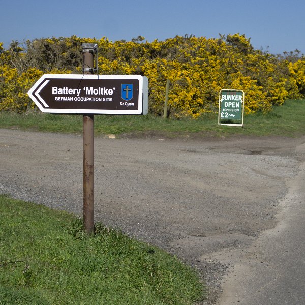
For our second trip of this term we went to the Battery Moltke which is located in St.Ouens, which during those times was the central location for bunkers as it faces out to sea.

This is one of the many remarkable monuments left back to be glorified. The Battery Moltke is actually comprising four 15.5cm K418(f) gun emplacements and an associated underground complex was named in honour of Helmuth Johann Ludwig von Moltke, who was Chief of the German General Staff from 1906 to 1914.
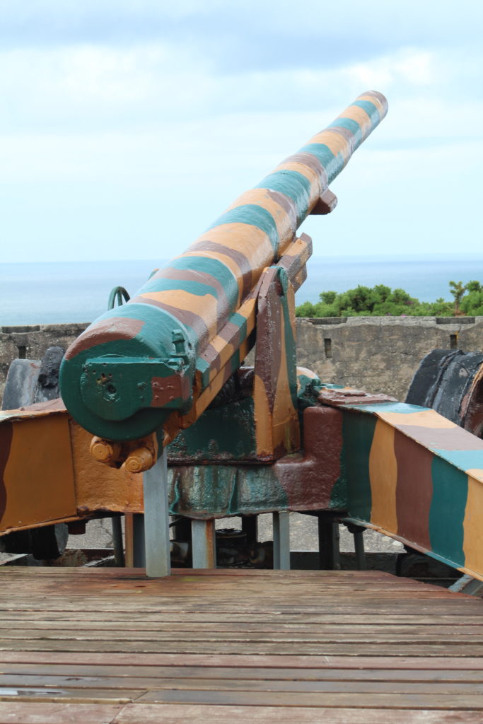
One of the gun placements has been completely renovated including fashionably painted in camouflage colours this is due to the fact that firstly it needs to be preserved beautifully but for it to also blend in with its surroundings. Not only has it been heavily done up on the outside people have invested years of hard work to create a display of this underground passage that used to accommodate about 27 men which when I first heard about thought it was quite a small amount due to the amount of space that was in there, however after learning that they’d have to carry ammunition through these meter and a half corridors it made more sense that a lot more things would have been going on back in the time of its use.

This bunker, with a ceiling two metres thick, was built to “Fortress” standards. It is fully equipped with original ventilation equipment, boiler, bunks, and central heating. Standing outside the bunker makes you visually image what you expect it too look like on the interior, having never been inside a bunker this big I was shocked but also amazed at how big, how clean and surprisingly how decorated it was. although having been told it had been renovated It did not look like what I had imagined. Four M512 ammunition bunkers were also built to serve the gun, three of which are now used for display purposes. The complex has been subject to an ongoing restoration project that commenced in 1979.

We started off by meeting a member of the CIOS, Tony, who gave us a brief introduction about what we were going to be seeing and a little information about the history of this place. Just after being there for literally 10 minutes it quite quickly kicked in that there was lots of things that can be photographed. The cannon above was the first thing that caught everyones eye. Having looked at the gun placements he went on to say that the original gun placed there was actually french,he later informed us about the ammunition and artillery and how they were used as there defence to protect the coast. We then went on to proceed into the main bunker that had been converted into a showcase filled with images, newspaper articles from the time, real life artillery, helmets and even a room with footage of the bunker during the occupation, it is home to many special and valuable artifacts that are now on display for tourists and islanders to go and see. Inside this bunker there was maybe 4 to 5 rooms and one of those rooms is displayed as a medical room where when the soldiers got injured for whatever reason they’d be taken there for emergency care. It was interesting to see the way it was set out and how much technology used in the medical insdustry has developed as in those days sterilisation and a clean environment would have been hard to achieve due the circumstances of the occupation.

This was the 3rd bunker we got to visit along the coast of St Ouens

This was the last tower we went to visit before making our way back. Nine of these towers were originally planned for the coastline of Jersey, but the increasing shortages of cement and return of forced and slave workers to the Continent at the end of August, 1943 resulted in the abandonment of the project.

Totally unique to the Channel Islands, these observation towers were also built to “Fortress” standards. Each of the five observation levels was intended to provide the distance of a target for an individual artillery battery using the long base method of range-finding, in conjunction with the other MP towers. However, this method of range-finding had obvious limitations in inclement weather, at night or if there were numerous targets on the horizon.

MP3 was intended to bypass these difficulties with the installation of a radar on the roof. This gun-laying radar version had an accurate detection range of around fifteen miles, and was of a similar type utilised by the famous pocket battleship “Graf Spee.” The generator which provided electric power for the radar was housed in a very large bunker behind MP3. This also acted as a personel bunker for the soldiers, who were ordinarily barracked adjacent to a pre-war rifle range.

This is the map I copied from the website for the interior of the Tower.

Who’s Archive is it anyway…

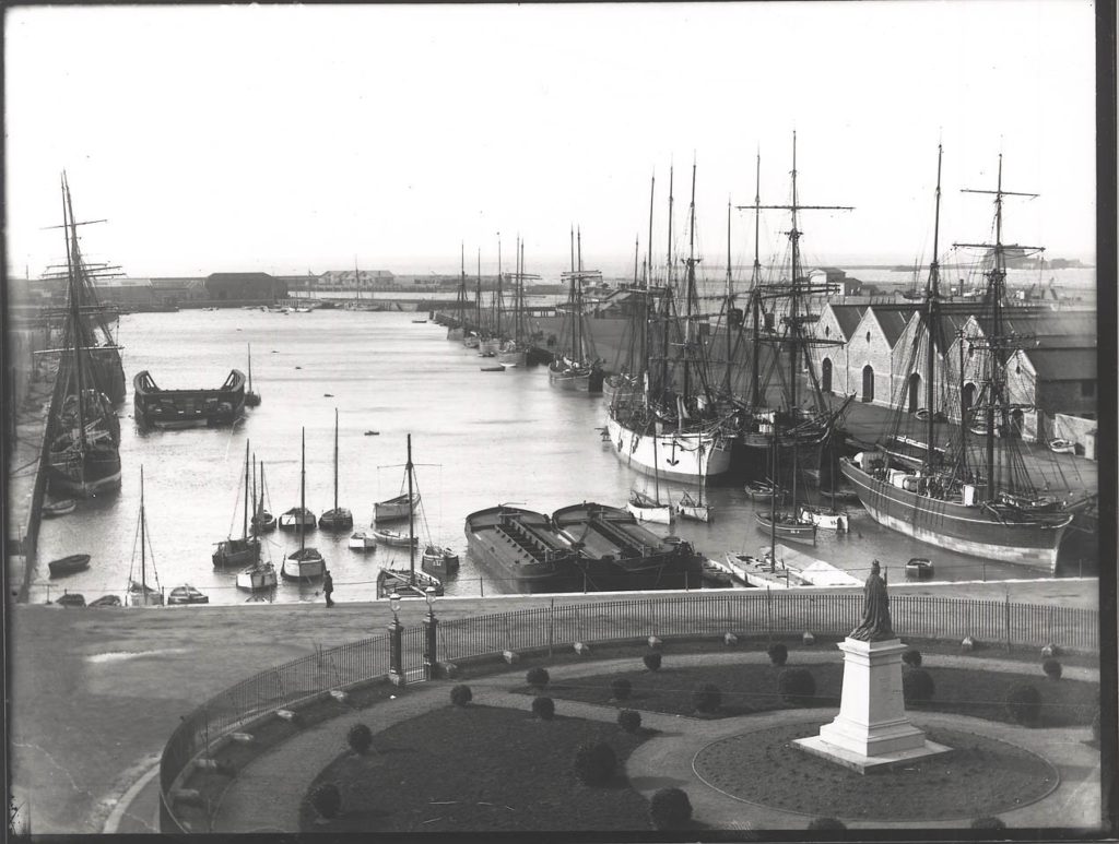
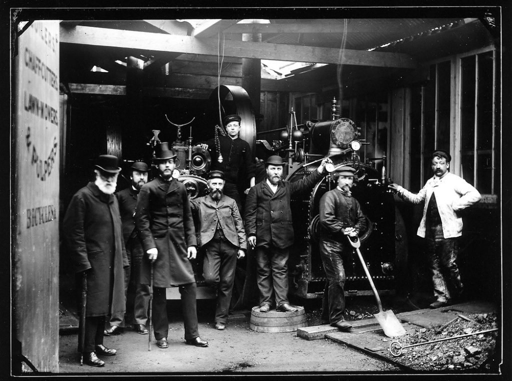
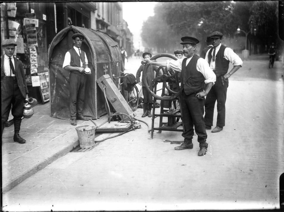
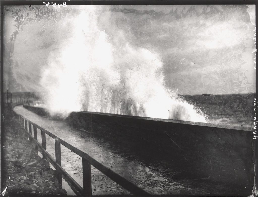
Above are some pictures from the archive taking from the Societe Jersiaise webiste

My interpretation of an archive is something that stores hardware photographs, audio books, letters, anything really that has sentimental value to its society and nation, it usually is relatively old meaning that it gives us a better insight to years that I certainly wasn’t around for. In many ways, the purpose of these archives is that they are there to protect old records that if displayed wherever could potentially be ruined and too also educate and inform younger generations of the sort of activities and events that have taken place on this island we call our home. Archives have the function to inform us of what our island’s culture used to be like. Having them in our lives is important as most of the images found in archives go way back to the 19′ hundreds which therefore gives us an insight into how much our culture has changed not just in terms of our streets and buildings but our fashion industries and government standards.

Images from the archive’s have dual meanings because what we see in these images is just an aspect of their reality, its a split second of their day whether they are working or just simply sitting doing nothing the reality of it is that we actually don’t have a clue of what the context being those images are and how those people are actually feeling.
Archives act like repositories of cultural memories because its where memories,events,important dates have been stored. By keeping them in a safe location it means that younger generations can look back on their grandparents or even great grandparents lives and see how much it has changed as the years have gone by.
Photography doesn’t just play an important role to the archives history but it plays an important role in day to day life without us even thinking about it. As previously stated, theres an idea that our feelings change once we know the context behind the image. I think it was important to photograph back in the day the reality of their lives without mobile phones,internet pretty much nothing but pen and paper if you wanted to communicate and how easy todays generations have it. I think it makes younger generations reflect that our older families did not have it easy and that just because they look happy for an image doesn’t mean that’s how they’re really feeling.
R

Now in the modern days, images can be taken on many different devices but there is a part of me that enjoys looking at pictures of my parents and grand parents because they have an element of being old and they look not as highly focused and the colour balance of some images are not the right tones. I do like the old fashioned photos but i know that most pictures i will likely look back on will be freshly coloured and in relatively high quality.

Visually, looking at the archival images will enrich our personal studies because we can see how much our culture and society has developed not only with the quality of those images but in terms fashion and political aspects on the island. Seeing it on a piece of paper will make us see the changes and give us a more personal account to look at it. It will also influence what we go out and photograph as they’re are going to be certain ideas that wouldn’t completely fit into this theme.

Looking at the images has been resourceful because it has given us lots to look at and from looking at those images we can take elements and copy into what our society and culture for our new images and my response. I think that as young photographers/ Artists we can use elements of their photos and adapt and use them into our own wether its by using photo – montage or a simple over layer of the two images 70 odd years apart. Archival images can be used in many inventive and creative ways therefore just being able to see what life was like before we were all born was seemingly interesting.

To answer the title “who’s archive is it anyway” I think its hard to say because each individual has a different interpretation of an archive. Some places were not affected by any sort of conflict so wouldn’t take into account archives from the war as they have no link to it but their are some that put 100% time and devotion to make our land remembered for what really happened to it and how much we have got and what It has really come to and why.

SOCIETE JERSIASIE

For our introduction to our new theme for this project, we took a trip to The Societe Jersiaise to look at archives during the jersey occupation it was founded in 1873 for these following purposes.

  • The Publication of Local History,
  • The encouragement of the use of French, the official language,
  • The study of the ancient local dialect
  • To achieve, as far as possible, the conservation of all prehistoric and historical sites
  • To found a library, mainly historical and archaeological
  • To collaborate with other societies with similar aims

Societe Jersiase found a permanent home in 1893 when they moved to 9 Pier Road, a large early nineteenth century merchant’s house. The extensive Museum collections are now looked after by Jersey Heritage but they are consistantly adding to the collection.  In 1977 they built a large extension to the archive on the site of No 7 Pier Road to house the library and meeting rooms.Over the years, Jersey heritage have purchased archaeological sites in Jersey for preservation and presentation. According to them their two most important sites are La Hougue Bie, bought in 1919, and La Cotte de Saint-Brélade, purchased in 1955. They’ve carried out extensive excavations at both sites.

In 1913 the Société’s activities as a learned society were organised into ‘Sections’ for the study of different aspects of the island.  These Sections, now 14 in number continue to be the backbone of their activities.  They also employ specialist staff to look after their library archives and photographic archives.

Many of their activities have been made possible by substantial gifts of money over the years and they’ve always got important projects in need of funds. In a way It shows that even over 70 odd years there are still many things on the island to be discovered and shown off as people often think that we are only an island so there’s limitations however Jersey is more precious with it archaeological discoveries. I believe that everything we find now should be preserved as something so small could contribute massively to researchers and historians interested in the times of the war and during the occupation.There are many museum and other collections that have been largely built up through gifts and bequests which has ensured its preservation of many important items with relevance to Jersey including; books, manuscripts and maps, photographs, prints and paintings, archaeological finds and historical items.


Developing and experimenting- Cropping

Cropping is a way of manipulating images where you can get rid of certain parts of the image. It can create different impacts because you get rid of some parts of the picture that can give an audience context. This means that you can obscure different aspect of a photo in order to contextualise.

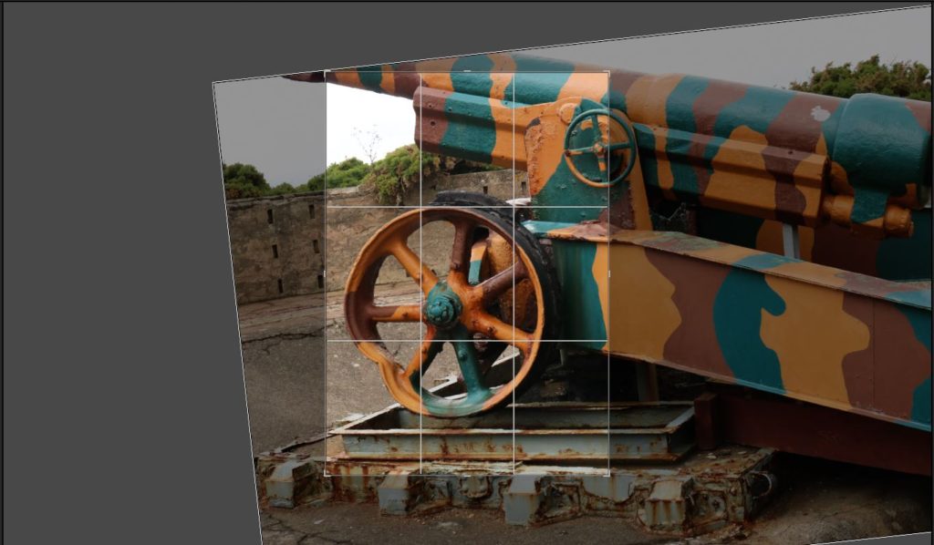
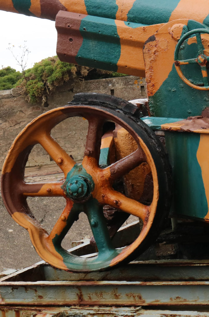
Here I cropped the image of the gun to just include the wheel. I did this because I thought it was the most interesting part of the image since the rust shows how old it is and shows the history that the gun represents.
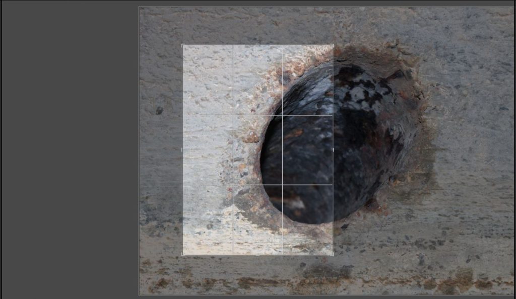
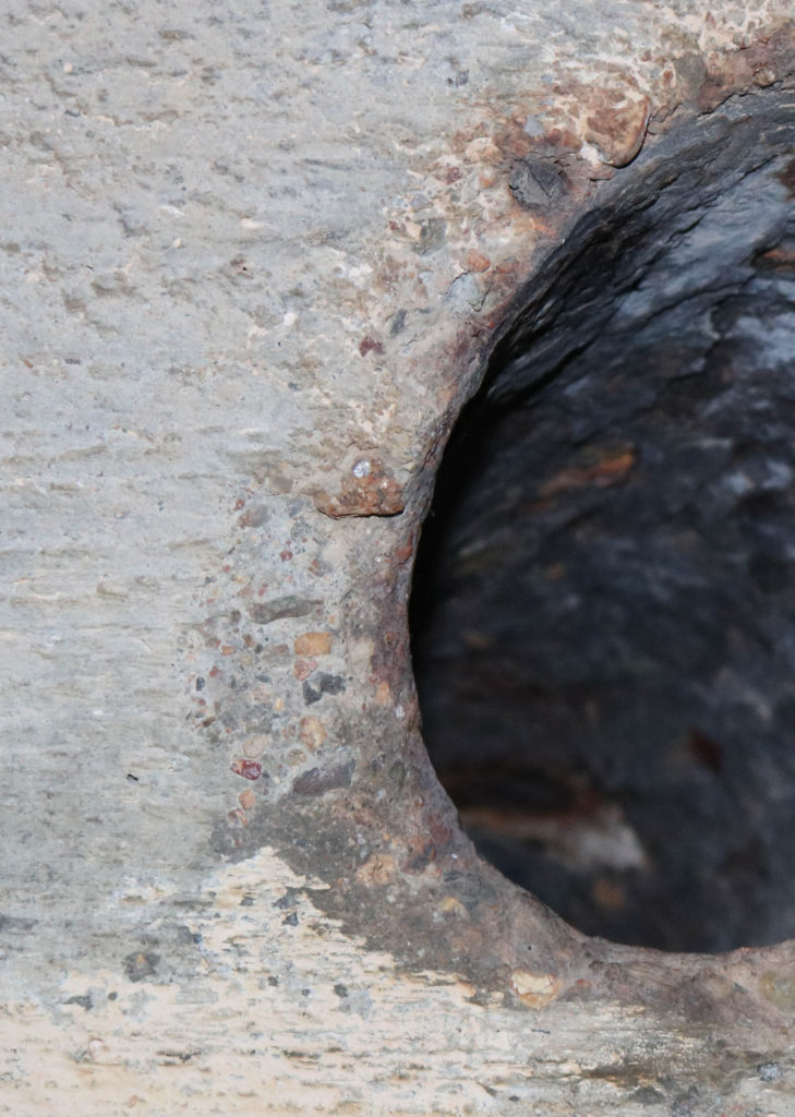
Here I cropped an image of hole I found in a bunker. I did this because I thought that closely being able to see all the different textures and the interest short depth of field would be an interesting way to view bunkers in more depth.
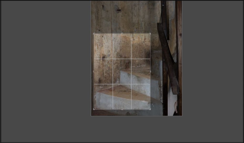
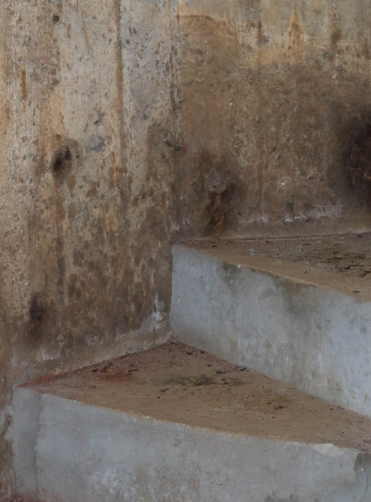
Here I cropped an image I took of the stairs. I did this because I thought it was a more abstract view on the bunker. I think that this image is more successful because of all the interesting angles of the steps and also because you can see the aging very clearly.

Developing and experimenting- Photo-montages

In this blog post I will be experimenting by creating photo-montages related to the war, which show the occupation of Jersey and the effects it had on the island. I will be using a mixture of original archive images and also some of my own images that I have taken as part of the project so far.

Montages can be created either physically or digitally using software such as Photoshop. It is the process of putting different types of images on top of each other in creative ways, in order to convey a feeling of theme.

Mood Board

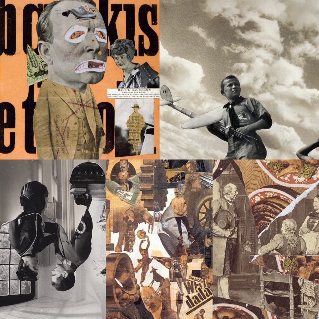
Below are some historical related photo montages that I have looked at, and used as inspiration before creating my own.

Mood board.
Images are not my own.

My Montages

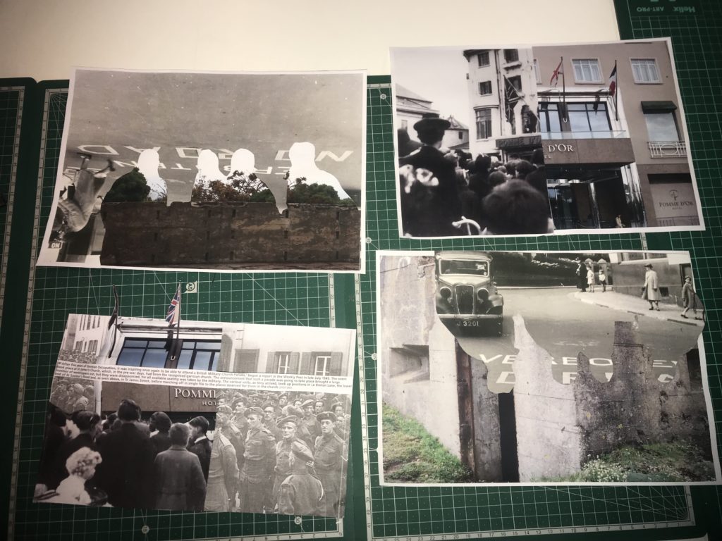
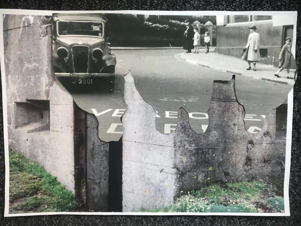
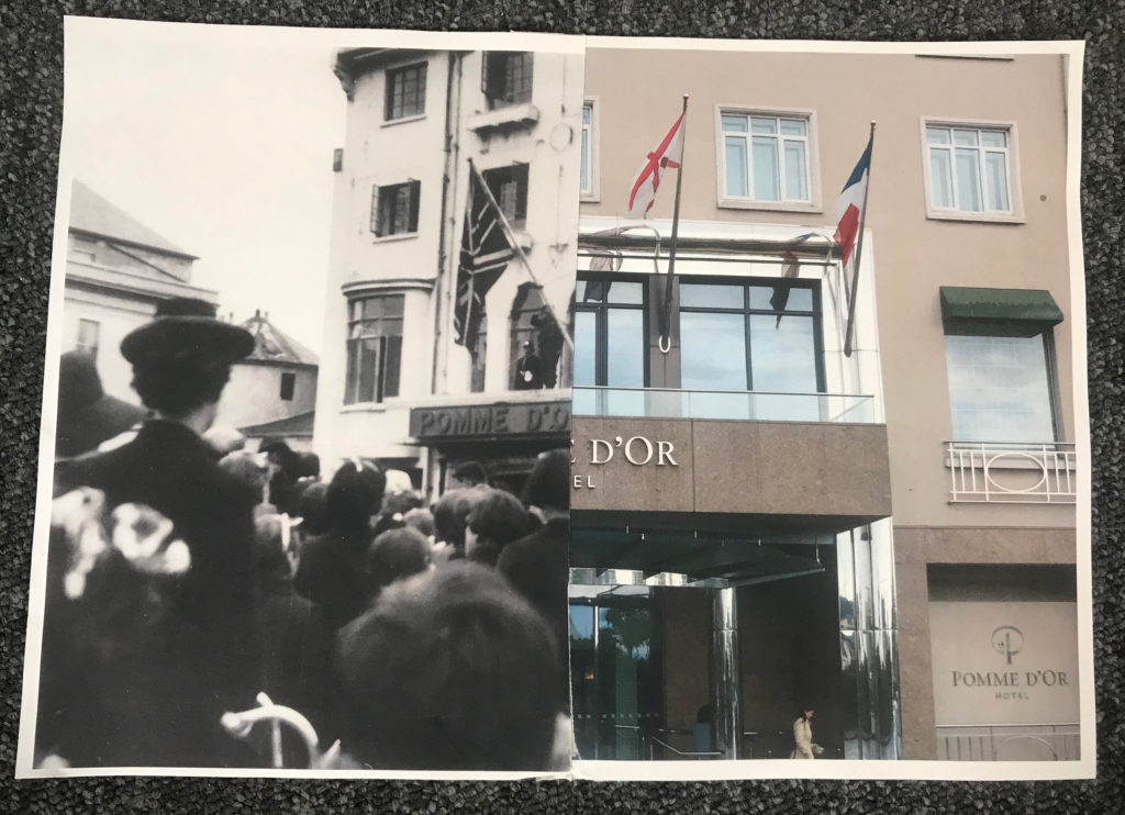
Below are my own montages that I have created my cutting and sticking together printed images.

Here all all 4 of my montages side by side.

1st montage

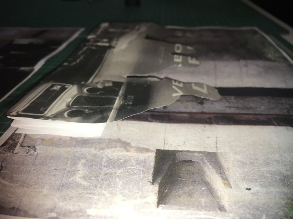
For this montage I used an image I took of a fortification in St Ouen’s bay. Over the top you can see an image of a road that had German writing on it. Since I printed out some images double sides to try and create an interesting effect, On the reverse of the image was a photo of some German soldiers which I cut around. I then turned the image around and stuck down the cut image with the soldiers on facing down. This created an interesting effect as you can see the sort of outline of the people. The cut of of people is also slightly elevated as I wanted it to stick out

This montage was intended to show how the Island changed under the occupation to include more “Nazi lifestyle”. The image includes something to represent different things that and how they changed Jersey. The fortification I used as my background shows how the island was changed and altered to become resistant to attacks, the road with the German writing on it shows how the language became introduced and forced onto the Jersey people, and the outline of the solders represents how they enforced a different way of life onto people.

In this image you can see that I made a spring out of paper in order to make the outline of the soldiers stand out more.

2nd montage

This montage and my previous one complement each other well. To create this montage I used a image of the wall surrounding the gun emplacement in St Ouens. I then used the rest of the paper from the previous image I cut out and stuck it on top. You can once again see the outline of the soldiers on the image.This montage and my previous one complement each other well. To create this montage I used a image of the wall surrounding the gun emplacement in St Ouens. I then used the rest of the paper from the previous image I cut out and stuck it on top. You can once again see the outline of the soldiers on the image.

If I were to display these montages I would display this one with my previous one as they both represent changes in Jersey’s society. This image shows a different part of a fortification in the background, to show how the island was changed into a fortress, the outline of the soldiers and the German writing shows how the islanders lost their freedoms and language.

3rd montage

Here I wanted to make a montage where you are able to compare and contrast. I simply cut an archive image showing the Pomme D’Or hotel in St Helier in half, and cut a recent image of the same hotel that i captured in half too. I then simply attached them together by taping the back.

I think this montage is very effective because you can clearly compare. It is very interesting because there is such a huge contrast in era, however you can also see that it is the exact same building. I think this shows that every place can have an important history. I decided to to a montage of this specific hotel because on Liberation Day, British troops hung a Union Jack from the balcony to symbolise the end of Jersey’s occupation, which is a very important turning point in Jersey’s history which I felt could be represented well in this way.

4th montage

For this montage I used an archive images of German soldiers for my background. I then stuck on half a picture of the Pomme D’Or hotel in a way which the middle sticks out. Over the top I stuck an archive image of people that were originally standing outside the Pomme D’Or on liberation day. Over the top I stuck an information caption to give the image more context.

This montage is interesting as it also alludes to Jersey’s liberation. The image of the hotel and the image of the islanders celebrating being liberated is placed over the image of the German soldiers. Having the German soldiers partially hidden represents the fact that they were defeated. Having the contrast of the hotel in the modern day, and the liberators standing outside the same hotel on the original day is also a huge but effective contrast since it shows that the site is just as important in representing liberation as it was in 1945.

Zine Analysis – Sandy Kim

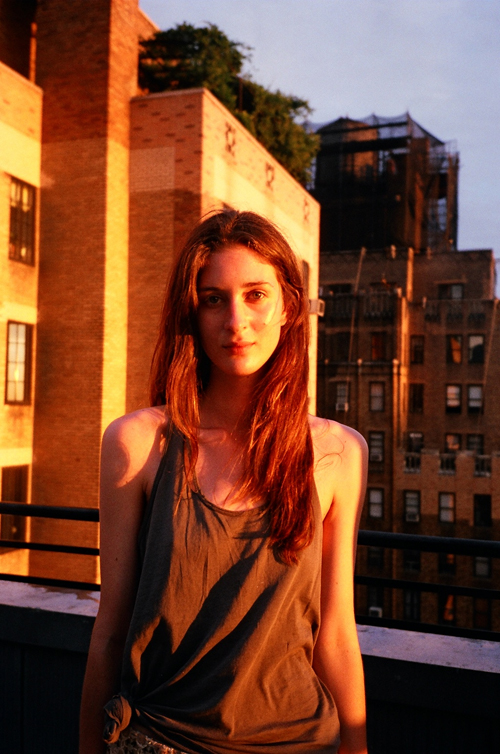
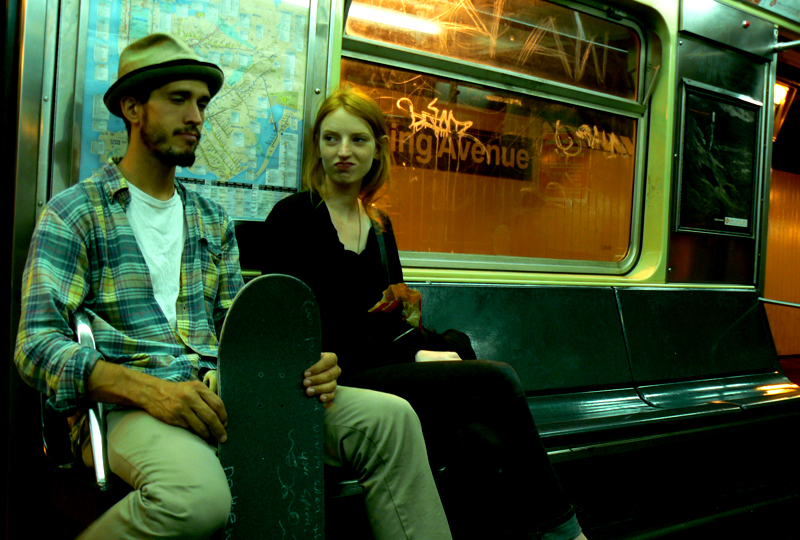
Sandy Kim is an American Photographer (b. in 1986). Kim grew up in Portland, Oregon where she began her photography career, then leaving at 18, she traveled to San Francisco. She started photographing what’s around her. Her friends, her loves and her life. Even unashamedly turning the camera back on herself. A large turning point in Kim’s career was when the band she befriended and was photographing, “Girls”, started to break through, her images suddenly were appearing in The New York Times and other publications. Her use of point and shoot cameras and unique style even received praise from art photographer Ryan McGinley.

She really knows how to use natural light, like early morning light, or sunset light in an apartment. She pays attention to it and that’s always the sign of a good photographer, knowing when and how to use that light. She’s small, a fly on the wall, with balls to pick up her arm and take the photo without asking permission. Sandy brings her camera everywhere and she’s always ready and waiting for the moment. She documents her life in San Francisco and you get a sense of the scene there-but not in a blogger way, Sandy is actually talented-an artist. I like how she still shoots film. it’s old school. She reminds me of when I was young – out partying every night, snapping away so that the pictures can provide evidence of the night.”    – Ryan McGinley, DAZED 2011

Image result for sandy kim girls
‘The Secret Life of Girls’


‘Sandy Kim turning the camera on herself is not that unique. But her exciting, off the hip style is what’s garnered her well deserved attention. Almost as if a great image emerges from not very much pre-thought or planning. You can see the planning and execution from other photographers. Not Sandy Kim. The intimacy of her photos are her own. Whether you live that lifestyle or not, you feel connected.’

-Anatomy Films

Sandy Kim never considered herself a photographer, and so spending more than 10 dollars on a camera seemed stupid. Which is how her point and shoot persona and thrift store finds began. And she still prefers film over digital. She likes being “stuck” with what she has to work with. She very much dislikes editing on a computer. And anyway, “the images don’t look the same”. While she’d be the first to admit her lighting and composition are not always thought through in the technical sense, she feels photographs are made to remember experiences and moments in time.

Aside from these photos, Kim has also created some interesting zines over the years. SKY2K by Sandy Kim: In her underwear and topless, Kim places herself at the center of various public spaces for this series, published in honor of the 2013 New York Art Book Fair as a one-shot zine. The twelve pages that contain the new work are actually just two pages folded and cut to fit the format of both a book and enormous poster at the same time.

Image result for sky 2k sandy kim
http://www.tipitin.com/shop/sky2k-by-sandy-kim

Sources:

http://www.pogobooks.de/content/sandykim.html

https://www.wired.com/2012/05/sandy-kim/

http://lovebryan.com/sandy/page/65/

http://lovebryan.com/sandy/page/76/

Narrative and Sequencing

My narrative

-In 3 words- Occupation to memorial

In a sentence- The journey from interior to exterior, the occupation to memorial and today.

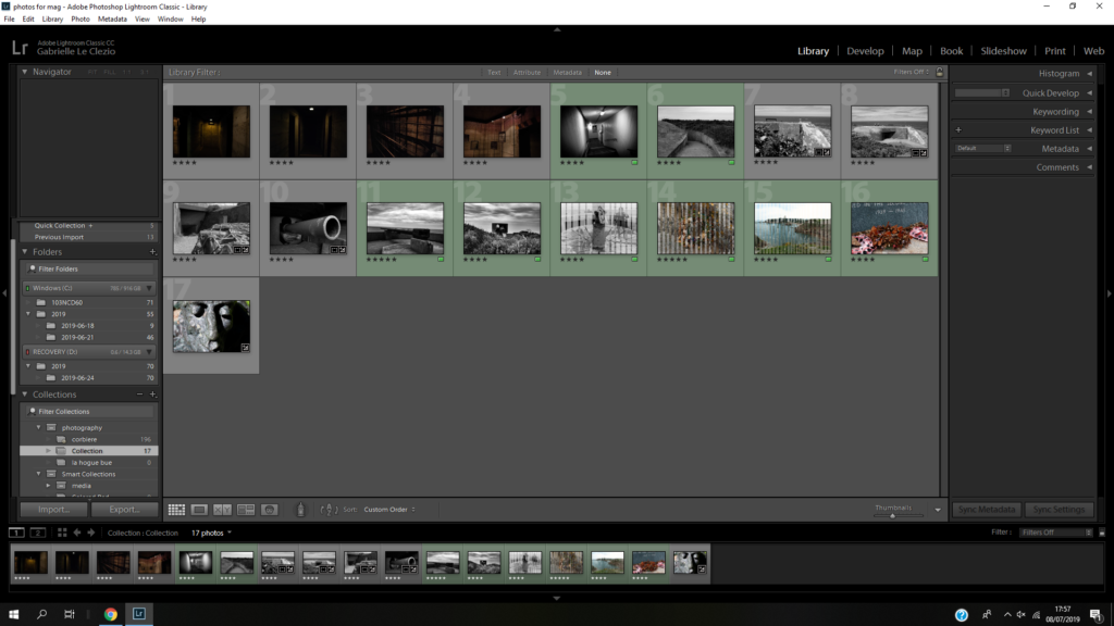
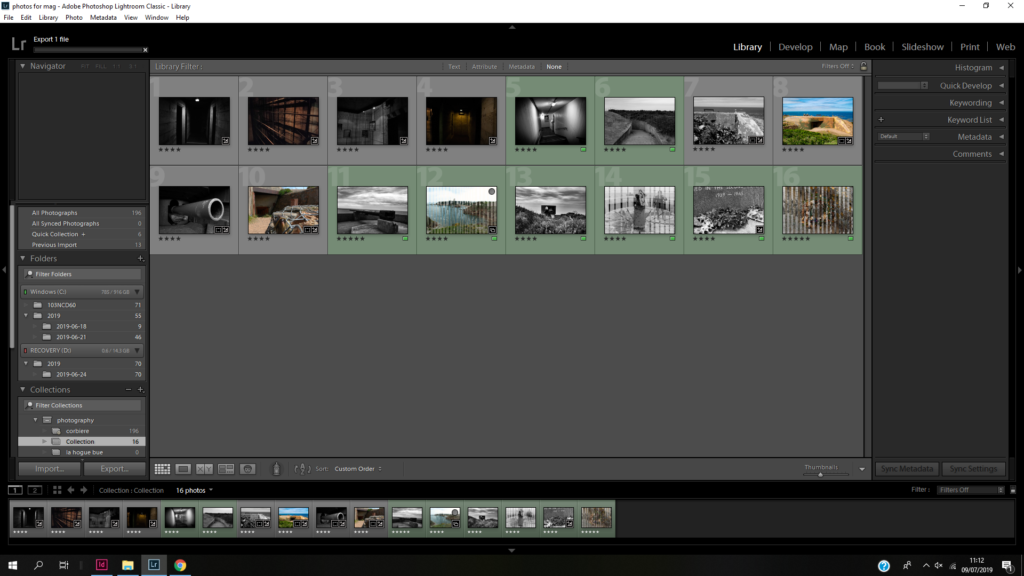
In a paragraph- My sequence is a combination of the exterior to interior because my images start underground going through a bunker corridor then go above ground to the guns and bunkers outside then the images of dead wreaths, the landscape around and memorials. My plan is to show the occupation into the present and memorials. I may have my montages in the middle which is a combination of images from the archive and modern pictures I’ve taken myself.

My sequence

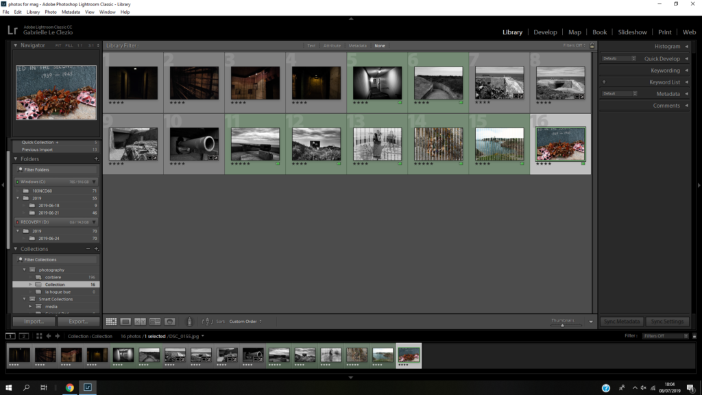
at first I was going to do my sequence like this but then I decided to have it like this….
I thought it made more sense move those first two images around to give the sense that you’re walking through the bunk and out of it. I also removed the last image because it didn’t fit with the others.
I then decided to make every second picture a montage

Bunker Archaeology

Noémie Goudal

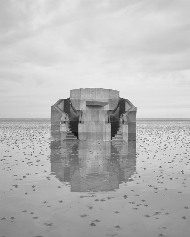
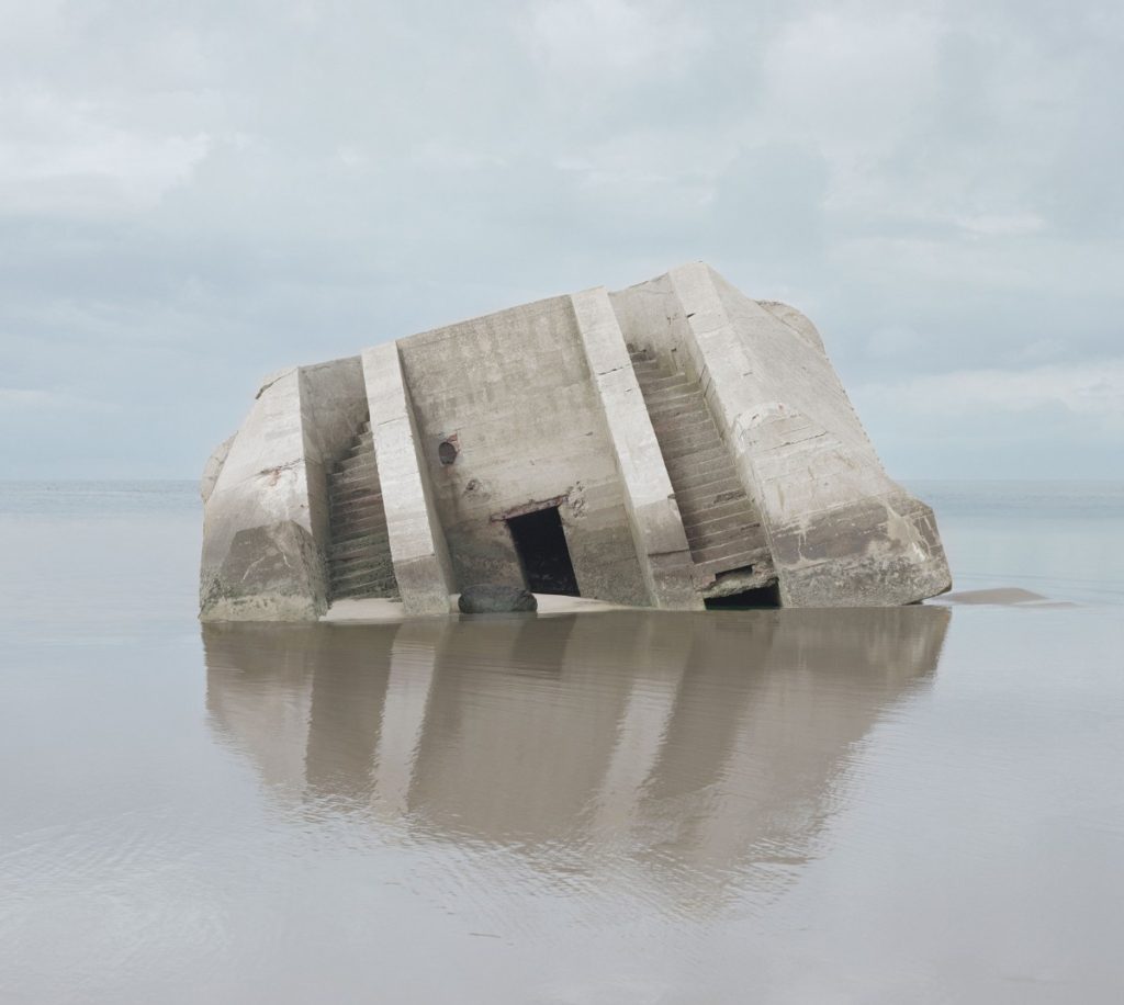
Observatoire IV, Observatoires serie, lambda print on Baryta paper

Noémie Goudal is a French artist who graduated from the Royal College of Art in 2010 with an MA in Photography and lives and works between Paris and London. Noémie Goudal’s practice is an investigation into photographs and films as dialectical images, wherein close proximities of truth and fiction, real and imagined offer new perspectives into the photographic canvas. The artist questions the potential of the image as a whole, reconstructing its layers and possibilities of extension, through landscapes’ installations.

Her series ‘Observatories’ is images of German artists Bernd et Hilla Becher, whose interest is focused on industrial buildings with objective black and white photographs. Noémie Goudal’s work shows utopian architectures without spaces nor time. It’s an encounter between realistic documentary images and dreamy illusion. She has used methods that blend traditional photographic technique with physical manipulation to create imagined architecture made with paper and scotch in real landscapes.

Combat, Haven her body was serie

Yaniv Waissa: Analysis

Yaniv Waissa is a photographer who was born in Haifa, Israel in 1978. His work deals with rebuilding and replacing the old with the new in Israel, gains a layer of meaning by virtue of the political context in which it is being made. Wherever he goes he examines the relationship between man and nature and the, sometimes absurd, connection and constant tension between past, present and future. Yaniv Waissa creates an intimate atmosphere in every frame and puts his personal feelings, emotions and nostalgia into it. Everywhere he goes he recognizes a personal memory that can ignite a collective memory of the viewer.

https://www.c41magazine.it/yaniv-waissa/
Link to More of Yaniv Waissa’s work and information

Zine Analysis: Beit Hakerem

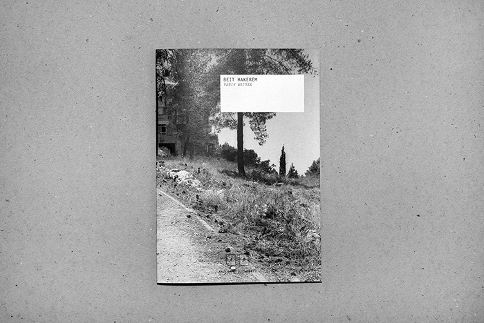
The Zine that I have chosen to look at and analyse by Yaniv Waissa is titled Beit Hakerem (translates to either ‘house’ or ‘village’), after the area of South West Jerusalem that the photographs were taken and produced. I have chosen this Zine and also this photographer to look into as I feel upon first looking without analysis the zine works well and is fluid and follows obvious pattern. As well as this I feel that I can link Wissa’s subject matter to mine in that he is documenting places of the past and ones that are significant to him personally.

Format, Size and Orientation – Design and Layout

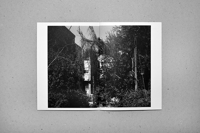
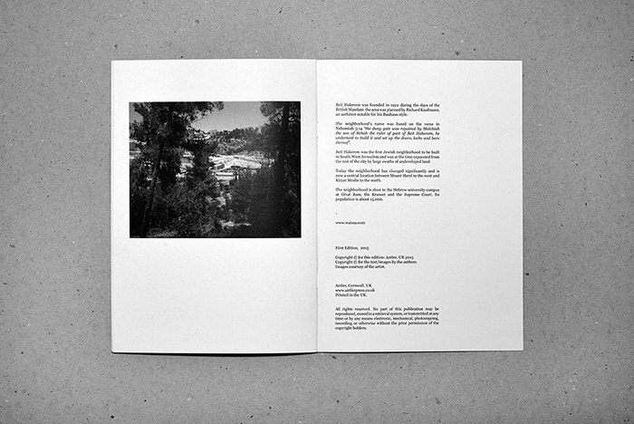
The zine itself is in an A5, portrait format. It is small and compact and the photograph used for the front cover uses a wrap-around method where it bleeds and covers onto the back into one double page, landscape image at full bleed to the very edge of the page. This is effective as the largest, and only full bleed photograph used in this zine.

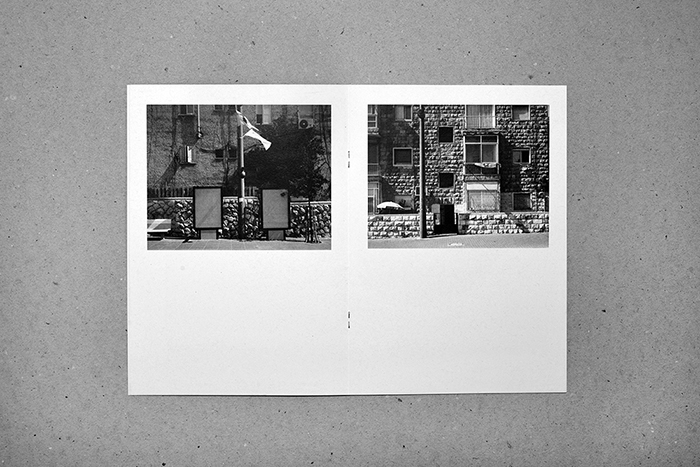
The design and layout inside the zine has all the photographs as landscape, all with a white boarded edge, none of the images apart from the one used on the cover are full bleed. This is effective as on the pages where there are two images, one on each page, there is spacing between the photographs and they don’t start to merge together.

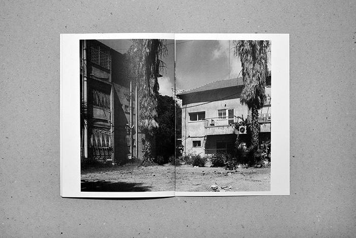
For the layout of the pages Waissa uses only two layouts – either a half image on each page across a double page or a full double page spread with each having a white boarder. This is effective as there are only two displays that have been chosen, it gives senses of simplicity.

Rhythm and sequencing

For the rhythm and sequencing we can see that Waissa is using the only two display choices and produces a sequence and rhythm with the photographs. Towards the middle of the book we have a sequence of two double page with 2 photographs each and then one full double page image, towards the end it then goes to one double page with two images to one full double page spread, it creates a bit of difference while only having to use two design and format layouts adding to the idea of simplicity. It creates a rhythm and sequence instead of jumping between layouts which would have made it make less sense and not show any narrative which can be helped by the rhythm and sequencing.

Narrative and visual concept

The zine follows a narrative of images that we can see and follow, we follow the smaller images showing the urbanized sides of the town, the brick and concrete, the visible man-made elements. Each larger image, however, follows and shows the natural side, the overgrown vegetation covering and hiding the buildings and streets. The last photograph in the book shows a half page display of a bit of a further away image, it is taking in the whole town through the trees rather than close to specific buildings. From this we could take and think of ideas of the narrative being about a journey through this town showing it in small snapshots and ending and closing on an on look of the place as a whole. For me, personally taking and looking on the photographs I feel that Waissa is showing a narrative of the journey and overtaking of the natural world on this landscape.

Title and cover

The title and the cover of this zine I feel work well with the layout and aesthetic. The inside of the zine shows a very simplistic layout and rhythm which is effective as it maps and mirrors the simplicity of the front cover and the title. The cover image bleeds across to the back cover in one large double photograph, one that reflects what is going to be inside. The photograph includes a path and suggests the walking journey that the photographer has gone through while taking the images. The title very simply ‘Beit Hakerem’ is the name of the area of Jerusalem that the photographs were taken and adds to the aesthetic of the zine.

Images and text

The only elements of images and text being used together in this Zine is on the last double page spread. As well as this page including the institutional information for example the websites and publishers, it also includes contextual information on Beit Hakerem, it explains some information surrounding the area historical of the reasons it was built and reasons for its naming, and also how it has changed and what it has become. I feel that it is an effective choice to have it at the end on the last page of the zine, as it lets the viewer create their own ideas and feelings before being given any information that may effect the way that they first initially feel. It allows the viewer to create their own ideas initially and then they are able to go back and re look with a bit more information contextually on the place and the photographs and allows them to generate more ideas and feelings.