concept, narrative and sequencing

concept

throughout my zine i want to show the stages of the occupation through to liberation by including; bunkers, statues, and also the updated buildings that were already built in jersey throughout the war, including the pomme o’dor hotel, where there is a very well known photograph taken at the liberation of jersey.

sequencing

i want to use colour effectively within my zine to represent the happier times, and the not so happy times, this may result in my zine being a little half and half between monochrome, and vibrant colour – as i do want to set my zine out in chronological order, from the start of the occupation, through to the liberation.

narrative

in terms of narrative i don’t think that i want to include any text within my zine. however i will have the title on the front page, i’d like to title my zine ‘change’ as throughout it i will be aiming to show the changes that not only happened during the occupation and liberation, but also the change from the occupation to the present.

Zine

A zine is most commonly a small circulation of self published work. It could be about many different topics such as photography, illustration, design etc. Usually zines are the product of a small group or a single person, and the primary intent is exposure rather than profit. A photography zine is a tool that photographers can use to tell a visual story, to inform an audience about a specific topic or issue, to showcase a new idea or simply create a preview of an ongoing project.


PAUL VIRILIO

Paul Virilio was a French cultural theorist,urbanest, and aesthetic philosopher. As well as having all these roles he also produced some images of bunkers which highly suit the topic and scheme we are currently looking at. Virilio was born in 1932. Around this time in France is when the great depression hit however France was one of the countries to be lastly effected which later led to the high rise in unemployment

Analysis of his image:

Visually, we can clearly see the images are of old bunkers maybe used during the war. The image due to the some shading clearly presents the image as 3D, this adds reality into the images and leads us to not think he has photoshopped them. From some of his images due to the outgrowth of nature onto these bunkers we can kind off see that this was photographed at a later time which indicates that it could potentially be quite old however I think he has converted the image to black and white to hide the age and ruins of the bunkers so we don’t think so intensely when looking at it. I Like how the bunkers are still quite refined as there’s a repetition of lines and small patterns that must have been made in the creating of those bunkers.

Technical- Some of his images seemed to have been taken using natural lighting however, having looked quite closely at his images he seems to have upped the setting on his camera so some of his images seem to be quite over exposed I think he may have done this on purpose as it highlights the bunkers more and actually makes us only really focus on them. He’s experimented with different positioning of the camera which again gives a better stance of the bunker it also adds excitement as we’re not always looking at the same bunker. He also has actually selected different types of bunkers which vary in shape and size I think by him doing this its allowing a lot more variety. Not all of his images are completely black and white as there is some where the temperature of the image is more to the golden tonal range I think due to the context behind the photograph and the time that it has been photographed in fits well with the colour of the image being more to the old fashioned colourless almost images weather he did this intentionally or not its just another interpretation of why he might have done this.

Context – Photographing Bunkers which were built built by the Germans. Virilio – was actually French but was a child during the times of the war as he grew up with it but never had any understanding of it till later on in life when he realised that his country was effected by the wars and that actually there was a lot more to still be explored than to what had been posted on the news and in magazines. He grew up and saw all these remains

Noirmont Photo shoot Edits

During my last blog post I showed the non-edited and original photos that I took whilst up at Noirmont.

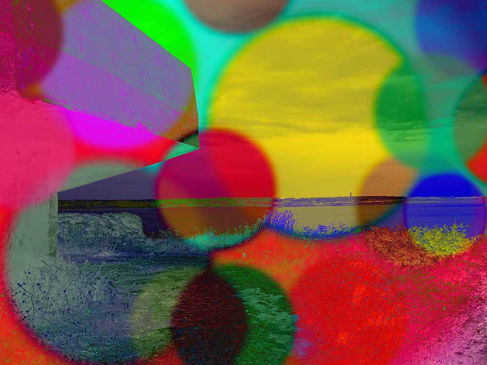
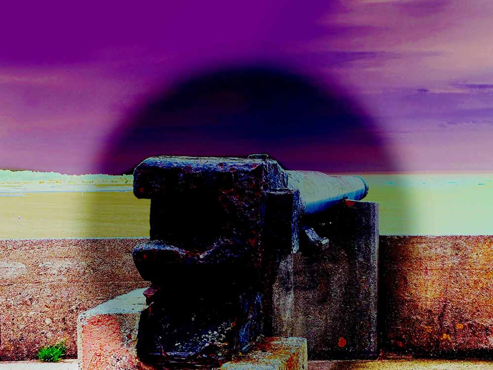
In this blog post I will be showing my edited and manipulated versions of those photos. Whilst editing the photos, I cam up with a theme that would help with the idea of a display with the photos. My theme is old bunkers ans war effected areas of jersey, but the photos are edited with bright colors.

Here are some of my ideas that I came up with.


I came up with this idea to present my photos in this way. because I have been known to edit my photos in a wild and over-exaggerated way. I like this because I can take gloomy and even boring photo, and turn it into a piece of modern art.

Whilst editing in this way, to get that over-exaggerated look, I am in no way trying to belittle or make a mockery of the difficult time Jersey went through in World war II.

I really like the way that these photos have turned out, because it took myself a while to find the right editing tools, and exposure settings to make these photos look good. For this project I think I m going to carry on to use this type of editing for my final project as I like the way they turn out, but also like the way that they contrasts with the doom and gloom with the subject that this is based on.

What Is Narrative In Photography?

Narrative photography appears everywhere from newspapers to magazines. Most articles come with at least a few pictures. The better those pictures, the more compelling the story. Using a single photo, or collection of connected photos, is about more than technical skill. Knowing how to focus and expose your photographs well is only the beginning. Photographs have a unique ability to convey a message and tell a story, whether that be something obvious, such as the beauty of a flower or the celebration of a holiday, or something more complex and abstract. At first glance, the photograph is merely a way to document a single moment in time. First glances can be deceptive, however, as how a photograph is crafted has a significant impact on how a viewer interprets it. The way a photographer chooses to use the tools in his or her camera and creative “toolbox” can dictate whether an image effectively tells a story and leaves the viewer with impression beyond the obvious.

Narrative photography is the idea that an image or a series of images can be used to tell a story or create a narrative. A narrative is an account of an event or a moment in time, which makes photography the perfect medium for constructing narratives. 

As the acclaimed documentary photographer David Campbell once wrote, “In photography, narrative is related to the idea of context. No matter how complete or comprehensive a narrative appears, it will always be the product of including some elements and excluding others. Inclusion/exclusion is part of what construction is all about, but knowing what is best included or excluded requires an understanding of context. And an understanding of context requires visual storytellers to be highly proficient researchers.”

Photo by Matthew Ryan Williams

Narrative and sequencing

Narrative: What is your story?
Describe in:

  • 3 words

Effects of the occupation

  • A sentence

I want to show how the occupation has effected Jersey in a physical, and historical way through exploring shapes and textures.

  • A paragraph

My zine will contain images I took of bunkers and around St. Helier. The images from the bunkers show how the fortifications were a big part of German occupation and how they are still around Jersey’s coast lines which is the physical effect of the occupation. The images from around St. Helier show the effects of the occupation in a more historical way since Jersey’s main town contains many reminders of important historical events, such as liberation day.

Sequencing: The order of your images

  • Produce a blog post where you evaluate your first sequence of images, reflect on what story you are trying to communicate and how you can improve and develop your narrative.

1st layout

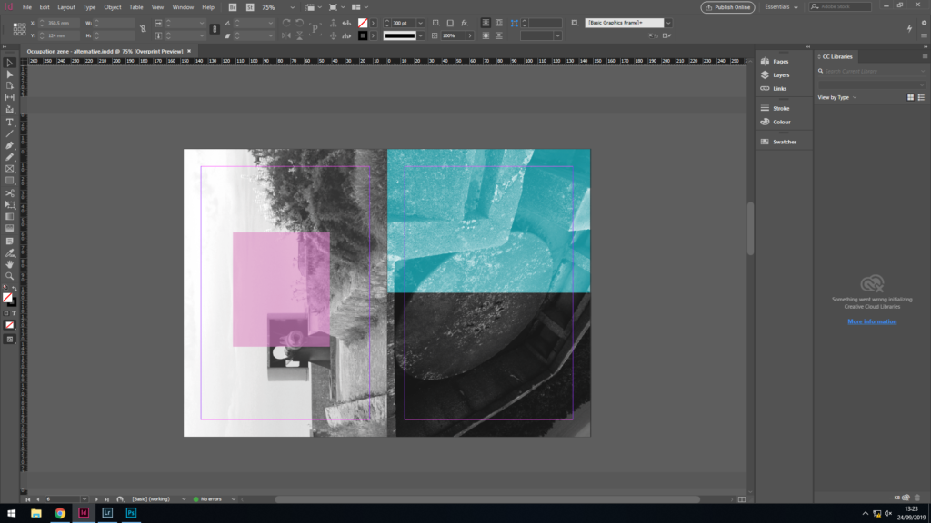
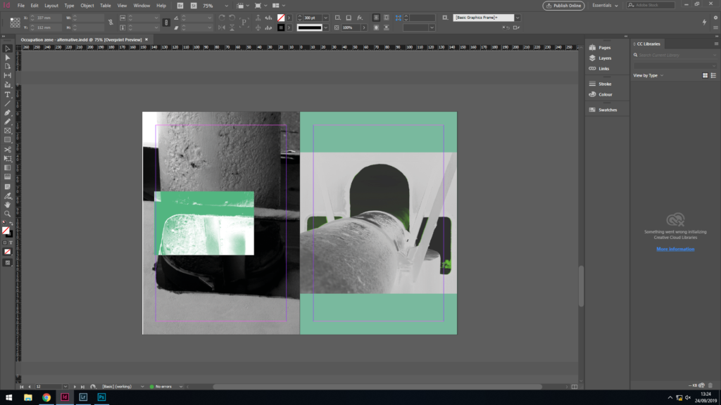
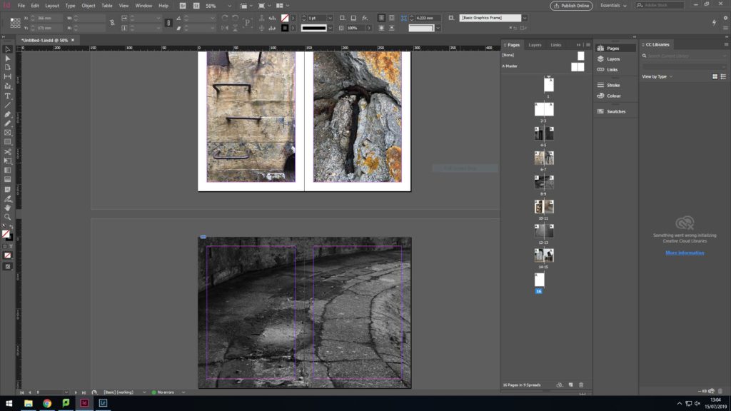
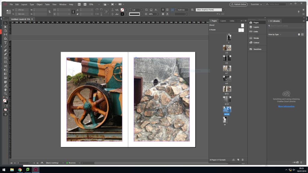
I wanted my zine to have a mixture of full spreads in black and white but also individual images on each pages in colour so that colours and textures can be seen clearly.

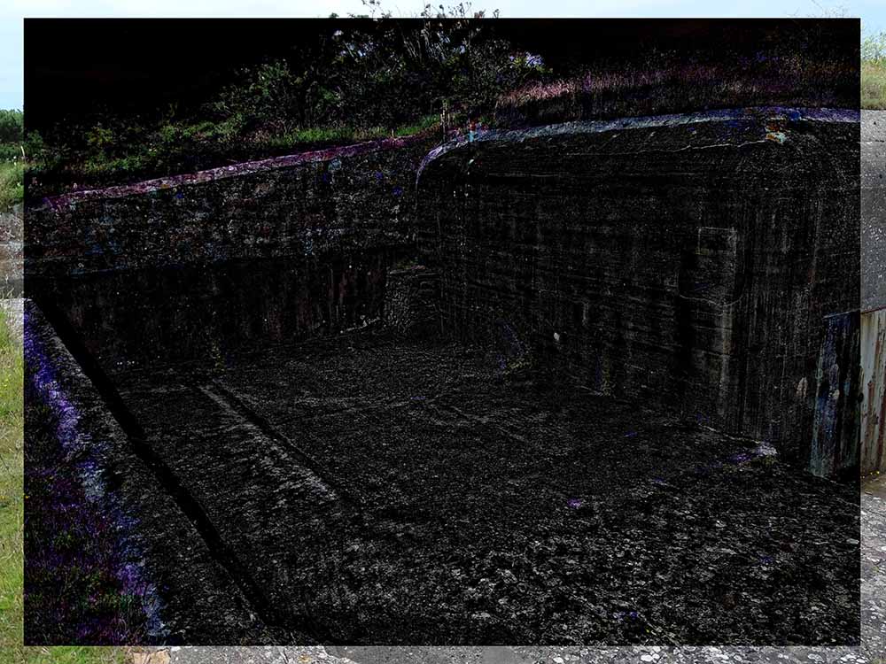
The 2nd set of individual images were pictures i had taken at Noirmont. I chose these 2 images because it is clear to see different colours and surface textures but they also show the effect of the occupation in a physical way. The double page spread is an image of the floor in black and white which shows how the gun at battery moltke used to be able to mover around. In the image you can see the remains of how it used to be able to turn 360 degrees. I think this image is a good divider from the colour images since the black and white conveys the fact that it was a time of hardship.
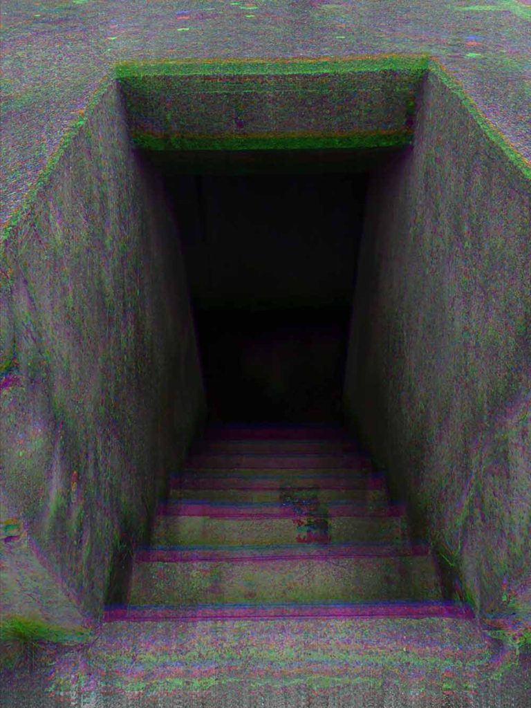
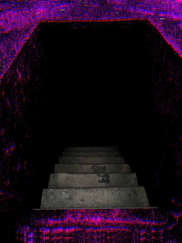
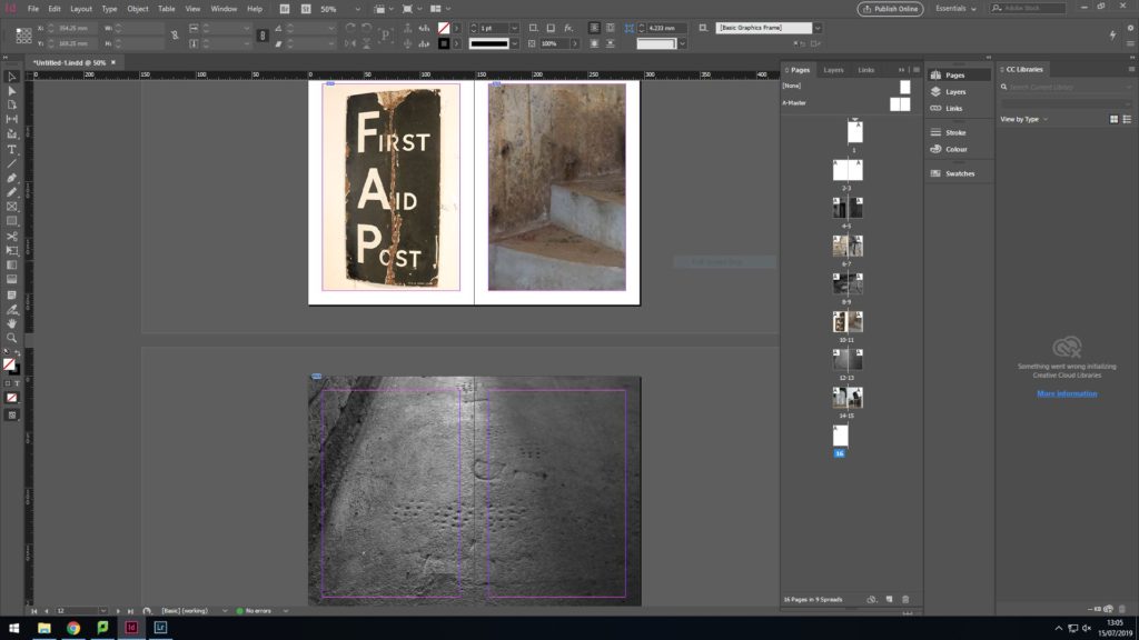
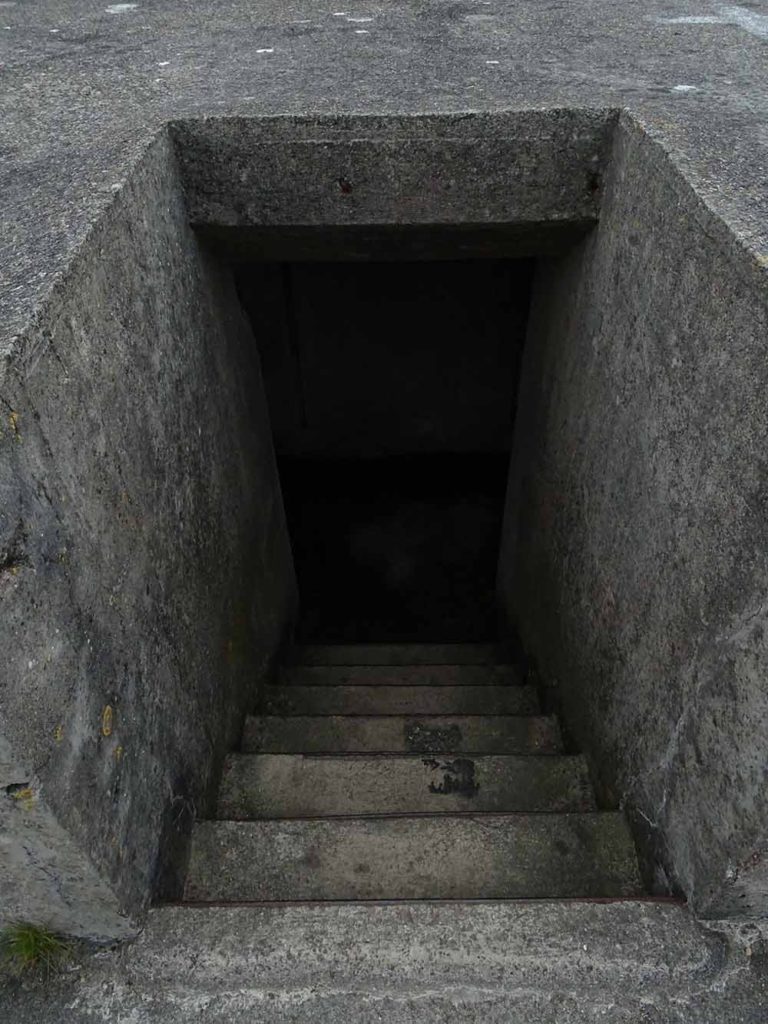
I then chose 2 images which i had taken at battery moltke, which shows a first aid sight and an abstract image of the bunker stairs. I think the image with the 1st aid sign is interesting because you can see the texture of the sign very well, and the images of the stairs shows how old it is due to all the colours. The black and white image i chose to used for my double page spread is an image I took of the foot prints of German soldiers in the concrete of battery motlke. I chose to have this image in black and white to symbolise how it is in the past and also because it allows the image to have a deeper contrast meaning the foot prints are more visible. I think it also helps draw out emotion from the audience.
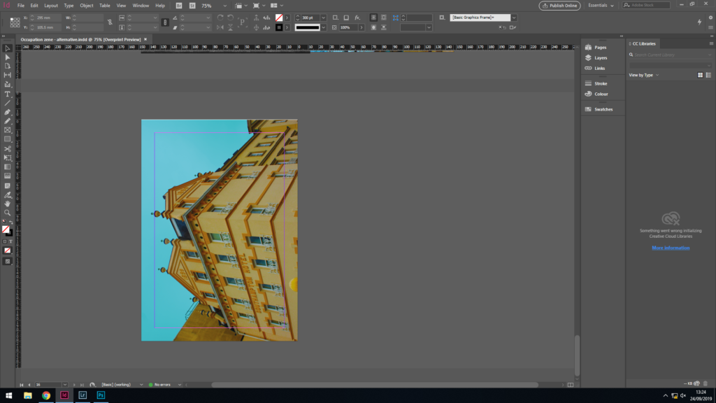
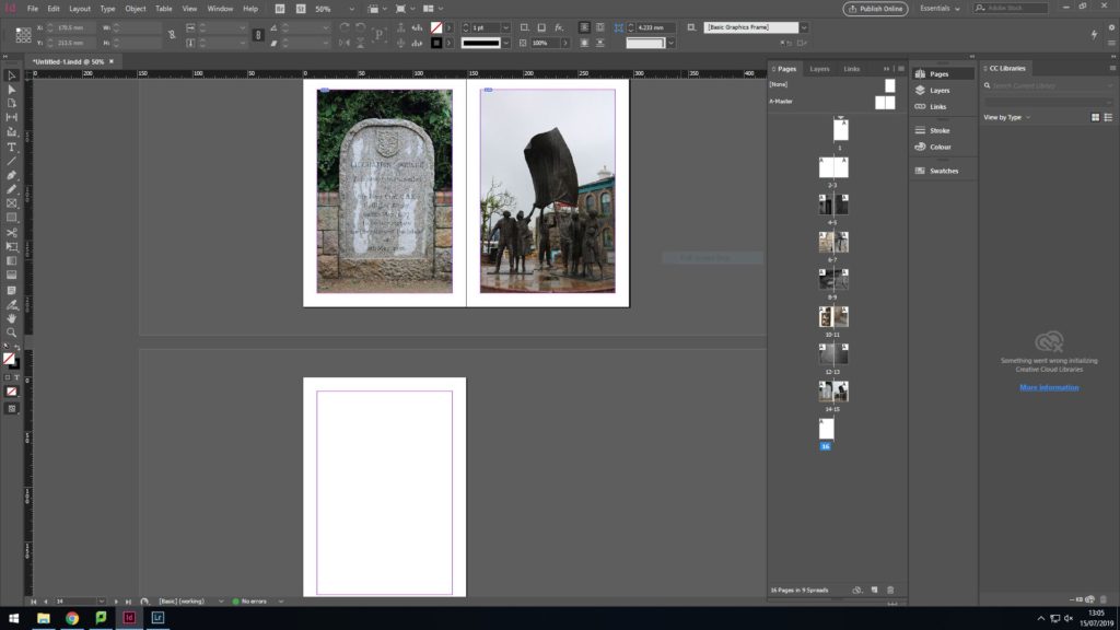
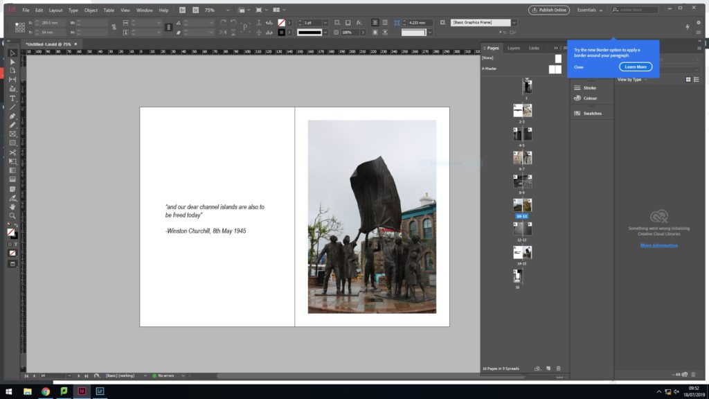
since the last 2 sides were the end of the booklet, i wanted to represent Jersey’s liberation since i wanted a loose chronical order to the zine, I chose to have an image of the liberation memorial since it liked hoe the 2 different types of concrete contrasted each other in order to help the memorial stand out. I also chose an image of the liberation statue because i thought that the shape of it is very intriguing

2nd layout

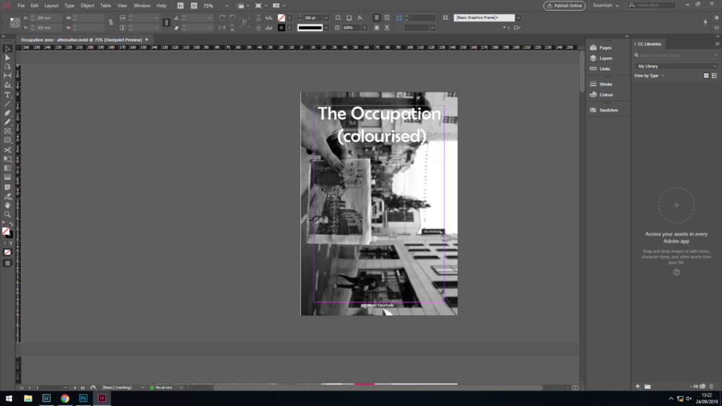
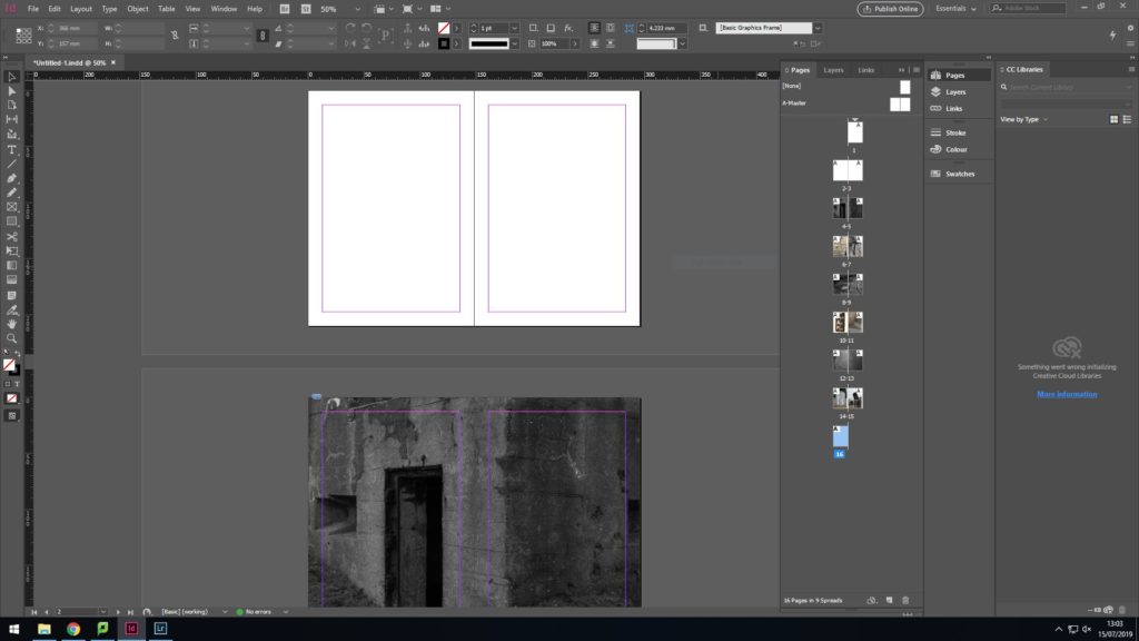
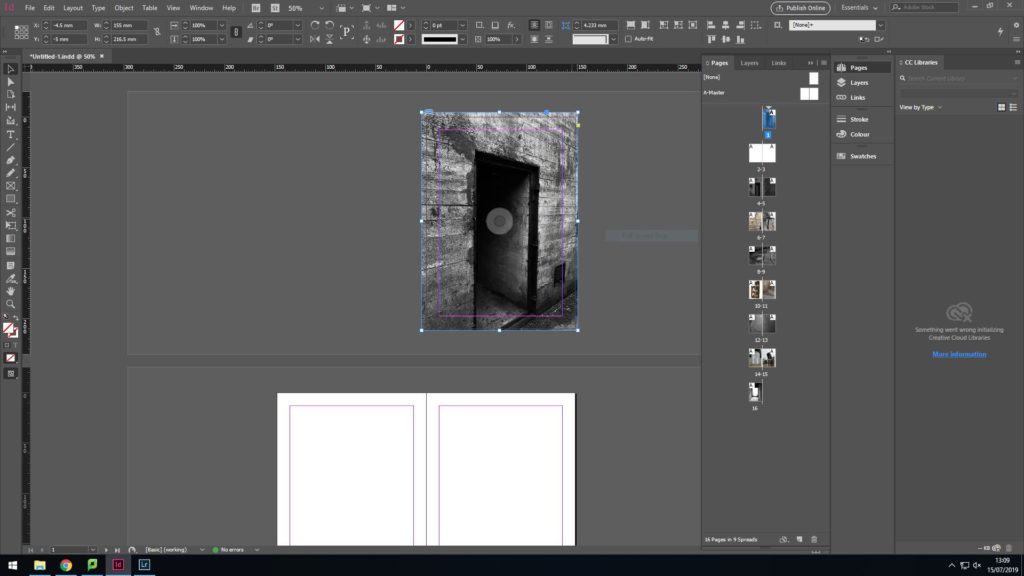
During the 2nd edit I finalized what images i wanted to display on my front and back cover.

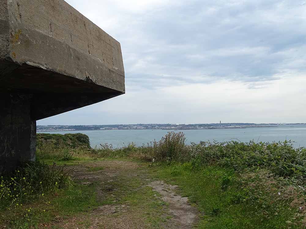
For the front cover i chose to have an image i took of an entrance to a bunker from the outside. I then edited this image in light room so that it looked very dark and dingy. I wanted to do this as it symbolises the beginning of the war and the beginning of a difficult period of time.
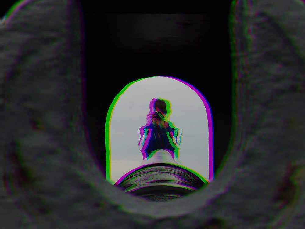
In contrast to the front cover, my back cover shows an image i took of the entrance of a bunker from the inside. I edited this image to look very bright as it symbolises the end of the occupation, and the end of dark times.

3rd layout

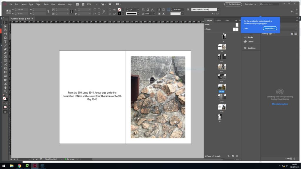
To fill in my beginning double pages pages, i wanted to place some images showing colour and texture. I do think my images look good together individually, however i think the dramatic contrast in colour makes it look like the image don’t go well together.
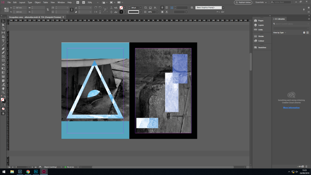
I thenc hose to keep the image on the right as i feel it fits in more with all my other images since the image i previously had on the left was too bright and colourful to fit in. I then experimented with text instead of trying to find another images that fitted in. Since it was the beginning of the zine i chose to have a little bachground context in order to properly introduce my images.

Initially, the 2 images I had on these pages where the first aid sign and the stairs. As i analysed it further, I didn’t think these 2 images were similar enough to complement each other. The screenshot on the right shows the 2 new images that i replaced the original 2 pictures with.

Noirmont Photoshoot

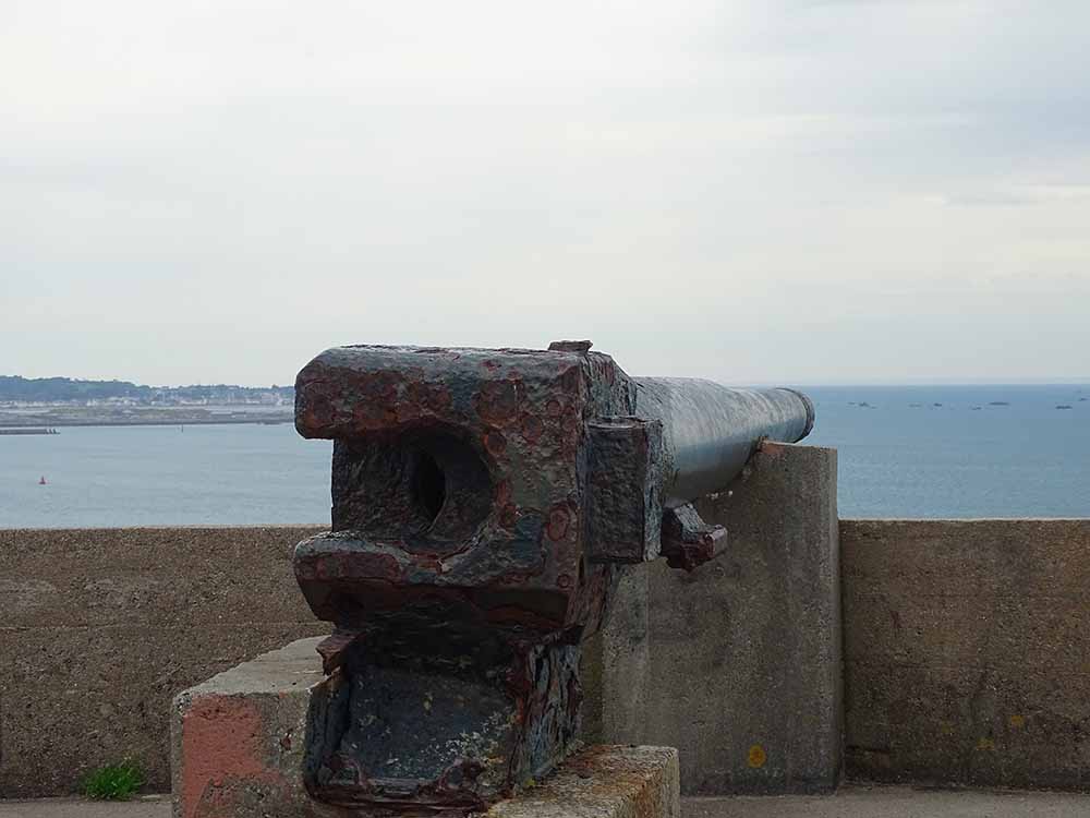
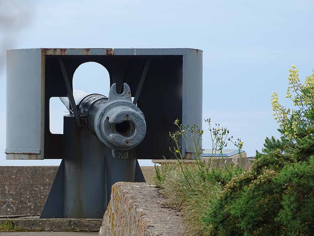
On the 18.06.19, we visited Noirmont, an area which had once been heavily fortified by the Nazi’s within World War 2.

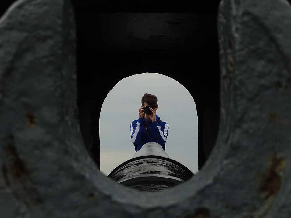
To capture the post war atmosphere, I took my camera and took photos at various angles, heights and of subjects other than the bunkers itself.

I was happy with the outcome of the photos I came out with as they helped to share a story of angles and construction that had taken over the island in the tough time of WWII

Here are my favorite photos from this photo shoot.

I really like these non-edited and original photos as they have a range of attributes that make them good pictures, like the lighting as it is balanced there is no under or over exposure. There is a clear focal point of the image, so you now where to look within the photo.

In order to create photos like these, when we visited Noirmont I decided to take photos at various angles, and zooming in extra close or cutting parts of the scenery out to focus in on one particular place of the image.

Out of all the photos that I took during this photoshoot, these were the photos that I decided to select and manipulate to hopefully be included in projects later on.

Ideas and brainstorming for the zine

For my zine i’m planning to take many photographs around Jersey of anything that has to do with the occupation of Jersey and focus on photographs with a lot of sky in the background.

Then i’m going to add a camouflage background instead of the sky part.

After that i’m going to adjust the color level of the end results and create a purplish effect in the end.

I was inspired to make this idea by mistake as i was just trying editing and effects and came up with this idea on one of my photographs and it was really eye catching so i decided to continue with this idea to create my zine.

Zine research and analysis

Artist research: Dale Konstanz


Concrete Jungle – Mood Board

The 1st zine I looked at was Concrete Jungle by Dale Konstanz. This zine initially attracted me because of the name. I like how the words concrete and jungle contrast each other in the sense that one is man made and the other occurs naturally. I also really like how there was a semi-transparent border box around the title since it means the writing is very clear, yet we are still able to see the background image.

  • Format, size and orientation

The zine is A5 portrait, most of the images are full spread landscape images that go across both pages. This means the zine is nice and compact, yet not so small that the images cant be seen clearly.

  • Design and layout

The layout of the zine is interesting all of the images are a full bleed onto two pages. This helps the images to appear more successfully as they’re presented clearly and largely which allows details to be seen easily.

  • Rhythm and sequencing

This zine simply shows images of man made structures with nature elements. All the images go together in rhythm because they’re all double page, full bleeds meaning they complement each other well.

  • Narrative and visual concept

The zine’s narrative is interesting as it depicts images of concrete walls surrounded by natural elements.

  • Title and cover

The title is one of the things that initially attracted me. It is simple, yet effective enough that it looks aesthetically pleasing. The title’s font is simple, and black. The front cover has the title written in a semi-transparent box with another image behind it. I think this is successful because it allows the audience to see the title clearly and it’s attracting because you can also see an image behind it