Societe Jersaise

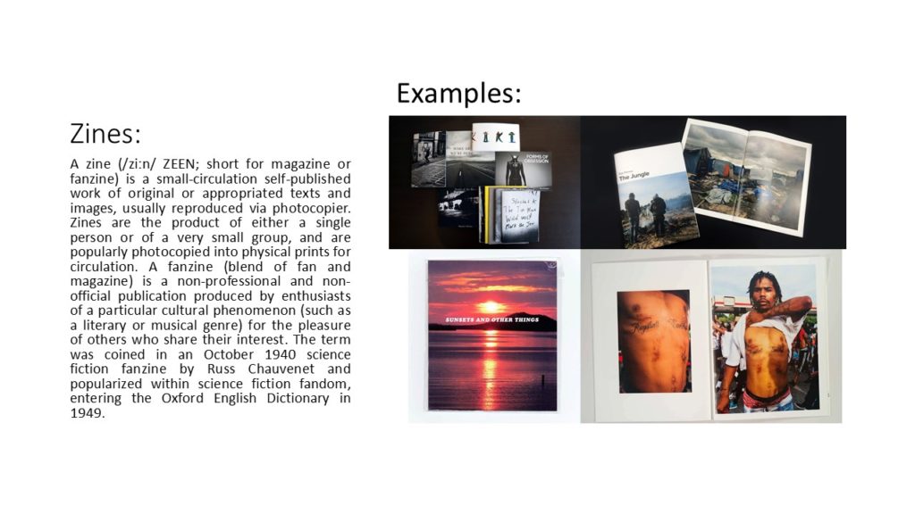
What is a Zine?
A zine is a independently or self-published booklet, often created by physically cutting and gluing text and images together onto a master flat for photocopying, but it is also common to produce the master by typing and formatting pages on a computer. The publication is usually folded and stapled.
Analysis of a Zine:
I will be analysing ‘Lingering Ghosts – The waiting for refuge’ by Sam Ivin in order to gain a better understanding of narrative and sequencing, and what makes a successful zine. I watched a video interview with Ivin where he explained his rational behind the zine and why the topic was important to him. His passion towards the subject matter is clearly shown through his work which showcases the importance of really understand and enjoying the subject matter to clearly portray a strong narrative within my own zine.
Link to Ivin’s website which provided me with further research and understanding of his project: http://www.samivin.com/lingeringghosts


Format, size and orientation
This zine is the size of A5 paper, which is used to create a literal representation of the actual size of someone’s passport, linking to the key theme of the zine. In addition to this, the zine is in a portrait orientation which further expands our understanding of the zine prier to reading it. It is formatted in a rectangular shape which is the same as a passport, which presents Ivin’s artistic creativity to present the theme of asylum seekers and immigration.
Design and layout
As previously mentioned the design of the zine is in the style of the passport which begins to build a relationship with the imagery and the theme of immigration and asylum seekers.
Rhythm and sequencing
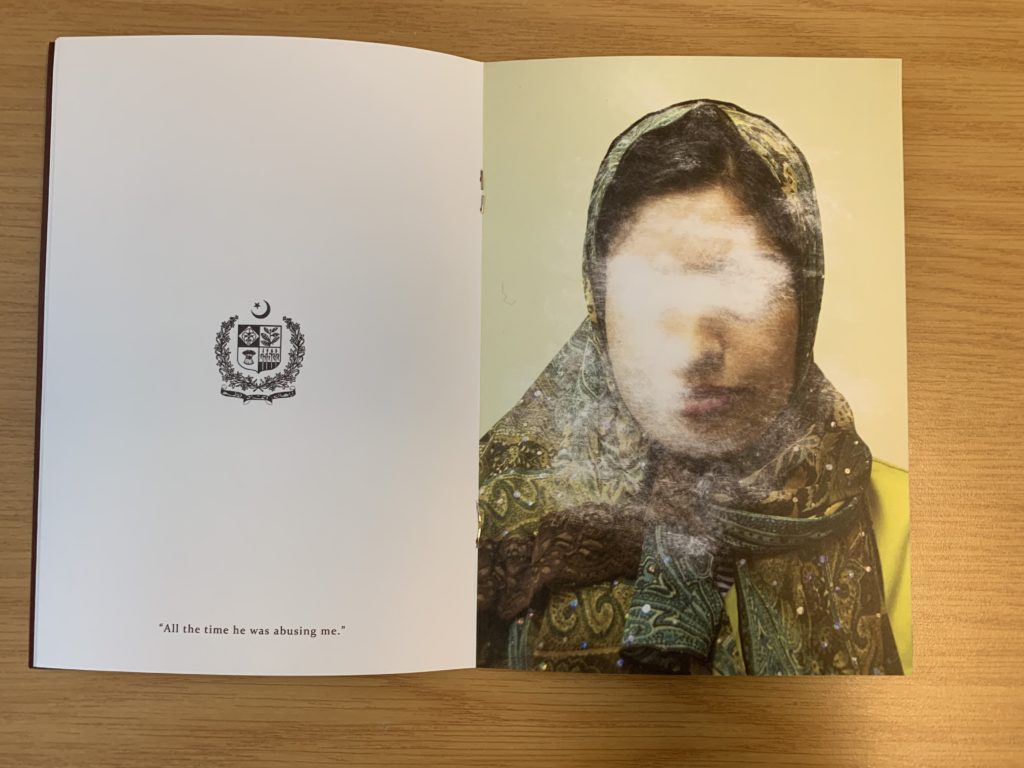
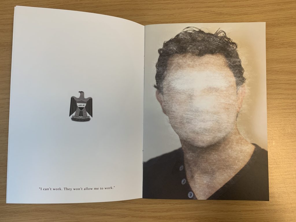
The sequence of the images is very simplistic but effective. On the left hand page the nationality of the person is presented through the country’s emblem, below this is a quote taken from what that person has said about being denied from seeking asylum. For example it says “All this time he was abusing me”. On the next page is a picture of that person with their face scratched out to show how they have been ghosted from England, and how the artist is expressing how others find asylum seekers irrelevant.
Narrative and visual concept
The story being told within the zine is people who are trying to seek asylum but are being declined. It’s trying to capture the uncertainty of their future and how their life has come to a stop and how they are being forgotten by others. This is shown through the portrait of the asylum seekers (in color), and the face has been scratched out, which symbolically represents this narrative. I would say the narrative is clear within the zine due to the introduction at the start of the zine. Needless to say, the imagery really encapsulates this idea.
Title and cover
The cover is very simplistic but has symbolic representations to present the theme of the zine. The background is a dark royal red/burgundy color which is the same color as a British passport which showcases the theme of travel. The simplicity of the design allows a bigger impact for the content within. The title ‘Lingering Ghosts’ is metaphorical to showcase how asylum seekers are neglected, frowned upon and find it hard to fit into society and are “unsure of what their future will hold”. Below the title is Britain’s emblem which is also shown on a passport, which presents the views of the artist that we should allow these asylum seekers into the country as they want safety.
Images and text
Image and text plays a massive role within this zine, due to the topic it is presenting. When we look at a two page spread, on the left we are presented with a country’s emblem with a quote taken direct from the asylum seekers words. On the right hand side is the picture of the asylum seekers them self which has been scratched out and distorted, which allows the image and text to work in cohesion.
Use of other design elements or inserts: archives, montages, graphics, typography
The images have been distorted by being scratched which showcases physical interactions with the photograph, showcasing a surrealist approach to photomontage. The text used is a simplistic bold lettering which is easy to read and understand from a viewers perspective.
Further Analysis:
To analyse this double page spread of Sam Ivin zine, I will be looking at different elements which make it successful. Conceptually, Ivin is trying to showcase the fact that the man has been declined asylum and is almost being forgotten by Britain, leaving him unsafe and uncertain about his future. This is clearly portrayed through the symbolism of the face of the man being scratched out, which showcases Britain trying to take away their identity. Contextually, these asylum seekers are leaving their country due to them being in danger as well as their family, and Britain are declining their entry due to the customs and immigration officers not believing what they are saying is true. This issue is very current today and this zine is aimed to inform those about this issue that innocent people are facing. Visually, the zine presents the formal elements of texture, shape and line through the scratching out of the portrait. The composition of the portrait is very simplistic, the portrait is located in the centre of the page and fills up most of the page, leaving the background plain allowing our focus to stay on the portrait. On the other side, the composition is also simplistic them emblem from where the man comes from is located in the centre of the page at a medium size with a quote taken directly from the man’s words located at the bottom of this page. Technically, the image uses a lot of negative space which represents the idea that they are left with nothing and being declined asylum leaves them feeling empty and not apart of society, due to where they come from. The portrait of the person is presented in colour which showcases the idea that they do still have an identity. In addition, the lighting used to capture the portrait is artificial warm lighting due to the image having a studio feel to it. To capture the images the aperture was low, and a large depth of field was used. The shutter speed was quick and the ISO is also low as there is no intended blur or noise presented within the image. The white balance used creates a warm atmosphere which creates a sense of coziness and safety which juxtaposes the theme of uncertainty which allows viewers to really understand and think about the issue before them. The zine uses a combination of image and text which makes it successful and shows variety also helping it to appeal to the viewers. In addition to this, the face (eyes in particular) have been scratched off showing photo manipulation in order to present the narrative of these people’s identity being stripped and taken away leaving them in uncertainty.
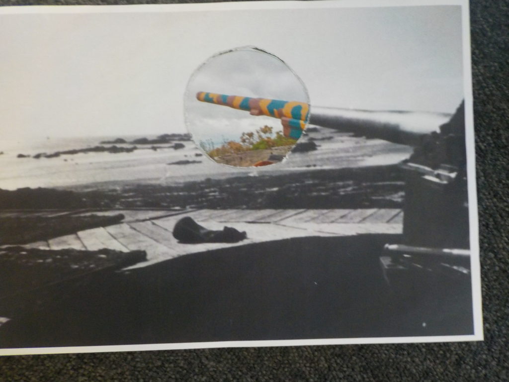
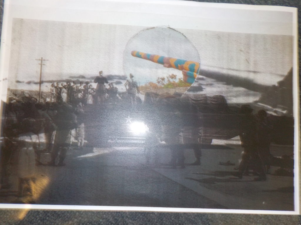
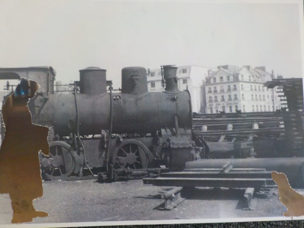
Working with archival work, I decided to creatively explore and experiment with the imagery to create photomontages. Due to previously looking at photomontages, I knew that I could successfully produce imagery which holds many conceptual factors as we as historical. My previous work can be found here :
With my exploration with war archive I decided to take more of a surrelasism approach, presenting a new way to look at the material. I experimented with handcrafts (cutting, sticking etc) images and within photoshop in order to create outcomes which I believe present a new way with looking at the war.
Photoshop Outcomes:
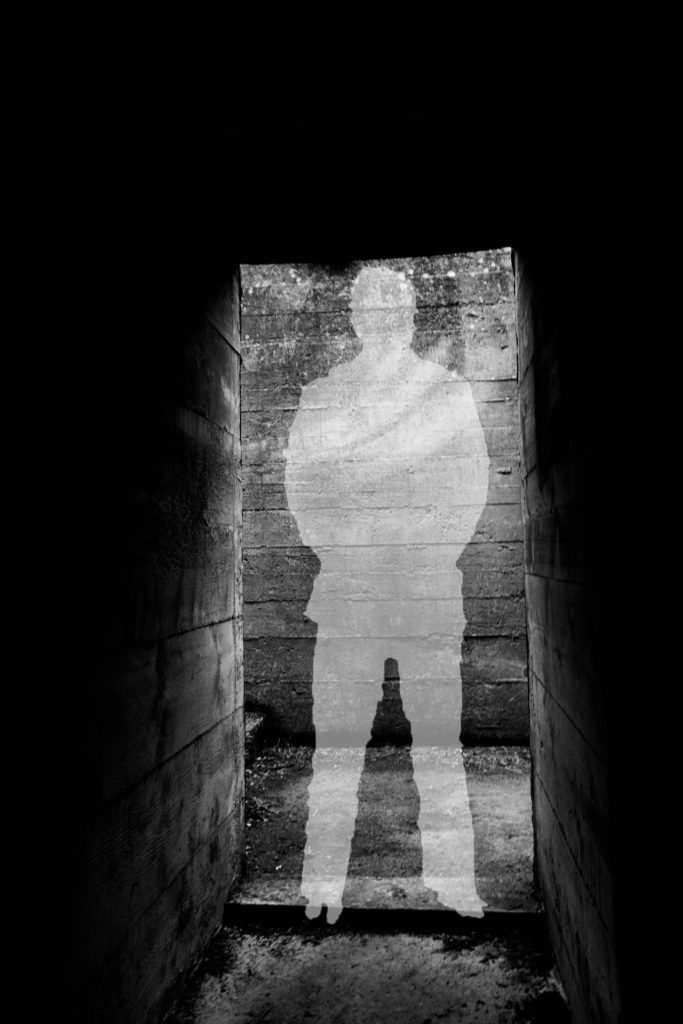
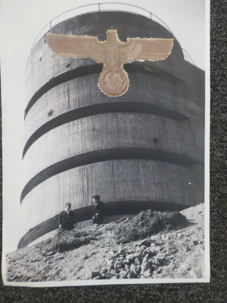
For my first experimentation I looked at the idea of silhouettes and the meaning behind them. This was inspired from the black metal cut out (outline) of soldiers which were spread across the UK, in order to remember those we lost during the war. This lead to the conceptual reasoning of the image above, I created a silhouette in the centre of the picture of the abandoned bunker to get viewers to not only remember the soldiers we lost, but also remind them that the bunkers had a massive impact on these people’s lives. In order to create this I found a cut out of a solider on google, and placed it onto of my image of the bunker. Then using the quick selection tool I outlines the solider, then on the layer with my image on I right clicked the selection and pressed layer via cut. I then deleted the layer with the solider on, and turned down the opacity of the outline I just cut out, creating a silhouette. This simplistic design works well as it clearly showcases the conceptual meaning, with still presenting history of the bunkers. It clearly takes the format of a surrealism photomontage and is an interesting piece for viewers to look at. I think that this outcome has turned out well, but is not the strongest one I produced.
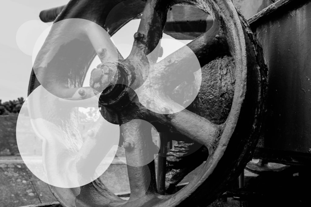
For my second experimentation I wanted to look at exploring with the formal element shape, considering my photograph was a wheel of a gun, found on a bunker site, I decided to use circles in order to manipulate this image. This contemporary final design conceptually presents the idea that although the bunkers are abandoned, and been left alone to rot, they will continue to stand there, reminding us of the horrors of the war. I believe this is mainly shown through the faded circles. Again this image presents the historical factors of the uses of the bunkers in Jersey during this time in history. To achieve this effect I used the circular marquee tool and created circles, adjusting the size by using the transformation tool (ctrl + t), and cut them out of the original layer. Then I turned down the opacity, randomly on each new layer creating the decay effect, reinforcing the conceptual factors of the image. I really like the way in which the outcome turned out, as it really emphasise the formal element of shape, creating and unique and interesting design for viewers to look at. The contemporary design, makes the concept more disguised, but needless to say it is still effective. To critique the design I would make the circles more central, to make them more ascetically pleasing.
Artist Research:
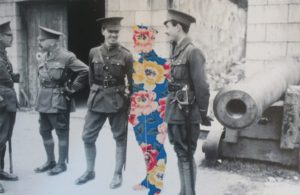
Sky-Alling Phillips created a series of photographs called ‘Paper’, in this she cut out parts of a war archival image and placed floral prints behind it, creating a unique and juxtaposing design. Although this series can not be found online, I captured a photograph of her work, when looking through different Zines. Contextually, this photograph is showcasing solider at a bunker, who seem to be off duty and socialising, making it seem like war was not all that bad as it was said to be. This further reinforced by the background, the structure of the bunker looks strong standing which creates a sense of comfort. Conceptually, Phillips is trying to showcase that those who died at war are still with us. The person in the centre of the frame, made out of the floral design, represents a solider who has been killed but is still with his ‘friends’, creating the sense that we never forget those we loved. To technically analyse this work I will explore the camera settings of the archival image. The camera settings would have been very basic, due to camera’s not being as advanced during the war as they are know. The image would have been taken outside, using natural lighting of the sun to illuminate the subjects, this creates a sense of warmth which is then juxtaposed by turning the image into black and white. The quality of the photograph is poor, which could suggest it has been enlarged to big, or that the shutter speed was slightly slow, creating movement, alongside the ISO being high due to a sense of noise being shown within the image. In addition, the soldiers seem to be in focus with the background being slightly out of focus, suggesting a narrow depth of field being used to capture the image. Visually, the photograph has many elements which makes it pleasing to look at. It uses the formal elements of space, show through the floral patter in the space of a solider as well as a sense of space between the for and background; form, shown through the structure of the bunker and the pattern of the flowers. Having the colourful flowers in the middle of a black and white photo, makes the viewers eye initially draw the there, main focus point, and juxtaposes the black and white creating intrigue and allows the conceptual factors to be presented. In conclusion, I like the simplistic design of Phillips work, as it holds a lot of meanings and is shown in a creative and successful way. The floral pattern in the shape of a solider is a cleaver design creates a sense of separation, even though the cut out is close in proxemics to the other soldiers, making it interesting to view.
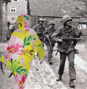
My final experimentation on photoshop was inspired by Sky-Alling Phillips. I found an online image of solider’s walking with weapons, as if they are ready to go into battle. I then decided to use the solider who was closest to the front of the frame, as the effect will stand out more, to cut out using the quick selection tool. I then found a floral pattern online and created a new layer on photoshop, placing it behind the original image, creating this effect. To make it stand out more I decided to add a drop shadow, which outlines the solider and makes the floral patter darker, creating a more subtle blend between the archival image and floral design. I am very happy with the way it turned out as it is very similar to Phillip’s photography, and represents the same conceptual factors. I believe this is my most successful outcome, as it has the strongest conceptual factor, and the design works and is ascetically pleasing to look at.
Craft Experimentations:
For my first experimentation I weaved two war archival images, one image of a landscape and an image of people, together in order to create a unique and abstract design. Due to the nature of the craft, viewers eyes are constantly looking round the image to try and make sense of what is happening, presenting the conceptual factor of the war was not as simple as it is told to be and there are many layers to what actual happened. Intertwining the two images clearly represents this as it is creating those layers. This outcome experiments with the formal elements of shape and space, which work together to create a eye catching image. Overall, I am pleased with the way in which this outcome has turned out, as the confusing design allows viewers to explore the concept of the overall image.
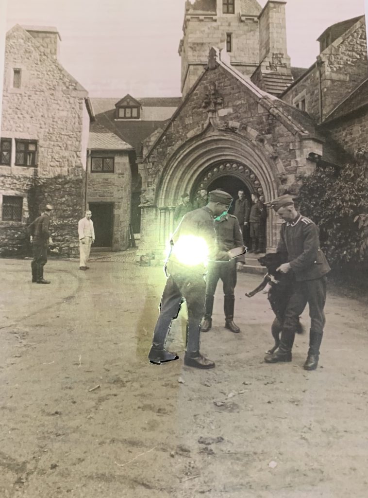
For my final hand craft experimentation, I kept it very simple, due to the simplicity of the image itself. The archival image used had a large sense of space, thus I wanted to utilise this. I decided to cut out man in the centre of the frame, but left bits of him still connected onto the image. I then placed a light behind him lighting his up and making him stand out from the rest, main focus point of the image. Conceptually, I am trying to showcase the light that each solider had but was eventually turned off as they were murdered fighting for their country. This is a more subtle concept, but can still successfully be told by the simplicity of my design. I prefer the outcome above compared to this, only because the design above is more interesting for viewers to look at due to the busyness of the frame, however this outcome is still successful.
Evaluation:
To evaluate my outcomes of my photomontages, I believe that I have managed to produce a strong set of designs. I have been able to showcases my competence in manipulating images on photoshop and give reasoning as to why I did what I did. I have also been able to utilise the main formal elements within an image, making more ascetically pleasing final outcomes. In addition, I have not only manipulated images on photoshop but also by hand to, showcasing the importance of experimenting by hand and computer. If I was to create more photomontages I would look at creating outcomes which take the form of dadaism making it easier to work out what concept is being presented within each design.
What is a photomontage?
A photomontage is the process and ending result of producing a composite of photographs this is done by cutting, gluing, rearranging, distorting and overlapping multiple images to make a final new piece that could aid a completely different meaning or experience.
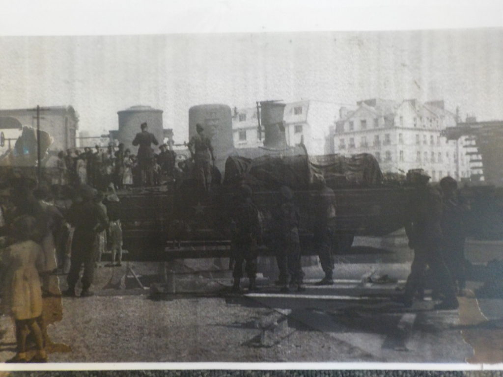
After getting a better understanding and experience with photomontages from previous work done, I decided to create new versions of my Occupational themed images to create montages that would help aid my project. Initially I selected my favourite images and those that I thought would work best in this situation in order to produce the best combined images possible; I selected these images from shoot that I produced from the war tunnels, St Quens bunkers and archival photos which showed a different point of view and highlights a clear comparison between archival and my own images. I started by printing out my main images that i wanted to incorporate within my montages , then laid them out on a plain white table and matched the images together and decided which parts of with images would be put together. After finally deciding what i wanted to create i used scissors, cutting board and a cutting knife to carve my photos together, then stuck them on to each other to create my final pieces. These were my final four images:
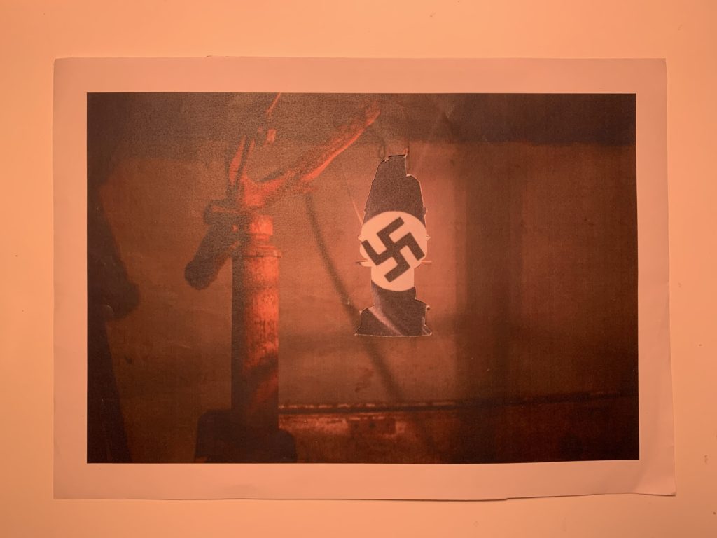
For this image i wanted to highlight the significance of the lamb and add deeper meaning of the Second world War through the lamp and the background image coming through
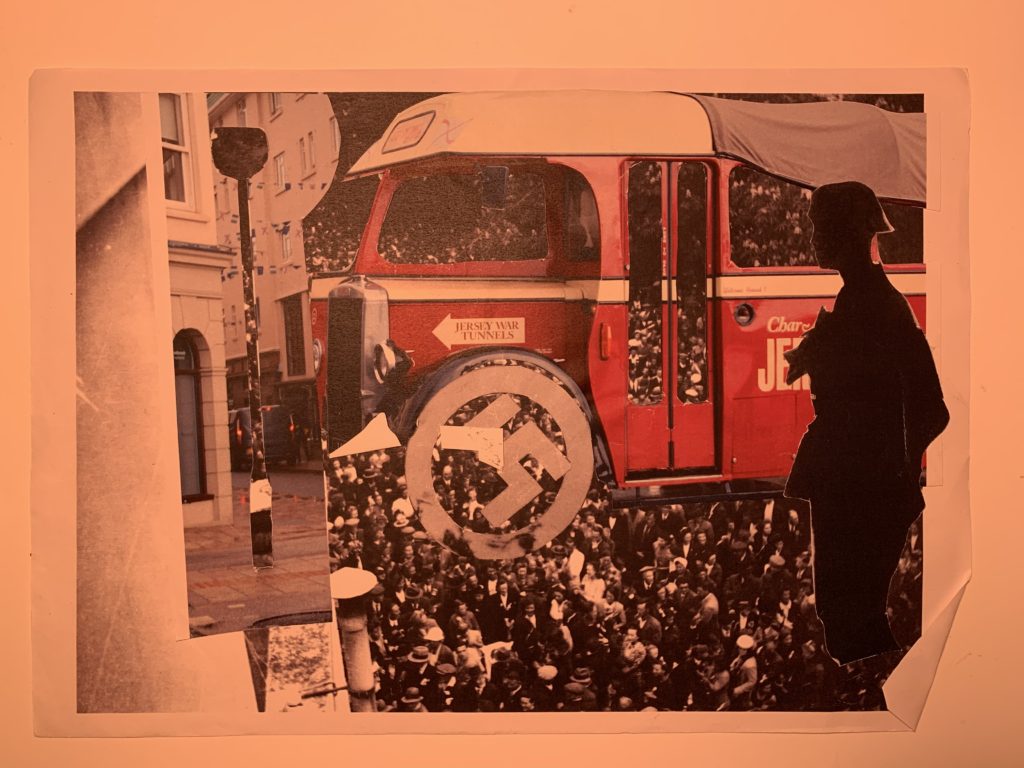
This image consists of multiple images combined together which shows a more chaotic representation which could further add deeper meaning to the time and what was happening and the significance it had on the places and people that were effected by the distraction of the Second World War.
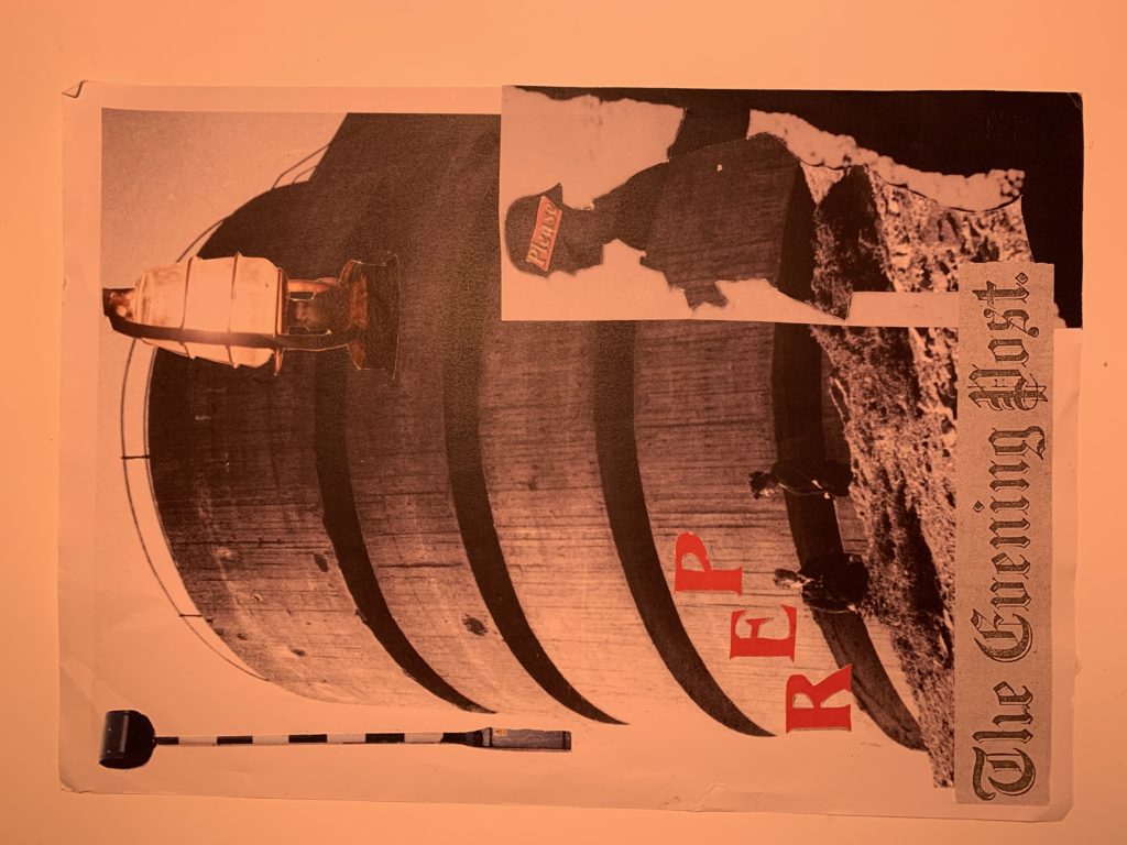
This last piece was one that i had not planed but came together due to through the left overs of my other images, and includes yet again a wide variety of sections and cut outs from different images which helps the idea of deeper meaning and opens opportunities for the view to have their own response and thoughts toward the image- this shows a more individual and unique approach and supports the deeper meaning of all the individuals during the Second World War and all the different experiences that they had during that time
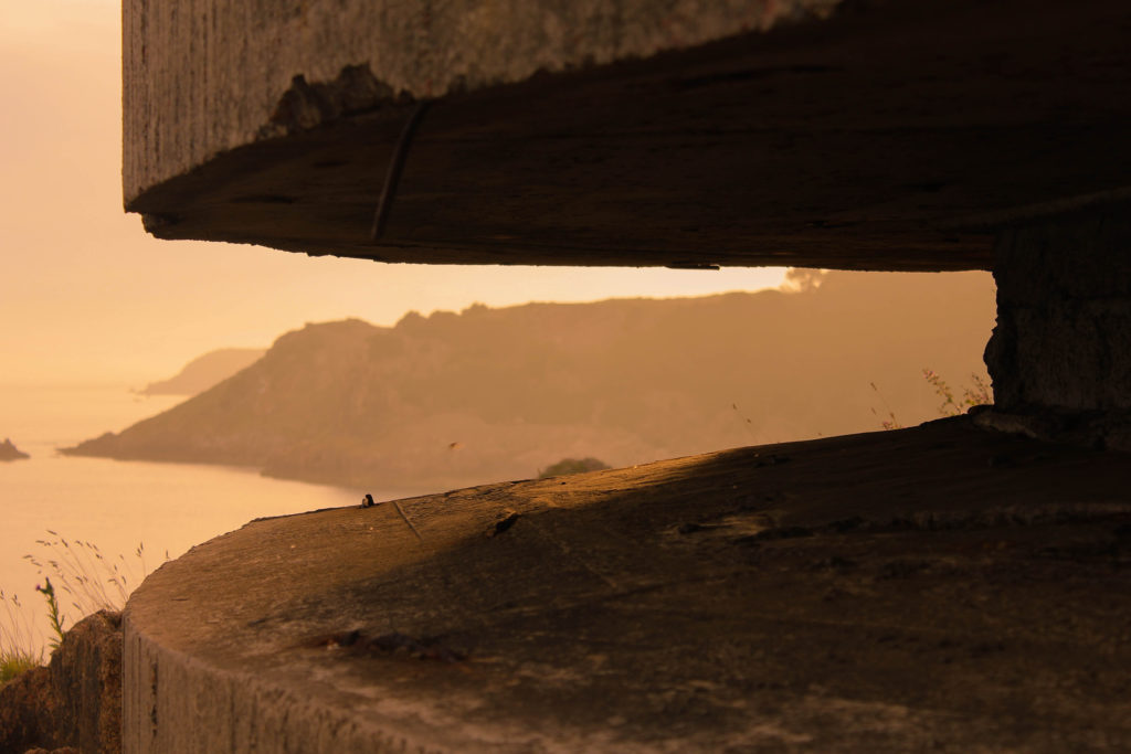
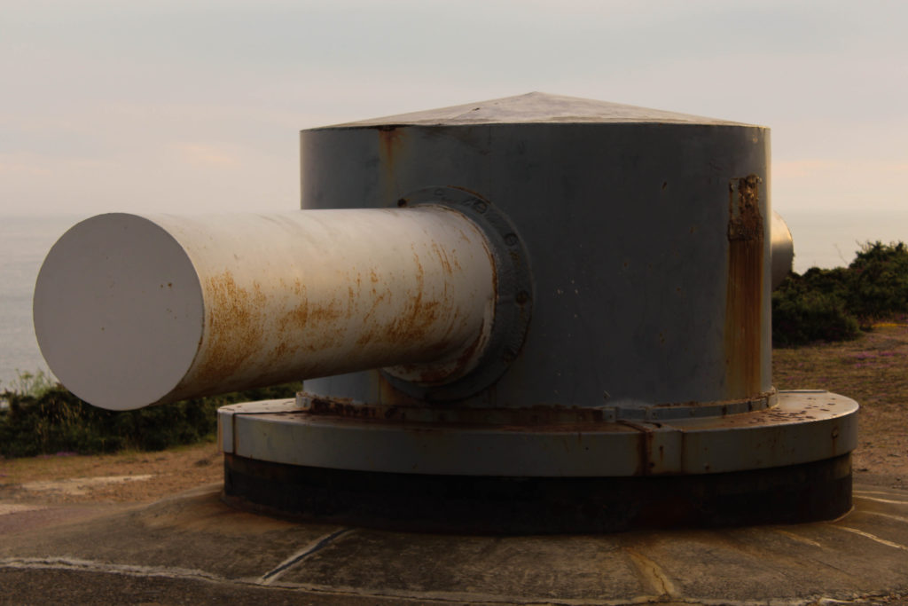
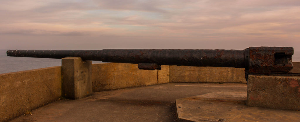
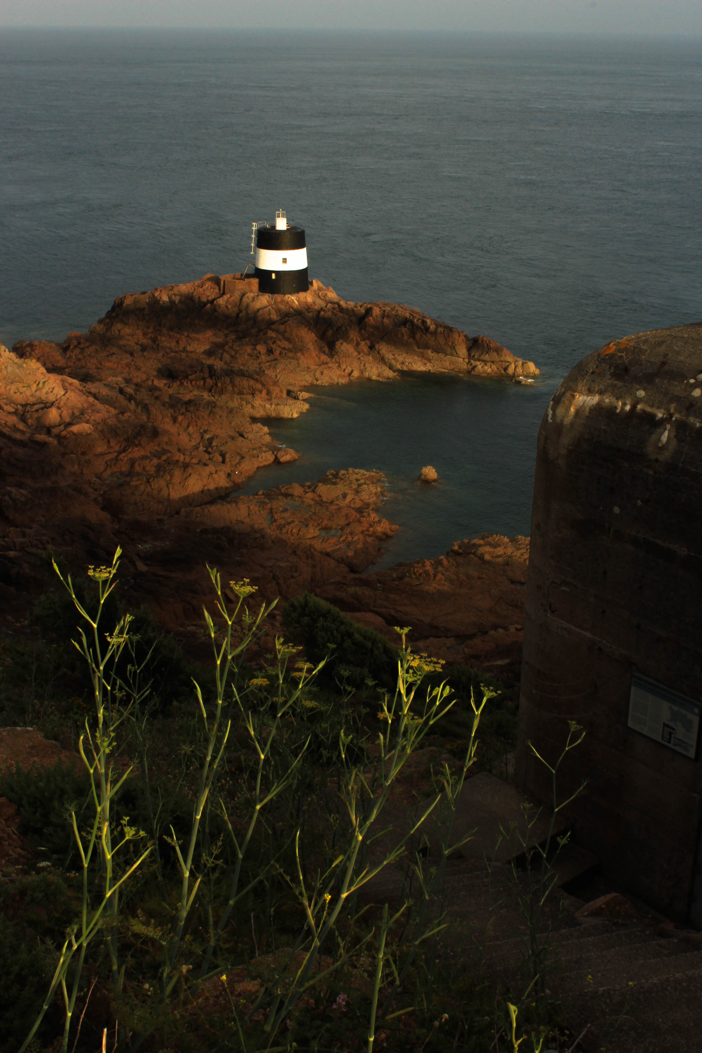
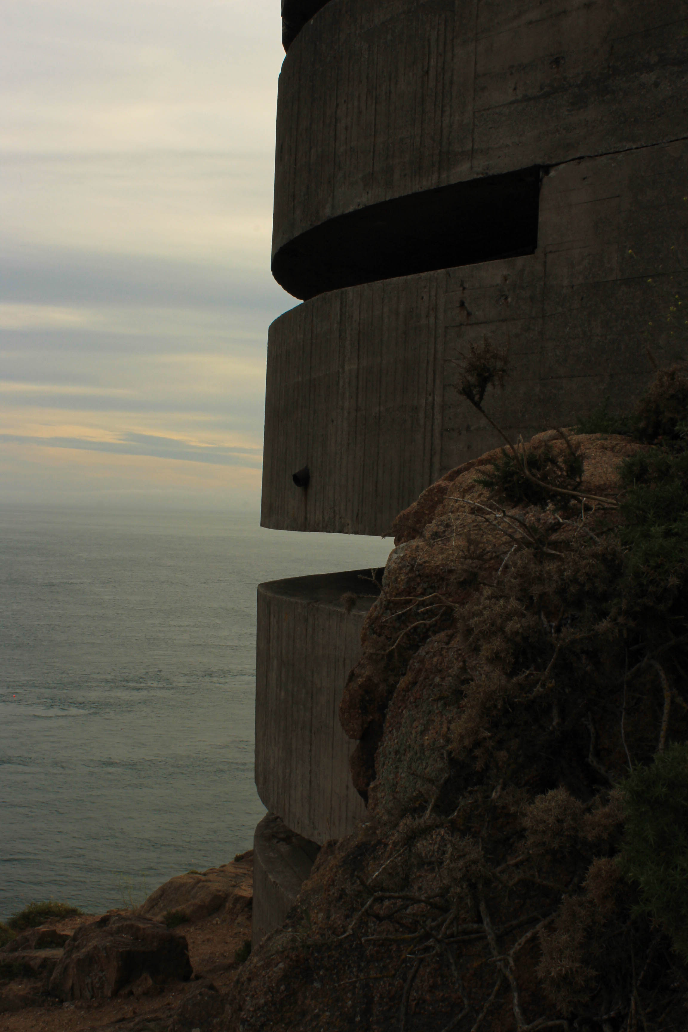
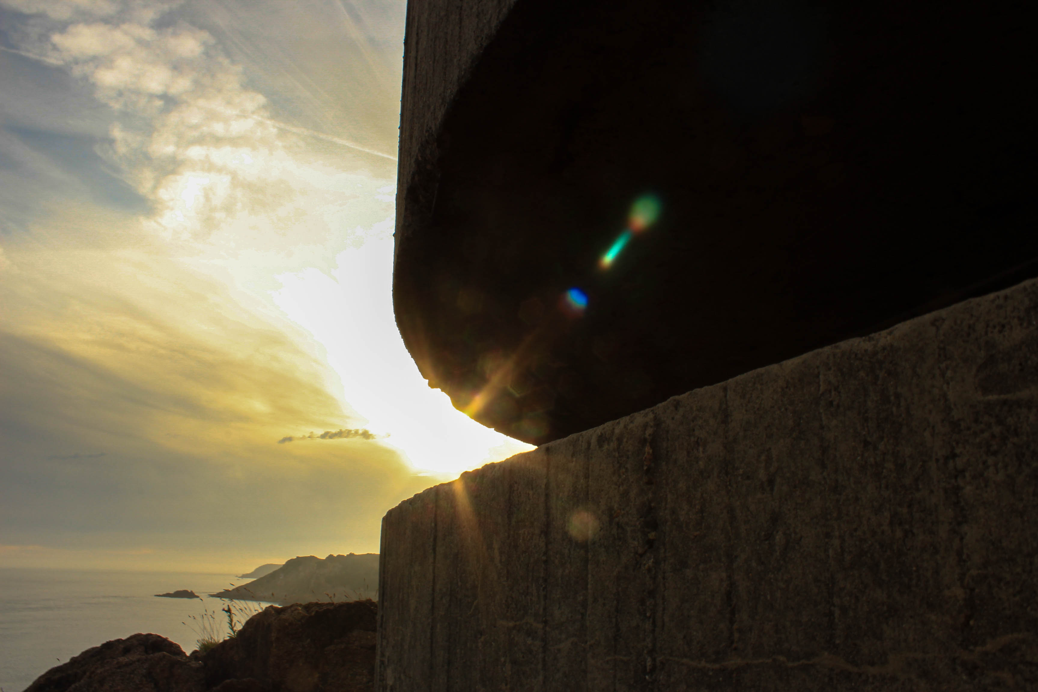
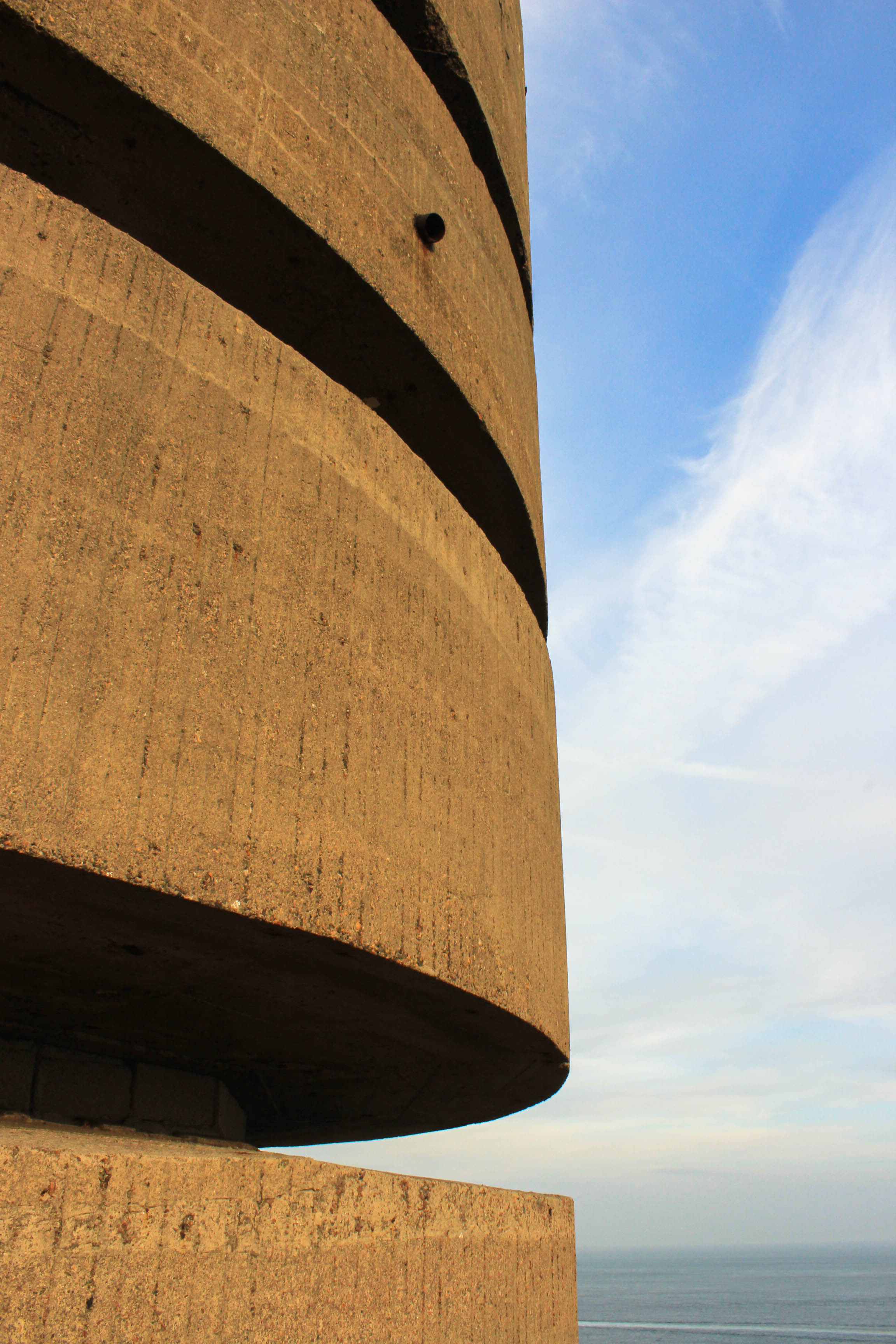
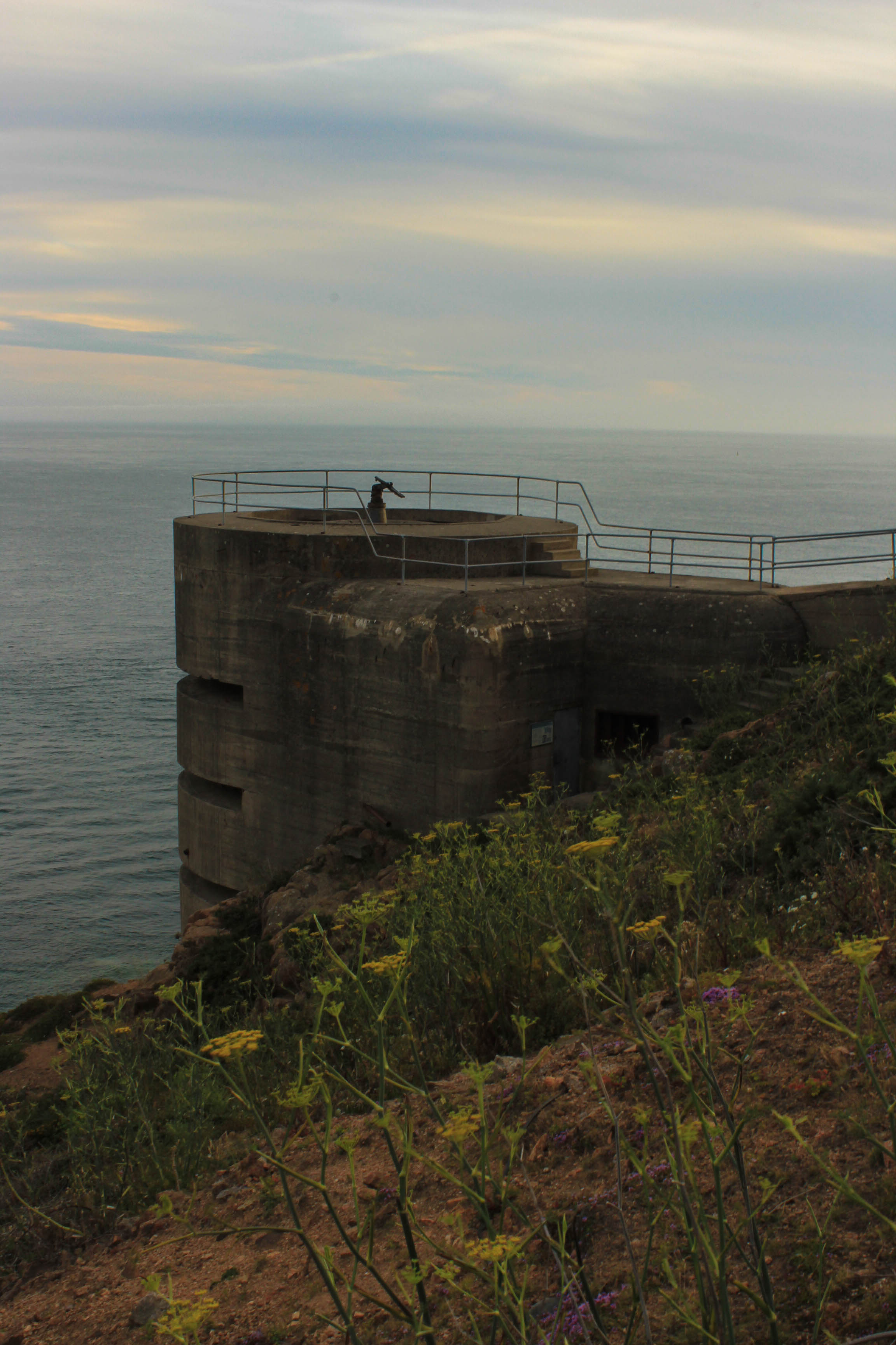
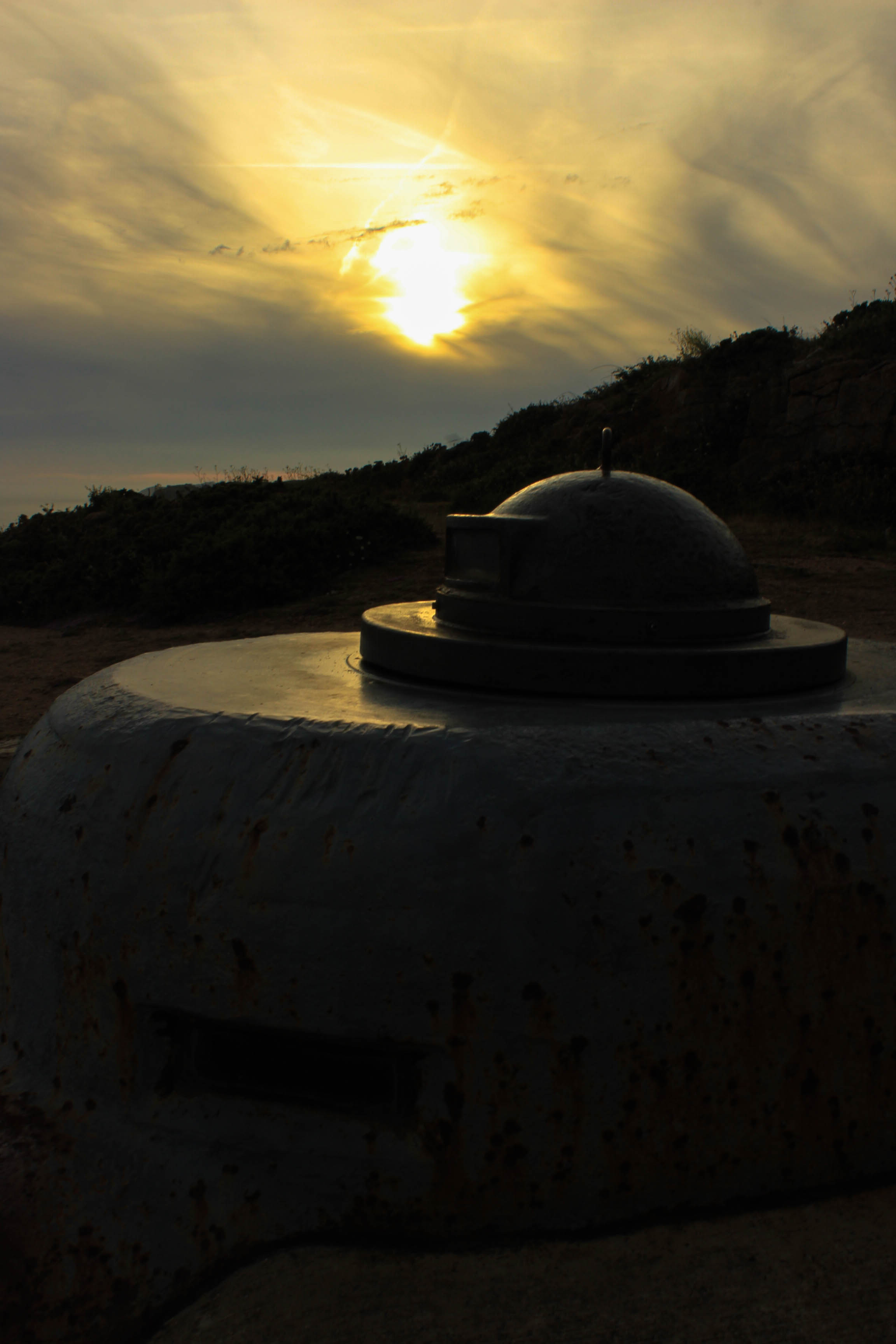
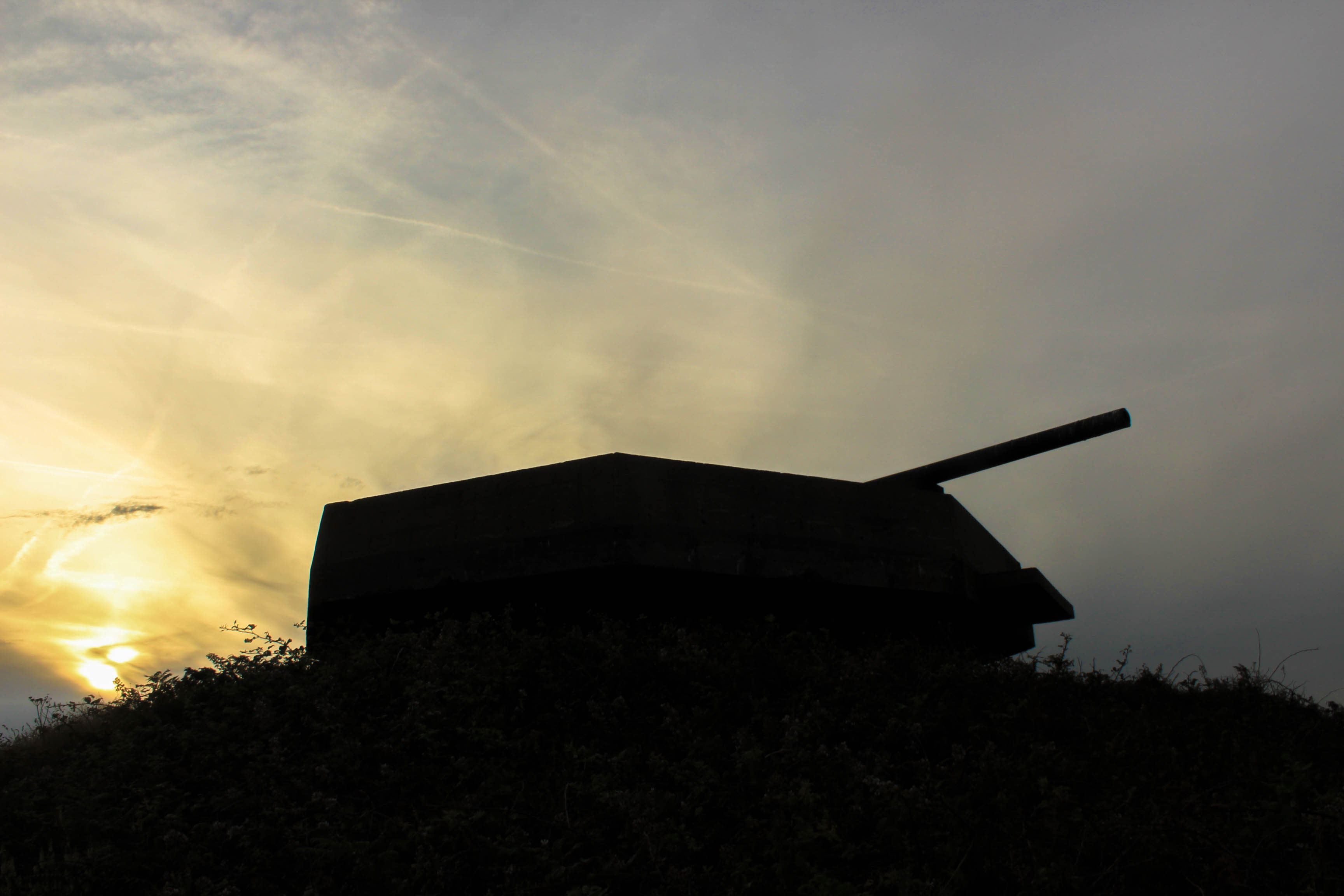
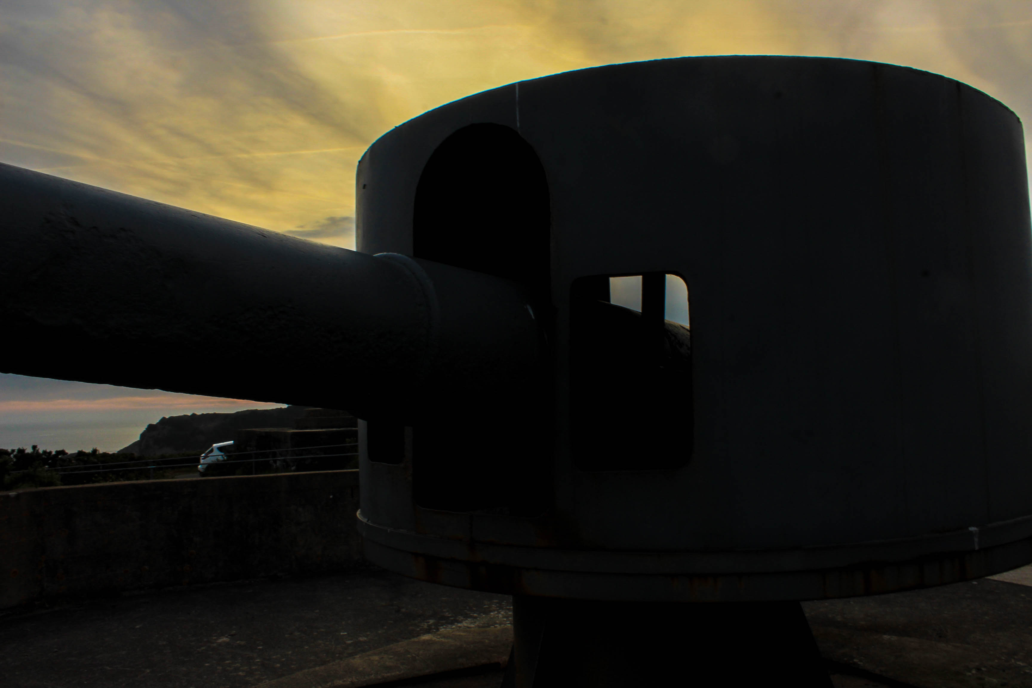
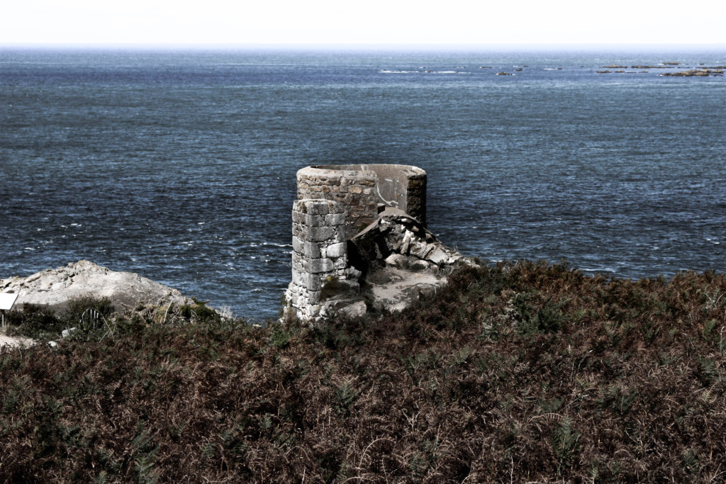
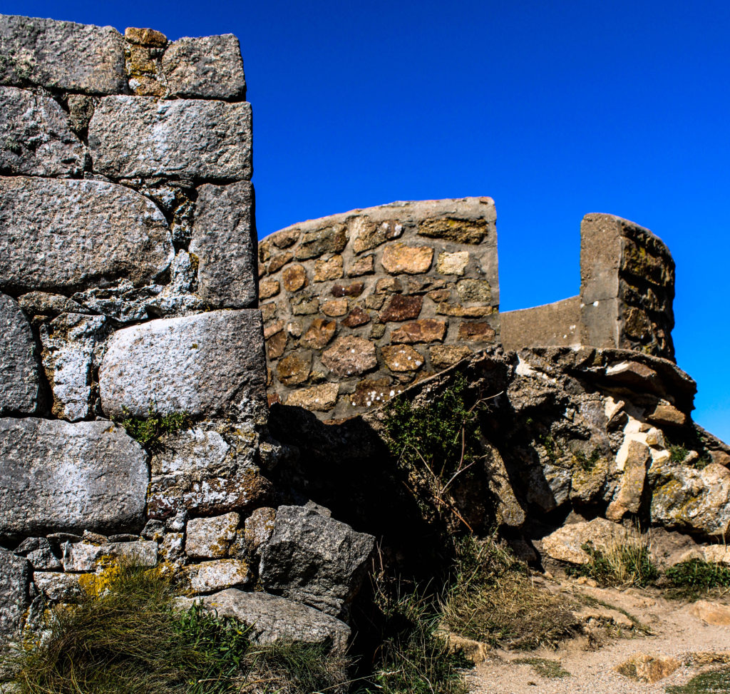
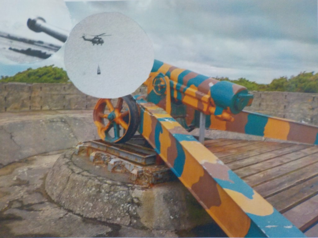
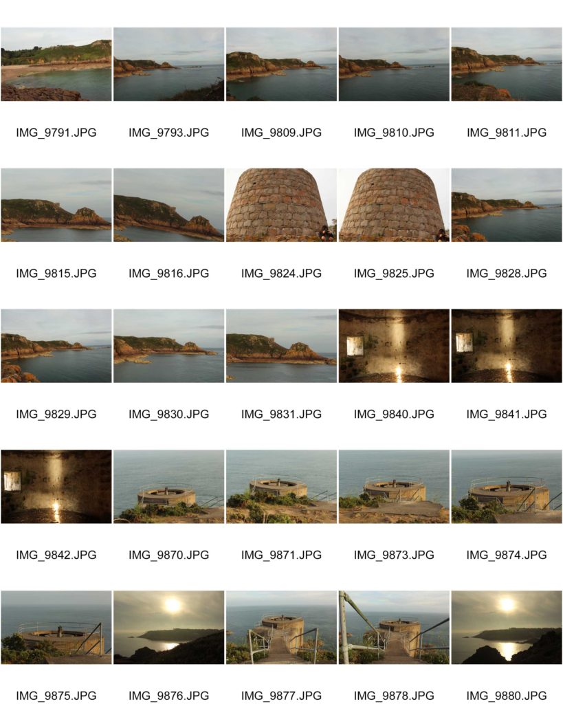
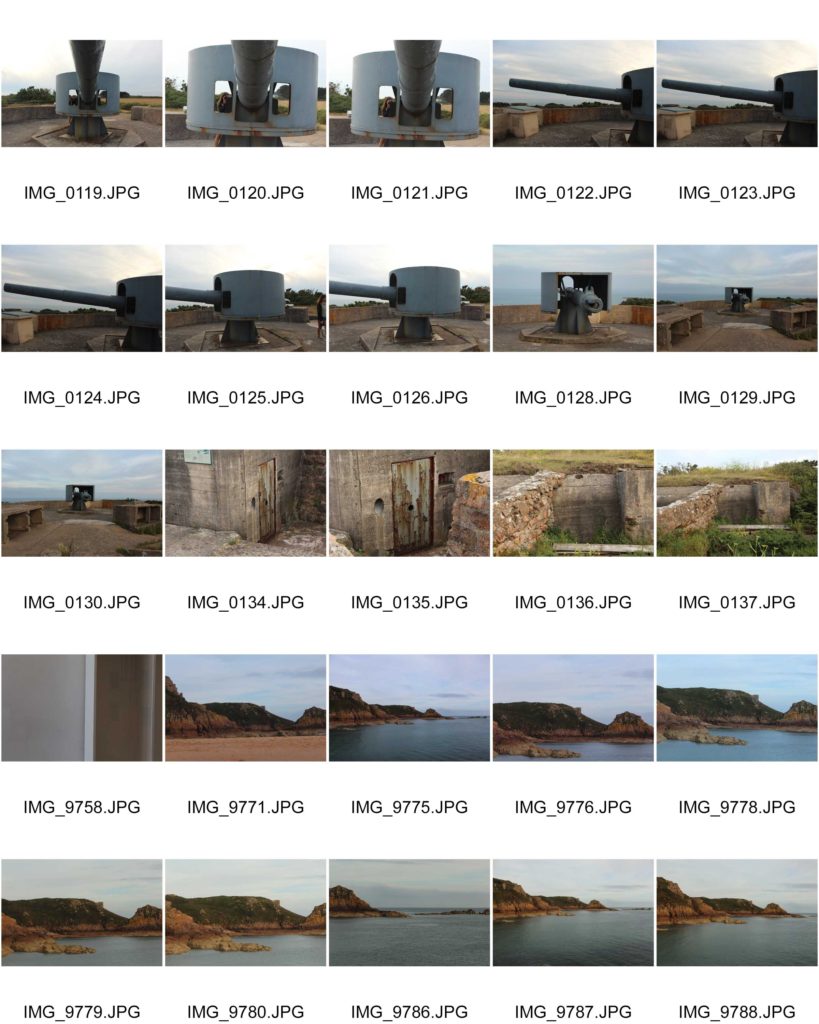
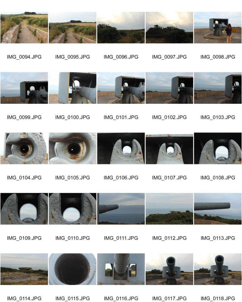
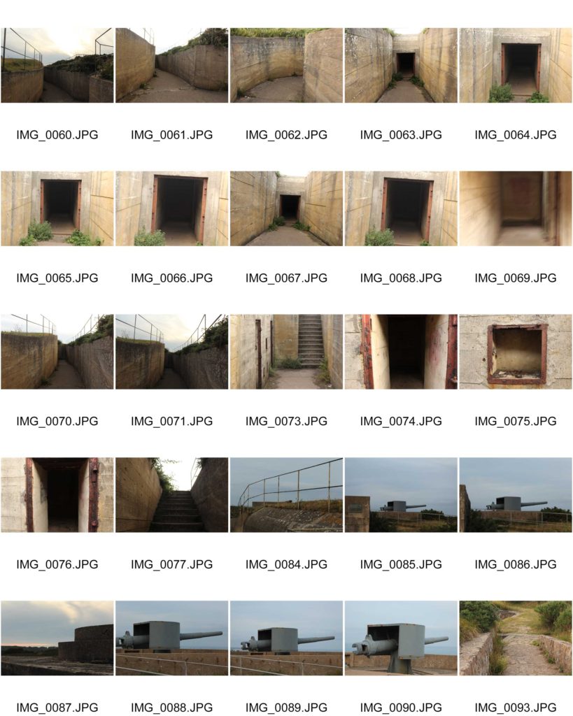
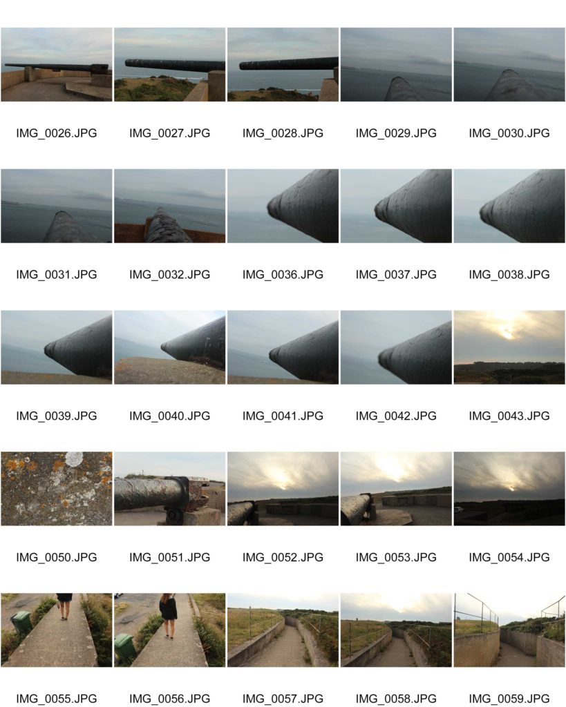
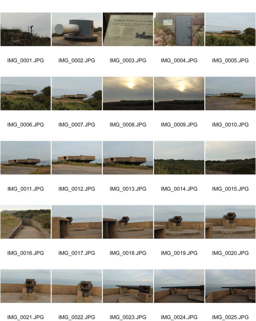
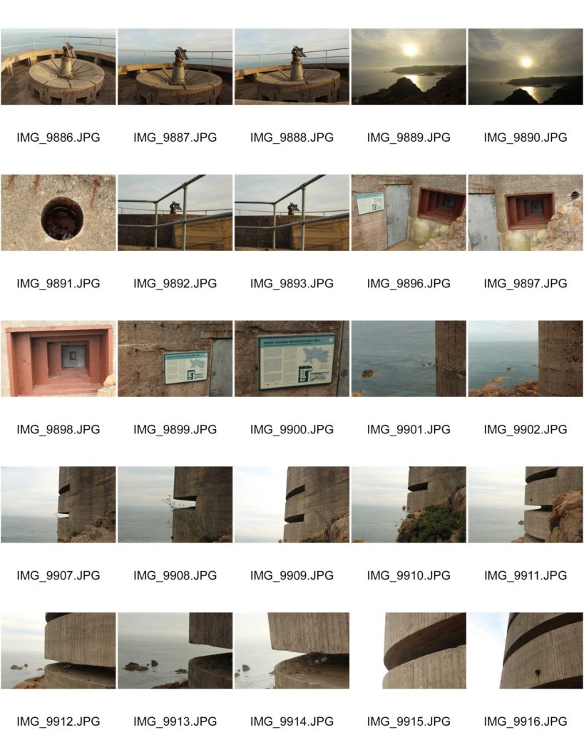
Batterie Lothringen was a World War 2 coastal artillery battery in Saint Brélade and constructed by Organisation Todt for the Wehrmacht during the Occupation of the Channel Islands. The first installations were completed in 1941, around the same time as the completion of Battery Moltke.
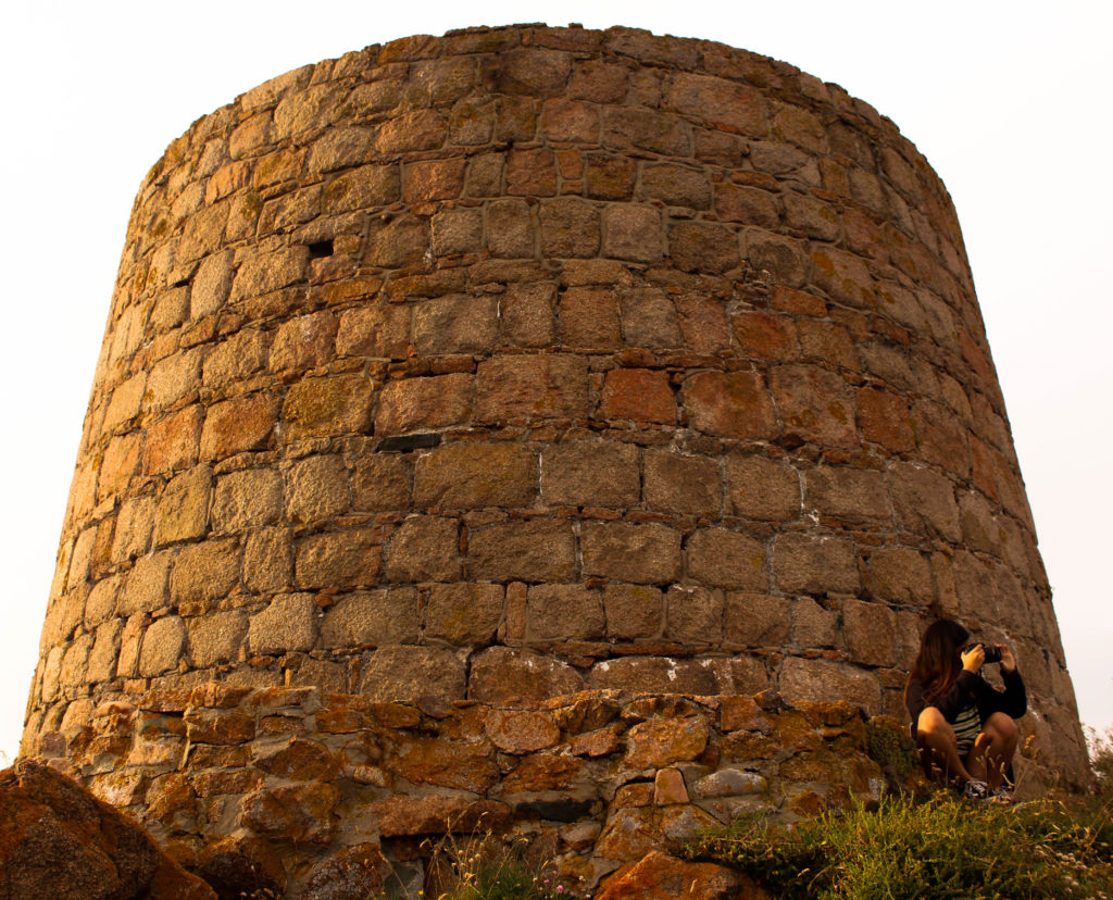
The site is located at the end of Noirmont Point, a rock headland. It was a part of the Atlantic Wall system of coastal fortifications and most of the concrete structures remain today. The site is preserved by the Channel Islands Occupation Society and open to the public.
In 1950 the States of Jersey purchased the headland of Noirmont as a memorial to all those Jersey people who died during the Occupation. A memorial stone was unveiled at Noirmont on 9 May 1970 to mark the 25th anniversary of Liberation.
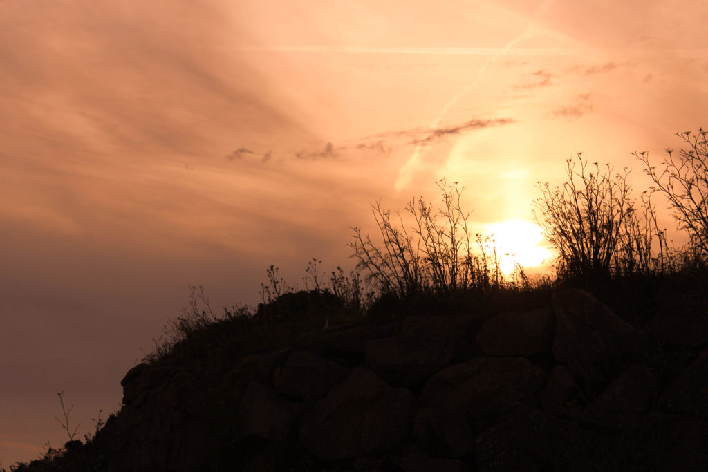
When visiting Batterie Lothringen, I took into account the time of day. I decided to have a photo shoot at the site during the evening around 7pm so I could capture images during the golden hour, the period just before sunset. In landscape photography, the warm colour of the low sun is often considered desirable to enhance the colours of the scene. It is the best time of day for any photography since the light is diffused and warm.
Information:
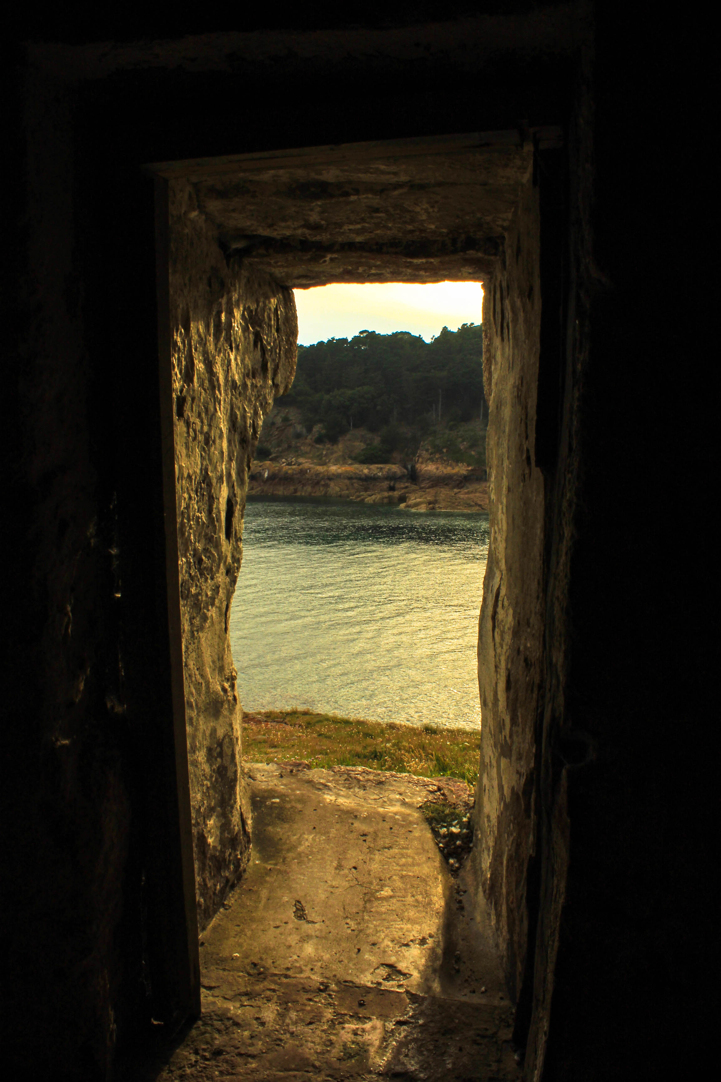
Due to my previous success on the other two photoshoots, capturing different bunker sites in Jersey. I wanted to further explore a different site, looking at different aspects and ways of presenting the decay of bunker archeology, creating a rational for this photoshoot. The site I selected is Strongpoint Plemont, which didn’t have as many structures to capture compared to the other two locations, creating a challenge and allowing me to explore artistically with my camera.
Strongpoint Plemont is site located on the North-West coast on the Island, it was created by the Troopsof 216 Infantry Devision. The purpose of the site was mainly to hold communication cables to Guernsey left Jersey from there. It also was a holiday camp which would have been useful for billeting the soldiers. 319th IR arrive and reinforced field positions are put in place in different levels becoming a Strongpoint. On top of this the bunker site also held many different weapons to prevent unauthorised access into the Island.
In preparation for the photoshoot I preplanned and adjusted my camera settings based on the weather outside, when conducting this photoshoot. I used the AV setting on my camera allowing me to put main focus onto my aperture settings. I used a quick shutter speed, alongside a mix of high and low apertures, allowing different depths of fields to be used in order to capture the archeology. The ISO remained low, due to the sun being beaming onto the bunker’s, as well as the white balance being set onto sunny day, in order for a sense of warmth and image colour correction within my composition.
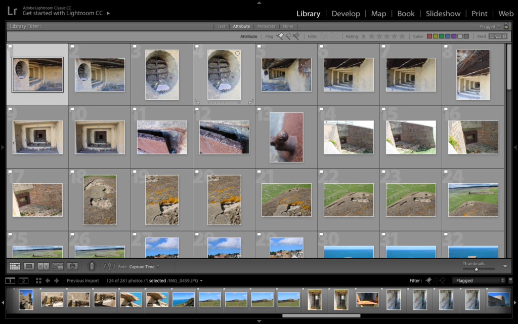
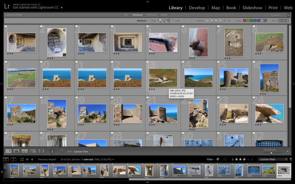
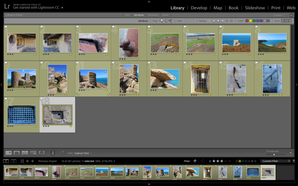
Lightroom Selection:
Black and White Edits:
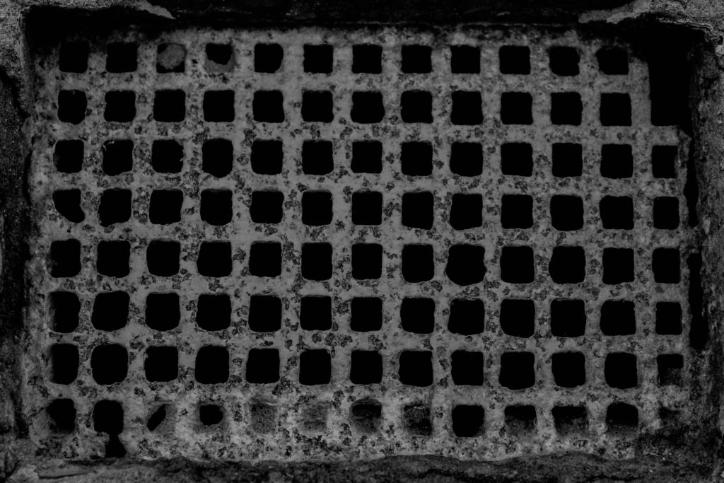
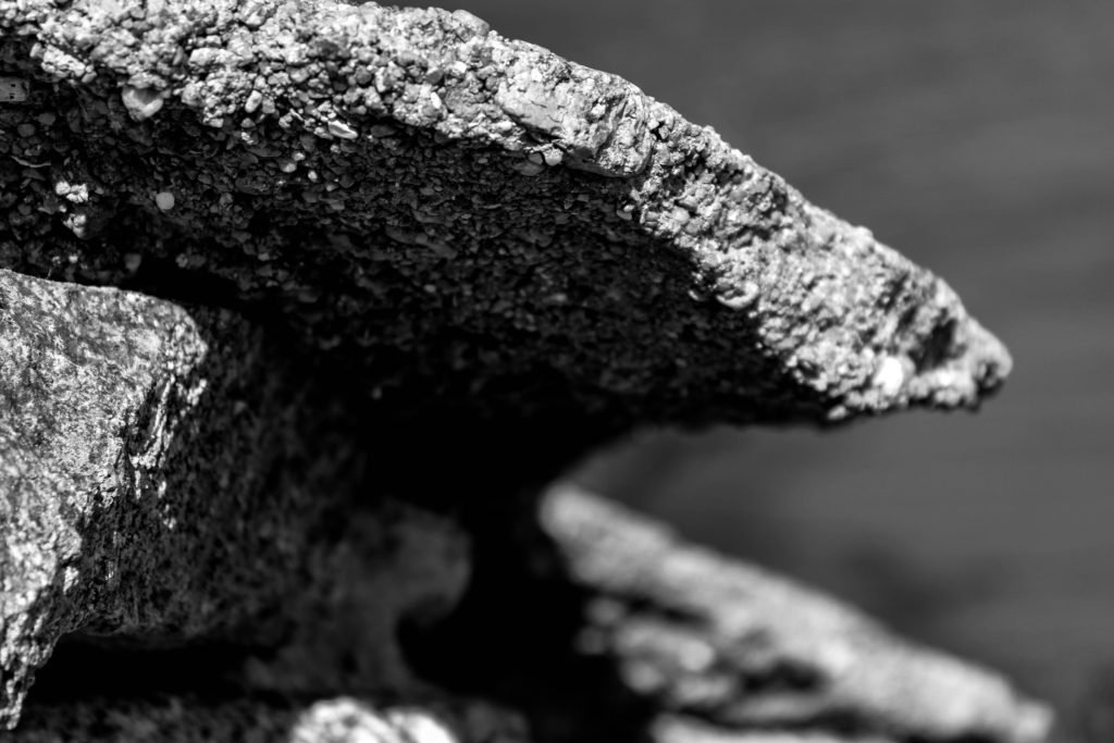
For my black and white final outcomes, I decided to utilise images which clearly presented the formal elements of texture and shape, and wanted these to clearly be presented within the final composition, As well as using macro images, presenting a new way to perceive the archeologies. I started of by cropping some of the images, in order to present a clear subject alongside having a clearer ascetic to my work.
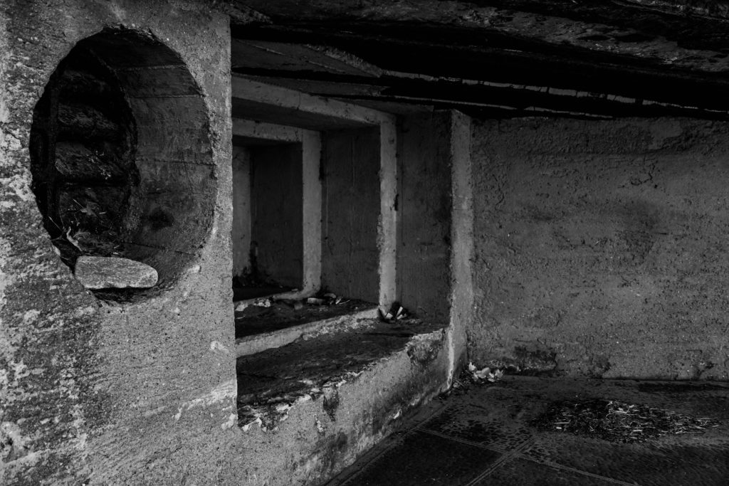
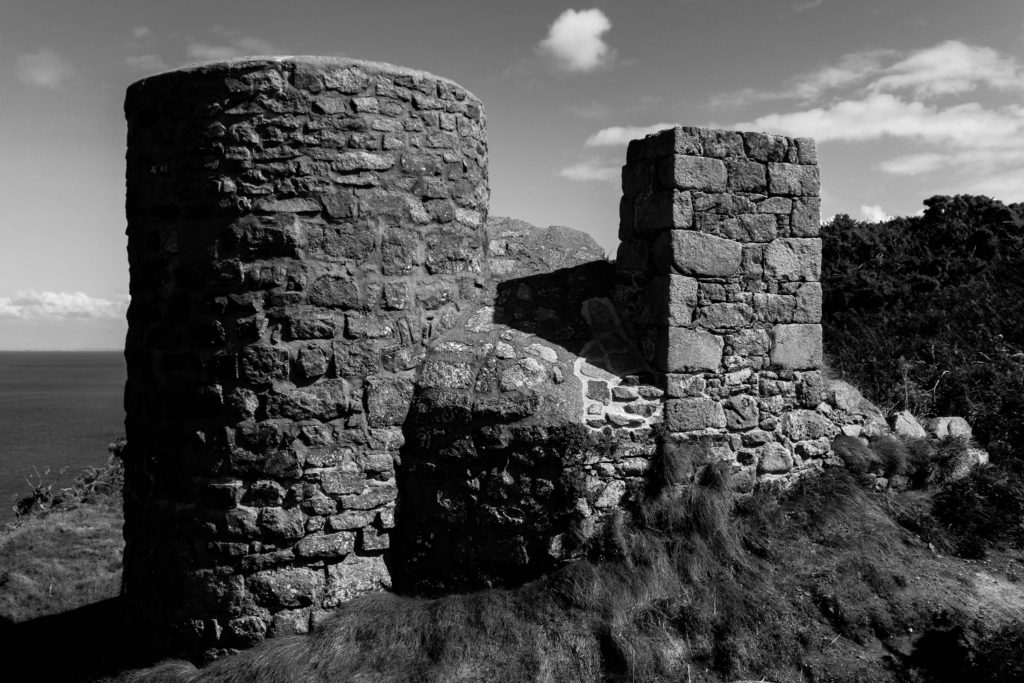
Above is my favourite outcome from the photoshoot, thus I deiced to break down the different components within the image, to showcase my rational as a photographer. Conceptually, I was showcasing the decay of bunkers, and how they have been abandoned and untouched since the war, allowing nature to grow and take back it’s land, whilst leaving a permanent mark on the Island reminding us of the history of Jersey. Contextually, the bunker’s were used to store artillery and weapons in order to prevent unauthorised access into the island. Visually, I have used a macro photograph of the structure of the bunker which has been destroyed, leaving jagger edges, creating a textural design within my imagery. The composition is simplistic as the foreground is apart of the structure and background is the landscape which is blurred, showcasing the use of a narrow depth of field. The photograph was taken at a straight on angle, and is in black and white, allowing a contrast in tonal regions to clearly be illustrated within my work. Technically, the lighting used is natural, produced by the sun, and is soft allowing the structure to not seem so full on, and allows the shadows to naturally be casted onto the structure. The ISO used was low, as there is no intended noise within the photograph as well as the shutter speed being quick as there is no intended blur. The aperture used was low creating the narrow depth of field, which I previously mentioned and the white balance is set to the daylight setting.
Colour Edits:
For my colour edits I used different photographs, which allowed me to explore ways of editing the photographs to make the bunkers not look like they are in real life. I achieved this by moving the bipolar bars to either extreme on the panels, for example having the blacks one end and the whites the other end. The unique and abstract designs produced allows us to rethink the purpose of the bunker, outlining their importance to the Island’s history.
Above is my favourite image from the colour edits, as well as my top image from the whole photoshoot, as I believe it changes the perspective and the way in which we look at Jersey’s bunkers. Conceptually, I was showcasing the decay of bunkers, and how they have been abandoned and untouched since the war, allowing nature to grow and take back it’s land, whilst leaving a permanent mark on the Island reminding us of the history of Jersey. Contextually, the bunker’s were used to store artillery and weapons in order to prevent unauthorised access into the island. Visually, the image clearly showcases the formal elements of texture, space and form, which is showcased by the editing technique I adopted as well as the subject of the image. The composition of this photograph is simple, as the piece of wood is the subject of the photograph, main focus point, and the background is the simple structure of the bunker which has moss and shows decay, again clearly outlines by the editing technique. Technically, the photograph uses natural lighting produced by the sun, which is not harsh as the image was taken at a straight on angle in a location in the shade, allowing my white balance to stay on the daylight setting. The ISO was kept low as there is no noise being presented within my work, as well as the shutter speed being quick due to no intended blur. The photograph uses a wide depth of field which showcases the high aperture used.
Evaluation:
To evaluate my third photoshoot exploring the bunkers, I believe I have been able to produce strong outcomes showcasing the bunkers in an abstract way, allowing us to rethink and remind ourselves of the importance of the bunkers on our Island. I have been able to further explore with the editing on Lightroom, showing my competence to think creatively as well as not sticking to the basic and standard edits that are usually conducted when editing images. I have been able to gain further understanding into the history of Jersey and have shown further exploration into the project.

In the image above i have inserted
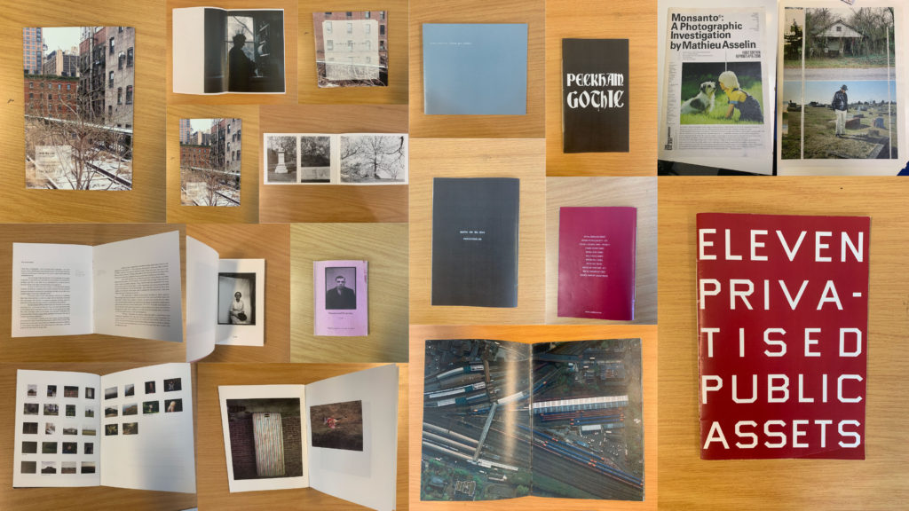
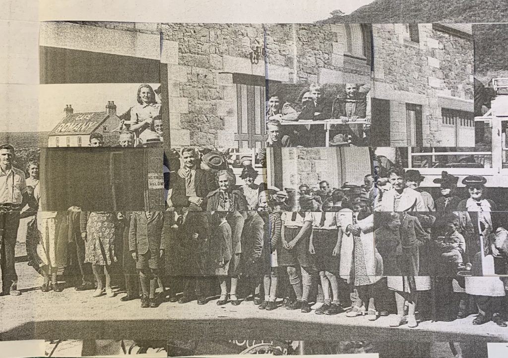
This zine below is made by J Carrier
Last weekend I went to Noirmont and then Portlet shortly to take images of the historical German sites it has to offer.
Noirmont is a headland in Saint Brelade enclosing St Aubin’s Bay on the western side.
Noirmont Point and a substantial part of the headland behind it was acquired by the States in 1950 as the Island’s war memorial.
It is a strange irony given its status as a memorial of a war in which Jersey was occupied by the Germans for five years, that probably the main reason for visiting the headland is to view the restored bunkers and gun emplacements of Batterie Lothringen, the only naval coastal artillery battery in the island and part of Hitler’s infamous Atlantic Wall.
Final edited images: