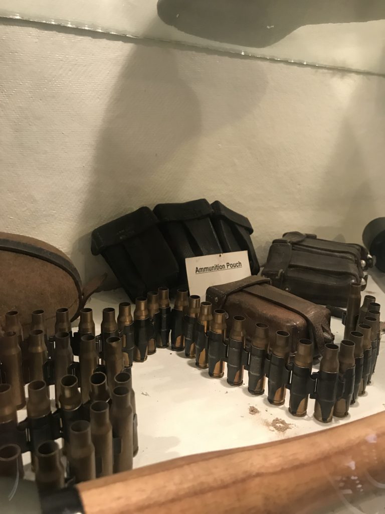
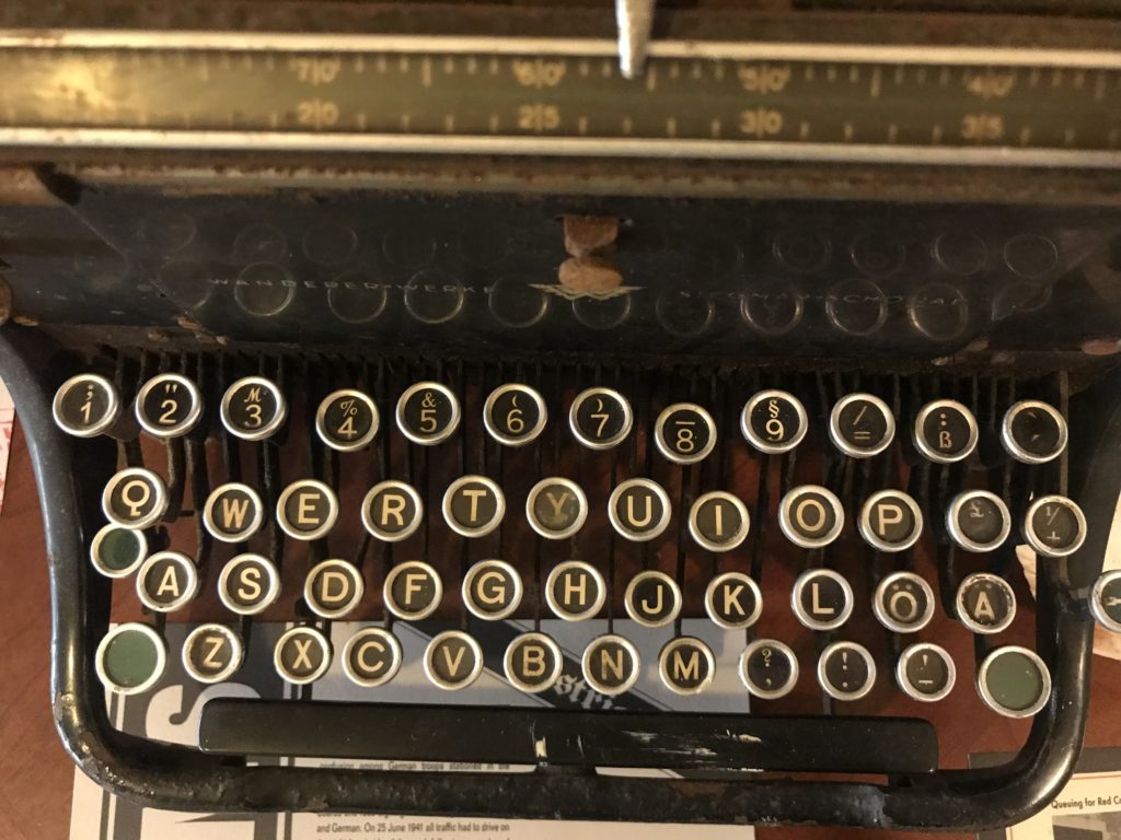
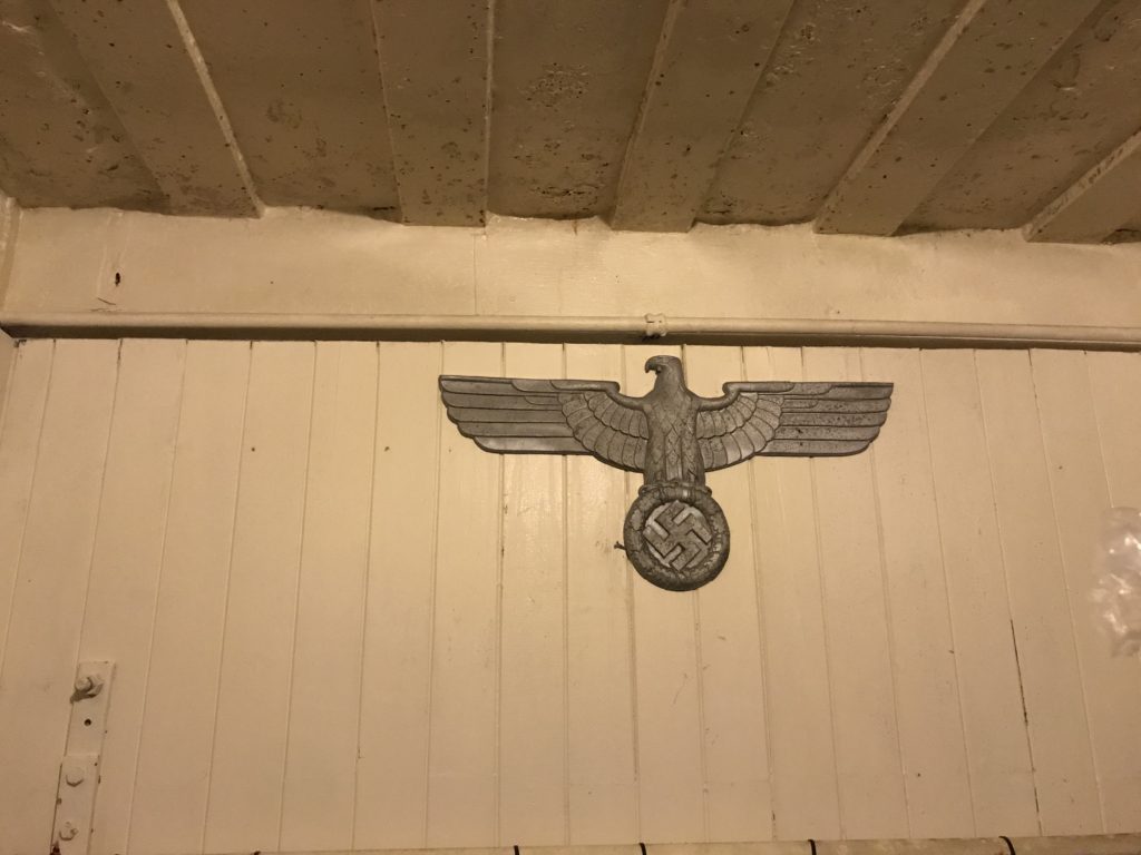


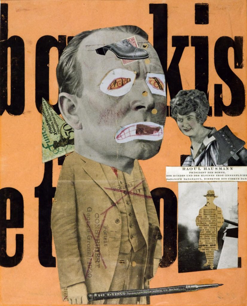
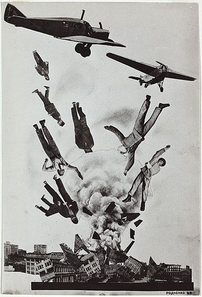
Photomontage is a type of collage art. It is mainly composed of photographs or sections of photographs in order to direct the viewer’s mind towards specific connections. Photomontages are often constructed to convey a message, whether that be a commentary of political, social or other issues.
There are many ways that a photomontage can be constructed. It is often photographs, newspaper and magazine clippings glued onto a surface, giving the work a collage feel. It is also very common for images to be created digitally.
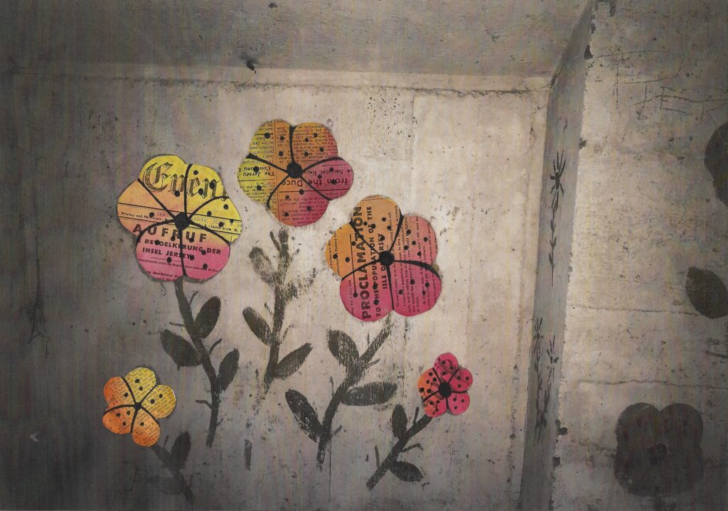
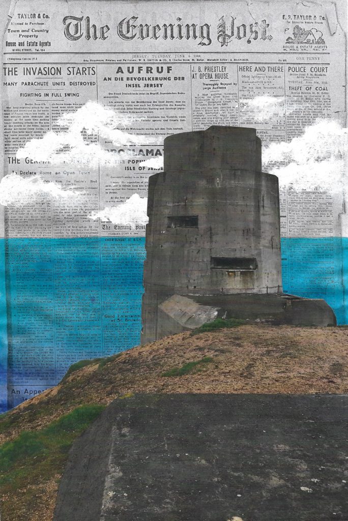
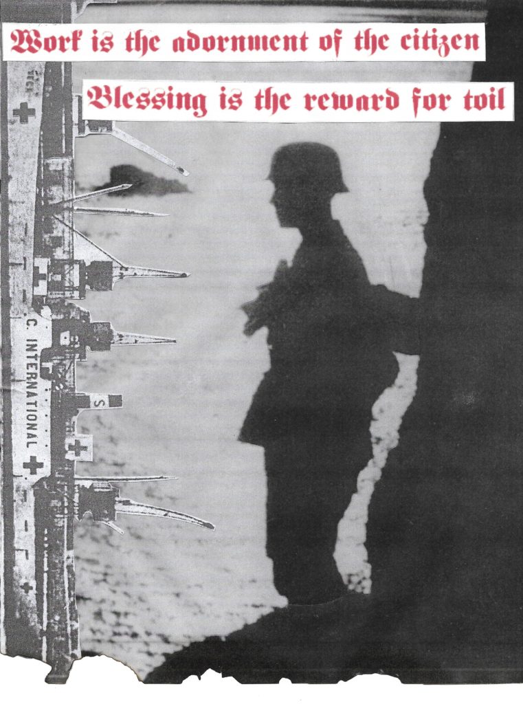
We were given the task of creating our own photo montages that link to Jersey during the Occupation. I have experimented with the photo montage technique by combining my own images (primary source) with archival photographs and newspapers (secondary source). I have used the approach of creating a composite photograph by cutting, gluing and overlapping two or more photographs into a new image. Photo montage 1 and 2 have been enhanced with paint since I wanted to add my artistic skills into the collages. By doing this I have added colour and vibrance into my photo montages to contrast with the dull colour scheme associated with the black and white photography used during the Occupation. Image 3 has been slightly burnt with fire to create an interesting scorched effect, almost as if the paper is decaying: a metaphor of the past slowly disintegrating and people forgetting the importance of the Occupation. The bold red quote has been taken from my trip to Battery Moltke and has been translated from German to English. The resulting composite images have been scanned by the printer so that the final photo montages appear as a seamless photographic print.
A zine is an independently published booklet, often by a single person. They used to be created by physically cutting and gluing text and images together onto a master flat for photocopying, but now it’s more common to produce the master by typing and formatting pages on a computer. Since the 90’s, zine production has dwindled but that doesn’t mean it’s died out.
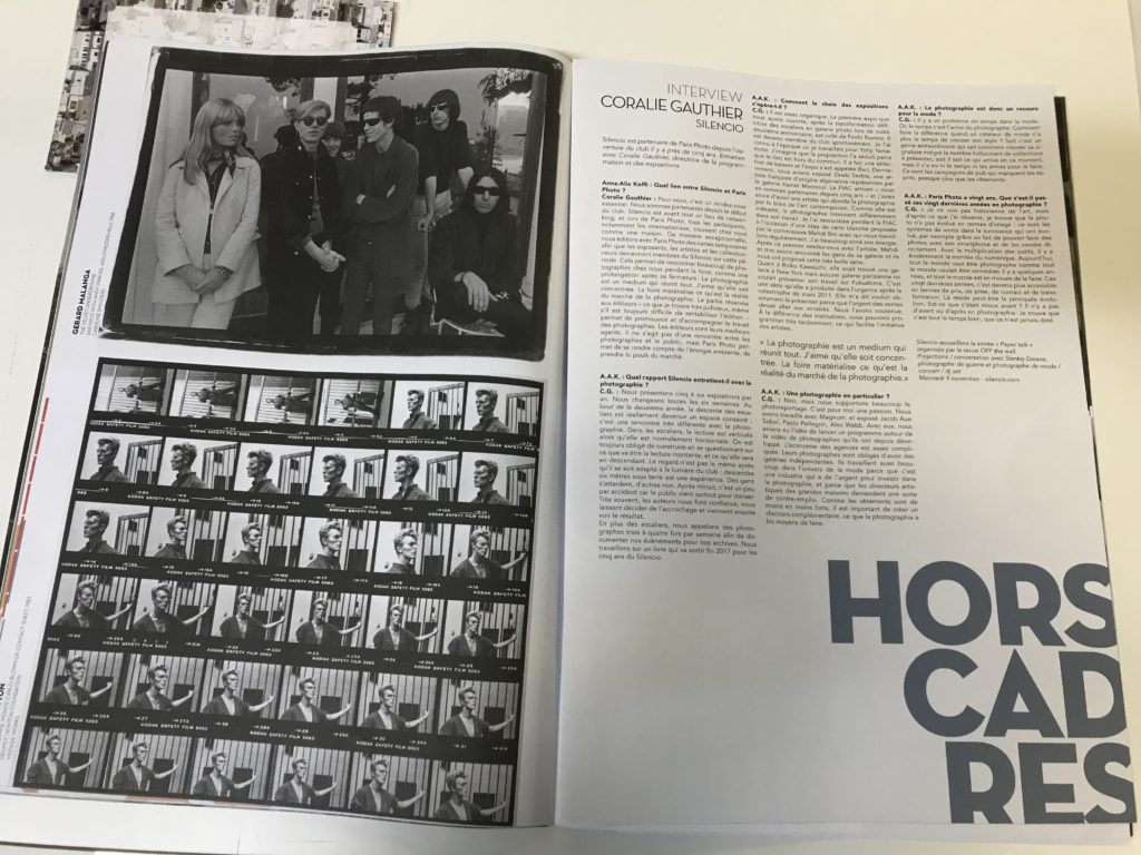
In order to create a zine lots of planning goes into it, many different elements need to be considered. Display is important to create a specific aesthetic, for instance in the zine below there are 36 images of David Bowie on a contact sheet. The creator of the zine could have chosen their favourite photo out of the 36 taken but they chose to include all of them. This could be because it creates a sense of originality and shows the journey in which the photographer took when photographing David. As well as that the contact sheets also are a form of sequencing, this is an important aspect of a zine as having structure provides an opportunity for the readers of the zine to decode the intended narrative in which the creator encodes into the sequence. This particular zine also highlights how text can be used, in this is one there is detailed writing as it’s an interview format but not all zine’s have this much, the majority have very minimal text. The font is very basic but it’s not a negative as it suits the basis of an interview, it’s simply just question and answer. Also it’s layout is very formal, it’s looks like a broadsheet in the way columns are used to display the text, this creates a sense of professionalism towards the creator of the zine. The chronological order of the contact sheets and the repetitive columns of the interview work in harmony and compliment each other nicely as well as them both being in black and white creating a simplistic feel to the two pages. On the left page there is also addition text which is placed vertically to the side of the featured photography, this is a common feature of a zine but also again links to the design and how it’s similar to a broadsheet newspaper as usually with an image comes a caption underneath it providing a description. The dates featured are 1966 and 1983, so the black and white helps the reader to identify the age of the photos and people in them without having to the read the side caption.
Les Landes:
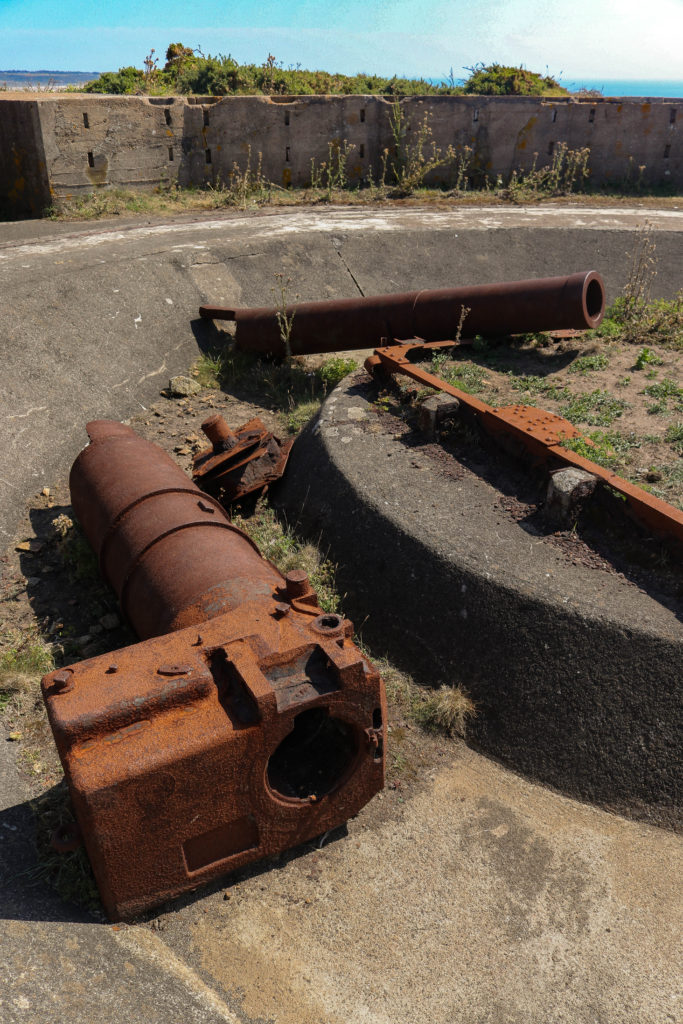
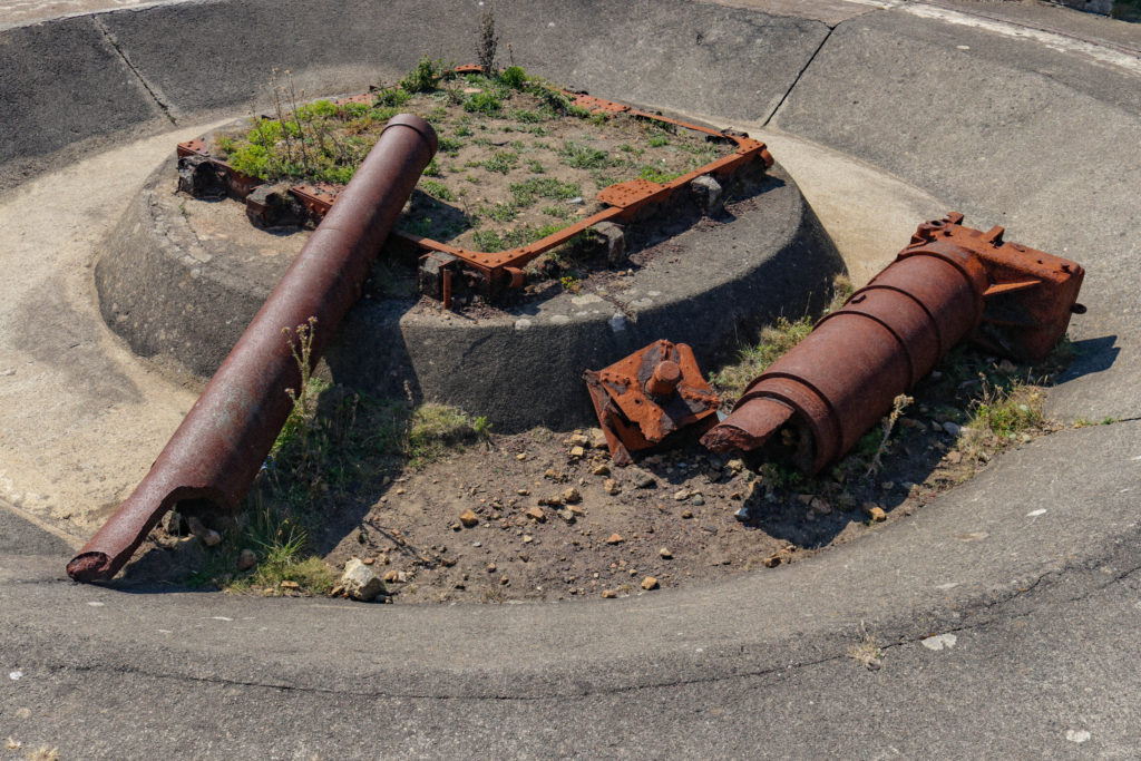
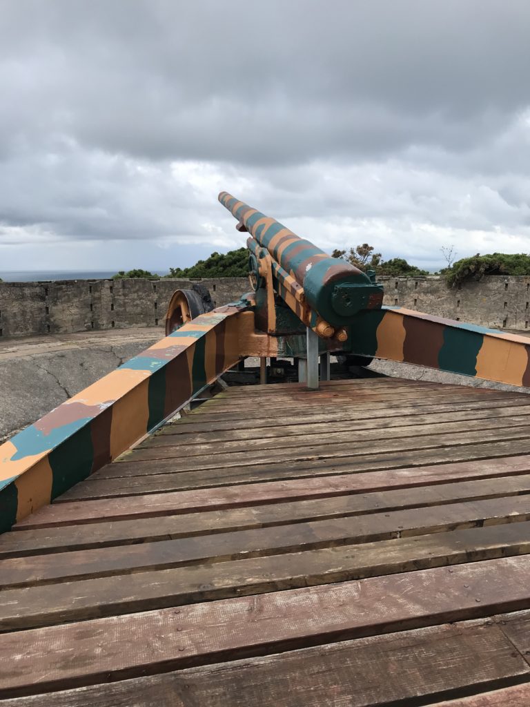
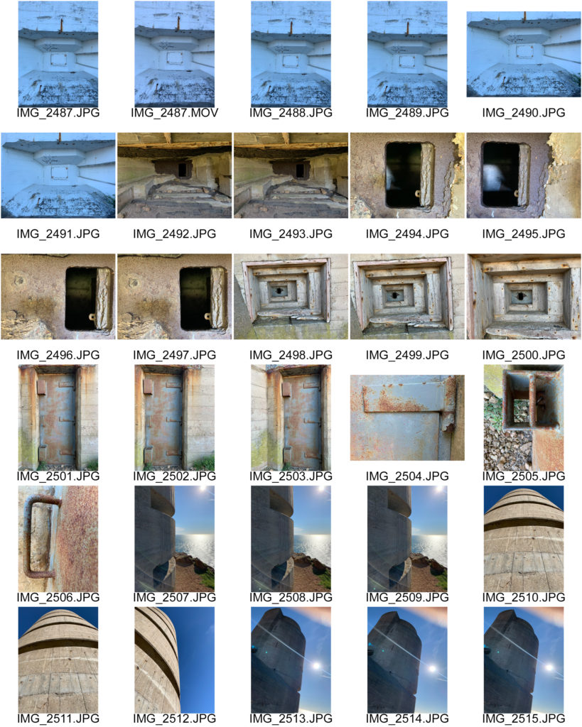
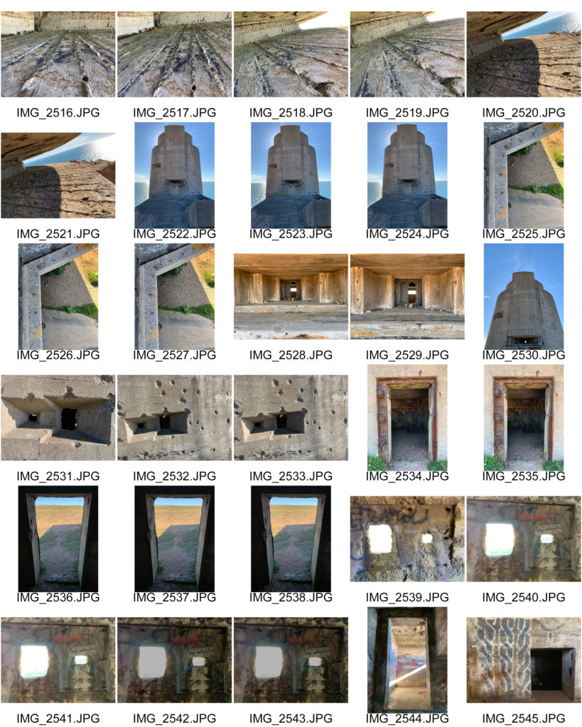
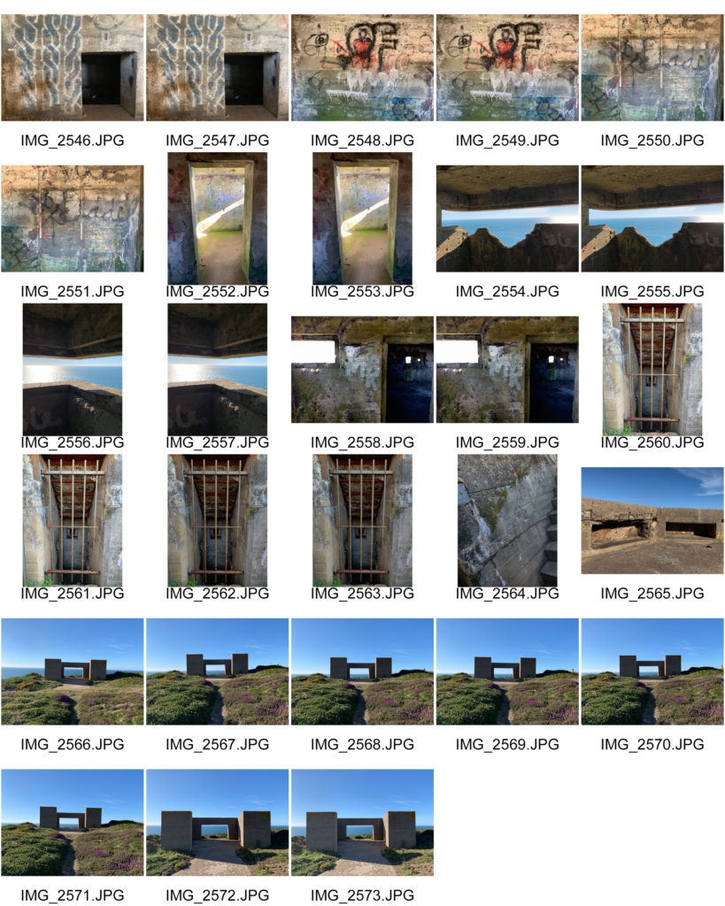
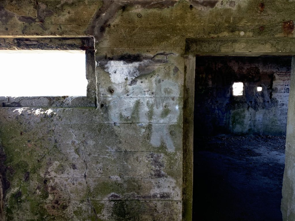
Located on the north-west coast of the island, Les Landes is a coastal headland which was heavily fortified during the occupation of the island. It is home to probably the most impressive of all naval towers in the Channels Islands, Marine Peilstand 3. High above the 60 meter granite cliffs, it looks out over the sea to the north-west. The whole new battery was built except for its fire control post, but the guns were never placed. It is one of three of such naval towers in the channel islands, the others being Bt Steinbruch on Guernsey and Bt Annes on Alderney which have about the same layouts and structures. A gun is restored in one of the old emplacements and several bunkers and tunnels are a museum now.
http://bunkersite.com/locations/ci/jersey/landes.php
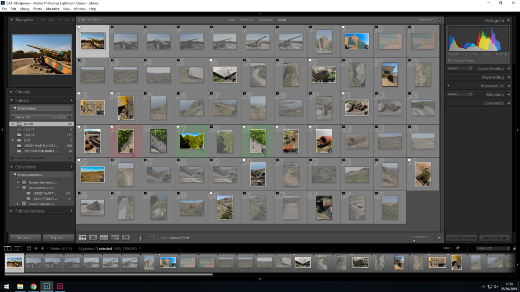
Contact sheet:
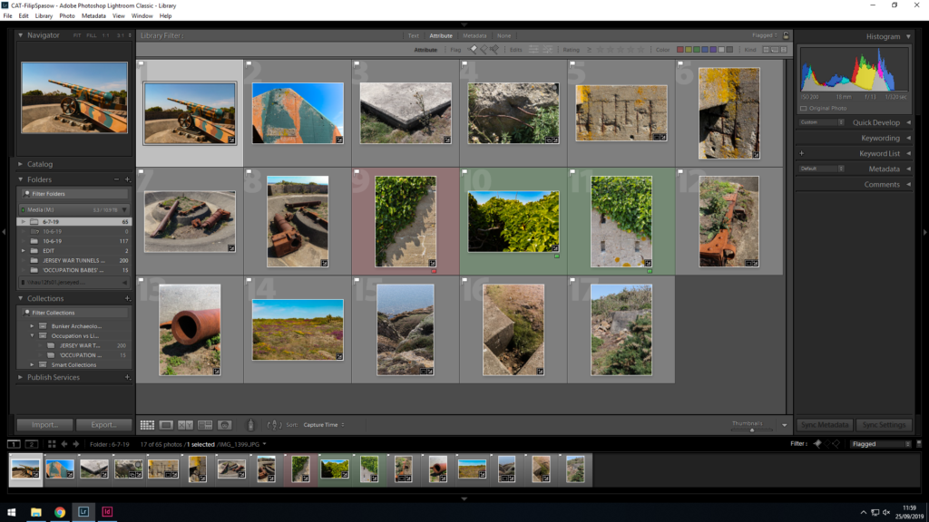
Best Images:

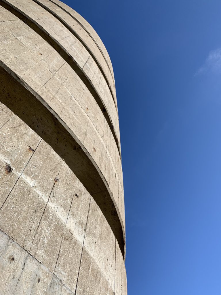
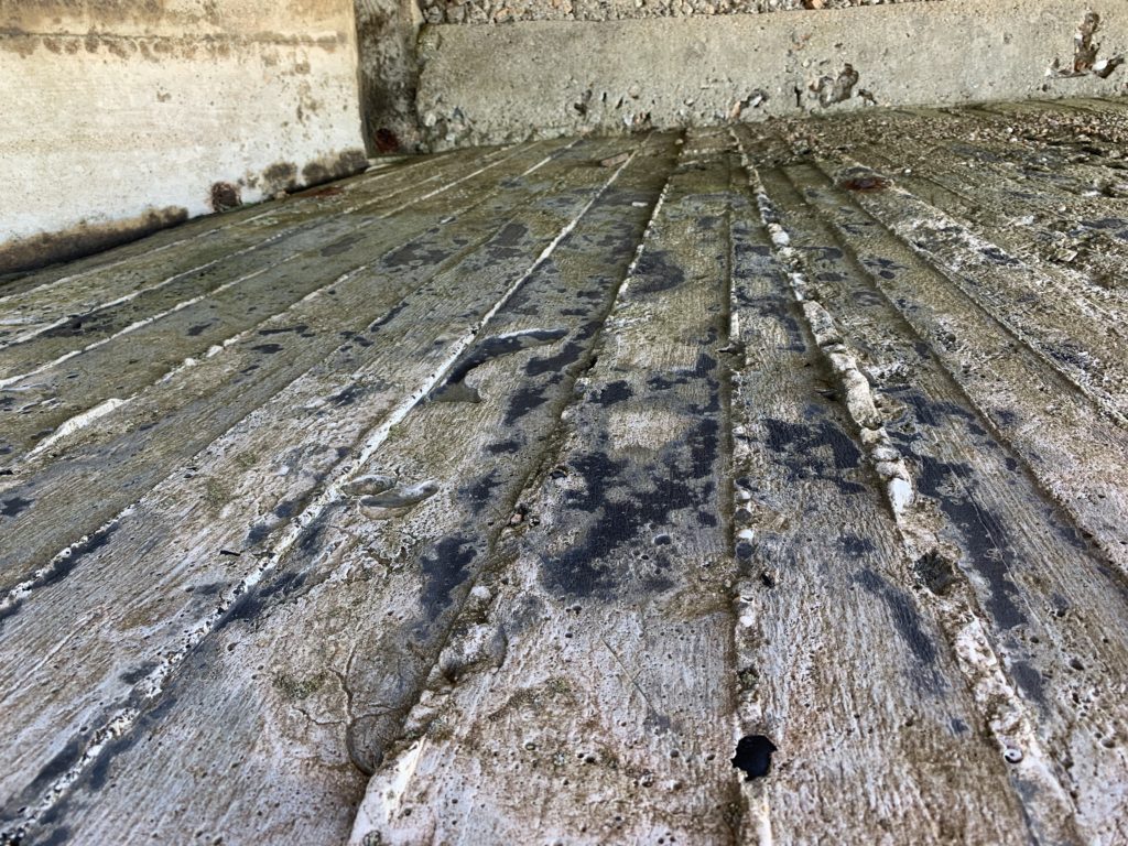
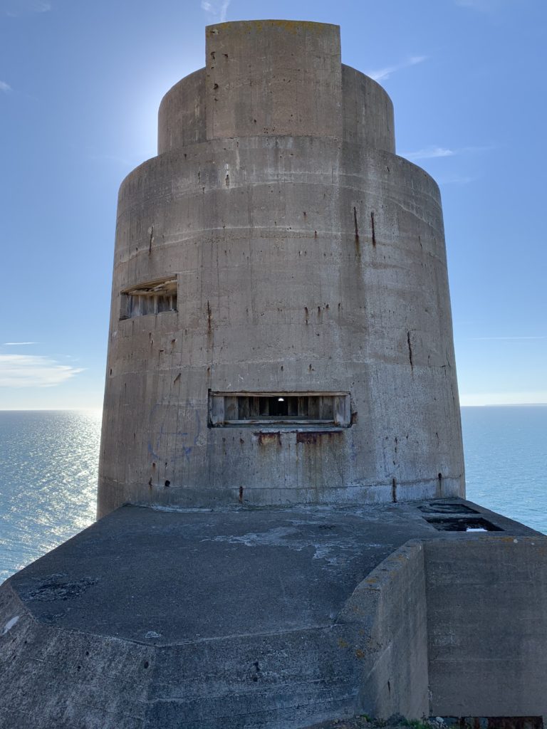
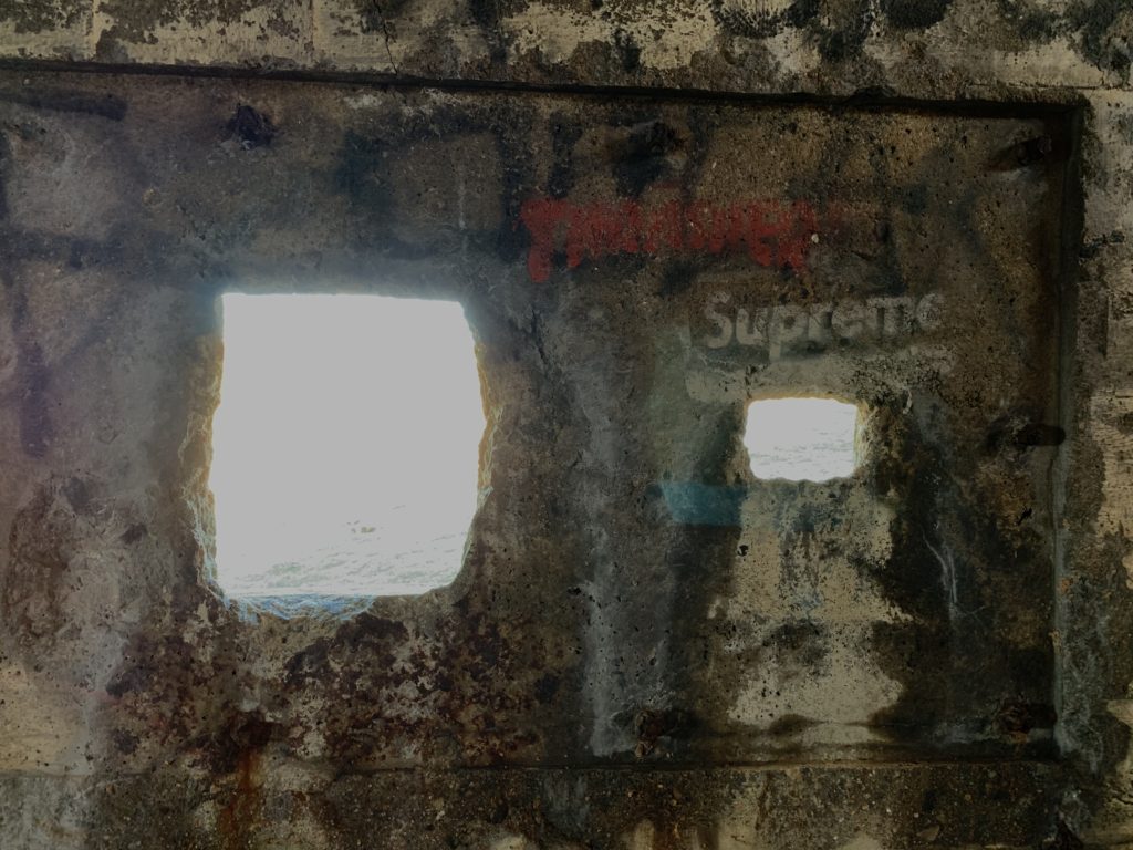

A zine is a book made from a collection of photographs presented in a often magazine style. They can be used as a way to present a series of images from a project or to tell a story. Many zine are hand made, therefore each zine is unique to the photographer.
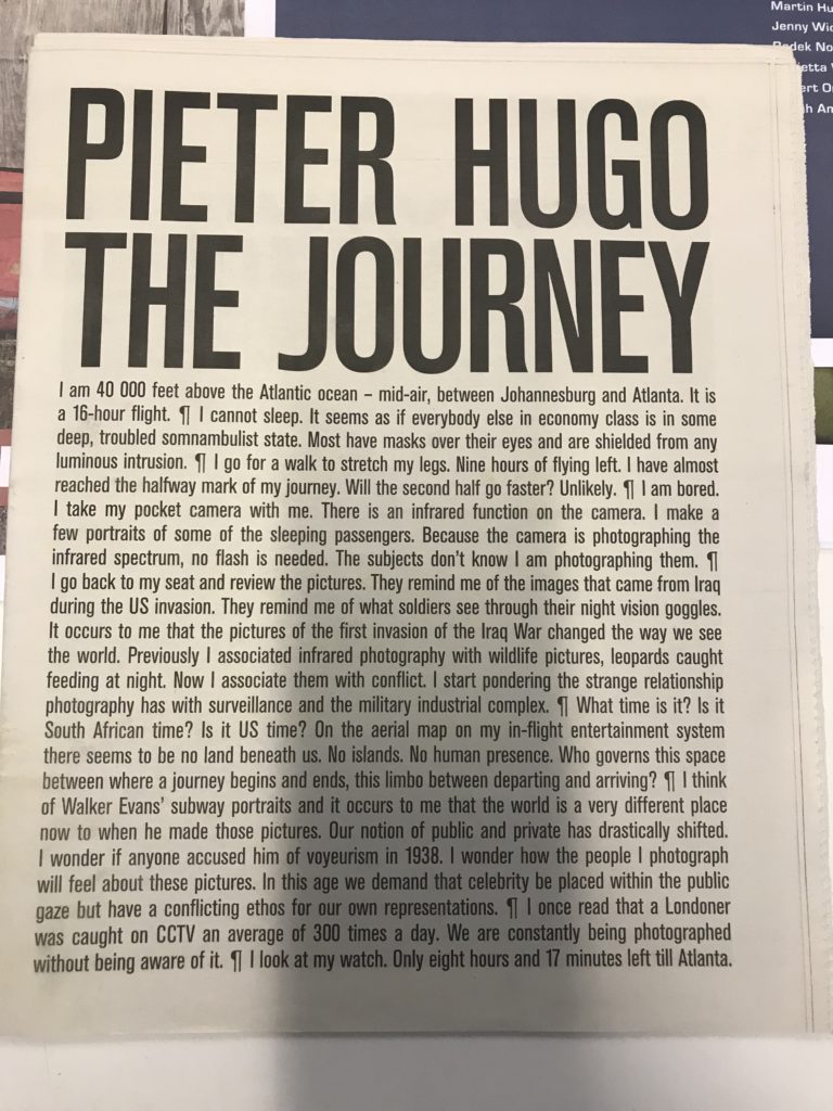
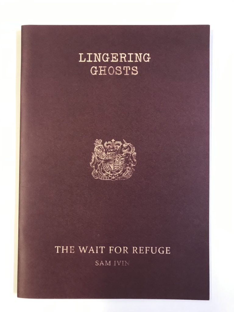
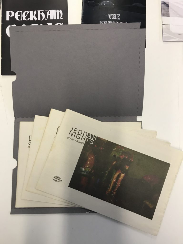
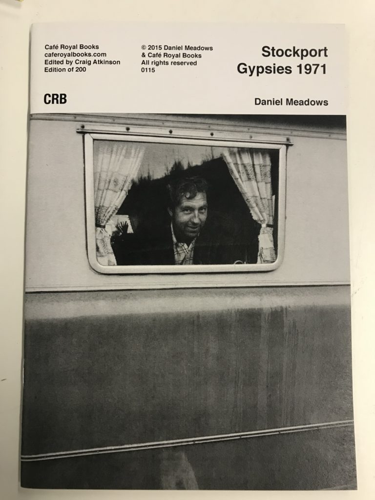
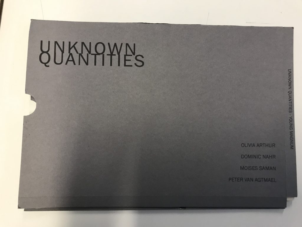
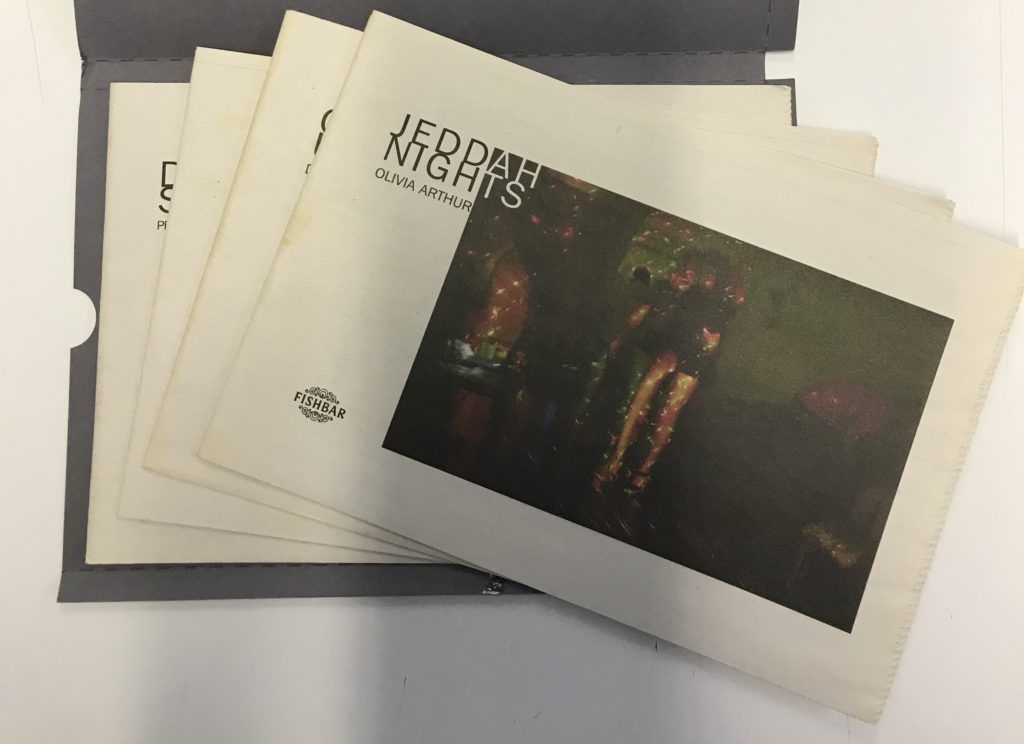

Unknown Quantities is a collection of zines from four different photographers, Olivia Arthur, Dominic Nahr, Moises Saman and Peter Van Agtmael. Each zine documents the time the photographer spent in a developing country. However, each focuses on very different political issue.
Arthur spent her time in Saudi Arabia, documenting the lives of women there and how they are mistreated. Nahr shows the uprising against former Egyptian president, Mubarak. Saman combines his own images with government images from the civil war in Libya. While Van Agtmael stays slightly closer to home, combining images from Iraq, Afghanistan and the USA.
The zine collection is presented in a small folder, similar to that used to file official government documents. This shows that the zine are focusing on important political issues. Is also gives a professional and serious feel that empathises the importance of the issues raised in within the folder.
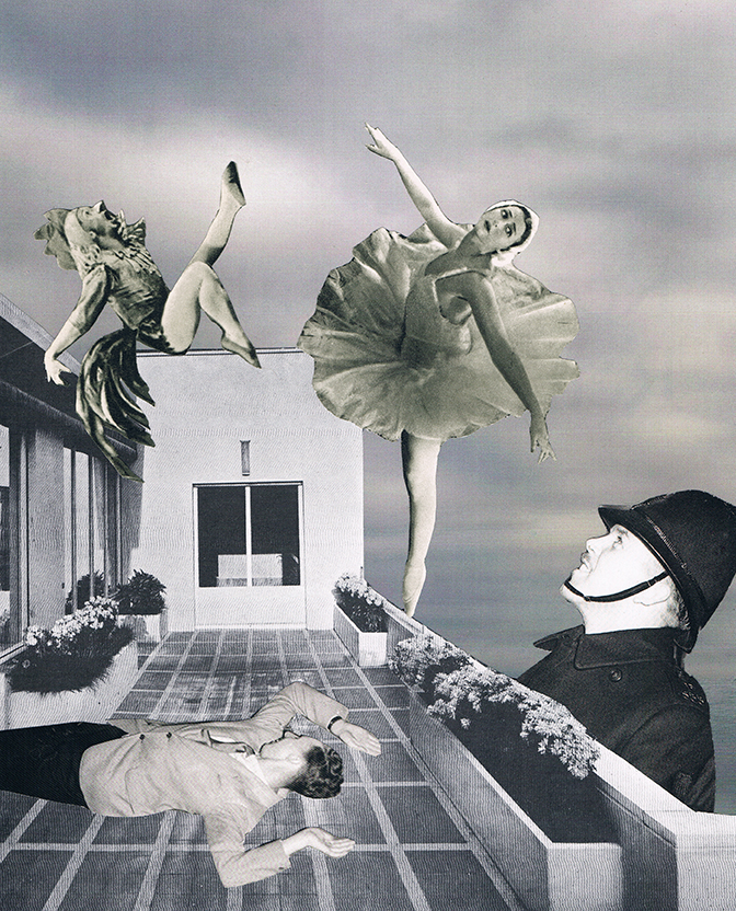
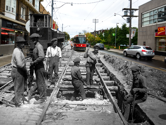
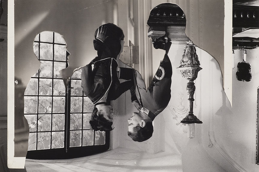
Before starting my experimentation on designing and creating a series of photo-montages using the images I collected from the archives, my own images from bunker trips, and images found online, I did some research into the process of creating photo-montages, and the history behind them. Although I already developed an overall understanding of photo-montage during my AS photography course, I did some more in depth research, and decided to take inspiration from a range of war-focused photo-montage works in order to relate my research to my current work.
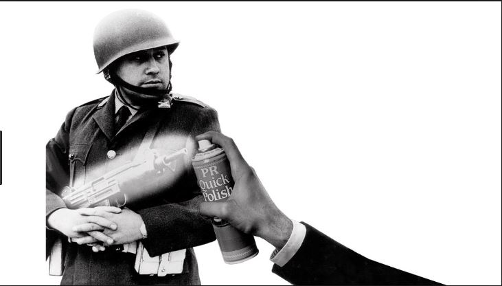
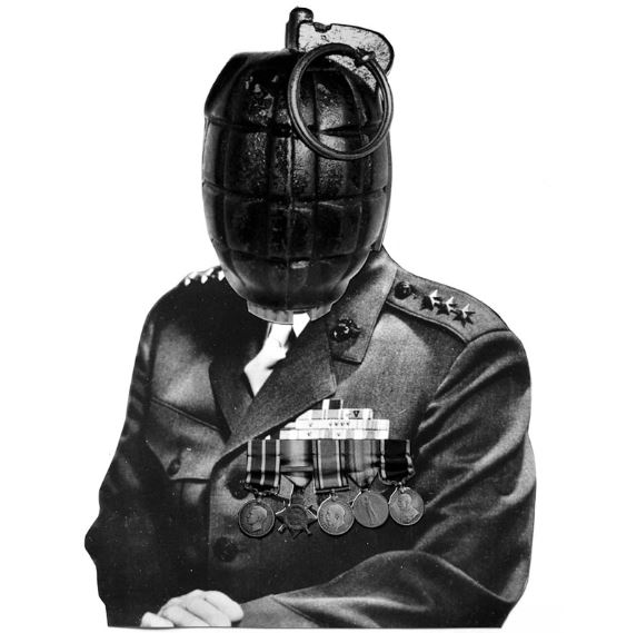
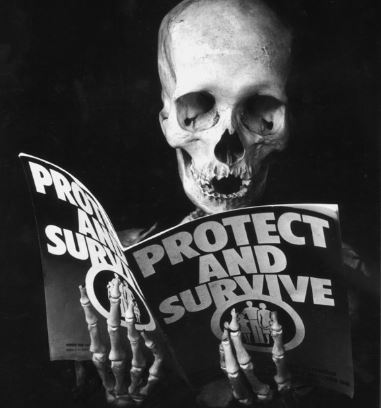
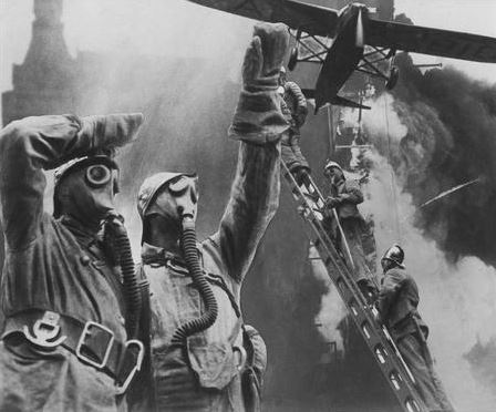
The above images are examples or war-related photo-montages created by various artists including Peter Keenan and Michael Dmitriev. I have taken inspiration from their work and will be developing experimental photo-montages around the same theme: war and its effects, in order to keep with my overall project of bunker archaeology.
A photomontage is a series of individual photographs, collectively of one subject, arranged together to create a single image. Sometimes a photomontage can move and include video. We are used to seeing single photos. Most photographs are created in a fraction of a second and do not convey a duration of time.
This information is from expertphotography.com


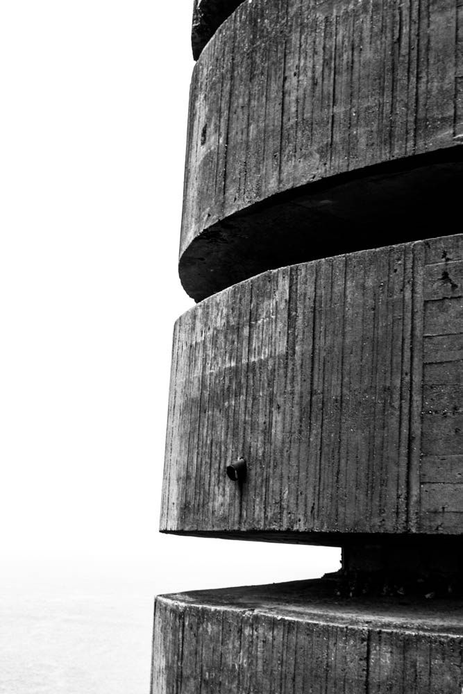
For my montage I combined using my own images, images from the jersey archives and images from the newspapers. My own image is of the bunker on the far right. On lightroom I manipulated my image by changing the light intensity, clarity, dehaze and contrast. I also converted the image to black and white to contribute to the aesthetics of the archive and newspaper images. To create this montage I printed out the images and used a stanley knife to cut out the parts of the images I wanted to use and then arranged and glued the images onto the newspaper.
Week 5, 6 & 7 : 3 – 17 July
Complete a 16 page zine
Deadline: Final zine needs to be printed on both sides and bound on WED 17 July.
Photo-zine: For the next 3 weeks we will be working towards producing a 16 page zine using InDesign and learn about narrative and sequencing.
All the zines will be assessed as part of your first coursework that is part of Personal Investigation unit.

Use PLANNING-TRACKING-PERSONAL INVESTIGATION-AUTUMN-TERM-2018 for a full overview of what you are required to do in the next 3 weeks.
You are required to self-monitor your progress and will be asked to upload Tracking-Sheet with an update on a weekly basis to your blog.
TASKS > produce a number of appropriate blog posts
Week 5: 1 – 7 July
Research and Narrative
Complete the following blog posts
RESEARCH > ANALYSIS
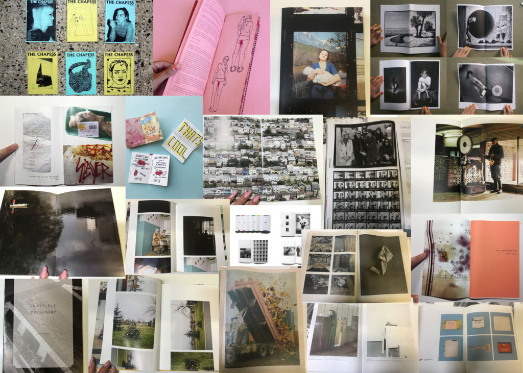
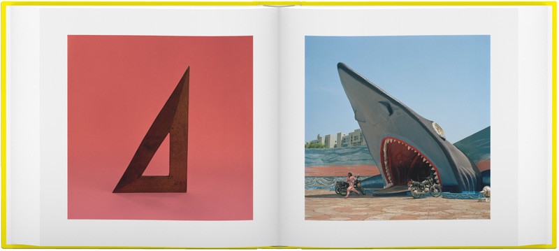
Research zines and newspaper design made by artists and photographer that will provide visual stimulus for your page designs. Produce a mood board and consider the following in your analysis:
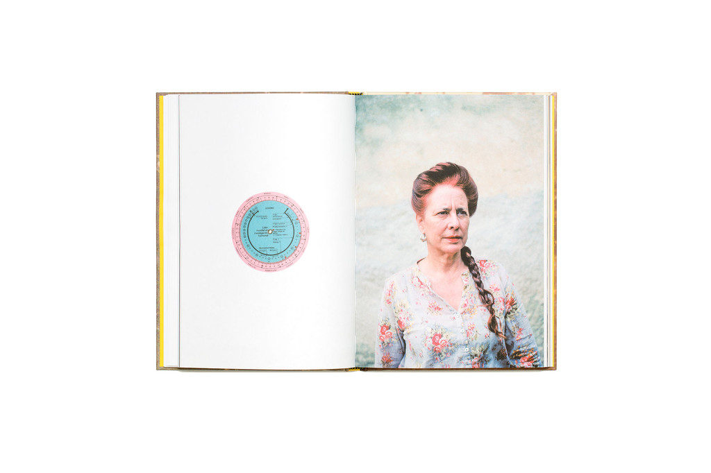
Café Royal Books is a small independent publisher of photography photobooks or zines, and sometimes drawing, solely run by Craig Atkinson and based in Southport, England. Café Royal Books produces small-run publications predominantly documenting social, historical and architectural change, often in Britain, using both new work and photographs from archives. It has been operating since 2005 and by mid 2014 had published about 200 books and zines and they are held in major public collections
https://www.caferoyalbooks.com/

Editions Bessard is a paris-based independent publishing house created by pierre bessard in 2011. Focusing on working with artists, writers and curators to realise intellectually challenging projects in book form.
https://www.editionsbessard.com/product-category/zine-collection/
Something to read:
EXTENSION > ARTISTS REFERENCES
Select at least one zine and analyse the photographer who made it, considering their work in more detail.
Follow these steps to success!
NARRATIVE > SEQUENCING
Write a specification and describe in detail what your ZINE will be about in terms of narrative, concept and design. Produce a mood-board of design ideas and consider the following:
Narrative: What is your story?
Describe in:
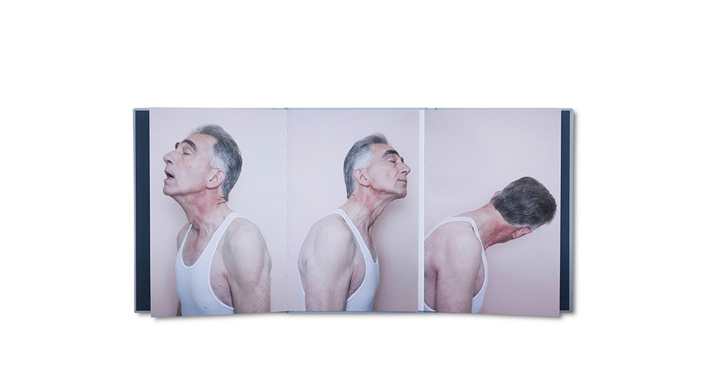
Sequencing: The order of your images
Week 6: 8 – 14 July
Design and Layout
Complete the following blog posts
DEVELOP > EXPERIMENT
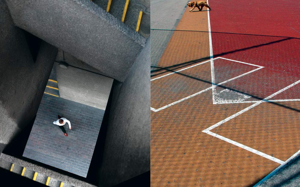
Design: How you want your zine to look and feel, in terms of :
Experimenting: Show variation of designs
Week 7: 15 – 17 July
Print and Present
Complete the following blog posts
EVALUATE > PRESENT
Presentation: Print, fold and bind final zine and hand in for assessment.
Evaluation:
Write an overall final evaluation (250-500 words) that explain in some detail how successfully you explored the Bunker Archaeology project. Considerthe following:
DEADLINE: Wed 17 July
PHOTO-ASSIGNMENT > SUMMER STUDY
You should return to your bunker area or choose other locations with remnants of German fortifications in the Jersey landscape. See our book in class: Jersey War Walks with details of suggested areas in each Parish of the island.
Link to map of bunkers in Jersey
You have to ask yourself:
Am I satisfied that I have enough images/ material?
What are you going to do differently on next shoot?
How are you going to develop your ideas?
Your photo-zine is a final outcome that will be assessed as part of your Personal Investigation (coursework) giving you marks based on skills, knowledge and understanding of photography as a tool for communication in narrative, sequence and design
FAMILY ARCHIVES > SUMMER STUDY
1. Explore your own family/ personal archives over and make a blog post with some of the material and describe how it will inform and develop your Personal Investigation. Ask parents, grand-parents and other family members to look through photo-albums, letters, boxes etc.
2. Plan at least one photo-shoot and make a set of images that respond to your research above and/ or Personal Investigation on the Occupation of Jersey.
Deadline: Bring your new set of images and any research material from exploring family archives into class on Wed 4 Sept.
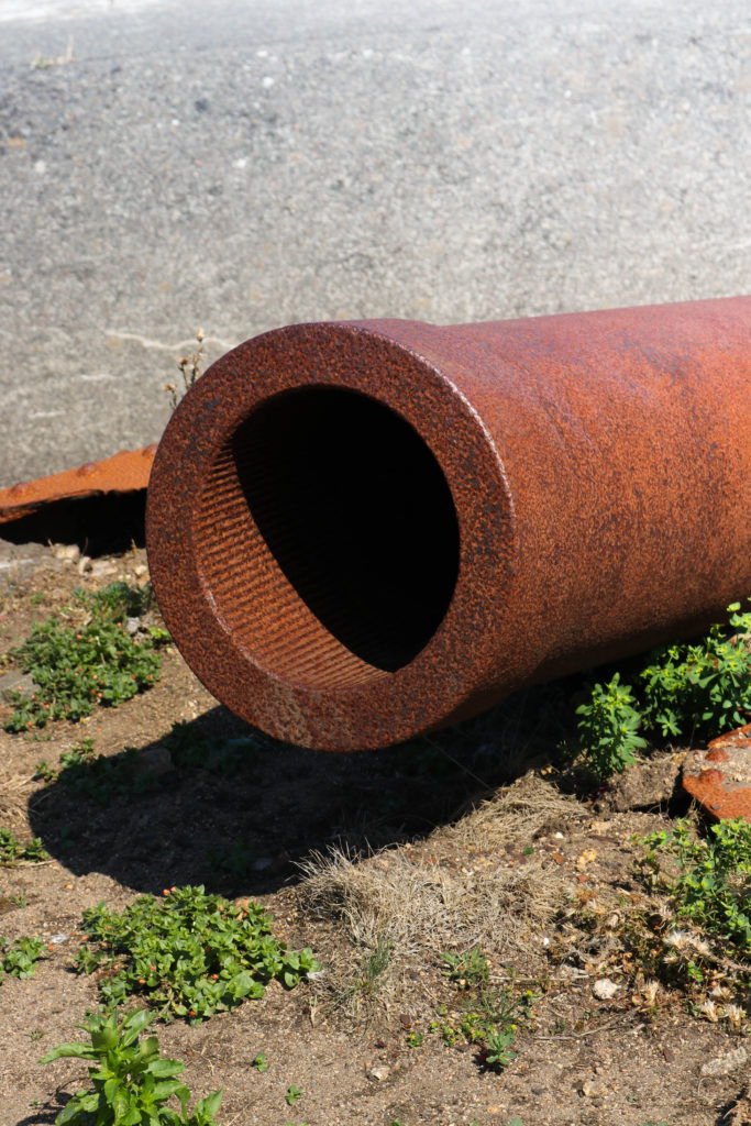
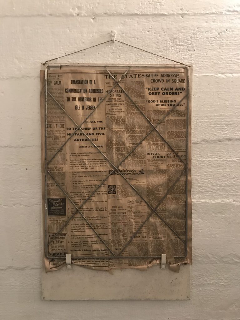
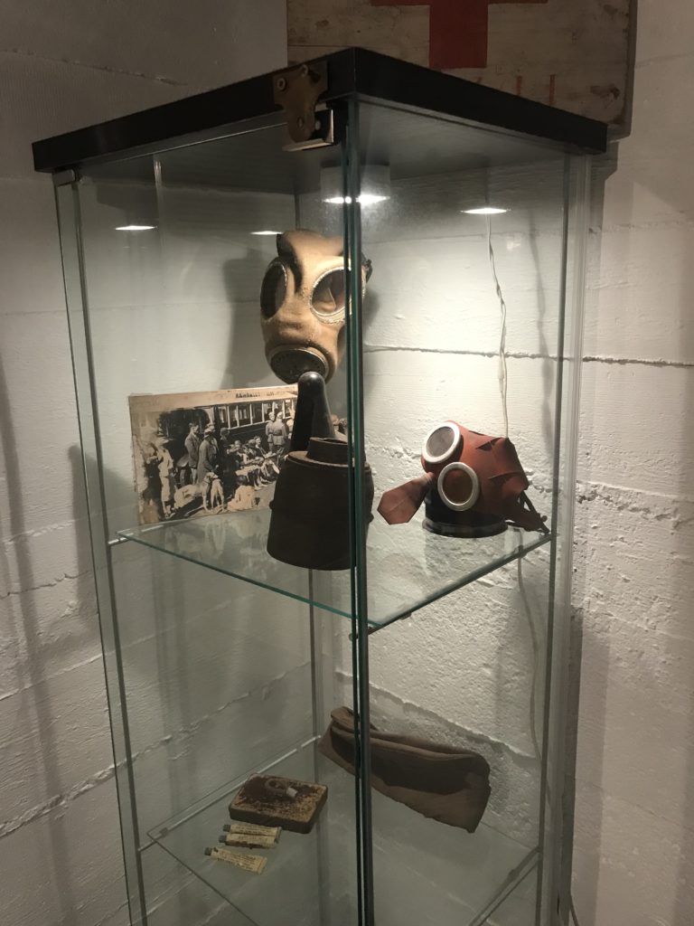
For this shoot, my primary aim was to take images of objects and scenery which I wasn’t able to on the field trip (First site visit) due to poor weather. My second aim for the shoot was also to take higher quality images with better lighting as the lighting inside the bunker was quite dim.
