Case study: Aleksander Rodchenko

Portrait of Aleksander Rodchenko

Rodchenko was a Russian artist, sculptor, photographer and graphic designer. He was one of the founders of constructivism in Russian design. Before turning to montages and photography we was more focused on painting and graphic design. His work is describes as being socially engaging since he recognised the importance of analytic documentary series.

” Don’t try to capture a man in one synthetic portrait, but rather in lots of snapshots taken at different times and in different circumstances ” – Rodchenko

He often shot his viewers from strange angles, such as high and above and down below in order for it to take longer for an audience to recognise someone.

“One has to take several different shots of a subject, from different points of view and in different situations, as if one examined it in the round rather than looked through the same key-hole again and again.” -Rodchenko

He became an artist after having had no exposure to the art world, and instead being inspire by art magazines. He began studying at the Kazan art school in in 1901.

Under the Bolshevik communist government, Rodchenko became director of the museum bureau and purchasing fund, which made him responsible for the reorganisation of art schools and museums.

Rodchenko became interested in montages after become impressed by the montages of German artists experimenting with dadaism.

Mood Board

Aleksander Rodchenko montage mood board
Images are not my own.

From the mood board on the right we can clearly see how Rodchenko was inspired by Cubism and futurism since his montages seem to almost look like they’re ahead of him time.

Most of the montages seem to depict images of conflict and war which could reflect the period he lived in since he lived under communist rule which may have made him feel threatened by other countries since capitalist places hated communist countries.

We can also see how he feels that these conflicts and wars will effect people, since he has incorporated them into many of his montages. This shows that many of his montages relate to society at the time which is interesting as the images have a rich historically social context.

Analysing an image

Context: This mintage is called “Krisis” and was made in 1923
Technical: Since this montage was made in the early 20s it couldn’t have been created using a computer software program. This means that this montage was most likely made by just cutting and sticking images down onto paper.
Visual: In this montage we can see what appears to be destructed houses and building at the bottom of the page and some planes flying in the sky that appear to be dropping people out of them into the chaos below.
conceptual: I think this montage may be a metaphor for what the artist believes human life was worth at the time. Having planes appearing to throw people in to conflict shows that the artist may think that human life was viewed as having no worth during war, and that they were seen as dispensable.

Zine Analysis – Sam Ivin

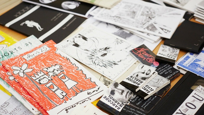
I have looked at a lot of different zines. Different artists create them in new unique ways. This means that lots of them have different sizes such as being A5 or A4 pages, they come in different formats such as being in a newspaper or in a hard-back book, and they may be made portrait or landscape, depending on the artists preference. The zine I have spent a longer time looking at is “Lingering Ghosts” by Sam Ivin. This zine has A5 pages. It is formatted as a passport-looking booklet.

Each were designed and laid out differently. The design was quite often based upon what the photos inside were about. The layout of the images inside is also down to the preference of the artist. Some artists decide to have a coloured border around each image, some span a whole page and some span both pages inside. The zine “Lingering Ghosts” was laid out with the images on the right hand page with a small amount of text written on the bottom of the left hand page.

Sam Ivins zine shows rhythm and sequencing in his zine. He creates rhythm through the use of a pattern in how his zine is made, keeping the photos on one side of each double page spread and the quote on the bottom of the left page. His zine also tells the story of Asylum Seekers looking for work and an identity in the new place they are in to feel welcomed. Though, it tells this well, his images are not really in any particular order to tell this which means it isn’t really sequenced to show the story.

The cover of different books varies heavily. Lots of zines have covers that are landscape images that go across the back and front of the zine. Some take the theme of the photos inside further by relating the cover and the other space to something to do with the photos. This is done in Sam Ivins also. In this zine the outside covers and text are in the same font and colours as that of a passport. This is done to relate the asylum seekers who are unable to get passports, and therefore an identity, which is why the faces are removed on the images inside.

Lots of zines tend to have different visual and narrative concepts. The zine I looked at by Sam Ivins, showed people without a face. The face is the most recognizable part of a person, and through the removal of it he has shown the people which are asylum seekers to not really have an identity outside of their own country.

The title and colour scheme are very important as it is pretty much what decides whether people will decide to browse the work of the artist. In Sam Ivins zine he uses a dark-red colour scheme with a more light brown text colour for the title, this made the zine come out with a passport look. It has an interesting title that can catch peoples interests, and can make people think of different things as the title is quite vague.

The images and text in Sam Ivins zine are all related to the theme of Asylum Seekers. The images are all really similar and show peoples self-portraits, with parts of their faces removed to symbolise them having no identity. These images are used with quotes such as “I can’t work. They won’t allow me to work.” and “He will feel like a stranger until he gets the papers.” These quotes are supposed to make the reader feel bad for these people who have been almost forced to leave their previous homes to a new country, where everything is against them.

Zine Narrative

3 words

Nature with War

A sentence

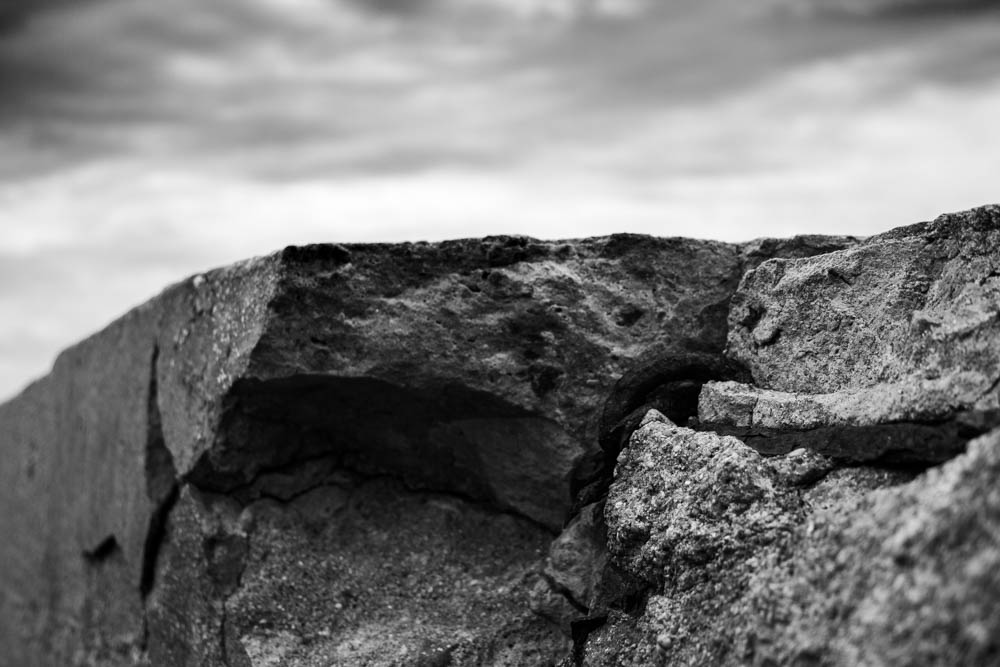
I want to highlight the idea in how such man-made structures manage to blend in with the delicate nature of Jersey.

A paragraph

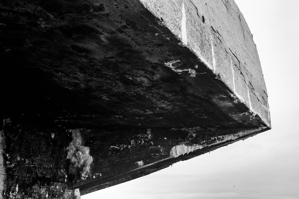
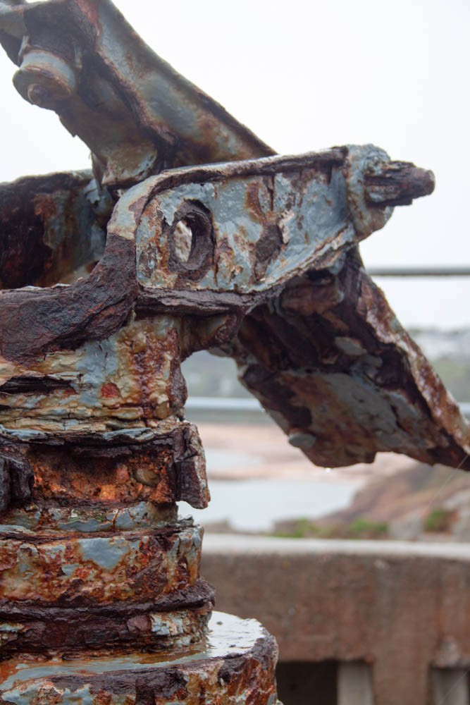
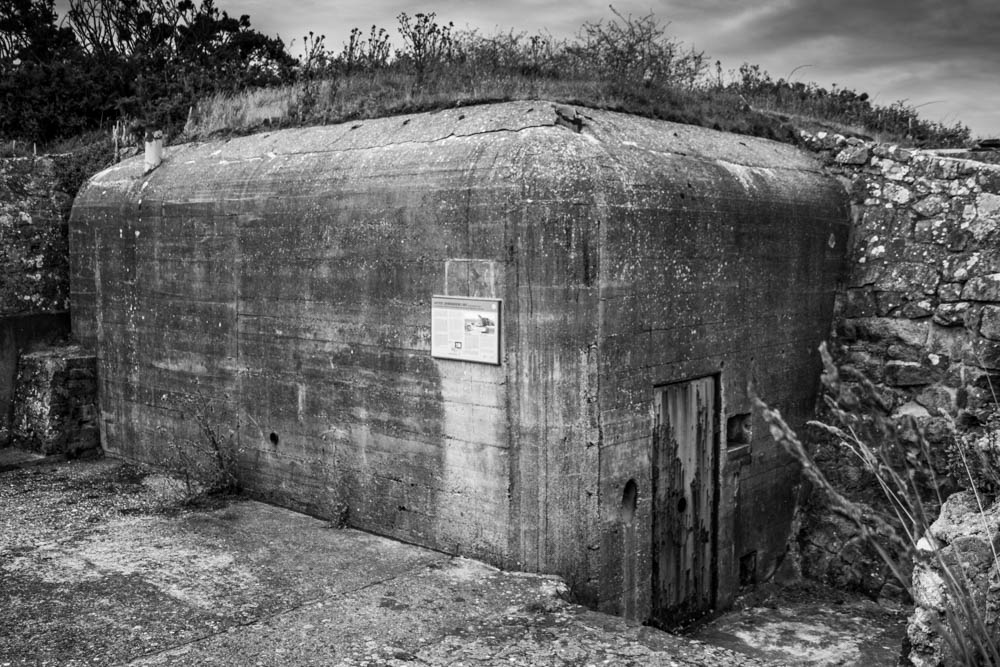
When on the trip to Noirmont point the bunkers were what caught my eye immediately, they are big, dull and square the complete opposite to the nature of the headland, but yet they seemed to compliment each other well. This links to the idea of overtime people get used to one another and get along to me it symbolizes the end of the war and how eventually the Nazi’s were defeated and everyone at the time just got back on with their lives. They had to rebuild their homes, like nature, they had to deal with what they had left over from the war and carry on as if it was the same before the war. I want to capture in my zine, how nature had to grow around the Nazi fortification, which is similar to how the soldiers had to live on with their horrific war memories because they can never get rid of them. The majority of German fortification are on Jersey’s coastline which have some of the islands most scenic views, the fort and bunkers add a sense of historical background to these landscapes.

Narrative and Sequencing

3 Words:

Aftermath Of War.

Sentence:

The impact of the 2nd World War and the occupation the island of Jersey.

Paragraph:

How was jersey impacted by the occupation in 1940 as well as the lasting effects of the Germans occupying the island. I Want my ‘zine to show the aftermath of the events that took place between 1940-45 using both contrasting images and as well as similar images to show the different effects of the occupation.

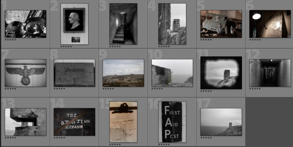
Order of Image Selection (image No. 17 to be used as a wrap-around cover)

I wanted to start off by showing a more human and personal side to the occupation, hence why I started off with both the old rusted helmets and sculpture of a soldier, as it shows the decay from what once was a pristine shiny helmet, into a rusted lump of metal. I also like that the image has a photo of a family underneath the sculpture, which only adds to creation of the soldier character that my zine follows.

Next I wanted to show some of the sights that a soldier would see, such as the stairs in a bunker as well as using a photo with multiple layers, having a prominent background and a shallow focus in order to create a realistic view of what a person would actually see.

My next 2 pages use light to connect them together(Note: images 5 & 6 have to be swapped around to create desired effect) as well as being fairly close up and focusing on smaller subjects in comparison to the previous images. I found that both of these images have light coming from fairly similar angles, which can be linked together by putting image 6 on the left page, and image 5 on the right, making it seem as if they are being lit from the same source.

The next 2 images carry on the theme of the smaller items that a German soldier would pass by when navigating the bunkers. I also decided to put these images together as they both feature symbols of the German occupation, with one quite clearly a symbol of the Nazis, and the other a German word for scriptorium; which is a room set apart for writing and where manuscripts were copied. I like this contrast from something so extreme to something so simple and calm.

My next 2 images are linked through colour, showing the open greenery of the island, which is then contrasted by the harsh concrete of the bunkers, but still keeping a part of jerseys beauty in the form of a single plant sprouting from the base.

This is followed by 2 images that focus on the idea of tunnel vision with one using multiple exposures to show how disorientating it must be to be under attack, or even just the though of a possible attack happening. I intended for the other image to seem like a machine gun placement aiming at the lookout tower, to add to the theme of paranoia and disorientation.

After these pictures, I wanted to show the exterior and then interior to the lookout post and i specifically took the picture of the tower through another bunker in order to highlight the floor that the writing was found on. The images are also linked as they both feature themes of building and destruction, with one being a repair of the interior, and the other having significant damage around the bunker.

My final set of images show what could have happened to the soldier that we have been following the whole time, and how he could have been wounded and sent to a first aid post, put on a list of patients, or even a list of those who died. For the front and rear covers i will be using the last image to wrap around the front and back of the zine, with the tower on the front cover and most likely a title next to it on the left, and then have the back of the zine be taken up by the ocean of in the photo.

Zine Making Research

What is a Zine?

The definition of a zine/zeen is short for a magazine and is self-published work in a small-circulation which is usually published vie photocopier. Zines can be a product of a single person or a small group which are photocopied into physical prints. The concept of zines came from the amateur press movement of the late 19th century, which crossed over with subculture of science fiction in the 1930s. This was known as a popular graphic-style which associated with zines which was an artistic influence.

Sky-Alling Phillips

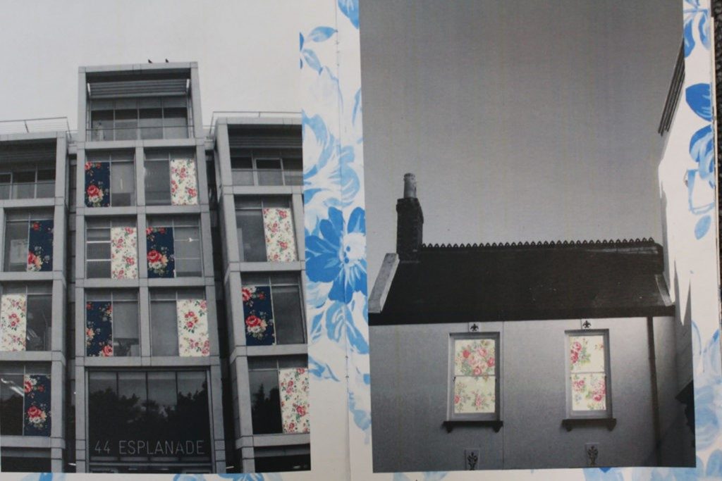
From looking into Phillips’s work, i discovered that she was a very colorful artist who used photo manipulation in order to add a different concept to an image. She is known for her war images which have been edited to include brighter prints to bring more colour into an image as the old world war images were black and white which is adding character. This method is used very effectively as its helping hinder people to look at older images from the war, due to the new twist on the images to make them modern. Therefore, her method is helping to educate.

This photographer/ photo manipulator is not on the internet, however i can get a feel to the type of editor she was by looking into her images from a book.

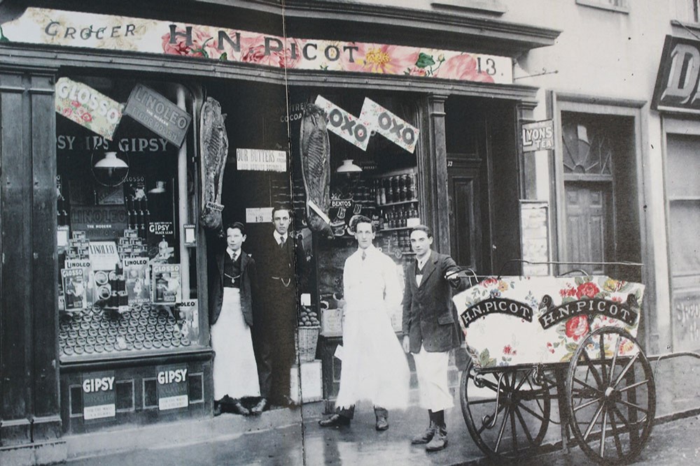
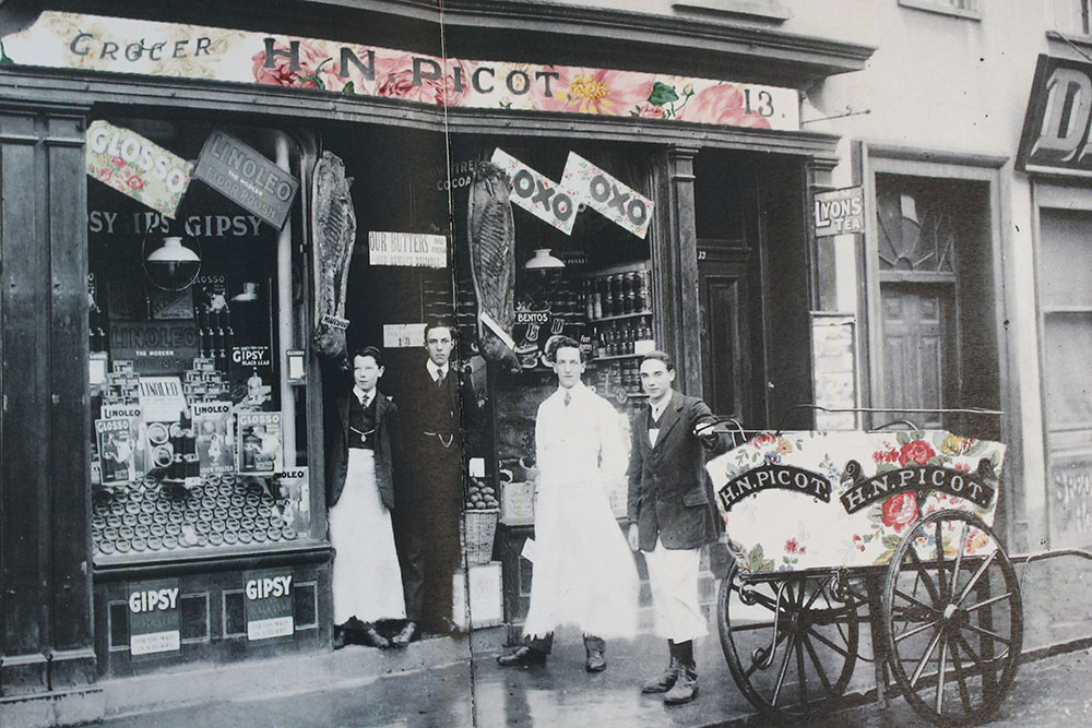
There was a certain topic of hers which intrigued me which was simply called ‘Paper’. During this project she mainly worked with older images from the world war stage. This project included editing flower prints onto images from cut out windows, people etc. The use of the world war images was helping to educate people as they wanted to look at these now modernly modified images.

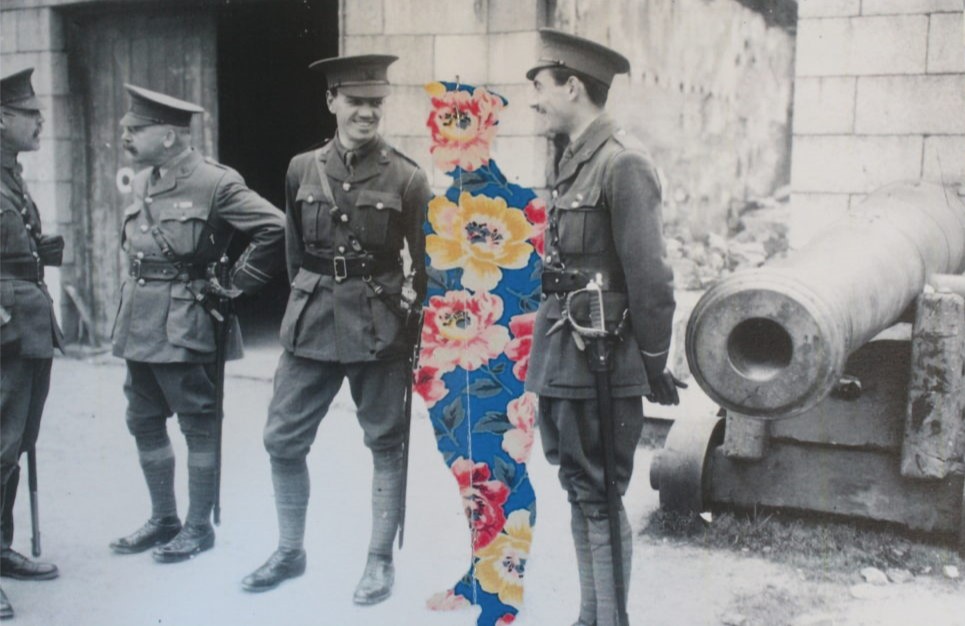
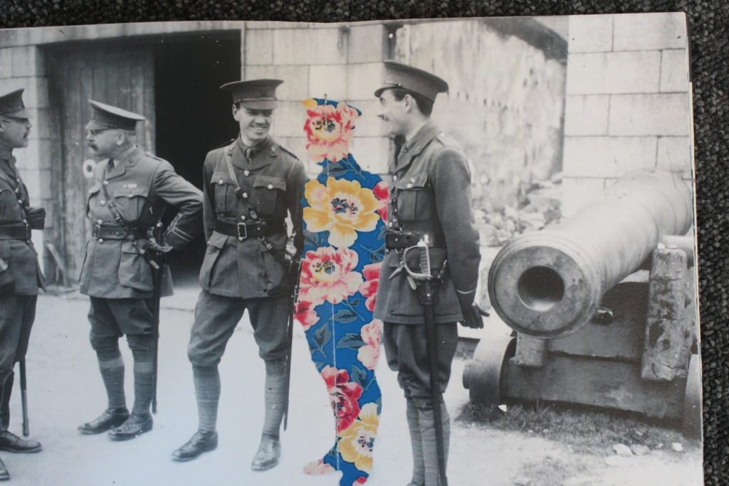
Example of her work..

Photo analysis

This image was displayed in a zine which was an A4 size and the particular image was landscape just like the whole book. The orientation of this image was originally from WWII , meaning Phillips did not take the original image. However, as seen she has edited a flower print after cutting out a soldier in the image. This is suggesting that even tho these soldiers are in a horrible situation as they are having to kill people to defend their country, they still have a colorful heart and are pure. The flowers are representing growth and the colors are representing happiness and childishness. Although we don’t know why they could be happy, the growth aspect is representing that although they are fighting for their lives they are living and growing, as well as growing from this horrid situation they are in. The colors could represent childishness as some people faked their age in order to get into the war.

Technical analysis- This image would have been taken in natural lighting as it has been taken outside which we can tell from the background. This also would have been originally taken with an old camera due to the black and white effect, meaning that there wouldn’t have been many camera setting to experiment with. However, it looks as if a fast shutter speed have been used due to the fully focused image.

Visual analysis- This is a landscape image which as we can see if a black and white original image with a flower print edit as a solider. This edit is directly in the center of the image making it stand out even more.

Zine producing-Sky Ayling Phillip’s Work

The first thing i wanted to do before i created my zine was to research an artist that caught my eye with their work, so i wondered about my photography class looking at the zine previews that are found there and the artist Sky Ayling Phillip caught my eye with one of her work which was a zine called “Paper”

Now unfortunately i tried to find Sky on the internet in order to research them but i didn’t find them

What i liked about Sky’s work is how they used a flower wall paper-like background in each of her photographs and cropped out some objects like window, doors, etc. in order to show the wall paper in the background only behind some parts in the zine

This is one of her work found in her zine called Paper, this piece of art as you can see contains a missing person that Sky cut out of the image to make the background wall paper visible, which adds a lot of color and meaning to the photograph and the mixture of the black and white background in addition to the colored flower wallpaper really exposes and makes the wall paper piece stand out and catch is the eye of the viewer.

Other pieces of her work:

i took some photographs of her zine “Paper” using a camera with manual focus and chose the best two photographs

Conclusion

In conclusion, Sky’s work inspired me with a lot of ideas for my zine and i just wanted to give her credit by writing this blog post about her work.

Occupation Family history

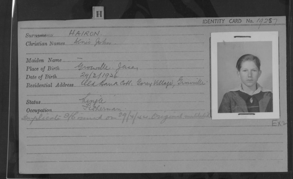
The history of my family is massively based around the occupation, there were six people from my direct family that were alive during the occupation, this was my grandmother and great grandmother and her husband, and my grand father and great grandfather and his wife. There is a plethora of stories about things about my grandfather during the occupation a she lived very actively and hated the Germans ans wasn’t afraid to act upon that hatred.

This is my grandfathers registration card (Denis John Hairon)

The first was when he was about 15 him and his friends got wind of a Pig that a group of high ranking Jersey officials and a few of the high up Nazis within the island were fattening up to have a feast, once they had confirmed this they all (about 8 of them) all marched up to Queens valley woods where the pig was being kept. Going up there a few of them including my grandfather had their rifles with them, this is significant as if the Germans had seen them with their guns they would have been shot on sight, but they took them with them anyways as they thought the Germans might have tried to kill them to get the cow as they were just as hungry. Once they had the pig they took it back to Gory and it butchered then shared out the meat between as many people as they could.

Another story from my Grandfathers time in the occupation was that he was a fisherman the whole time with his dad, he used to row the boat out into Gory bay. He had been doing it for years before the occupation but because of the rationing and the hard conditions within the final year of the occupation he had to stop as he didn’t have the energy to do it any more.

The final main story is the one about the relationship between my grandparents as they had both known each other for years before as her mother was the fishmonger that my granddad and his dad brought their catch to. During the occupation they started seeing each other and their relationship became official on liberation day at the end Albert pier when they could see the american warship coming in to liberate them.

Batterie Lothringen

The Channel islands were the most heavily fortified part of the ‘Atlantic wall’ (a line of massive defence works that ran from the baltics to spain). The channel islands were the only part of the British isles that German troops would set foot on, Hitler poured resources into defending the islands from British forces trying to re-capture them; the amount of resources and funds that he put in the islands far outweighed the genuine strategic value of them.

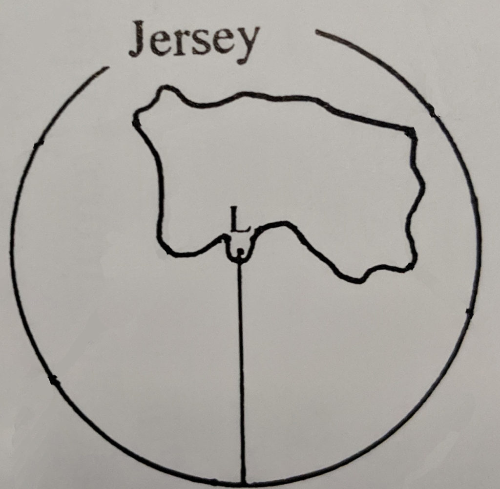
Batterie Lothringen was made so that it could cover the whole island at close range, it was made to mainly protect the south of the island it has an effective range of 14,000m and had 47 permanent implacements from artillery to flamethrowers.

This diagram shows the effective range and protection of the fortification and the main direction of fire.