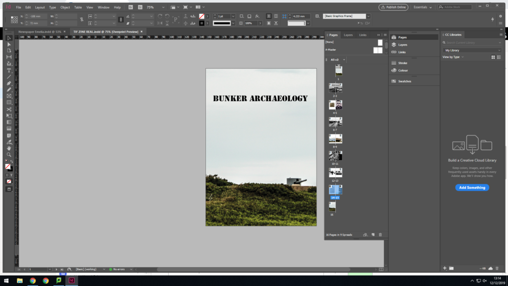
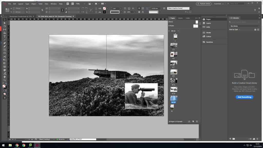
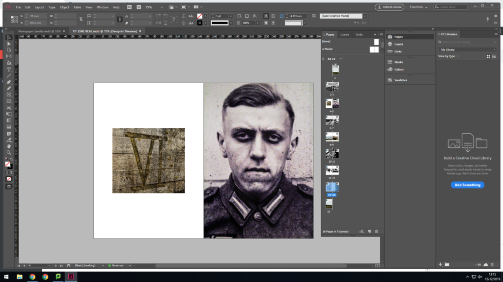
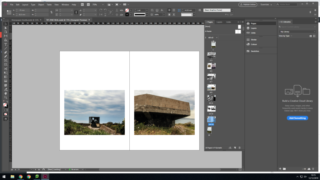
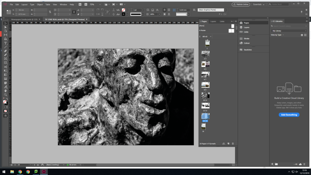
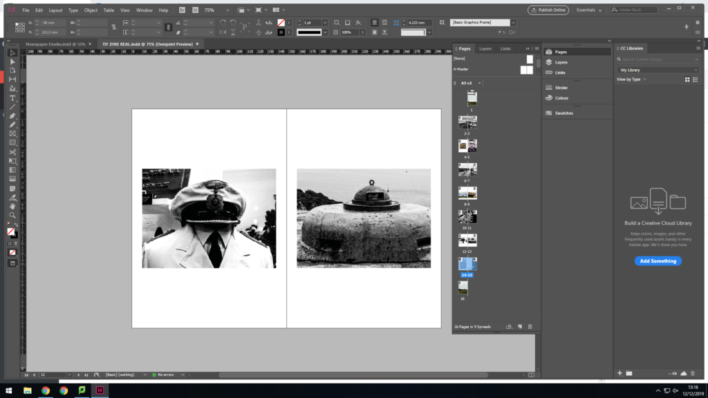
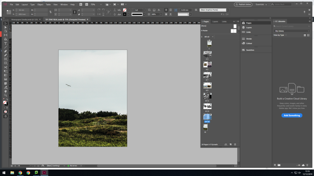
This is the overall layout of my zine. For my title I decided to use a very military style font to display how the zine is about WW2. I also decided to make the front cover a double page spread, the front cover a has the gun turret and the back has the seagull in the sky.
The first pages are also a double page spread with a black and white image with the bunker then an archival image or a soldier looking through a telescope. I decided to put these together as the bunker gun and the telescope look very similar.
 I then placed a picture of roman numerals that were on a bunkers wall alongside an image I took of a picture of a soldier that was in a bunker. I put these together because I like how simplistic but bold the numerals are and the defiant look on the soldiers face.
I then did a double page spreak of a black and white image of a bunker. I wanted to include this image as it looks like the path is leading the audience to take the journey to explore the bunkers which is reflected in the next pages that features images of the canons and bunkers.
I featured a black and white image of a sculpture of a man which was a memorial at La Hogue Bie dedicated to the fallen soldiers of the war. I made this black and white to emphasize the textures of the sculpture and give more depth to the image.
The next pages feature a hat and the top of a bunker. I placed these images together as I feel like they imitate eachother. It creates humor in the book as they are almost making fun of eachother.