Narrative and Sequencing:
For my narrative and sequencing I found it quite difficult to establish the idea of having a narrative with the photographs that I produced. Eventually I decided that I would use the photographs that were specifically centred around Noirmont and use this as a narrative of the place itself, taking on what would be suggested as a walking journey of the enviroment. For the sequencing I have used the idea of keeping similar layouts to gernatre a rhythem and flow and use this for a sequence.
Design and Layout:
For my main designs and layout I waned to keep a lot of rhythm within the book and it not be choppy with the way I was laying out my pages. For this reason I decided to keep the rhythm of having a frame photograph then a double page full bleed and so on. I have repeated two of my framed layouts for the rhythm and flow of the zine and chose one to be different to create a break towards the end of the photograph. I also made the decision to have a full bleed double page image spread on the front and back covers as this is something I have enjoyed seeing while looking at other zines.
Image Choices Example:
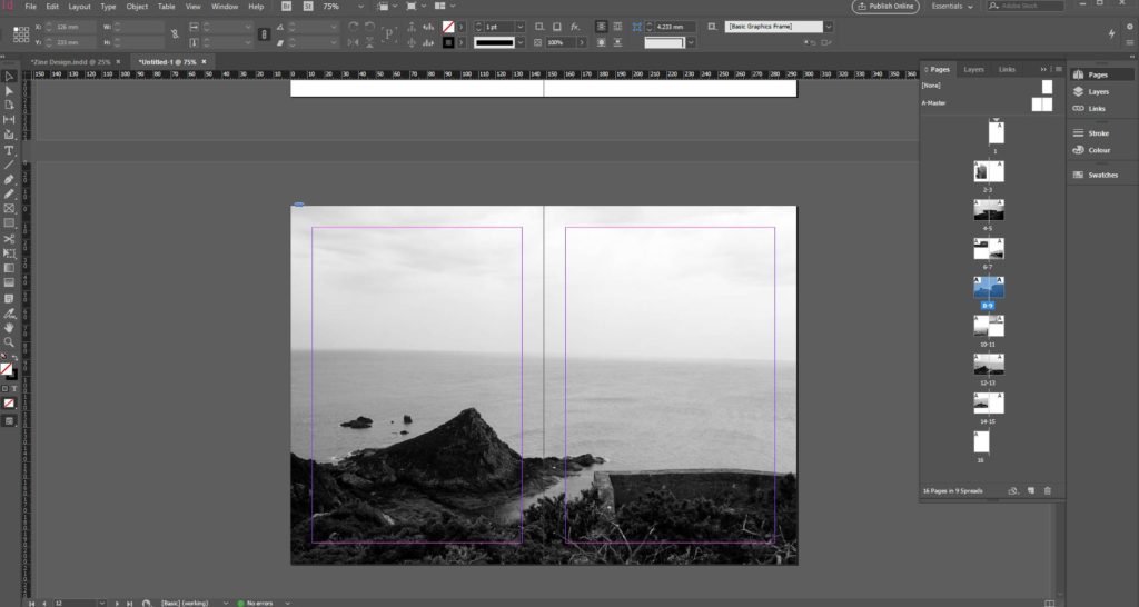
Image option 1 
Image option 2
While deciding and choosing my images to use for the zine I was looking and thinking about how the composition would work and how it was going to look especially if it was a full bleed double page spread. Using the example above it shows two different photographs of the same place that I wanted to incorporate into my zine as a view looking out from the sight. The first image has a slightly wonky horizon line compared to the image on the right, for this reason I chose to use the image on the right in my final zine. This is the process I went through when choosing which specific images I wanted to use in my zine.
Use of Text:
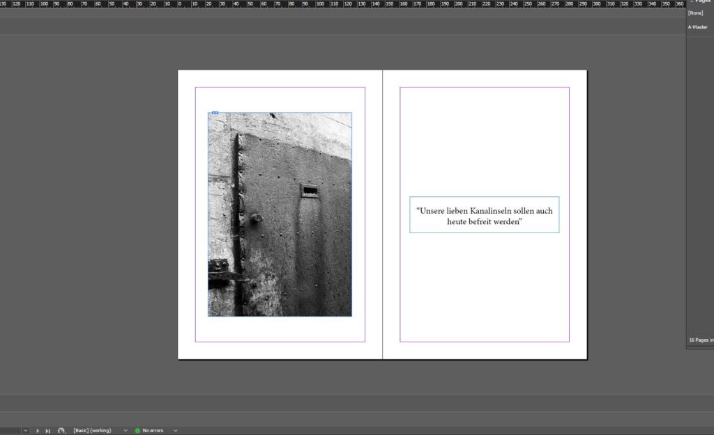
Image and Text 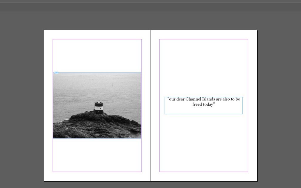
Image and Text
In my zine after looking at some other zines I wanted to incorporate the use of images and text together. For this I decided to start and end on the same layout with text and a photograph placed next to each other. For the words I used, on the first double page I used a phrase taken from the Liberation speech given when the channel islands were liberated, the first page shows the sentence in German and then on the last page is written in English. This was a decision I made to have the separated and to have the reader find out the meaning at the end of the zine.
Colour / Black and White:
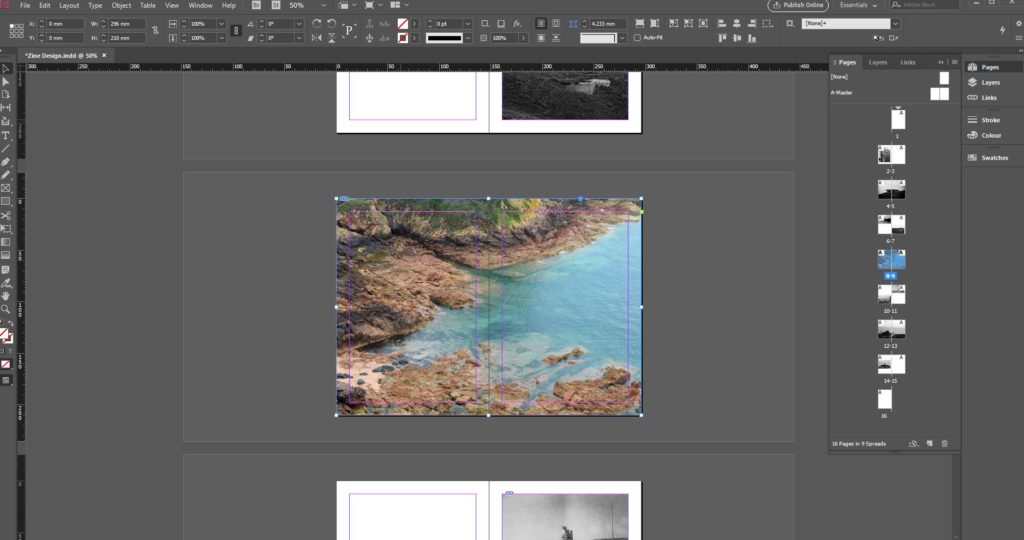
Colour 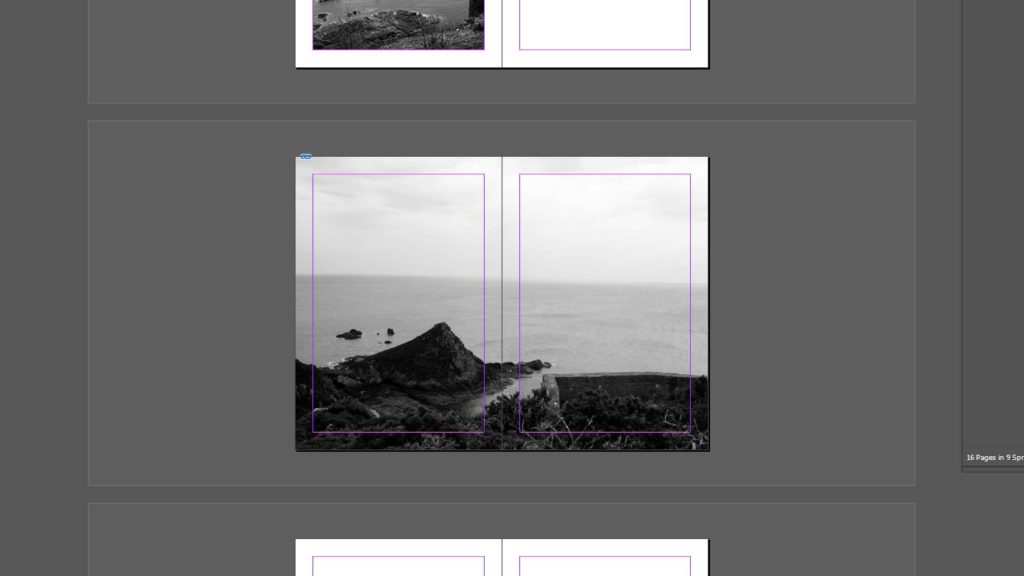
Black and White
Originally in my working I had my middle page as a full bleed photograph and the only one in colour. I did this originally to create a break in the design and add something different compared to all my other images. However I then made the decision to keep the middle page in black and white along with all of my other photographs as I feel it had more of a flow and kept with the ideas of all of the photographs being still and having this silent feel to them.
Archival and Own Photography:

Archival 
Own Photographs
When designing my zine I decided that I wanted to incorporate one archival image, originally I had my archival photograph next to one of my own photographs showing the same structure to create a difference and compare them. However towards the end of the development I decided that I would take the archival image to the last page and put it with the translated text as I feel having it at the end was more effective and allowed a break in the middle of the zine where the photograph previously was placed.
