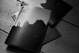
Bunker zine-War With Nature

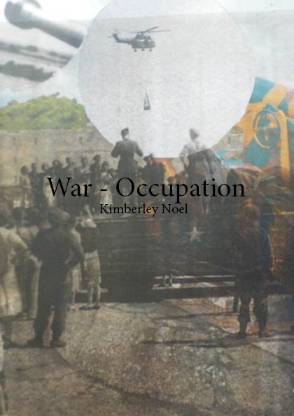
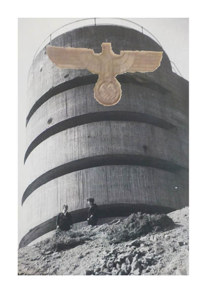
I named my zine ‘war with nature’ because I wanted to capture the relationship between the islands scenery and the man-made bunker. the key concept was to photograph how nature as grown around the fortifications similarly to how after the occupation everyone had to rebuild themselves with what had been left behind my the German’s. The harmony in which bunkers and natures now live in symbolizes the end of the war and how Jersey is now peaceful place, war free. The fact that the bunkers are permanent to the island, mirrors how the soldiers after WWII had to live with permanent PTSD and trauma from the war fields. The majority of German fortification are on Jersey’s coastline which have some of the islands most scenic views, the fort and bunkers add a sense of historical background to these landscapes.
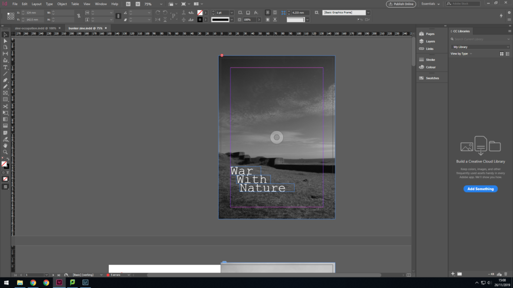
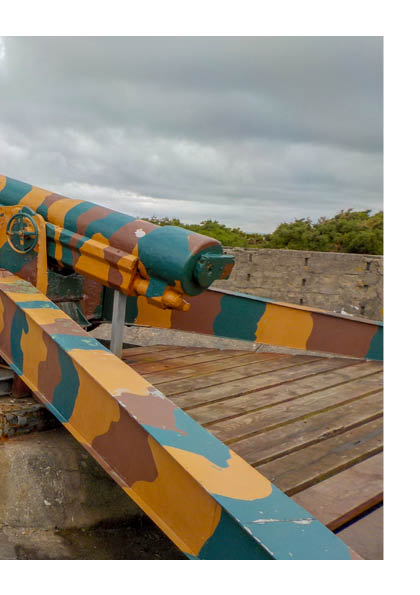
I went for a minimalist font, which looks like a typewriting, providing war connotations. This image is of the sea wall on the north of St Ouen’s coastline. The wall is structured like stairs it moves in height with the uneven land, my title is mimicking this shape.
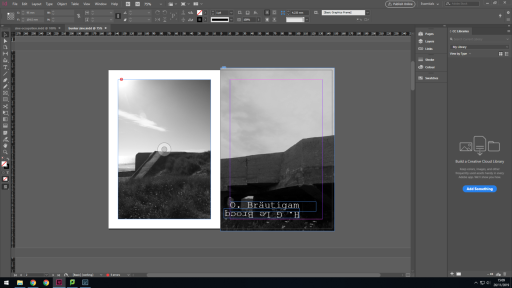
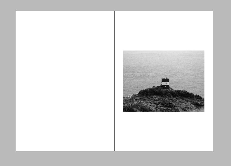
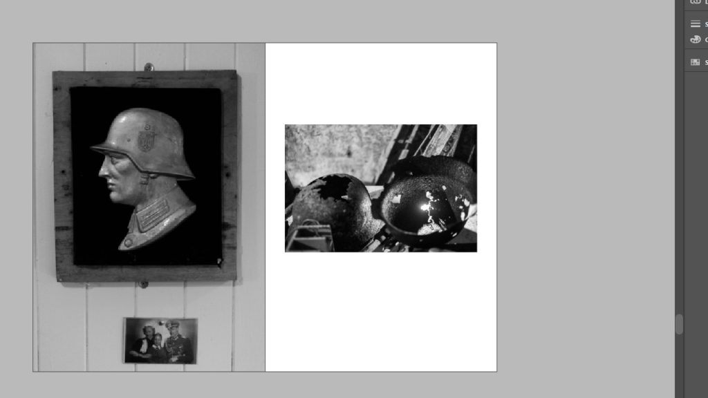
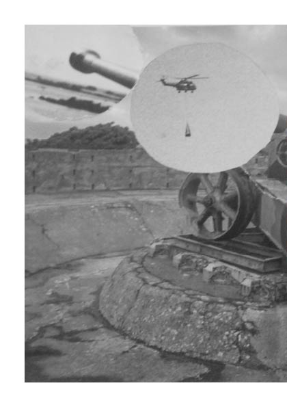
Next I used another image from the sea wall fortification at St Ouens bay like the font cover image. I put a border around it to seperate the two images, to signify the spread of bunkers across the island. The second image of a bunker at Noirmont Point part of Battery Lothringen. I wanted to start the book simple and set the scene and theme with images of bunkers in and amoung nature. The typography is of a German soldier and Jersey soldier, I chose this font as it creates a typewriter effect. I placed them parallel to each other to express that even though they were enemies they were still both human.
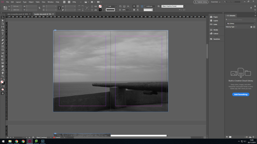
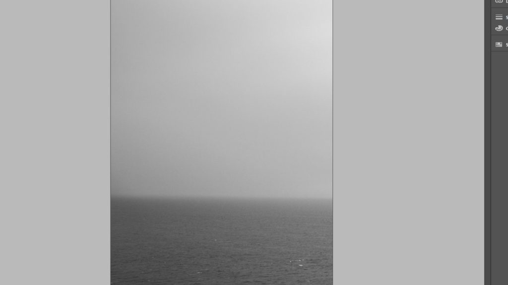
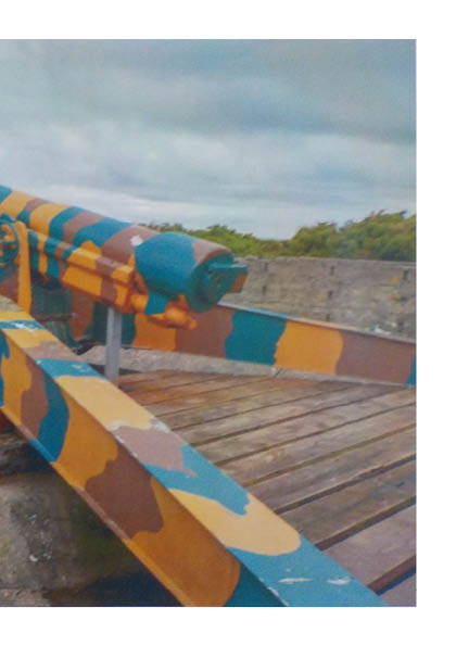
I then moved onto a double page spread which was of the weaponary on Battery Lothringen. This time nature is represented by the sea, which is a large part of Jersey because of it’s size. We also forget how significant the sea was during the war for transporting things like Red Cross parcels.
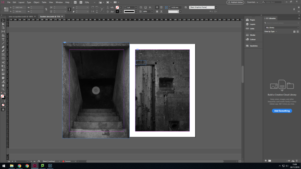
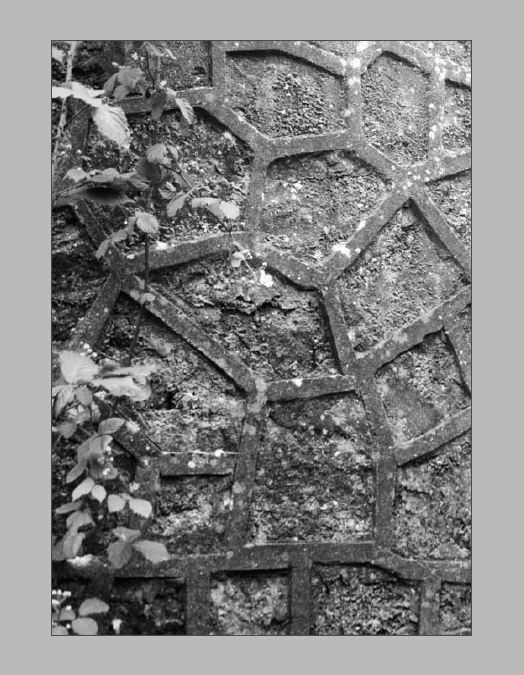
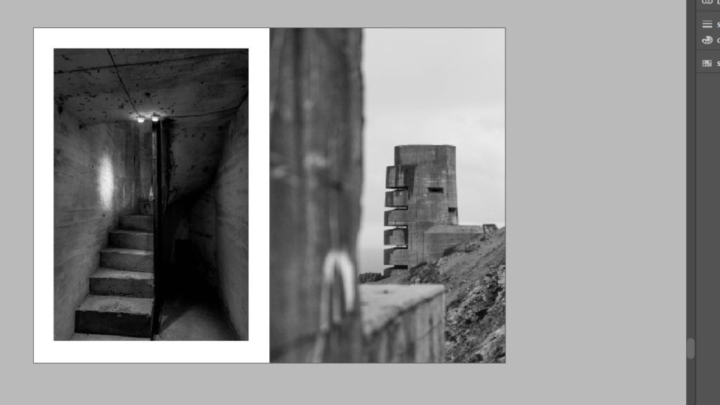
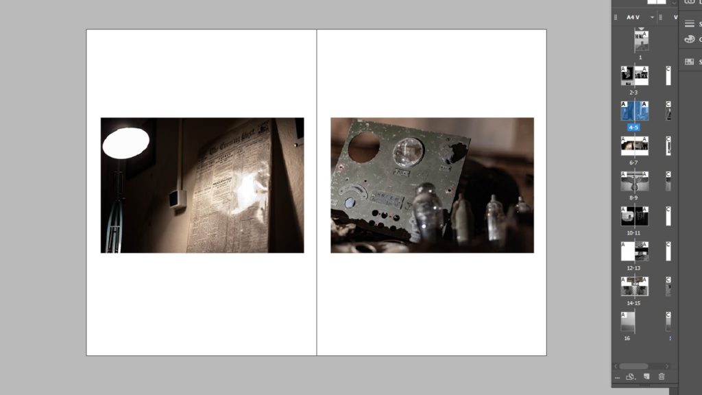
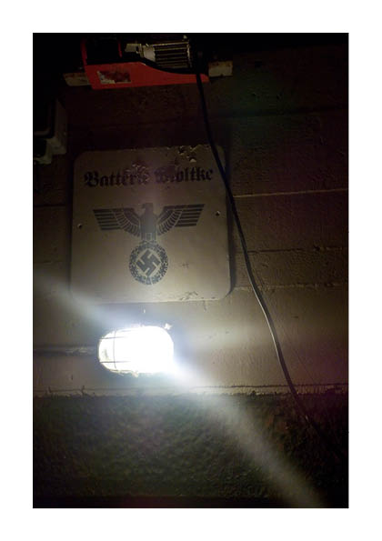
The next two images are close ups of features of bunkers, so the narrative is becoming more detailed by focusing on their characteristics. The first image is very dark and gives connotations of the unknown which is how the locals felt during the occupation, in a state of not knowing whats next.

Again I have gone even further into the bunker with his image of the lighting. Light was such an important part of life in the bunkers because they didn’t have the sun as there source. When it came to lighting that was where nature couldn’t adapt, which is like how some people during the war couldnt adapt back to normal life and had severe PTSD.
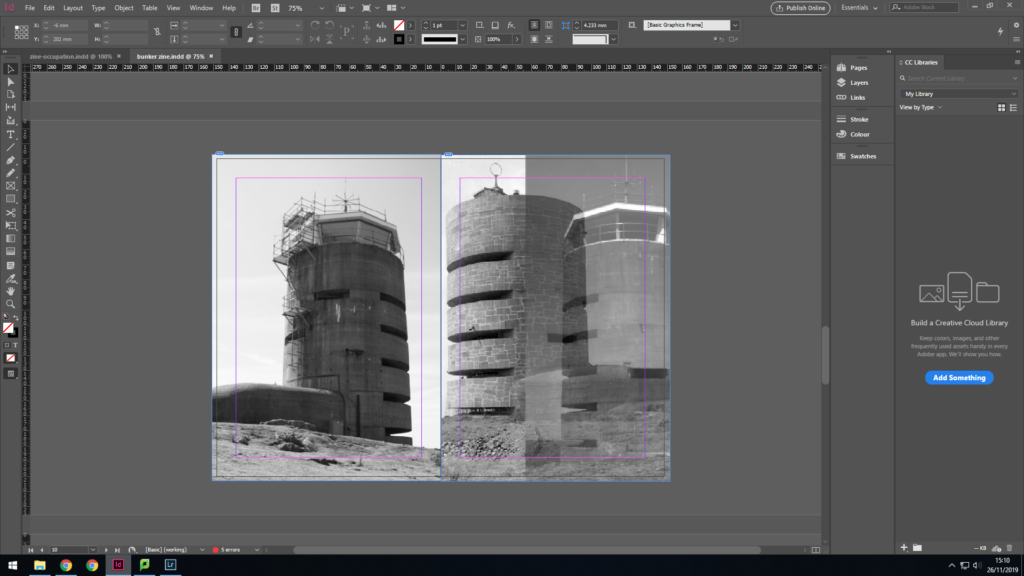
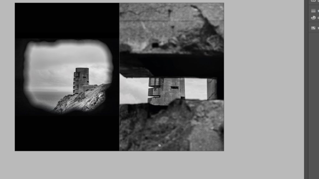
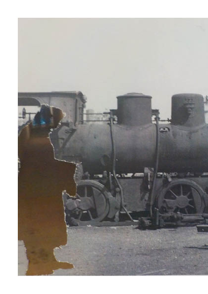
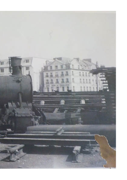
The next two images are of the radio tower at Corbiere so the book is chrongically making it’s way along the Jersey coast line. The first image is of my own photography and the seccond is a merger of my own and an archive image during the occupation. I wanted to capture the change in the nature around the tower and how its adapted to live around a man-made histroical eye-sore.
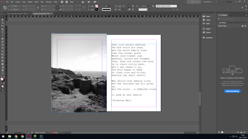
This image is also at Corbiere but is of a German look out town, which would have been stragetically placed within the greenary for camoflague. The shrubs have continued to grow around it and inside of it, which helps it to look like part of the landscape. On the other page is a poem from Kingsley Amis called Wasted which he wrote during the occupation. I included this poem to also move focus to the people rather than the environment.
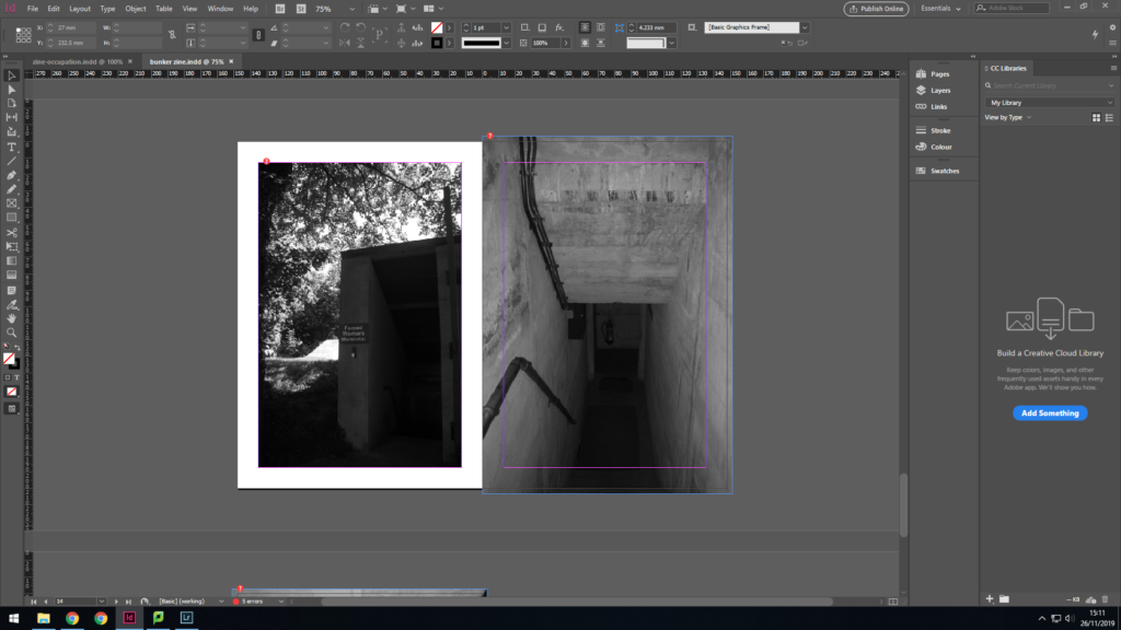
I am focusing back on nature with this image with a bunker from Le Houge Bie. This bunker is different from all the others as it’s fully submergeed by greenary. The second image is of the inside and it create a juxtaposition between the green exterior and concrete interior.
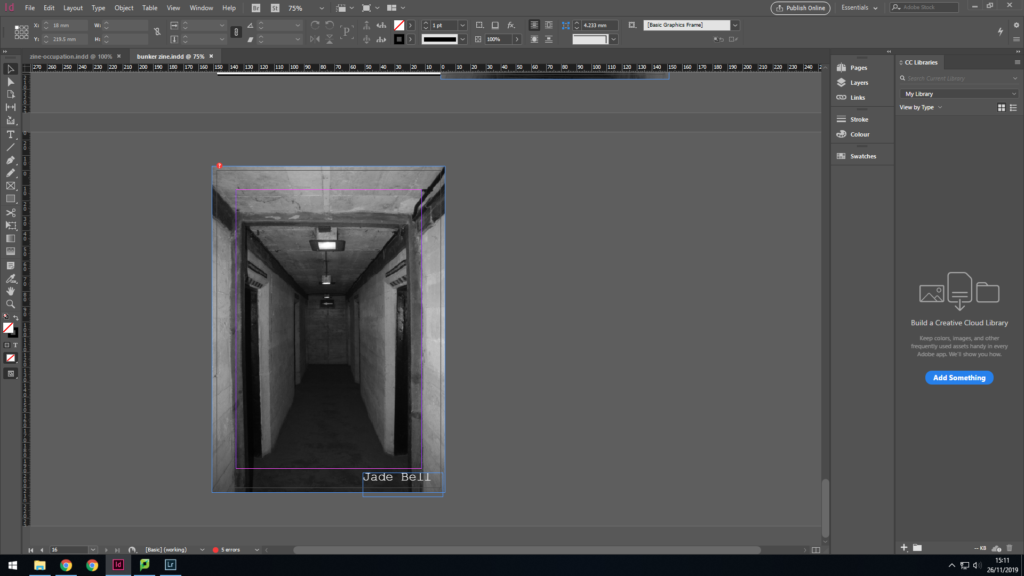
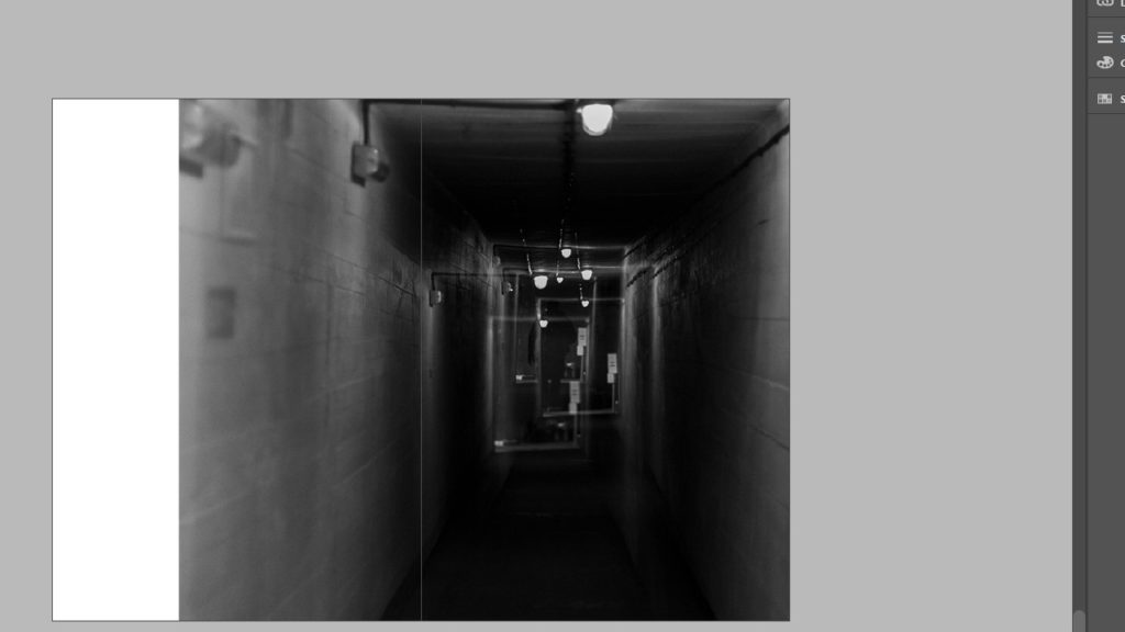
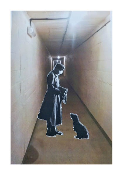
I finished with an enigmatic image of a eerie looking corridor to bring home truths of the occupation. Although people moved on and started a new life, it was still a burden of memories they had to live with for the rest of their life. The war bought many changes, some for the best, others for the worst.

Zine Design

Narrative and Sequencing:

For my narrative and sequencing I found it quite difficult to establish the idea of having a narrative with the photographs that I produced. Eventually I decided that I would use the photographs that were specifically centred around Noirmont and use this as a narrative of the place itself, taking on what would be suggested as a walking journey of the enviroment. For the sequencing I have used the idea of keeping similar layouts to gernatre a rhythem and flow and use this for a sequence.

Design and Layout:

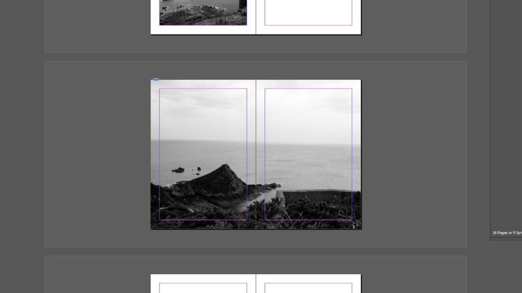
For my main designs and layout I waned to keep a lot of rhythm within the book and it not be choppy with the way I was laying out my pages. For this reason I decided to keep the rhythm of having a frame photograph then a double page full bleed and so on. I have repeated two of my framed layouts for the rhythm and flow of the zine and chose one to be different to create a break towards the end of the photograph. I also made the decision to have a full bleed double page image spread on the front and back covers as this is something I have enjoyed seeing while looking at other zines.

Image Choices Example:

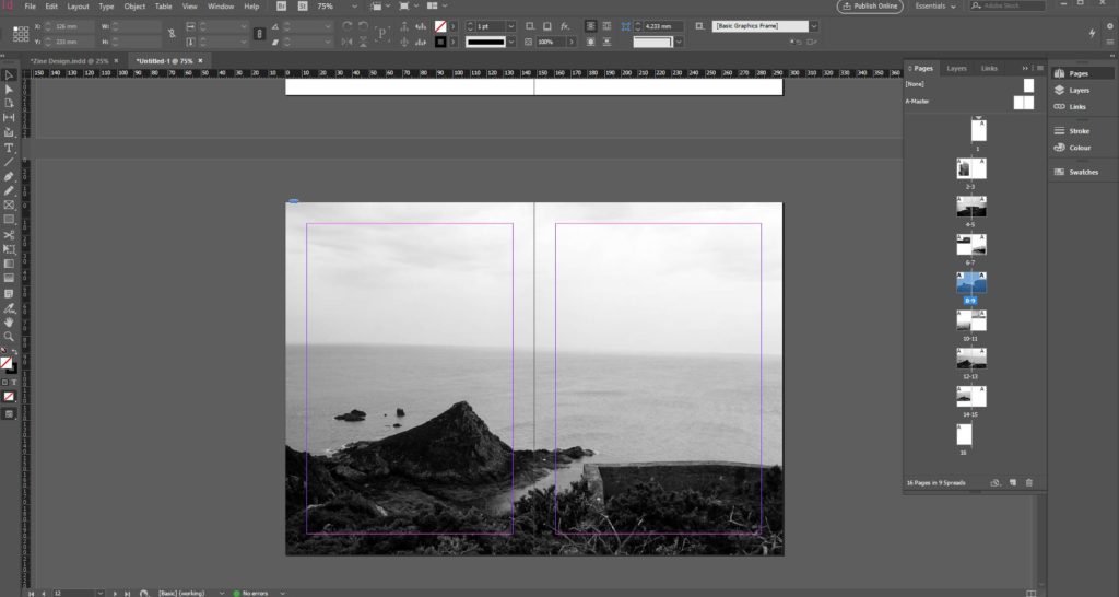
While deciding and choosing my images to use for the zine I was looking and thinking about how the composition would work and how it was going to look especially if it was a full bleed double page spread. Using the example above it shows two different photographs of the same place that I wanted to incorporate into my zine as a view looking out from the sight. The first image has a slightly wonky horizon line compared to the image on the right, for this reason I chose to use the image on the right in my final zine. This is the process I went through when choosing which specific images I wanted to use in my zine.

Use of Text:

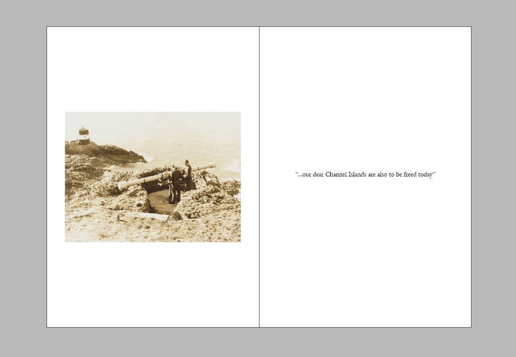
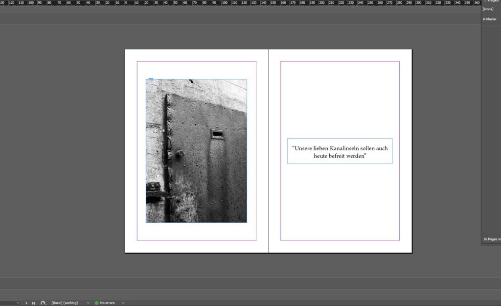
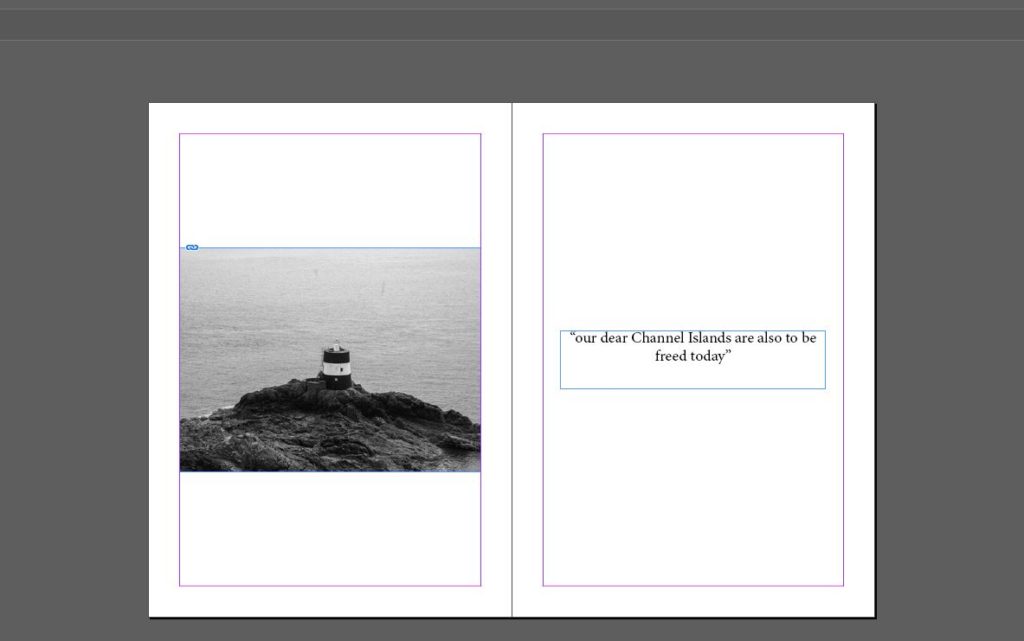
In my zine after looking at some other zines I wanted to incorporate the use of images and text together. For this I decided to start and end on the same layout with text and a photograph placed next to each other. For the words I used, on the first double page I used a phrase taken from the Liberation speech given when the channel islands were liberated, the first page shows the sentence in German and then on the last page is written in English. This was a decision I made to have the separated and to have the reader find out the meaning at the end of the zine.

Colour / Black and White:

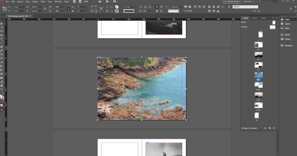
Originally in my working I had my middle page as a full bleed photograph and the only one in colour. I did this originally to create a break in the design and add something different compared to all my other images. However I then made the decision to keep the middle page in black and white along with all of my other photographs as I feel it had more of a flow and kept with the ideas of all of the photographs being still and having this silent feel to them.

Archival and Own Photography:

When designing my zine I decided that I wanted to incorporate one archival image, originally I had my archival photograph next to one of my own photographs showing the same structure to create a difference and compare them. However towards the end of the development I decided that I would take the archival image to the last page and put it with the translated text as I feel having it at the end was more effective and allowed a break in the middle of the zine where the photograph previously was placed.

zine – planning and research

A photo zine is a self-published, often handmade collection of photographs laid out in a magazine style. It can include written text and illustrations as well as photos. They are designed to display and share photo stories. A photo zine can be a single, one-off publication. The type of zine I will make is a single-section zine. This is the standard zine which is like a small book. My zine will be A5 paper size. I am going to feature photographs on their own pages as well as some having a double page spread.

Examples of Zines:

Related image

Final Version for Zine

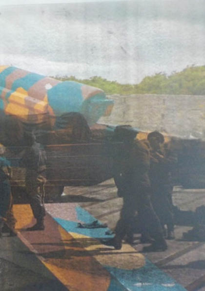
For my final configuration, I largely left it the same as version 3, however I decided to make Most of the images black and white except for pages 5 and 6, because i found that the images were much more impactful in the slightly warmer colour, acting as a sort of throwback to the days of colour film cameras. I also made the final spread in full colour as it is meant to represent the liberation of the island. I also changed pages 9 and 10 to show a larger image that bleeds onto the next page instead of having 2 smaller pictures. overall I think that this is the best variation of my zine yet, as it incorporates all of the elements that I wanted it to, in showing the harsh and unsaturated world of life in the bunkers, as well as the more positive aspect of the liberation of the island.