
I used Adobe InDesign in order to produce the final layout for my zine. In doing so, I was able to manipulate the layout and sequence of the images easily, and could continuously develop my ideas as I worked to find the best layout for the narrative of my zine. The following steps are those that I followed using InDesign:

In the above image, I was experimenting with the layout of individual images. With some of the images, I decided that in order to keep the interest of the viewer, and to break the images between the pages up more clearly, I would use some of the landscape images, and rotate them 90 degrees so that they presented landscape, horizontally across the book, and by reducing their size, they fit on the page, leaving blank space on all sides. I n doing this I feel I am able to draw more attention to these specific images, and it allows me to break up the images so that they do not look like one continuous block of image.
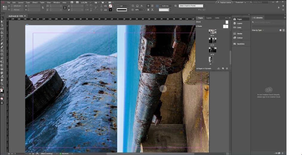
The above image is an example of one of the final doubly-page spreads for the zine. One of the images is portrait, and the other is landscape. I used a full bleed layout, and rotated the landscape image in order to fit it on the page.
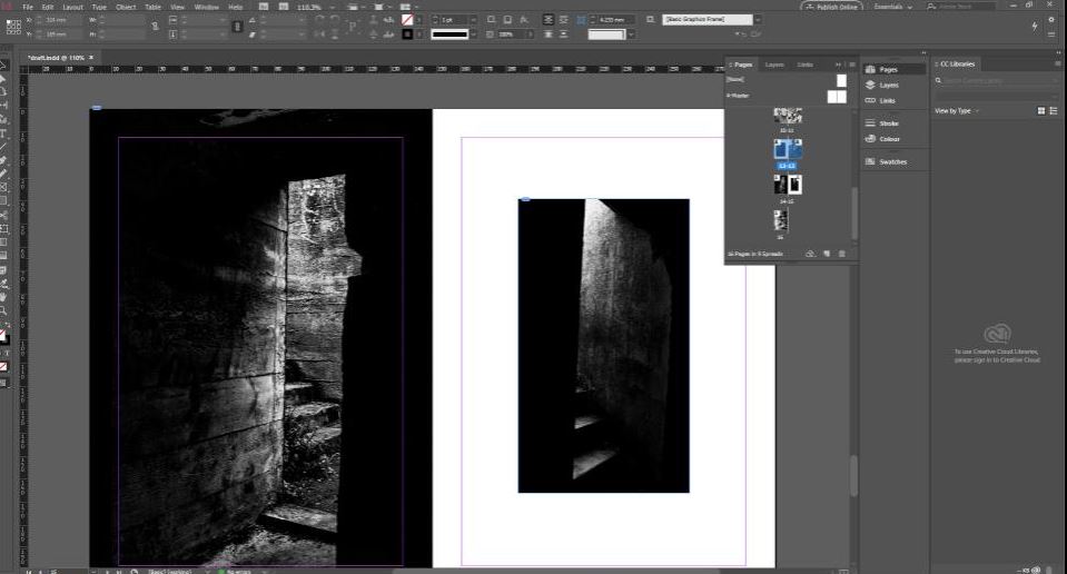
The above image is an example of where I reduced the size of a portrait image, in order to break up the images further along in the zine. These images are both dark in colour, and so in order to between distinguish between the images, I reduced the size of one of them, leaving blank space as a boarder to frame the image and draw more attention to it.

The final image is an example of the layout of all of the pages for my zine. Here it is easier to see the progression from the lighter images to the darker images as the zine progresses, reflecting the increasingly dismal atmosphere of the occupation of Jersey by the German forces.
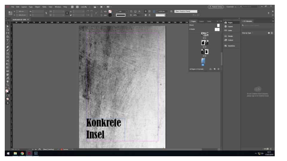
The above image is what I will be using as a front cover. It is a simple image of close up concrete, which I feel provides a minimalist and tidy layout as the front cover. I have experimented with having a leaflet stapled to the size of the zine, which would showcase a map of Jersey taken from the archives, in order to draw the attention of the viewer and add more to the front cover. The title I have chosen is the German translation of “Concrete Island”. I feel like this title sums up what the German occupation did to the island of Jersey, turning the landscapes from fields and forest land into concrete bunkers and watch stations.
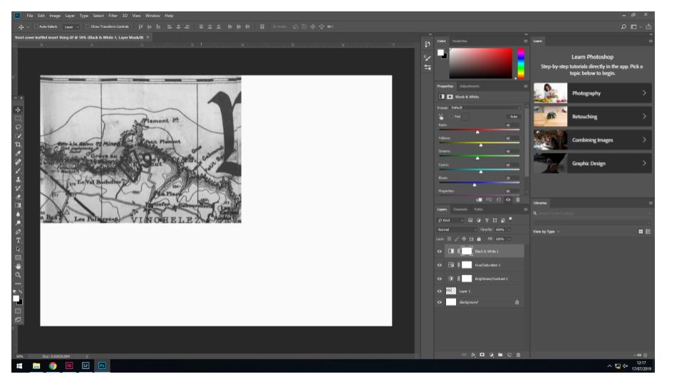
Above is an experimentation with what I may use as a leaflet stapled to the outside of the zine to add more to the front cover. It is an image of a map of Jersey designed around the time of the occupation. I increased the contrast and saturation to make the lines darker, which draws more attention to the image.