Société Jersiaise


What is a Zine?
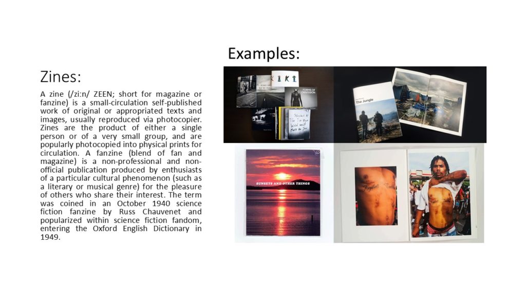
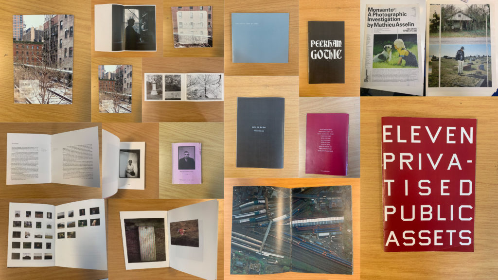
A zine is a independently or self-published booklet, often created by physically cutting and gluing text and images together onto a master flat for photocopying, but it is also common to produce the master by typing and formatting pages on a computer. The publication is usually folded and stapled.

Analysis of a Zine:
I will be analysing ‘Lingering Ghosts – The waiting for refuge’ by Sam Ivin in order to gain a better understanding of narrative and sequencing, and what makes a successful zine. I watched a video interview with Ivin where he explained his rational behind the zine and why the topic was important to him. His passion towards the subject matter is clearly shown through his work which showcases the importance of really understand and enjoying the subject matter to clearly portray a strong narrative within my own zine.
Link to Ivin’s website which provided me with further research and understanding of his project: http://www.samivin.com/lingeringghosts


Format, size and orientation
This zine is the size of A5 paper, which is used to create a literal representation of the actual size of someone’s passport, linking to the key theme of the zine. In addition to this, the zine is in a portrait orientation which further expands our understanding of the zine prier to reading it. It is formatted in a rectangular shape which is the same as a passport, which presents Ivin’s artistic creativity to present the theme of asylum seekers and immigration.
Design and layout
As previously mentioned the design of the zine is in the style of the passport which begins to build a relationship with the imagery and the theme of immigration and asylum seekers.
Rhythm and sequencing
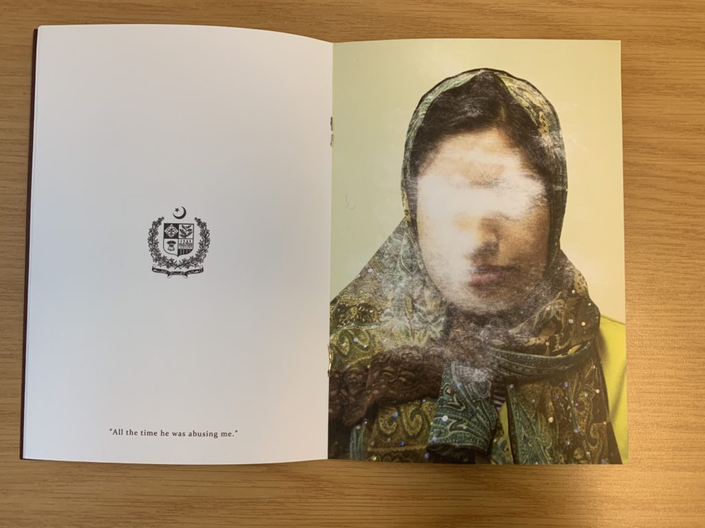
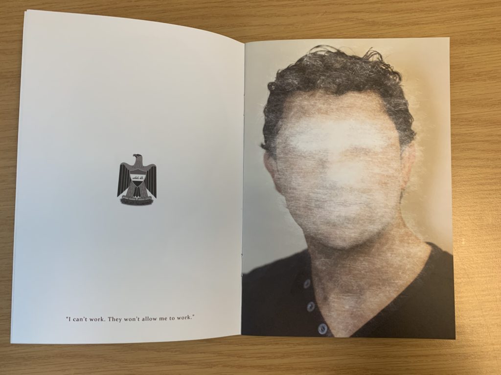
The sequence of the images is very simplistic but effective. On the left hand page the nationality of the person is presented through the country’s emblem, below this is a quote taken from what that person has said about being denied from seeking asylum. For example it says “All this time he was abusing me”. On the next page is a picture of that person with their face scratched out to show how they have been ghosted from England, and how the artist is expressing how others find asylum seekers irrelevant.
Narrative and visual concept
The story being told within the zine is people who are trying to seek asylum but are being declined. It’s trying to capture the uncertainty of their future and how their life has come to a stop and how they are being forgotten by others. This is shown through the portrait of the asylum seekers (in color), and the face has been scratched out, which symbolically represents this narrative. I would say the narrative is clear within the zine due to the introduction at the start of the zine. Needless to say, the imagery really encapsulates this idea.
Title and cover
The cover is very simplistic but has symbolic representations to present the theme of the zine. The background is a dark royal red/burgundy color which is the same color as a British passport which showcases the theme of travel. The simplicity of the design allows a bigger impact for the content within. The title ‘Lingering Ghosts’ is metaphorical to showcase how asylum seekers are neglected, frowned upon and find it hard to fit into society and are “unsure of what their future will hold”. Below the title is Britain’s emblem which is also shown on a passport, which presents the views of the artist that we should allow these asylum seekers into the country as they want safety.
Images and text
Image and text plays a massive role within this zine, due to the topic it is presenting. When we look at a two page spread, on the left we are presented with a country’s emblem with a quote taken direct from the asylum seekers words. On the right hand side is the picture of the asylum seekers them self which has been scratched out and distorted, which allows the image and text to work in cohesion.
Use of other design elements or inserts: archives, montages, graphics, typography
The images have been distorted by being scratched which showcases physical interactions with the photograph, showcasing a surrealist approach to photomontage. The text used is a simplistic bold lettering which is easy to read and understand from a viewers perspective.
Further Analysis:

To analyse this double page spread of Sam Ivin zine, I will be looking at different elements which make it successful. Conceptually, Ivin is trying to showcase the fact that the man has been declined asylum and is almost being forgotten by Britain, leaving him unsafe and uncertain about his future. This is clearly portrayed through the symbolism of the face of the man being scratched out, which showcases Britain trying to take away their identity. Contextually, these asylum seekers are leaving their country due to them being in danger as well as their family, and Britain are declining their entry due to the customs and immigration officers not believing what they are saying is true. This issue is very current today and this zine is aimed to inform those about this issue that innocent people are facing. Visually, the zine presents the formal elements of texture, shape and line through the scratching out of the portrait. The composition of the portrait is very simplistic, the portrait is located in the centre of the page and fills up most of the page, leaving the background plain allowing our focus to stay on the portrait. On the other side, the composition is also simplistic them emblem from where the man comes from is located in the centre of the page at a medium size with a quote taken directly from the man’s words located at the bottom of this page. Technically, the image uses a lot of negative space which represents the idea that they are left with nothing and being declined asylum leaves them feeling empty and not apart of society, due to where they come from. The portrait of the person is presented in colour which showcases the idea that they do still have an identity. In addition, the lighting used to capture the portrait is artificial warm lighting due to the image having a studio feel to it. To capture the images the aperture was low, and a large depth of field was used. The shutter speed was quick and the ISO is also low as there is no intended blur or noise presented within the image. The white balance used creates a warm atmosphere which creates a sense of coziness and safety which juxtaposes the theme of uncertainty which allows viewers to really understand and think about the issue before them. The zine uses a combination of image and text which makes it successful and shows variety also helping it to appeal to the viewers. In addition to this, the face (eyes in particular) have been scratched off showing photo manipulation in order to present the narrative of these people’s identity being stripped and taken away leaving them in uncertainty.