

Front cover 
Back cover


Format, size and orientation
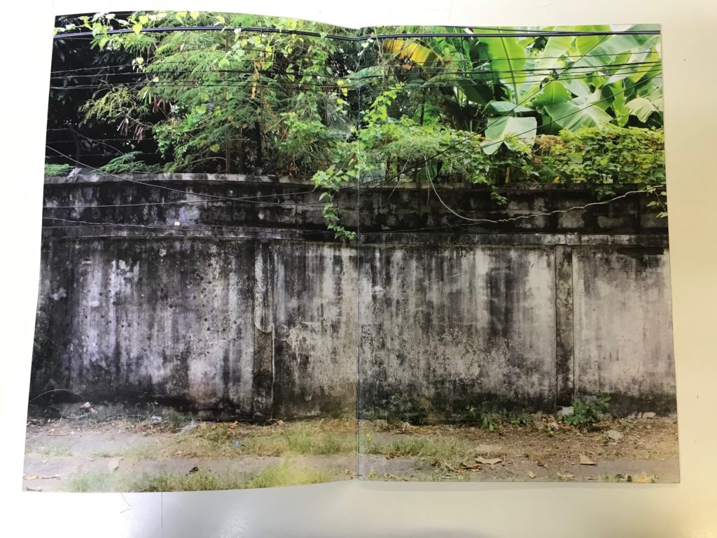
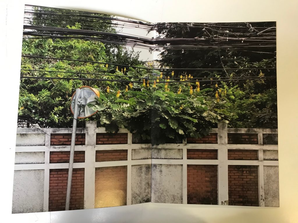
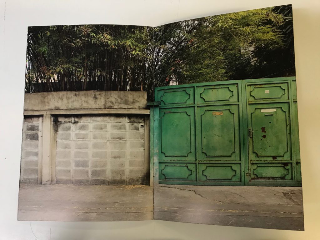
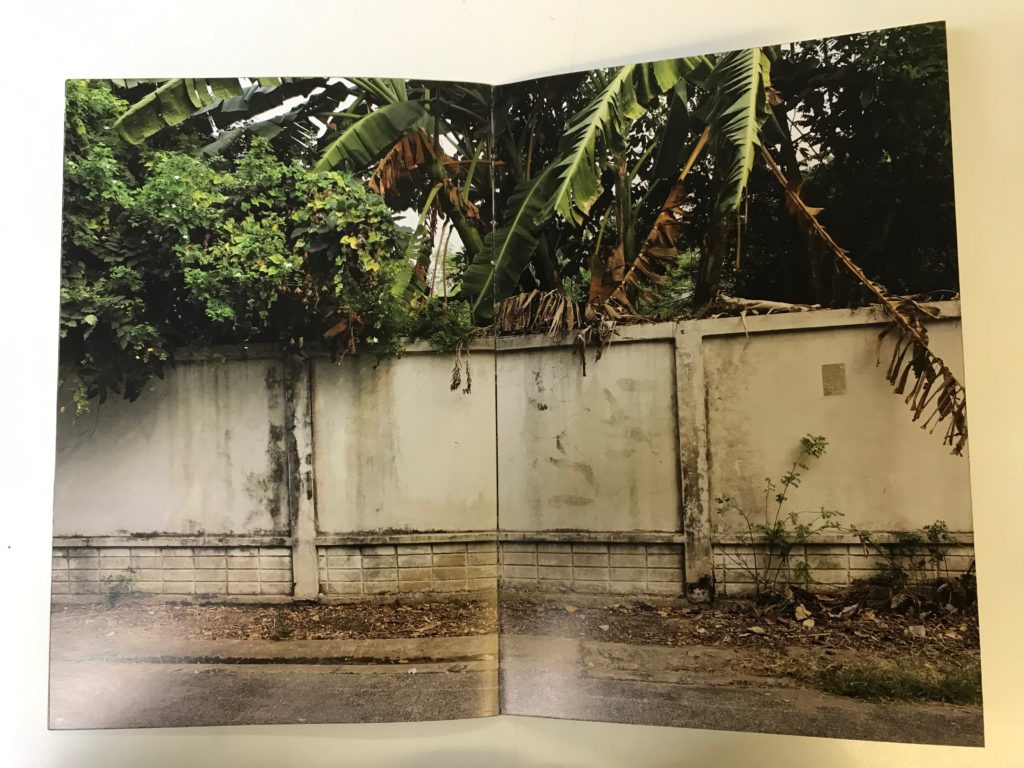
The zine is made up of A4 papers folded into A5. All of the images bleed which means that the printing goes beyond the edge of the sheet. This is an interesting way of presenting images since it makes the viewer focus on that one image. All the images are landscape and take up two pages. Landscape photography demonstrates the photographer’s own connection to nature and their view of the world around them.
Design and layout
The layout is simple yet effective. All images bleed onto two pages which makes the photo clear and allows the viewer to focus on the detail. The large sized images helps to convey the message the photographer is trying to get across to his audience.
Rhythm and sequencing
All pages link to one another since they are all portraying the same idea: man made structures and nature together. All images have the same layout which creates a rhythm because when the viewer turns the page they see the same format of one image across a double page.
Narrative and visual concept
The zine is showing the viewer different locations where man made structures and nature come together. They are either in harmony or in conflict. I believe Dale Konstanz is trying to tell his audience that we as humans are trying to dominate nature. As seen in all the images an artficial barrier is constraining the natural world. In a way nature can be seen as a more powerful force since its seeping through any gaps and overtopping the human barricade.
Title and cover
The name “Concrete Jungle” is unusual yet interesting since we wouldn’t usually see those two words together. Both words contradict each other since concrete is associated with the urban environment while jungle is related to nature. The title explains what we as a viewer will expect to find inside this zine. The zine does just that and shows us several images of locations where manmade structures and nature are visible in the same image. The semi transparent box in the center of the cover is an interesting feature as it includes the title in a simple font as well as the photographers name. Since the box is transparent we can see through it and see the front cover’s image. This box is an interesting feature and is something I might consider when creating my own zine.