I want to show how the occupation has effected Jersey in a physical, and historical way through exploring shapes and textures.
A paragraph
My zine will contain images I took of bunkers and around St. Helier. The images from the bunkers show how the fortifications were a big part of German occupation and how they are still around Jersey’s coast lines which is the physical effect of the occupation. The images from around St. Helier show the effects of the occupation in a more historical way since Jersey’s main town contains many reminders of important historical events, such as liberation day.
Sequencing: The order of your images
Produce a blog post where you evaluate your first sequence of images, reflect on what story you are trying to communicate and how you can improve and develop your narrative.
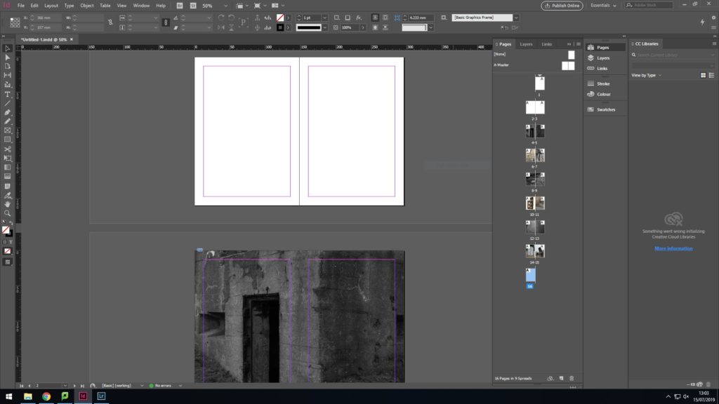
1st layout
I wanted my zine to have a mixture of full spreads in black and white but also individual images on each pages in colour so that colours and textures can be seen clearly.
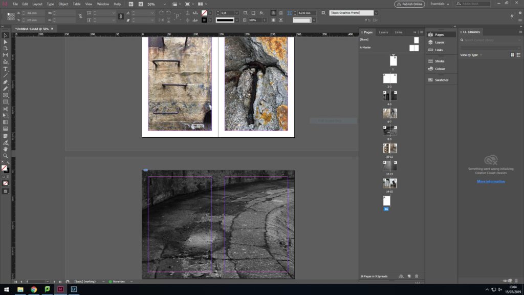
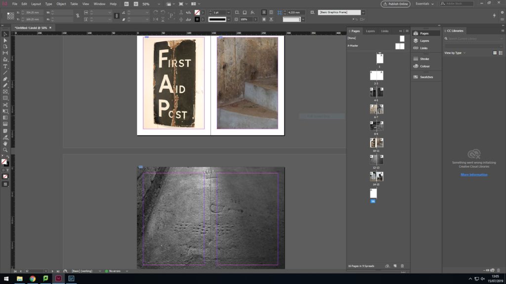
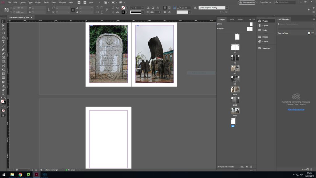
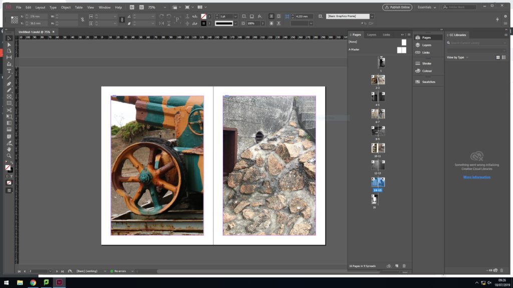
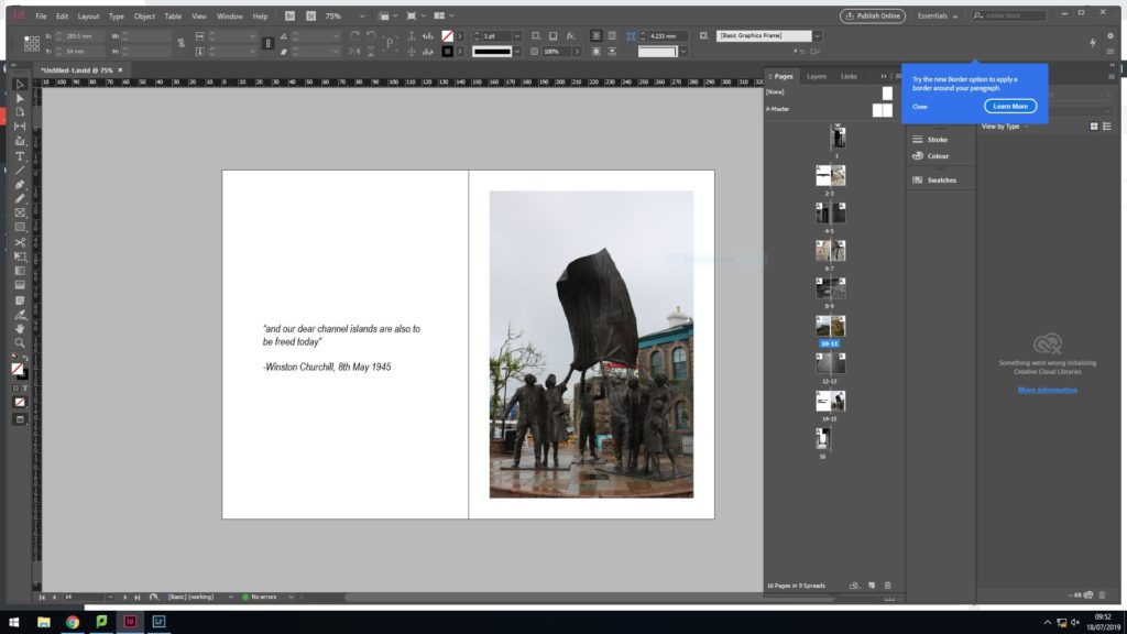
The 2nd set of individual images were pictures i had taken at Noirmont. I chose these 2 images because it is clear to see different colours and surface textures but they also show the effect of the occupation in a physical way. The double page spread is an image of the floor in black and white which shows how the gun at battery moltke used to be able to mover around. In the image you can see the remains of how it used to be able to turn 360 degrees. I think this image is a good divider from the colour images since the black and white conveys the fact that it was a time of hardship.I then chose 2 images which i had taken at battery moltke, which shows a first aid sight and an abstract image of the bunker stairs. I think the image with the 1st aid sign is interesting because you can see the texture of the sign very well, and the images of the stairs shows how old it is due to all the colours. The black and white image i chose to used for my double page spread is an image I took of the foot prints of German soldiers in the concrete of battery motlke. I chose to have this image in black and white to symbolise how it is in the past and also because it allows the image to have a deeper contrast meaning the foot prints are more visible. I think it also helps draw out emotion from the audience.since the last 2 sides were the end of the booklet, i wanted to represent Jersey’s liberation since i wanted a loose chronical order to the zine, I chose to have an image of the liberation memorial since it liked hoe the 2 different types of concrete contrasted each other in order to help the memorial stand out. I also chose an image of the liberation statue because i thought that the shape of it is very intriguing
2nd layout
During the 2nd edit I finalized what images i wanted to display on my front and back cover.
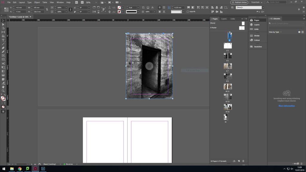
For the front cover i chose to have an image i took of an entrance to a bunker from the outside. I then edited this image in light room so that it looked very dark and dingy. I wanted to do this as it symbolises the beginning of the war and the beginning of a difficult period of time.In contrast to the front cover, my back cover shows an image i took of the entrance of a bunker from the inside. I edited this image to look very bright as it symbolises the end of the occupation, and the end of dark times.
3rd layout
To fill in my beginning double pages pages, i wanted to place some images showing colour and texture. I do think my images look good together individually, however i think the dramatic contrast in colour makes it look like the image don’t go well together. I thenc hose to keep the image on the right as i feel it fits in more with all my other images since the image i previously had on the left was too bright and colourful to fit in. I then experimented with text instead of trying to find another images that fitted in. Since it was the beginning of the zine i chose to have a little bachground context in order to properly introduce my images.
Initially, the 2 images I had on these pages where the first aid sign and the stairs. As i analysed it further, I didn’t think these 2 images were similar enough to complement each other. The screenshot on the right shows the 2 new images that i replaced the original 2 pictures with.