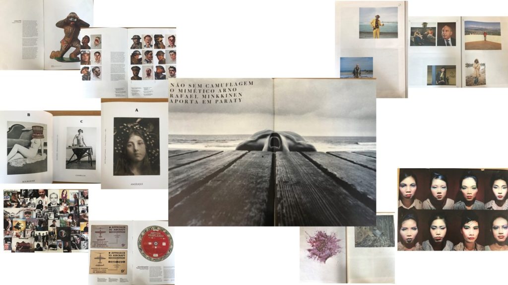
Zines originated in the United States during the 1930’s. A zine is a magazine which is a small, self-publication of your original work where appropriate text and images can be added, depending on what you want to publish,. They are normally printed via a photocopier, meaning that they are pretty cheap and strait forward to produce. Many photographers have created zines and have had them published around society, some even being a series and collectible items. After looking at many different types of zines, created by different photographers, I began to get ideas of how I wanted to lay out images within my zine. Here are some visual representations of what I looked at and what inspired me;

The layout of a zine can differ, some can be landscape or portrait, along with big in different sizes, like A5 or newspaper size. This is similar with the photos that are inside, the images can range in size, some may bleed over two pages, or some pay just cover the corner of one side of the page. Some of the zines had a rhythm/sequence, one I looked as had images in alphabetical order, so the image related to the letter, creating a sequence. The visual concept of the zines can change as well, depending on what the artist is focusing on, some of them related back to the war, whereas some related to different identities. Not all zines just have images only in, a majority of zines also had text printed along side the image, giving a background or maybe writing down the meaning of this page/image.
