
Yaniv Waissa is a photographer who was born in Haifa, Israel in 1978. His work deals with rebuilding and replacing the old with the new in Israel, gains a layer of meaning by virtue of the political context in which it is being made. Wherever he goes he examines the relationship between man and nature and the, sometimes absurd, connection and constant tension between past, present and future. Yaniv Waissa creates an intimate atmosphere in every frame and puts his personal feelings, emotions and nostalgia into it. Everywhere he goes he recognizes a personal memory that can ignite a collective memory of the viewer.
Zine Analysis: Beit Hakerem
The Zine that I have chosen to look at and analyse by Yaniv Waissa is titled Beit Hakerem (translates to either ‘house’ or ‘village’), after the area of South West Jerusalem that the photographs were taken and produced. I have chosen this Zine and also this photographer to look into as I feel upon first looking without analysis the zine works well and is fluid and follows obvious pattern. As well as this I feel that I can link Wissa’s subject matter to mine in that he is documenting places of the past and ones that are significant to him personally.
Format, Size and Orientation – Design and Layout
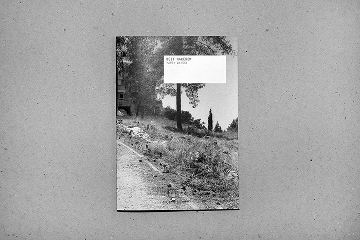
The zine itself is in an A5, portrait format. It is small and compact and the photograph used for the front cover uses a wrap-around method where it bleeds and covers onto the back into one double page, landscape image at full bleed to the very edge of the page. This is effective as the largest, and only full bleed photograph used in this zine.
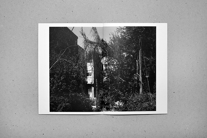
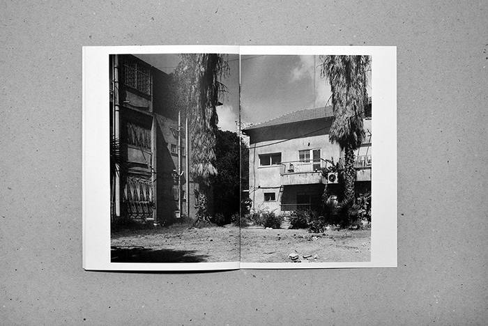
The design and layout inside the zine has all the photographs as landscape, all with a white boarded edge, none of the images apart from the one used on the cover are full bleed. This is effective as on the pages where there are two images, one on each page, there is spacing between the photographs and they don’t start to merge together.
For the layout of the pages Waissa uses only two layouts – either a half image on each page across a double page or a full double page spread with each having a white boarder. This is effective as there are only two displays that have been chosen, it gives senses of simplicity.
Rhythm and sequencing
For the rhythm and sequencing we can see that Waissa is using the only two display choices and produces a sequence and rhythm with the photographs. Towards the middle of the book we have a sequence of two double page with 2 photographs each and then one full double page image, towards the end it then goes to one double page with two images to one full double page spread, it creates a bit of difference while only having to use two design and format layouts adding to the idea of simplicity. It creates a rhythm and sequence instead of jumping between layouts which would have made it make less sense and not show any narrative which can be helped by the rhythm and sequencing.
Yaniv Waissa – Beit Hakerem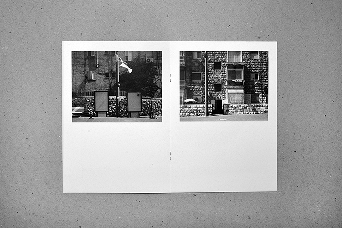
Yaniv Waissa –Beit Hakerem
Narrative and visual concept
The zine follows a narrative of images that we can see and follow, we follow the smaller images showing the urbanized sides of the town, the brick and concrete, the visible man-made elements. Each larger image, however, follows and shows the natural side, the overgrown vegetation covering and hiding the buildings and streets. The last photograph in the book shows a half page display of a bit of a further away image, it is taking in the whole town through the trees rather than close to specific buildings. From this we could take and think of ideas of the narrative being about a journey through this town showing it in small snapshots and ending and closing on an on look of the place as a whole. For me, personally taking and looking on the photographs I feel that Waissa is showing a narrative of the journey and overtaking of the natural world on this landscape.
Title and cover
The title and the cover of this zine I feel work well with the layout and aesthetic. The inside of the zine shows a very simplistic layout and rhythm which is effective as it maps and mirrors the simplicity of the front cover and the title. The cover image bleeds across to the back cover in one large double photograph, one that reflects what is going to be inside. The photograph includes a path and suggests the walking journey that the photographer has gone through while taking the images. The title very simply ‘Beit Hakerem’ is the name of the area of Jerusalem that the photographs were taken and adds to the aesthetic of the zine.
Images and text
The only elements of images and text being used together in this Zine is on the last double page spread. As well as this page including the institutional information for example the websites and publishers, it also includes contextual information on Beit Hakerem, it explains some information surrounding the area historical of the reasons it was built and reasons for its naming, and also how it has changed and what it has become. I feel that it is an effective choice to have it at the end on the last page of the zine, as it lets the viewer create their own ideas and feelings before being given any information that may effect the way that they first initially feel. It allows the viewer to create their own ideas initially and then they are able to go back and re look with a bit more information contextually on the place and the photographs and allows them to generate more ideas and feelings.
Yaniv Waissa –‘Beit Hakerem’ 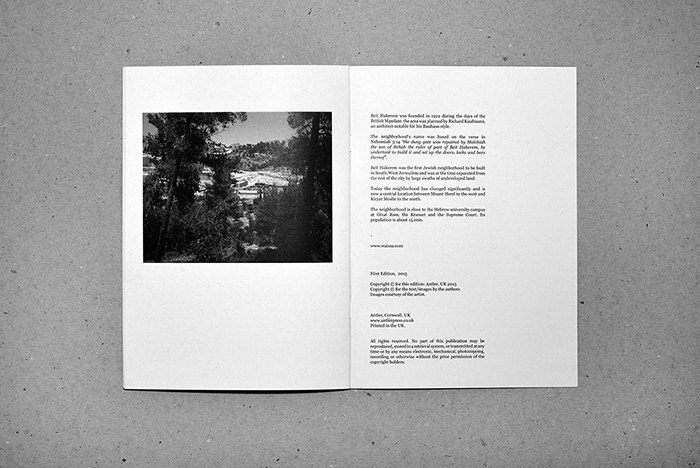
Yaniv Waissa – ‘Beit Hakerem’