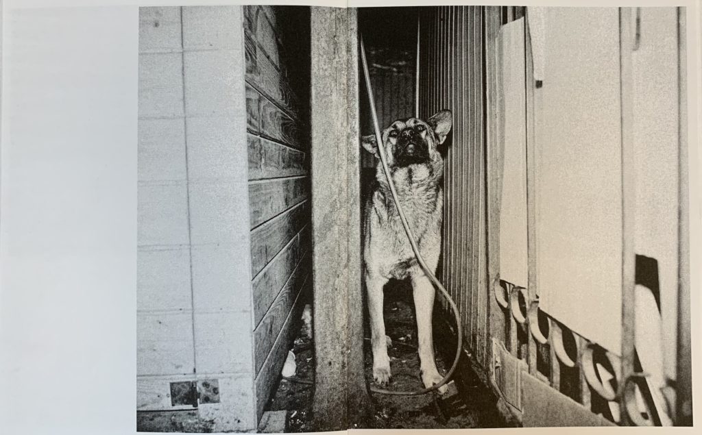
The design and layout of a zine is important. Its layout should show off the images as well as possible, some layouts having metaphorical or intentional meaning in relation to the images within. The design should reflect the photographers’ style and ideas while highlighting and strengthening concepts. The design and layout should pull the entire zine together.
Narrative and Visual Concept:
A narrative is a story or message being told by an artist. In photography the narrative is usually supported with string images, representing a visual concept that the photographer has tried to portray.
Title and Cover:
The title and cover of a zine are two very important factors. The title should relate to the content or subject without giving too much away and leaving room for curiosity. The cover similarly needs to be appealing and display the type of photography showcased in the zine but should not distract or differ too much from the content, unless done intentionally as a concept.
Images and Text:
Images and text are useful as the image can be explained by the photographer themselves. Giving context to the composition and explaining aspects of the image that possibly couldn’t be portrayed within the image itself.
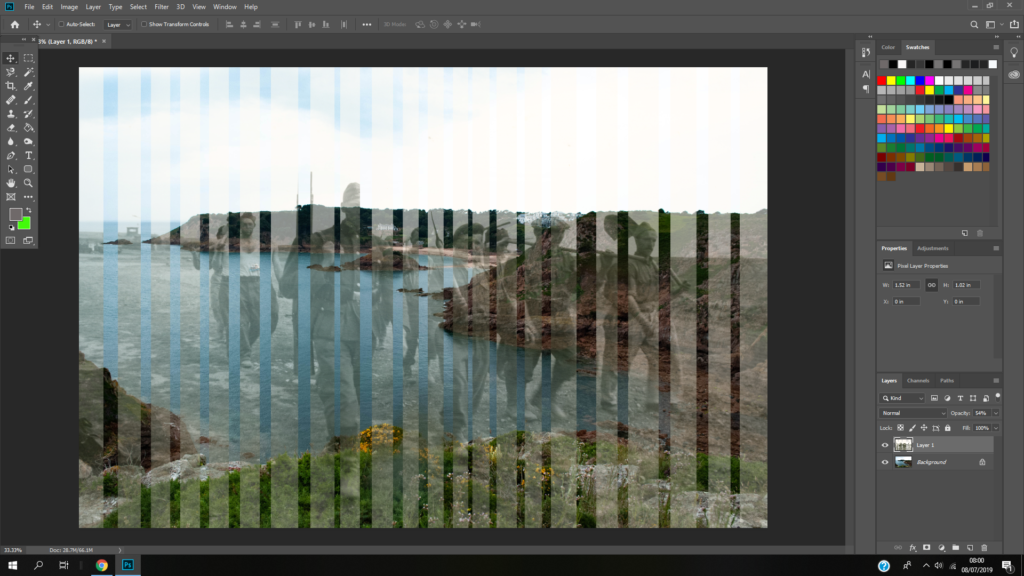
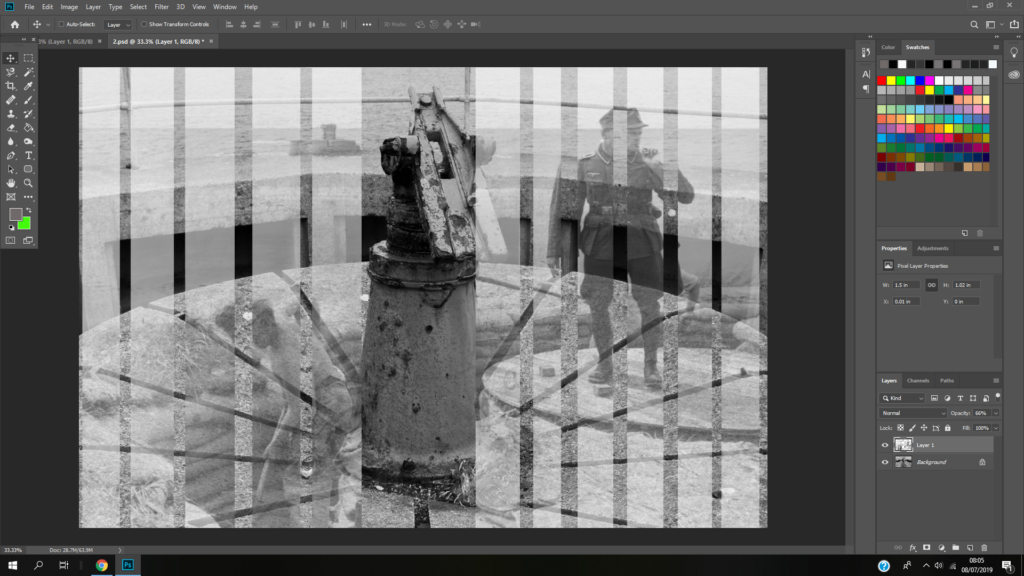
After taking inspiration from the photo-montage style of photography/art, I was able to develop a series of photo-montage pieces. The following are examples of experimental, trial photo-montages that I created using Photoshop, using archival images that I found online:
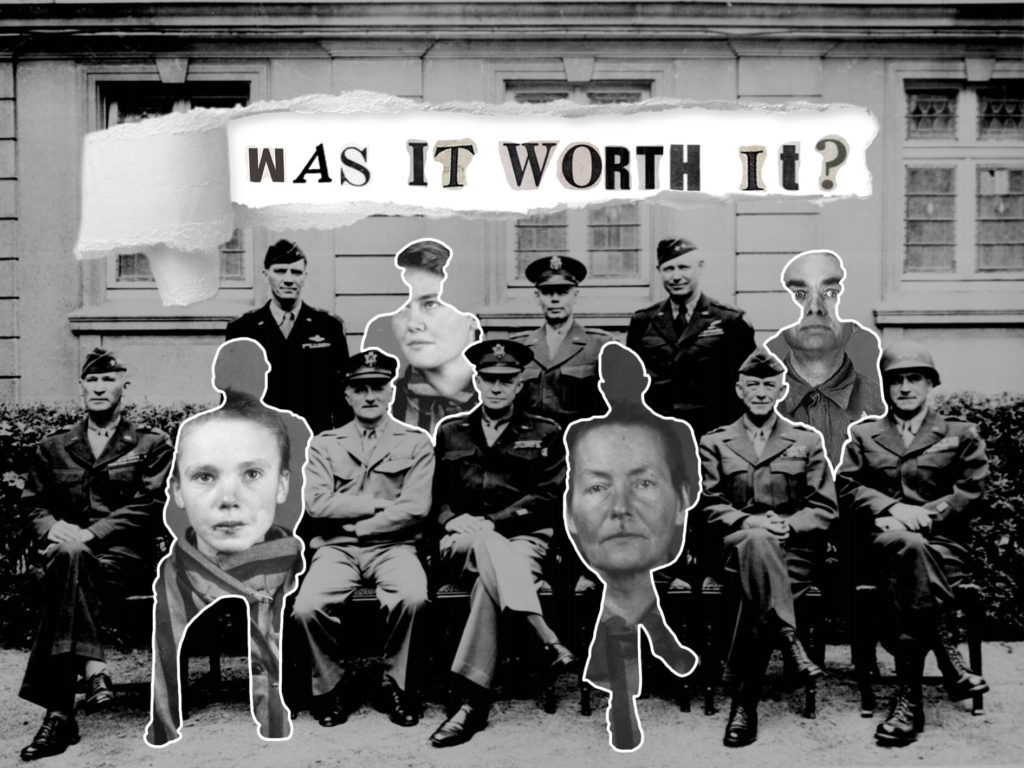
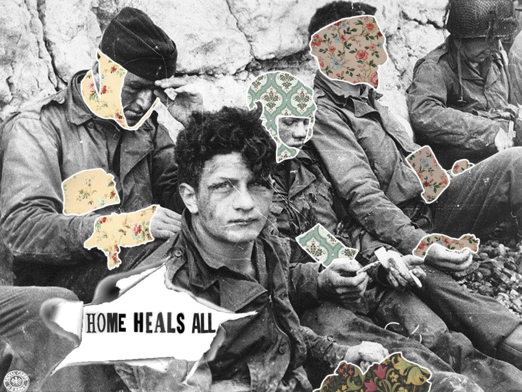
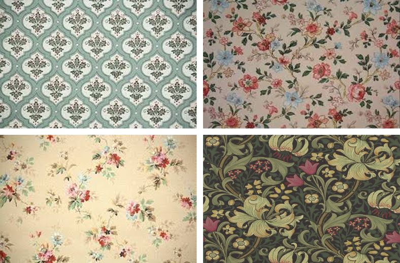
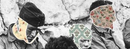
The above image I developed in Photoshop. It involved cutting out the outlines of 4 German soldiers in the background image, and replacing them with the identification photographs of various concentration camp victims. I did this to show a contrast between the dignity with which the German officers held themselves in the original image, and the reality of how their actions caused unforgivable suffering to millions of people who were left without a voice. The above image used the same process as the first image, yet this time, I replaced the bandages and wounds of the soldiers with images of 1900’s wallpaper patterns. In doing this, I used this photo-montage to represent that the thought of home encouraged many soldiers to continue fighting, and gave many demoralized individuals something to look forward to after the war.
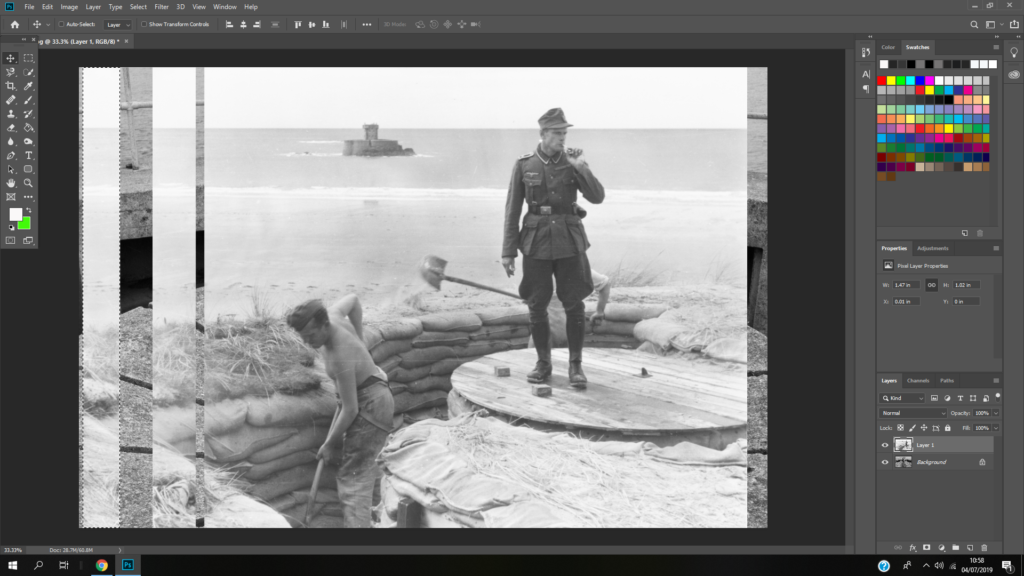
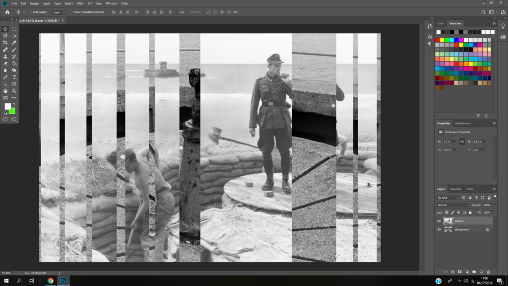
The above process is the one I used in Photoshop to create the above image. From top left to bottom right:
Left: I researched a range of 1900’s wallpapers that I would use as the background for my image,
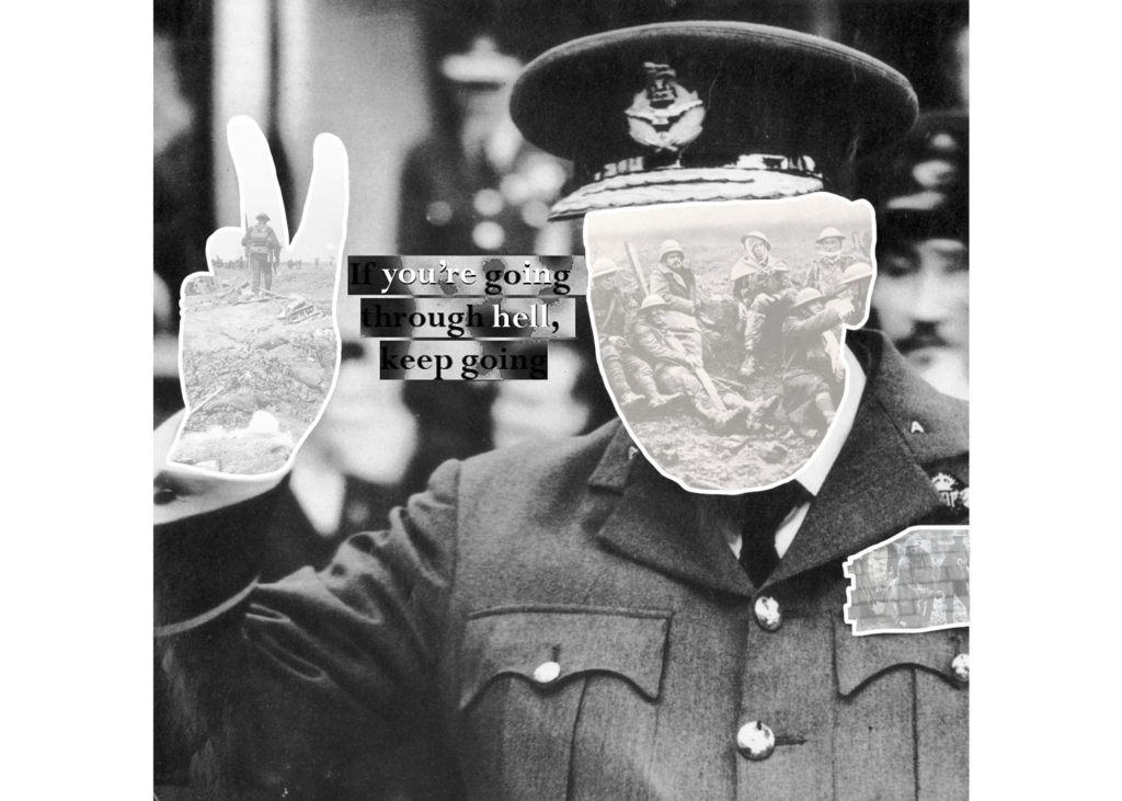
The above photo-montage was created in an attempt to display the sacrifices made for victory during the war.
Above is a gallery showing the process I used to create the final image (seen above). From top left to bottom right:
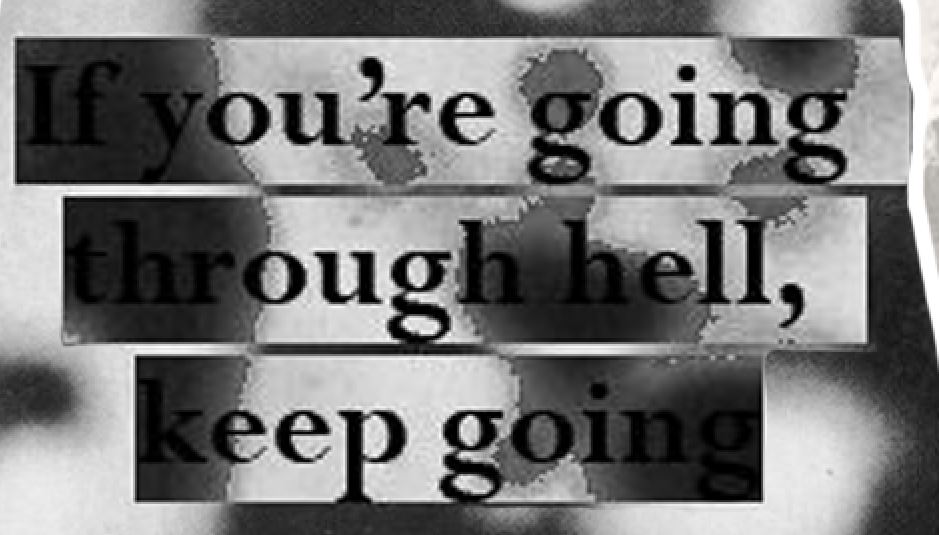
Left: I lowered the opacity of the eraser tool to 50% in order to fade the background of a war scene that I would be replacing the face and hands with. I did this in order to make sure the definition between the foreground (Churchill) and the background (the war scene) was obvious, and also to emphasize that the sacrifice of millions of lives was merely an afterthought to the victory of political leaders during the war.
Middle and right: I outlines the hands and face of Churchill in order to show contrast between the background and foreground. I also feel that by creating an outline, my work mimics the style of many very well known photo-montage artists, who used physical cutting and sticking to create their work.
Bottom row: The bottom row shows the process of creating the text that I placed over the top of the image to act as a centre piece/ main focal point. I took a real quote from Churchill, and decided to emphasize certain words/letters using white text to show contrast between the quote and the reality of war. To create this text, I copied the image of highlighted text and pasted it back onto the image (to give the contrasting background effect) and then placed a second layer of white text over the original black text to show contrast between the words.