contact sheet 1

In this blog post I will be experimenting by creating photo-montages related to the war, which show the occupation of Jersey and the effects it had on the island. I will be using a mixture of original archive images and also some of my own images that I have taken as part of the project so far.
Montages can be created either physically or digitally using software such as Photoshop. It is the process of putting different types of images on top of each other in creative ways, in order to convey a feeling of theme.
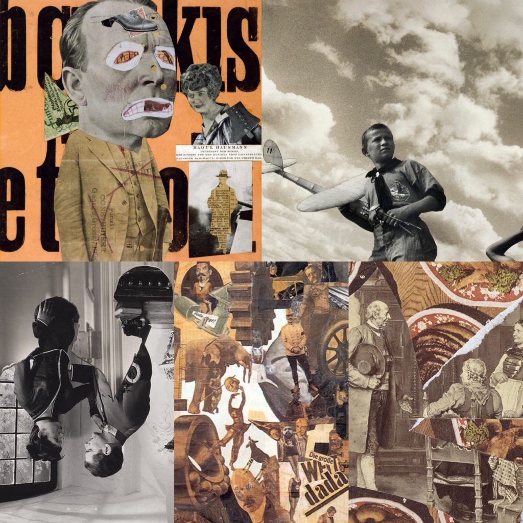
Below are some historical related photo montages that I have looked at, and used as inspiration before creating my own.
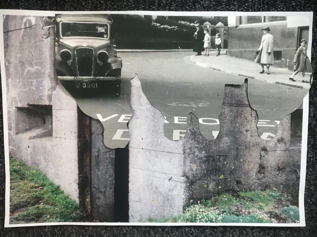
Below are my own montages that I have created my cutting and sticking together printed images.
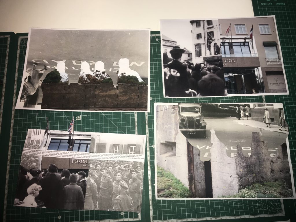
This montage was intended to show how the Island changed under the occupation to include more “Nazi lifestyle”. The image includes something to represent different things that and how they changed Jersey. The fortification I used as my background shows how the island was changed and altered to become resistant to attacks, the road with the German writing on it shows how the language became introduced and forced onto the Jersey people, and the outline of the solders represents how they enforced a different way of life onto people.
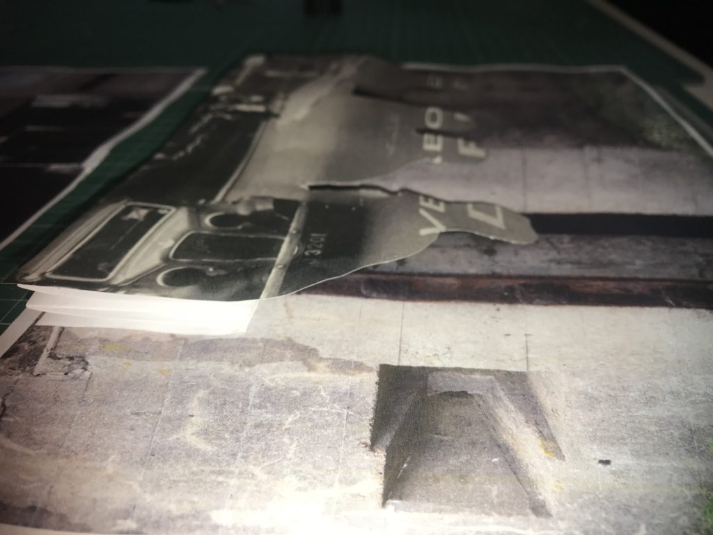

If I were to display these montages I would display this one with my previous one as they both represent changes in Jersey’s society. This image shows a different part of a fortification in the background, to show how the island was changed into a fortress, the outline of the soldiers and the German writing shows how the islanders lost their freedoms and language.
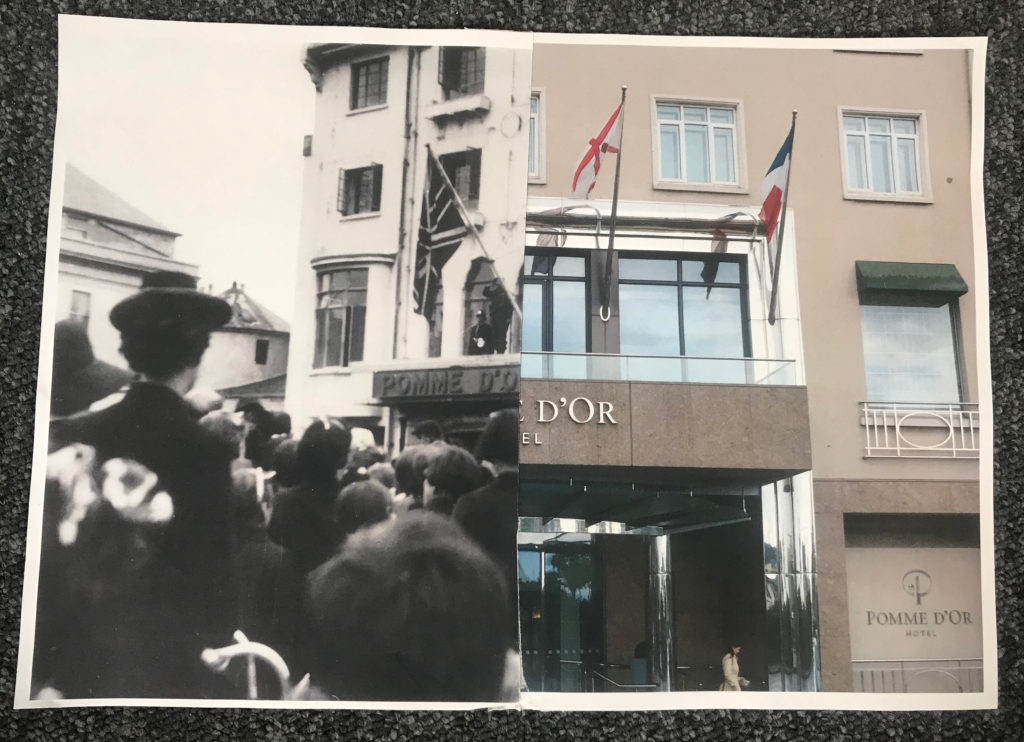
I think this montage is very effective because you can clearly compare. It is very interesting because there is such a huge contrast in era, however you can also see that it is the exact same building. I think this shows that every place can have an important history. I decided to to a montage of this specific hotel because on Liberation Day, British troops hung a Union Jack from the balcony to symbolise the end of Jersey’s occupation, which is a very important turning point in Jersey’s history which I felt could be represented well in this way.

This montage is interesting as it also alludes to Jersey’s liberation. The image of the hotel and the image of the islanders celebrating being liberated is placed over the image of the German soldiers. Having the German soldiers partially hidden represents the fact that they were defeated. Having the contrast of the hotel in the modern day, and the liberators standing outside the same hotel on the original day is also a huge but effective contrast since it shows that the site is just as important in representing liberation as it was in 1945.
Sandy Kim is an American Photographer (b. in 1986). Kim grew up in Portland, Oregon where she began her photography career, then leaving at 18, she traveled to San Francisco. She started photographing what’s around her. Her friends, her loves and her life. Even unashamedly turning the camera back on herself. A large turning point in Kim’s career was when the band she befriended and was photographing, “Girls”, started to break through, her images suddenly were appearing in The New York Times and other publications. Her use of point and shoot cameras and unique style even received praise from art photographer Ryan McGinley.
She really knows how to use natural light, like early morning light, or sunset light in an apartment. She pays attention to it and that’s always the sign of a good photographer, knowing when and how to use that light. She’s small, a fly on the wall, with balls to pick up her arm and take the photo without asking permission. Sandy brings her camera everywhere and she’s always ready and waiting for the moment. She documents her life in San Francisco and you get a sense of the scene there-but not in a blogger way, Sandy is actually talented-an artist. I like how she still shoots film. it’s old school. She reminds me of when I was young – out partying every night, snapping away so that the pictures can provide evidence of the night.” – Ryan McGinley, DAZED 2011

-Anatomy Films
‘Sandy Kim turning the camera on herself is not that unique. But her exciting, off the hip style is what’s garnered her well deserved attention. Almost as if a great image emerges from not very much pre-thought or planning. You can see the planning and execution from other photographers. Not Sandy Kim. The intimacy of her photos are her own. Whether you live that lifestyle or not, you feel connected.’
Sandy Kim never considered herself a photographer, and so spending more than 10 dollars on a camera seemed stupid. Which is how her point and shoot persona and thrift store finds began. And she still prefers film over digital. She likes being “stuck” with what she has to work with. She very much dislikes editing on a computer. And anyway, “the images don’t look the same”. While she’d be the first to admit her lighting and composition are not always thought through in the technical sense, she feels photographs are made to remember experiences and moments in time.
Aside from these photos, Kim has also created some interesting zines over the years. SKY2K by Sandy Kim: In her underwear and topless, Kim places herself at the center of various public spaces for this series, published in honor of the 2013 New York Art Book Fair as a one-shot zine. The twelve pages that contain the new work are actually just two pages folded and cut to fit the format of both a book and enormous poster at the same time.


Sources:
http://www.pogobooks.de/content/sandykim.html
https://www.wired.com/2012/05/sandy-kim/
My narrative
-In 3 words- Occupation to memorial
In a sentence- The journey from interior to exterior, the occupation to memorial and today.
In a paragraph- My sequence is a combination of the exterior to interior because my images start underground going through a bunker corridor then go above ground to the guns and bunkers outside then the images of dead wreaths, the landscape around and memorials. My plan is to show the occupation into the present and memorials. I may have my montages in the middle which is a combination of images from the archive and modern pictures I’ve taken myself.
My sequence
Noémie Goudal
Noémie Goudal is a French artist who graduated from the Royal College of Art in 2010 with an MA in Photography and lives and works between Paris and London. Noémie Goudal’s practice is an investigation into photographs and films as dialectical images, wherein close proximities of truth and fiction, real and imagined offer new perspectives into the photographic canvas. The artist questions the potential of the image as a whole, reconstructing its layers and possibilities of extension, through landscapes’ installations.
Her series ‘Observatories’ is images of German artists Bernd et Hilla Becher, whose interest is focused on industrial buildings with objective black and white photographs. Noémie Goudal’s work shows utopian architectures without spaces nor time. It’s an encounter between realistic documentary images and dreamy illusion. She has used methods that blend traditional photographic technique with physical manipulation to create imagined architecture made with paper and scotch in real landscapes.
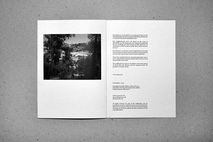
Yaniv Waissa is a photographer who was born in Haifa, Israel in 1978. His work deals with rebuilding and replacing the old with the new in Israel, gains a layer of meaning by virtue of the political context in which it is being made. Wherever he goes he examines the relationship between man and nature and the, sometimes absurd, connection and constant tension between past, present and future. Yaniv Waissa creates an intimate atmosphere in every frame and puts his personal feelings, emotions and nostalgia into it. Everywhere he goes he recognizes a personal memory that can ignite a collective memory of the viewer.
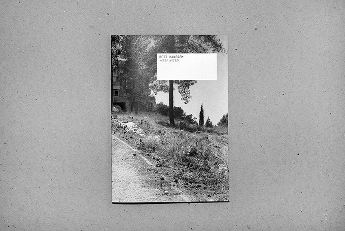
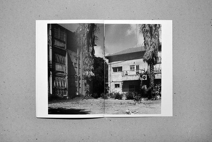
The Zine that I have chosen to look at and analyse by Yaniv Waissa is titled Beit Hakerem (translates to either ‘house’ or ‘village’), after the area of South West Jerusalem that the photographs were taken and produced. I have chosen this Zine and also this photographer to look into as I feel upon first looking without analysis the zine works well and is fluid and follows obvious pattern. As well as this I feel that I can link Wissa’s subject matter to mine in that he is documenting places of the past and ones that are significant to him personally.
The zine itself is in an A5, portrait format. It is small and compact and the photograph used for the front cover uses a wrap-around method where it bleeds and covers onto the back into one double page, landscape image at full bleed to the very edge of the page. This is effective as the largest, and only full bleed photograph used in this zine.
The design and layout inside the zine has all the photographs as landscape, all with a white boarded edge, none of the images apart from the one used on the cover are full bleed. This is effective as on the pages where there are two images, one on each page, there is spacing between the photographs and they don’t start to merge together.
For the layout of the pages Waissa uses only two layouts – either a half image on each page across a double page or a full double page spread with each having a white boarder. This is effective as there are only two displays that have been chosen, it gives senses of simplicity.
For the rhythm and sequencing we can see that Waissa is using the only two display choices and produces a sequence and rhythm with the photographs. Towards the middle of the book we have a sequence of two double page with 2 photographs each and then one full double page image, towards the end it then goes to one double page with two images to one full double page spread, it creates a bit of difference while only having to use two design and format layouts adding to the idea of simplicity. It creates a rhythm and sequence instead of jumping between layouts which would have made it make less sense and not show any narrative which can be helped by the rhythm and sequencing.
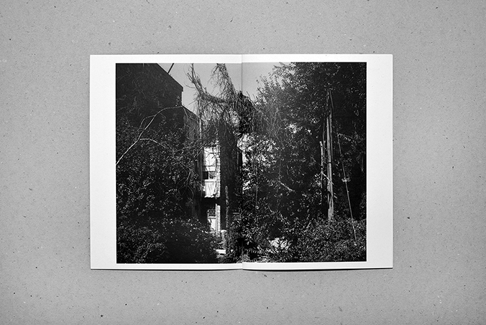
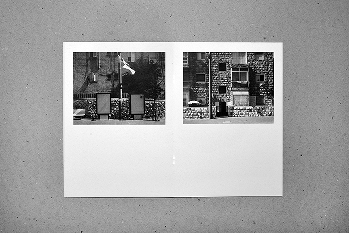
The zine follows a narrative of images that we can see and follow, we follow the smaller images showing the urbanized sides of the town, the brick and concrete, the visible man-made elements. Each larger image, however, follows and shows the natural side, the overgrown vegetation covering and hiding the buildings and streets. The last photograph in the book shows a half page display of a bit of a further away image, it is taking in the whole town through the trees rather than close to specific buildings. From this we could take and think of ideas of the narrative being about a journey through this town showing it in small snapshots and ending and closing on an on look of the place as a whole. For me, personally taking and looking on the photographs I feel that Waissa is showing a narrative of the journey and overtaking of the natural world on this landscape.
The title and the cover of this zine I feel work well with the layout and aesthetic. The inside of the zine shows a very simplistic layout and rhythm which is effective as it maps and mirrors the simplicity of the front cover and the title. The cover image bleeds across to the back cover in one large double photograph, one that reflects what is going to be inside. The photograph includes a path and suggests the walking journey that the photographer has gone through while taking the images. The title very simply ‘Beit Hakerem’ is the name of the area of Jerusalem that the photographs were taken and adds to the aesthetic of the zine.
The only elements of images and text being used together in this Zine is on the last double page spread. As well as this page including the institutional information for example the websites and publishers, it also includes contextual information on Beit Hakerem, it explains some information surrounding the area historical of the reasons it was built and reasons for its naming, and also how it has changed and what it has become. I feel that it is an effective choice to have it at the end on the last page of the zine, as it lets the viewer create their own ideas and feelings before being given any information that may effect the way that they first initially feel. It allows the viewer to create their own ideas initially and then they are able to go back and re look with a bit more information contextually on the place and the photographs and allows them to generate more ideas and feelings.
Zine Composition – It is important to have some type of link between the images in a zine in order to form a coherent piece of work, this can be done even by putting similar images on each 2 page spread or by keeping some form of link be it thematic or in the style of photography across the entire zine. This not only helps the images to belong to the zine, it also allows the images to flow throughout the zine.
Juxtaposition can also be put to good use as this can also create a link through the images. This is most commonly done using color however can also be done by simply changing the feel of the images (such as using a smaller aperture next to a large aperture image in order to contrast the amount of depth of field) however juxtaposing the themes of the images can also be done to great effect.
The title and cover of the zine is arguably one of the most important elements of the zine and allows for a great degree of freedom in order to attract a viewer.
Other techniques such as typography and graphics can be used in a zine for a visual effect or for the sake of pacing.
In my previous studies into the bunkers of Jersey, I researched the artists Jonathon Andrew and Paul Virilio, in order to get an understanding of different ways on how to capture and edit my images of bunkers. This work can be found here:
https://hautlieucreative.co.uk/photo19ase/2019/03/13/artist-research-paul-virilio-jonathan-andrew/
To further my research I will now be analyzing Lynda Laird’s photographs who captures bunker archaeology in color. Her work shows similarity with the two artists researched above but also is very different and unique which presents the bunker’s in new and interesting way.
Lynda Laird:
Lynda Laird is a British based photographer who usually works on longitudinal projects focusing on capturing landscapes, and enjoys working with the idea that the subject holds a memory at that specific moment in time, trying to bring history back to life. Laird studied documentary photography and photo journalism at university, which lead her to also using archival images within her work. In addition, her photographic work has won many awards such as Planche (s) contact Festival, Deauville, selected artist residency, 2017 and has also exhibited her work on many occasions.
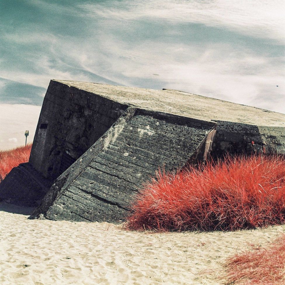
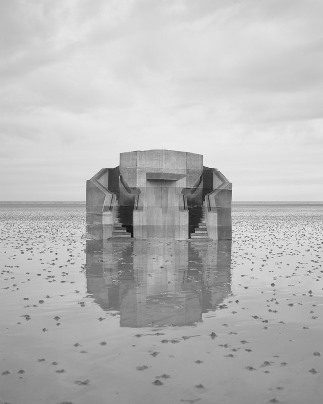
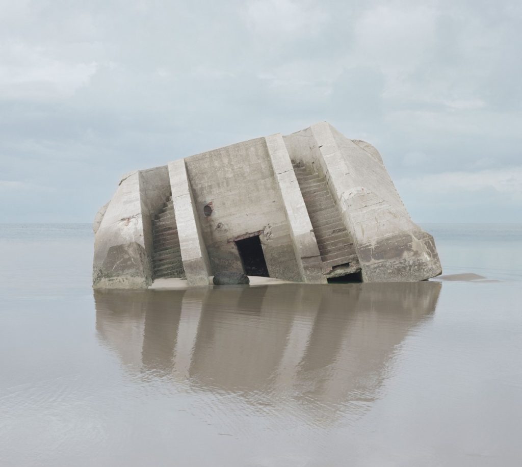
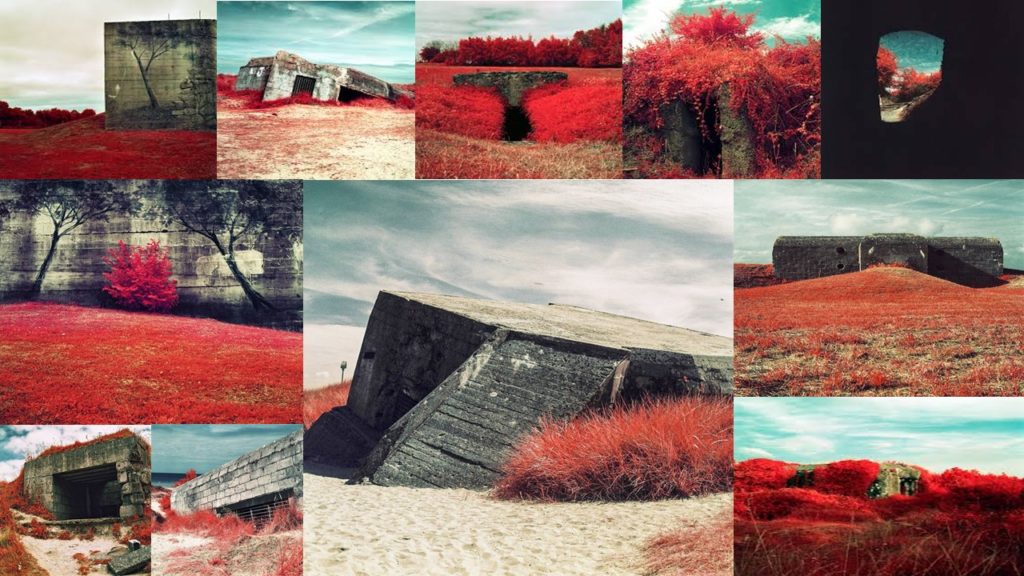
The image above is apart of Laird’s photographic series ‘Dans Le Noir’, which in English is translated to ‘In The Dark’. The photographic series captures coastal surveillance bunkers which are apart of the Atlantic wall located along the coast of Normandy. Contextually, the photographs were inspired by an air-raid which took place in Normandy during the second world war. This story is outlined on Laird’s website https://lynda-qbha.format.com/dans-le-noir . In addition to this, another contextual factor she also showcased was the use of infrared film, created by the military during world war 2 in order to detect camouflage and expose visual spectrum which is invisible to the naked eye, using this to capture her subject allows a beauty to be presented to the bunkers. As mentioned before the subject of the image above is a bunker used during the second world war. The image presents the formal elements of texture, line, shape and pattern which is shown through the bunker and the nature around it. The image also clearly presents a clear tonal contrast due to the shadows and lighting on the bunker. The main focus point of the image is the bunker itself, which is reinforced by a narrow depth of field and the light coming from directly on top of the bunker. The background of this photograph is plain and simplistic, it showcases the sky and some of the nature surrounding the bunker, allowing our attention to begin on the bunker and then take in the background. Technically, the lighting used is natural due to the subject being a structure located outdoors. It seems to be a bright sunlight, taken at just past midday as the shadow of the bunker is being reflected on the left hand side of the frame. The aperture used is likely to be low as a lot of light is being presented in the photograph, which also allows the depth of field to be narrow. The shutter speed is quick and the ISO is low as there is no intended blur being presented within the imagery. Moreover, the white balance used creates warm atmosphere. As mentioned before these camera settings almost present the beauty of the bunkers even though the contextual factors behind the series is negative, creating a clear juxtaposition making it interesting to view. Conceptually, Laird is trying to showcase the horrible historical factors of the bunkers and their uses during the war, but also showcasing how they have been neglected and the beauty and nature is almost claiming back the land.
Action Plan:
As an action plan I want to conduct photo shoots where I will capture Jersey’s bunker’s which were used during the occupation of Jersey. I will look at capturing images in the style of Laird, looking at how the bunkers hold memories, and Virilio and Andrew’s. When it comes to editing the photographs I will look at the use of color and black and white edits in order to produce imagery which is clearly inspired by the two artists, as well as exploring with different elements on light room.
People and bunkers.
Showing the contrast between the people of Jersey and the Nazi bunkers.
To show a contrast between the people of Jersey and the new bunker structures. I want to show how Nazi bunkers quickly became a common site along the Jersey coastline and how the Occupying forces integrated with what was already there.
I wanted my zine to made up of montage images. These images would be a combination of my own bunker photographs and photos from the archive. I wanted to show that life under German rule gradually got harder for the Islanders as time progressed and I thought that best way to show this was to have my images n my zine to gradually get more and more violent. I couldn’t really violence in my own images as they only show the now, no longer weaponized remains of German fortifications, so I had to do this in the archive images I combined them with.
