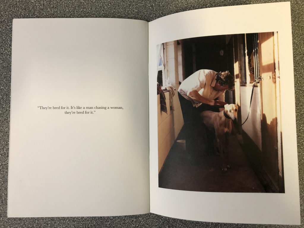
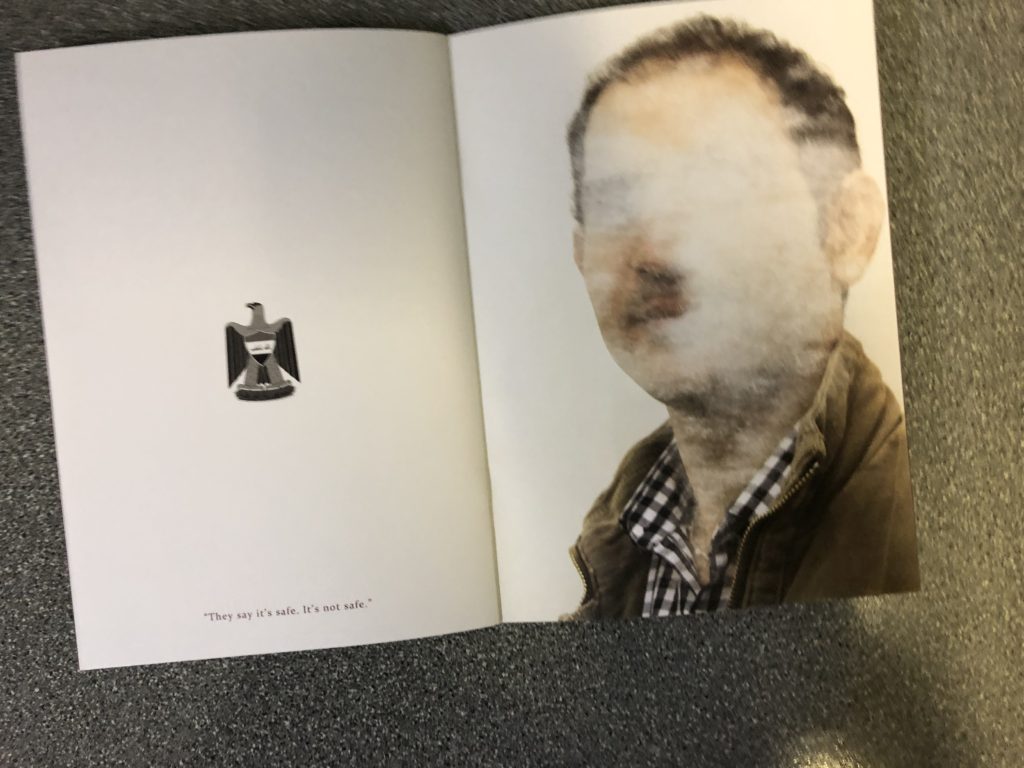
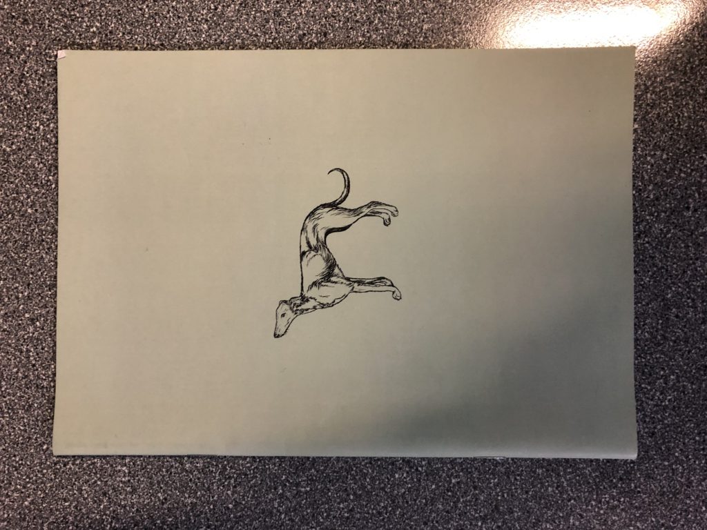
As the production of a Zine, including images of my best work, is an ongoing process throughout the year, I have researched into the Zine making process, and have taken the time to physically look over various examples of Zines, produced by both professional and amateur photographers, in order to take inspiration that can be used in the development of my own Zine.
After coming into contact with a range of different Zine styles and layouts, I was able to gain an understanding of the type of layout and style that would suit my work, and this has given me the opportunity to begin to develop and plan my own layout for a Zine. The following are examples that I felt were useful and/or were interesting examples of layout/design:
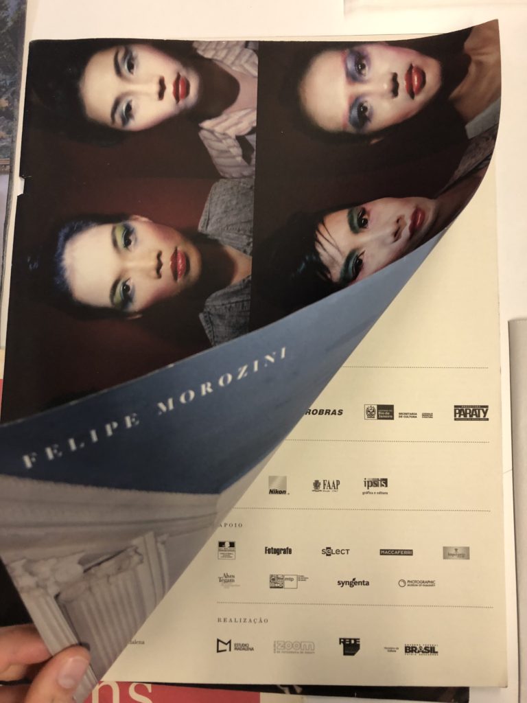
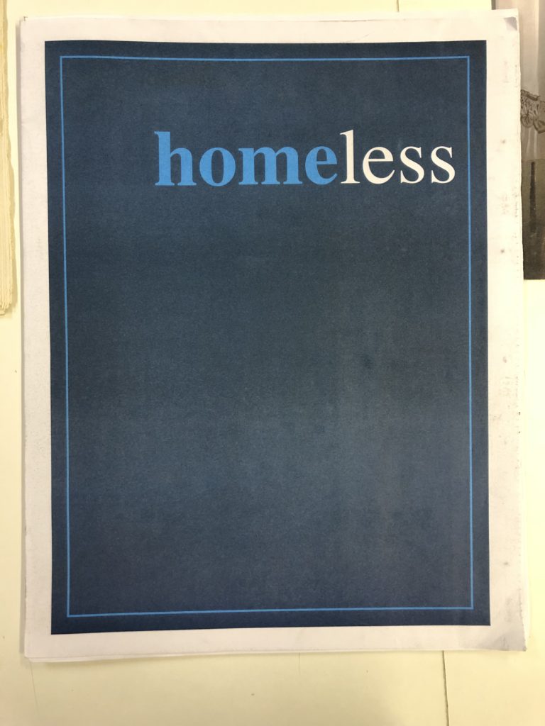
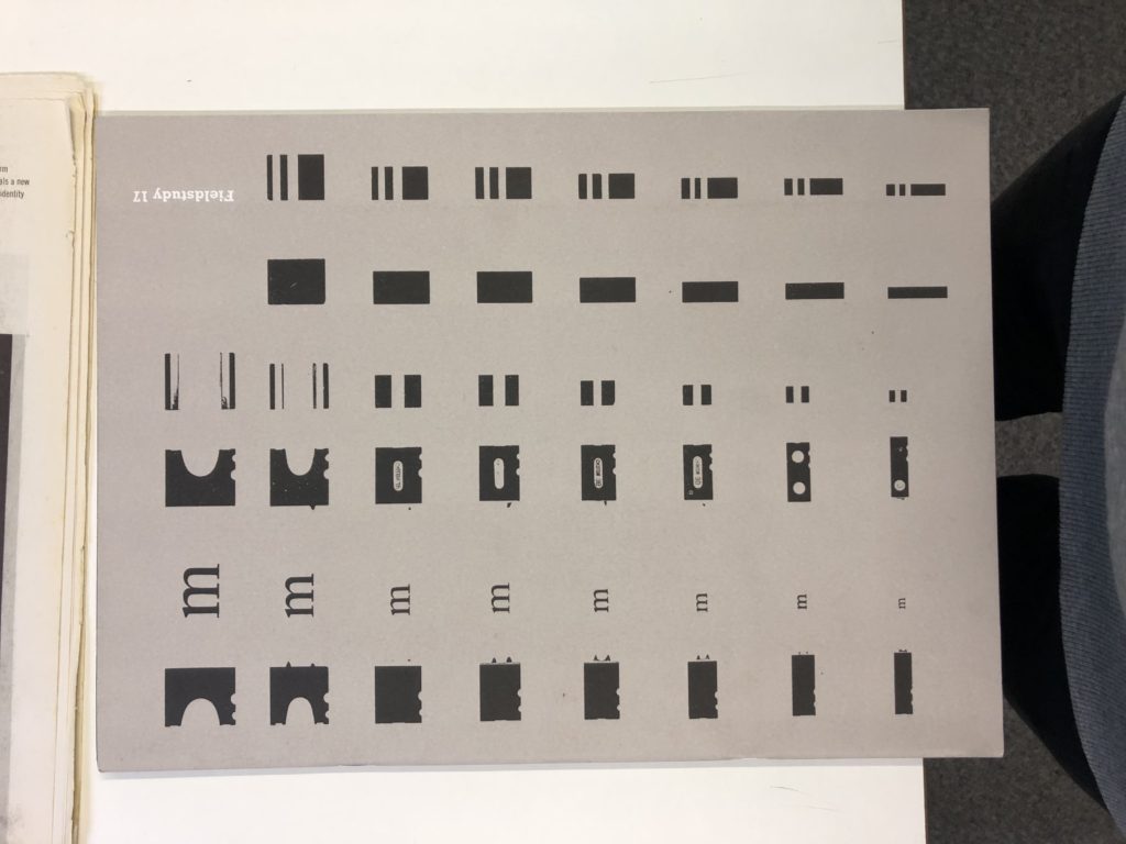
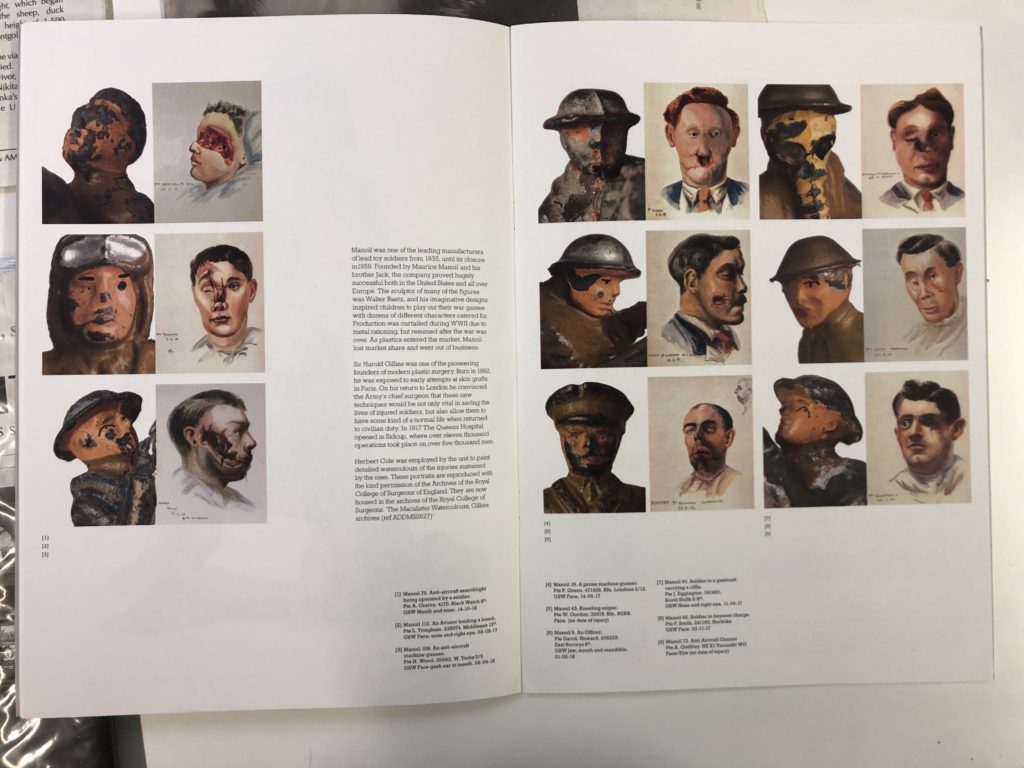
The above images are examples of zines that I researched. I have taken inspiration from the above images, and they have influenced the development of the experimentation for the layout of my zine itself.
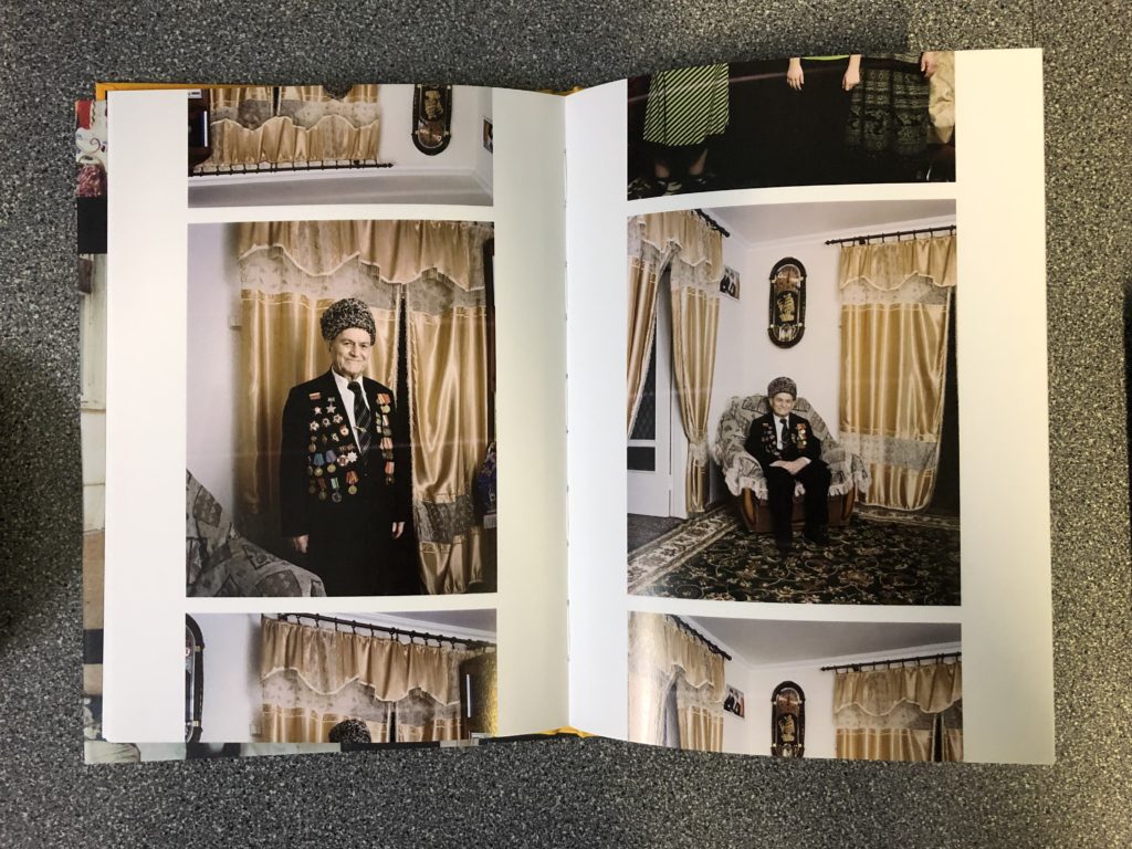
I found that the above image used an interesting layout for its images throughout the book. The images are laid out in a contact-sheet style, with certain images being cut off and the centre image acting as the main focus for the page. I found this to be a unique and original way to layout the images in the zine, and it shows a connection between the photographs themselves, and their origins (as photography used to involve the printing of contact sheets).
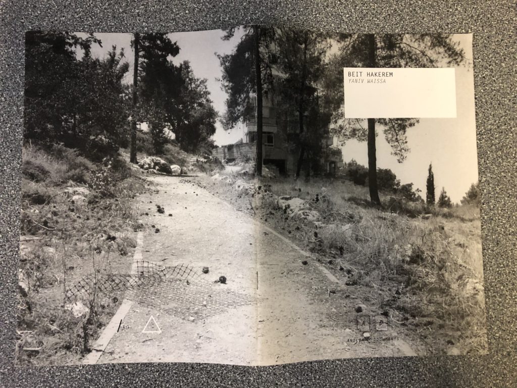
Many of the zines that I came across contained at least one full-bleed image. This involves a single image taking up the space of two pages in the book (typically over the middle page), allowing for the focus of the observer to placed fully on the single image. This layout also allows for a larger image to be presented in an effective and eye-catching way.
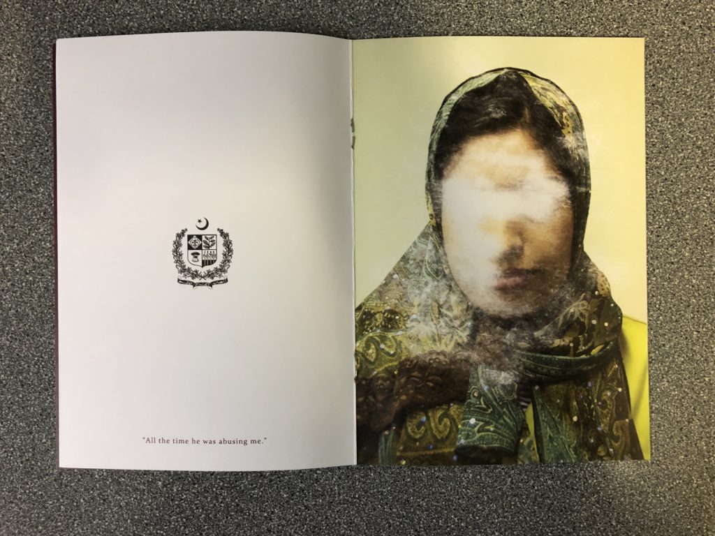
The image above was taken from a zine in which the front cover was designed to replicate the layout of a passport, which reflects the theme of the whole zine itself (being issues occurring abroad). I feel like the contrast between the minimalism of the logo and the quote on the left, and the image on the left allows for the narrative of the book to be easily told, as the quote on the left related to the story represented in the image on the right.

