1 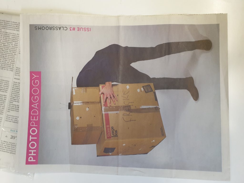
2 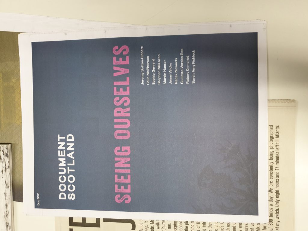
3 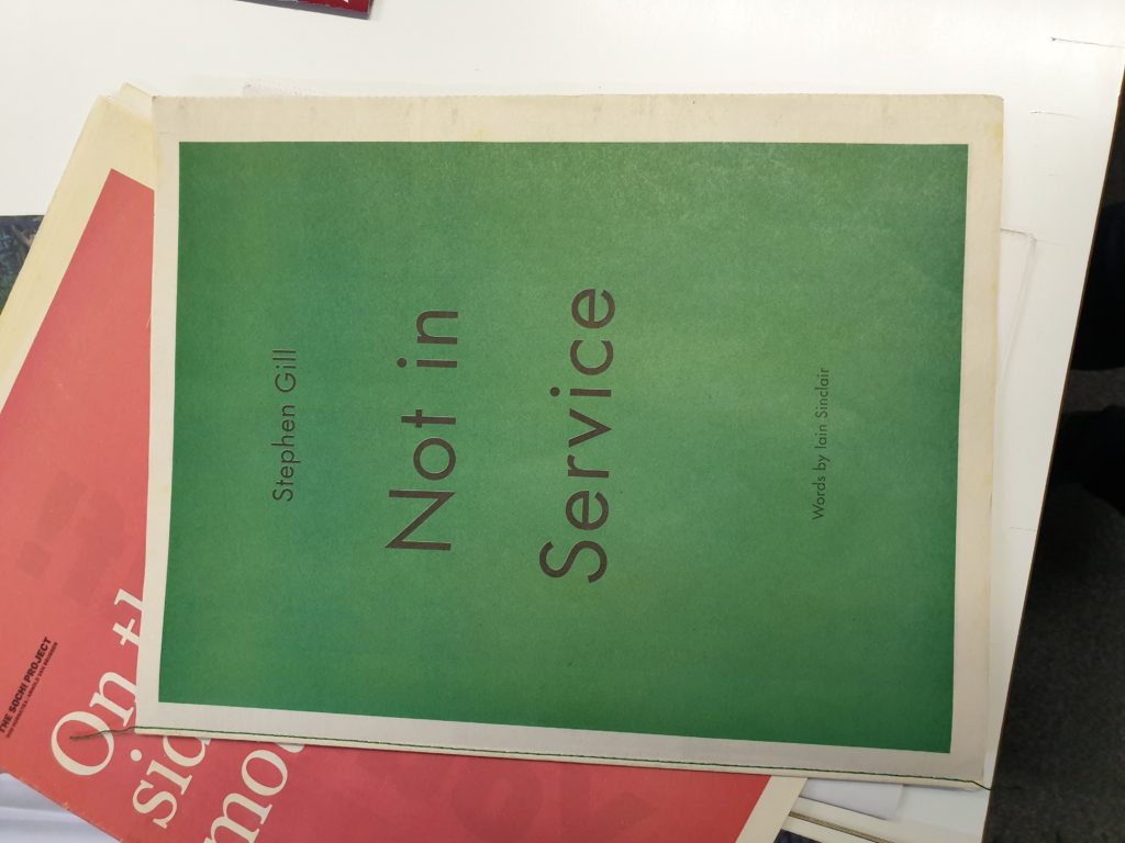
4 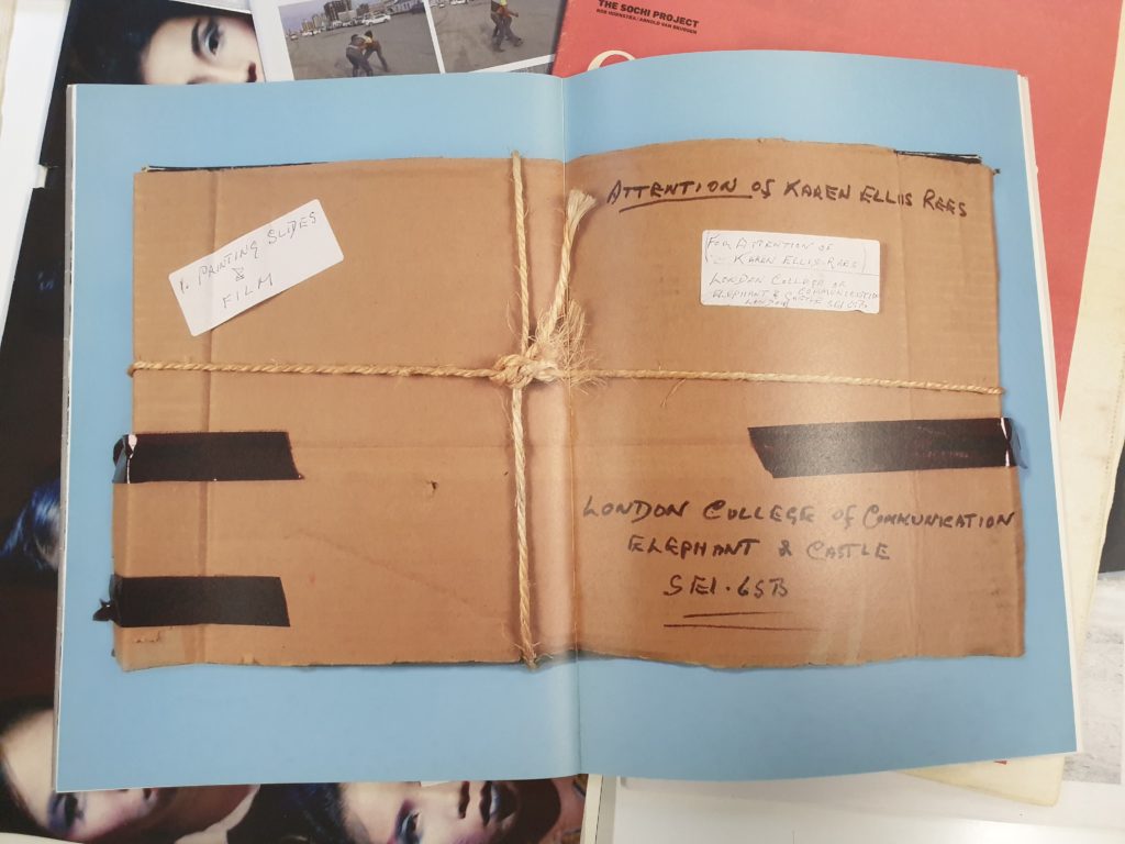
5 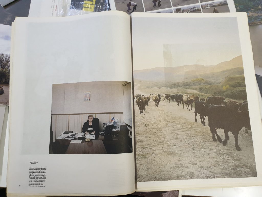
6 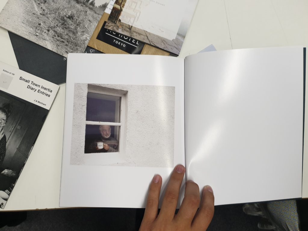
7 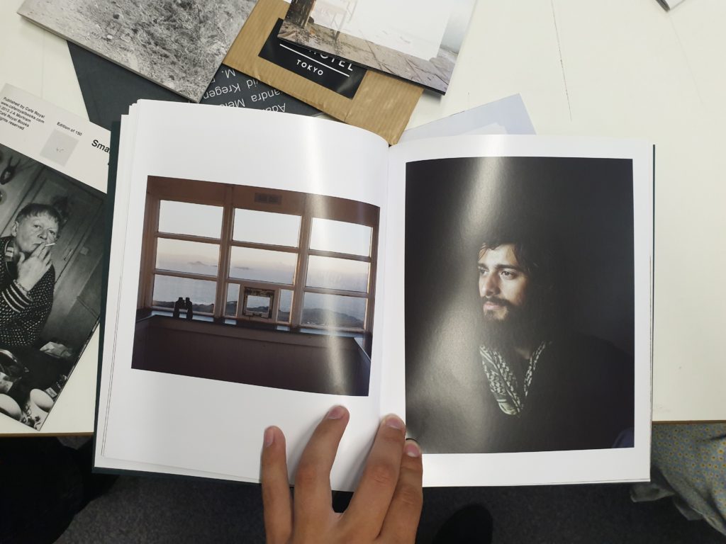
8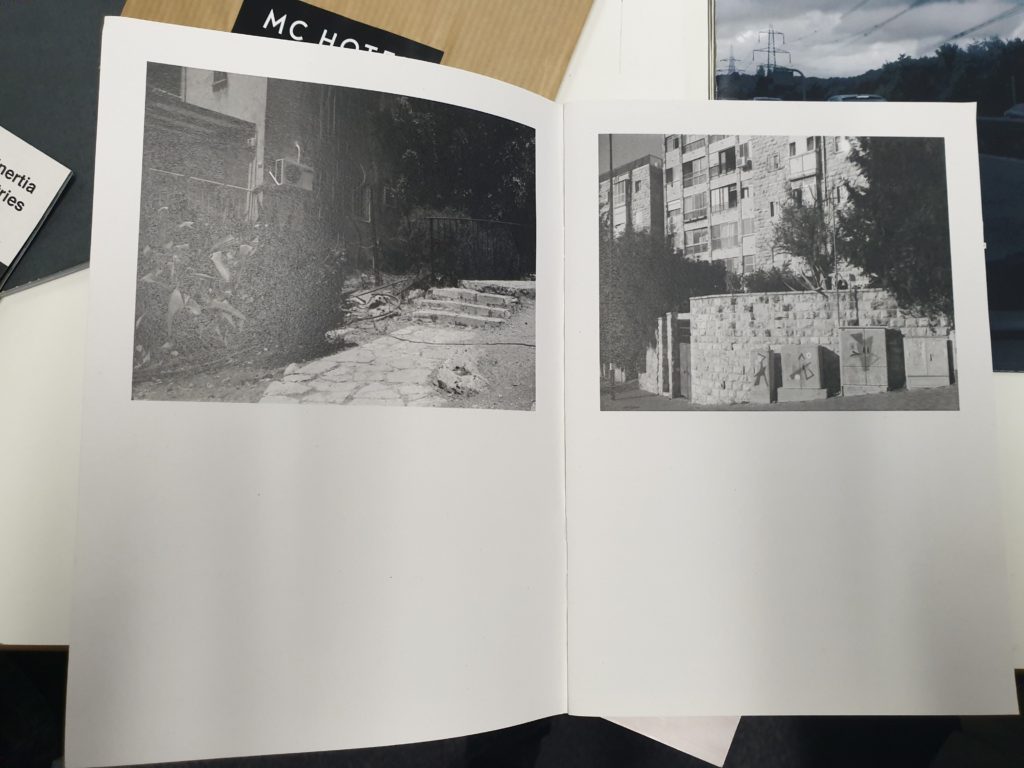
9 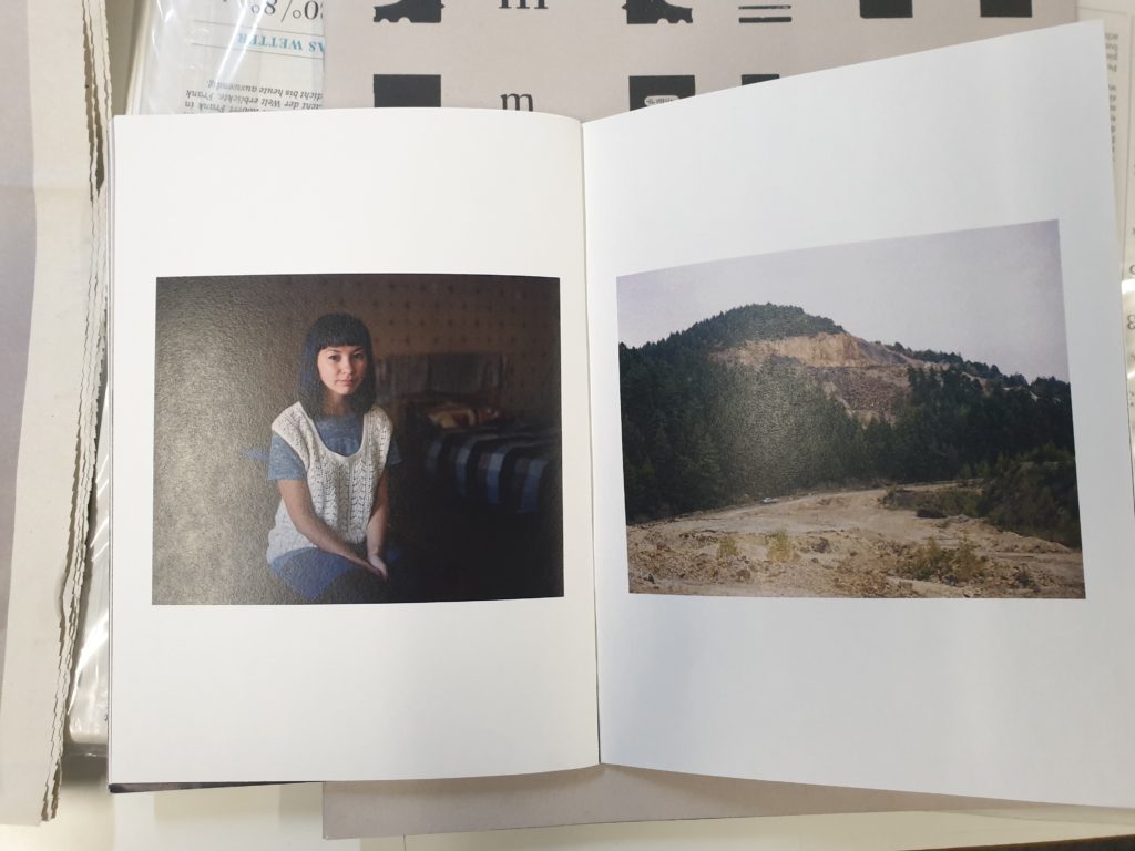
10 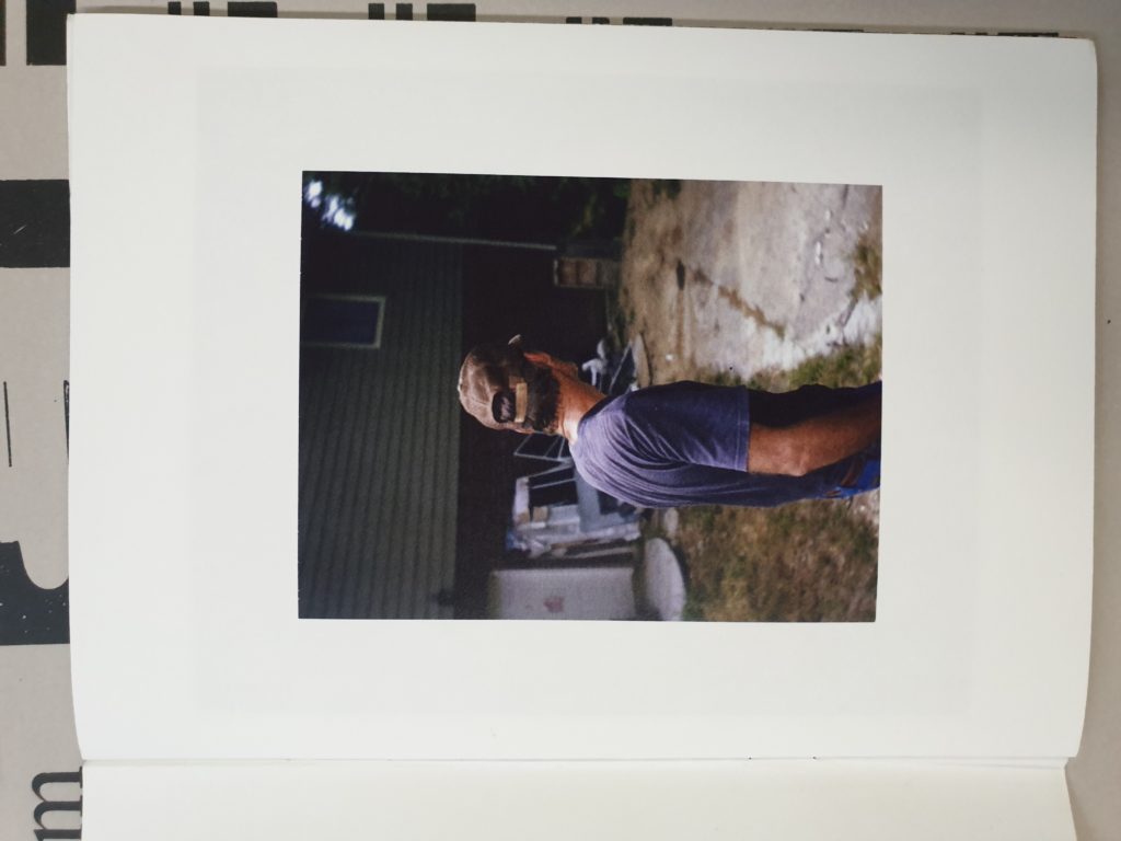
11
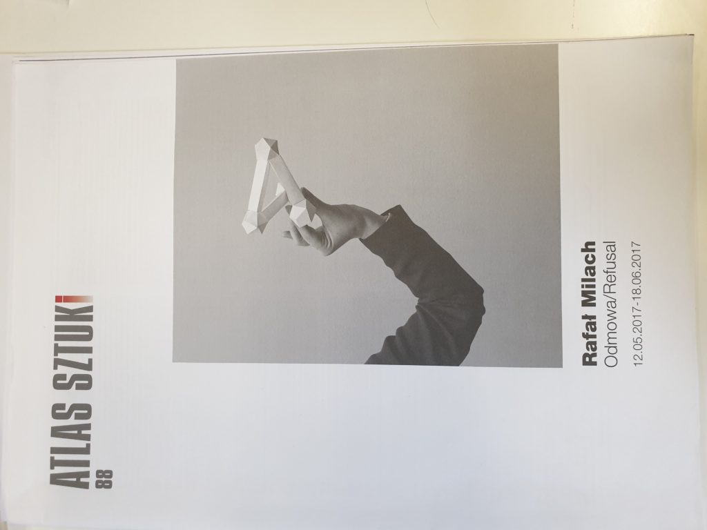
For my first selection, I wanted to highlight one of the front covers that stood out the most to me. I like the use of bold typography for the title, and the use of the red for the final letter definitely gives it a unique look, whilst still being fairly minimalist, using negative space to its advantage. To continue the style of minimalism, I also like the layout of picture number 2, as having one bold image that takes up most of the page, along side the brightly colored title. In contrast to this, I also like the idea of using a darker or colored background, as I have highlighted in pictures 3 and 4. Even though I definitely prefer the colours used in image 3, however I think the much more simple design of image 4 looks much cleaner.
Moving on to the inside of the ‘zines, I like the use of this double page spread and how the subject has a border within the image, rather than adding a border in Photoshop. The ideas presented in the 6th image also stood out to me, as there were very few ‘zines or newspapers that used the different sizes of images to contrast them, and I like the idea of using different image layouts to help create a narrative. Speaking of which, image number 7 uses only 1 picture over the course of 2 pages, and the use of the white background in the photo over the white of the paper creates a very nice effect in showing the subject as especially small. An idea that could work in tandem this would be to feather the image out at the edges, so it blends into the white page background even more. I’m not entirely sure how effective this will be, but I’m probably going to try and utilize it in my own ‘zine.
I like the way that image 8 uses light to convey a sense of space and setting, as the image on the left of the window makes it seem as though the man in the right picture is being lit by the other photo, even though they could have been taken at completely different times and places. Picture number 9 uses negative space under the image very effectively. The layout is slightly more obscure than the more common idea of putting the images in the center of each page as highlighted by picture 10. However picture 10 also uses juxtaposition to its advantage, and even though the layout is nothing particularly new or inventive, I like the use of the barren landscape of the mountainside in comparison to the portrait taken within someone’s home. Finally for picture number 11, I like the use of minimalist and simple framing, using a particularly thick frame, to display the isolation of the subject. I am hoping to incorporate as many of these different techniques and styles as possible in my final ‘zine.
