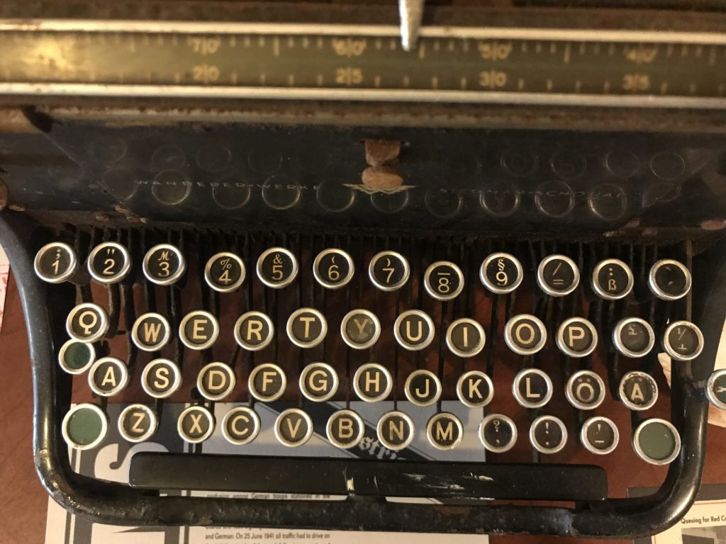
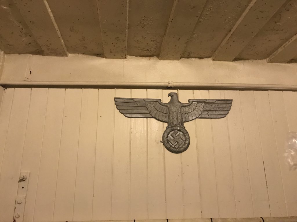
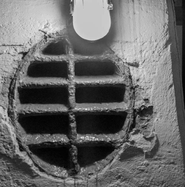
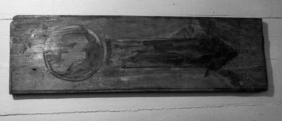
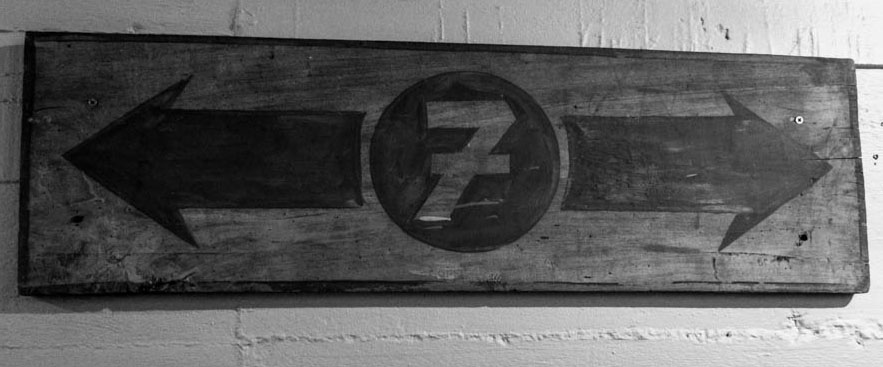
For this experiment I used photo shop with the cropping tool to achieve these edits. I also turned the photos into black and white on light room.
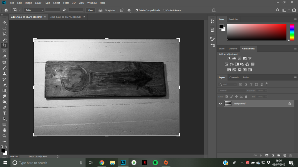
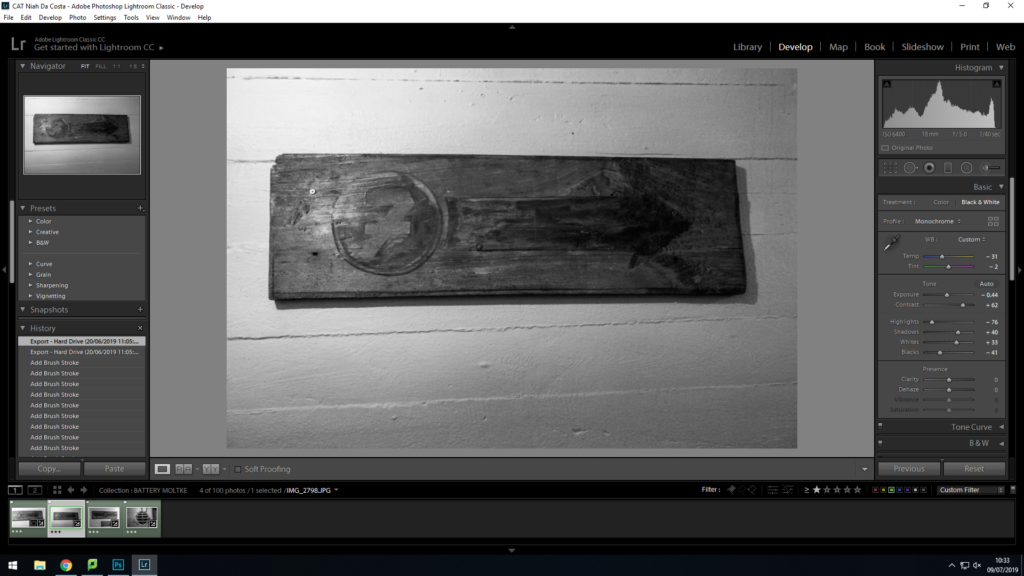
Edit 1 (Cropping and Black and White):
Edit 2 (Photo Montage):
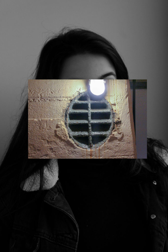
For this experiment I used photo shop with the cropping tool to achieve these edits. I also turned the photos into black and white on light room.


Editing Process:
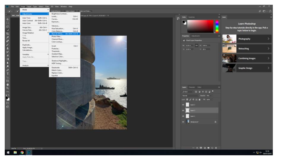
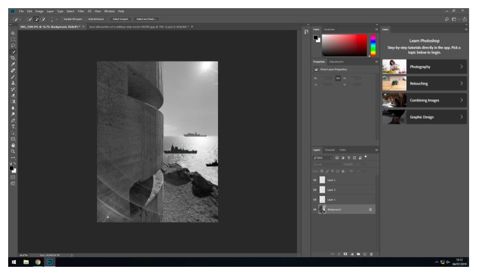
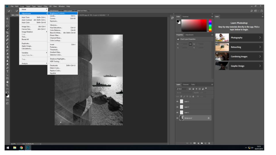
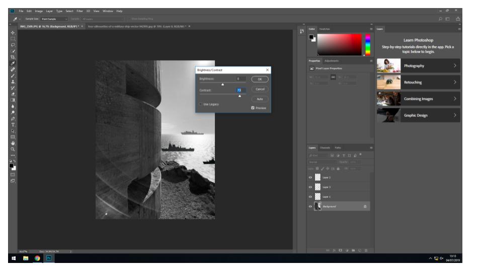
Final Images:
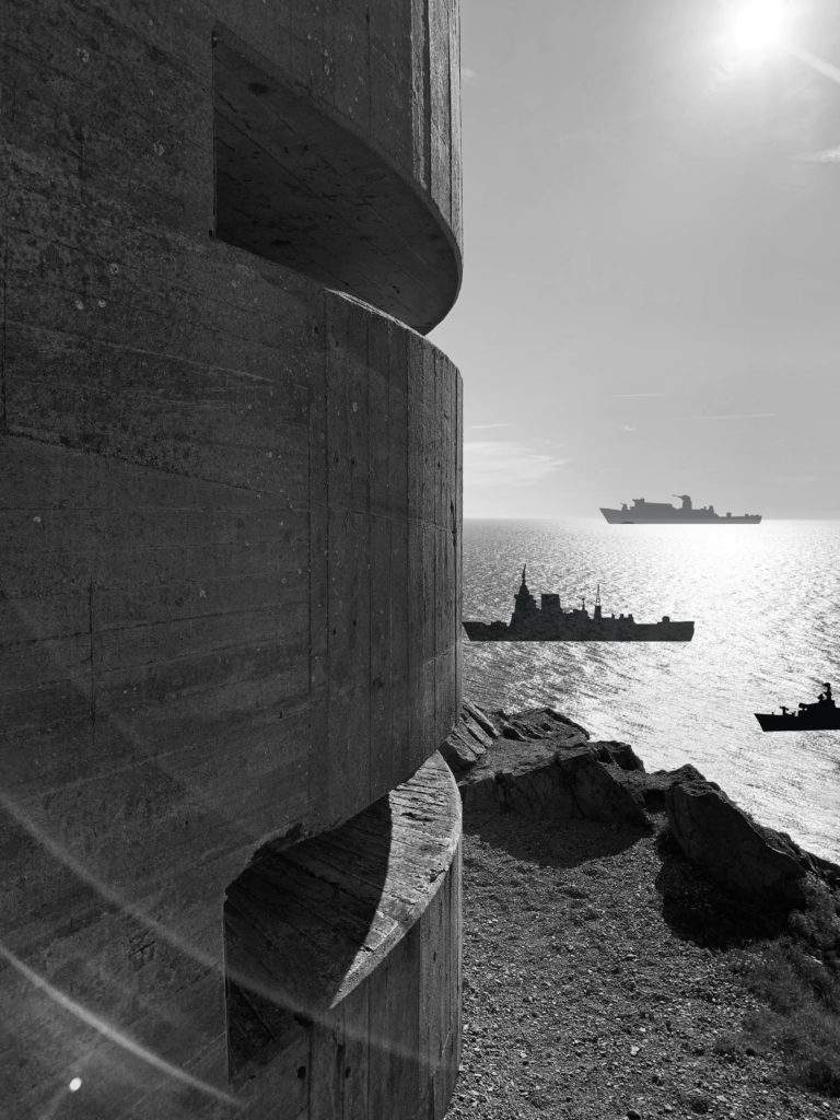
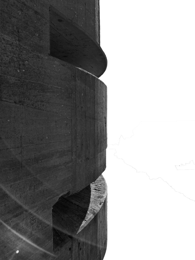
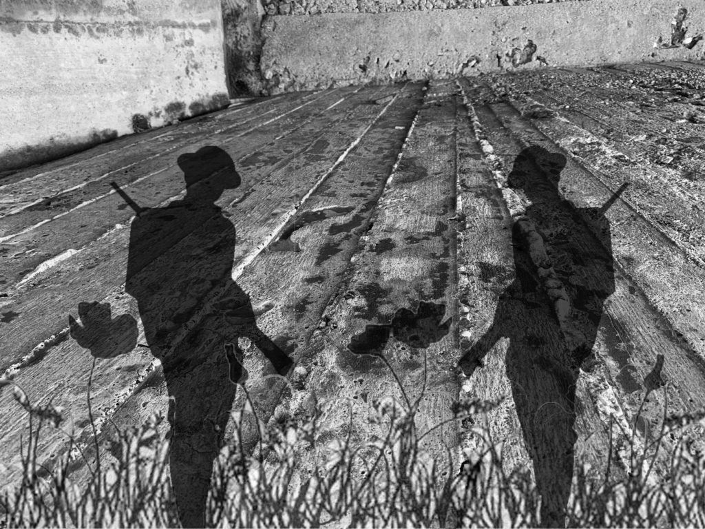
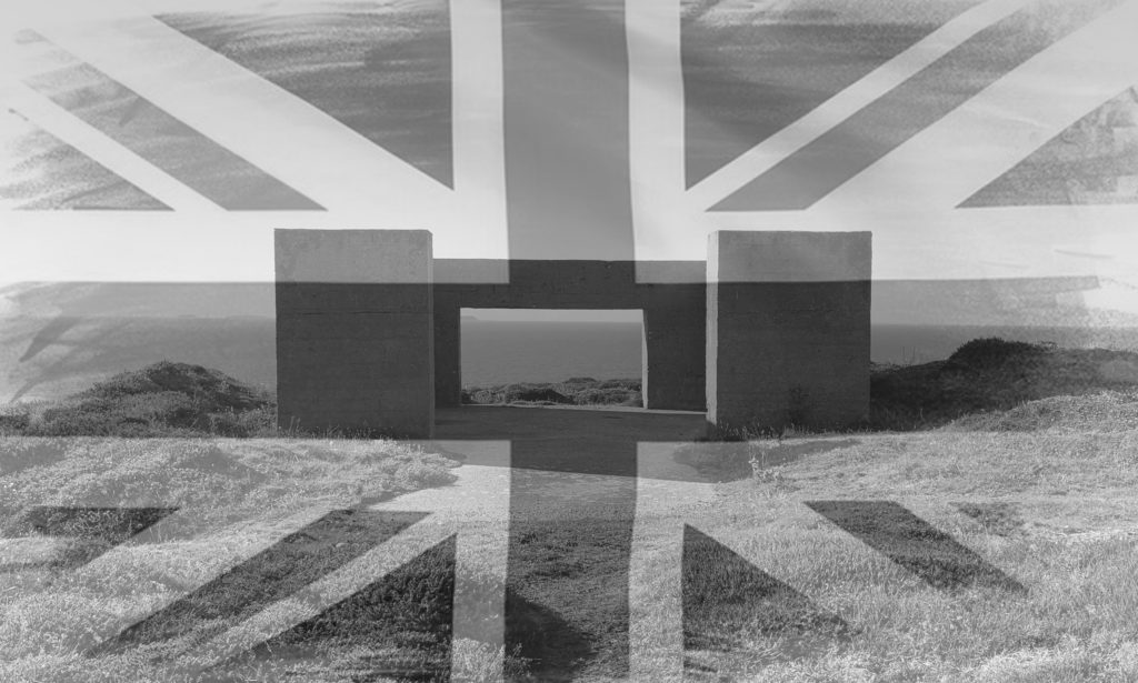
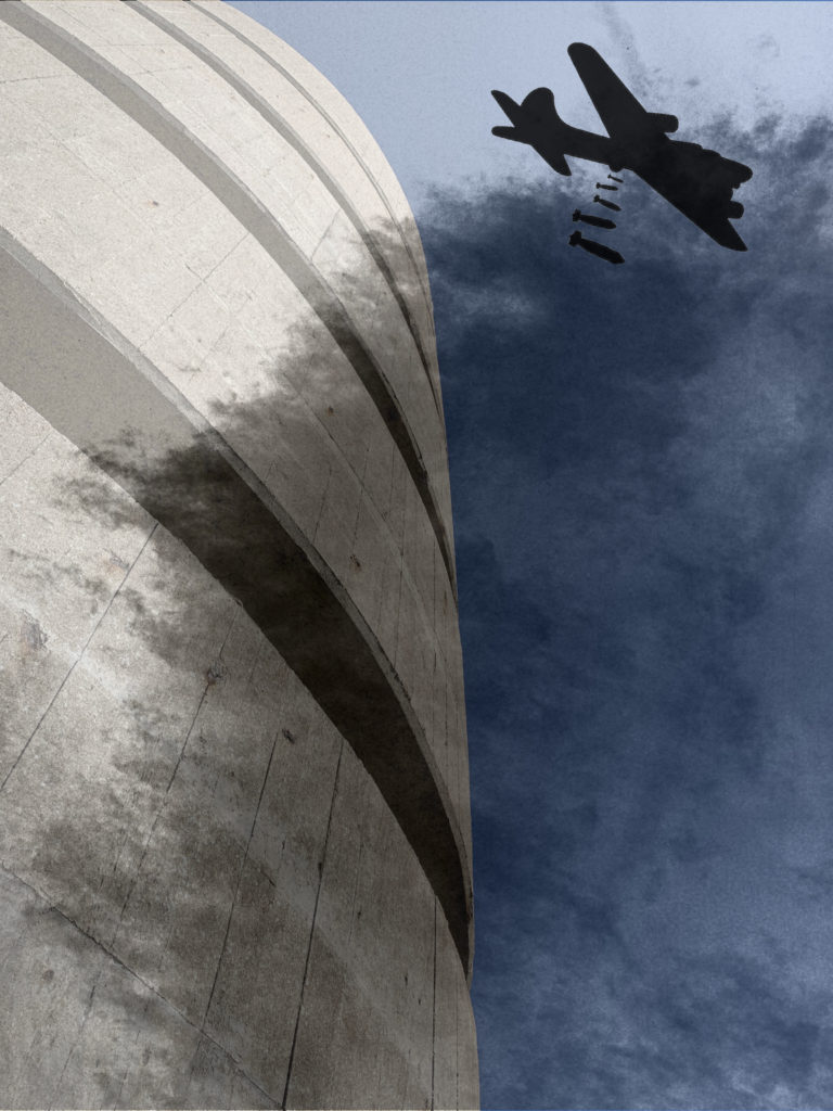
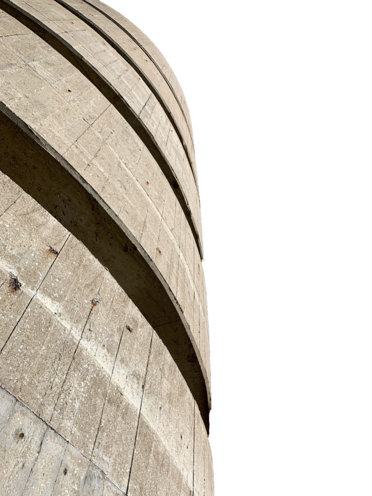
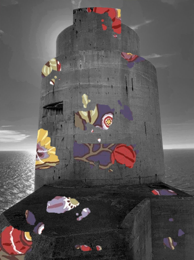
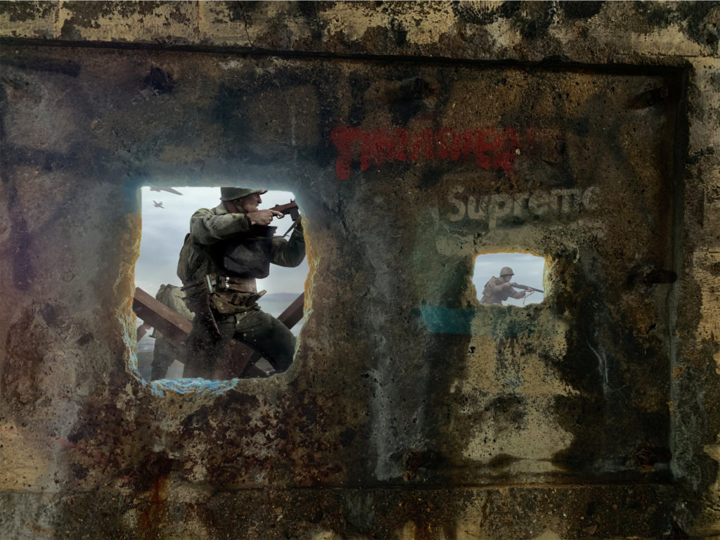
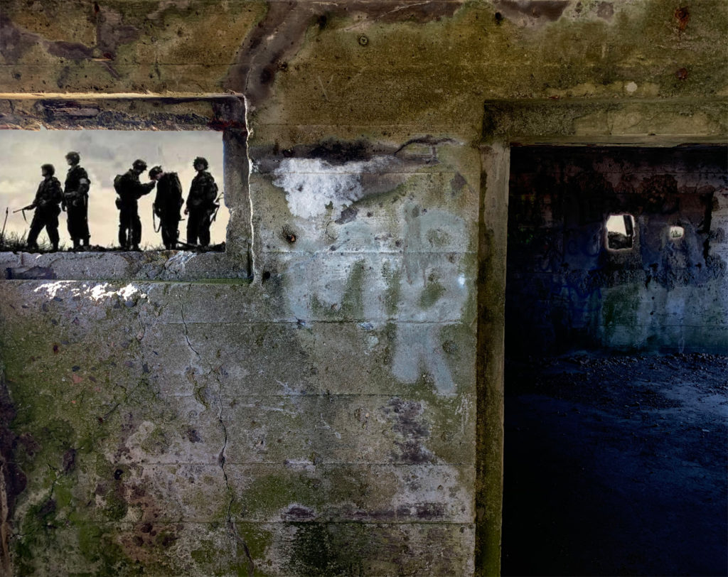
During the occupation and world war 2 many montages where made as posters, and where put up around villages and towns which had been invaded. The montages gave off messages to people and also governmental issues. There were many photographers and artists who have made montages based on the war. Two artists who I came across where Aleksander Zhitomirsky and John Heartfiled who have both made montages on the German occupation along with different wars. I like their work as it is simple yet effective as it is putting accorss a strong message to society.
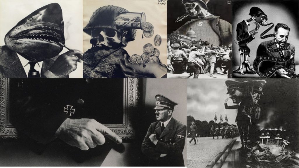
Aleksander Zhiyomirsky was a Russian photographer who was boring in January 1907. After studying in Moscow he went on working as an illustrator and began making posters for magazines. Shortly after people began to realise what photo montage actually was and started to value and respect his work. Most of his montages would come from different types of culture he would experience but mainly the Soviet mass culture. After WW2 he began to find many photos based on the war and started putting them together, to show history in a different way which may have a everlasting effect on people. After this his work was published throughout Europe, Russia and the USA and it is still being viewed up to this day.
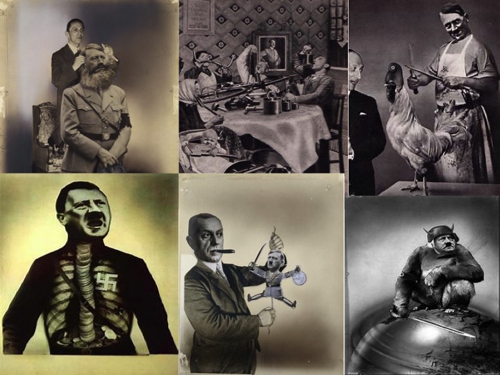
John Heartfiled was a German visual artist who was born June 1891. He was one a small amount who used art as a political weapon, such as his well known montages includes of anti-Nazi statements. His work appeared on many magazines during the time of the war. During his time making his montages, he had to flee from the Nazi’s on many occasions and had to leave his family.
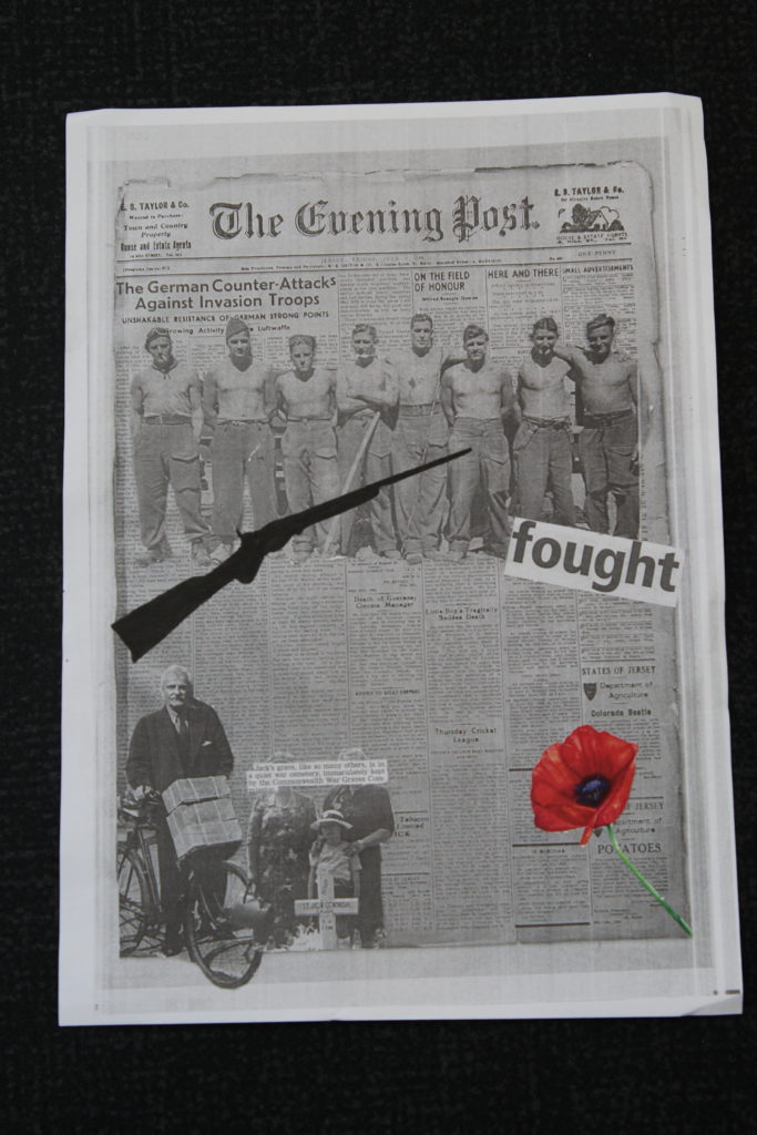
After being inspired after looking at these artists, I then began to picture and have ideas on what I wanted to produce. To create my montage, I found photos of images that had been taken back during the German occupation in the channel islands and used them to create my montage, so that it what have a bigger meaning and relate better to me. After picking the images I wanted to use, I began to cut out the sections of images that I wanted to stick onto my background, which was a copy of an old newspaper. I then places the images on top and arranged them how I saw fit. This is my final product of my montage I created.
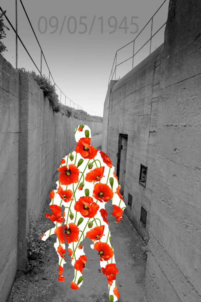
After creating a paper base montage, I then moved on on to creating montages in Photoshop, which I preferred, this is because I could use more images, and select parts of the images with more precision. For the first montage I created, I wanted it to be simple yet effective. This is what I created and these are the steps I took;
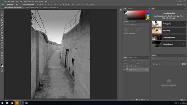
I firstly started off with my original image that I had edited in lightroom, in the previous lesson.
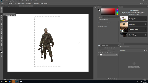
I then went on and opened up a new canvas in Photoshop, where I added this image of a soldier. I then used the ‘quick selection’ took and the ‘eraser’ tool to then remove the original background of the image.
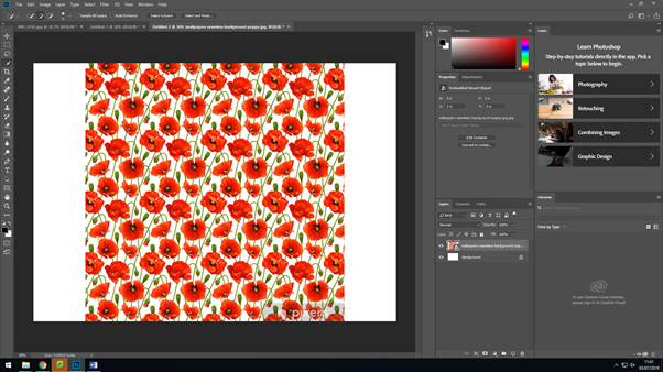
After editing the background of the previous image, I went on too add the image I was going to make the silhouette of the soldier out off, by adding a new canvas again.
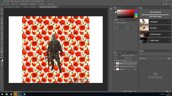
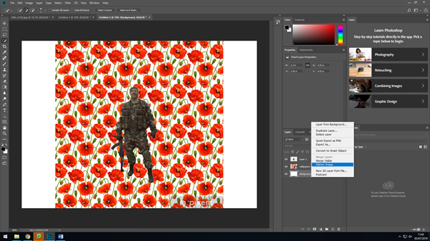
After dragging on the solider to the poppy background, I then selected everything by using the ‘magic wand’ took, I then made sure that the settings were set to ‘invert’ this is so that the background would change and come onto the outline of the soldier after this I then flatten all the layers together to make it one image.
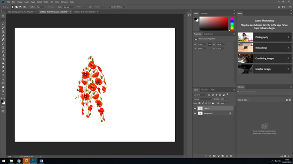
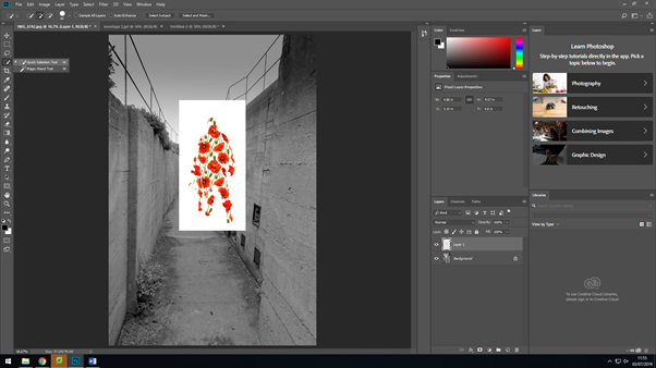
I then selected around the solider after flattening the layers and dragged it over to where I was making my montage. I then used the ‘quick selection’ tool again to removed the white background around the solider, so that I would just have them on their own. After doing that, I saved the soldier as it was, so then I could use it for any other montages I would make, so I would’ve have to remove the background again.
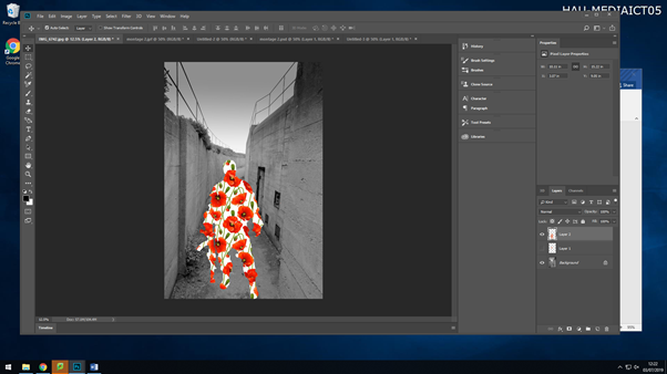
I then placed the soldier where I wanted it, by ‘Ctrl+T’ and then holding down shift whilst making the image bigger, this is so that everything stays within proportion of itself.
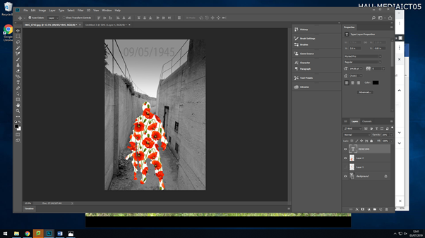
After moving around the soldier, I then went in and added some text to the image. After typing it in, I changed the text to black, made the font size bigger so viewers where able to read it at a glance, but then I changed the opacity of it, as I felt with the text being at 100% opacity, it was drawing attention away from the main aspect of the image. This is what my final first montage came out to look like;
My seconded montage I created, was completely different to my first one, I wanted there to be a relation and link to the Jersey Occupation in this one. This is what I produced and the steps I took;
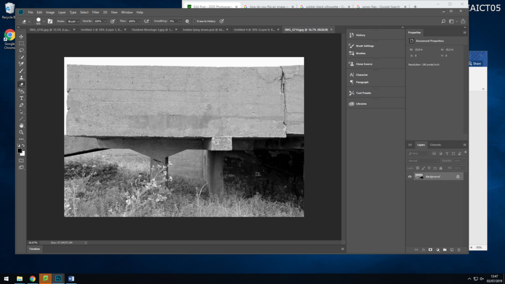
As before I have started off with my original image, this image is my background for my montage.
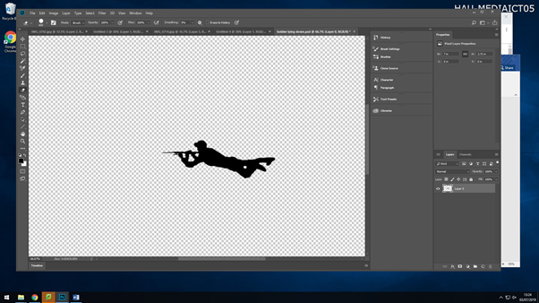
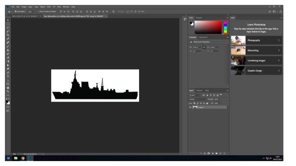
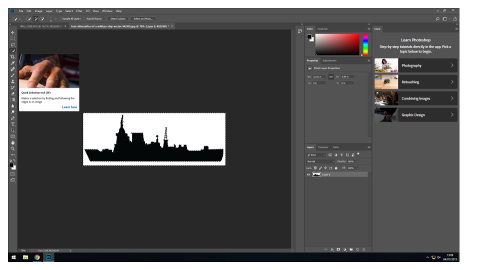
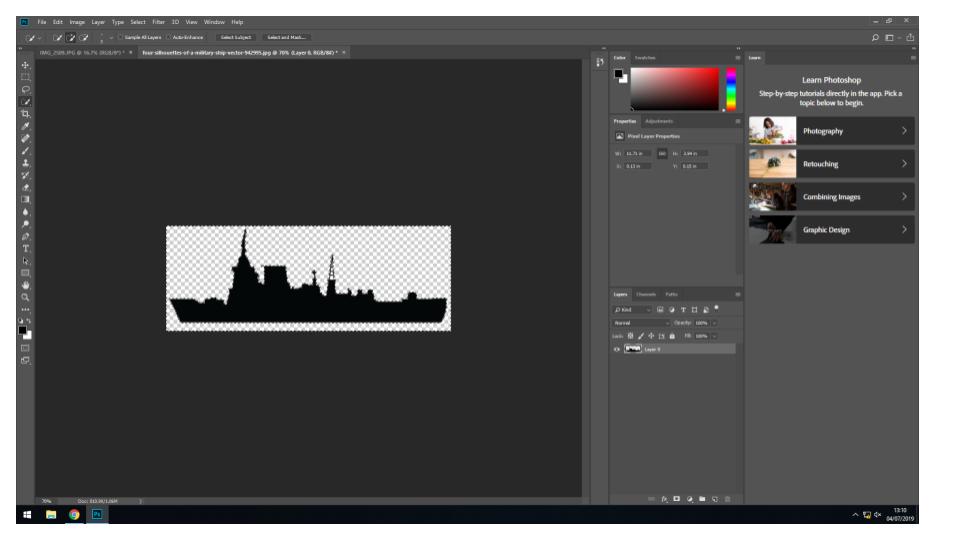
I then created a new page, and added on a black silhouette of a soldier lying down with their gun, I then deleted the background with the ‘quick selection’ took and then saved the image as a PNG so I could then use again if I needed too.
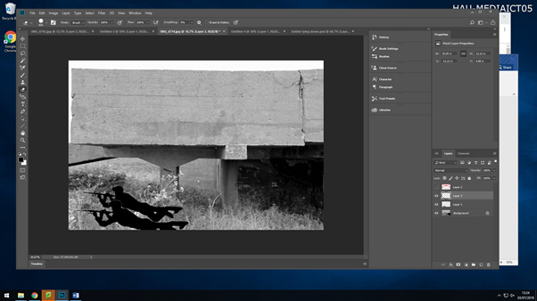
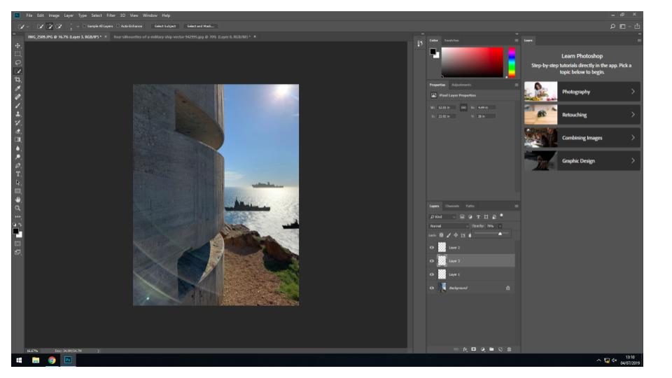
I then dragged the image onto my background twice and enlarged them by selecting the layer they were each on, going ‘Ctrl+T’, then holding down shift whilst dragging the image outwards to make it bigger whilst keeping the proportions the same.
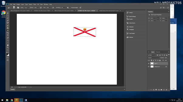
I then went in on downloading an image of the Jersey flag, as this allows people to connect to the image more as you have something relating to you which also defines you. I also then added this to my background image.
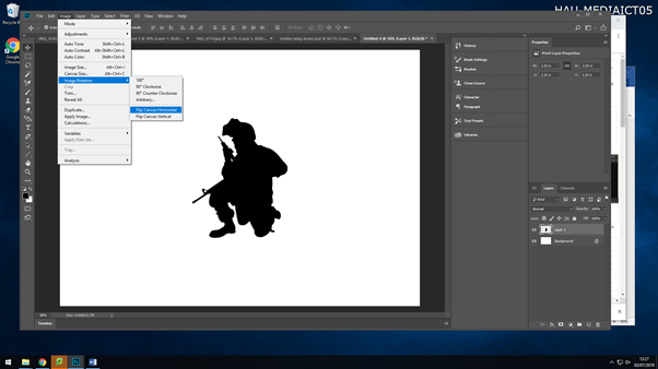
I then decided to ass another silhouette to my montage. But after downloading the image I realised it was the wrong way round for where I wanted to put it. So by selecting the image then going Image>Image Rotation>Flip Canvas Horizontal,I got the image to flip to the side I needed it to be. I then again removed the back ground, saved it as a PNG and then dragged it onto my background image.
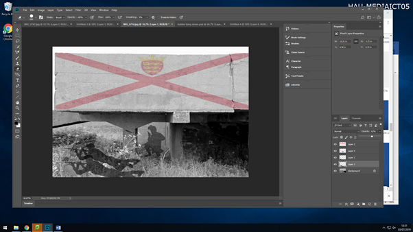
After adding all my images to my background, I then went ahead and changed the opacity of each image, to give it a shadow effect. I changed the opacity of the soldiers as they aren’t alive anymore, so they are representing ghosts.
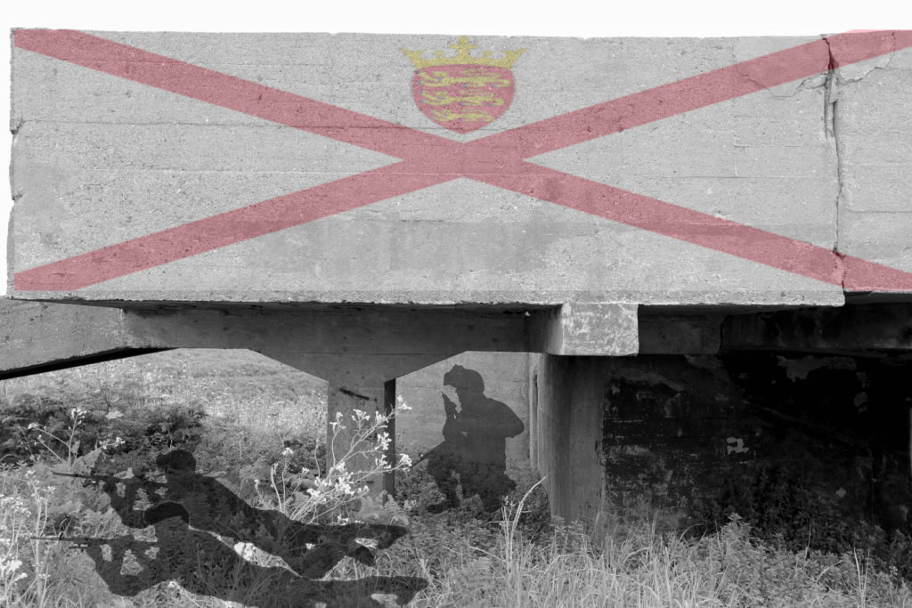
This is my third montage I created on Photoshop

In this montage I have used a war graveyard as the main background, this graveyard were for soldiers who fought in world war 2, as the German occupation happened during world war 2, so their is a link between the two. I then added a black silhouette of two soldiers walking, and lowered the opacity, so they are acting as ghosts walking around their fellow soldiers who lost their lives. And to then finally finish it off, I added an overlay of people who lost their lives in world war 2 and the occupation, I placed this over the full image, and lowered the opacity again, so you could see the image through it, this gives the image a touching emotion.

Paul Virilo is a well known for his images of bunkers. He is a French photographer who was also a cultural theorist, urbanist and aesthetic philosopher. Virilo was in to taking image of the geographical surface, his book contains essays within the first half, on the history of some of his images, which set the concept behind some of the images and then the other half of his book containing mostly black and white images of bunkers within different locations around France. Some of his images I like include;
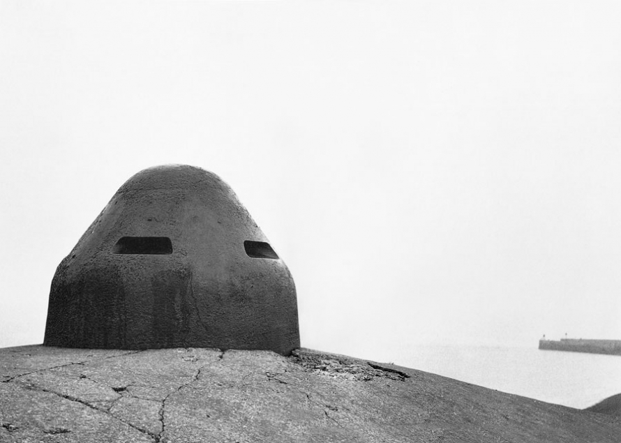
This image is one of my favorites he has produced. I love how simple the image is. It has a longer depth of field of some of his other images where he tends to just focus on the bunker. Whereas in this image he has included a pier behind the bunker, which adds more to the image. The over exposed sky works really well with this image, due to the bunker and pier being in a dark grey/black colour which allows them to stand out and be more bold, along with the over exposed sky causing a foggy/muggy look for the image which changes the emotions presented when looking at this image, to cold and mysterious as something may be able to creep over the horizon. The image is so clear that is allows you to see all the detail of the bunker even from a distance, the features of the bunker have been enhanced and made darker which again works well in his favor as it adds a more of a dramatic feel to the image.
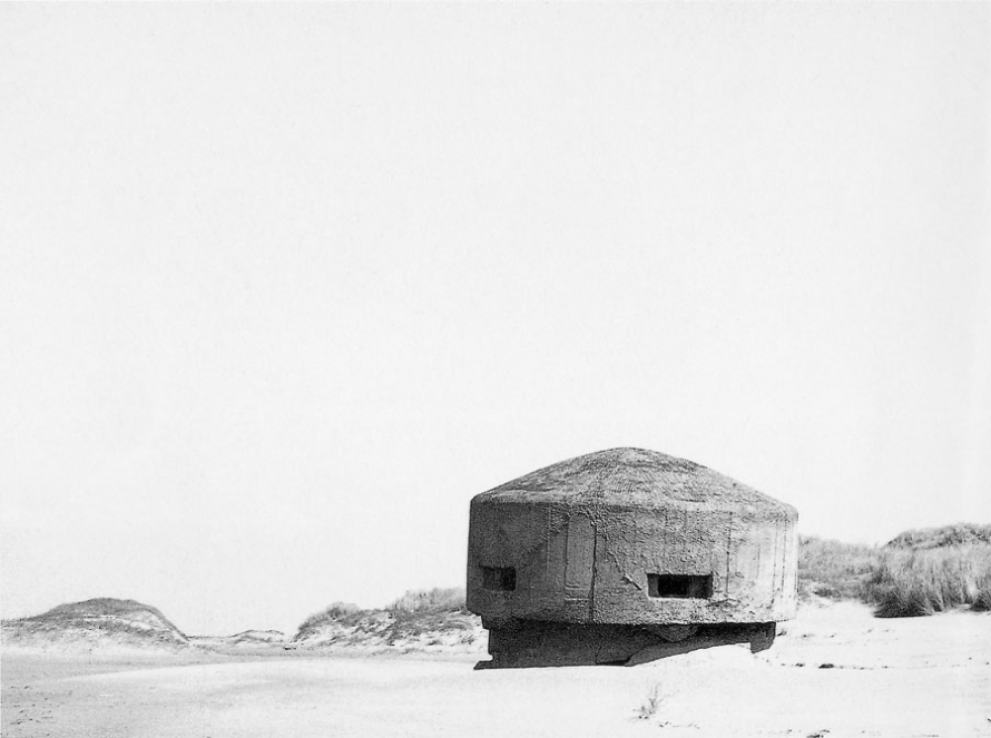
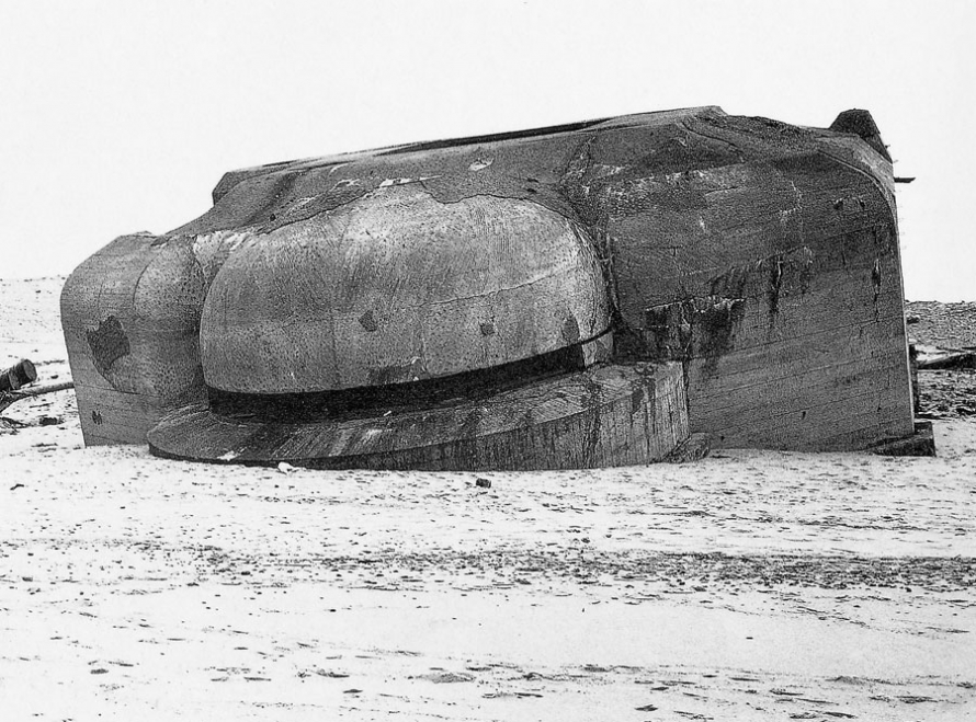

His other images are also simple, but they incorporate different shapes and lines in different direction which makes you want to look at the image and figure out what is happening in it. In on of the images above, his image inst set straight at all, but it allows him to show the purity and untouched through his images without him manipulating them too much and just enhancing the detail of the historical artifacts. Again in his black and white images, he really focuses on making the little details of the bunkers stand out which allows people to see the marks that history has left.
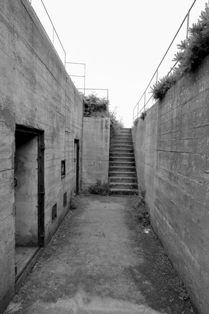
With the photos taken at Noirmount I then used light room to edit them and adjust the settings. I then finally decided to change them into black and white as I feel the images look better. These are the steps I took to edit my photos
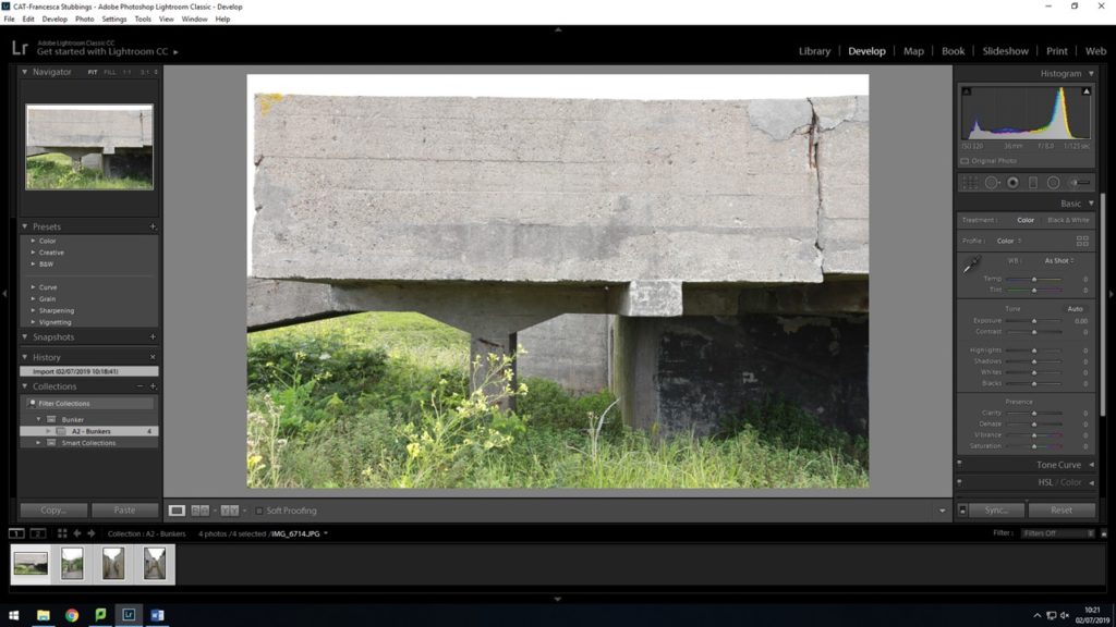
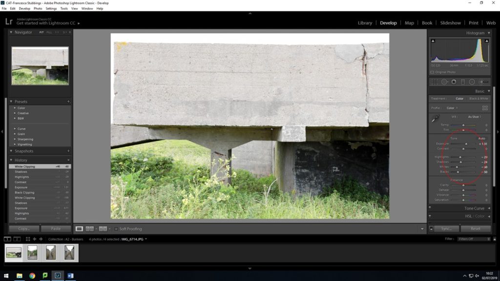
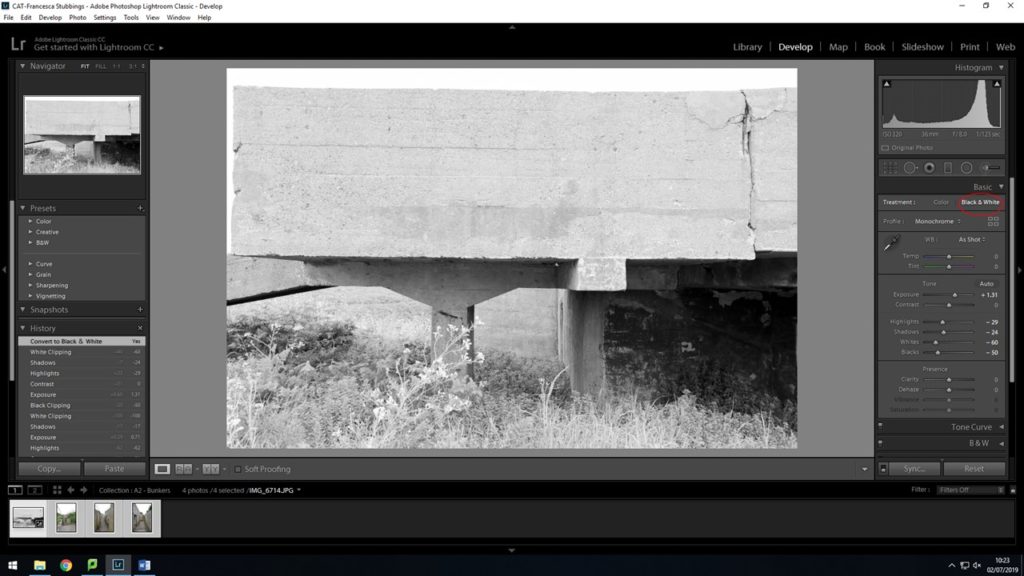
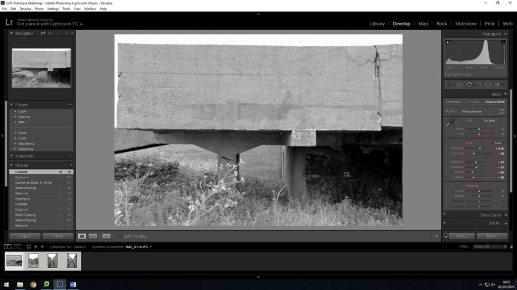
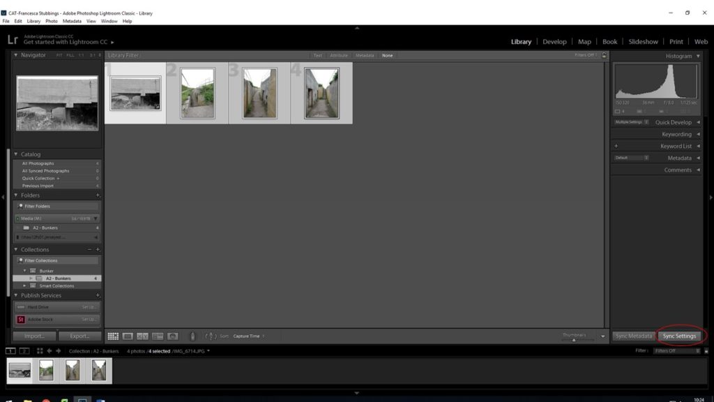
After editing my first image, I then when back to the ‘library’ view so I could see all my images, I then selected them all and clicked on the ‘sync settings’ button in the bottom right hand corner. This allows me to change all my photos into black and white, along with the same exposure, contrast, highlights, etc as the first photo I edited.
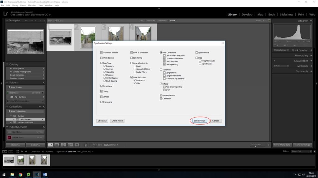
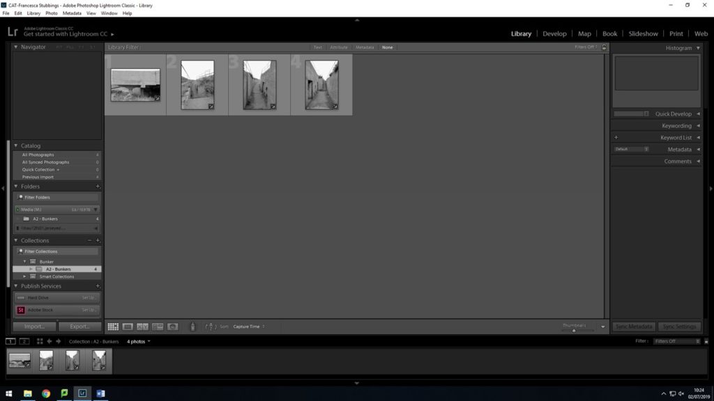
After confirming to synchronize my settings to all the same, my images are now all in black and white. But when going through them some of them look over exposed, but I can still go in and change the settings of that one image, without it then changing the rest of them.
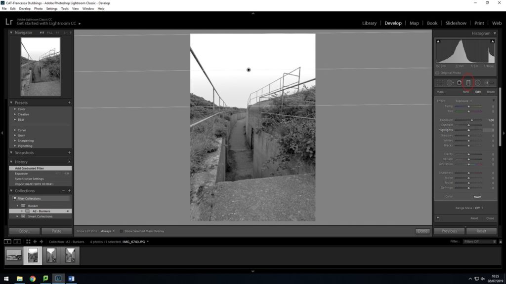
Here using the gradient tool, and dragging down from the top of my image and stopping about half way, this allows me to select that part of my image and then only edit that specific part. I changed the exposure of the sky and made it a bit darker to give it more of a unlit look and the darker sky fits the bunker and environment I have photographed
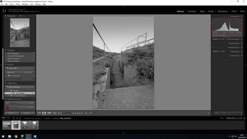
After editing my images in lightroom, I then had to export them as a JPEG in order for me to upload them to the blog. Overall I think editing my images made a massive change in the way I now look at them. They come across as more deep and strong as they were before I edited them. These are my final images;
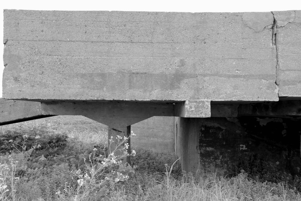
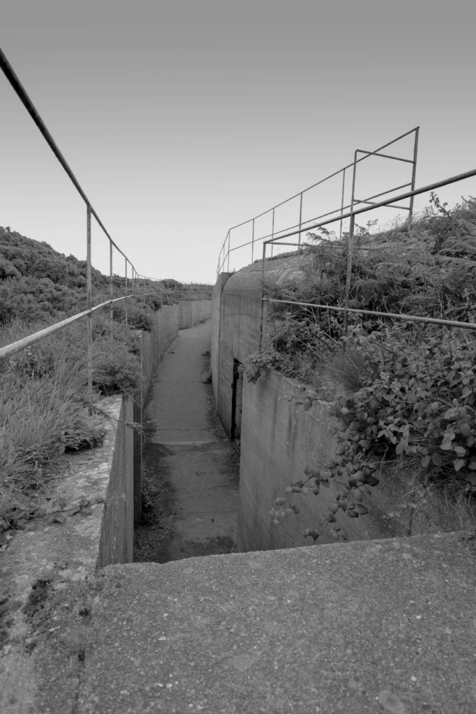
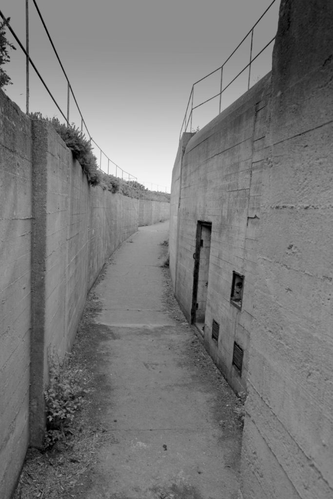
A photo book is a physical compilation of images presented in a book/leaflet form. The vast majority of photo books provide a narrative and tell a story. I have been studying a selection of photo books by various photographers and here are my observations and analysis of these photobooks.
Here are a few of the books I have studied and images from all of them and analysis of the images themselves
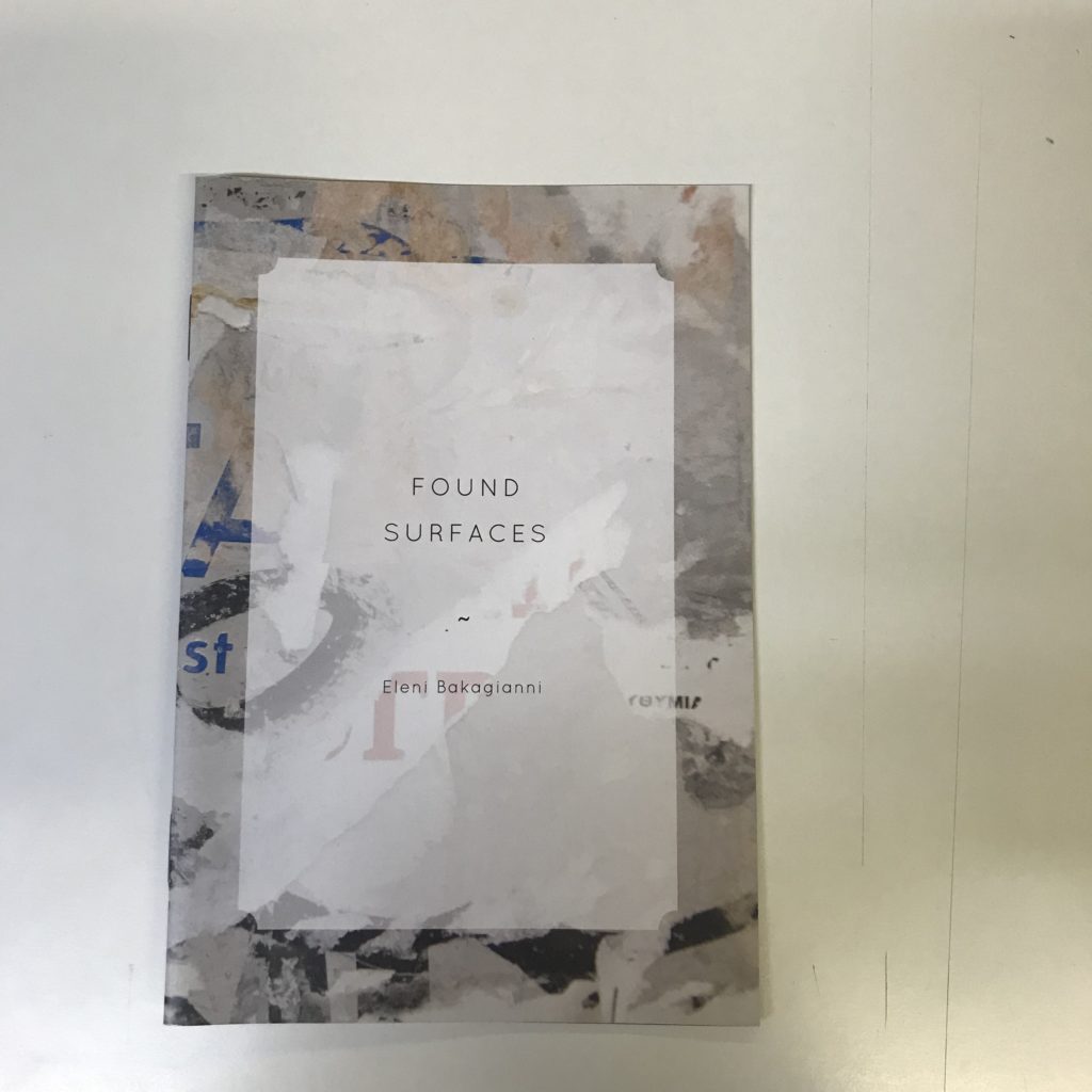
“Found Surfaces” is a photo book by Eleni Bakagianni and it provides us double page spread images of various surfaces and textures found in an urban environment. I find the images very aesthetically pleasing and I also like the book as a whole as it helps to portray the authours creativity in terms of her being able to take a photograph of something that is essentially always overlooked and walked past on a daily basis, and turn it into a piece of art that pleases the eye
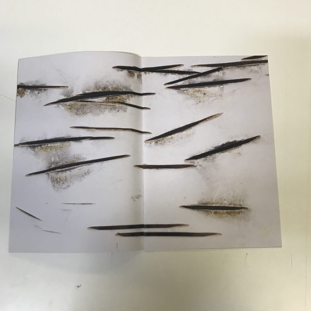
This is my favorite image from Found Surfaces. I am unsure as to what the image is of, I am assuming it is either a wall with damage marks or a birch tree trunk. Either way the image is very powerful in terms of its minimalism yet aesthetic properties. The black marks provide a nice contrast to the whites of the surface and there is a good sense of texture throughout the image
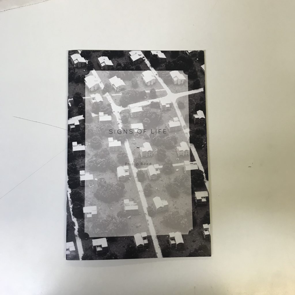
Signs of life is a photo book by Phillip Reid, which depicts aerial images of built up areas and includes images of sports stadiums, housing estates and high rise districts. The whole book has consistently strong geometric properties as a result of photographing from an angle which captures multiple of the same of similar types of building.
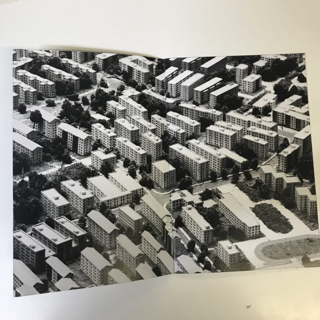
Here is my favorite image from Signs of Life. I am particularly drawn to the geometric nature of the image, with the straight walls and roofs of the buildings really standing out. The photo is well contrasted due to the white of the buildings standing out from the blacks of all of the surrounding trees/bushes.
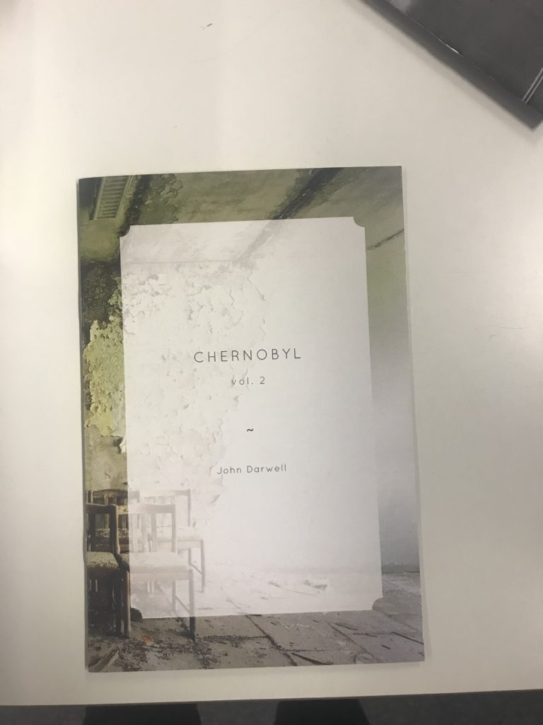
Another photo book I have studied is “Chernobyl” by John Darwell. The book provides an insight into the once populated Ukrainian town of Chernobyl, which was home to one of the worlds most disastrous nuclear catastrophes the world has ever seen. I have a particular interest in Chernobyl itself due to its story and how the whole town has essentially been frozen in time. The only thing that has changed through the absence of human life in the city is that nature has started to take over and decay is widespread.
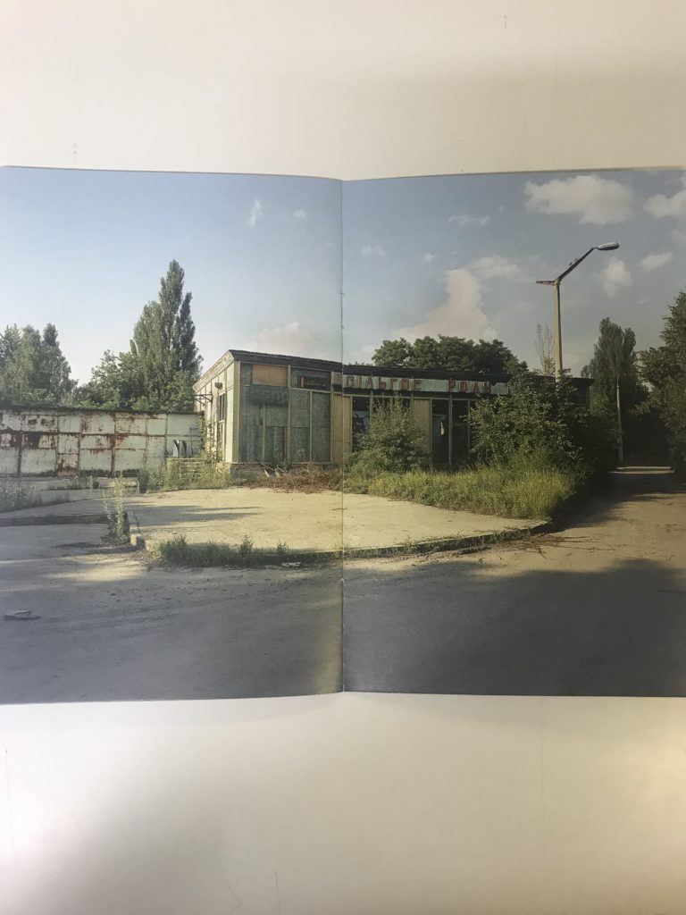
Here is my favorite image from Chernobyl. The image depicts what appears to be a local grocery store. In the photo, it is evident that the place has been left to nature and nature has well and truly taken over, with the plants overgrowing and growing out of the concrete pavement at the front of the shop.The photo itself truly represents the power of the natural world and its ability to reclaim land when humans are not present. the image itself consists of many greens and yellows in the form of the shop and pavement, as well as the greens of the undergrowth and both of these colors compliment each other very well. Another feature of this photo I like is the blue sky, it represents serenity and peace and is a nice complimentary background to the subjects in the image.
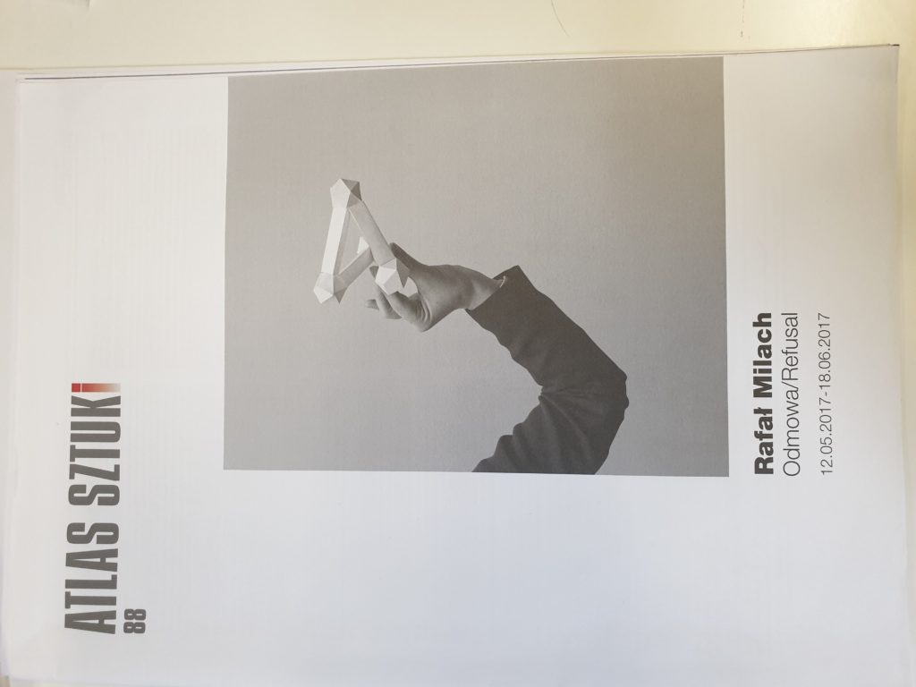
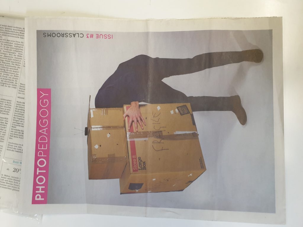
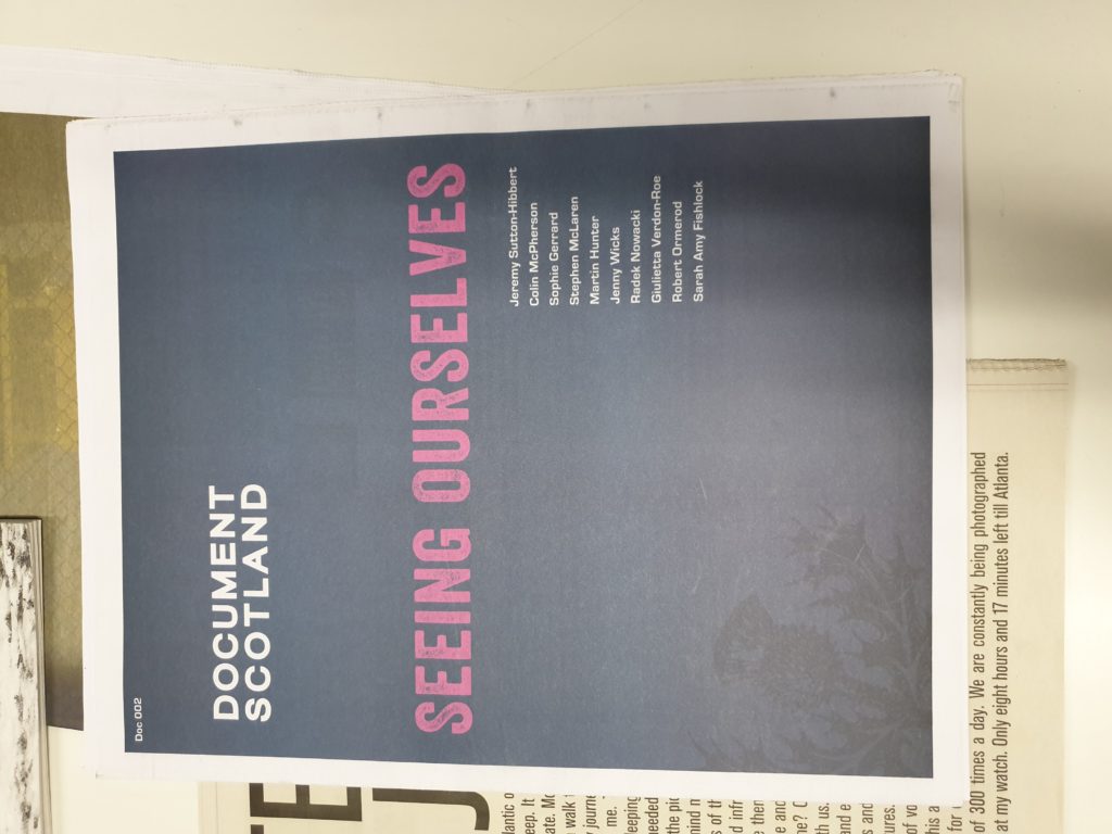
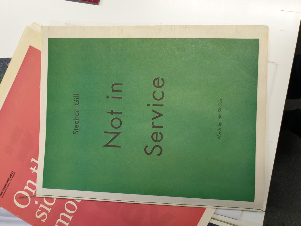
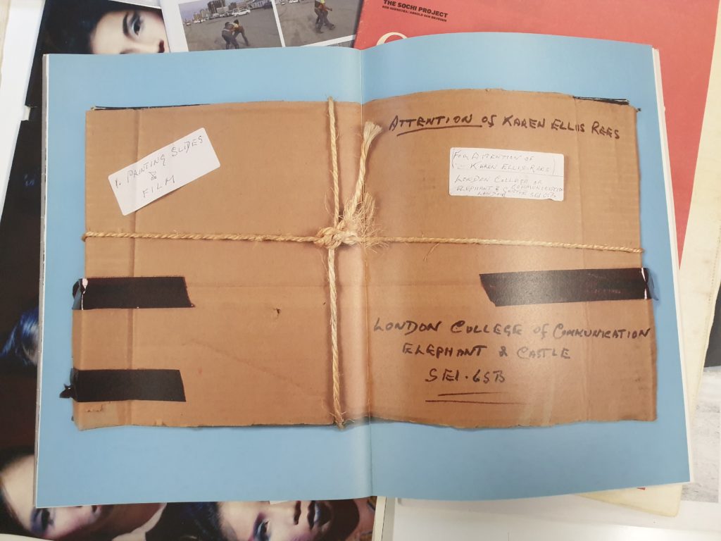
For my first selection, I wanted to highlight one of the front covers that stood out the most to me. I like the use of bold typography for the title, and the use of the red for the final letter definitely gives it a unique look, whilst still being fairly minimalist, using negative space to its advantage. To continue the style of minimalism, I also like the layout of picture number 2, as having one bold image that takes up most of the page, along side the brightly colored title. In contrast to this, I also like the idea of using a darker or colored background, as I have highlighted in pictures 3 and 4. Even though I definitely prefer the colours used in image 3, however I think the much more simple design of image 4 looks much cleaner.
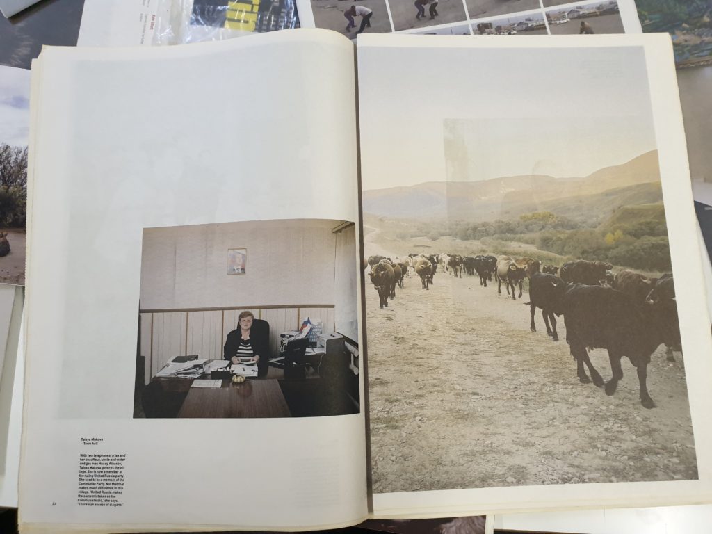
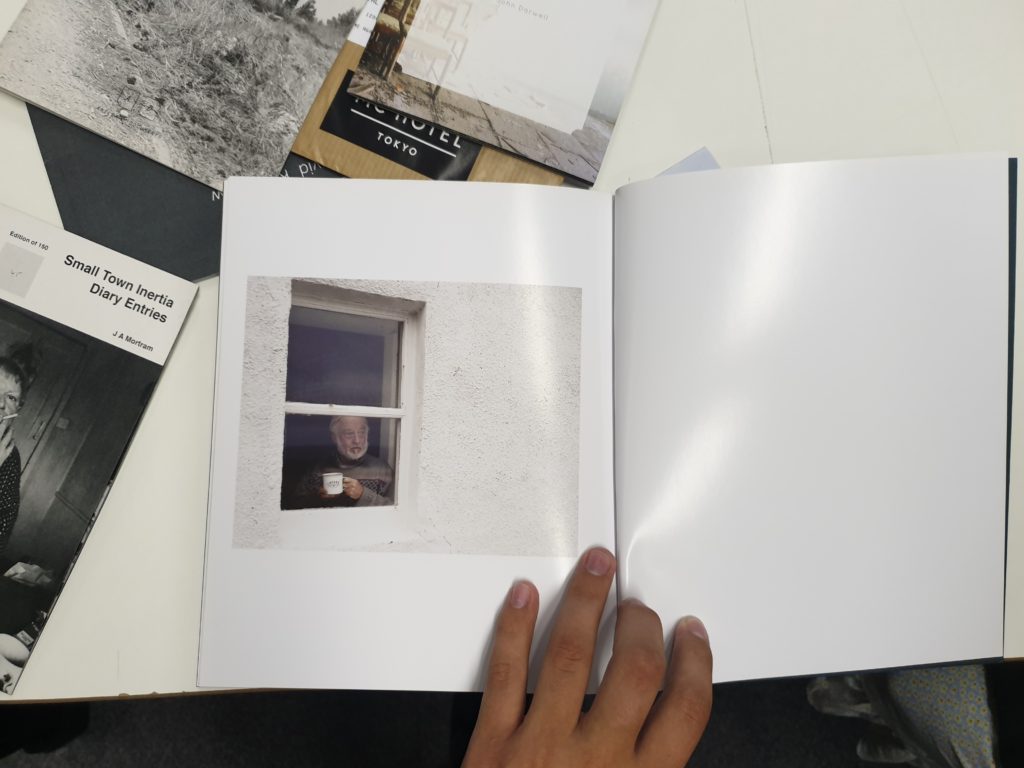
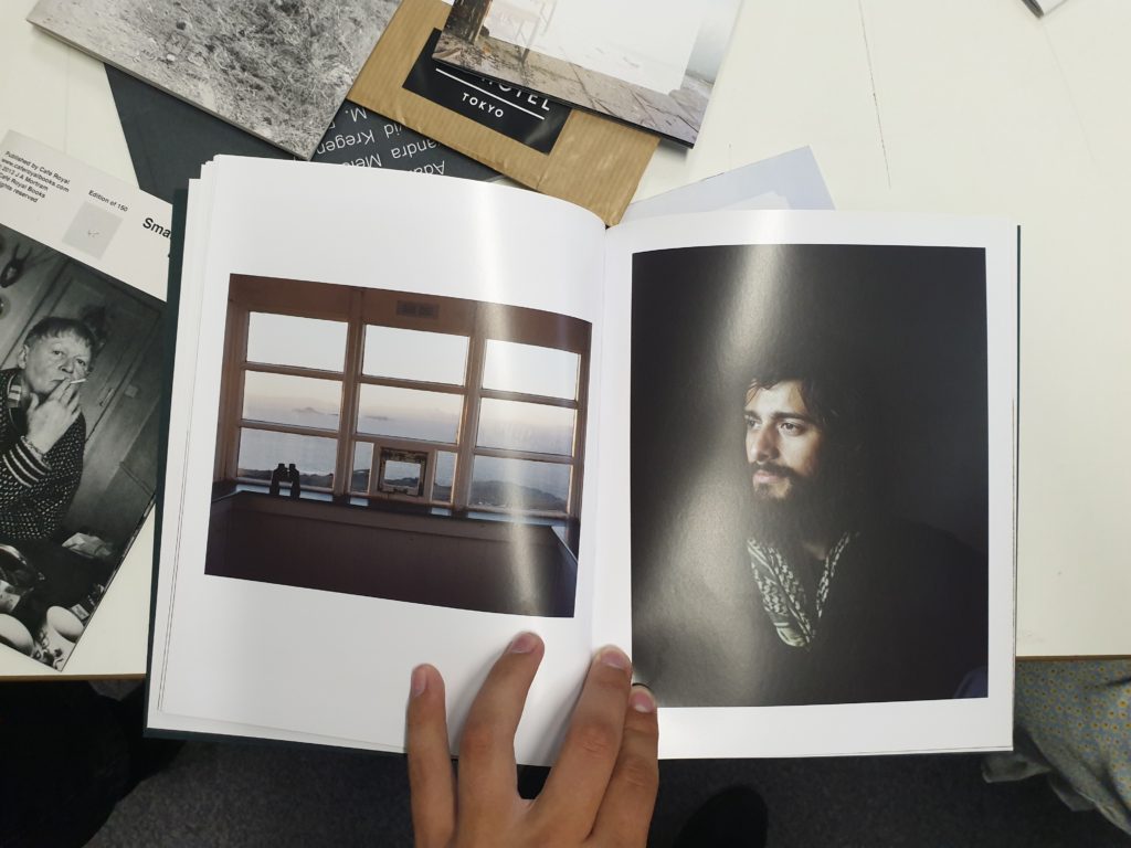
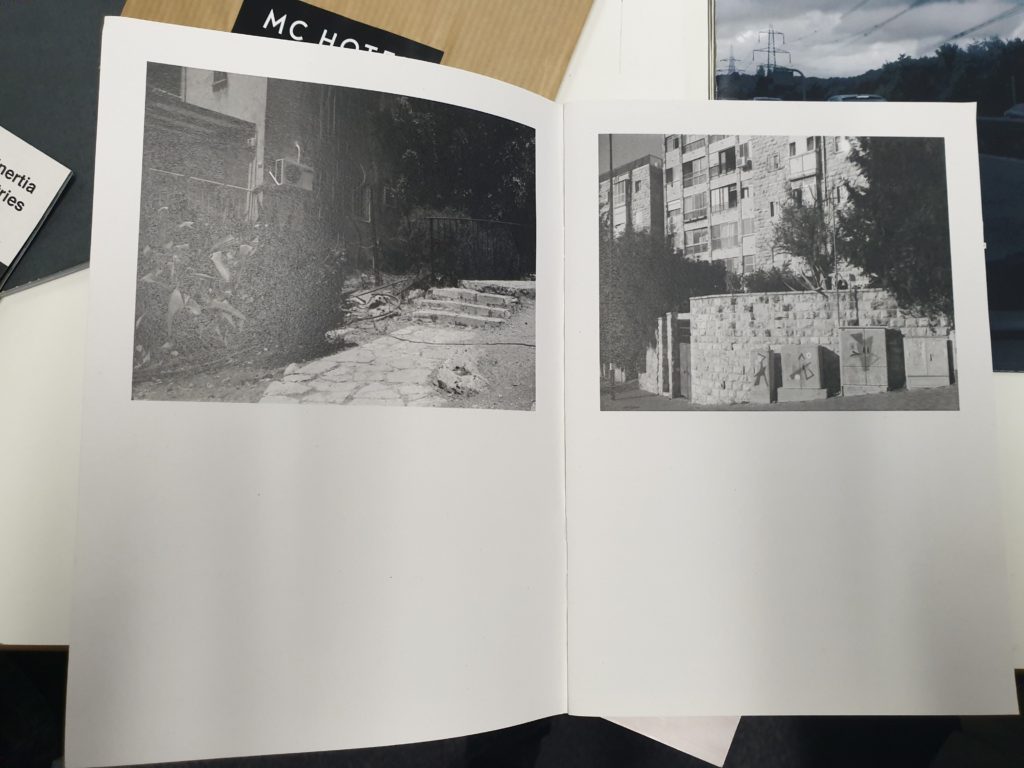
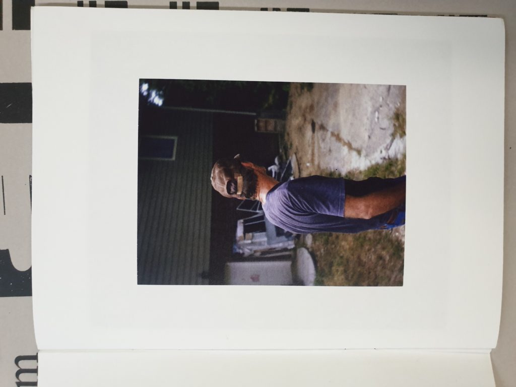
Moving on to the inside of the ‘zines, I like the use of this double page spread and how the subject has a border within the image, rather than adding a border in Photoshop. The ideas presented in the 6th image also stood out to me, as there were very few ‘zines or newspapers that used the different sizes of images to contrast them, and I like the idea of using different image layouts to help create a narrative. Speaking of which, image number 7 uses only 1 picture over the course of 2 pages, and the use of the white background in the photo over the white of the paper creates a very nice effect in showing the subject as especially small. An idea that could work in tandem this would be to feather the image out at the edges, so it blends into the white page background even more. I’m not entirely sure how effective this will be, but I’m probably going to try and utilize it in my own ‘zine.
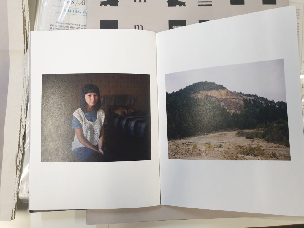
I like the way that image 8 uses light to convey a sense of space and setting, as the image on the left of the window makes it seem as though the man in the right picture is being lit by the other photo, even though they could have been taken at completely different times and places. Picture number 9 uses negative space under the image very effectively. The layout is slightly more obscure than the more common idea of putting the images in the center of each page as highlighted by picture 10. However picture 10 also uses juxtaposition to its advantage, and even though the layout is nothing particularly new or inventive, I like the use of the barren landscape of the mountainside in comparison to the portrait taken within someone’s home. Finally for picture number 11, I like the use of minimalist and simple framing, using a particularly thick frame, to display the isolation of the subject. I am hoping to incorporate as many of these different techniques and styles as possible in my final ‘zine.
