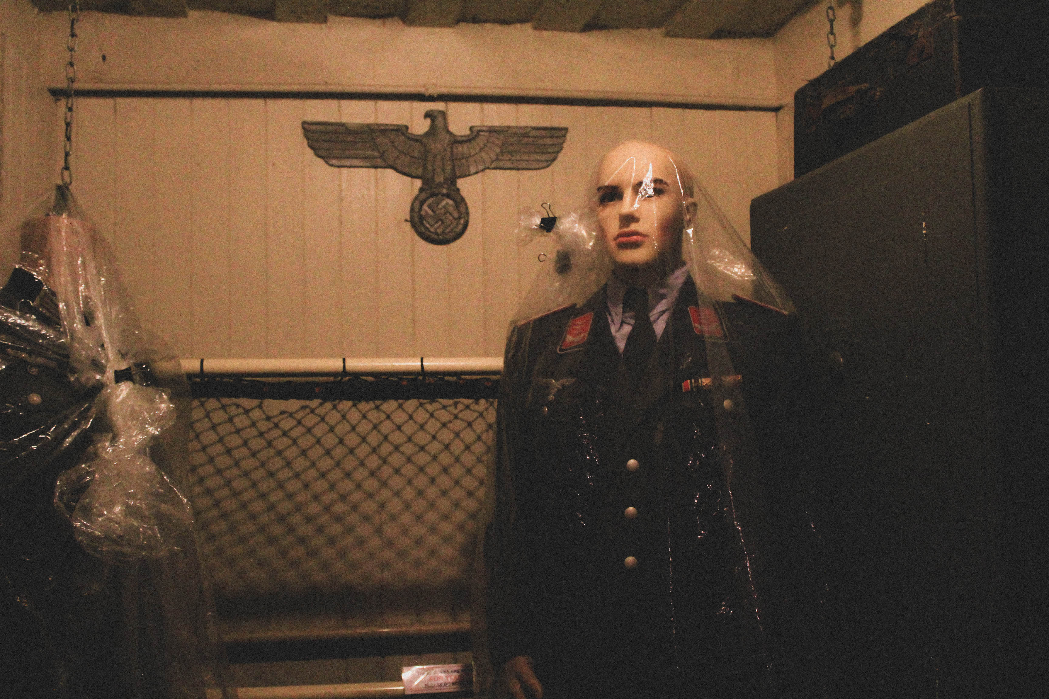
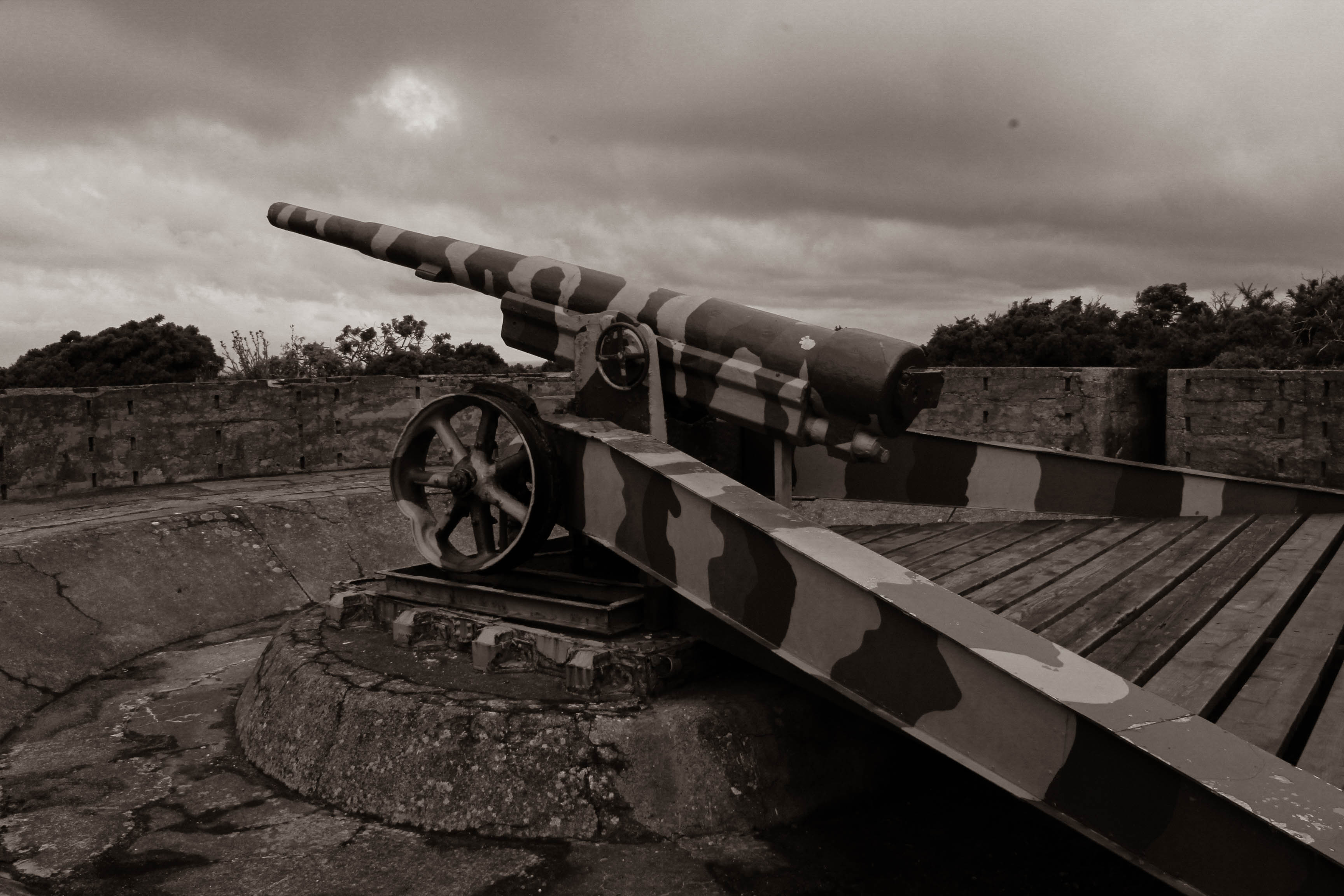
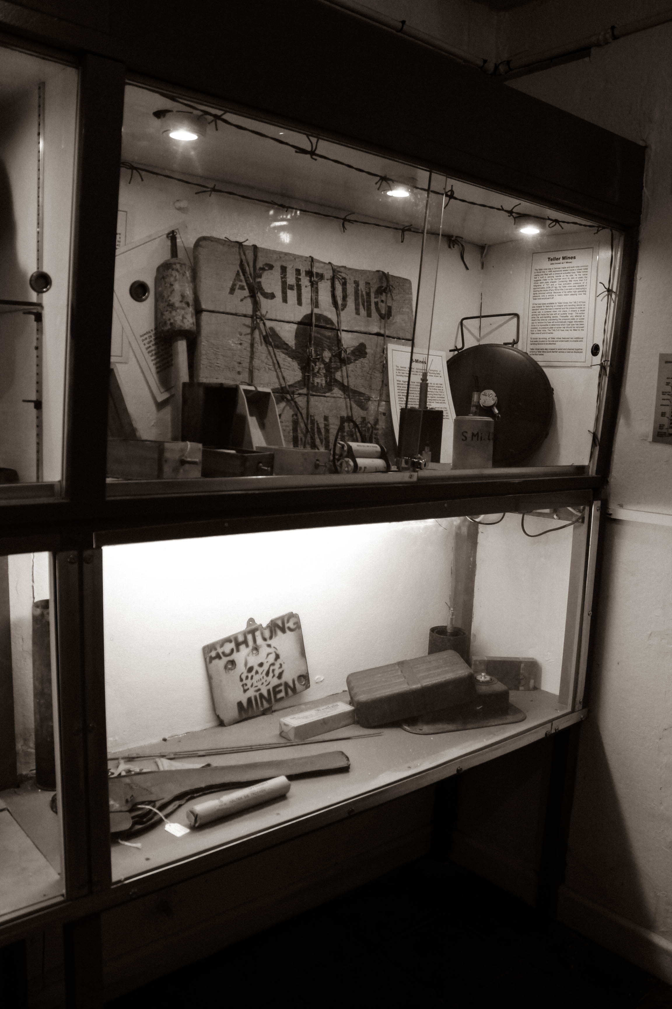
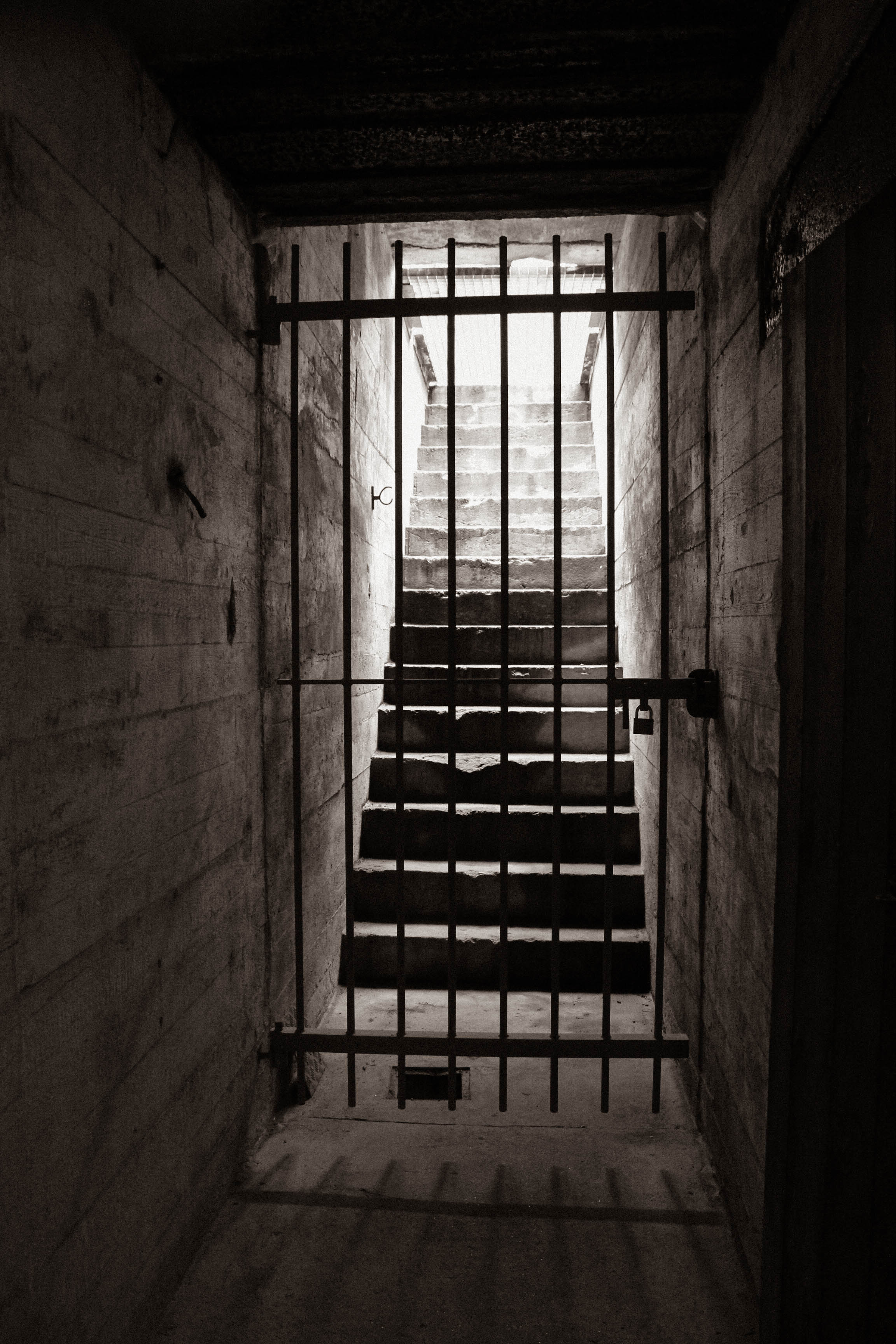
black and white
I experimented with lightroom by changing a few images into black and white to link them to the type of photos they would have captured during World War 2. Viewers may have a different perspective on how they see a black and white image and may feel more somber as a result of the dark colour scheme. I used the preset B&W Sepia Tone since it brings a slight vintage feel to the image.
why use black and white?
- Colour can be distracting in some images and can take the focus away from the subject.
- Textures and contrast within a black and white image are prominent.
- Black and white images often have a nostalgic look. Because black and white was invented before colour, we associate monochromatic images with the past, even when they portray a current event. As a result, subjects from the past tend to look best when edited in black and white.
- The contrast between the highlights and shadows of a black and white photograph can add a dramatic effect. Turning up the contrast is a powerful way to capture the viewers attention.
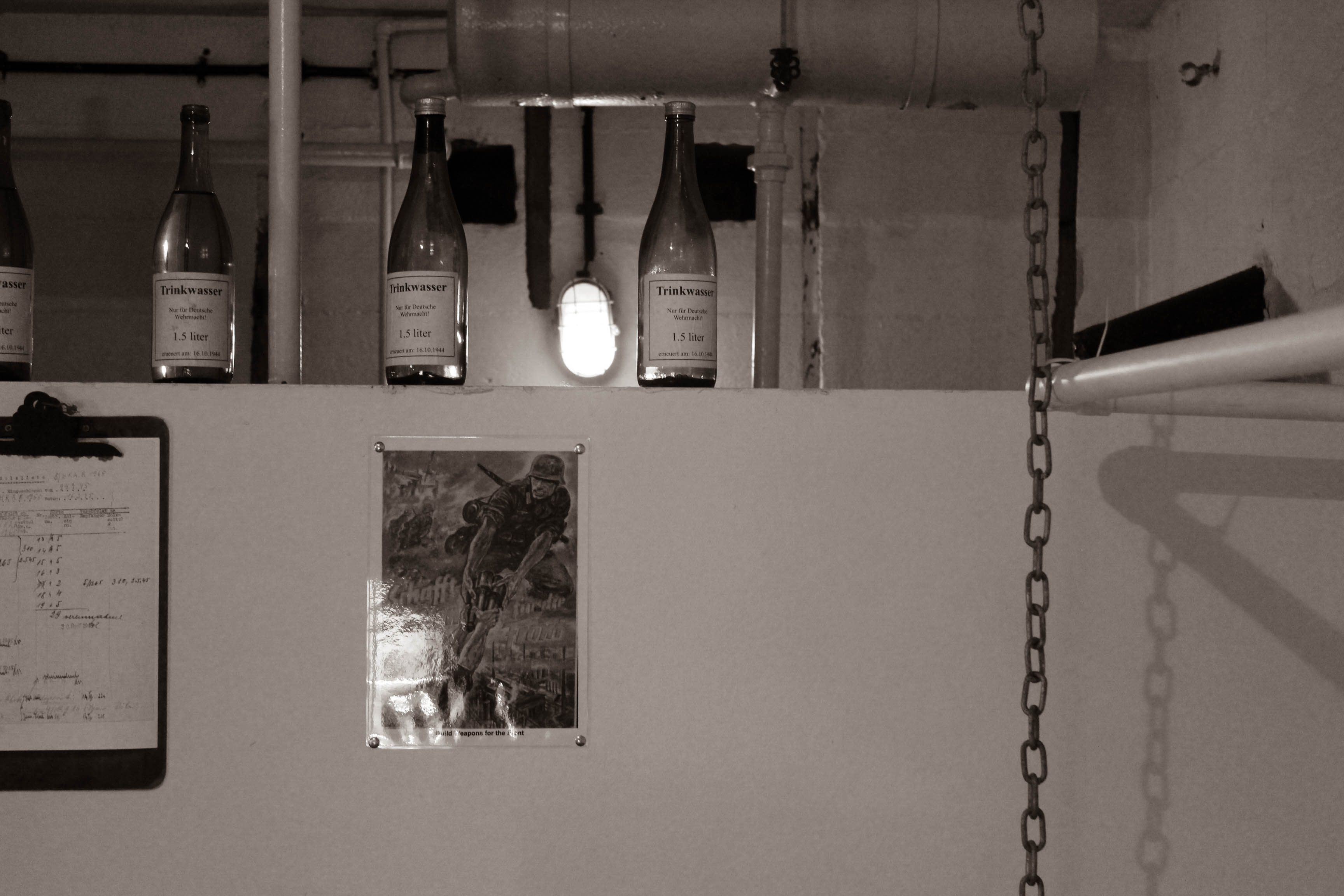
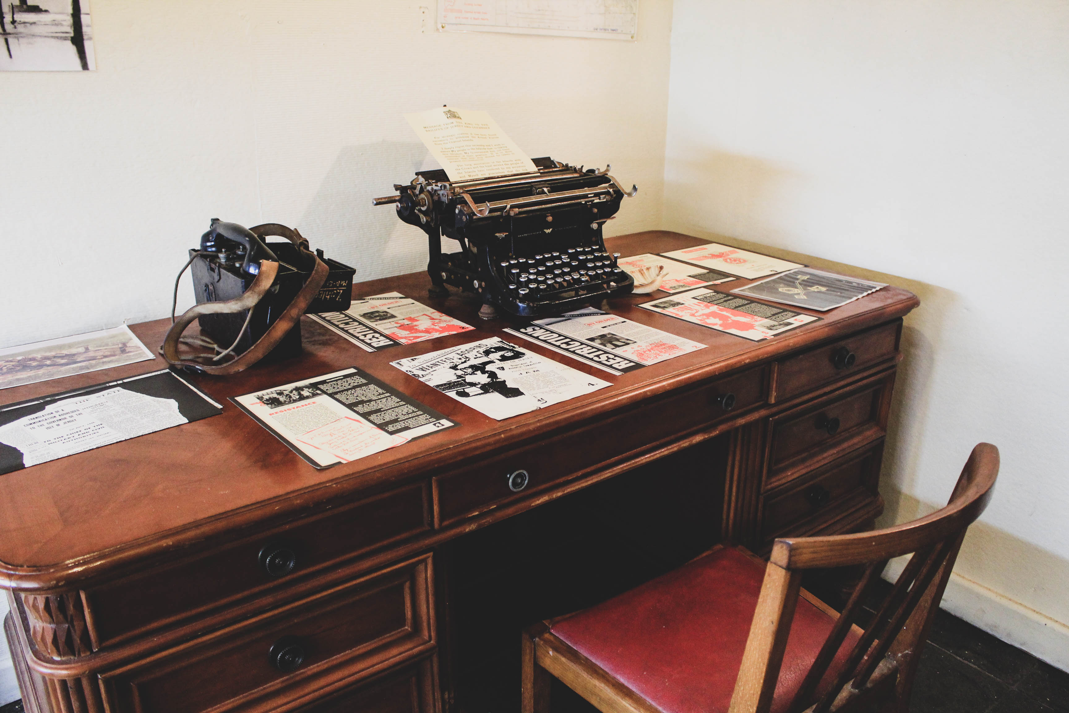
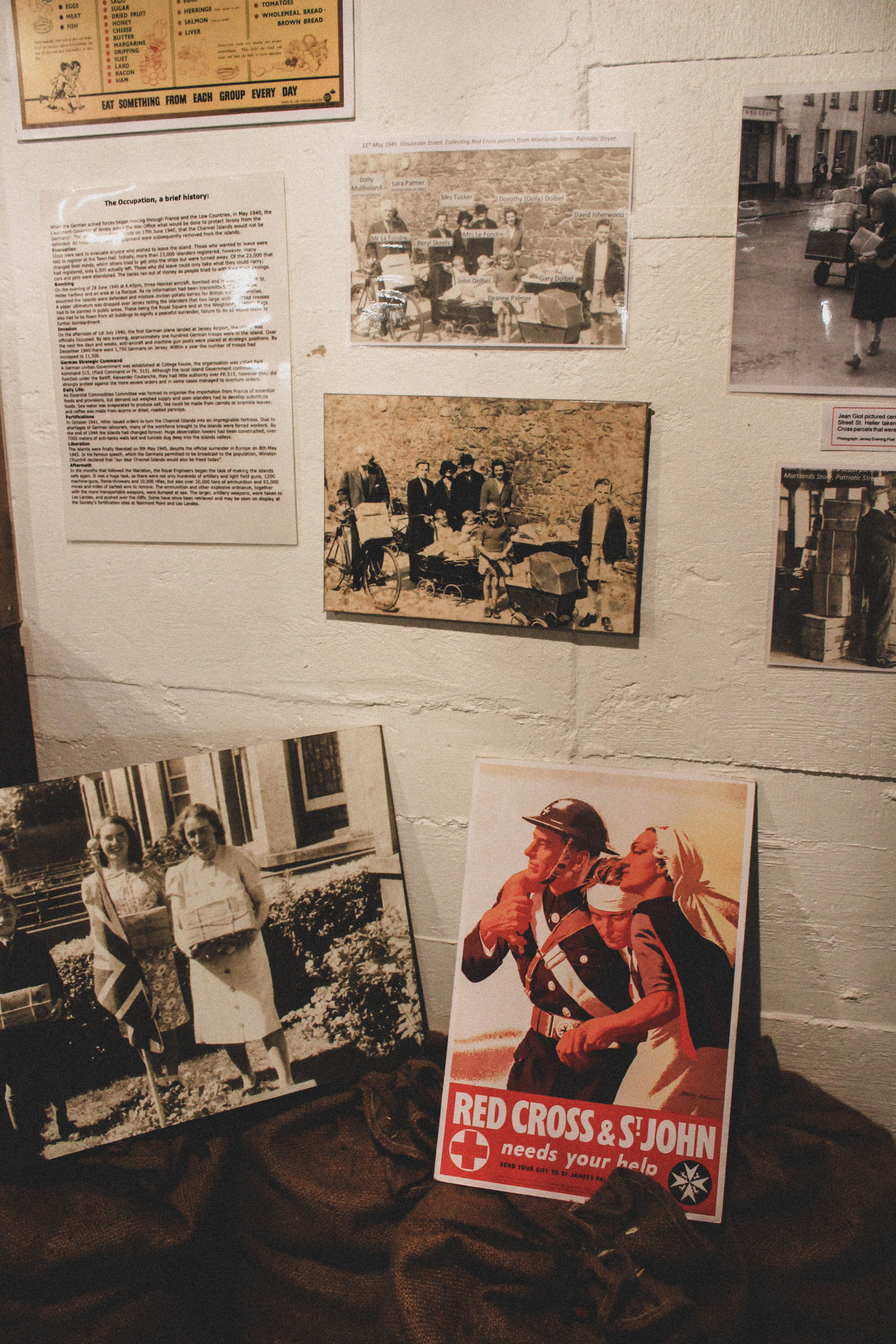
colour
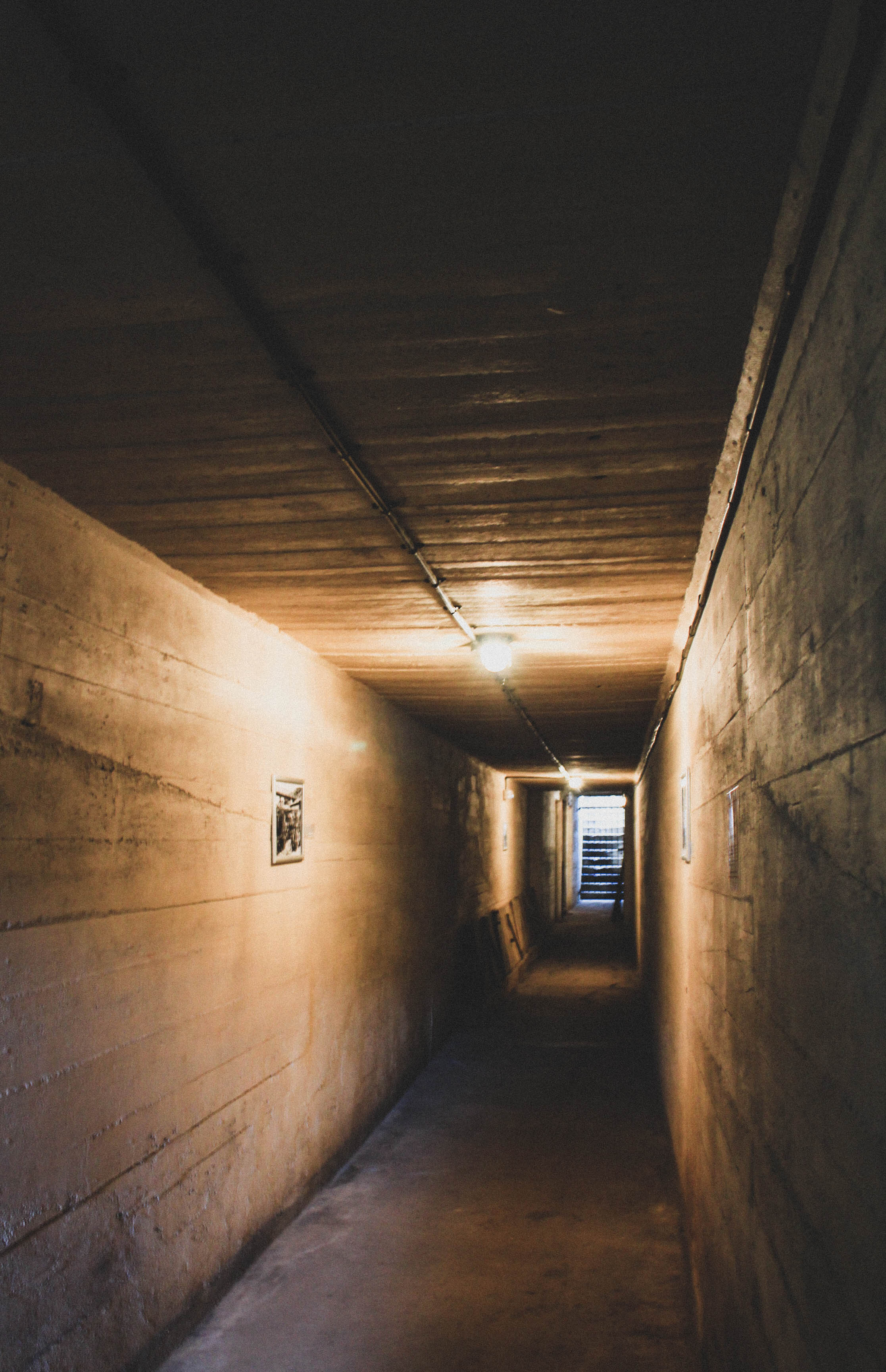
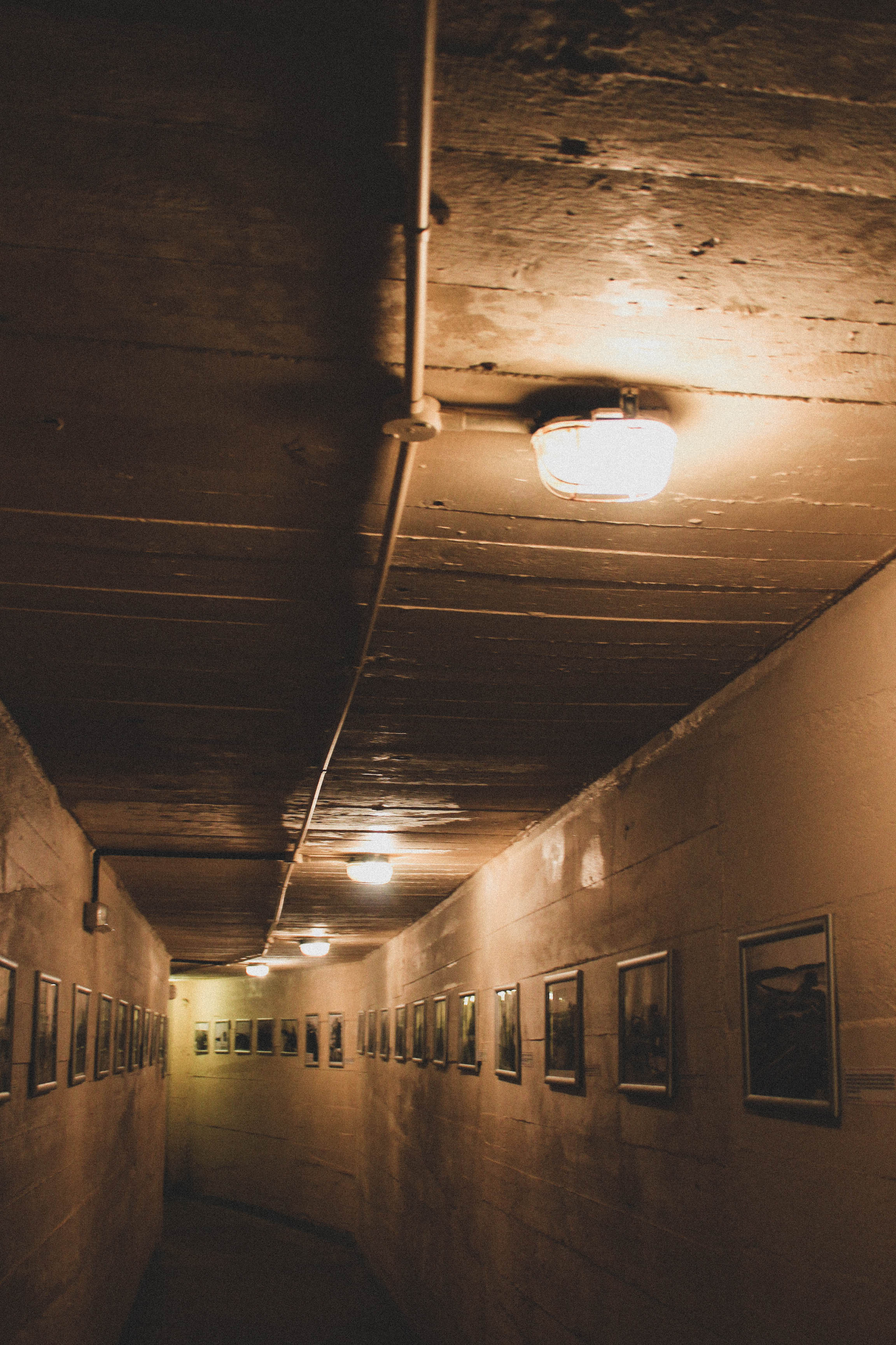
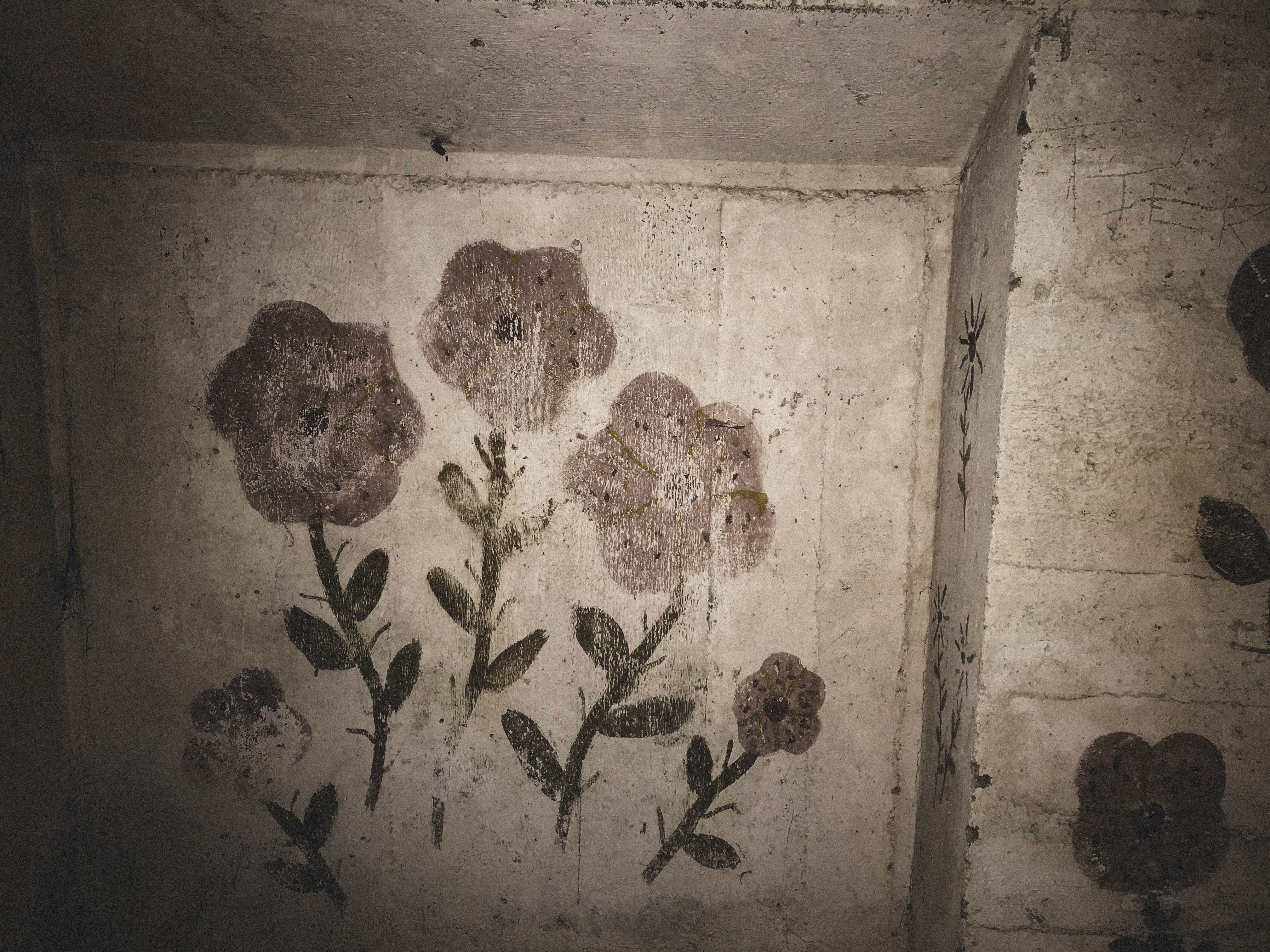
For the colour images I added the Matte filter. This filter makes the contrast subtle and the saturation lower than normal. These adjustments make the vibrance of the images less intense. I wanted my outcomes to have a vintage effect so that’s why I chose this specific filter for the colour images. Finally, I added grain to make the images appear like film.
why use colour?
- Colour photographs show important aspects of a subject.
- Colour can suggest the era in which the photograph was taken. Films manufactured in the past often have a very distinct look.
- Colour can help describe the mood of a picture.