Goudal is a French artist who has graduated from the royal college of art in 2010 with an MA is photography. She is currently living and working in Paris. She often works directly with landscapes, sometimes inserting photographic backdrops into a scene then photographing it. She is also known for making video work that is linked to the themes within her work.
“Fiction meets reality in her photographic work” – cercle
Observatoires

All images by Noemie Goudal
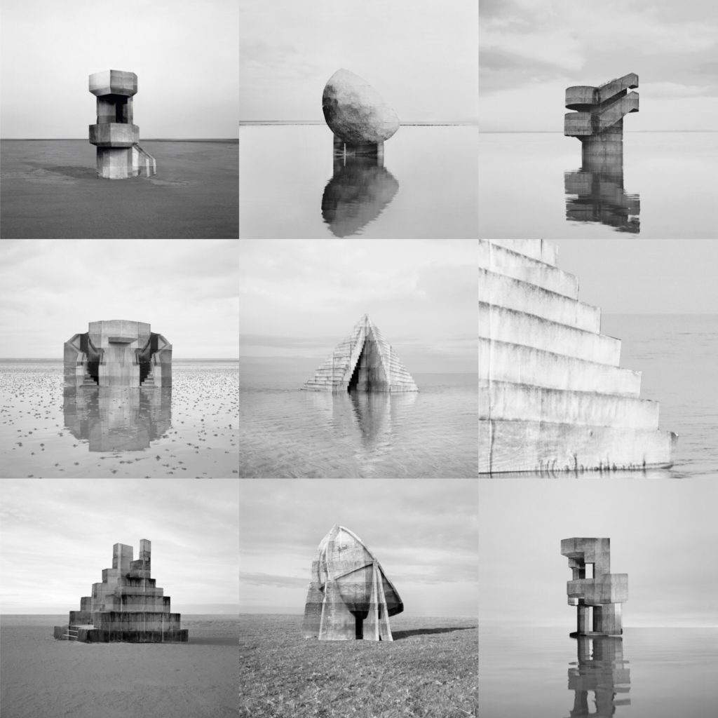
This series photographed between 2013 and 2014 shows science fictional architecture in landscapes. From the mood board it’s clear to see her documentary like images in this series almost look like an illusion. During this project she had used traditional photography and a physical form of manipulation since she created architectures out of paper and placed them in real landscapes. All of the images are in black and white which helps bring out all the dimensions of the figures. All the images are also taken on a landscape setting, which helps all the images in the series complement each other. This photographer is useful to look at since throughout my project i will be photographing bunkers and sites similar to the one sin her images, and looking at these photos has helped me to understand the importance of framing and angles when capturing these types of architecture.
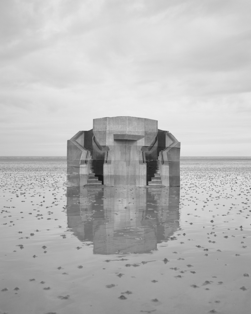
Analysing image

Technical: This image appears to be taken outside in natural light. It looks as if the shutter speed is fairly quickly, maybe around 1/250, since it is not blurry and not underexposed.
Visual: In this picture we can see a sort of tower structure in the centre of the image. The structure seems to be on a breach landscape since you can see a sandy surface. The picture is also in black and white meaning that you can see all the different dimensions of the structure, which brings out lots of tonal contrasts which makes the image look my 3 dimensional and dramatic. We are also able to see the reflection of the structure in the sand, since it appears to be wet. This makes the image have more depth.
Conceptual: I think the use of the black and white filter and all the different tonal shades, makes the image more dramatic in order to convey a sense of sadness or a more monotone feeling.
