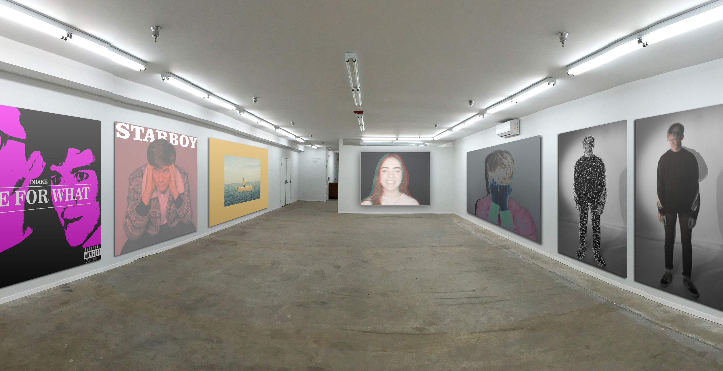
I have created a virtual gallery containing my final photos as well as en extra photo to fill out the space.
On the right side are the final pieces that were created in the studio. I have chosen to group them together because they all explore emotions and expression.They are also all composed of similar colours; the third photo along is more colourful than the others but it still has a dark background and has a cold tone which helps it fit in. The furthest away photo was part of this photo shoot but I didn’t include it in my final photos as it didn’t match the colours of the other photos, as well as it expressing a contradicting emotion (hapiness) to the rest of the photos, which primarily express sadness. But I have included it in this gallery as it fits in well enough to be placed next to them. However, it isn’t located on the same plain to show that it is somewhat seperate.
On the left side are my takes on album covers. These are a lot brighter and more colourful than the photos on the other side. In my opinion this balances out the room as a whole, it isn’t overpowered by monotone or colourful photos.
