Final Printout Pieces

A3 PIECES:

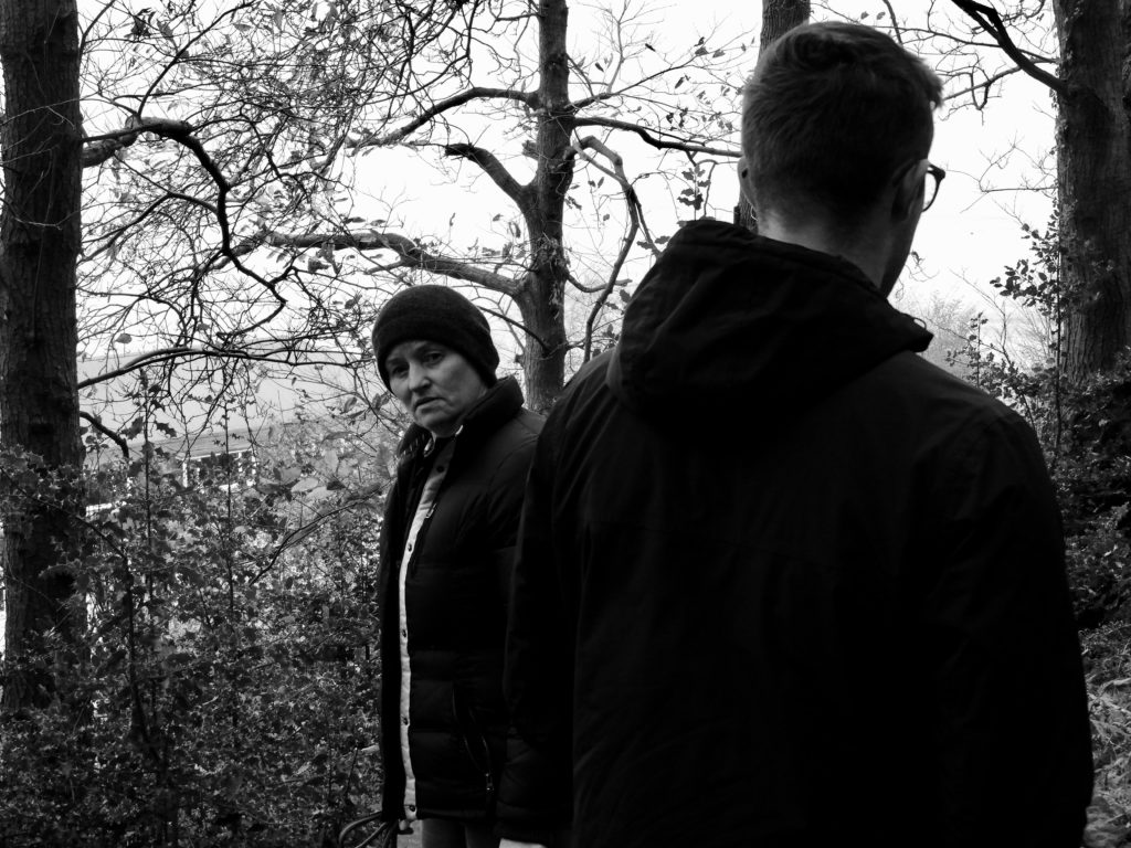
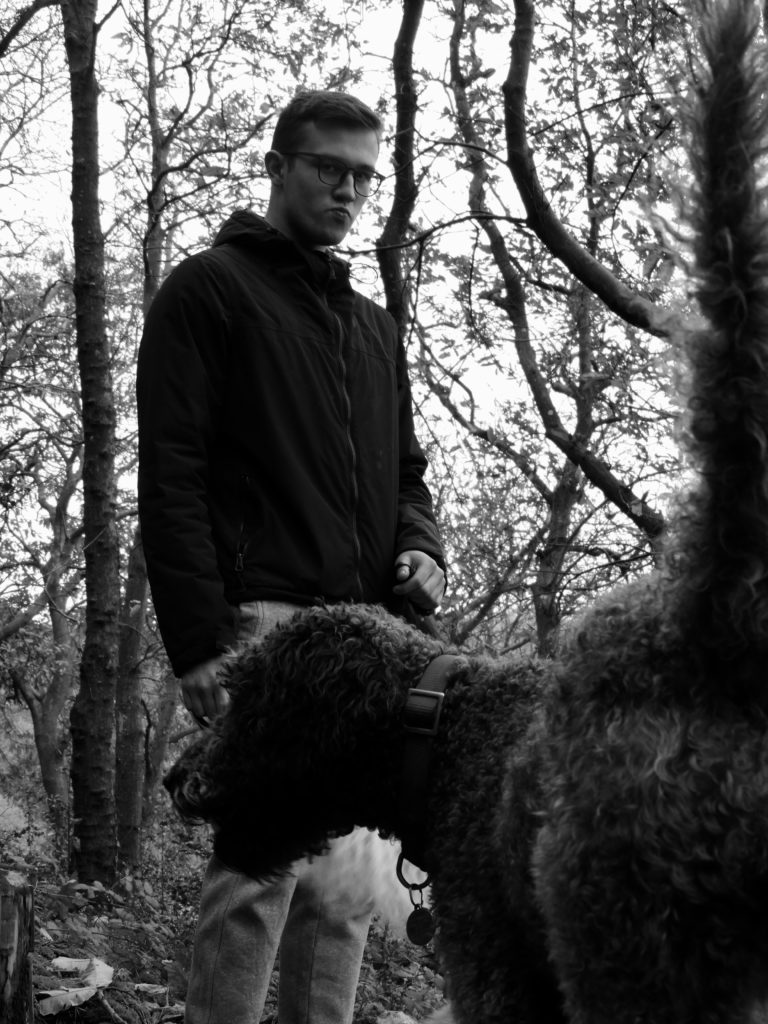
I chose this set of images for my A3 and A4 pieces as I wanted them to remain fairly consistent with one another, as during the mounting process I would be combining the two sets of images. The monochrome nature of the images means that they fit well with one another and seamlessly harmonize with each other to create a very pleasant overall mounted product. Furthermore, they fit well with each other as they feature the same set of models within them. The mood of both images are also very similar, being mostly dark with neutral facial expressions on both of the faces of the models.

A4 PIECES:

A5 PIECES:

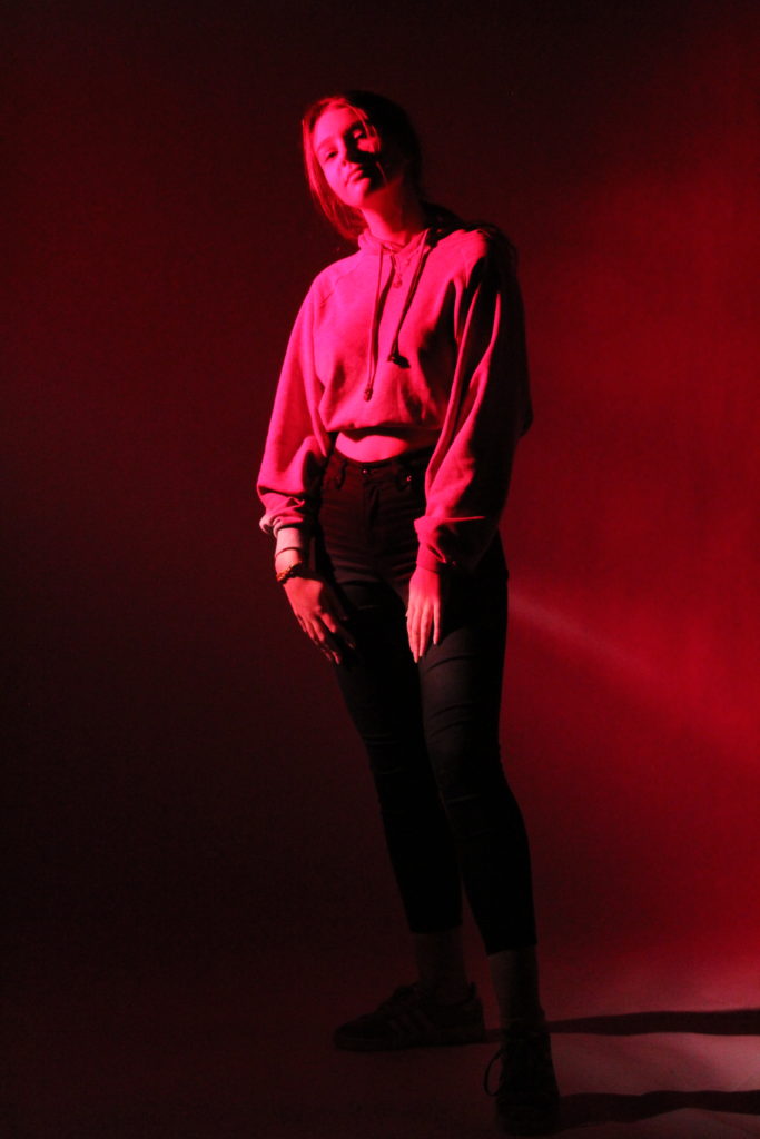
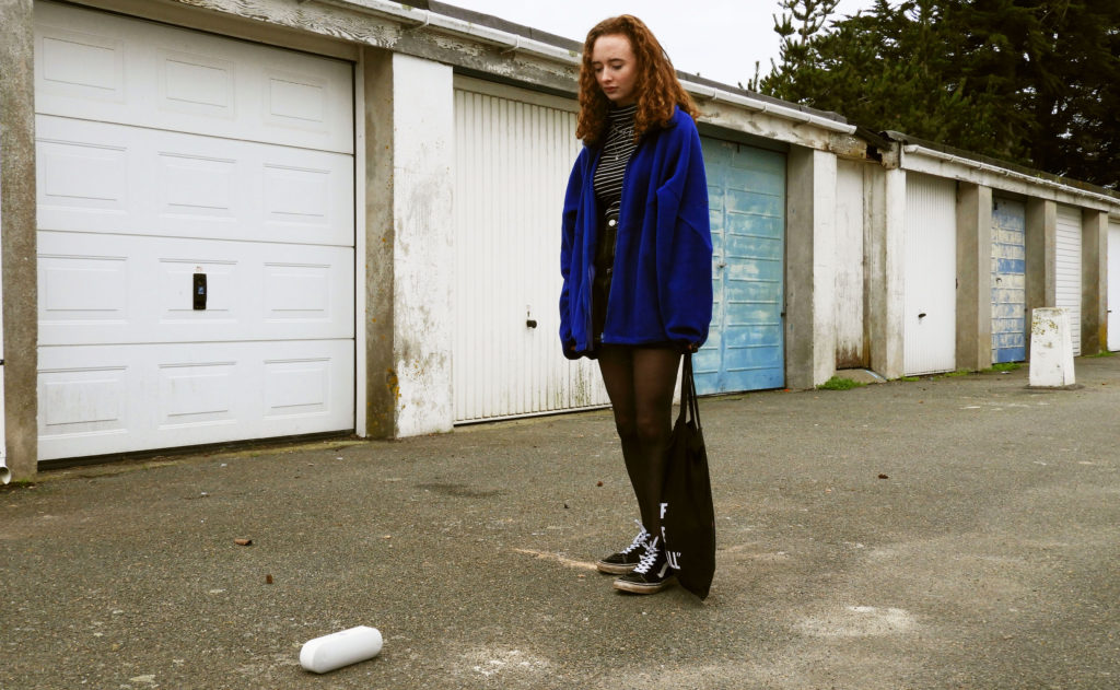
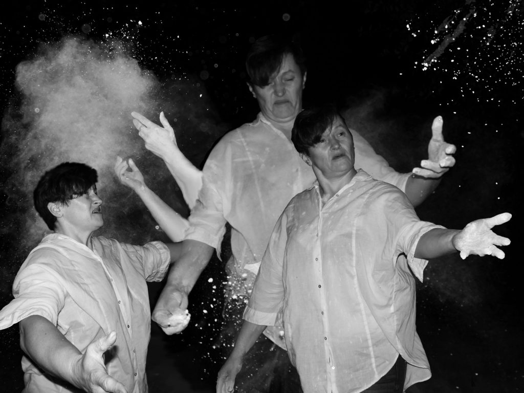
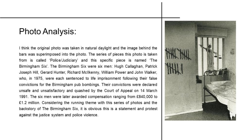
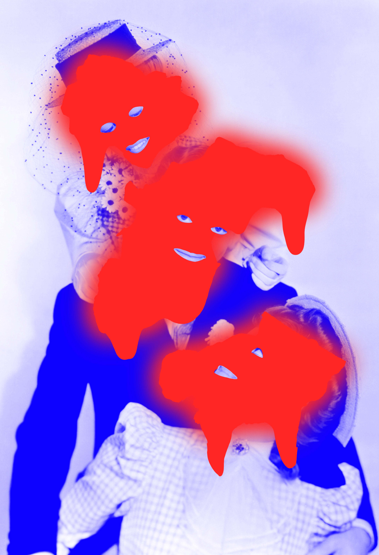
I chose this set of 3 images for my A5 pieces as they all had their own unique and effective qualities. The first image was taken from the first formal studio photography session we did. The red filter which was applied over the top of the image means that the color palette of the image is very different, creating ominous themes and connotations with the image. The second piece was taken from the Tableaux Vivant project which I did earlier in the portrait project. It was the final product which I produced in response to my chosen artist, Arnis Balcuks. I put modern twists on the themes which the artist himself tackled in his own work. The final image was the final product for the portrait project, and an extension of the photo montage project which I did previously. I used the same editing techniques as in my previous photo montage which produced a very similar outcome.

Photo-Montage Artist Research Task 2

Tyler Spangler

Tyler Spangler

“Tyler Spangler’s work is all about the mashup of context and perception, with a massive injection of color. He looks at the formalist relationship between images as they are removed from their original context. Connected to this, Spangler explores the significance of color, form, and photography through the medium of his digital collage. His background has undoubtedly had a massive impact on his artwork. He studied psychology at college, and he attended the Art Center College of Design. He also ran an illegal punk venue for thirteen shows until it got shut down by police. All of these elements combined play their part to influence and build his aesthetic.” https://www.forbes.com/sites/felicitycarter/2018/08/21/tyler-spangler-and-his-psychedelic-stream-of-consciousness/#20457db81d9a

Tyler says he bases his work around Pop art, mental health, Surrealism, Dada, and humor. He says he essentially just wants to inspire people, make them laugh, and create something beautiful.

Examples of his work:

Image result for tyler spangler
Tyler Spangler
Image result for tyler spangler
Tyler Spangler
Image result for tyler spangler
Tyler Spangler
Image result for tyler spangler
Tyler Spangler

Final image gallery

I have created a virtual gallery containing my final photos as well as en extra photo to fill out the space.

On the right side are the final pieces that were created in the studio. I have chosen to group them together because they all explore emotions and expression.They are also all composed of similar colours; the third photo along is more colourful than the others but it still has a dark background and has a cold tone which helps it fit in. The furthest away photo was part of this photo shoot but I didn’t include it in my final photos as it didn’t match the colours of the other photos, as well as it expressing a contradicting emotion (hapiness) to the rest of the photos, which primarily express sadness. But I have included it in this gallery as it fits in well enough to be placed next to them. However, it isn’t located on the same plain to show that it is somewhat seperate.

On the left side are my takes on album covers. These are a lot brighter and more colourful than the photos on the other side. In my opinion this balances out the room as a whole, it isn’t overpowered by monotone or colourful photos.