Gender identity- 2nd photoshoot

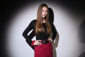
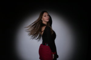
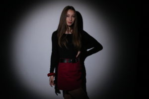
For my 2nd photo shoot I wanted to something that contrasted with the 1st. I wanted this to represent a more masculine female identity. So for this I will have my model pose in a less feminine way. In contrast to the 1st I will not have my model wearing any sort of feminine clothing (skirt), or makeup. Instead I will have her wear trousers and  baggy cardigan as it’s plain clothing that isn’t usually associated with typical females in the media.


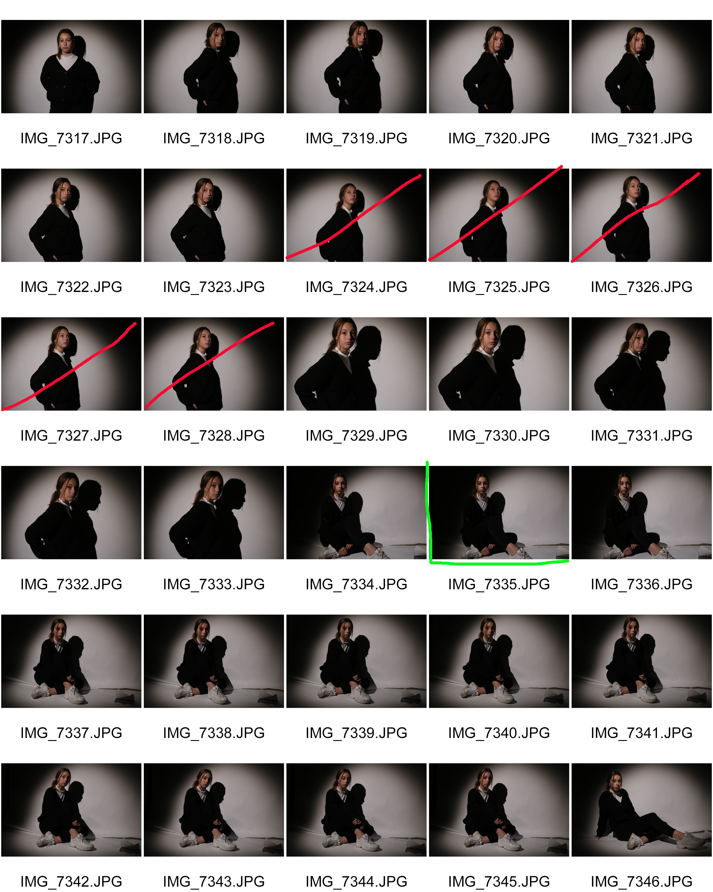
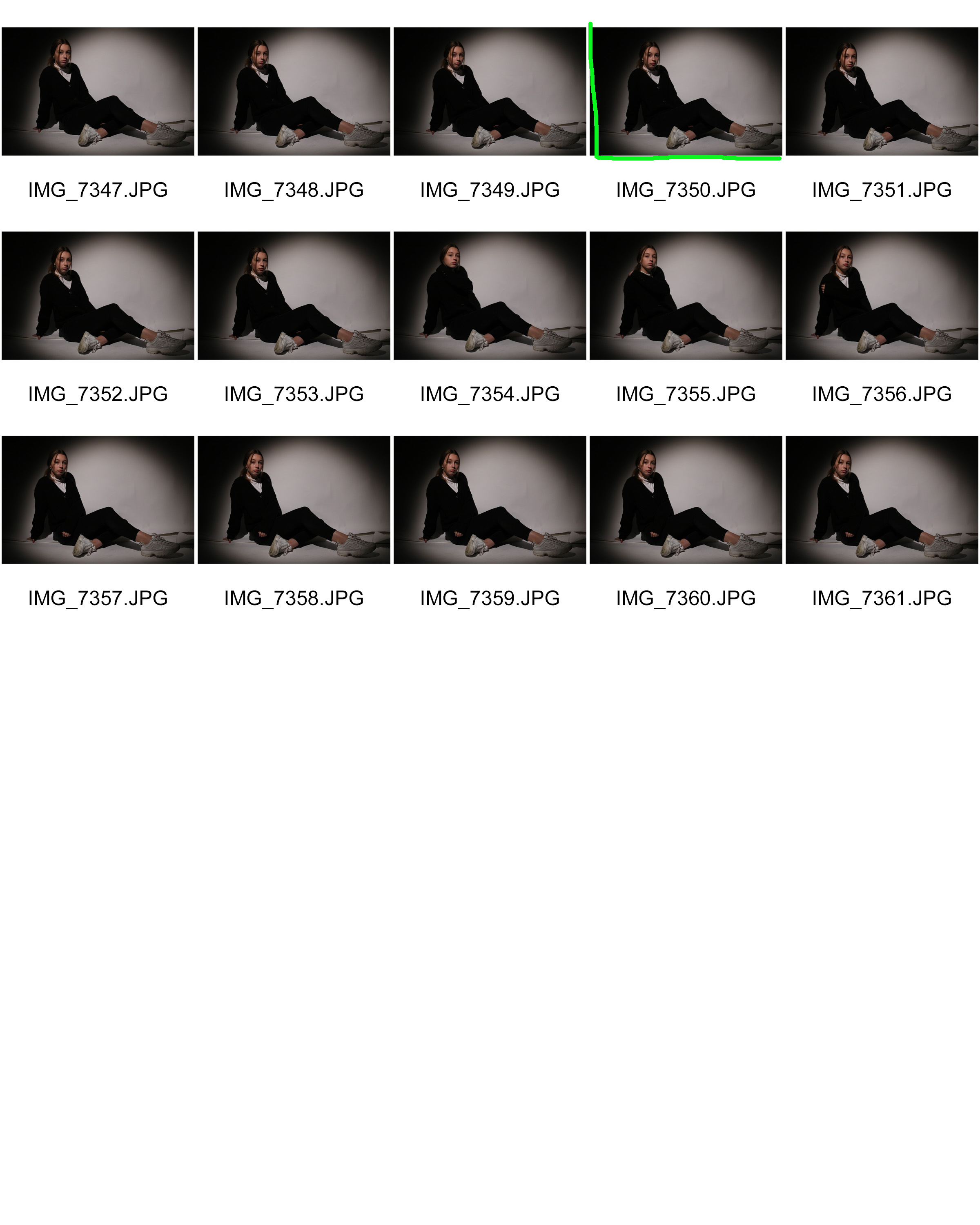
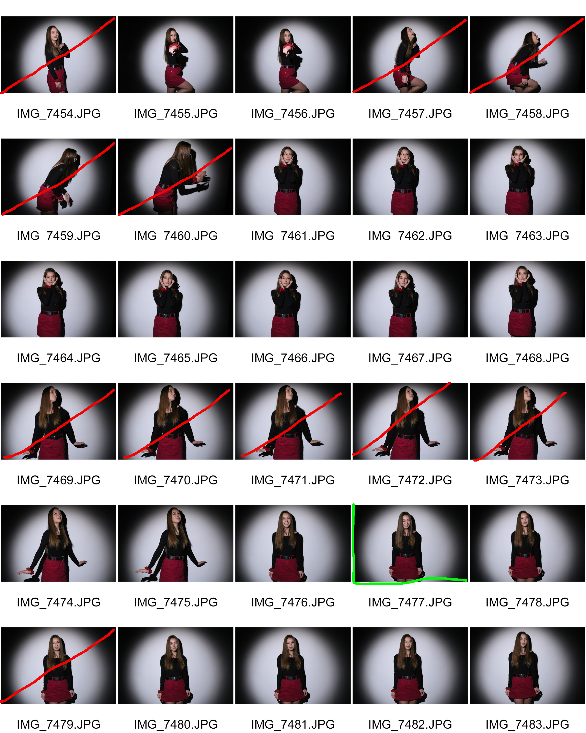
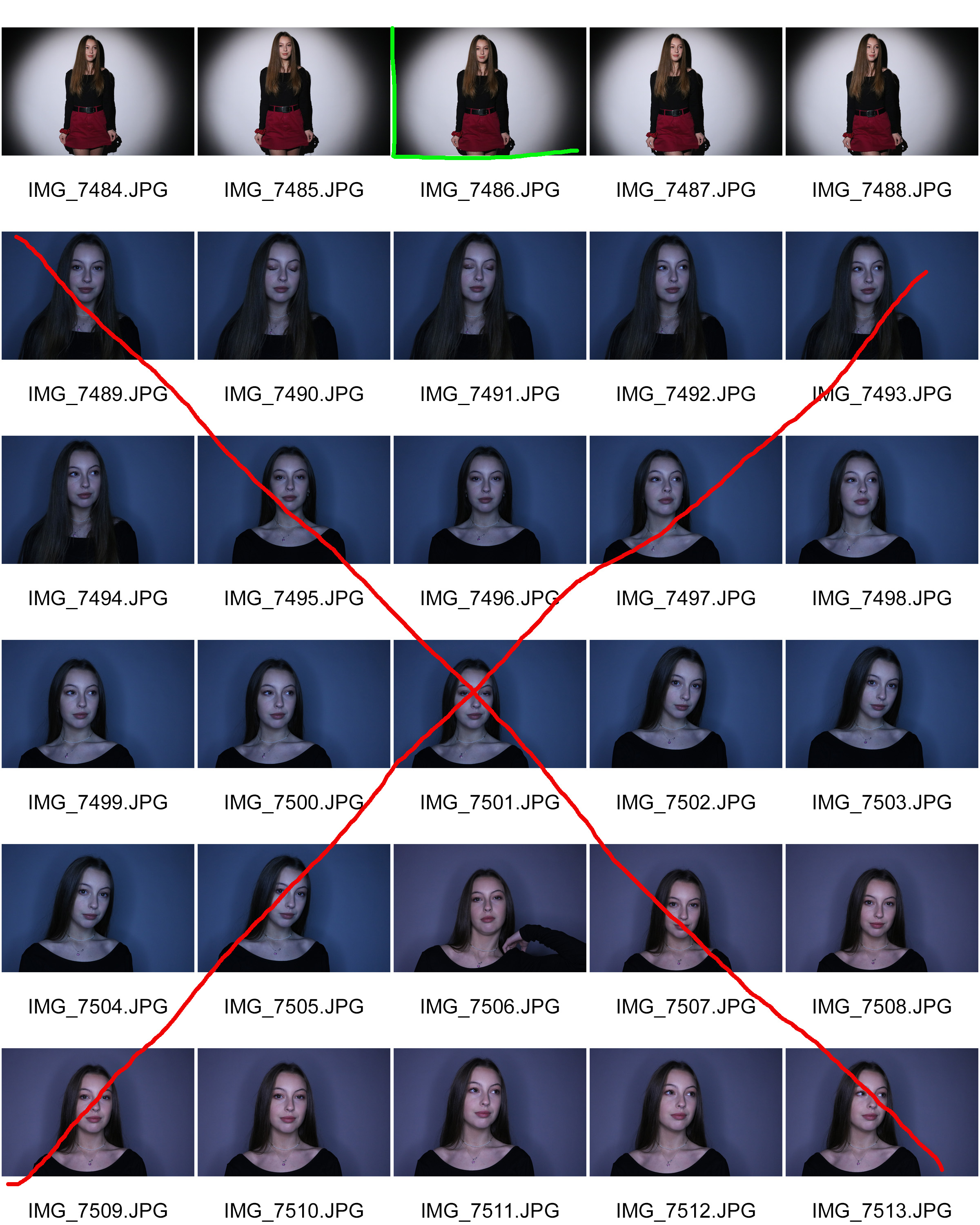
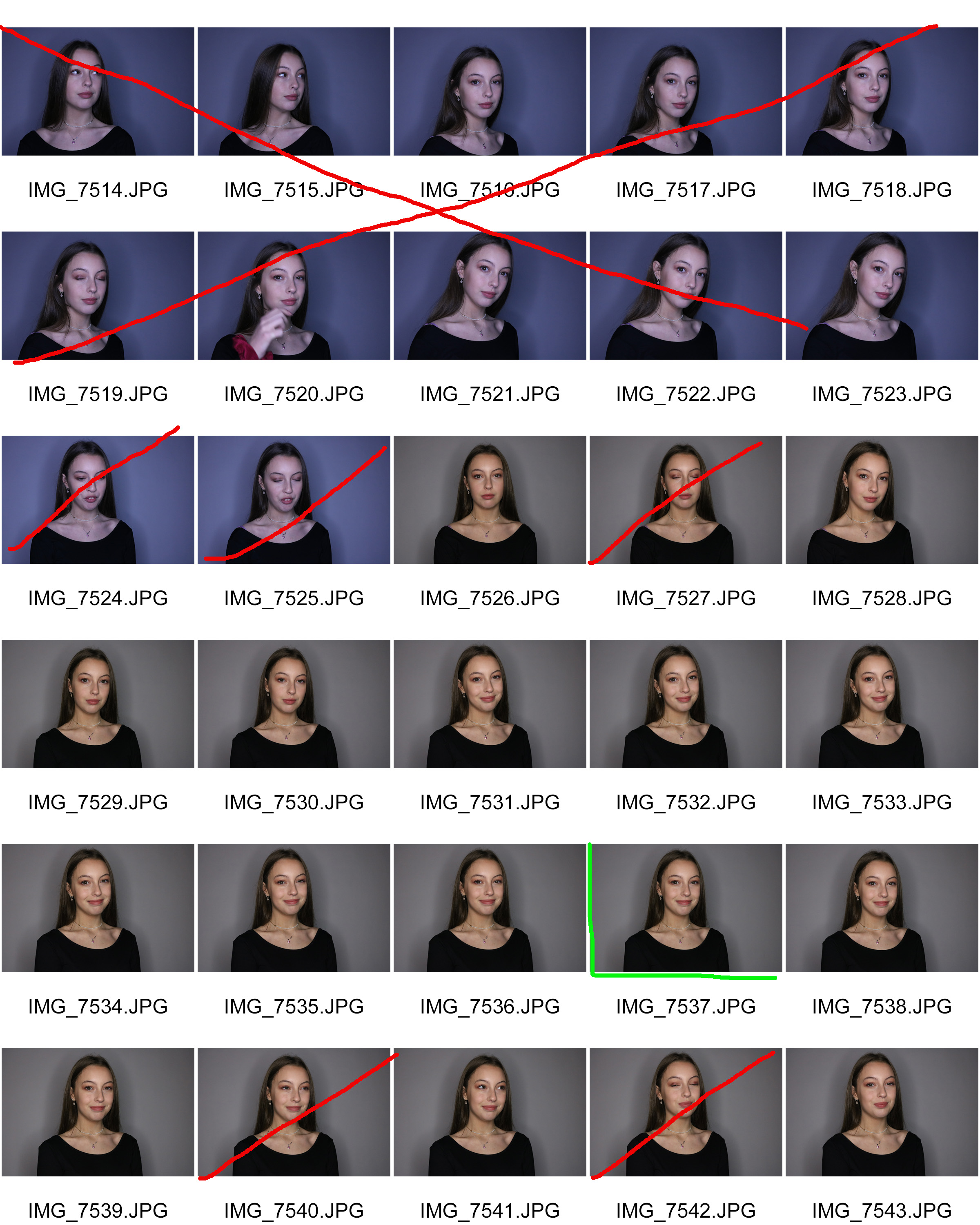
Contact sheets
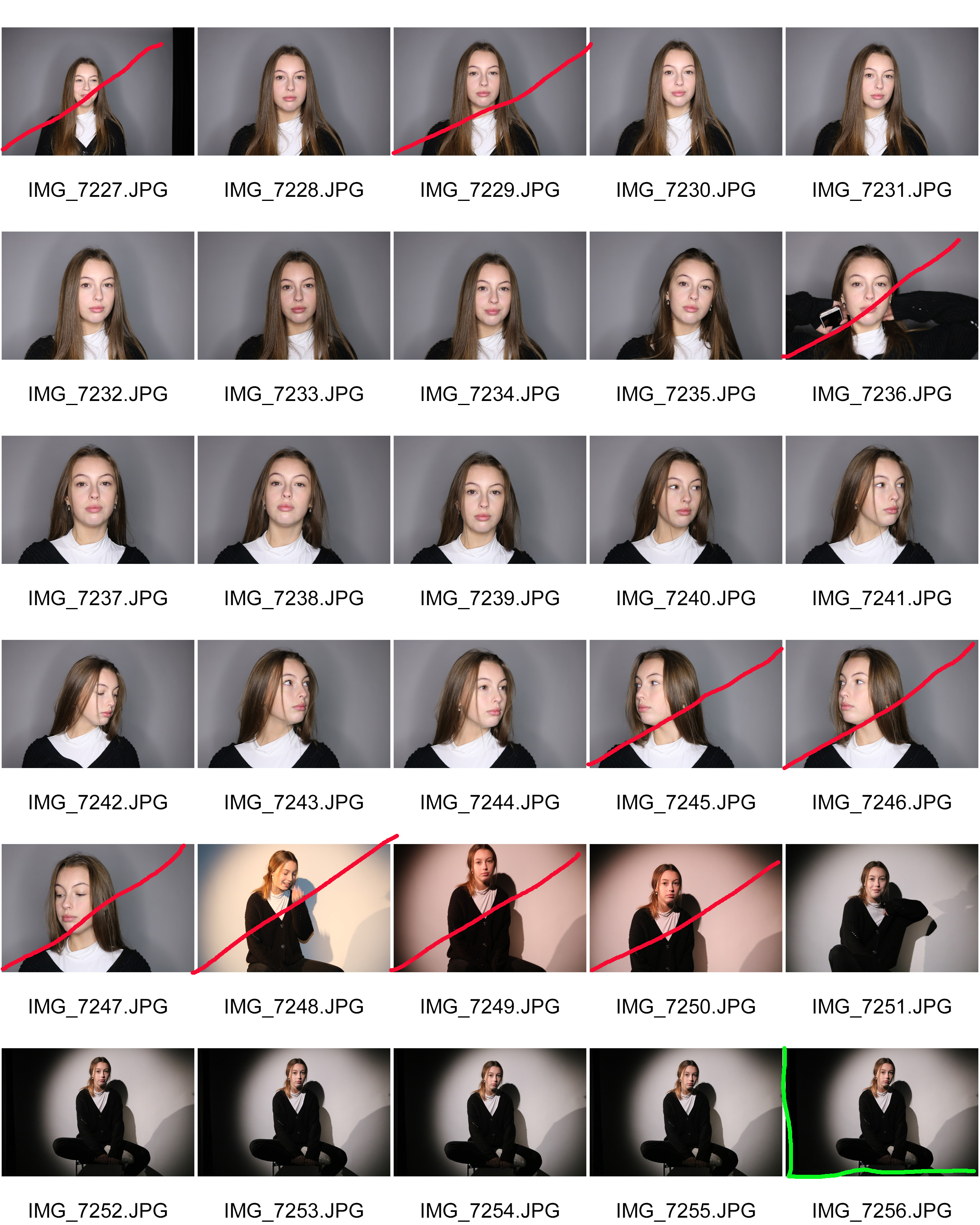
Best outcomes
 

Analysing
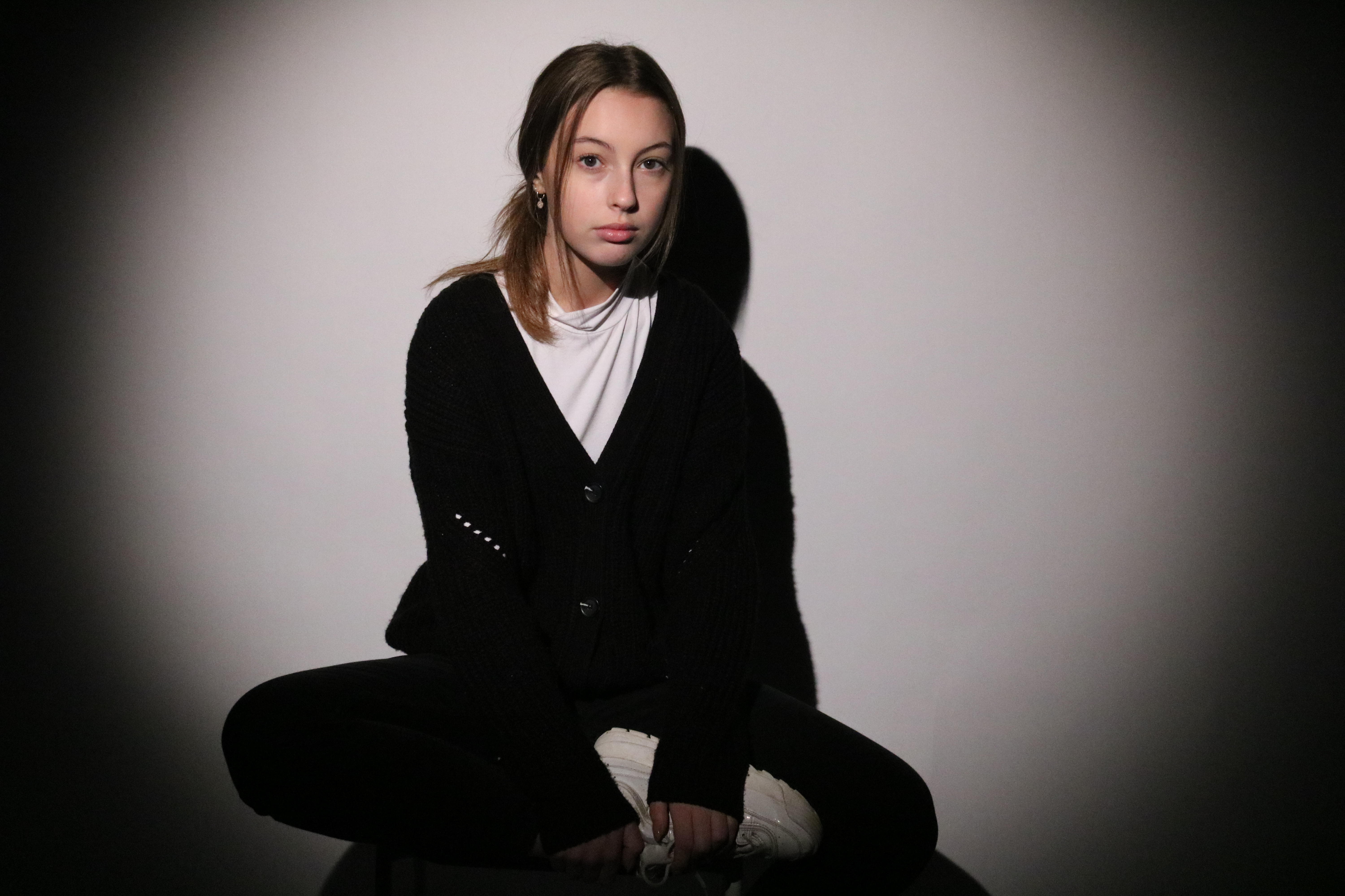
 Technical

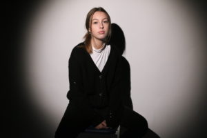
In this image the model is positioned in the centre of the spotlight in front of a white back drop.

Visual

In this image we see the same model from the previous photo shoot. This time she is dressed in black jeans, a black cardigan and white trainers. She’s sat on a stool with her left leg hanging off, and her left leg folded inwards. Her back is also slightly slouched so her arms can support her leg.

Conceptual

I think that this photo is quite effective in showing that there are variations of what people see as the “typical women”. In this image the model is wearing a lot of black, which typically isn’t a colour associated with femininity. The model is also posed in way that could be typically associated with “masculinity” as she is slightly slouching. Her long hair is also tied back  to make it less obvious, as long hair can often be associated with femininity.
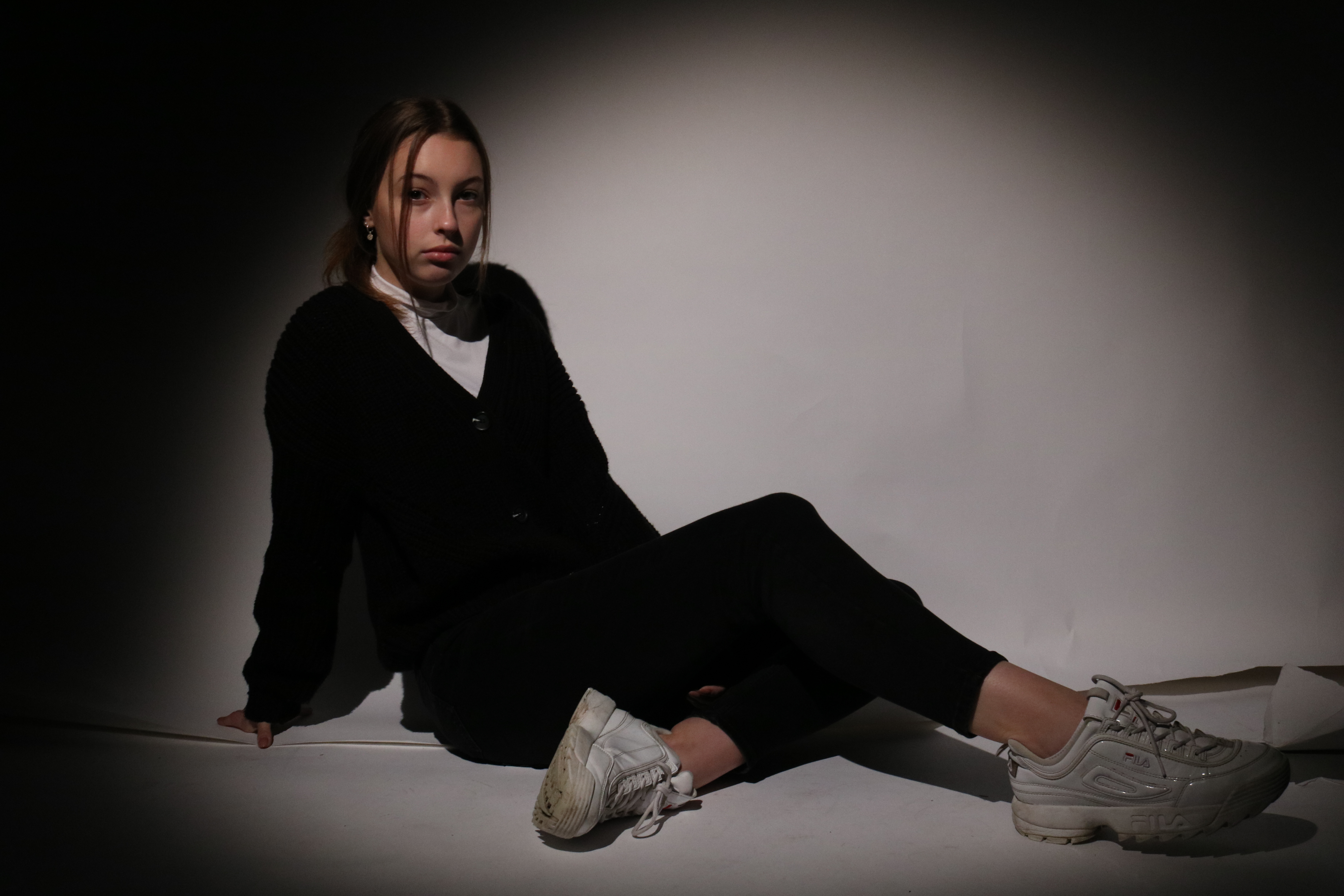


Technical

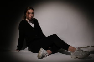
In this image, the model is situated in the studio with a spot light positioned in front of her.

Visual

In the photo, we can see a female model wearing an over sized black cardigan, black jeans, a white top and white trainers. She is posed sitting on the ground with both her hands outstretched behind her.

Conceptual

This image, similar to the one above is effective in showing an opposite view to stereotypical dressed up females in the media. Here, the model is wearing dark and less feminine clothing. I especially like how in this image her posing is quite relaxed, as this is not normally seen in the media, such as magazine covers.


Gender identity- 1st photo shoot

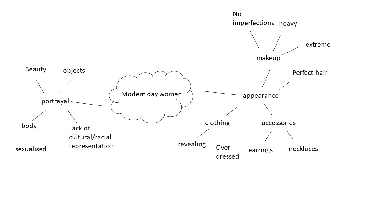
For my first photo shoot I will be photographing the individual as how the “modern day women”. I will be using how women are portrayed in the modern day media as inspiration. Below is my mood board and mind map and planning, in order for me to achieve the stereotypical vision in my images.I plan to have my model dressed up in typical “feminine clothing”, something like a dress or a skirt.

Mood board

Not my images.

Mind Map

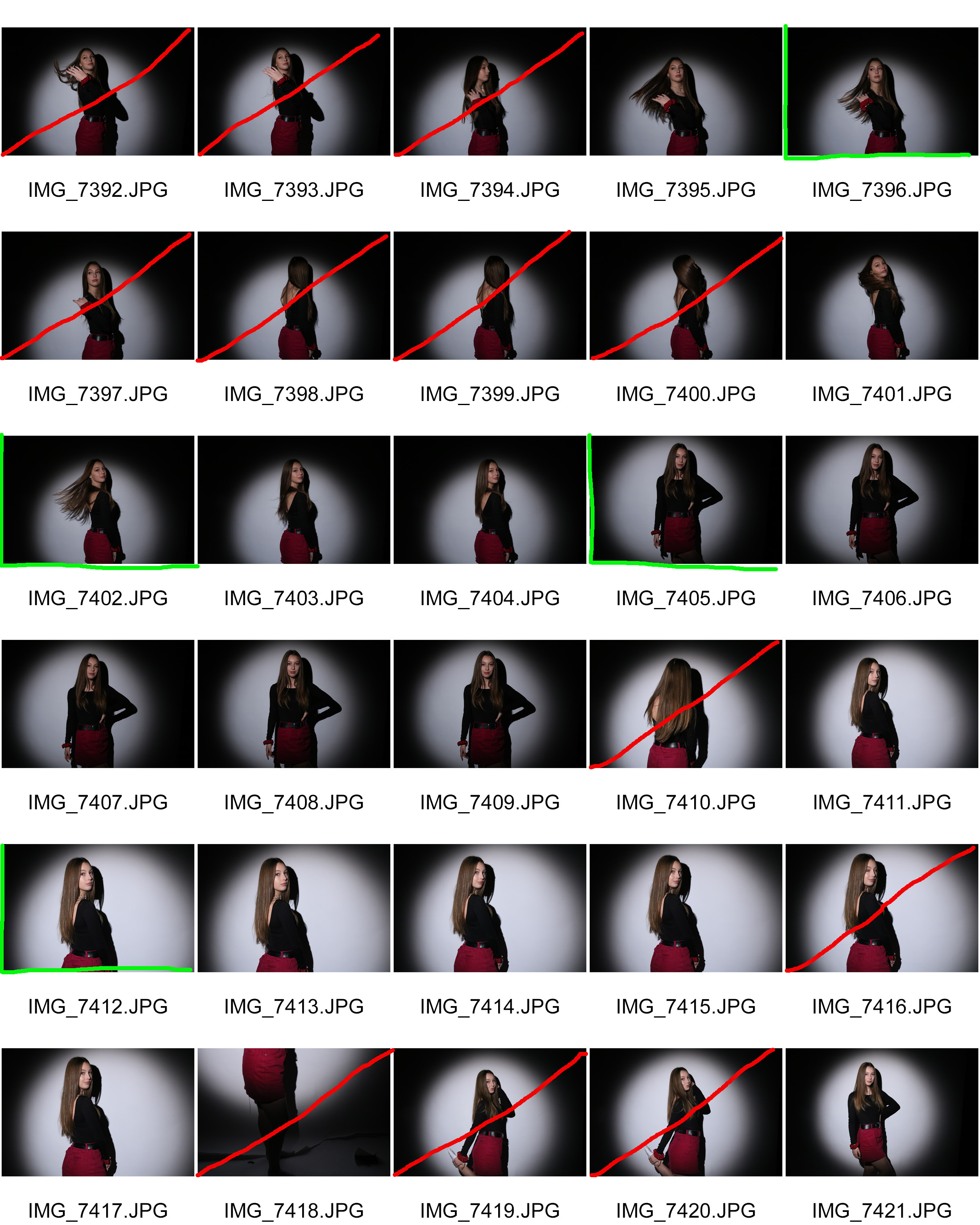
Contact sheet

Successful outcomes


Editing

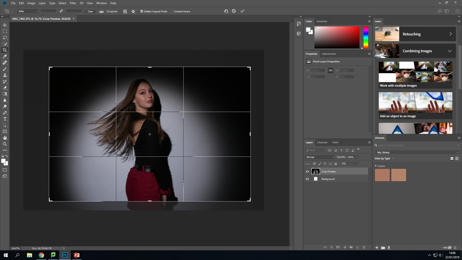
Firstly, I simply cropped the picture to get rid of some of the background
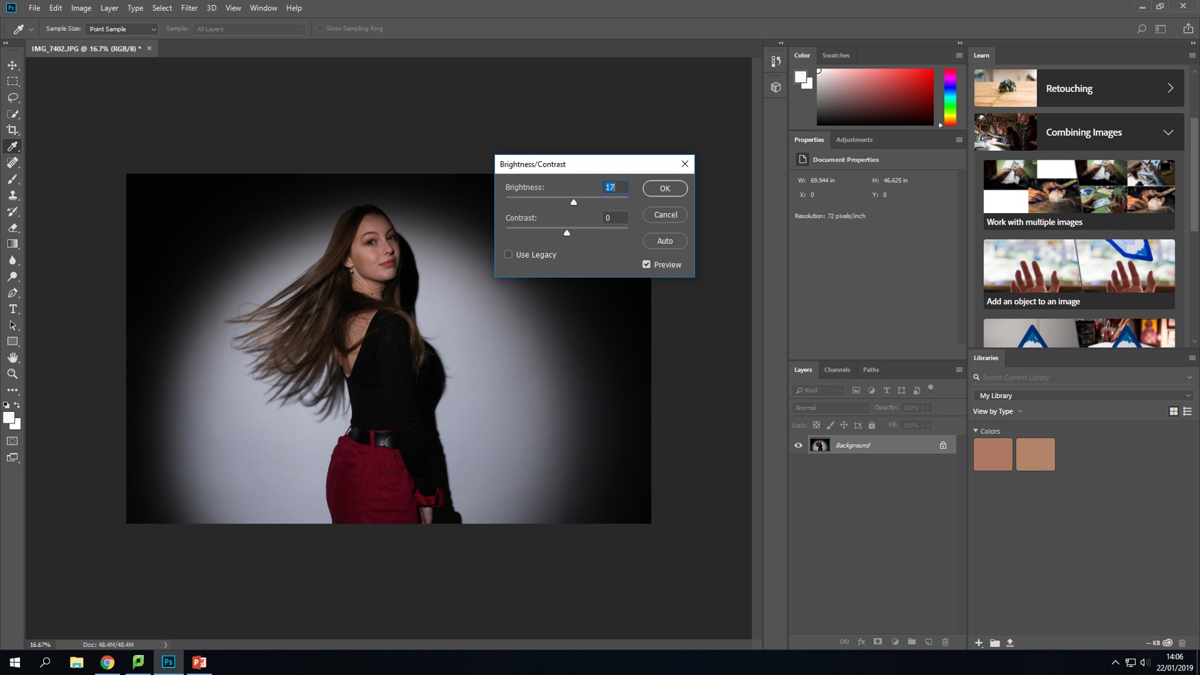
Next, I turned up the brightness as I thought that the image was a bit too dark.
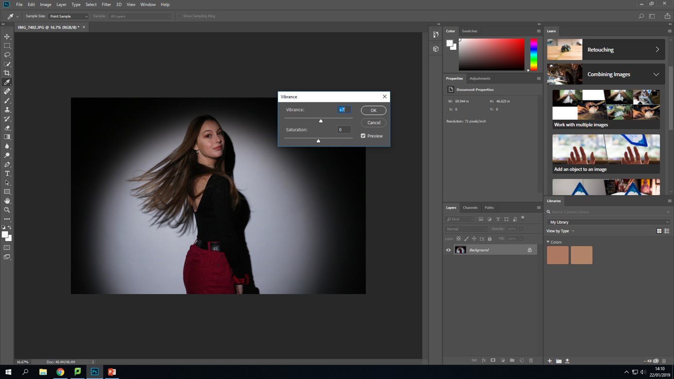
Lastly, I turned up the vibrance as I wanted the colors to stand out more-especially the pink.

Final edited photo.

Analysing

Technical

This image was taken in a studio with a white background and a spotlight placed in front of my model.

Visual

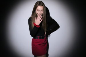
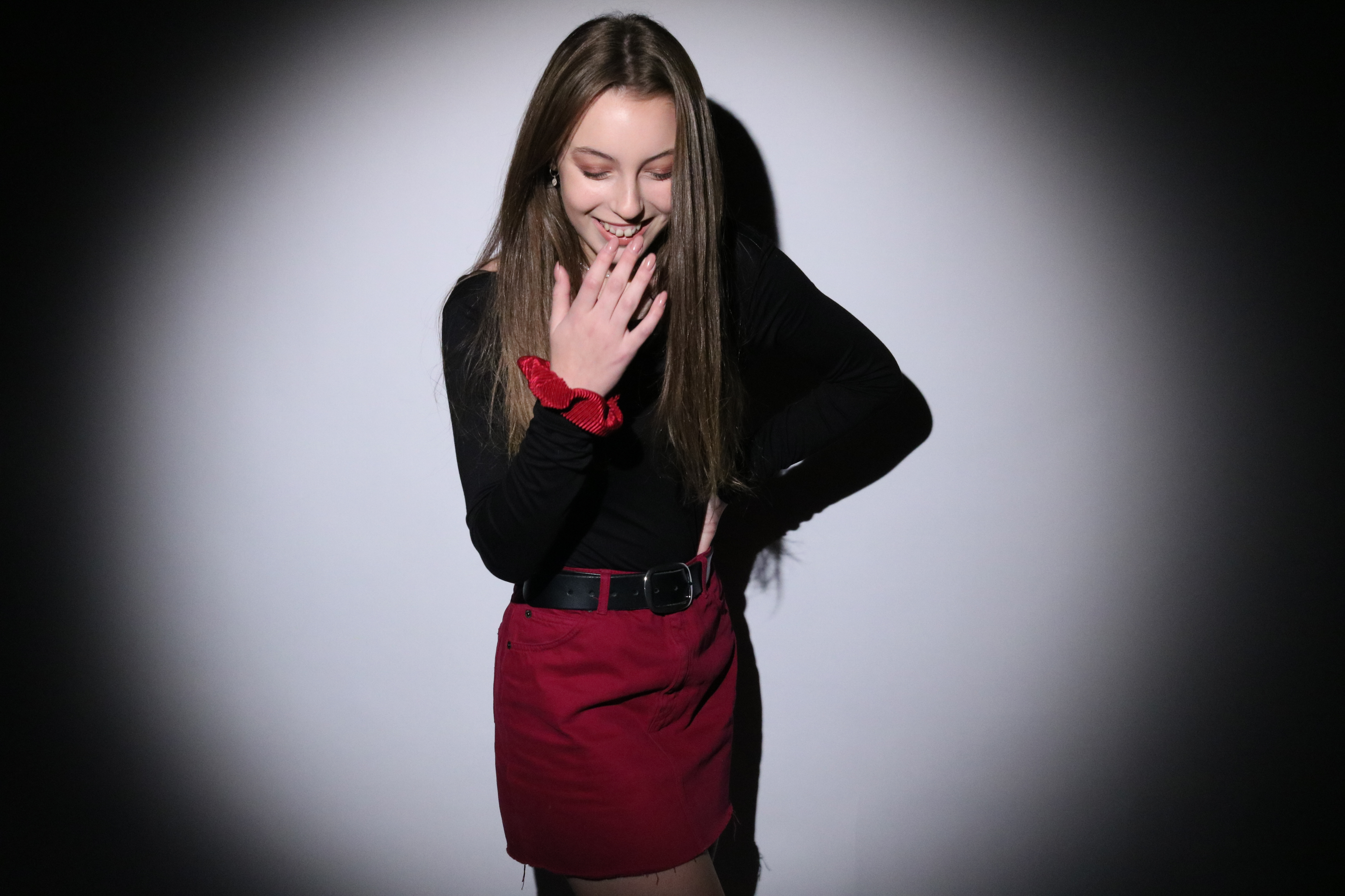
In this image we see a female posed in the centre of a spotlight. She is wearing a black top and also a pink skirt. She is posing with her left hand rested on her hip, and her right hand is held up to her face as she laughs.

Concept

I wanted this photo shoot to represent a very typical type of feminine woman. By having the model wear a pink skirt- and matching scrunchie on her wrist- I think this is conveyed as pink could be considered a stereotypical colour associated with women. The choice of a skirt was also intentional as it is a clothing item traditionally worn by females. The pose is also helpful in conveying a “feminine” vibe as the hand on the hip can be seen as a typical female pose, and the hand near the mouth while she’s laughing can make the model seem quite delicate, which is also a stereotypical feminine trait.


Technical

This photo was taken in the studio with a spotlight.

Visual

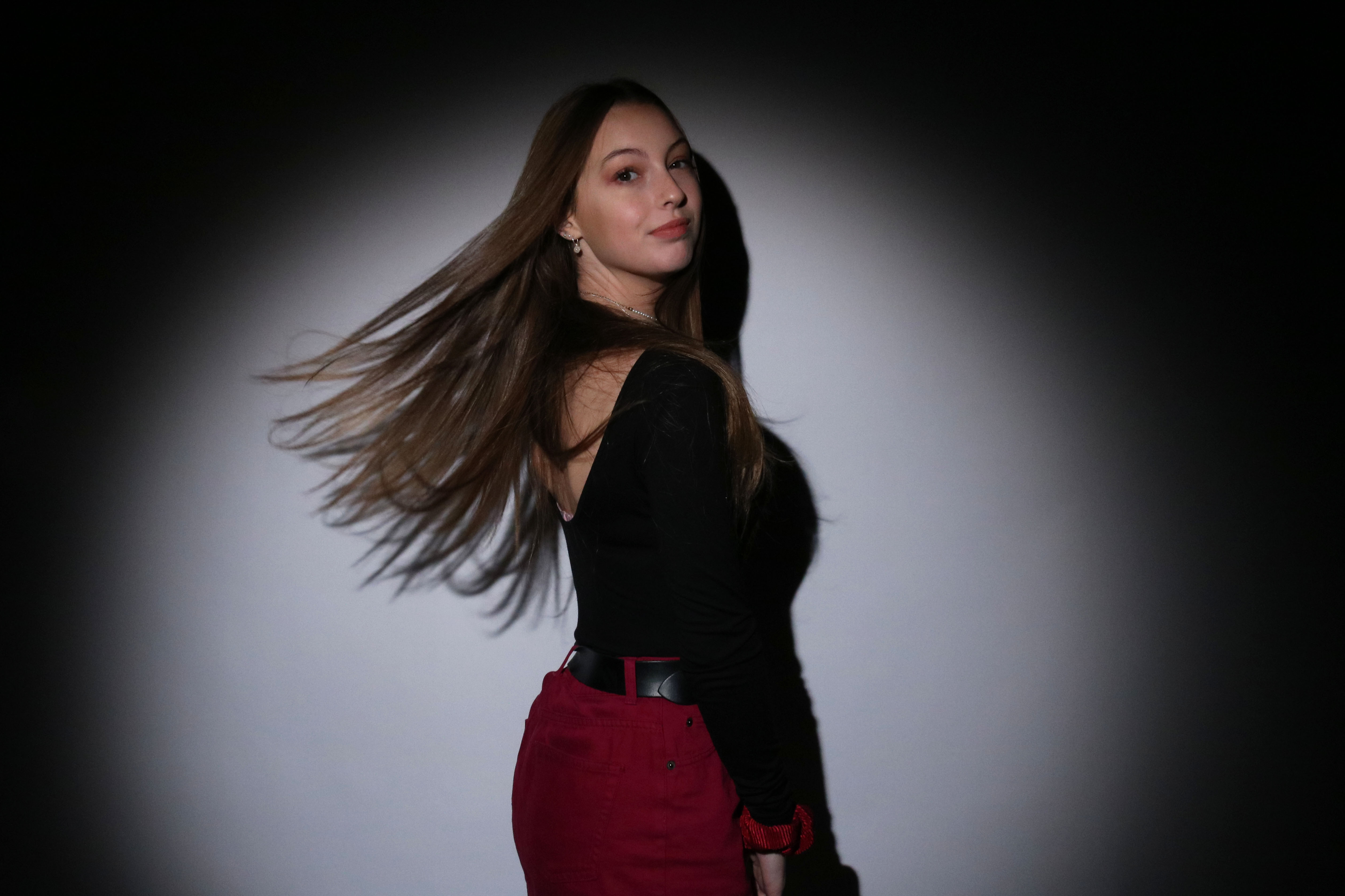
This image shows a female with her body sideways to the camera, and with her face looking directly into the lens. Her hands are neatly by her side and her hair has been flipped back, and the photo shows it moving in mid air as its pushed backwards.

Concept

Similar to the last image, this photo conveys stereotypical feminine traits. As I’ve mentioned previously, I used the colour pink, to represent femininity, as it is typically a colour associated with females. However, whats different with this image is that the model is posing with another “feminine pose”, as it is one where her long hair attracts a lot of attention. I think this pose is effective in showing typical femininity as long hair is a stereotypical image that can be associated with girls.

Gender identity- 1st and 2nd photo shoot plan

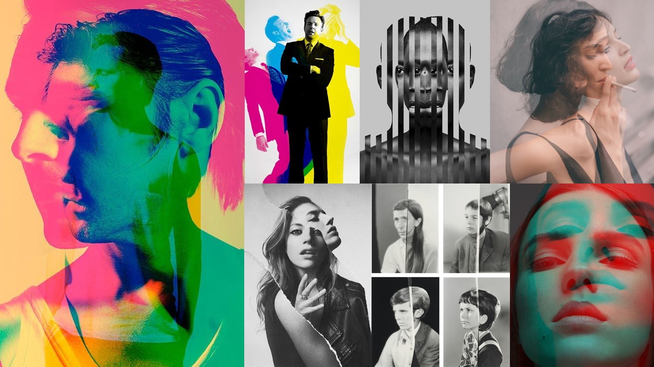
For this photo shoot, I was inspired by Sarah Maple’s work to create outcome challenging society’s view of modern day women, as they’re portrayed in the media. In order to do this I wanted to do 2 separate photo shoots, one where I photograph a female who I would consider to represent the “stereotypical women”, and another photo shoot with the same individual where their appearance has been altered in different ways so that they would now represent a different variation of the gender. After the two photo shoots are completed, I will experiment with different ways of displaying the images in such a way, where they conceptually contrast each other. Below is a mood board of inspiration, on how I could display my images.

Mood board

Not my images.


Displaying Final Outcomes

Displaying Final Outcomes

Order

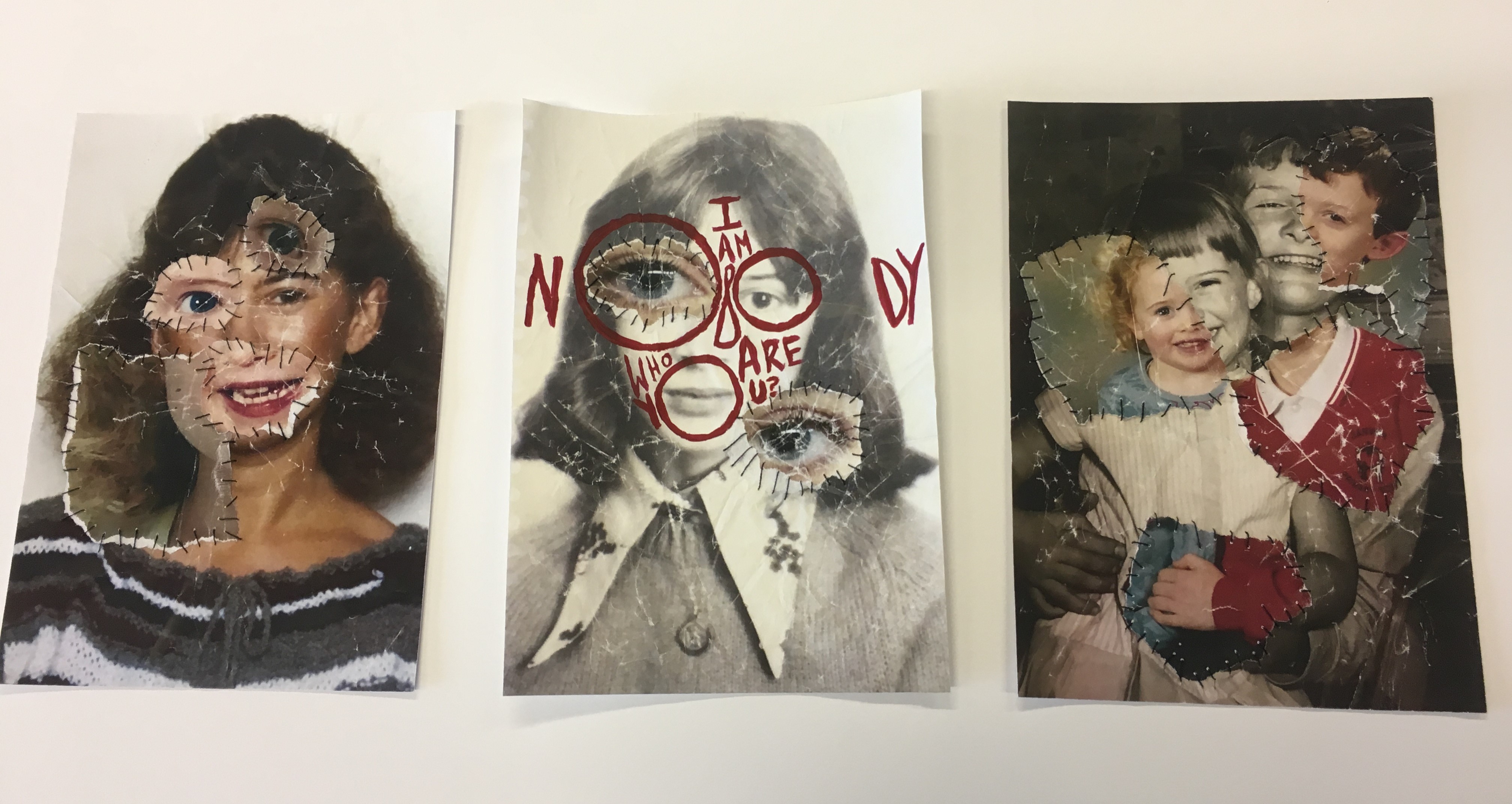
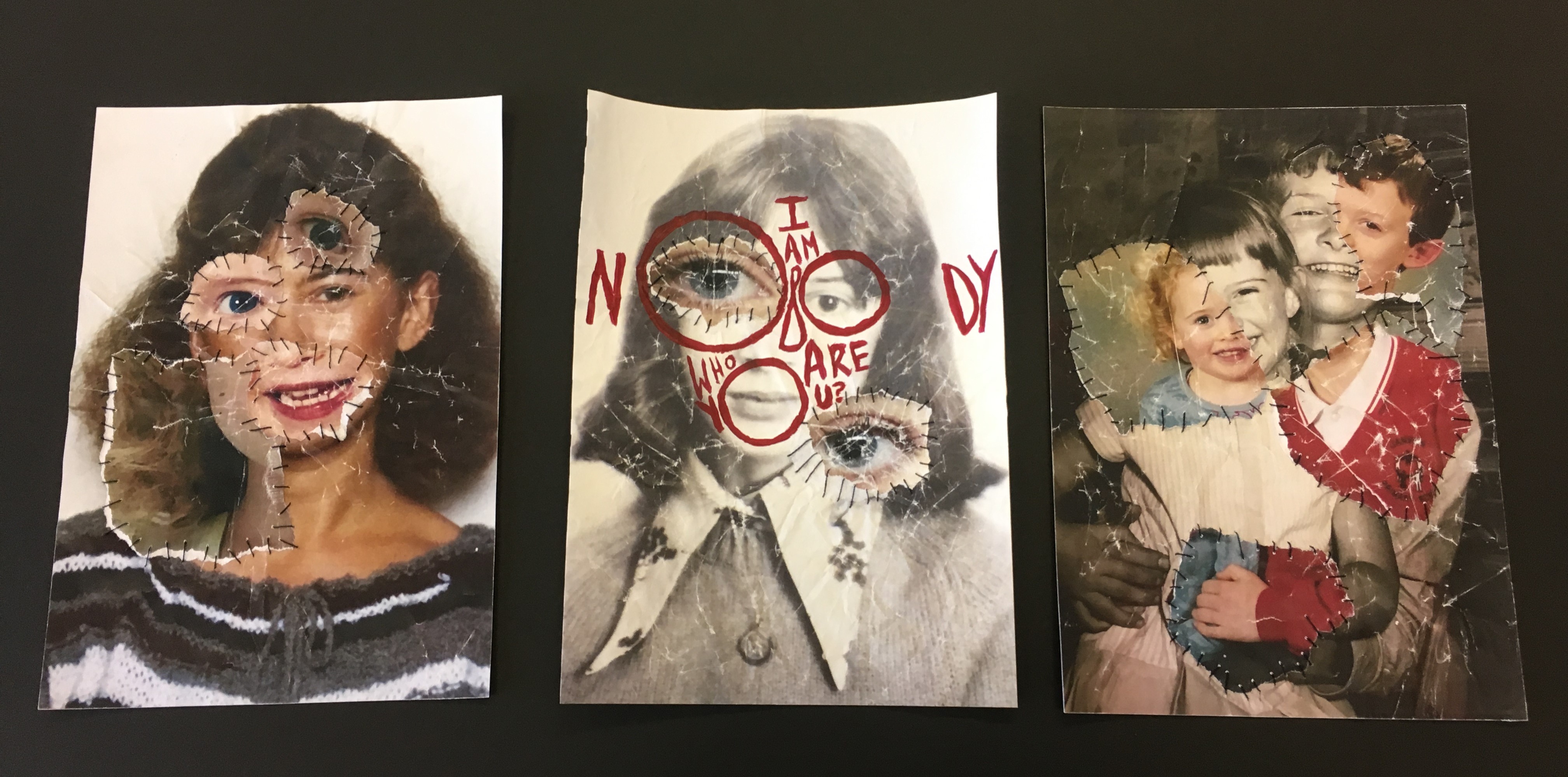
To display the photo-montages which I have made for my final outcome for the Identity and Place stimulus, I have decided to display them in a trio. Starting with the middle photo-montage, I placed this one there because it has bright red text on it which made it stand out more and it was the only one with text on it, I also wanted peoples eyes to be drawn to the center so they can read the text and see what it’s all about. I was originally going to put the two portraits at each end of the display because they were similar, however I changed my mind.

The Finished Display

Background 

I was also originally going to have a window mount in either black or white, however some things went wrong and then I decided to go without one and just mount them on a thin piece black card, which solely went around the edges, and then place them on white mount card afterwards. Below you can see that I was trying to figure out to use either black or white as the background colour, eventually I went with white because I thought black would be too dark and a bit distracting from the photo-montages.