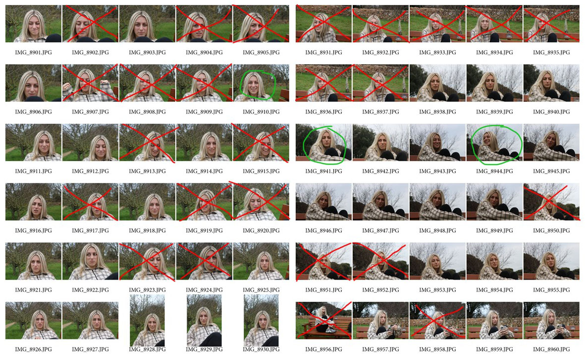

When I went to do this photo shoot, my aim was to try capture photos that were similar to Hockney’s photos. I took pictures from different angles with the amount of light changing from angle to angle. I got the subject to move between photos so that there could be a sense of movement in some of the images. The subjects facial expressions changed throughout the photo shoot, and I could use these when I merge some of the photos together. On the whole I am happy with the outcome of this photo shoot as I have come out with some photos that I can use. If I were to do the photo shoot again I would do some photos indoors to and see what would come out of them.
Edits 1:

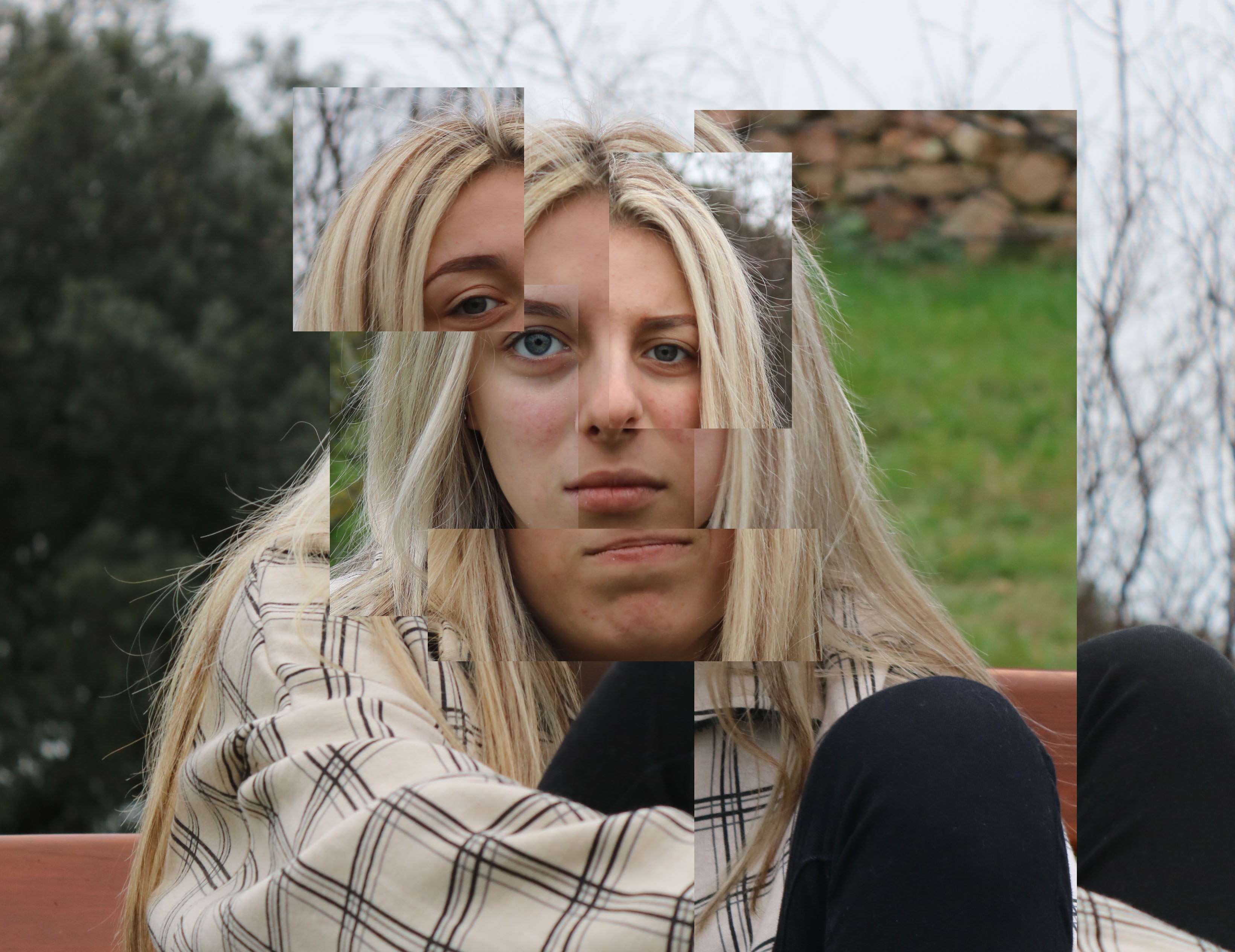
When I edit this image, I tried to find photos that would contrast each other so that it was obvious to the viewer that it was different photos on top of each other. I also moved photos out of position in order to give the image a sort of abstract feel and make the viewer concentrate on each part of the photo. I used IMG_8941 as the main background as the subject in the photo had their face straight looking at the camera, so I felt that it would be easiest to edit on. I then used IMG_8953 and IMG_8964 for the different eyes edited on. Each eyes had a different shading, and each one had a different white balance to it. I then aligned the eyes to the face and put one out of position as the eyes was looking in a different and I felt like the eye look in the right position in the place where it was positioned. I then used IMG_8942 for the mouth. I positioned the mouth under the background mouth, to give the image the distorted and lost effect that Hockney used. I then proceeded to use IMG_8930 for the left side of the face. I aligned the eye with the background one. I used this image to change the shading of the face and also to give the image that block effect in Hockney’s images. I used IMG_8935 for the right side of the hair. I did this to break up the background and also to make the block effect. I tried to make my edit as distorted and broken up as possible to make it look like Hockney’s work, but I made sure not to over do it or else it would end up like a mess and just make the image not attractive to look at.
Edit 2:

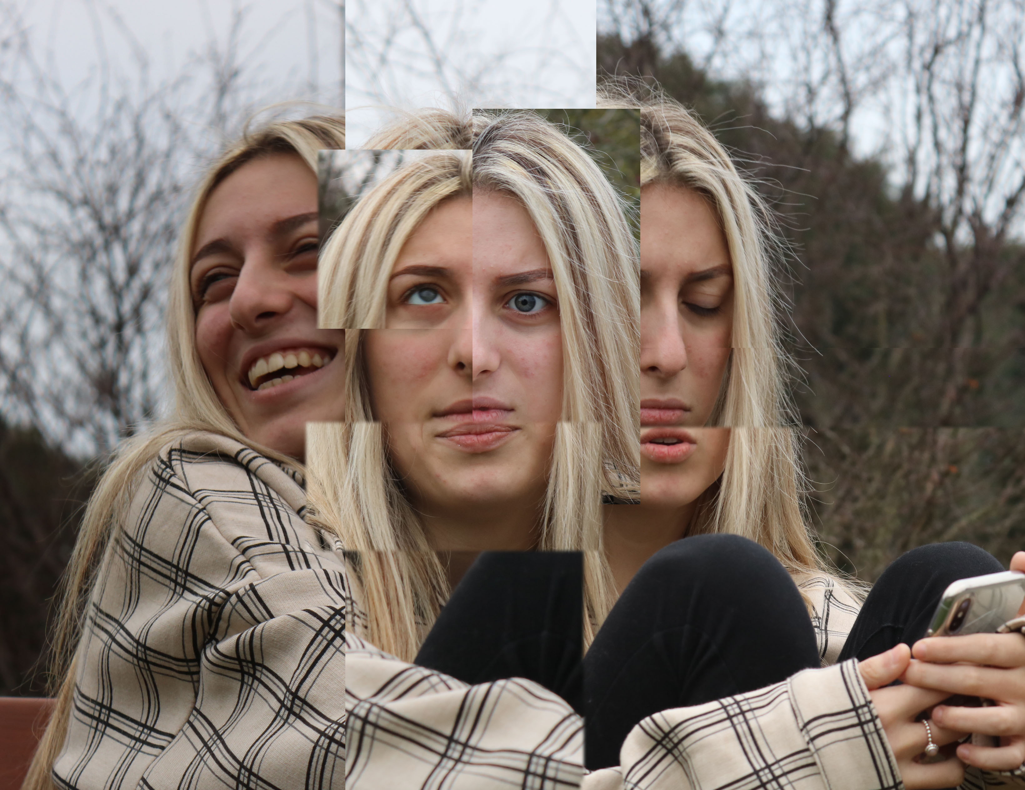
In this edit I used the same method as with the edit before. My target with this edit was to make it seem like it was moving, that is why I sort of divided the edit into three sections: the subject smiling; the subject with a straight face; and the subject with a sad face. I did the same thing and put other images on top to make the image distorted and sort of block like. I made sure that some segments were bigger than others and that they would contrast each other. There are different white balances that also make the segments contrast each other. I am happy with the outcome of the edit. I found it hard placing the segments in sections as I didn’t want to make the image seem like it was too busy and overcrowded. I also want to make sure that the subjects facial expressions were easily visible.

Filipe you must produce the following blog posts by the end of the summer term :
INTRO TO OCCUPATION / WW2 (BLOG POST) – –
SJ ARCHIVES (BLOG POST) – –
ARCHIVE ESSAY (BLOG POST) – –
SITE VISIT images + edits (BLOG POST) – –
PHOTO-MONTAGE examples and artist references (BLOG POST) – –
BUNKER ARCHAEOLOGY VISUAL REFERENCES (BLOG POST) – –
INDEPENDENT STUDY PHOTO ASSIGNMENT (BLOG POST)
ZINE DESIGN AND LAYOUT include narrative and sequence (BLOG POST) – –
ZINE RESEARCH AND INFLUENCES (BLOG POST) – –
ZINE PRESENTATION AND OUTCOME (BLOG POST) – –
ZINE PRINTED AND SUBMITTED – –
Following on from our chat: very limited progress here.
Please aim to complete and submit the 2 current photo assignments…
Environmental Portraits
Candid Portraits
Establishing shot (group photo)
Detail shots
You should also have the following blog posts published
Jersey Archives
Jersey War Tunnels
Occupation Babes
Compare / contrast old and new photographers
Home Sweet Home Photo Assignments (as above)