In this post I will be referring back to this mood board:
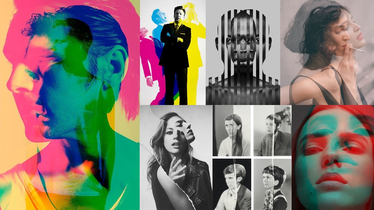
Now that I have my 2 contrasting set of images completed I’m now going on to editing them using the mood board above as inspiration. The reasoning behind editing my images like this is so that it is clear to viewers that that one image will be a stereotypical representation, and the other will be a different version challenging the view. Conceptually, I’m hoping to show that there is more than one possible way for someone to look, as people feel differently and represent themselves in different ways, giving them different variations of identity.
Editing
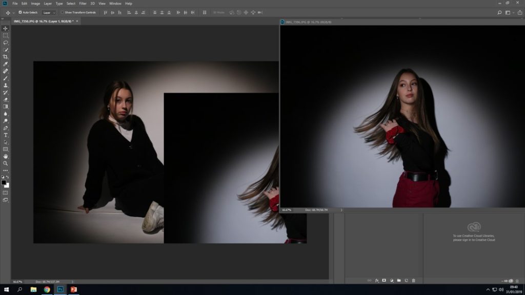
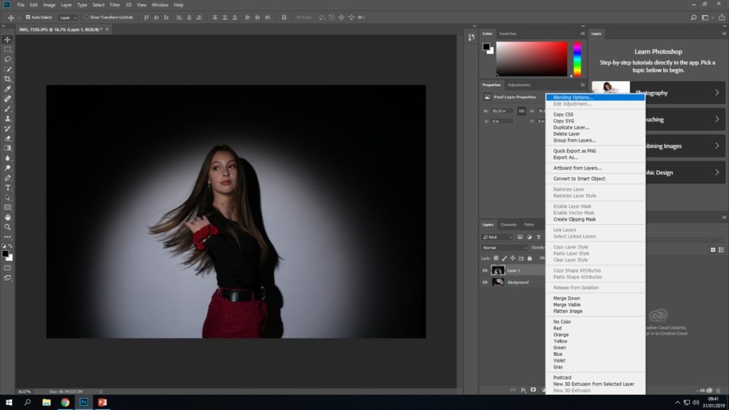
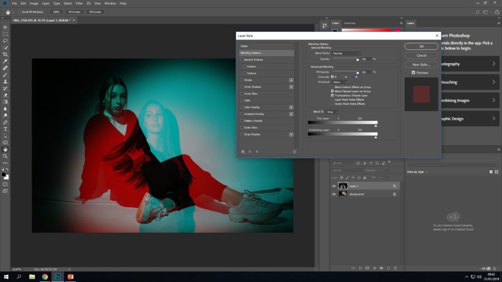
Initial final outcome
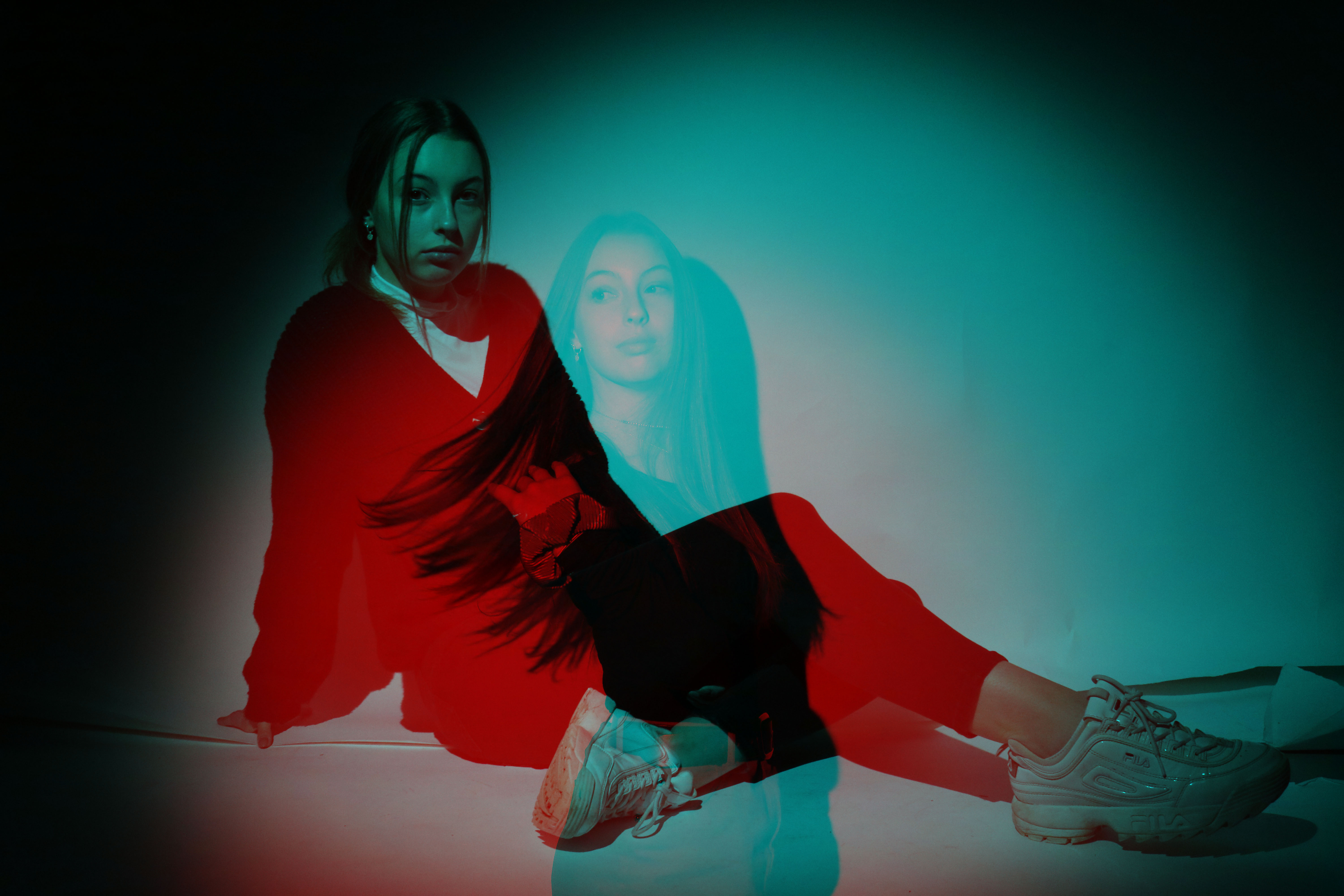
This is the outcome that I got from the above process. I think that this outcome was quite successful because we’re able to see both of the contrasting images through each other, and its clearly noticeable that one image symbolises a more feminine identity and the other shows an opposite variation. By having both images displayed directly on top of each other its a lot easier to be able to notice all of the contrasts in the model’s appearance, meaning that the image is more successful at getting its meaning across
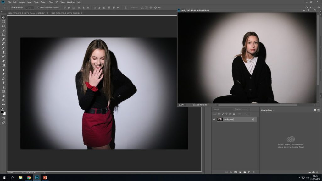
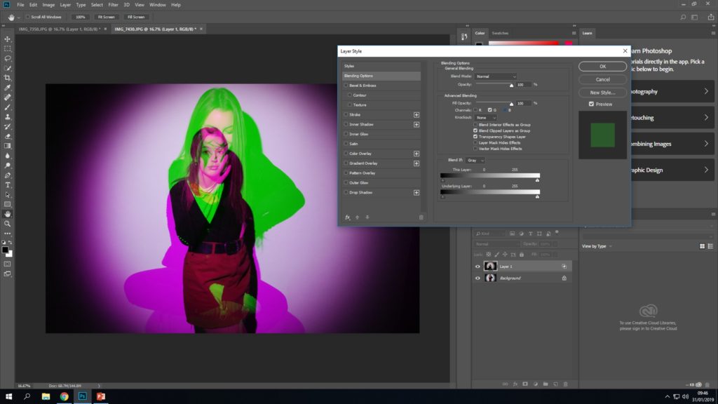
Initial final outcome
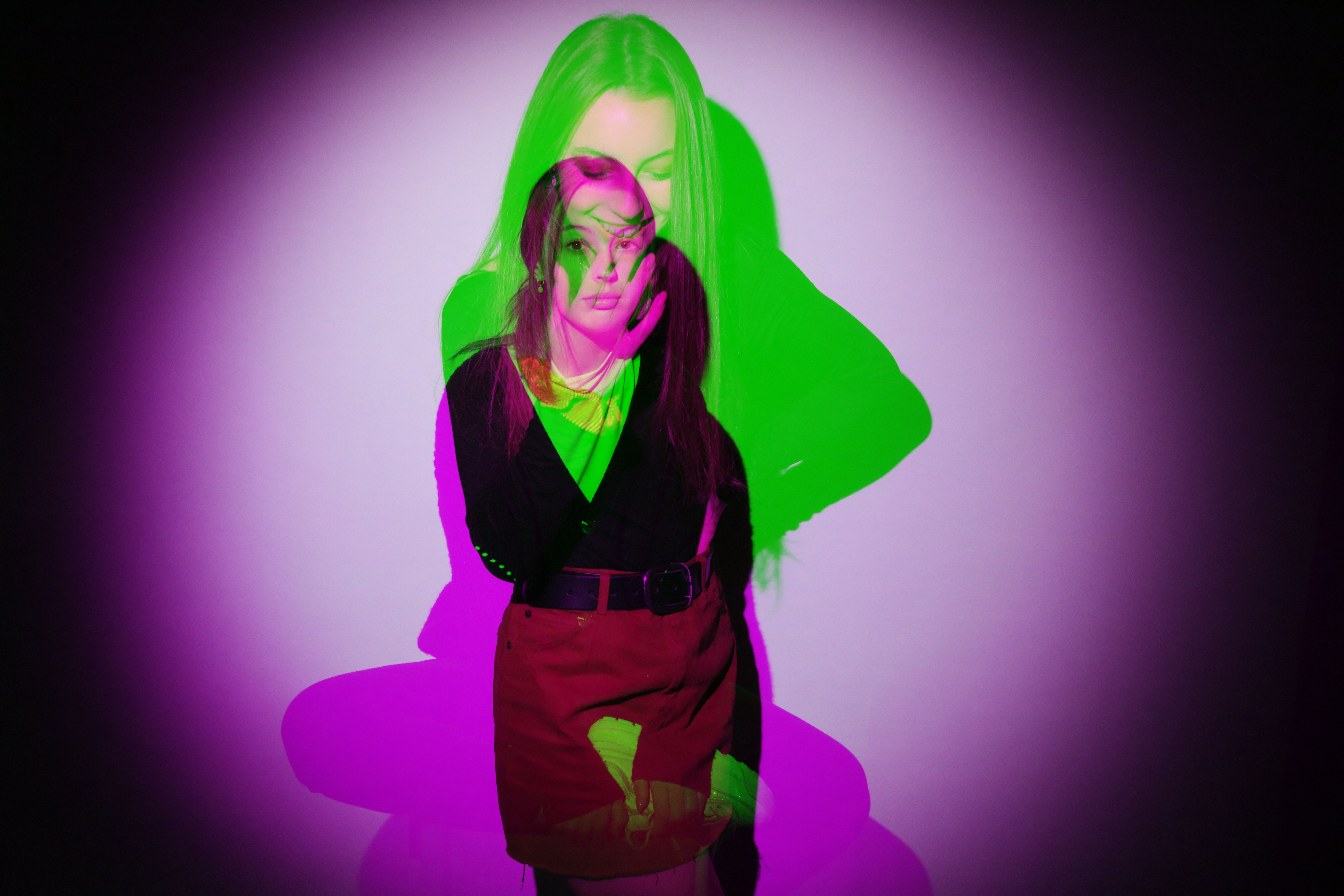
This is the final outcome from editing my 2 images together the second time. Like the last outcome, we are able to see the model on both of the images. I think that this outcome is also able to get the concept of differing identities within the same gender, because we see the same model presenting herself in two different way directly over each other which makes it a lot easier to be able to spot all the contrasts.
Comparing my outcomes


I think that both of my outcomes using layering, both show the differing appearance of the model quite effectively. However, I think that my 1st outcome (image right above this text) is the most successful one. I think this because with the other outcome we’re not clearly able to see the model’s whole body due to them being directly over each other. I think that being able to see how the model has positioned her body is very important in showing her identity as the way someone uses body langue says a lot about how they see themselves, meaning its their identity.
Final outcome overall

Editing
Next I will be using a technique where I create a pattern on Photoshop and use it as an overlay for another image.
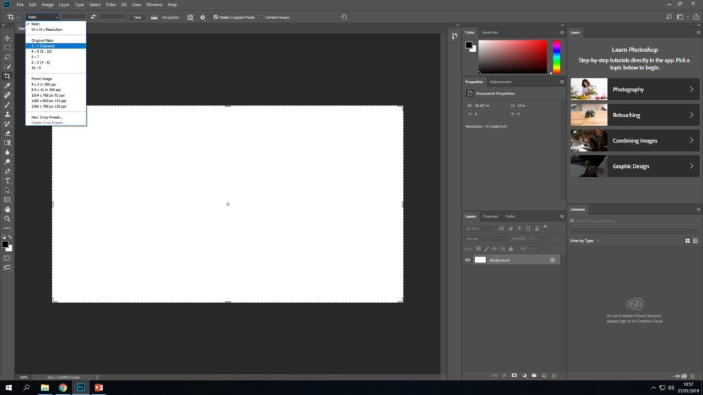
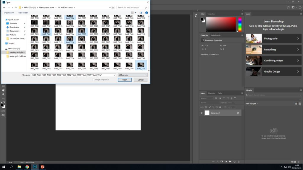
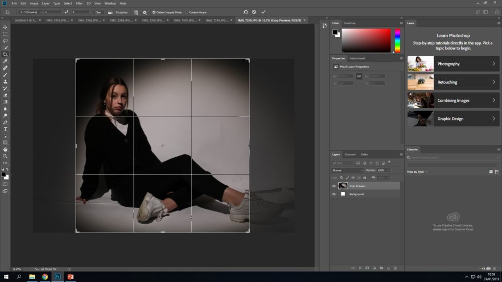
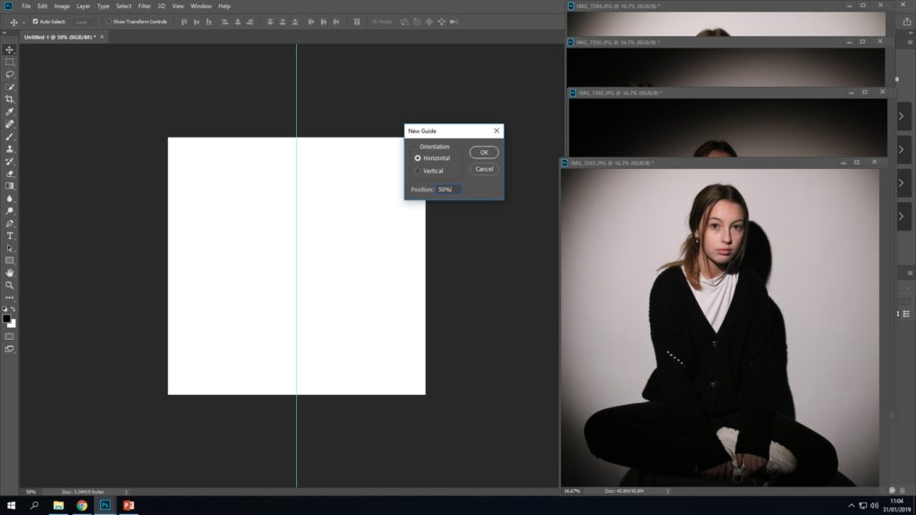
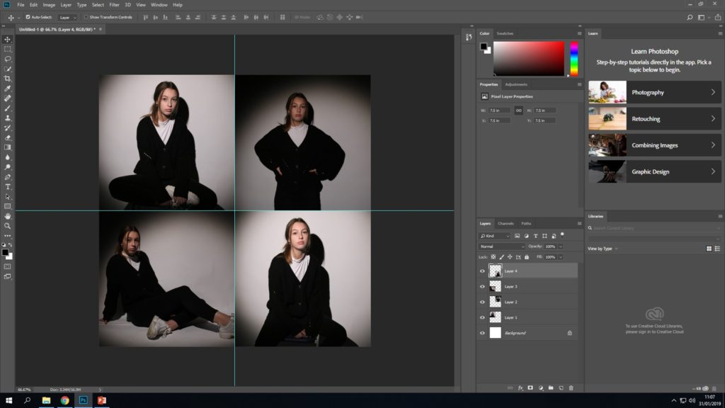
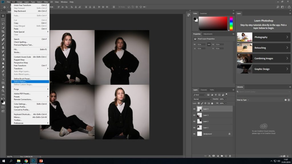
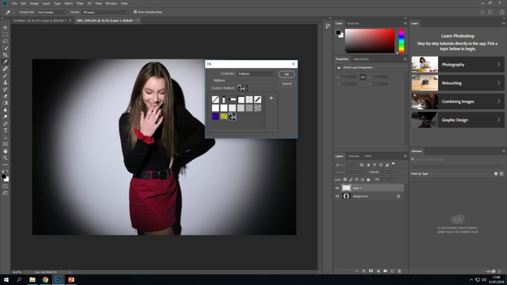
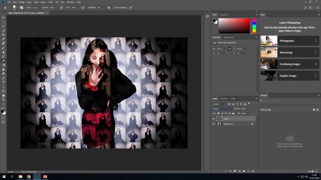
Final outcome

Overall I’m very happy with my final outcome. In the image we can see the “feminine female” image being made up of lots of smaller versions of the same model from the contrasting shoot. This outcome is another way of showing how the way a gender represents themselves can vary.
Final 2 images

