Displaying Final Outcomes
Order
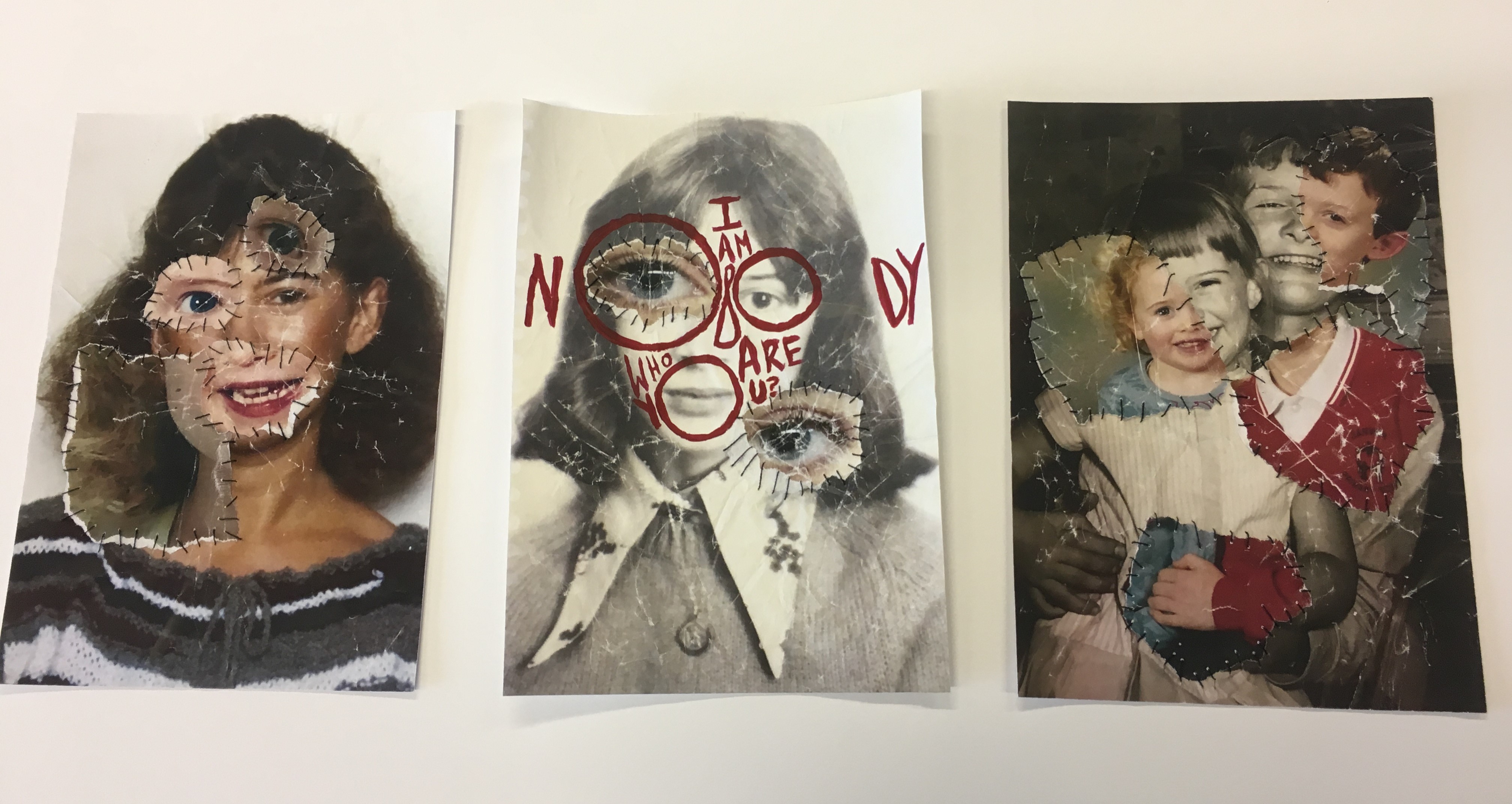
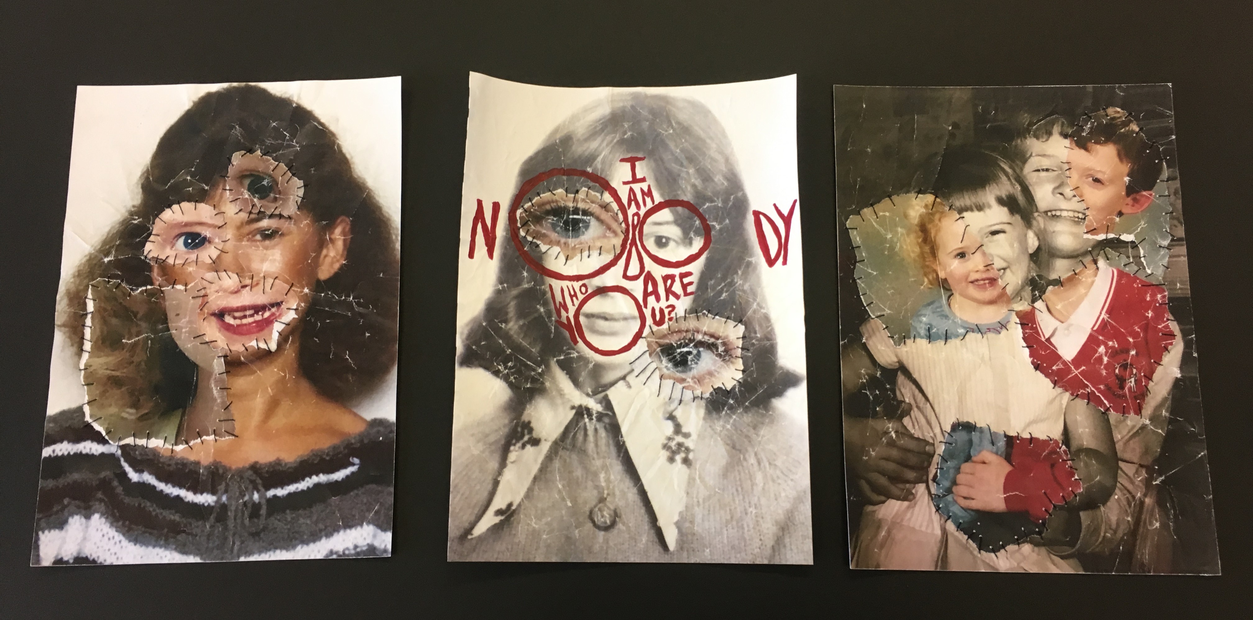
To display the photo-montages which I have made for my final outcome for the Identity and Place stimulus, I have decided to display them in a trio. Starting with the middle photo-montage, I placed this one there because it has bright red text on it which made it stand out more and it was the only one with text on it, I also wanted peoples eyes to be drawn to the center so they can read the text and see what it’s all about. I was originally going to put the two portraits at each end of the display because they were similar, however I changed my mind.
 The Finished Display
Background
I was also originally going to have a window mount in either black or white, however some things went wrong and then I decided to go without one and just mount them on a thin piece black card, which solely went around the edges, and then place them on white mount card afterwards. Below you can see that I was trying to figure out to use either black or white as the background colour, eventually I went with white because I thought black would be too dark and a bit distracting from the photo-montages.


