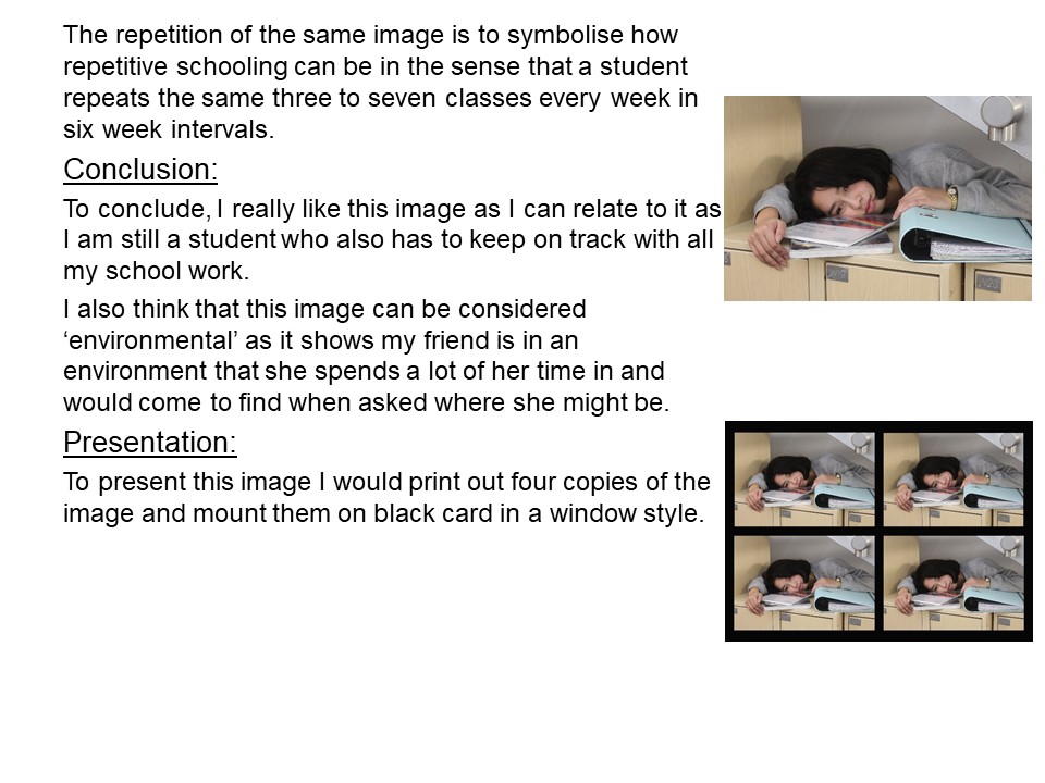
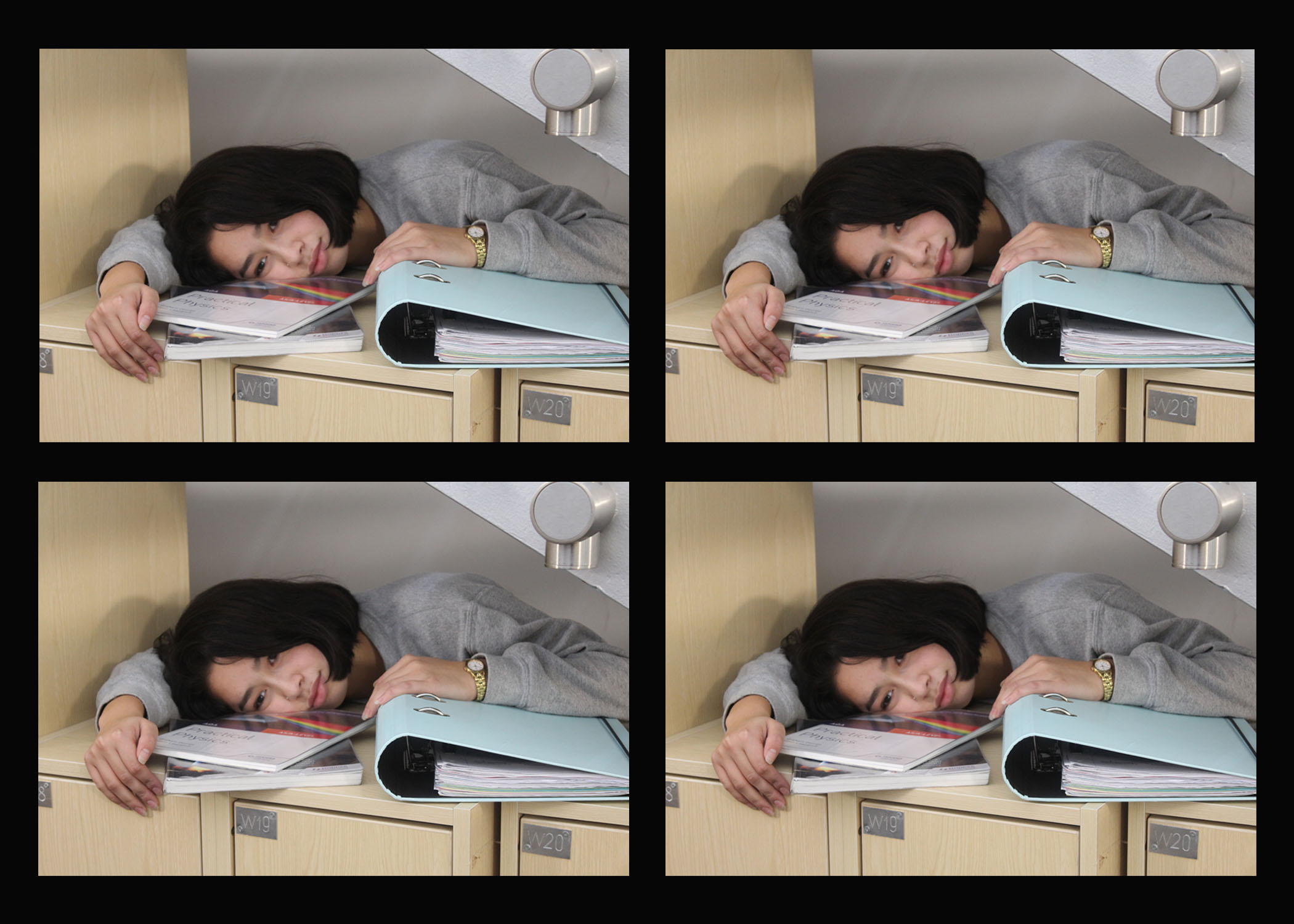
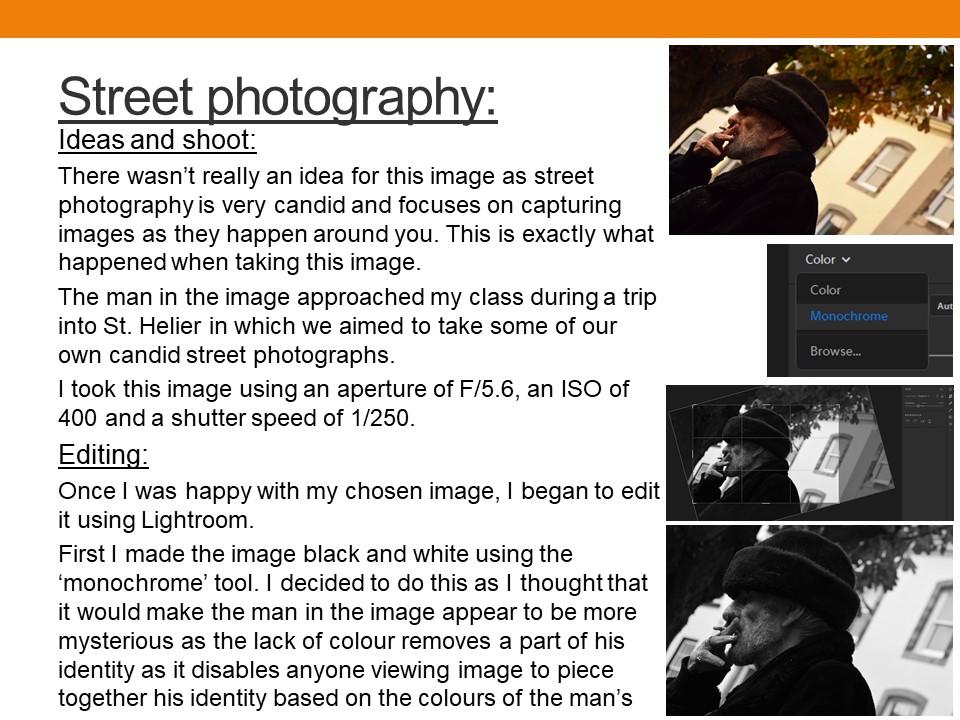
Isabella Madrid

Isabella Madrid was born in Pereira, Columbia. At the age of twelve, she began to feel a void in her life until her father gave her the first camera at thirteen and she discovered photography. Her style is simple, candid and introspective. She has a love for post production and knows the incredible things that can be achieved from a photograph. Inspiration comes to her from the most unexpected places and people. She also finds it within herself, in her feelings, in the human body, in light and nature. Her artistic photography is mainly self portraits. Therefore, her whole creative process is very personal and aimed for self discovery. She does all the editing on photoshop and likes to experiment with textures, mixing digital painting with photos, with colours, with light, with black and white. Her creative work mainly happens in her own room. A place where she can be herself without any concerns.

ANALYSIS OF IMAGE

This image is a self portrait of the photographer holding two paintbrushes towards her face. One is towards her mouth and the other is near her right eye. This image relates to ‘loss of identity’ since the edit shows that her face is a blank canvas. The two paintbrushes are painting her facial features and creating a false identity for her. When responding to Isabella Madrid’s work I will create edits that convey the theme ‘lack of identity’ just like she does through photoshop manipulation.

Identity: Photo-shoot 1 Final Selections

Below is a gallery of the final images i selected fro  the contact sheets of my first photo-shoot:

In order to take inspiration from Murtha’s style of photography as well as her concept, I edited each image so that they followed her black and white coloring, and made a range of other edits in order to alter and enhance each image, the following images are the results:

The above gallery displays the images after the editing process. Some involved more editing than simply changing the color of the image.

The above image involved editing 3 different images together, in order to give the appearance that the cardigans in the background are floating on their own. This was done as a representation of loss, as both cardigans appear to belong to the generation before (grandparents). This editing was done in Photoshop using the following process:

I used the quick selection tool in photo-shop to select the cardigan separately from the background, and pasted this selection into the other image, therefore merging the 2 images. The same process was used for the second sweater.

Editing was also used to create different effects on my photographs, such as the following:

In order to create the final image from the above photograph, I used photo-shop and lowered the opacity of the eraser tool, and using different layers, created 3 versions of the subject, each one slightly more erased than the last:

The final image (below) takes inspiration from Murtha’s work through the color scheme and documentary style photography, while also keeping with the theme of the identity project (showing the development and change of a child as they grow and, literally, move forward)

Final Portrait Photoshoot 1 + Image editing Ideas

Action Plan

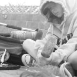
For my final photo shoot, I decided to feature myself as the main subject of the photographs and took photos in my garden and on my local beach where I have grown up playing football and socializing.  I Then met up with a friend in town and used him as a subject afterwards. We simply walked around the backstreet areas to capture images. I mainly focused on using available light sources such as shop fronts and Street lights however, in some scenarios I used my camera flash

In order for the first half of this shoot to take place, I had to take the photos from a distance. I therefore downloaded the Nikon Snap bridge app, Which allowed me to set timers and take photos directly from my phone via Bluetooth connection. I also used a tripod in order to hold the camera at a suitable height and to get a very stable, focused image. For the second half of the shoot, I simply held my camera and shot from different angles. I preferred this approach more as even though I captured more blurred images, I had more of a free range of movement with the camera and I was able to capture angles that a tripod simply wouldn’t allow me to

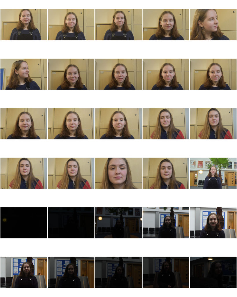
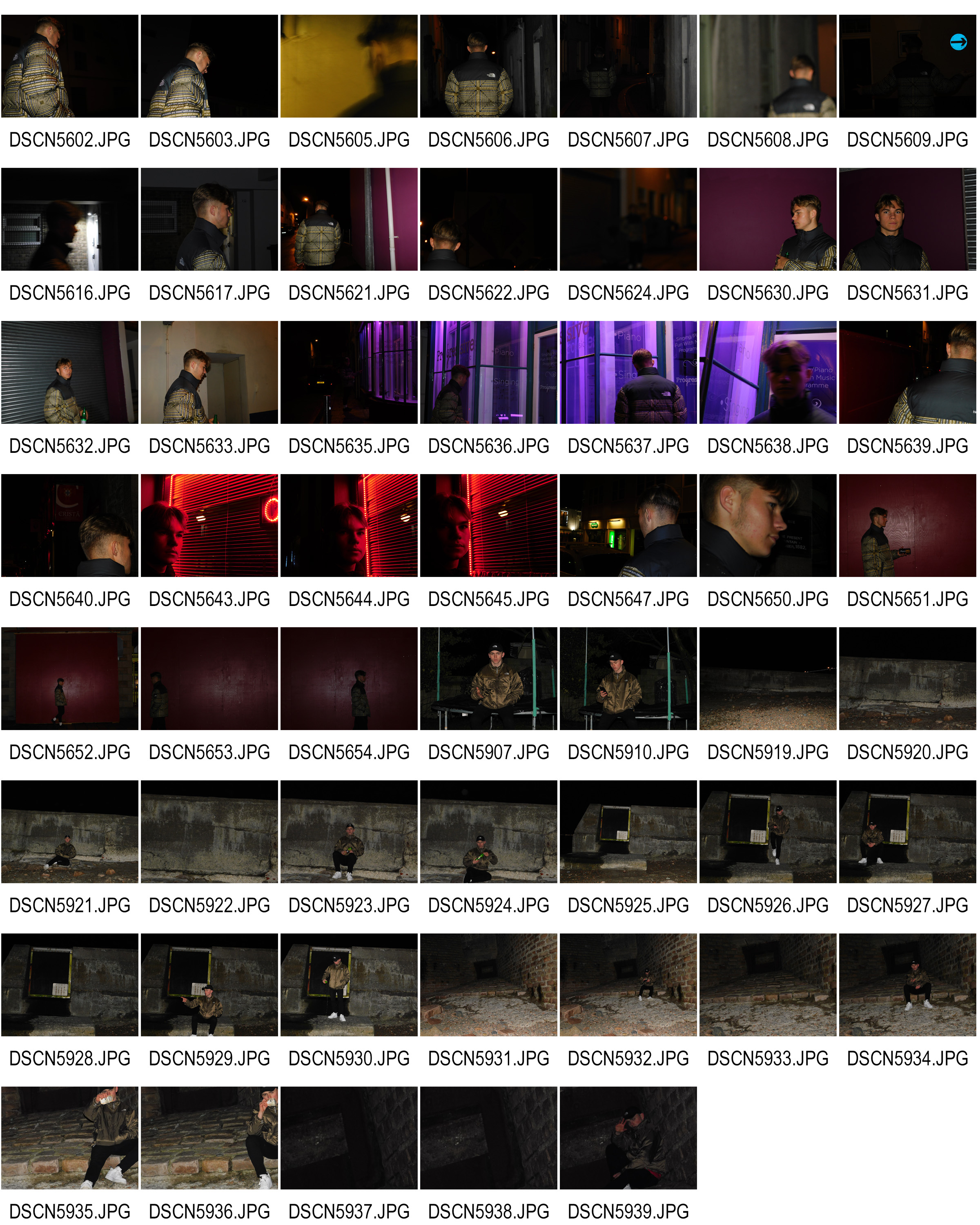
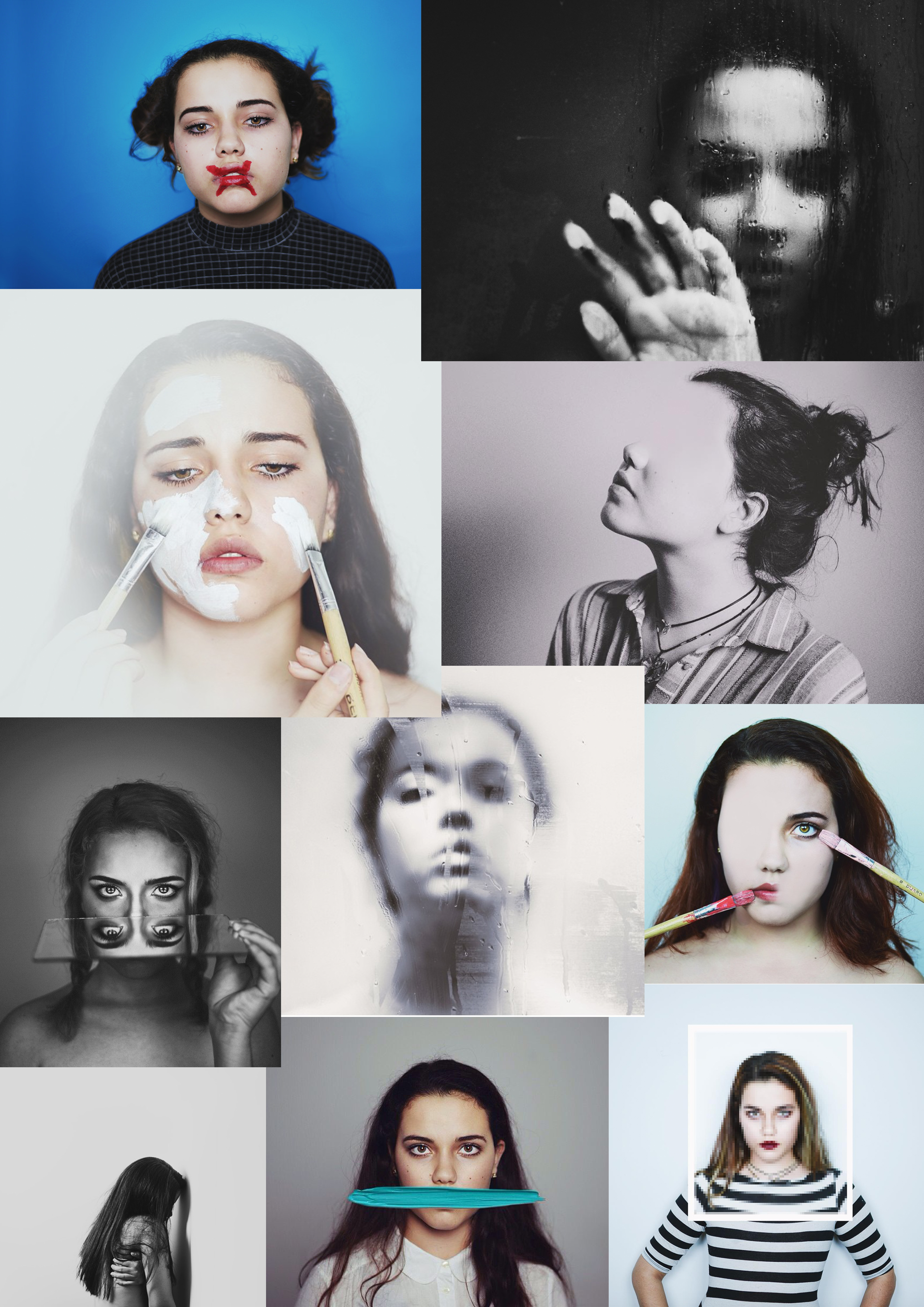
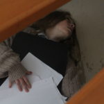
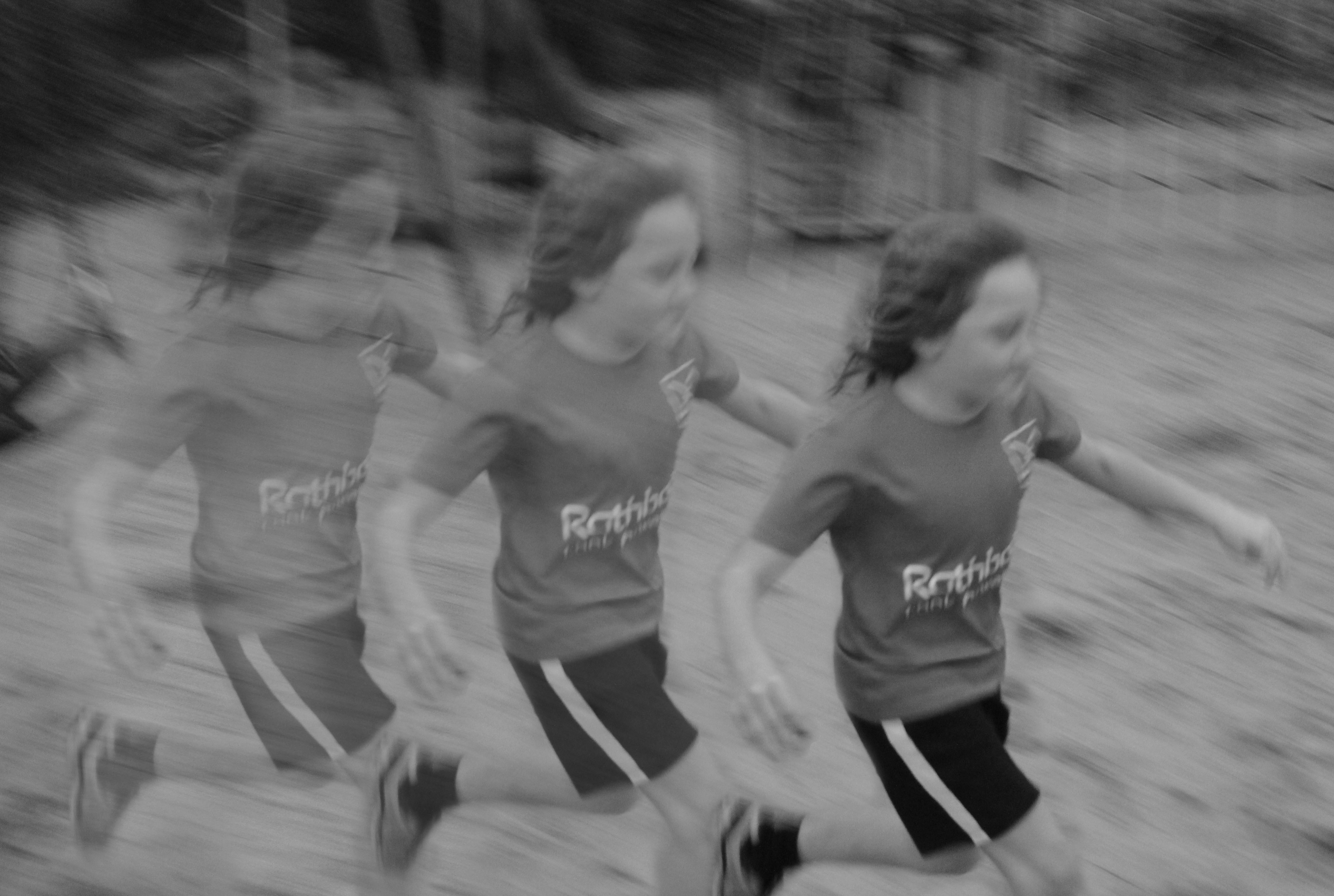
Below is a contact sheet from the shoot. overall, The night I chose to shoot on was a very stormy night, So a lot of my images contain a lot of noise and blurring. I have however, looked over all of the images to see if I can make anything out of the negative images due to the nature of my chosen area,  Fortunately I have been able to identify a few which can have some potential further down the line due to their composition obscuring the subjects identity

Contact Sheet

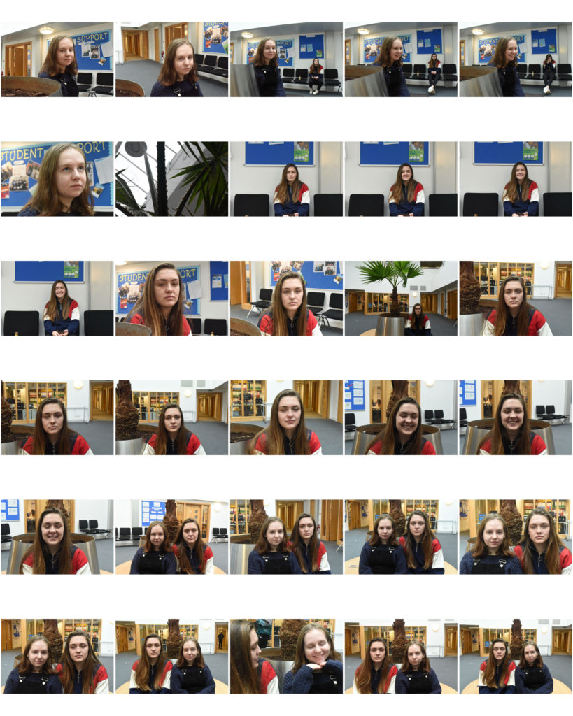
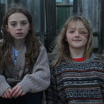
This is the contact sheet of my narrowed down images.

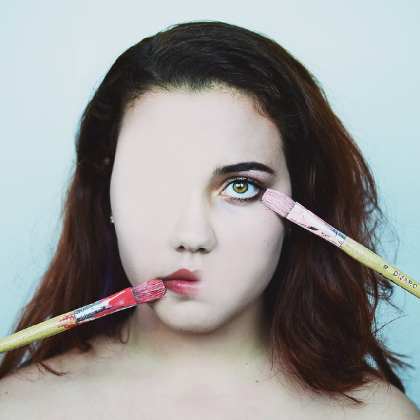
With the help of this contact sheet, I have been able to select images that I feel stand out for numerous reasons. Below are some of these images and my thoughts on them.
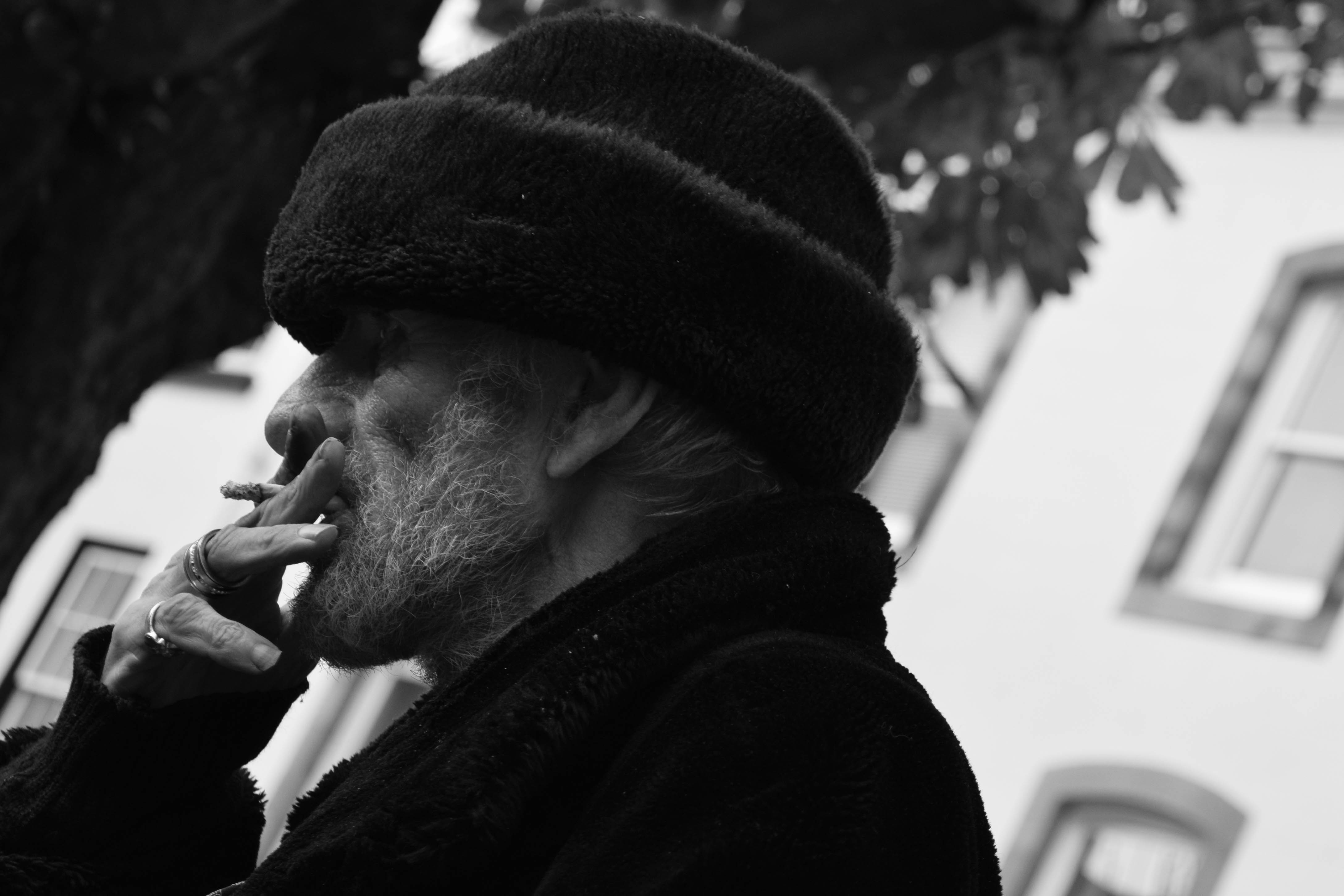
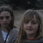
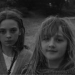
Image 1

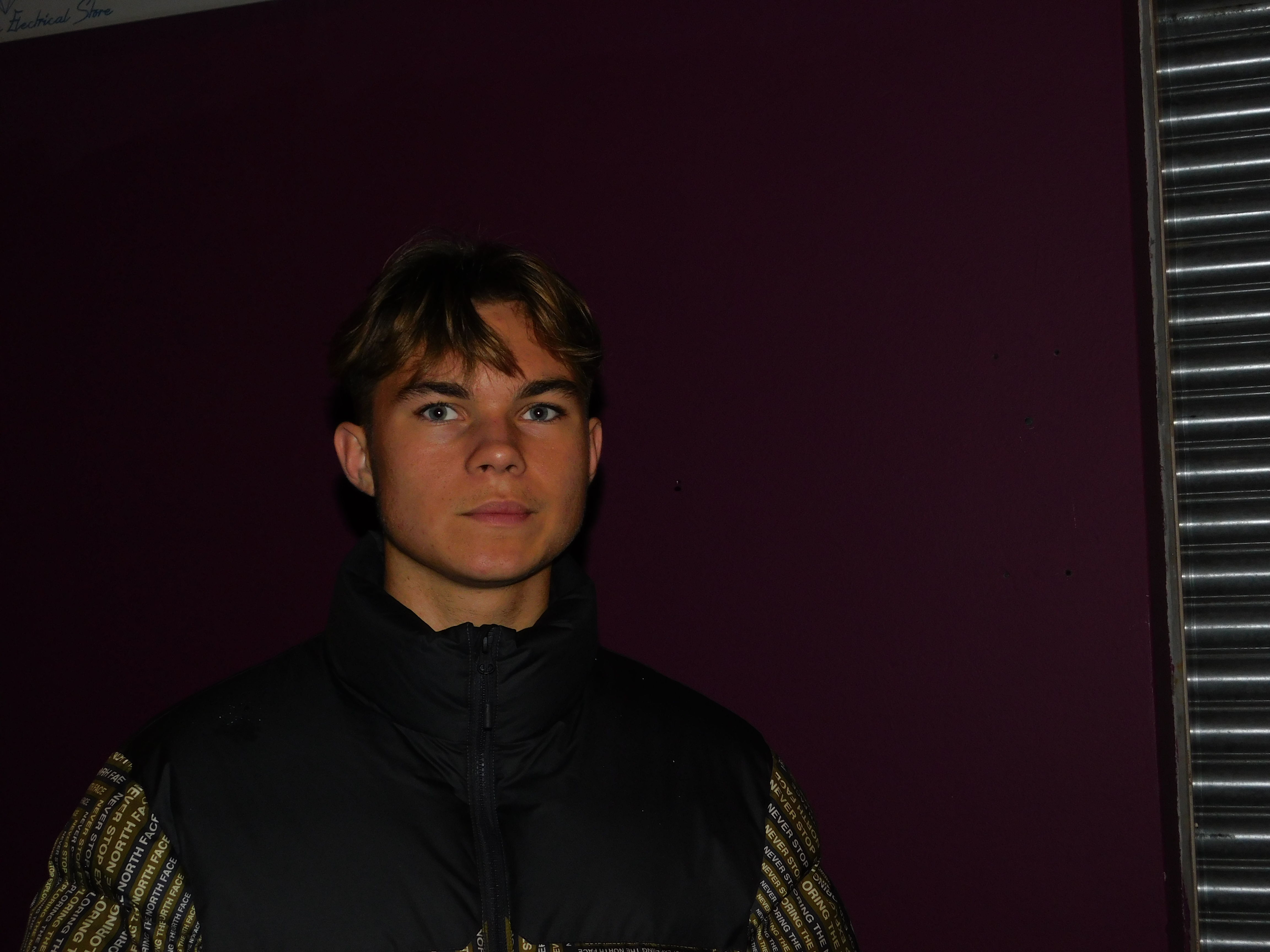
I like this image due to the clarity of the subjects face. The solid purple background helps the neutral colors of skin tone and the subjects jacket stand out, Essentially drawing all of our focus onto the subjects profile and facial features. The image does need some cropping at the edges in order to ensure our entire focus is on the subject and not the garage door at the sides and top left of the image.
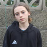
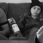
Image 2

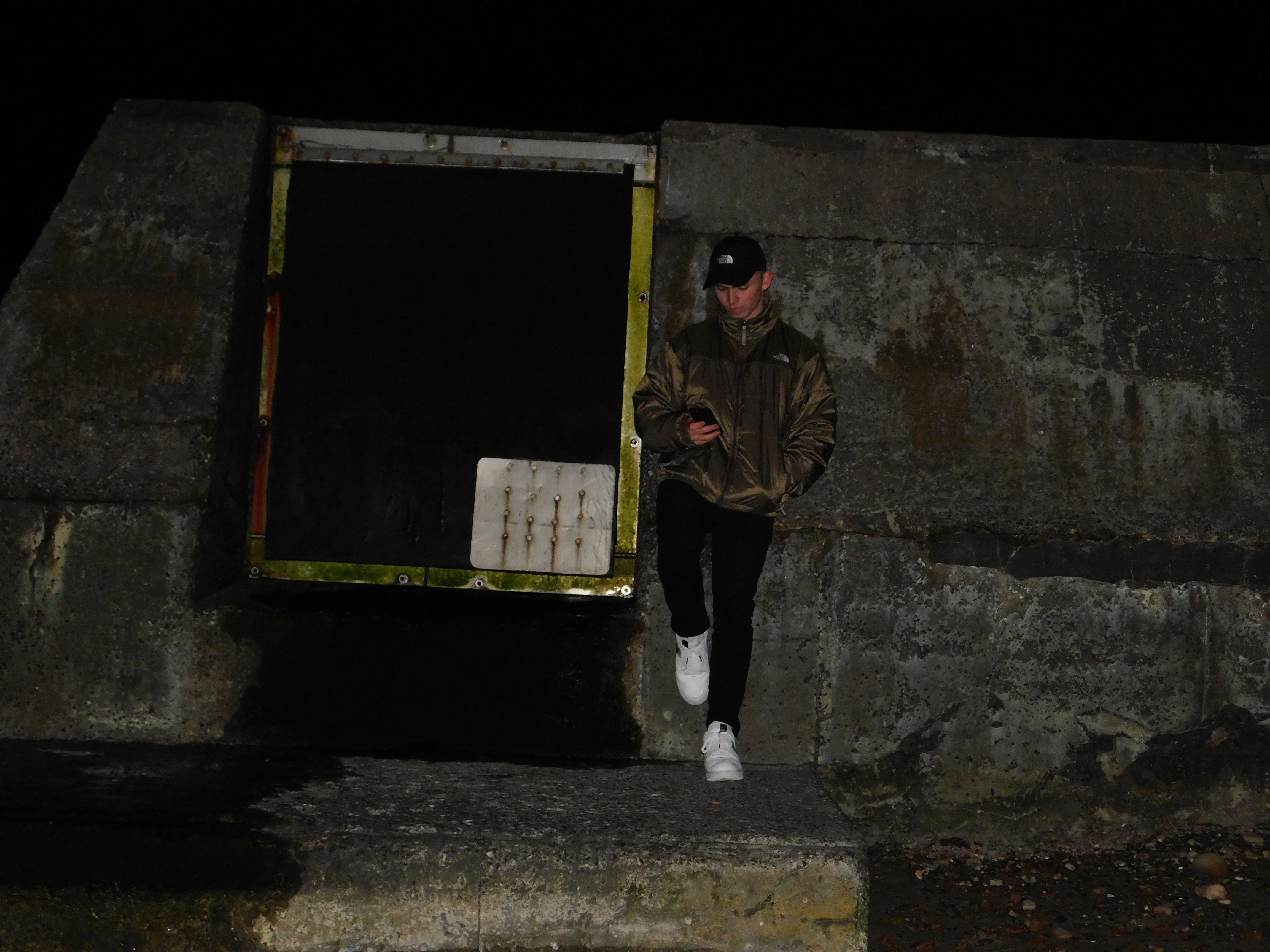
I also particularly like this image. The photo was taken using a tripod and as a result of the environment, The tripod was on a slope explaining the angle of the image. This can easily be corrected using free transform in Photoshop. I like the composition of the images color due to my outfit consisting of neutral colors, similar to that of the breakwater I am propped up against, as well as the bright white color of my shoes standing out among these darker, neutral colors.
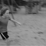
Image 3

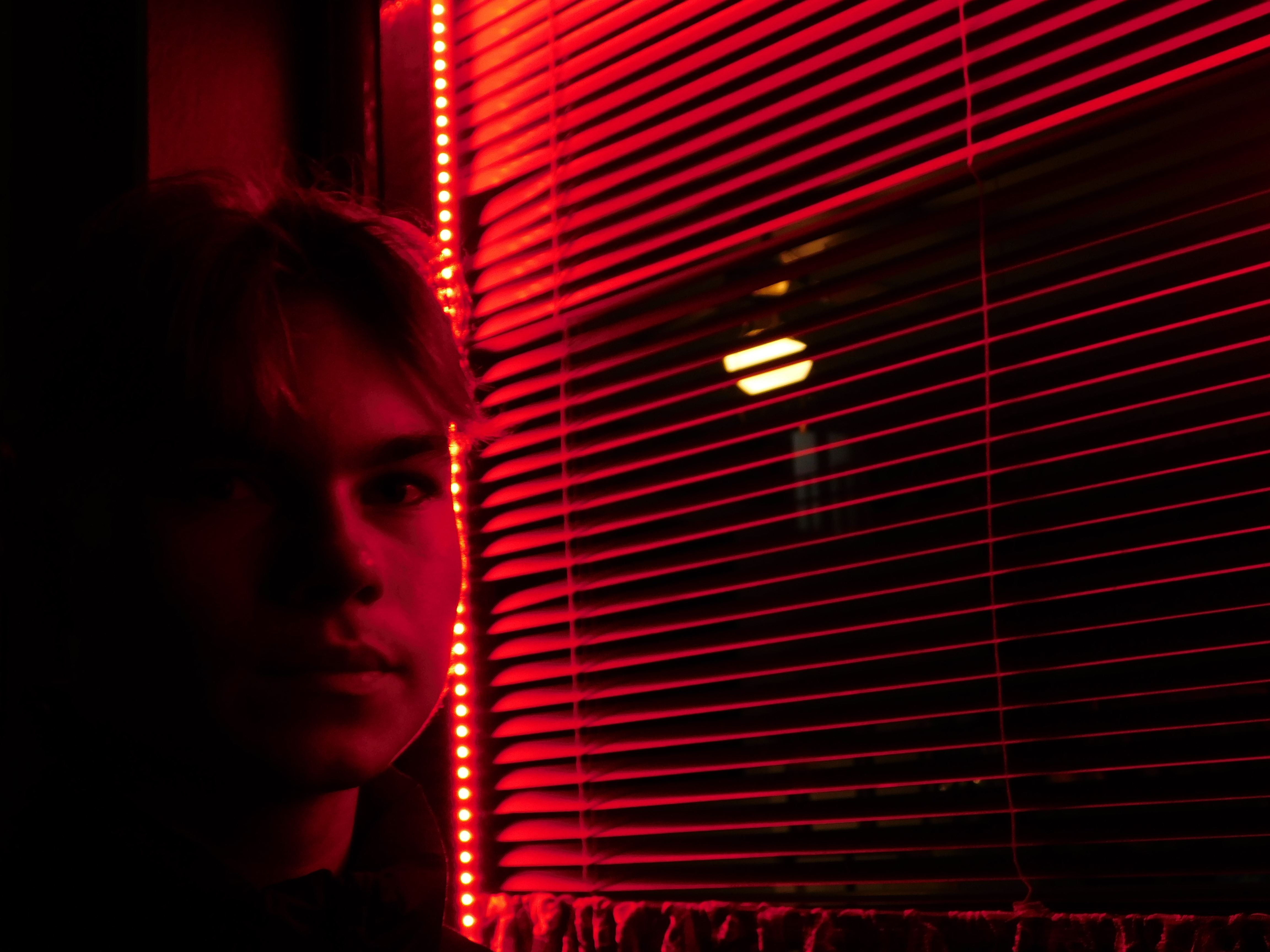
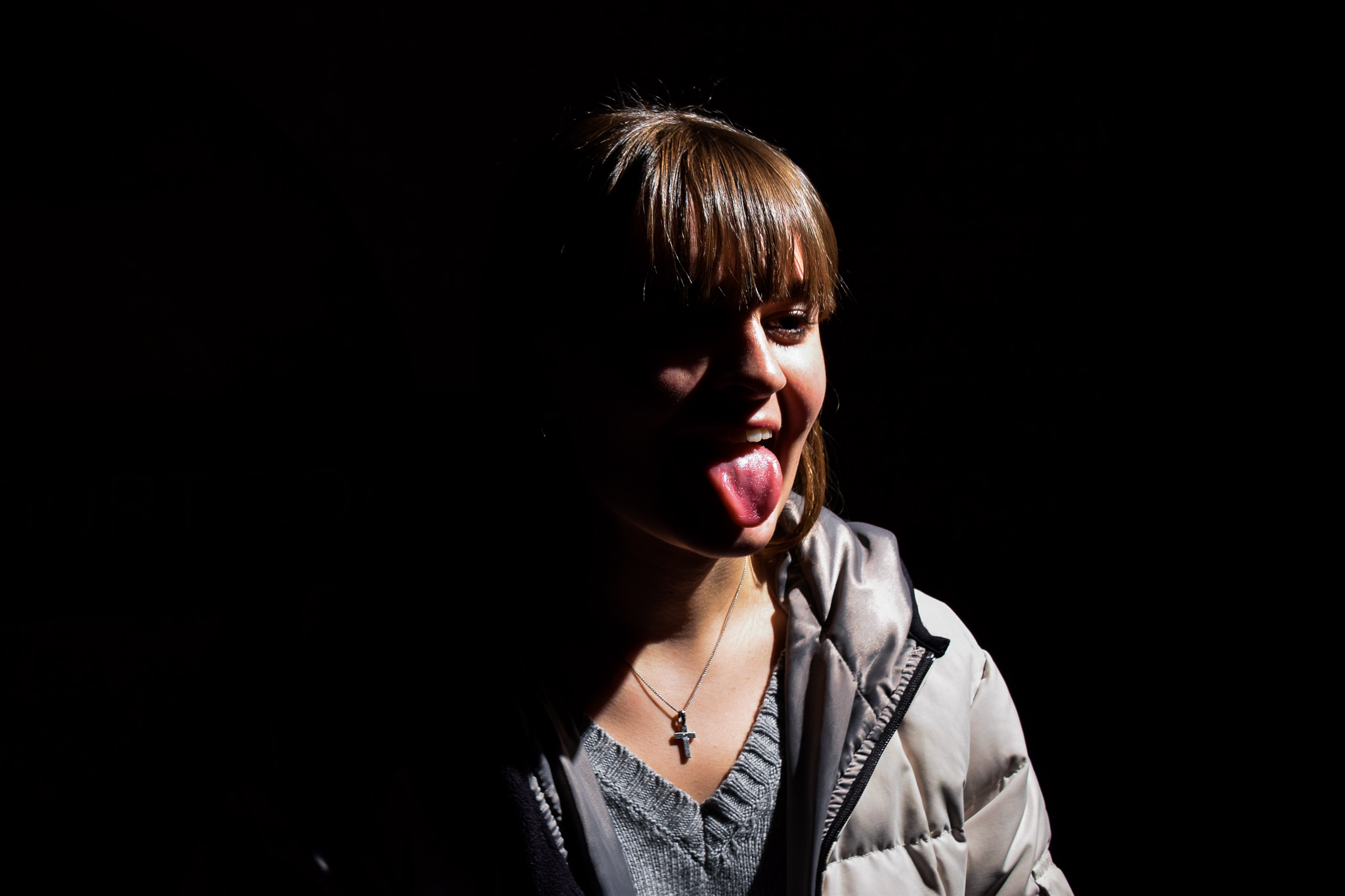
This is also another personal favorite out of all my Images. I decided to utilize the lighting from a red LED shop window display. I asked my subject to step into the light and the result was an effect similar to chiaroscuro, with half of the subjects face being illuminated and the other half being left out of the light and in the shadows.
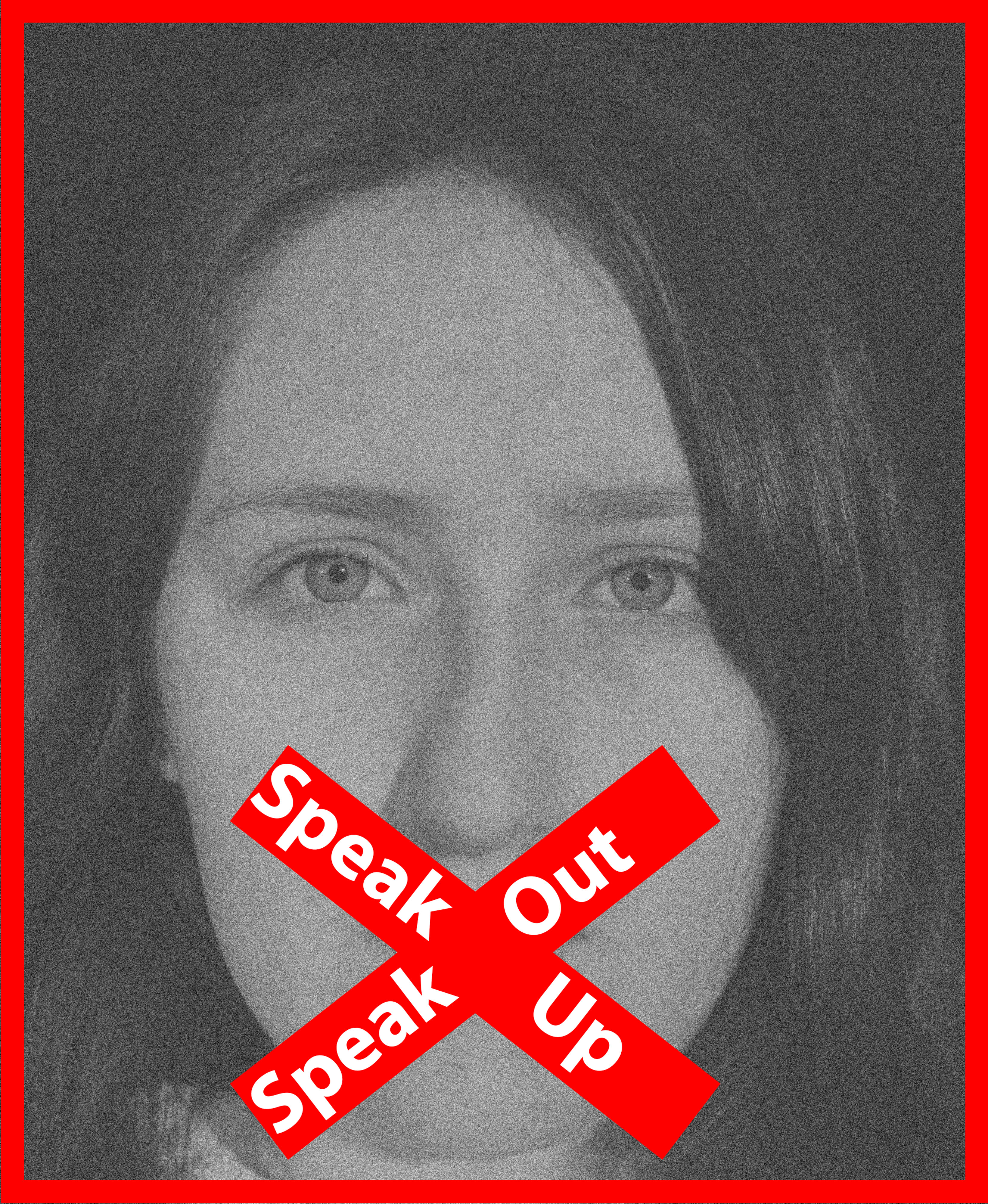
Editing Techniques

For my project, i have decided to focus on the idea of obscuring identity.I have decided that I will achieve this process through multiple editing techniques, exploring ideas of digital editing methods like pixelating, Blurring as well as physical methods such as taping and tearing. Here are a few demonstrations of my chosen methods demonstrated below.

Pixelating

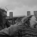
This method is essentially using a filter from the filter gallery.  Firstly,  I have cropped the image down to remove the unwanted garage doors on the sides of the Image. I have then drawn around the subjects face  with the lasso tool, as this is the feature I wish to select for pixelization and Created a new layer out of it with the CTRL+J Function. I have decided to leave a bit of space around the face in order for the outermost pixels to fade into the background rather than towards the edge of the face, as this will also contort the face shape of the subject more if I do this and, arguably , The subjects face shape is quite a noticeable feature.

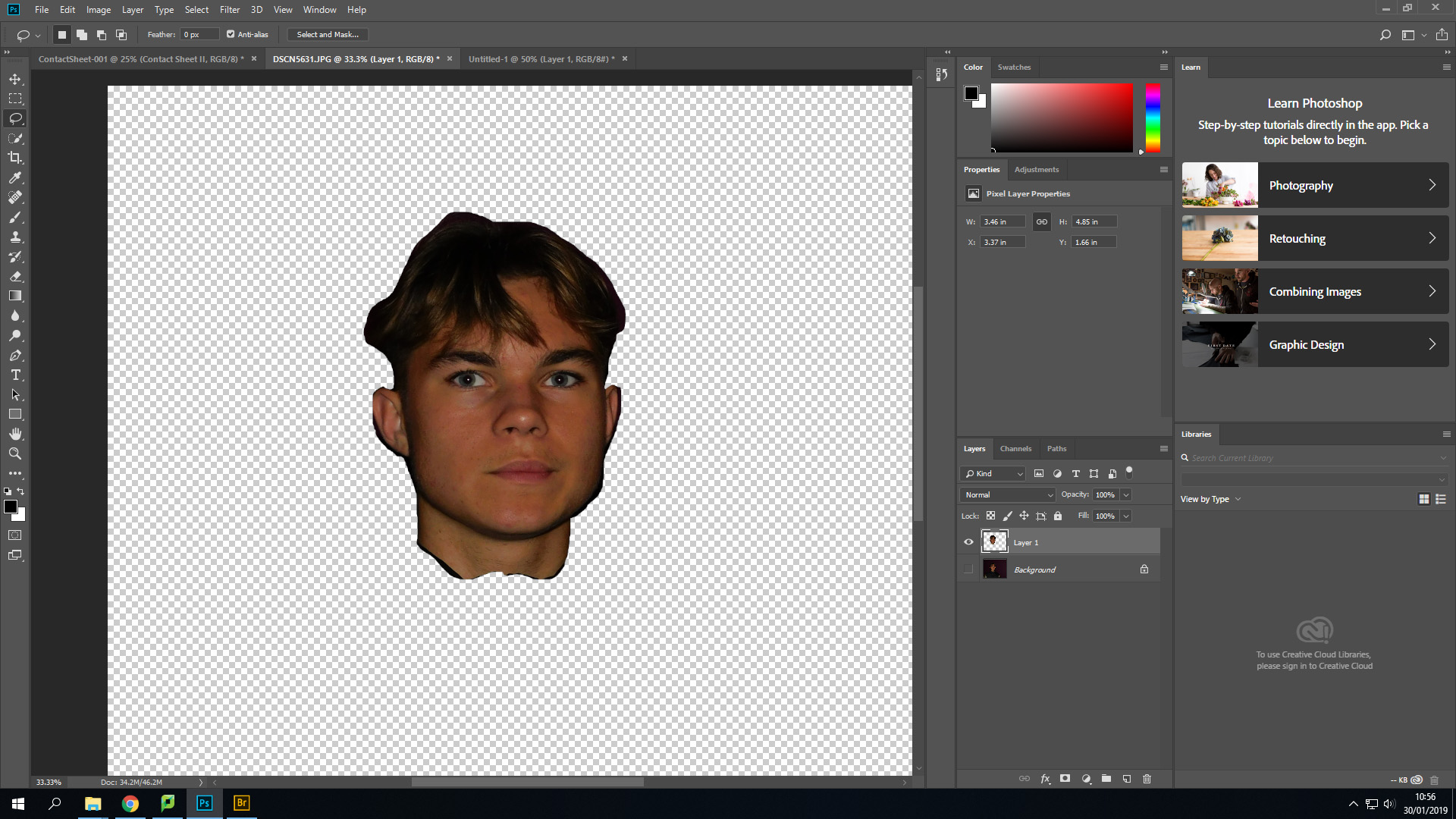
In the filter bar at the top of the screen, I have gone down to the pixelate function and selected mosaic, as this is a style of pixelation that truly represents the style I wish to Achieve

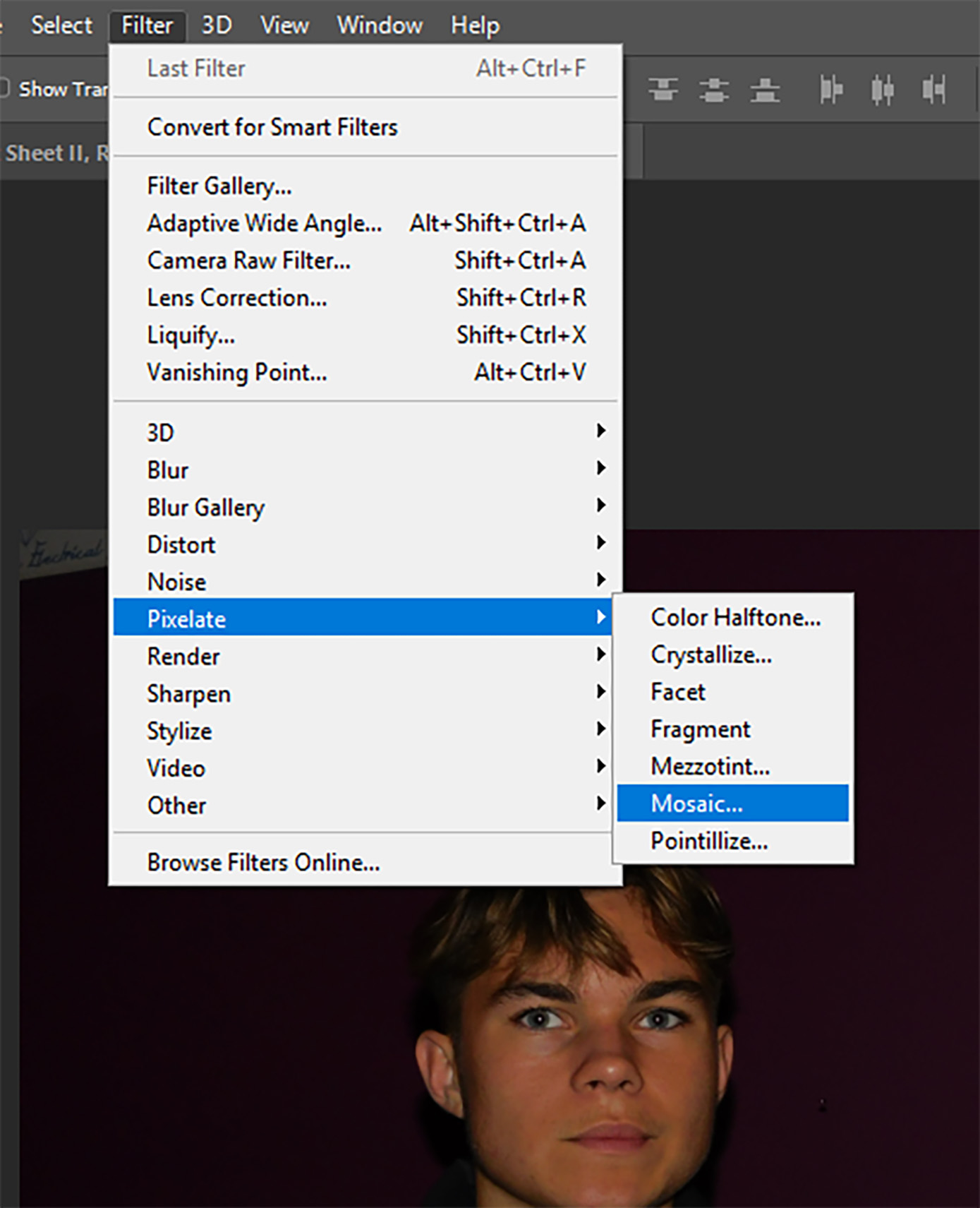
I have then set the Pixel square size to 70. This is not a set size and will vary from image to image dependent upon the composition of the element I wish to pixelate

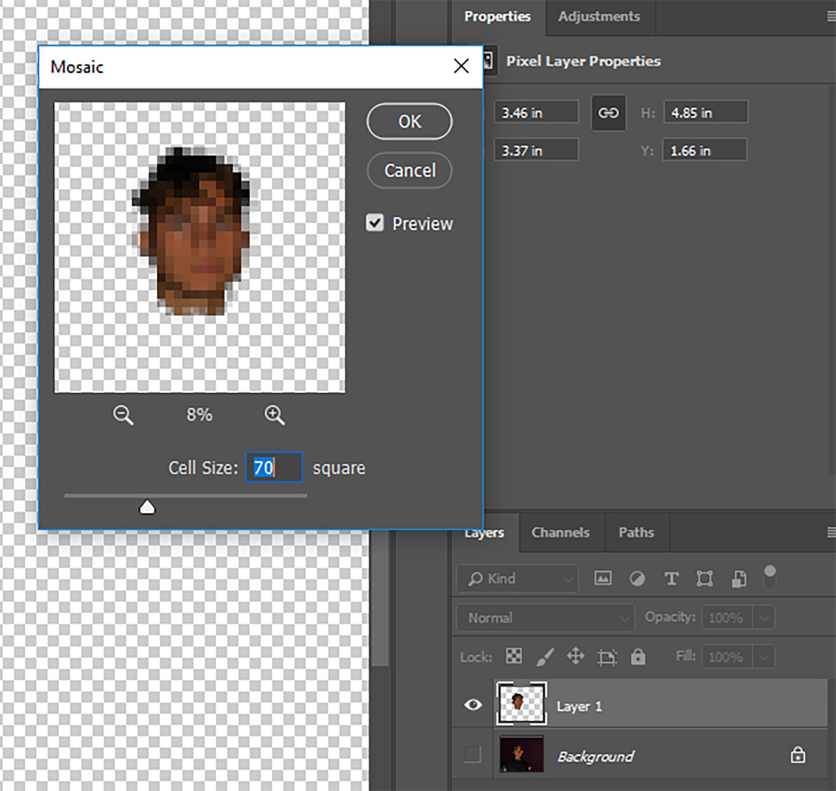
Here is the final outcome of this process in the editing stage. As you can see, the majority of facial features are distorted but from analyzing this image, I have decided that In future I may enlarge the pixels in order to further obscure the identity of the subject and break up facial features further.
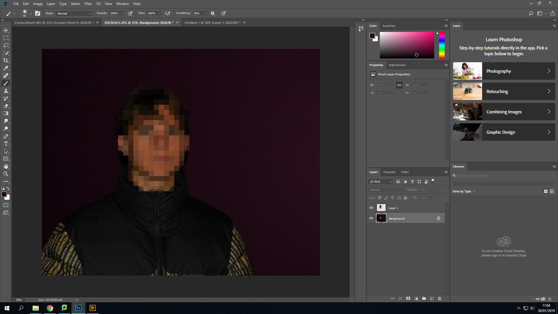
Blurring

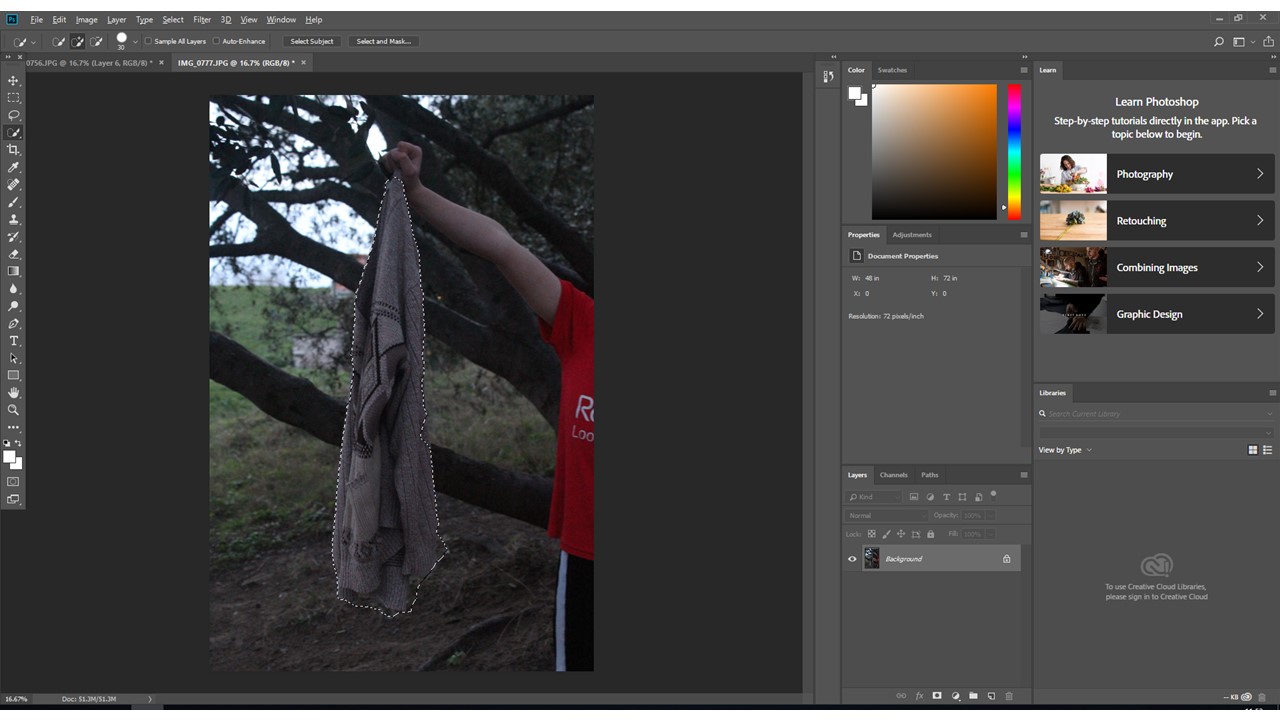
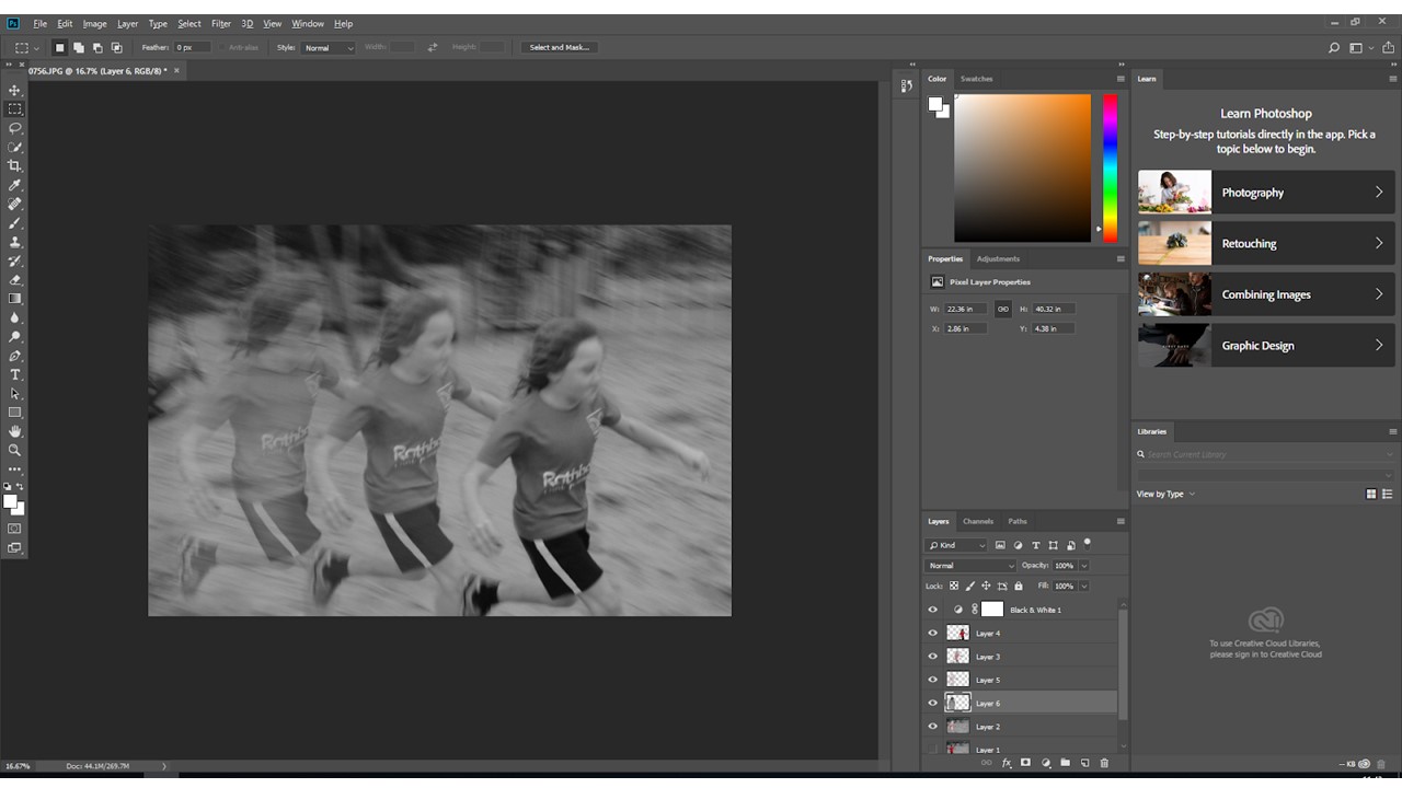
I have decided to also incorporate features of blurring within this project. I will be focusing my work around 2 different types of blurring- Motion and box blurring, Motion blurring is a type of blurring that can occur naturally within an image by either moving the camera when taking a photo, Or photographing something moving with a low shutter speed. For my project, I simply just like the motion blur aesthetic so I will apply it through the motion blur filter interface.

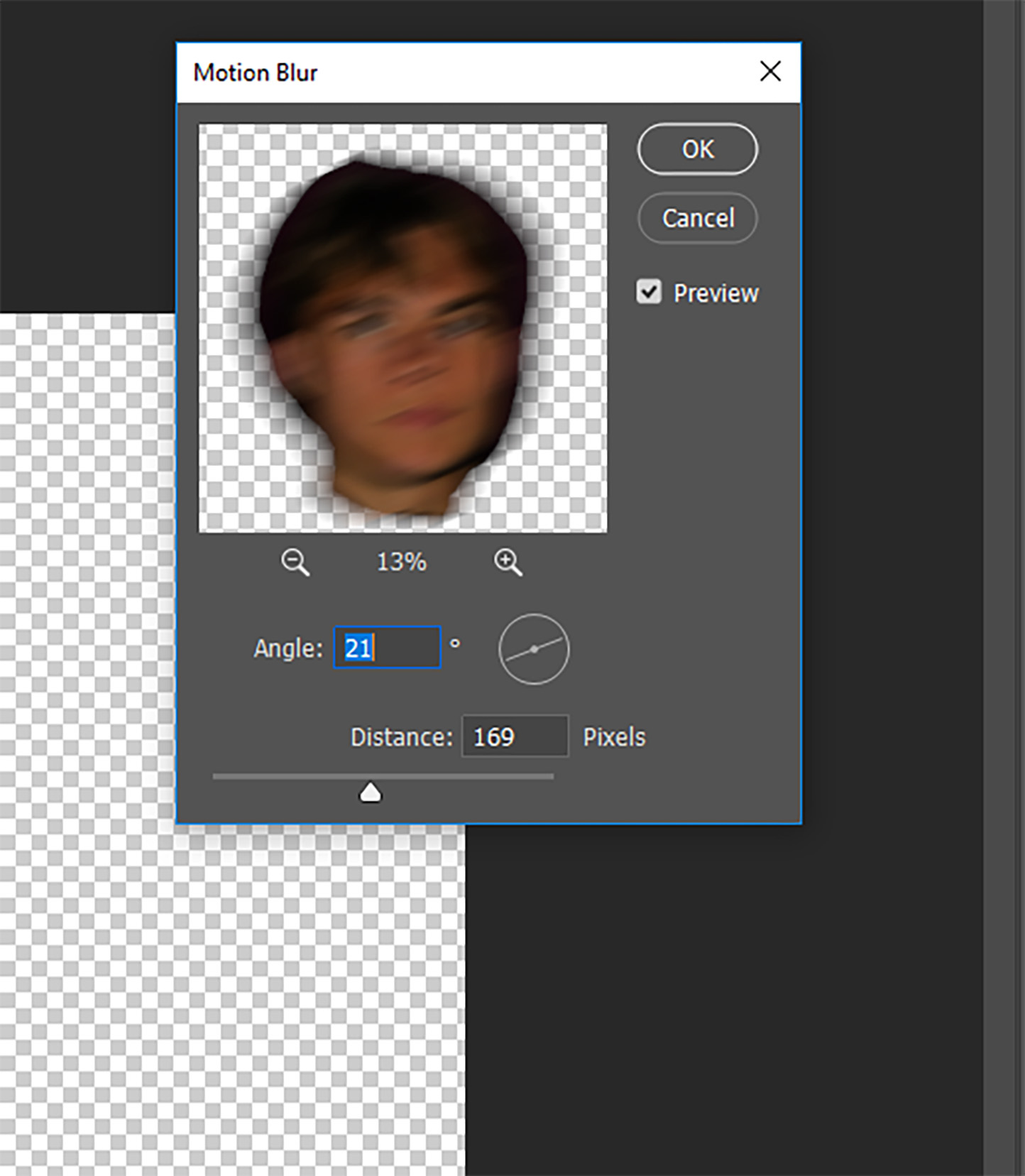
I have repeated the first few steps from pixelation in the sense of isolating the area I wish to blur (The subjects face). I have then selected motion blur from the filter drop down and set the angle at 21 degrees, Meaning the blur is going across the subjects face horizontally and slightly vertically. The blur distance has been set at 169 pixels, As I find it matches the aesthetic I am trying to capture.

Here is my final outcome for the motion blurring. In other images, i may choose to blur the subjects whole body to give off a sense of movement which could portray ideas of a hatred of the subjects own identity or an element of being camera shy

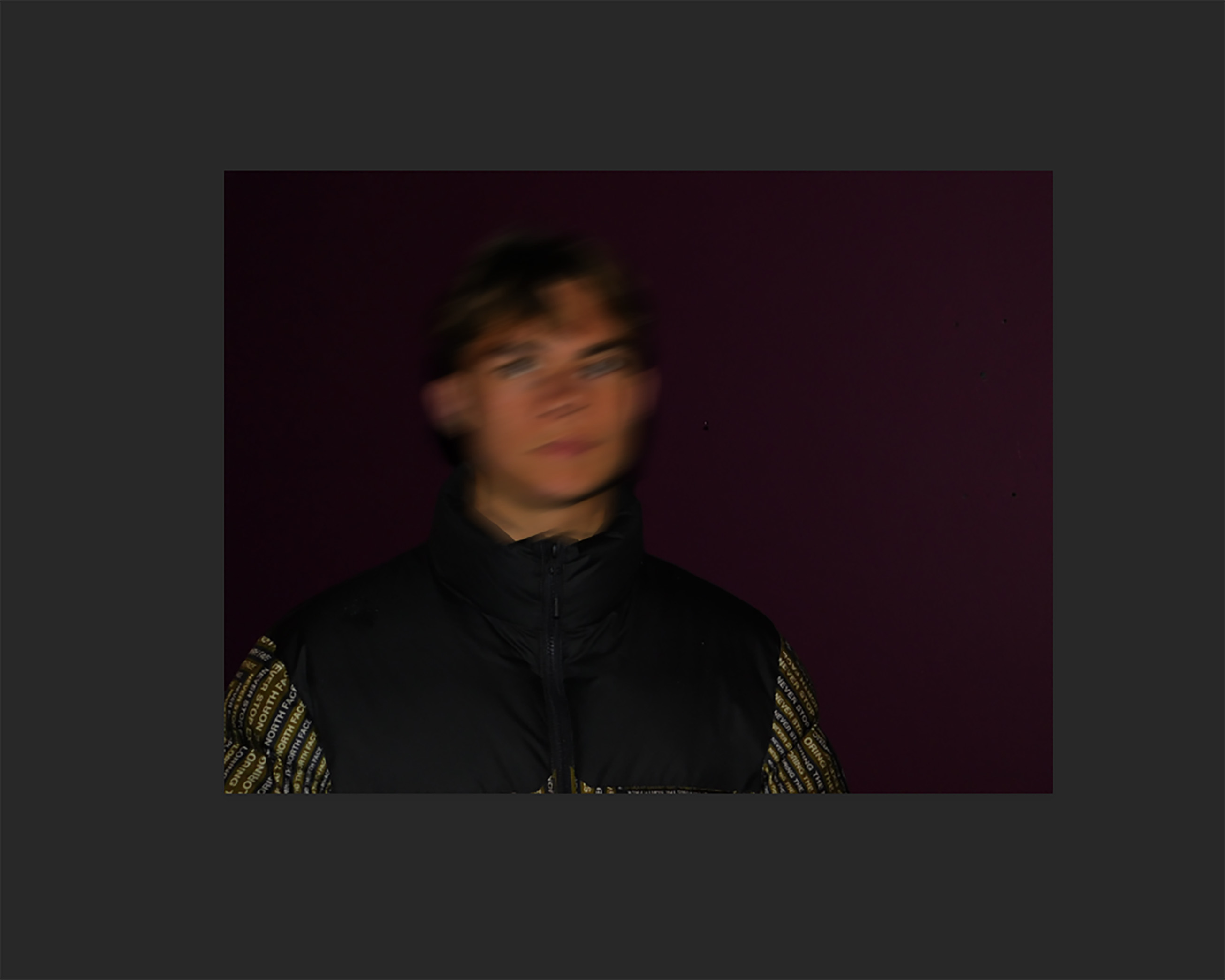
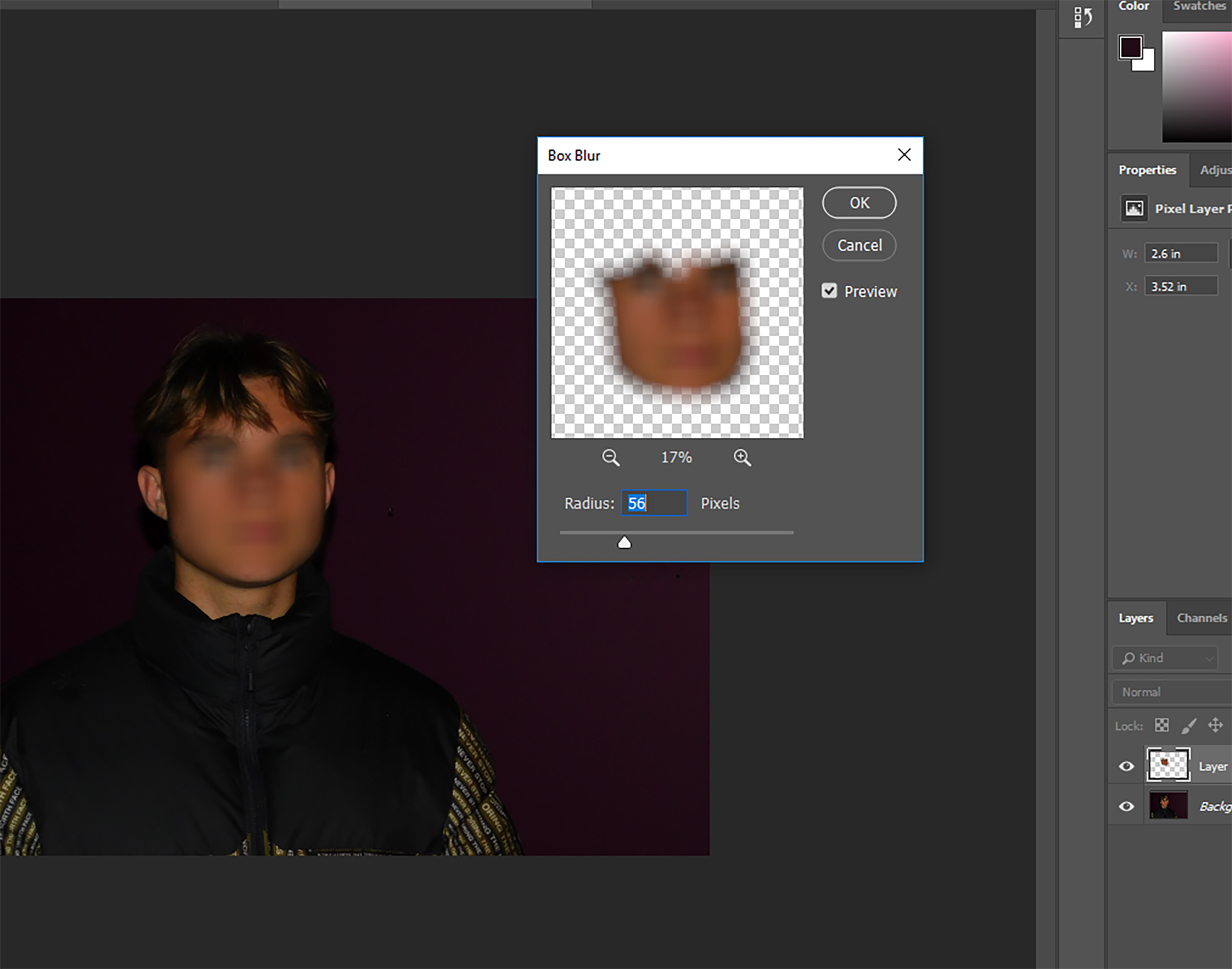
Box blurring is a process that follows roughly the same procedure as all of the above editing techniques, However for this feature, I have decided I want to keep the subjects facial shape the same and instead, blur only the face in order to create a feeling of a lost identity rather than the need to conceal it.

I have selected the subjects face with the lasso tool and from that, created a new layer. I have then applied the box blur filter with a radius of 56 pixels.

I like the effect that is given off by this process, However I feel that the eyes and eyebrows are still very noticeable, So I have therefore decided that desaturating both the layer and the background can help to Hide this. By removing the color of the subjects face, He is now barely recognisable.

Here is the final edit for this process

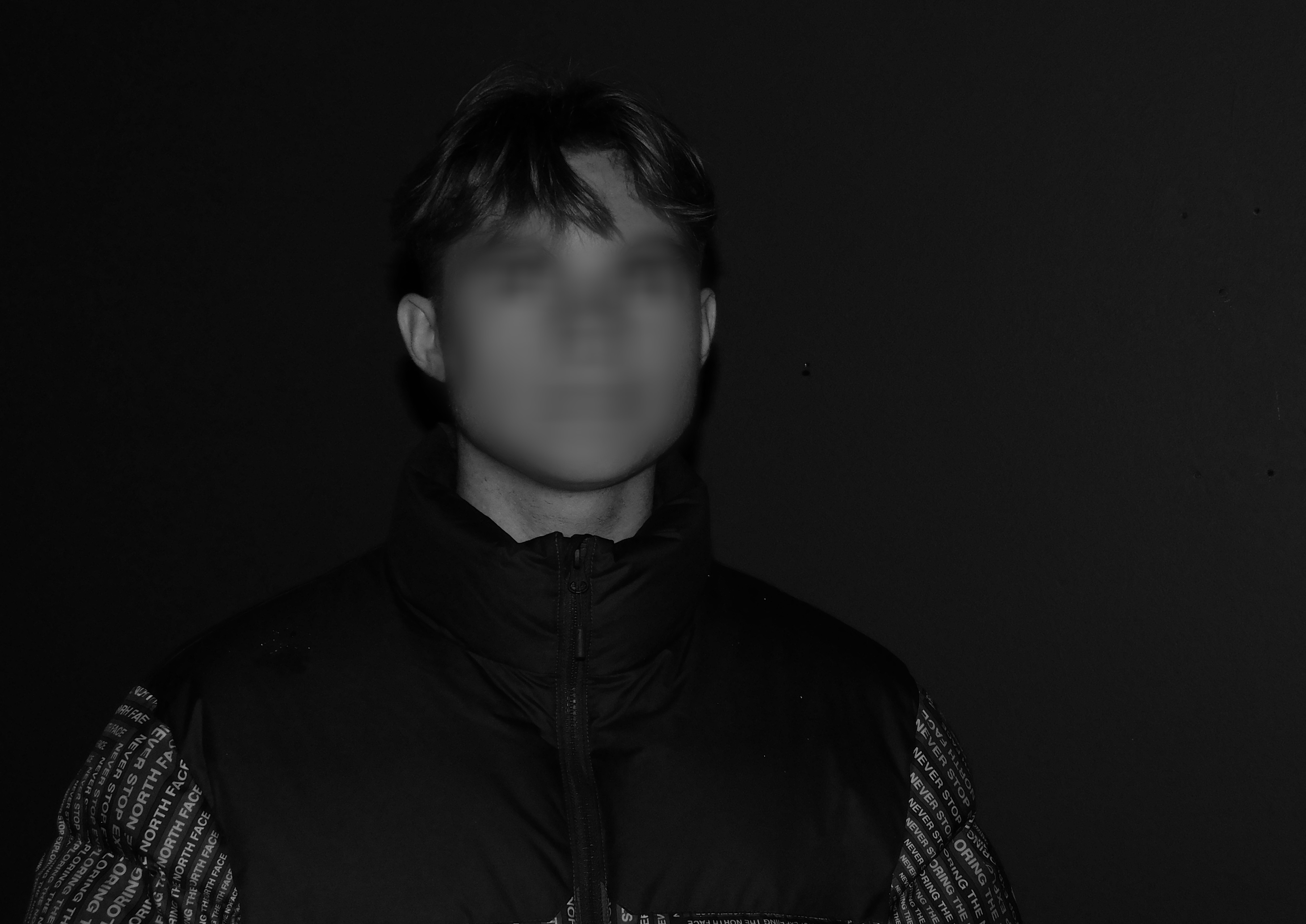
Straight away you are drawn into the obscured features of the participants face, Features are recognizable such as the nose,mouth and eyes, yet they are obscured to the point where it is practically impossible to identify the subject behind the edit

Final Outcomes & Explanations (MOCK EXAM)

These are my final photo-montages in a series of 3, which I have made as a response to the ‘Identity and Place’ stimulus.

The method I used to create these was first finding all these photos and taking some more recent ones. Next I photographed all the photos using my phone and transferred them over to my computer where I then printed them all out and began to experiment with what I was ripping/cutting out and where I was going to sew the piece back on. After deciding on what was going to go where, I scrunched up all the photos to make them look torn and then used glue to stick the pieces on. When the glue had dried I then started stitching into the photos with black thread and a needle, in order to make the pieces like patches.

Final Outcomes

This is the first one in the series, and one of the only ones that I only used 2 photos to create. The base picture is a passport photo of my mum from the 70s and the two eyes are from a photo of me, which was taken about a month ago, this age difference contrasts the base photo which is around 40 years old. This can also be seen through the fact the most recent one is better quality, there is less blurring and it is in colour. Whereas the older one is in black and white and the features on the face do have some blurring. This photo-montage was also the only one which I decided to add text to.  I used acrylic red paint in order to paint on the words “I am nobody, who are you?”. I chose to write this as I felt the piece was missing something and the words link in the identity theme. The original creator of this phrase (which has now become a popular saying) was Emily Dickinson. Dickinson was a notable poet, born in 1830-1886. Her poem ‘I am nobody!’ has now become one of her most famous. The poem addresses a feeling of being on the outside, it is about being “us against them”.

I’m Nobody! Who are you?
Are you – Nobody – too?
Then there’s a pair of us!
Don’t tell! they’d advertise – you know!

How dreary – to be – Somebody!
How public – like a Frog –  
To tell one’s name – the livelong June –  
To an admiring Bog!

Emily Dickinson

The inspiration for the layout of the text came from an artist named Dominic Beyeler. I first saw one of his pieces based on this saying on the Instagram Explore page, and I just thought it looked really interesting and cool, the way he had laid out the text over the persons face, and how it all fit perfectly. Therefore I decided to try it out on my photo-montage as it was lacking something, and I think it turned out really well. The painting could have been neater and more exact however, I feel that a messier look gives the photo-montage more authenticity.

Above is the second photo-montage I made. I used two photos to make this: the black and white one is of my mum and her brother, playing and posing for a photo. This was around the late 60s. I like how both of them seem happy and smiling, it is a breath of fresh air which contrasts some of the more depressing photos which are more common these days. The coloured photo is one from the early 2000s of me and my brother, posing for a school photo together. I thought this was quite a weirdly strange photo-montage as the two photos fit together quite well despite being taken a long time apart. Some parts are almost perfectly matched such as the hands at the bottom. The stitching in this one is also a lot more prominent than the last and there is more of it due to there being more pieces of photos to stitch on. Overall I enjoy the contrasting colours of the two photos and how they match together really well apart from at a few places.

This is my last one in the series. It is solely portraits/passport photos of me and my mum, at different ages in our lives. The base photo is a coloured photo of my mum in her 20/30s. I have layered over the top ripped out features from photos of me. Some of them match well and others don’t, which was the point of what I was doing. The piece of neck/jaw/hair matches almost perfectly with the base photo of my mum, some parts are a bit off because of the sizing of the photos but I think that this makes the finish product look more interesting and cool to look at when the pieces don’t match up. The addition of an extra eye also makes the portrait even less ordinary.

Identity and Place – Practical

Contact Sheet:

Final images:

Edited in: Photoshop + Lightroom

For this image I wanted to show a confusion and inevitable lack of identity, I did this by using multiple exposures in Photoshop and then using a large eraser (2500 px or so) with around a 20-35% brush hardness. Along with this, I used different opacity levels for many of the different layers, to make the image seem almost dream-like or as if it was happening inside the head of the subject, with the intention of the face furthest to the left to have different personalities or emotions. I wanted the image to have a different look than most other portraits in plain white/yellow light, and the pink hue added by the neon sign only adds to the image as it helps it look slightly unnatural/artificial.  There were a total of 9 different images used to add depth into the many faces, along with most of them using layer masks and using gradients to eliminate the edges, and then if an image was moved up or down, I used the eraser to eliminate any hard lines from either the top or bottom of the image.

Edited in: Photoshop

While I originally played around with the idea of digitally erasing parts of a subject like the mouth and eyes, however I found that this didn’t work in the way that I wanted it to, so I decided to use the lasso tool instead. For this image I used the Polygonal Lasso tool in Photoshop to select areas of the subjects face, then copied these areas and pasted them back into the image as a new layer, I did this several times on many different areas of the face as you can see above. I wanted to make the subject seem like a broken mirror, hence all of the layers are triangular and, for the most part, facing inwards like a smashed mirror. I did this to show the feeling of not knowing who you really are, similar to the first image, but this one is more about all of the ways we represent ourselves depending on who we are around, and how at a certain point you lose yourself when trying to put on these different faces for other people. To me, this image represents being lost and not really knowing who you, because you are trying to act differently around different people in your life, where as the first image represents a more internal struggle, and lack of identity because of focusing on too many things inside your own head.

Unsuccessful Images

Edited in: Photoshop

I also experimented with the idea of using mirrors but personally don’t really like how it turned out. I think that this idea could have worked better if I had found a larger, more open space, so you could see the depth of the image. I also think a different mirror would have enhanced the image as from this angle the mirror used doesn’t have and large edges; meaning it doesn’t look as much like a mirror compared to Laura Williams’ work, on which this image is based.

Sculpture For my final exam images

Sculpture to help with the image blending

For my final images I have created a sculpture that should inventory help make my I  mages have more depth and interest.  This sculpture is made from broken wood bringing in this running theme of industrialization and how everything is getting refurbished and we just have all this left over building materials.  My intentions for this sculpture that it was meant to reflect a head and  have the shape so that it will blend effortlessly into my images.  This wooden shape will also show the confusion of industrialization tho humans and how in effects key feature of there life such as there identity's and place of origin. The sculpture was made using off cuts of wood glues together with a hot glue gun. The sculpture is about the relative size of a head so should create a realist blend. I am thinking of blending a combination of these images to together with one image of a face  to show how mentally changeling change can be to a persons identity of there residence ( where they live). I also really like the idea of combining different kinds of media e.g sculptural and pictures I feel like it creates depth and a more interesting story to the photo because you can look at the image and see the whole work process behind it. Also adding a different rages of media lets be be more creative and it then can show through my final images.   

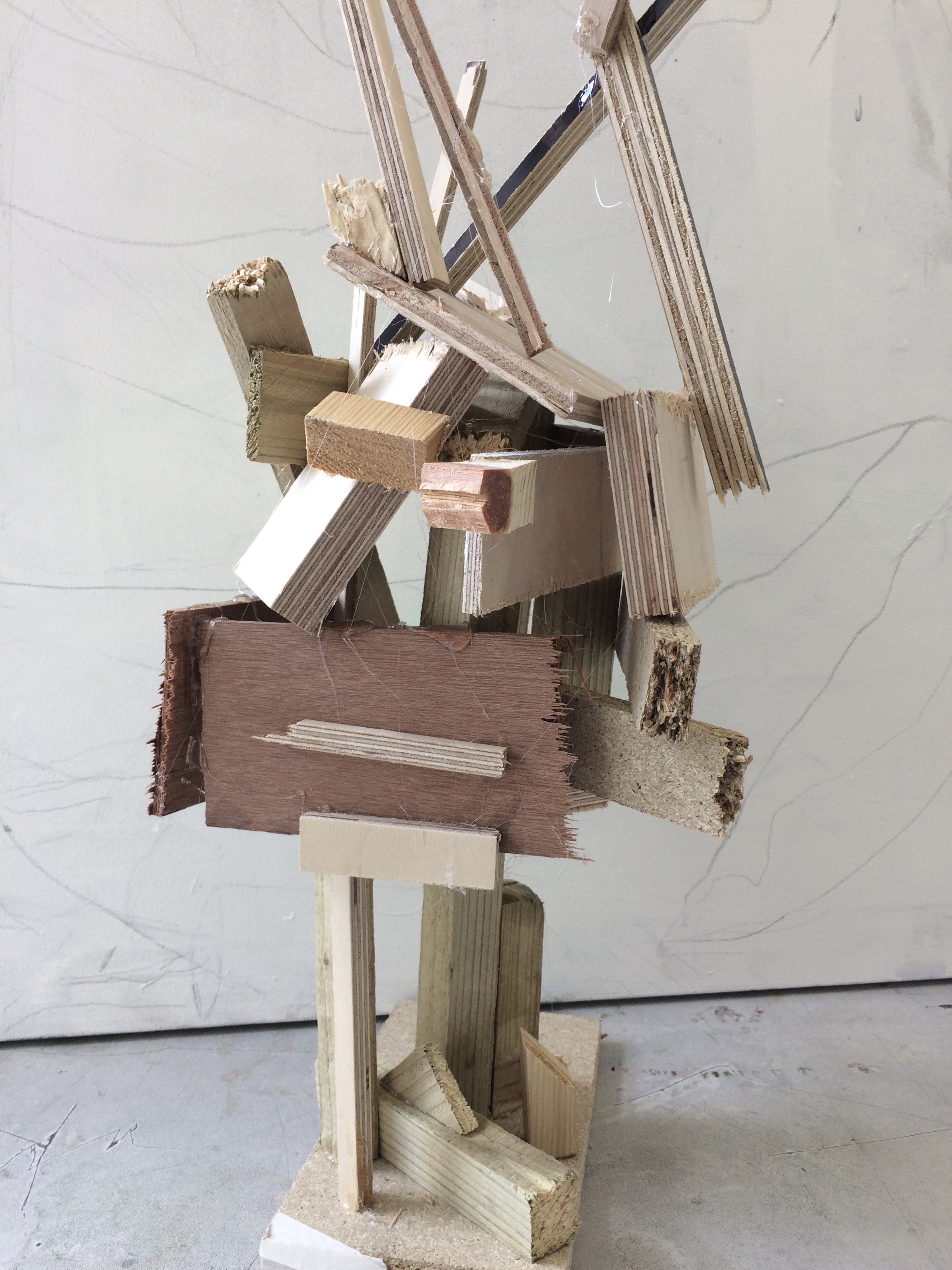
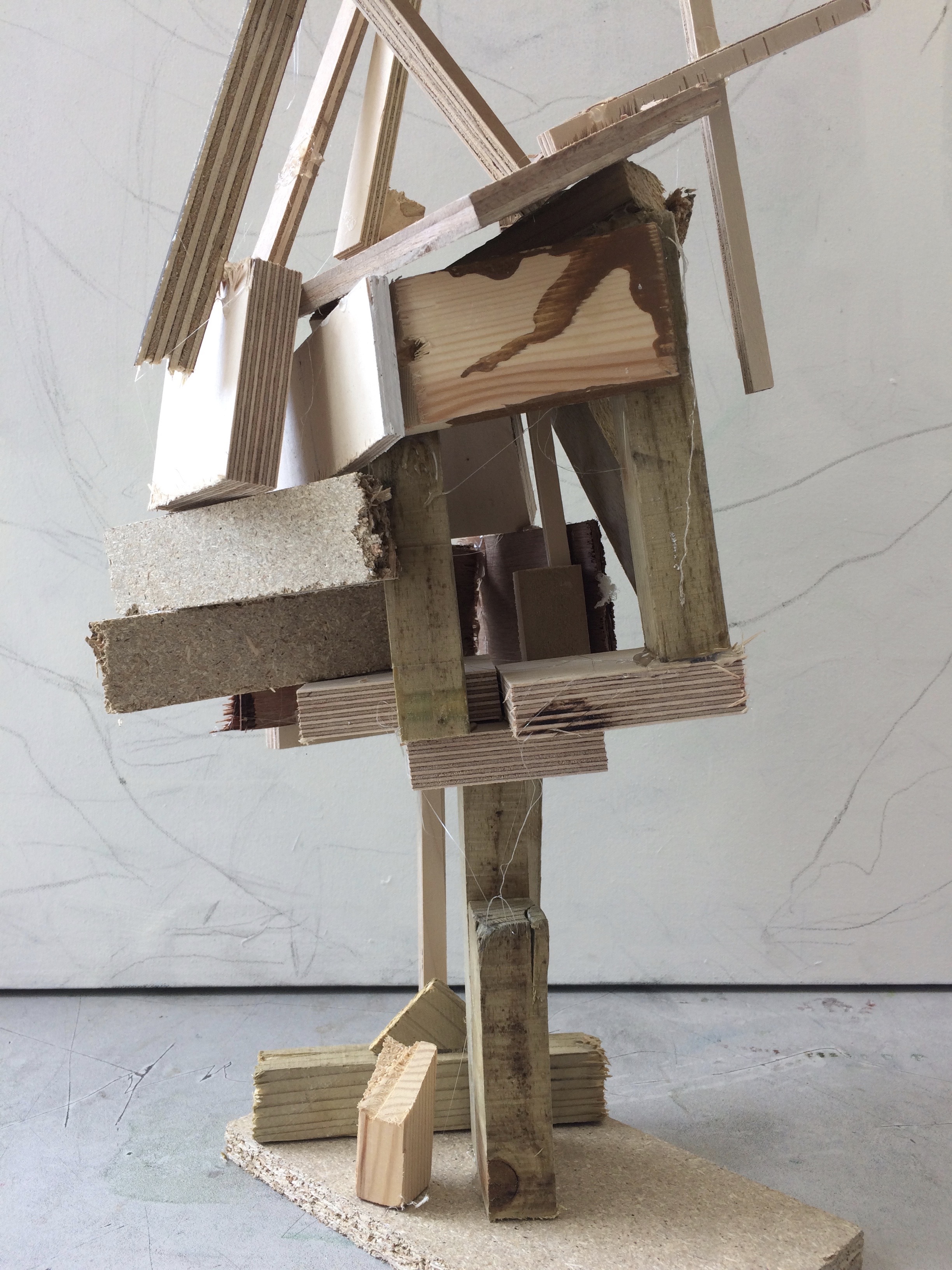
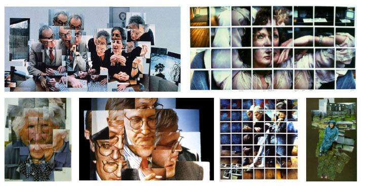
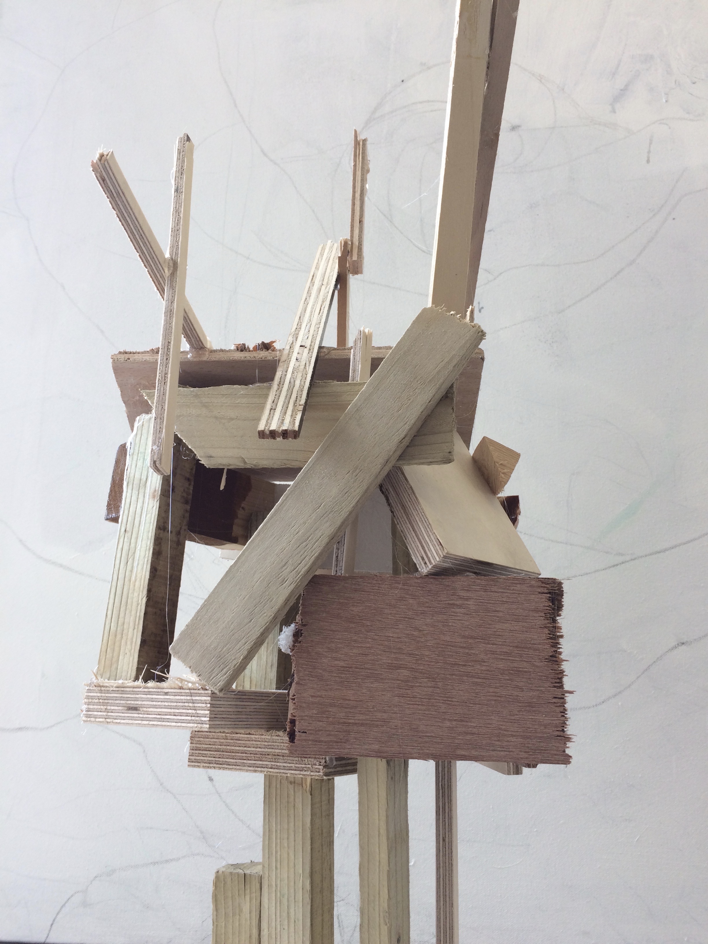
The artists work that I took inspiration for this work from was  Henry Moors work is all made from wood and created human forms through his work.
As a young artist, Moore was attracted to the principles of ‘direct carving’ and ‘truth to material’ which had inspired the great pioneers of modern sculpture, who in turn had been influenced by the work of masters from ancient civilizations on view in ethnographic displays across Europe. In his early career Moore adopted these principles uncompromisingly, creating quite experimental and innovative work in materials ranging from indigenous stones to exotic woods, a choice which declared his distance from the use of white marble typical of a tradition he was keen to reject.

After the Second World War Moore softened his position, to reflect his new belief that it was the idea, rather than the technique, that really mattered in art. Yet, while for many years modelling in plaster or clay and casting in bronze was his preferred method to make new work, he never completely relinquished carving. Having acquired a house near the famous Carrara quarries in Tuscany, from the early 1960s Moore took to work in marble and adopted more universal and timeless subjects, positioning himself within the great tradition of European humanism epitomized by one of his favorite artists, Michelangelo.

Image result for henry moore  wooden sculpture artistImage result for henry moore  wooden sculpture artistImage result for henry moore  wooden sculpture artistImage result for henry moore  wooden sculpture artist

Artist – David Hockney

David Hockney is an English painter, draftsman, printmaker, stage designer, and photographer. As an important contributor to the pop art movement of the 1960s, he is considered one of the most influential British artists of the 20th century. Hockney has owned a home and studio in Bridlington and London, and two residences in California, where he has lived on and off since 1964: one in the Hollywood Hills, one in Malibu, and an office and archives on Santa Monica Boulevard in West Hollywood, California. Hockney studied at the Royal College of Art, and featured in the exhibition ‘Young Contemporaries’ – alongside Peter Blake – that announced the arrival of British Pop art. He was associated with the movement, but his early works display expressionist elements, similar to some works by Francis Bacon. On 15 November 2018, Hockney’s 1972 work ‘Portrait of an Artist’ sold at Christie’s auction house in New York City for $90 million (£70 million), becoming the most expensive work by a living artist sold at auction. This broke the previous record, set by the 2013 sale of Jeff Koons’ Balloon Dog for $58.4 million.

Photo Analysis:

Hockney Joiner Work

The photograph seems to have been taken in a office or work environment. The subjects of the photo are a women and a man who seem to be working on a piece of paper, possibly a word search or some sort of game in a newspaper. There seems to be different paintings or pictures in the background, which could mean that the people in the photo could be artists. Hockney has used natural lighting to take this photo. This means that there wont be any dramatic shadows on the subjects faces or in the background. Each overlapping photo has a different amount of light, so some are brighter than others. This gives the photo a distorted feel as the photos don’t align perfectly and the light is also different. One way Hockney might have changed the amount of light in the photos is by changing the shutter speed to allow more or less light into the lens, or he could have used the auto setting on the camera as the camera will automatically change it shutter speed and aperture and create the effect Hockney might have been looking for. The way the different segments of photos have been organised shows the movement the subjects were making and almost gives the image a sense of movement or that the photo is like a small video.

BARBARA KRUGER RESPONSE (experiment) FINALS

‘I was only 8’

For my first edit I used a photo that was already quite dark, this was because I took this photograph as soon as I turned the camera on, the sun was only hitting one side of Katie’s face and therefore my camera was obviously on the incorrect settings, because the image came out extremely dark and shadowed, which I then tried to adjust while editing late on using the brightness and highlights settings.

‘forced to grow up’

I personally think that this photo looks a lot better as it wasn’t so close up and so I had more room to place bigger text surrounding Katie, I also took this image whilst sunlight was surrounding her, and so therefore, even before editing, the image was brighter and lighter.

‘you can’t have a rainbow,without rain’

As this image was a lot more positive, I chose to keep and enhance the colours, and use a brighter red background, I don’t think that this image looked as effective as it could have, this is because the coulors, although bright, don’t particularly go with each other nicely.

‘robbed of innocence’

I think that this image was the most like Krugers out of all of my experiments, this is because Kruger uses extremely heavy editing and there is a lot of black contrast, I have edited this image using the ‘threshold’ tool on Photoshop and this is something that I’ll probably take into the editing of my final images.